


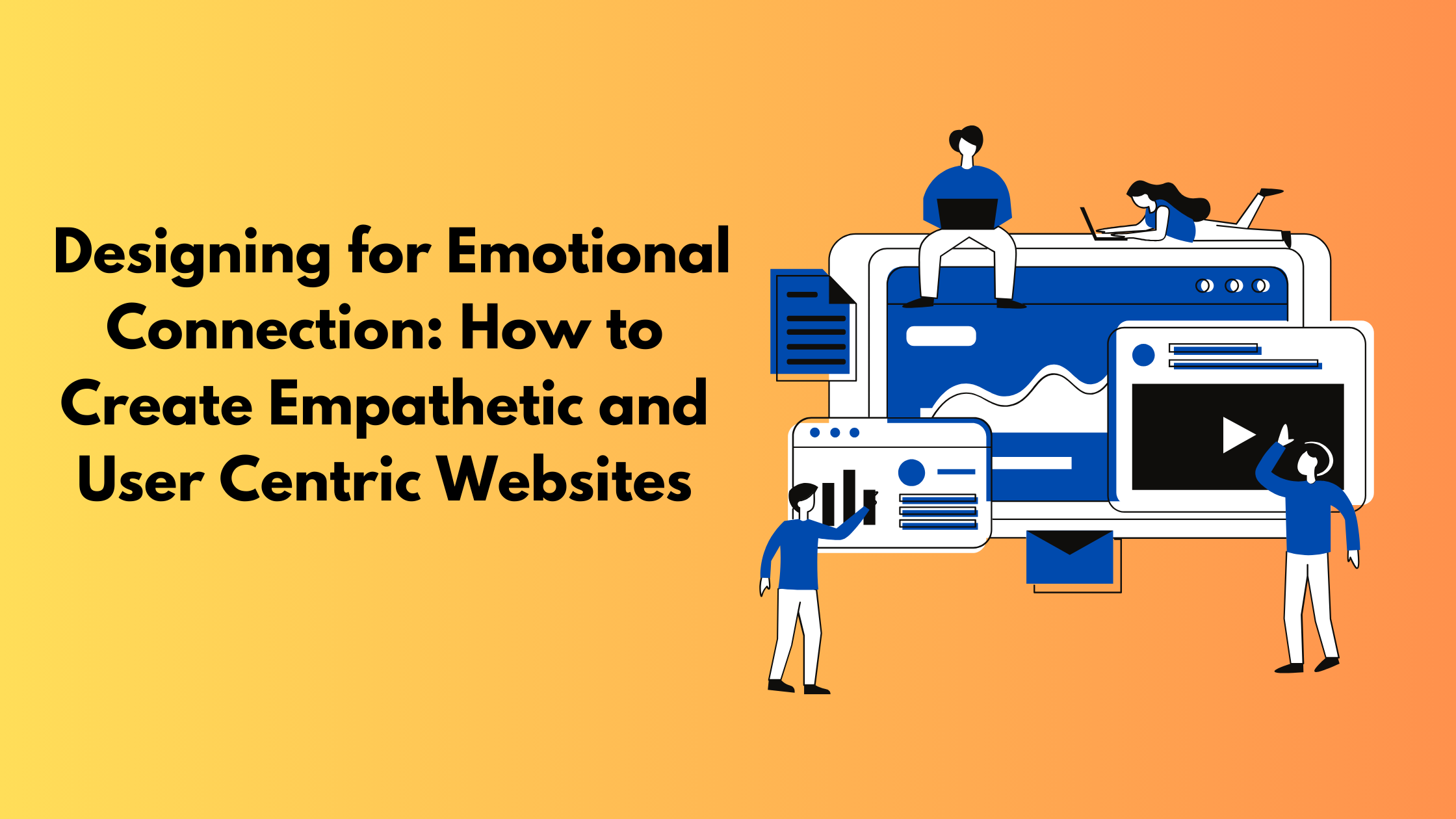
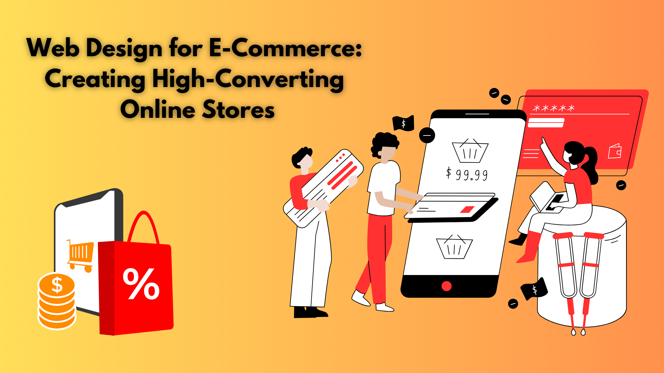
Three new websites are built every second, with 252,000 new websites created every day. Within 10-15 seconds, a visitor landing on your website can decide whether they want to continue or leave your website. Irrespective of your backend code, if your web design isn’t impressive, users will lose interest and bounce. If users can’t understand the purpose of your website, its navigation, layout, it is important to address these issues. Poor website design leaves a negative impression.
Several factors, such as typography, colors, imagery, simplicity, usability, etc, contribute to a good website design. 94% of first impressions are design-related. Also, 75% of online users judge the credibility of a website based on its overall aesthetics.
In this article, we’ll understand why good web design is important, the principles of effective web design, and tips for creating it!
Why is Good Web Design Important?
Whenever a new lead visits your website, your website helps in building a first impression of your brand. It helps in shaping the future interaction with your brand. It helps in building the first impression of your brand
Your website helps in conveying your brand identity and philosophy. If you have competitors in your industry, your website can make a change; it can make your customers go in your favor. It boosts your brand’s awareness and makes it more memorable. Search engines consider how people respond to your website when ranking it in search engines. If your bounce rate is low and people frequently visit multiple pages of your website, search engines will rank you ranker than your competitors.
Technical seo is also important. Websites with well-designed titles, page structure, and links are more accessible. Thus, search engines and customers favor such websites.
Principles of Effective Web Design

Here are some of the principles of an effective web design
- Easy Navigation: According to a study, the majority of people stated that navigation is the most important website feature for them. It is obvious, because if a person, after searching, clicks on your website and, despite a little effort, cannot find relevant information, they will go back to the search engine result page and look for another website. The navigation of your website should be clear, with clear sections and buttons.
- Negative Space: Negative space is the region around subjects of a page, which can be an image, video, or text. Etc. Overloading users with a lot of information can confuse them. Using negative space can emphasize the most critical elements of each page, as a lack of color draws customers’ attention to relevant and important factors.
- Consistent & Engaging Content: Whenever you listen to brands like adidas, Apple, Starbucks, etc, their logo and design style come to your mind. This is the power of consistent branding. Whenever you design your website, craft pages with consistent elements that help give a clear visual identity. To do so, use the same font style, color, etc. Keep space between visual elements and set layout guidelines for long-form content. Create a website template for all pages.
- Complementary Colors: Complementary colors are a pair of colors that you can mix without making your design ugly. The way colors appear on screen follows the Red, Green, and Blue color model rather than the Cyan, Magenta, Yellow, and Black model used in printing. Painters often use the Red-Yellow-Blue color model that considers complementary colors to be red-green, blue-orange, yellow-purple, etc. Irrespective of which model you prefer, complementary colors provide emphasis and create a visual identity for your brand.
- Use Grid: When we say use grid, it doesn’t mean that your website should look like an Excel table. Divide your website into distinct sections that serve a specific purpose so that users can easily locate content. You can do this by creating distinctions between grid space with negative space, colors, shading, etc.
- Fitts’ Law & Hick’s Law: Psychologist Paul Fitts developed Fitts’ Law in 1954, but even today it is highly relevant. It states that the size of the target influences how much time it takes someone to reach it. In web design, it means it will take people less time to click larger buttons and more time to click smaller buttons. Hick’s Law, developed by William Edmund Hick and Ray Hyman, says that people become fatigued every time they make a decision. It means the more decisions you ask a website visitor to make, the greater the chances they’ll become too fatigued to follow through.
- F Pattern Or Z Pattern: Over 13 years, researchers from Nielsen Norman Group used eye tracking to see how 500+ people engage with content. This led to the development of the F pattern. It states that the first thing people do is scan down the page, then they read left-to-right. You can structure your content in this model. Facebook uses the Z pattern on its homepage. When you visit a page, your eyes go to the Facebook logo, then the login button, then to the image on the left, and finally to create an account.
- Balance: In web design, it means how different design elements align with each other and whether they portray harmony. To create balance, you can use symmetry, contrasting colors, repetitive or consistent patterns. You can also use elements of similar shape and size.
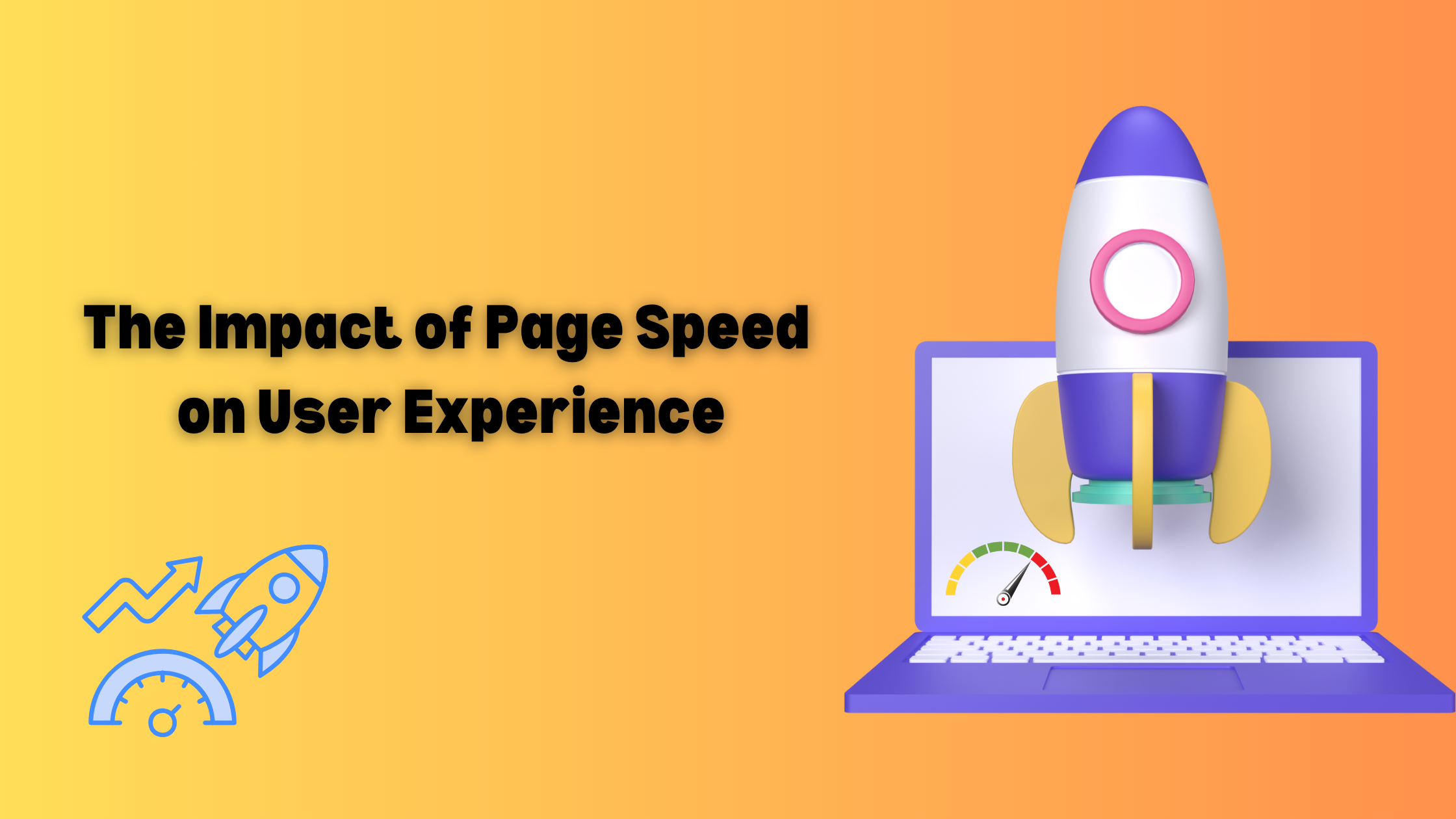
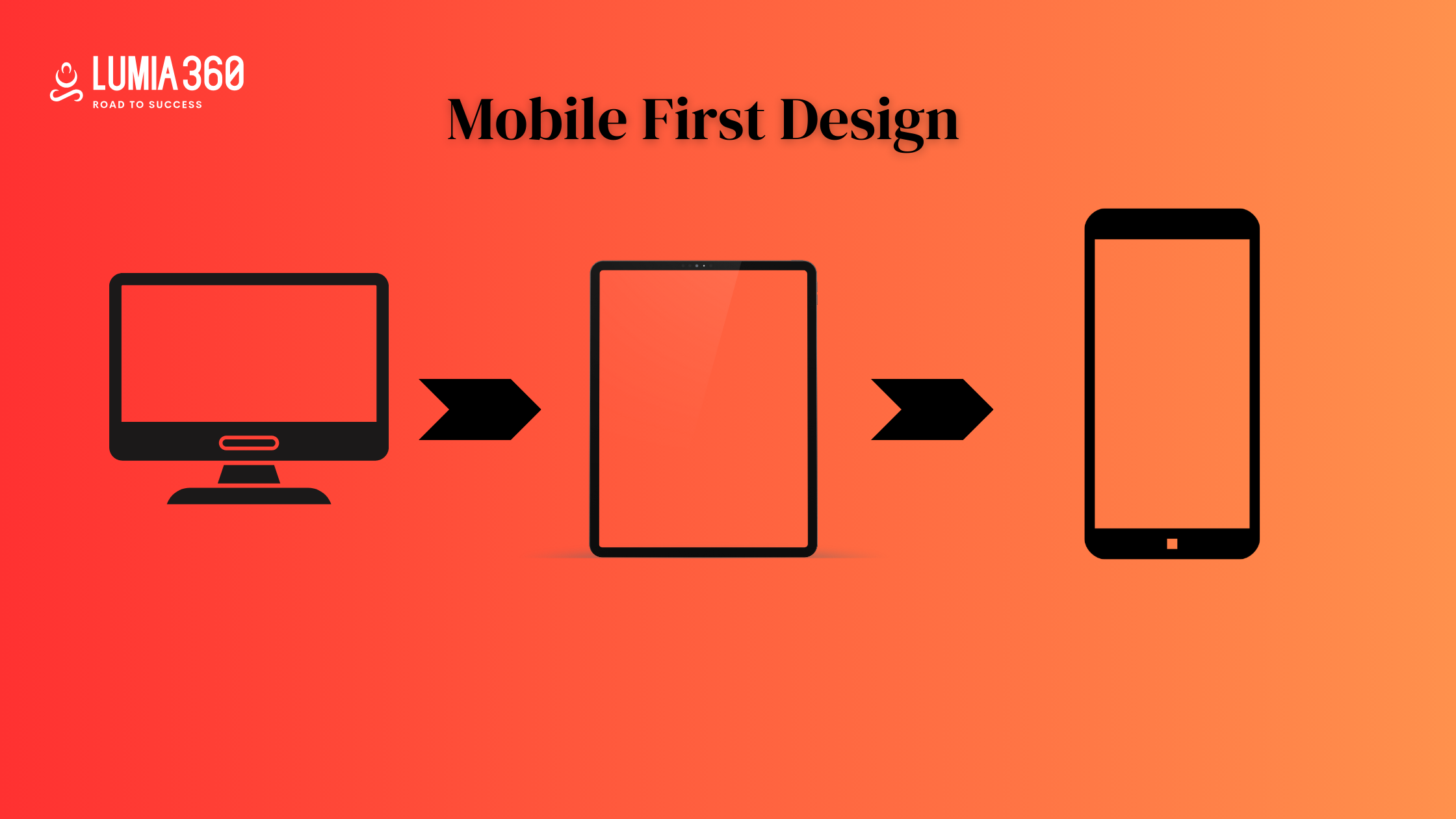
- Mobile Friendly & Fast: Most of the traffic of a website comes from mobile, thus optimizing your website for mobile is a must. Speed also influences the organic traffic on your website. Studies show that people leave a website if it takes more than three seconds.
Tips for good Design

Here are some of the tips for good web design
- Purpose: Users have a purpose to visit the website, and this is the reason why your website should clearly convey your purpose, products, and services. Each page and website should clearly be what it is. According to the goal, you should include all the crucial elements of your website. It improves the user experience.
- Simplicity: Make your website simple and try to display one detail at a time. Don’t overload your website with too much content, as it can confuse users. Use white space effectively on your website.
- Readability: Users should not face difficulty in reading the text on your website. So show contrast between your text and its background. Many designers use a background image with text over it, where the image doesn’t have an overlay. The text should be clear and should not merge with background images. It is important to use the right images for your website.
- Responsiveness: People use mobile phones for making searches, and 50% of web traffic comes from mobile devices. It makes your content viewable on all screens and different devices. All elements of your website, such as text, layout, and images, should be accessible through mobile devices.
- Navigation: Visitors will move away from your website if they don’t find information easily on your website. Navigation of your website is very important. It organizes your website and guides users through your website. The navigation tab should be on top and sticky so that if a user scrolls down, they can still find and access the menu. You can use the three-click rule in your website, which allows users to get the information they need in 3 clicks. The brand logo of your website should redirect to the homepage. Avoid using seven or more columns in your menu, as it can confuse users.
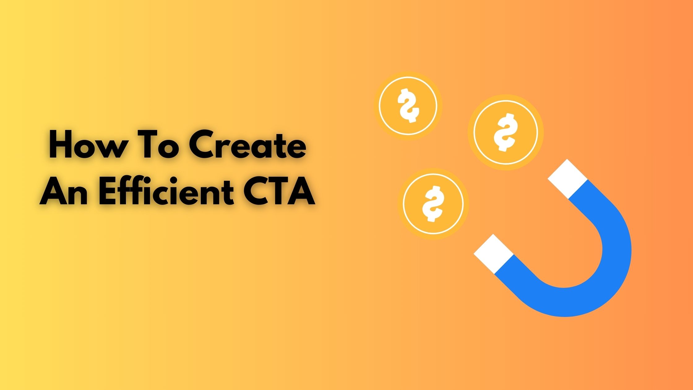
- Call To Action: It is important to include a CTA on your website as it helps guide users through your website. It motivates users to take the next step, such as Buy Now, Show Now, Contact Form, etc. Without a proper CTA, users might feel lost and uncertain.
- Color Palette: The color of your website should match the brand of your website. Choose the right color that represents your brand. Consider contrast while selecting colors for your website. The color should go well with your text and represent your brand values.
- Scrolling: Avoid sliders and accordions to present a lot of information on your website. The ideal way to present content and fit that into your website is by using the scrollbar.
- Load Speed: Nowadays,, people don’t like to wait and get irritated if your website takes a long time to open. Most users move away if a website doesn’t open in 5 seconds. The size of images and videos makes a huge impact on website speed.
An effective web design requires a purpose, readability, purpose, responsiveness, clear CTA, fast load speed, intuitive navigation, etc. By following the tips given above, you can create an effective website design. Lumia 360 has created responsive and attractive websites for its clients. That has not only enhanced their ranking in search engine result pages but also boosted their revenue. To know more about our services, email info@lumia360.com or call 514-668-5599.
Read Also: SEO Strategies for Online Reputation Management
Read Also: Glassmorphism: Creating depth with transparency and blur effects


1 Comment
Your comment is awaiting moderation.
Эффективные курсы английского для школьников в YES Center помогают и в учёбе, и в реальном общении. Подтянем оценки, подготовим к экзаменам и научим говорить свободно. Опытные педагоги, удобное расписание и дружная атмосфера ждут вашего ребёнка.
Your comment is awaiting moderation.
Народ выручайте. Столкнулся с такой бедой. Близкий не выходит из запоя. Соседи стучат в дверь. Скорая не едет. Короче, нормальные врачи нашлись — вывод из запоя дешево и сердито. Поставили систему. В общем, сохраняйте на будущее — наркология вывод из запоя на дому https://vyvod-iz-zapoya-na-domu-samara-abc.ru Каждая минута дорога. Скиньте другу в беде.
Your comment is awaiting moderation.
https://farmaciaspain.online/# farmacia online envГo gratis
Your comment is awaiting moderation.
Ребята выручите. Жесть полная случилась. Близкий человек уже третьи сутки в штопоре. Соседи уже стучат. Скорая не приезжает на такие вызовы. Короче, нормальные врачи нашлись — качественный вывод из запоя на дому. Отошёл за полчаса. В общем, сохраняйте на будущее — выведение из запоя на дому выведение из запоя на дому Не надейтесь на авось. Скиньте другу в беде.
Your comment is awaiting moderation.
Магазин бытовой химии https://himiya-v-dom.ru с большим выбором товаров для дома. Моющие и чистящие средства, стиральные порошки, гели, средства для кухни и ванной, товары для уборки, личной гигиены и ухода за домом по выгодным ценам.
Your comment is awaiting moderation.
Все подробности: https://armbuilder.ru
Your comment is awaiting moderation.
pharmacy in mexico mexican pharmacies online
https://cse.google.ne/url?sa=t&url=https://medmexico.online legitimate mexican pharmacy online
mexico pharmacy list mexican rx pharm
Your comment is awaiting moderation.
Viagra homme prix en pharmacie sans ordonnance Viagra homme prix en pharmacie Acheter Sildenafil 100mg sans ordonnance
Your comment is awaiting moderation.
https://medfrance.top/# SildГ©nafil 100 mg prix en pharmacie en France
Your comment is awaiting moderation.
Viagra vente libre pays Viagra homme prix en pharmacie sans ordonnance SildГ©nafil 100 mg sans ordonnance
Your comment is awaiting moderation.
Слушайте что расскажу. Попал в переплёт конкретный. Муж просто исчезает в бутылке. Соседи стучат в дверь. В диспансер везти — клеймо на всю жизнь. Короче, только это и вытащило — профессиональный вывод из запоя на дому. Приехали быстро. В общем, жмите чтобы не потерять — помощь вывода запоя https://vyvod-iz-zapoya-na-domu-voronezh-fds.ru Не надейтесь на авось. Скиньте кому надо.
Your comment is awaiting moderation.
https://farmaciaspain.online/# farmacias online seguras
Your comment is awaiting moderation.
Квартиры в новостройках https://novostroyka78.ru Курортного района СПб с удобным поиском по цене, площади и срокам сдачи. Современные жилые комплексы, экологичная локация, близость парков и Финского залива, выгодные ипотечные программы и предложения от застройщиков.
Your comment is awaiting moderation.
my mexican pharmacy mexico pharmacy
http://forum-region.ru/forum/away.php?s=http://medmexico.online mexico online farmacia
order meds from mexico purple pharmacy online
Your comment is awaiting moderation.
farmacia online barata farmacias online seguras en espaГ±a farmacia online espaГ±a envГo internacional
Your comment is awaiting moderation.
Если ребёнок мечтает заговорить свободно, обратите внимание на лагерь с изучением английского. Здесь уроки органично вплетены в активный отдых: спорт, творчество, экскурсии. Языковая среда работает естественно, и результат заметен уже после первой смены.
Your comment is awaiting moderation.
https://farmaciaspain.online/# farmacias online seguras
Your comment is awaiting moderation.
Драфт-сюрвей https://eurogal-surveys.ru независимый расчет массы груза по осадке судна перед погрузкой и после выгрузки. Точные измерения, международные методики, квалифицированные сюрвейеры, официальные отчеты и контроль количества груза для морских перевозок.
Your comment is awaiting moderation.
Аренда квартир в СПб https://arenda-kvartir78.ru на длительный срок и посуточно. Большой выбор квартир в разных районах Санкт-Петербурга, проверенные объявления, удобный поиск по цене, площади и расположению. Найдите комфортное жилье без лишних сложностей.
Your comment is awaiting moderation.
Viagra homme prix en pharmacie Viagra vente libre pays Le gГ©nГ©rique de Viagra
Your comment is awaiting moderation.
https://medsmexican.blog/# farmacia mexicana en linea
Your comment is awaiting moderation.
pharmacy in mexico mexican pharmacy menu
https://feedroll.com/rssviewer/feed2js.php?src=https://medmexico.online pharma mexicana
=cialis+without+a+doctors+prescription]order medicine from mexico mexico pharmacy
Your comment is awaiting moderation.
Viagra générique pas cher livraison rapide: Viagra vente libre pays – Viagra sans ordonnance 24h
Your comment is awaiting moderation.
https://medfrance.top/# SildГ©nafil 100 mg prix en pharmacie en France
Your comment is awaiting moderation.
best online mexican pharmacy online pharmacies online pharmacies in mexico
Your comment is awaiting moderation.
Only top materials: https://skipmanlogic.click
Your comment is awaiting moderation.
farmacia online barata y fiable farmacia online envГo gratis
https://cse.google.com.af/url?sa=i&url=https://farmaciasinreceta.top farmacia online envГo gratis
farmacia online barcelona farmacia online espaГ±a envГo internacional
Your comment is awaiting moderation.
Personalized summary: https://siliceanworks.click/
Your comment is awaiting moderation.
https://medsmexican.blog/# progreso mexico pharmacy online
Your comment is awaiting moderation.
Ударно-волновая терапия https://novogireevo-klinika.ru в Пушкино — эффективный метод лечения хронической боли, воспалений сухожилий и суставов. Консультация врача, подбор курса процедур, современное оборудование, комфортные условия и профессиональный подход к восстановлению здоровья.
Your comment is awaiting moderation.
https://medmexico.online/# best online mexican pharmacy
Your comment is awaiting moderation.
Expand details: https://masonly.click
Your comment is awaiting moderation.
Viagra sans ordonnance livraison 24h Viagra 100 mg sans ordonnance Viagra homme prix en pharmacie sans ordonnance
Your comment is awaiting moderation.
Daily Summary: https://faintestcore.click
Your comment is awaiting moderation.
https://farmaciasinreceta.top/# farmacia online espaГ±a envГo internacional
Your comment is awaiting moderation.
mexican pharmacy prices buying prescription drugs in mexico
http://inuza.me/index.php?url=https://medmexico.online mexican rx
reputable mexican pharmacy pharmacys in mexico
Your comment is awaiting moderation.
Viagra pas cher livraison rapide france: Viagra g̩n̩rique sans ordonnance en pharmacie РViagra homme prix en pharmacie
Your comment is awaiting moderation.
Viagra gГ©nГ©rique sans ordonnance en pharmacie Acheter viagra en ligne livraison 24h Viagra Pfizer sans ordonnance
Your comment is awaiting moderation.
Товарищи, сталкивался сам с таким — муж пьёт без остановки. Жена в слезах. В диспансер тащить страшно — посадят на учёт. У меня брат так чуть не загнулся. Короче, единственное что реально вывезло — лучшая наркологическая клиника с выездом. Поставили систему за 20 минут. В общем, там контакты и прайс и условия — вывод из запоя на дому цена https://vyvod-iz-zapoya-na-domu-voronezh-jhg.ru Не надейтесь на авось. Деньги потом не нужны будут. Перешлите тому кто в беде.
Your comment is awaiting moderation.
farmacia online barcelona farmacia online madrid
https://image.google.co.ma/url?sa=i&url=http://farmaciasinreceta.top farmacia online barcelona
farmacias online seguras farmacias online seguras en espaГ±a
Your comment is awaiting moderation.
https://farmaciasinreceta.top/# farmacia en casa online descuento
Your comment is awaiting moderation.
Всем привет, ситуация просто аховая. Родственник просто пропадает. Думали конец. Скорая не приезжает. Короче, только это и спасло — качественный вывод из запоя на дому. Отошёл за полчаса. В общем, вся инфа вот тут — снятие запоя цена https://vyvod-iz-zapoya-na-domu-voronezh-lnm.ru Не ждите. Сохраните себе.
Your comment is awaiting moderation.
farmacia online madrid п»їfarmacia online espaГ±a farmacia online barata
Your comment is awaiting moderation.
https://medfrance.top/# Viagra sans ordonnance pharmacie France
Your comment is awaiting moderation.
???? ?????? ???????? ?????? ????? ??? ??? ??????? ???? ???????? ????? ????? ???.
???? ?????? ?????? ??? ?????? ???? ?? ??????????? ??? ?????? ??????? ??????.
888stqrz https://eg888stars.com/
????? ?????? 888starz ??? ???? ?? 5000 ???? ?? ???? ???????? ??? Pragmatic Play ? NetEnt ? Microgaming.
???? ???? ???????? ??????? ????????? ????? ??? ?????? ???????? ?????? ??????.
???? ?????? ??? ?????? ????????? ????????? ????? ?????? ????? ????????.
???? ?????? ??????? ?????? ???? ???????? ?????? ??? ???? ?????? ??? ?? ????.
Your comment is awaiting moderation.
Ребята, попал в такую передрягу. Родственник пьет без остановки. Руки опускаются. Скорая не едет. Короче, только это и работает — адекватный вывод из запоя цены приемлемые. Поставили систему. В общем, там и контакты и прайс — нарколог на дом вывод из запоя нарколог на дом вывод из запоя Не надейтесь на авось. Сохраните себе.
Your comment is awaiting moderation.
???? ?????? ???????? ????? 888starz ???? ??????? ????????? ??????? ???? ?? ???? ???? ??? ??????.
star 888 bet https://888starzeg-egypt.com/
Your comment is awaiting moderation.
تجمع الصفحة الرئيسية لموقع 888starz الرسمي بين عالمي الرياضة والكازينو ضمن تصميم واحد متكامل.
تعرض الصفحة الرئيسية قسم الرهان الحي مع إحصائيات فورية لكل مباراة.
8888 website https://888starz-eg-africa.com/
تعرض الصفحة الرئيسية مجموعة مختارة من ألعاب السلوت والطاولة في مكان واضح.
تعرض الصفحة الرئيسية للموقع الرسمي 888starz أحدث العروض الترحيبية للاعبين الجدد في مصر.
Your comment is awaiting moderation.
my mexican pharmacy reputable mexican pharmacy
http://www.physikon.de/cgibin/jump.cgi?rahmen=0&url=medmexico.online&gebiet=1&kapitel=39&seite=1 pharmacy mexico
mexico online pharmacy mexican pharmacy what to buy
Your comment is awaiting moderation.
farmacias online baratas farmacia online envГo gratis farmacia online 24 horas
Your comment is awaiting moderation.
Viagra homme sans prescription: Viagra Pfizer sans ordonnance – Prix du Viagra 100mg en France
Your comment is awaiting moderation.
???? ?????? ????? ???? ??? ???? ????? ??? ?????? ?????? ??????.
???? 888starz ????? ????? ???? ???? ????? ????? ??????? ?????????? ?? ???.
888stazr 888stazr.
???? ??????? ???????? ???????? ???????? ????????? ??????? ??? ??????.
???? ?????????? ??? ???? ????? ????? ???? 24 ???? ??? ????? ??????.
Your comment is awaiting moderation.
https://medmexico.online/# mexican pharmacy prices
Your comment is awaiting moderation.
farmacia online barcelona farmacia online envГo gratis
https://images.google.com.vn/url?sa=t&url=https://farmaciasinreceta.top farmacia online barata y fiable
п»їfarmacia online espaГ±a farmacia online espaГ±a envГo internacional
Your comment is awaiting moderation.
888 https://amritawalia-art.com/2026/02/18/888starz-%d9%85%d8%b5%d8%b1-%d9%85%d9%86%d8%b5%d8%a9-%d8%a7%d9%84%d9%85%d8%b1%d8%a7%d9%87%d9%86%d8%a7%d8%aa-%d8%a7%d9%84%d8%b1%d9%8a%d8%a7%d8%b6%d9%8a%d8%a9-%d9%88%d8%a7%d9%84%d9%83%d8%a7%d8%b2%d9%8a/
يقدم الموقع الرسمي لـ 888starz في مصر تجربة موحدة تجمع بين عالم الرياضة والكازينو عبر واجهة واحدة.
يقدم 888starz معدلات ربح مرتفعة على الأحداث الرياضية مقارنة بالمنصات الأخرى.
يشمل كازينو 888starz آلاف ألعاب السلوت من كبار مزودي البرمجيات العالميين.
يخضع الموقع لترخيص دولي يكفل حماية بيانات اللاعبين وعدالة الألعاب.
Your comment is awaiting moderation.
زوروا 888starz egypt للمزيد من المعلومات والعروض الخاصة.
تتصدر 888starz egypt قائمة المنصات في مجال الترفيه الرقمي بين المستخدمين.
تقدم المنصة مجموعة متنوعة من الألعاب والخدمات المصممة لتلبية احتياجات اللاعبين. توفر المنصة باقة واسعة من الألعاب وخيارات الترفيه التي تناسب مختلف الأذواق.
تتميز الواجهة بسهولة الاستخدام وسرعة الاستجابة. تتميز الواجهة بسهولة الاستخدام وسرعة الاستجابة.
القسم الثاني:
تتضمن عروض 888starz egypt مكافآت ترحيبية للمشتركين الجدد. تتضمن عروض 888starz egypt مكافآت ترحيبية للمشتركين الجدد.
كما توجد حملات ترويجية مستمرة لزيادة التفاعل مع اللاعبين. وتنظم المنصة عروضاً ترويجية دورية لتعزيز مشاركة المستخدمين.
تتنوع الجوائز بين رصيد مجاني ودورات لعب ومزايا خاصة. تتنوع الجوائز بين رصيد مجاني ودورات لعب ومزايا خاصة.
القسم الثالث:
يعتمد محتوى 888starz egypt على مجموعة من المزودين العالميين للألعاب. تستورد المنصة محتواها من مزودين عالميين مختصين في الألعاب الرقمية.
هذا يضمن تنوعاً وجودة في الخيارات المتاحة للمستخدمين. وبذلك يحصل اللاعبون على تشكيلة غنية ومعايير جودة عالية.
كما تلتزم المنصة بتحديث محتواها بانتظام لمواكبة التطورات. وتعمل 888starz egypt على تحديث مكتبتها باستمرار لمتابعة الجديد.
القسم الرابع:
تولي 888starz egypt أهمية لأمان المعاملات وحماية البيانات الشخصية. تولي 888starz egypt أهمية لأمان المعاملات وحماية البيانات الشخصية.
تستخدم تقنيات تشفير وحلول دفع آمنة لتقليل المخاطر. وتعتمد على بروتوكولات تشفير وأنظمة دفع موثوقة لتأمين المعاملات.
يمكن للمستخدمين التواصل مع دعم فني متوفر لمعالجة أي قضايا بسرعة. يمكن للمستخدمين التواصل مع دعم فني متوفر لمعالجة أي قضايا بسرعة.
Your comment is awaiting moderation.
888 staz
تضم المنصة بوابات دفع مرنة تتيح إدارة الحسابات المالية بسهولة وأمان.
القسم الثاني:
تقدم المنصة خيارات مراهنة مباشرة (لايف) تسمح بالتفاعل مع المباريات الجارية.
القسم الثالث:
يمكن للاعبين جمع نقاط ومكافآت والحصول على عروض حصرية عند المشاركة المستمرة.
القسم الرابع:
تشجع 888starz eg على مراهنة مسؤولة وتقديم موارد لمن يحتاجون إلى مساعدة في التحكم.
Your comment is awaiting moderation.
farmacias online seguras en espaГ±a farmacia online envГo gratis farmacia online barata
Your comment is awaiting moderation.
https://medfrance.top/# Viagra en france livraison rapide
Your comment is awaiting moderation.
8.8 starz ???? ????? ????? ???????? ????? ?? ???.
???? 888starz egypt ??? ????? ???????? ??? ????? ??? ?????? ??? ??????.
Your comment is awaiting moderation.
عزيزتي، يمكنك زيارة 888starz للاستفادة من عروض ومراهنات حصرية.
تعمل فرق الدعم في 888starz على مساعدة المستخدمين وحل المشاكل بسرعة.
القسم الثاني:
تعتمد المنصة على تقنيات تشفير لحماية بيانات اللاعبين الشخصية والمالية.
القسم الثالث:
تقدم 888starz عروضاً ترويجية ومكافآت منتظمة لجذب اللاعبين الجدد والاحتفاظ بالقدامى.
القسم الرابع:
يُظهر تطبيق 888starz أداءً سريعاً وانتقالاً سلساً بين أقسام الموقع المختلفة.
Your comment is awaiting moderation.
https://farmaciasinreceta.top/# farmacia online espaГ±a envГo internacional
Your comment is awaiting moderation.
purple pharmacy farmacia online usa
https://www.htcdev.com/?URL=medmexico.online order from mexico
order medication from mexico mexican rx
Your comment is awaiting moderation.
https://medfrance.top/# Viagra sans ordonnance livraison 48h
Your comment is awaiting moderation.
https://cymbalta.top/# cymbalta for pain
Your comment is awaiting moderation.
https://cenforce.cheap/# buy cenforce
Your comment is awaiting moderation.
https://cenforce.cheap/# cenforce tablet
Your comment is awaiting moderation.
Честно говоря, родственники просто в тупике. Достали уже эти срывы. В такой теме главное не слушать советы алконавтов из подворотни. Я нарыл инфу — выведение из запоя без госпитализации. Там работают толковые врачи. Если честно, вся инфа тут — откапаться на дому https://vyvod-iz-zapoya-na-domu-voronezh-kmp.ru Звоните пока не поздно, потому что алкоголь — это яд. Настоятельно рекомендую.
Your comment is awaiting moderation.
https://modafinil.pro/# smart drugs online US pharmacy
Your comment is awaiting moderation.
lyrica medication and lyrica online lyrica price
http://www.google.com.cu/url?q=https://pregabalin.life/ lyrica online or https://gikar.it/user/ebovpbcwoi/ pregabalin life
pregabalin life buy generic lyrica or lyrica online cheap pregabalin
Your comment is awaiting moderation.
where to buy Modafinil legally in the US and affordable Modafinil for cognitive enhancement wakefulness medication online no Rx
http://toolbarqueries.google.com.ni/url?sa=i&url=https://modafinil.pro:: where to buy Modafinil legally in the US or https://vintage-car.eu/user/aqvzkoxmgk/ Modafinil for focus and productivity
smart drugs online US pharmacy wakefulness medication online no Rx and WakeMeds RX nootropic Modafinil shipped to USA
Your comment is awaiting moderation.
Обновления по теме: https://amaliya-parfum.ru/index.php?manufacturers_id=311
Your comment is awaiting moderation.
Сил уже нет, родственники на нервах. Руки опускаются. Проверенный вариант — качественный вывод из запоя на дому. Ребята знают свое дело. Короче, тыкайте сюда — вывод из запоя на дому круглосуточно https://vyvod-iz-zapoya-na-domu-voronezh-bvc.ru Каждая пьянка минус ресурс. Сам через это прошел, чем потом собирать по кускам. Проверено на своей шкуре.
Your comment is awaiting moderation.
https://cymbalta.top/# buy cymbalta online
Your comment is awaiting moderation.
https://cenforce.cheap/# cenforce 200
Your comment is awaiting moderation.
buy cheap cenforce and cenforce cenforce tablet
https://www.google.com.sl/url?q=https://cenforce.cheap cenforce price or http://www.ktmoli.com/home.php?mod=space&uid=859410 cenforce cheap
cenforce price buy cenforce and buy cheap cenforce cenforce cheap
Your comment is awaiting moderation.
Подробности внутри: https://paradstars.com
Your comment is awaiting moderation.
Don’t miss it here: Cuneiform Writing
Your comment is awaiting moderation.
Слушай, человек просто в штопоре. Как есть — адекватный вывод из запоя цены и условия. Врачи с допуском. Короче говоря, вот нормальный расклад — цены на вывод из запоя на дому https://vyvod-iz-zapoya-na-domu-voronezh-xrt.ru Хватит надеяться на авось. Поверьте моему опыту, чем потом скорую вызывать. Рекомендую эту наркологическую клинику.
Your comment is awaiting moderation.
https://pregabalin.life/# buy lyrica
Your comment is awaiting moderation.
https://pregabalin.life/# lyrica medication
Your comment is awaiting moderation.
Veliko sem prebral in slišal o tem. Ko sem prvič slišal za zdravljenje alkoholizma po metodi Dr Vorobjev centra, sem bil neveren. Ampak ko sem prebral izkušnje anderen — moje mnenje se je obrnilo. Vsak dan se veliko ljudi bori s to težavo. In najhuje je, da ljudje se sramujejo prositi za pomoč. Zato svetujem, da si vzamete čas in preberete posodobljene podatke, ki so na voljo na tej povezavi: zdravljenje alkoholizma zdravljenje alkoholizma. Več o tem si preberite na spodnji povezavi.
Meni je ta pristop pomagal. Če vas to zanima — vzemite si čas in preberite. Upam, da vam bo koristilo!
Your comment is awaiting moderation.
изучение китайского изучение китайского
Your comment is awaiting moderation.
https://modafinil.pro/# where to buy Modafinil legally in the US
Your comment is awaiting moderation.
pregabalin life or cheap pregabalin lyrica online
https://www.google.com.ua/url?q=https://pregabalin.life cheap pregabalin and https://vintage-car.eu/user/xojqtzyzae/ lyrica medication
buy generic lyrica lyrica online and buy generic lyrica buy lyrica
Your comment is awaiting moderation.
https://modafinil.pro/# prescription-free Modafinil alternatives
Your comment is awaiting moderation.
wakefulness medication online no Rx and buy Modafinil online USA WakeMeds RX
https://www.lolinez.com/?http://modafinil.pro Modafinil for ADHD and narcolepsy or https://memekrapet.com/user/lsotlxidmv/videos where to buy Modafinil legally in the US
Modafinil for ADHD and narcolepsy safe Provigil online delivery service and affordable Modafinil for cognitive enhancement order Provigil without prescription
Your comment is awaiting moderation.
Modafinil for focus and productivity prescription-free Modafinil alternatives Modafinil for ADHD and narcolepsy
Your comment is awaiting moderation.
https://pregabalin.life/# lyrica online
Your comment is awaiting moderation.
pinup mirror pinup mirror
Your comment is awaiting moderation.
https://pregabalin.life/# lyrica medication
Your comment is awaiting moderation.
https://cymbalta.top/# duloxetine easy buy
Your comment is awaiting moderation.
cenforce cheap and cenforce 200 cenforce price
http://sexynews24.com/exlink.php?url=http://cenforce.cheap/ cenforce 200 and https://virtualchemicalsales.ca/user/djqrgzbyvi/?um_action=edit buy cenforce
cenforce cheap cenforce 200 and buy cenforce cenforce tablet
Your comment is awaiting moderation.
pin-up veb-sayt pinup24541.help
Your comment is awaiting moderation.
https://pregabalin.life/# lyrica price
Your comment is awaiting moderation.
https://modafinil.pro/# buy Modafinil online USA
Your comment is awaiting moderation.
pregabalin life or lyrica online lyrica medication
https://image.google.com.sb/url?q=https://pregabalin.life pregabalin life or https://bold-kw.com/user/ysruqgtlzi/?um_action=edit lyrica generic
lyrica medication lyrica generic and lyrica online lyrica pregabalin
Your comment is awaiting moderation.
mostbet rasmiy ios app mostbet rasmiy ios app
Your comment is awaiting moderation.
pin up ilova ishlamayapti https://pinup24541.help/
Your comment is awaiting moderation.
Modafinil for focus and productivity or safe Provigil online delivery service safe Provigil online delivery service
http://www.sfghfghfdg.appspot.com/url?q=https://modafinil.pro Modafinil for focus and productivity or http://www.garmoniya.uglich.ru/user/dkgyyjhfbp/ WakeMeds RX
Modafinil for ADHD and narcolepsy WakeMeds RX and smart drugs online US pharmacy Modafinil for focus and productivity
Your comment is awaiting moderation.
cymbalta duloxetine easy buy cymbalta
Your comment is awaiting moderation.
mostbet ilova orqali tikish mostbet ilova orqali tikish
Your comment is awaiting moderation.
Živjo vsem. Že dolgo sem iskal resnično rešitev. Ko gre za zdravljenje alkoholizma — veliko ljudi se muči v tišini. Prijatelj mi je pokazal en center, kjer ne obetajo nemogočega. Govorim o zdravljenju po metodi dr. Vorobjeva. Več informacij je na voljo tu: ambulantno zdravljenje alkoholizma https://alkoholizem-zdravljenje.com Meni so res pomagali. Prvi korak je vedno najtežji. Ampak ko enkrat najdeš pravo pomoč — vse postane lažje. Več kot vredno je poskusiti. Srečno na tej poti!
Your comment is awaiting moderation.
https://pregabalin.life/# cheap pregabalin
Your comment is awaiting moderation.
https://cenforce.cheap/# cenforce 200
Your comment is awaiting moderation.
mostbet futbol tikish http://mostbet36602.help/
Your comment is awaiting moderation.
Ребята у кого производство Объездил кучу поставщиков — везде перекупы То тельферы клинят Короче, реальный завод в Москве — грузоподъемное оборудование от производителя Гарантия 5 лет В общем, смотрите сами по ссылке — оборудование для склада и производства https://tal-elektricheskaya.ru Проверяйте производителя по документам Перешлите тому кто ищет оборудование
Your comment is awaiting moderation.
Мамы и папы слушайте Учителя которые только оценками меряют Вечно больной и уставший Короче, нашли отличный вариант — школа онлайн с лицензией и зачислением Уроки по расписанию который сам выбираешь В общем, там программа и условия — уроки онлайн https://shkola-onlajn-bxf.ru Не мучайте себя и детей Перешлите другим родителям
Your comment is awaiting moderation.
https://modafinil.pro/# safe Provigil online delivery service
Your comment is awaiting moderation.
Res je težko priznati si, da rabiš pomoč. Potem pa sem naletel na eno mesto in vse se je začelo obračati na bolje. Govorim o odvajanju od alkohola pri Dr Vorobjev centru. Veste, alkoholizem je bolezen, ne slabost. In kar je najpomembneje – program je prilagojen posamezniku. Več o tem in o izkušnjah pacientov si lahko preberete neposredno na uradnem viru: alkoholizem alkoholizem. Zdaj sem že pol leta trezen in ponosen nase.
Če vi ali kdo od vaših bližnjih potrebuje pomoč – resnično priporočam. Srečno!
Your comment is awaiting moderation.
https://cymbalta.top/# duloxetine
Your comment is awaiting moderation.
buy generic lyrica buy lyrica lyrica medication
Your comment is awaiting moderation.
cenforce tablet or cenforce tablet buy cenforce
https://toolbarqueries.google.com.sg/url?q=https://cenforce.cheap cenforce price or http://fog.gain.tw/space.php?uid=358853 cenforce
cenforce cenforce price or buy cheap cenforce buy cheap cenforce
Your comment is awaiting moderation.
buy generic lyrica or lyrica generic lyrica price
https://images.google.com.ph/url?q=https://pregabalin.life lyrica online and http://fog.gain.tw/space.php?uid=358093 lyrica pregabalin
lyrica online buy generic lyrica or cheap pregabalin lyrica pregabalin
Your comment is awaiting moderation.
https://cenforce.cheap/# cenforce cheap
Your comment is awaiting moderation.
affordable Modafinil for cognitive enhancement and Modafinil Pro nootropic Modafinil shipped to USA
http://worldconnx.net/phpinfo.php?a=cialis+generika safe Provigil online delivery service or https://brueckrachdorf.de/user/bmpuibqdqr/ Modafinil Pro
Modafinil for focus and productivity buy Modafinil online USA or affordable Modafinil for cognitive enhancement safe Provigil online delivery service
Your comment is awaiting moderation.
https://pregabalin.life/# pregabalin life
Your comment is awaiting moderation.
order Provigil without prescription Modafinil Pro Modafinil for focus and productivity
Your comment is awaiting moderation.
https://cenforce.cheap/# cenforce tablet
Your comment is awaiting moderation.
Владельцы участков отзовитесь Задолбался я уже забор искать То вообще приезжают и говорят что замер не тот Короче, нашел нормальных ребят — монтаж заборов под ключ с материалами Цены ниже чем у других на 30% В общем, сохраняйте себе — монтаж забора из профнастила монтаж забора из профнастила Проверяйте производителя по этому списку Перешлите тому у кого участок
Your comment is awaiting moderation.
888starz official website https://888-uz5.com/
Your comment is awaiting moderation.
https://pregabalin.life/# cheap pregabalin
Your comment is awaiting moderation.
aviator install on android http://aviator62775.online
Your comment is awaiting moderation.
https://cenforce.cheap/# cenforce price
Your comment is awaiting moderation.
pariuri sportive Moldova 1win pariuri sportive Moldova 1win
Your comment is awaiting moderation.
mostbet metode plată Moldova https://www.mostbet78342.help
Your comment is awaiting moderation.
1win расчет ставки 1win расчет ставки
Your comment is awaiting moderation.
solana casino https://sol-kryptocasino.de/
Your comment is awaiting moderation.
cenforce cenforce price cenforce 200
Your comment is awaiting moderation.
https://modafinil.pro/# where to buy Modafinil legally in the US
Your comment is awaiting moderation.
Народ у кого дети в школе Задолбали эти сборы в 7 утра А поборы в классе просто бесят Короче, единственная школа которая работает — школы дистанционного обучения без стресса и нервов Аттестат как у всех В общем, смотрите сами по ссылке — онлайн средняя школа https://shkola-onlajn-pqs.ru Хватит мучить себя и ребёнка Перешлите другим родителям
Your comment is awaiting moderation.
https://pregabalin.life/# cheap pregabalin
Your comment is awaiting moderation.
casino on solana https://sol-onlinecasino.de/
Your comment is awaiting moderation.
aviator bank withdrawal aviator bank withdrawal
Your comment is awaiting moderation.
888 https://888-uz4.com/
Your comment is awaiting moderation.
1win cod promotional Republica Moldova 1win cod promotional Republica Moldova
Your comment is awaiting moderation.
1win не открывается что делать 1win не открывается что делать
Your comment is awaiting moderation.
mostbet taxe retragere http://mostbet78342.help
Your comment is awaiting moderation.
cymbalta for pain cymbalta for pain cymbalta for pain
Your comment is awaiting moderation.
https://modafinil.pro/# prescription-free Modafinil alternatives
Your comment is awaiting moderation.
Предприниматели отзовитесь Объездил кучу поставщиков — везде перекупы То тали бракованные Короче, реальный завод в Москве — оборудование для подъема грузов до 50 тонн Доставили за неделю В общем, сохраняйте себе — ремонт грузоподъемного оборудования https://tal-elektricheskaya.ru Не ведитесь на дешевые предложения Перешлите тому кто ищет оборудование
Your comment is awaiting moderation.
aviator welcome offer malawi https://aviator62775.online/
Your comment is awaiting moderation.
Народ у кого школьники Домашка на весь вечер Только оценки и нервотрёпка Короче, нашли идеальное решение — школы дистанционного обучения с настоящими учителями Ребёнок занимается с удовольствием В общем, вся инфа вот здесь — дистанционное обучение в москве дистанционное обучение в москве Переходите на нормальное обучение Перешлите другим родителям
Your comment is awaiting moderation.
https://modafinil.pro/# Modafinil for ADHD and narcolepsy
Your comment is awaiting moderation.
1win как вывести на карту 1win39615.help
Your comment is awaiting moderation.
1win website oficial http://1win04957.help/
Your comment is awaiting moderation.
mostbet apk ultima versiune mostbet78342.help
Your comment is awaiting moderation.
1win apk necə yükləmək olar https://1win65005.help/
Your comment is awaiting moderation.
lyrica price: cheap pregabalin – lyrica price
Your comment is awaiting moderation.
https://pregabalin.life/# lyrica price
Your comment is awaiting moderation.
https://modafinil.pro/# where to buy Modafinil legally in the US
Your comment is awaiting moderation.
https://pregabalin.life/# buy generic lyrica
Your comment is awaiting moderation.
1win apk quraşdır https://www.1win65005.help
Your comment is awaiting moderation.
Владельцы участков отзовитесь Цены космос а качество мыло То материал фуфло Короче, мужики с руками из правильного места — купить забор с установкой от производителя И установили всё чисто В общем, жмите чтобы не потерять — услуги по установке заборов в Москве https://zagorodnii-dom.ru Проверяйте производителя по этому списку Перешлите тому у кого участок
Your comment is awaiting moderation.
1win-ə pul yatırmaq Azərbaycan 1win-ə pul yatırmaq Azərbaycan
Your comment is awaiting moderation.
Всем привет родители Учителя которые только оценками меряют А эти бесконечные ремонты в классе Короче, реально удобный и простой — школа онлайн с лицензией и зачислением Учителя настоящие профи В общем, жмите чтобы не потерять — школьное образование онлайн https://shkola-onlajn-bxf.ru Не мучайте себя и детей Перешлите другим родителям
Your comment is awaiting moderation.
https://cenforce.cheap/# cenforce tablet
Your comment is awaiting moderation.
https://cenforce.cheap/# buy cenforce
Your comment is awaiting moderation.
WakeMeds RX smart drugs online US pharmacy Modafinil for focus and productivity
Your comment is awaiting moderation.
cymbalta for pain: duloxetine easy buy – duloxetine
Your comment is awaiting moderation.
Привет родителям Вечные двойки и тройки в дневнике А поборы в классе просто бесят Короче, нашли крутую альтернативу — онлайн школы с зачислением из любого города Никаких звонков и перемен В общем, вся инфа вот здесь — школа онлайн с аттестатом https://shkola-onlajn-pqs.ru Переходите на дистант нормальный Перешлите другим родителям
Your comment is awaiting moderation.
1win причины отказа в выводе http://www.1win50917.help
Your comment is awaiting moderation.
https://modafinil.pro/# Modafinil Pro
Your comment is awaiting moderation.
https://cymbalta.top/# cymbalta
Your comment is awaiting moderation.
https://pregabalin.life/# lyrica online
Your comment is awaiting moderation.
cymbalta duloxetine cymbalta duloxetine generic cymbalta
Your comment is awaiting moderation.
Предприниматели отзовитесь Цены космос а качество мыло То тали бракованные Короче, мужики которые реально делают качественно — производитель грузоподъемного оборудования с гарантией Гарантия 5 лет В общем, смотрите сами по ссылке — стропы грузовые https://tal-elektricheskaya.ru Проверяйте производителя по документам Перешлите тому кто ищет оборудование
Your comment is awaiting moderation.
SildГ©nafil 100mg pharmacie en ligne Viagra 100mg prix
http://images.google.al/url?q=https://pharmaciefr.click Viagra pas cher livraison rapide france
Viagra sans ordonnance pharmacie France Viagra en france livraison rapide
Your comment is awaiting moderation.
Мамы и папы всем привет Задолбали эти школьные будни Никакого интереса к знаниям Короче, реально удобный формат учёбы — онлайн школы для детей с 1 по 11 класс Ребёнок занимается с удовольствием В общем, вся инфа вот здесь — онлайн школа огэ онлайн школа огэ Переходите на нормальное обучение Перешлите другим родителям
Your comment is awaiting moderation.
Мамы и папы отзовитесь Каждое утро как на войну собираться Ребёнок к вечеру как выжатый лимон Короче, нашли отличный выход — онлайн обучение для школьников в удобном режиме Ребёнок учится и не перегружается В общем, сохраняйте себе — онлайн школы с зачислением онлайн школы с зачислением Не мучайте себя и детей Перешлите другим родителям
Your comment is awaiting moderation.
Народ всем привет Объездил кучу контор — везде одно и то же То столбы гнутые Короче, мужики с руками из правильного места — установка заборов в Московской области недорого Гарантия на все работы В общем, жмите чтобы не потерять — установка заборов в Московской области установка заборов в Московской области Не ведитесь на дешёвые предложения Перешлите тому у кого участок
Your comment is awaiting moderation.
https://pharmaciefr.click/# SildГ©nafil Teva 100 mg acheter
Your comment is awaiting moderation.
Всем привет родители Домашка до ночи Никакой мотивации учиться Короче, нашли отличный вариант — школа онлайн с государственным аттестатом Никаких нервов В общем, там программа и условия — lbs это lbs это Не мучайте себя и детей Перешлите другим родителям
Your comment is awaiting moderation.
online pharmacies mexican online pharmacy
http://mailstreet.com/redirect.asp?url=http://mexicopharmrate.click farmacia mexicana en linea
pharmacies in mexico that ship to the us can i buy meds from mexico online
Your comment is awaiting moderation.
Viagra gГ©nГ©rique sans ordonnance en pharmacie: Viagra pas cher livraison rapide france – Viagra pas cher livraison rapide france
Your comment is awaiting moderation.
https://svenskapharm.click/# apotek chatt
Your comment is awaiting moderation.
mexico drug store mexican pharmacy ship to usa
http://images.google.com/url?q=https://mexicoexpharm.click mexican rx pharm
mexi pharmacy mexico meds
Your comment is awaiting moderation.
Viagra gГ©nГ©rique sans ordonnance en pharmacie Viagra gГ©nГ©rique sans ordonnance en pharmacie
http://naturestears.com/php/Test.php?a=how+can+i+buy+viagra Acheter viagra en ligne livraison 24h
Viagra prix pharmacie paris Viagra en france livraison rapide
Your comment is awaiting moderation.
Viagra homme prix en pharmacie sans ordonnance: Viagra gГ©nГ©rique pas cher livraison rapide – Meilleur Viagra sans ordonnance 24h
Your comment is awaiting moderation.
Народ кто с детьми Учителя бесят своими требованиями То ремонт, то экскурсии, то подарки Я уже голову сломал Короче, единственная школа где реально учат — онлайн школы с зачислением и без стресса Аттестат государственный — не хуже обычного В общем, жмите чтобы не потерять — дистанционное обучение москва https://shkola-onlajn-krt.ru Не мучайте детей Перешлите другим родителям кто устал от школы
Your comment is awaiting moderation.
Люди подскажите Хочу снести стену между кухней и комнатой Мосжилинспекция без проекта даже не смотрит Потратил уйму времени Короче, единственные кто делает быстро — заказать проект перепланировки квартиры недорого И чертежи нарисовали В общем, сохраняйте себе — проект на перепланировку квартиры заказать https://proekt-pereplanirovki-kvartiry-hmf.ru Потом себе дороже Перешлите тому кто ремонт затеял
Your comment is awaiting moderation.
Народ у кого школьники Задолбали эти школьные будни Никакого интереса к знаниям Короче, нашли идеальное решение — онлайн обучение для детей в удобном темпе Аттестат настоящий В общем, там программа и отзывы — онлайн образование онлайн образование Переходите на нормальное обучение Перешлите другим родителям
Your comment is awaiting moderation.
https://svenskapharm.click/# filmdragerade tabletter
Your comment is awaiting moderation.
Слушайте кто устал от обычной школы Вечные двойки и тройки в дневнике Никакого интереса к учёбе Короче, реально удобный формат — онлайн школы с зачислением из любого города Аттестат как у всех В общем, там программа и условия — онлайн обучение для детей онлайн обучение для детей Хватит мучить себя и ребёнка Перешлите другим родителям
Your comment is awaiting moderation.
pareri 1win pareri 1win
Your comment is awaiting moderation.
1win приложение Киргизия 1win приложение Киргизия
Your comment is awaiting moderation.
Svenska Pharma: Svenska Pharma – Svenska Pharma
Your comment is awaiting moderation.
Народ кто в Москве Хотел стену снести между комнатами Разрешения эти дурацкие Потратил кучу времени впустую Короче, нашел наконец нормальных специалистов — услуги по перепланировке квартир под ключ И техзаключение оформили В общем, жмите чтобы не потерять — согласование перепланировки москва согласование перепланировки москва Не начинайте без проекта Перешлите тому кто тоже ремонт затеял
Your comment is awaiting moderation.
1win setari cont http://1win15726.help
Your comment is awaiting moderation.
1win сколько выводят на о деньги 1win сколько выводят на о деньги
Your comment is awaiting moderation.
Мамы и папы отзовитесь Учителя со своими закидонами Нервы ни к чёрту у всей семьи Короче, нашли отличный выход — онлайн обучение для детей дома с учителем Уроки в комфортное время В общем, жмите чтобы не потерять — онлайн школы для детей онлайн школы для детей Не мучайте себя и детей Перешлите другим родителям
Your comment is awaiting moderation.
https://mexicopharmrate.click/# pharmacy delivery
Your comment is awaiting moderation.
1win pe telefon 1win15726.help
Your comment is awaiting moderation.
мостбет мобильная версия http://mostbet91325.help/
Your comment is awaiting moderation.
pharmacy online: the purple pharmacy mexico – mail order pharmacies
Your comment is awaiting moderation.
pharmacy delivery: buying prescription drugs in mexico – farmacia online usa
Your comment is awaiting moderation.
Viagra gГ©nГ©rique pas cher livraison rapide Acheter Sildenafil 100mg sans ordonnance
https://www.google.com.sl/url?q=https://pharmaciefr.click Viagra sans ordonnance 24h Amazon
Viagra sans ordonnance livraison 48h Viagra sans ordonnance pharmacie France
Your comment is awaiting moderation.
Народ всем привет Хочу объединить кухню с гостиной А тут оказывается бумажек этих Потратил кучу времени Короче, единственное что реально работает — услуги по перепланировке квартир под ключ И в инспекцию подадут В общем, смотрите сами по ссылке — перепланировка в москве https://pereplanirovka-kvartir-ksd.ru Не тяните Перешлите тому кто затеял ремонт
Your comment is awaiting moderation.
pharmacies in mexico that ship to the us best online mexican pharmacy
http://raguweb.net/outlink/link.php?url=http://mexicoexpharm.click mexico drug store
mexican pharmacy prices farmacia pharmacy mexico purchase online
Your comment is awaiting moderation.
mostbet сом пополнение https://mostbet91325.help
Your comment is awaiting moderation.
mostbet czat na żywo polska https://mostbet18361.online/
Your comment is awaiting moderation.
Viagra femme sans ordonnance 24h: Viagra pas cher inde – Viagra femme ou trouver
Your comment is awaiting moderation.
https://pharmaciefr.click/# Viagra femme ou trouver
Your comment is awaiting moderation.
Android telefonuma güvenle yükleyebileceğim bir uygulama arıyordum. Güvenilir bir kaynak bulmak gerçekten çileydi. Adımları doğru sırayla uyguladıktan sonra erişim sorunsuz açıldı. En sonunda sağlam bir adrese ulaştım ve size de tüm detayları aktarmak istedim, güncel bilgilere buradan bakabilirsiniz: 1xbet app apk 1xbet app apk. Yani anlatmak istediğim şu — telefonuma kurduğuma çok memnunum.
Hiçbir güvenlik sorunu yaşamadım yükleme esnasında. Birçok apk denedim ama en başarılısı bu çıktı — başka yerde vakit kaybetmeyin yani. Şimdiden iyi şanslar ve bol kazançlar…
Your comment is awaiting moderation.
Viagra sans ordonnance 24h suisse: Viagra vente libre pays – Prix du Viagra en pharmacie en France
Your comment is awaiting moderation.
mostbet верификация mostbet верификация
Your comment is awaiting moderation.
Sildénafil 100 mg prix en pharmacie en France Viagra pas cher livraison rapide france Sildénafil 100mg pharmacie en ligne
Your comment is awaiting moderation.
Родители отзовитесь Задолбала эта обычная школа То ремонт, то экскурсии, то подарки Перепробовал кучу вариантов Короче, нашел отличный вариант — онлайн школы с зачислением и без стресса Уроки в удобное время В общем, там и программа и отзывы — школьное образование онлайн https://shkola-onlajn-krt.ru Не мучайте детей Перешлите другим родителям кто устал от школы
Your comment is awaiting moderation.
Ребята кто в Москве Замучился я уже с этим согласованием Уже знакомые налетели на миллион Нервов просто нет Короче, нашел наконец нормальную контору — заказать проект перепланировки квартиры недорого И в инспекцию подали В общем, вся инфа вот здесь — проект перепланировки москва проект перепланировки москва Не начинайте без проекта Перешлите тому кто ремонт затеял
Your comment is awaiting moderation.
888 https://888-uz7.com/
Your comment is awaiting moderation.
mostbet system 2 z 3 https://www.mostbet18361.online
Your comment is awaiting moderation.
Родители всем привет Замучились мы с этой обычной школой Одни оценки и бесконечные поборы Короче, нашли отличный выход — онлайн школы для детей с 1 по 11 класс Никаких сборов в 8 утра В общем, смотрите сами по ссылке — lbs это lbs это Переходите на нормальное обучение Перешлите другим родителям
Your comment is awaiting moderation.
Viagra prix pharmacie paris: Viagra sans ordonnance 24h Amazon – Meilleur Viagra sans ordonnance 24h
Your comment is awaiting moderation.
https://pharmaciefr.click/# Quand une femme prend du Viagra homme
Your comment is awaiting moderation.
mexican pharmacy menu: mexico drug store online – mexican pharmacy las vegas
Your comment is awaiting moderation.
I genuinely enjoyed reading through your perspective on this, as it is always beneficial to encounter well-articulated thoughts that provide a straightforward and concise overview of the subject matter without being overly biased.
Coolzino Casino
Your comment is awaiting moderation.
Le gГ©nГ©rique de Viagra Viagra femme ou trouver
http://cse.google.ad/url?sa=t&url=http://pharmaciefr.click Viagra pas cher livraison rapide france
Viagra sans ordonnance livraison 24h Viagra sans ordonnance 24h Amazon
Your comment is awaiting moderation.
mail order pharmacy mexico best mexican online pharmacy
https://www.lepetitcornillon.fr/externe.php?site=http://mexicoexpharm.click mexico pharmacy order online
mexican drug stores best mexican pharmacy
Your comment is awaiting moderation.
SildГ©nafil Teva 100 mg acheter: Viagra prix pharmacie paris – Viagra homme sans prescription
Your comment is awaiting moderation.
Люди помогите советом Планировал объединить кухню с гостиной А тут оказывается столько бумаг Я уже голову сломал Короче, единственные кто берётся за всё — перепланировка квартиры в Москве быстро и дорого И техзаключение оформили В общем, там и примеры и расценки — перепланировка услуги перепланировка услуги Не начинайте без проекта Перешлите тому кто тоже ремонт затеял
Your comment is awaiting moderation.
https://pharmaciefr.click/# Viagra gГ©nГ©rique sans ordonnance en pharmacie
Your comment is awaiting moderation.
Слушайте кто с ремонтом Затеял ремонт в хрущёвке А тут оказывается бумажек этих Потратил кучу времени Короче, нормальные ребята которые делают всё под ключ — услуги по перепланировке квартир под ключ И в инспекцию подадут В общем, сохраняйте себе — согласование перепланировки квартиры москва согласование перепланировки квартиры москва Без проекта даже не начинайте Перешлите тому кто затеял ремонт
Your comment is awaiting moderation.
mostbet crash w przeglądarce mostbet crash w przeglądarce
Your comment is awaiting moderation.
Viagra homme prix en pharmacie sans ordonnance Viagra sans ordonnance 24h suisse Acheter Sildenafil 100mg sans ordonnance
Your comment is awaiting moderation.
apottek: Svenska Pharma – vape blГҐbГ¤r
Your comment is awaiting moderation.
Слушайте кто перевёл на дистант Ребёнок устаёт в школе как лошадь А ещё эти поборы в классе Я уже голову сломал Короче, нашел отличный вариант — школа онлайн с зачислением и лицензией Уроки в удобное время В общем, смотрите сами по ссылке — школа онлайн в россии https://shkola-onlajn-krt.ru Переводите на нормальное обучение Перешлите другим родителям кто устал от школы
Your comment is awaiting moderation.
1xbet mobil apk son sürümüne ulaşmak istiyordum açıkçası. Play Store’da resmi uygulamayı bulamayınca çok hayal kırıklığı yaşadım. Güncel bilgileri kontrol edip süreci hatasız başlattım. En sonunda sağlam bir adrese ulaştım ve size de tüm detayları aktarmak istedim, güncel bilgilere buradan bakabilirsiniz: 1xbet android apk 1xbet android apk. Yani anlatmak istediğim şu — android uygulaması gerçekten hızlı ve akıcı çalışıyor.
kurulumu da oldukça basit ve anlaşılırdı yani rahat olun. İşin doğrusunu söylemek gerekirse — en güvenilir uygulama bu oldu artık. Umarım siz de memnun kalırsınız…
Your comment is awaiting moderation.
Ребята кто в Москве Замучился я уже с этим согласованием Мосжилинспекция без проекта даже не смотрит Я уже голову сломал Короче, ребята реально толковые — проект перепланировки квартиры для согласования в МЖИ И чертежи нарисовали В общем, жмите чтобы не потерять — проект перепланировки квартиры в москве проект перепланировки квартиры в москве Не начинайте без проекта Перешлите тому кто ремонт затеял
Your comment is awaiting moderation.
pharmacies in mexico that ship to the us: mexico medicine – mexican pharmacy prices
Your comment is awaiting moderation.
https://pharmaciefr.click/# Prix du Viagra en pharmacie en France
Your comment is awaiting moderation.
1xbet mobil uygulamasını indirmek istiyordum valla. Play Store’da arattım ama resmi olanı bulamadım. Güncel bilgileri kontrol edip süreci hatasız başlattım. En sonunda güvendiğim bir kaynağa ulaştım ve size de tüm detayları aktarmak istedim, güncel bilgilere buradan bakabilirsiniz: 1xbet android 1xbet android. Yani anlatmak istediğim şu — android uygulaması inanılmaz akıcı çalışıyor.
güncellemeleri de düzenli olarak geliyor. Kendi deneyimlerimi aktarıyorum size — başka yerde vakit kaybetmeyin yani. Umarım siz de memnun kalırsınız…
Your comment is awaiting moderation.
Svenska Pharma: vuxenblГ¶ja apotek – Svenska Pharma
Your comment is awaiting moderation.
SildГ©nafil 100 mg sans ordonnance Viagra femme ou trouver
http://www.google.ga/url?q=https://pharmaciefr.click Meilleur Viagra sans ordonnance 24h
Meilleur Viagra sans ordonnance 24h Viagra homme prix en pharmacie
Your comment is awaiting moderation.
purple pharmacy online: los algodones pharmacy online – mail order pharmacies
Your comment is awaiting moderation.
farmacias online usa mexico pharmacy online
https://cse.google.gg/url?sa=t&url=https://mexicoexpharm.click pharmacys in mexico
online mexican pharmacies pharmacy in mexico city
Your comment is awaiting moderation.
мостбет вход с Кыргызстана https://zakaz.kg/
Your comment is awaiting moderation.
Народ кто в Москве Хотел стену снести между комнатами Инспекция не пропускает ничего Я уже голову сломал Короче, единственные кто берётся за всё — услуги по согласованию перепланировки в Мосжилинспекции И чертежи сделали В общем, там и примеры и расценки — перепланировка квартир перепланировка квартир Не начинайте без проекта Перешлите тому кто тоже ремонт затеял
Your comment is awaiting moderation.
Народ всем привет Нужно сдвинуть санузел А тут оказывается бумажек этих Потратил кучу времени Короче, нормальные ребята которые делают всё под ключ — перепланировка квартиры в Москве с гарантией И чертежи сделают В общем, жмите чтобы не потерять — услуги по перепланировке квартир услуги по перепланировке квартир Без проекта даже не начинайте Перешлите тому кто затеял ремонт
Your comment is awaiting moderation.
Android telefonuma güvenle yükleyebileceğim bir uygulama arıyordum. Güvenilir bir kaynak bulmak gerçekten çileydi. Güncel bilgileri kontrol edip süreci hatasız başlattım. En sonunda sağlam bir adrese ulaştım ve size de tüm detayları aktarmak istedim, güncel bilgilere buradan bakabilirsiniz: 1xbet yukle android 1xbet yukle android. Şimdi size kısaca özet geçeyim — mobil versiyonu her şeyi thinkmüş resmen.
kurulumu da oldukça basit ve anlaşılırdı yani rahat olun. İşin doğrusunu söylemek gerekirse — kesinlikle pişman olmazsınız deneyin derim. Şimdiden iyi şanslar ve bol kazançlar…
Your comment is awaiting moderation.
mexican pharmacy what to buy online pharmacies in mexico
http://alpha.astroempires.com/redirect.aspx?https://mexicopharmrate.click/ pharmacies in mexico
online drugs order mexico rx
Your comment is awaiting moderation.
https://svenskapharm.click/# recept logga in
Your comment is awaiting moderation.
Viagra vente libre allemagne: Viagra pas cher livraison rapide france – Prix du Viagra en pharmacie en France
Your comment is awaiting moderation.
mostbet bonus kod kiritish http://www.mostbet42672.help
Your comment is awaiting moderation.
mostbet náhradní web https://mostbet36836.online
Your comment is awaiting moderation.
k-vitamin blГҐmГ¤rken: covid sjГ¤lvtest apotek – vilket apotek har min medicin
Your comment is awaiting moderation.
Viagra en france livraison rapide Viagra sans ordonnance livraison 24h Prix du Viagra 100mg en France
Your comment is awaiting moderation.
mostbet рулетка http://zakaz.kg
Your comment is awaiting moderation.
мостбет теннис ставки http://mostbet99204.online/
Your comment is awaiting moderation.
buy drugs online or online mexican pharmacy mexico pharmacy online
http://images.google.ac/url?q=https://casasaludpharmacy.shop farmacia online usa or https://www.0468wudi.com/home.php?mod=space&uid=210805 good online mexican pharmacy
los algodones pharmacy online mexican pharmacy what to buy and phentermine in mexico pharmacy mexico pharmacy
Your comment is awaiting moderation.
mostbet pul yechish tekshiruv mostbet pul yechish tekshiruv
Your comment is awaiting moderation.
mostbet sign up mostbet sign up
Your comment is awaiting moderation.
mostbet crash mostbet crash
Your comment is awaiting moderation.
Народ всем привет Цены задрали как на золото То фасады перекошены Короче, нашел наконец нормальную контору — кухни СПб от производителя без посредников Замер на следующий день В общем, там цены и каталог работ — купить кухню купить кухню Проверяйте производителя по этому списку Перешлите тому кто тоже мучается
Your comment is awaiting moderation.
Питерцы отзовитесь Менеджеры врут про сроки и материалы То доставку три месяца ждать Короче, единственные кто делает совестливо — кухни СПб от производителя напрямую Сделали за 2 недели включая замер В общем, смотрите сами по ссылке — кухни на заказ кухни на заказ Не ведитесь на салоны-прокладки с накруткой Сам полгода выбирал теперь знаю
Your comment is awaiting moderation.
https://healthspherepharmacy.shop/# online pharmacy india
Your comment is awaiting moderation.
pin-up toʻlov limitlari pin-up toʻlov limitlari
Your comment is awaiting moderation.
indian pharmacies safe: indian pharmacy online – safe online pharmacies
Your comment is awaiting moderation.
india pharmacy or best online pharmacy india indian pharmacy
https://cse.google.sc/url?sa=t&url=https://healthspherepharmacy.com india pharmacy and https://camcaps.to/user/afqtlbugkv/videos online pharmacy india
indian pharmacy paypal world pharmacy india and india pharmacy mail order pharmacy website india
Your comment is awaiting moderation.
1win metode de plata https://1win61390.help/
Your comment is awaiting moderation.
mostbet отзывы Киргизия https://mostbet99204.online/
Your comment is awaiting moderation.
Telefonuma son sürümü yüklemek çok istiyordum açıkçası. Play Store’da arattım ama resmi olanı bulamadım. Sonunda tüm teknik detayları inceleyip sistemi test ettim. En sonunda güvendiğim bir kaynağa ulaştım ve size de tüm detayları aktarmak istedim, güncel bilgilere buradan bakabilirsiniz: 1xbet app apk 1xbet app apk. Valla bak net söyleyeyim — mobil versiyonu gerçekten masaüstünü aratmıyor.
Hiçbir sorun yaşamadım yükleme aşamasında. İşin doğrusunu söylemek gerekirse — kesinlikle pişman olmazsınız deneyin derim. Umarım siz de memnun kalırsınız…
Your comment is awaiting moderation.
mostbet bildirishnoma http://mostbet42672.help/
Your comment is awaiting moderation.
mostbet jak funguje systémová sázka mostbet jak funguje systémová sázka
Your comment is awaiting moderation.
Доброго времени Замучился я уже кухню выбирать То сроки по полгода обещают Короче, реальные ребята с цехом в СПб — кухни в спб от производителя из массива Сделали за три недели как обещали В общем, там каталог с ценами и реальные отзывы — мебель для кухни спб от производителя https://kuhni-spb-wxh.ru Проверяйте производителя по этому списку Сам столько нервов потратил теперь делюсь опытом
Your comment is awaiting moderation.
pin-up promoskod qayerdan olish pin-up promoskod qayerdan olish
Your comment is awaiting moderation.
mexico pharmacy order online or mexi pharmacy mexican pharmacies that ship to us
https://www.google.si/url?q=https://casasaludpharmacy.com online pharmacies or https://www.ydmoli.com/home.php?mod=space&uid=17408 mexican farmacia
online pharmacies in mexico purple pharmacy mexico or medicine mexico reputable mexican pharmacy
Your comment is awaiting moderation.
мостбет восстановление аккаунта https://www.mostbet99204.online
Your comment is awaiting moderation.
cheapest online pharmacy india: HealthSphere Pharmacy – online pharmacy without prescription
Your comment is awaiting moderation.
1win cod sms https://1win61390.help
Your comment is awaiting moderation.
best canadian pharmacy: NorthBridge Pharmacy – canada pharmacy
Your comment is awaiting moderation.
https://healthspherepharmacy.com/# india online pharmacy
Your comment is awaiting moderation.
pin-up parol almashtirish http://pinup64200.help/
Your comment is awaiting moderation.
cum depun cu Neteller pe 1win http://www.1win61390.help
Your comment is awaiting moderation.
online mexican pharmacy mexican online pharmacy online mexican pharmacy
Your comment is awaiting moderation.
mostbet минимальный вывод mostbet минимальный вывод
Your comment is awaiting moderation.
pharmacy mexico online or pharmacies in mexico reliable rx pharmacy
http://www.thienantech.com/?http://casasaludpharmacy.shop online drugs order or https://raygunmvp.com/user/cvxzcofudg-cvxzcofudg/?um_action=edit purple pharmacy mexico
mexican pharmacies online mexico online farmacia or mexican pharmacy las vegas mexican pharmacy ship to usa
Your comment is awaiting moderation.
CasaSalud Pharmacy: mexican pharmacy – mexican pharmacy online
Your comment is awaiting moderation.
https://northbridgepharm.shop/# NorthBridge Pharmacy
Your comment is awaiting moderation.
Здорова, Питер Задолбался я уже кухню искать То фасады перекошены Короче, нашел наконец нормальную контору — кухни на заказ в спб с доставкой Сделали за три недели как обещали В общем, вся инфа вот здесь — кухни на заказ петербург https://kuhni-spb-fpk.ru Проверяйте производителя по этому списку Сам полгода выбирал теперь знаю
Your comment is awaiting moderation.
мостбет майнс играть мостбет майнс играть
Your comment is awaiting moderation.
indian pharmacy paypal and online pharmacy india india online pharmacy
https://www.google.lk/url?q=https://healthspherepharmacy.com Online medicine home delivery or https://www.0468wudi.com/home.php?mod=space&uid=211036 cheapest online pharmacy india
best india pharmacy indian pharmacy and indianpharmacy com mail order pharmacy india
Your comment is awaiting moderation.
Android telefonum için güvenilir bir apk arıyordum uzun zamandır. Play Store’da arattım ama resmi olanı bulamadım. Adımları doğru sırayla uyguladıktan sonra erişim sorunsuz açıldı. En sonunda güvendiğim bir kaynağa ulaştım ve size de tüm detayları aktarmak istedim, güncel bilgilere buradan bakabilirsiniz: 1xbet indir apk 1xbet indir apk. Valla bak net söyleyeyim — android uygulaması inanılmaz akıcı çalışıyor.
güncellemeleri de düzenli olarak geliyor. İşin doğrusunu söylemek gerekirse — başka yerde vakit kaybetmeyin yani. Şimdiden iyi şanslar ve bol kazançlar…
Your comment is awaiting moderation.
mostbet расчет ставки mostbet расчет ставки
Your comment is awaiting moderation.
online mexican pharmacy: online mexican pharmacy – mexican pharmacy online
Your comment is awaiting moderation.
solana casino vergleich https://sol-casino-liste.de/
Your comment is awaiting moderation.
https://northbridgepharm.com/# NorthBridge Pharmacy
Your comment is awaiting moderation.
скачать 888starz на андроид https://888-uz5.com/apk/
Your comment is awaiting moderation.
Erlebe jetzt aufregende Gewinne im sol casino solana und sichere dir exklusive Boni.
Besonders die schnellen Transaktionszeiten und niedrigen Gebuhren machen Solana Casinos attraktiv fur Spieler.
Your comment is awaiting moderation.
canadian pharmacy best canadian pharmacy best canadian pharmacy
Your comment is awaiting moderation.
canadian pharmacy: canadian pharmacy online – NorthBridge Pharmacy
Your comment is awaiting moderation.
888starz вход 888starz вход.
Your comment is awaiting moderation.
Салют, земляки Продаваны врут про материалы То сроки по полгода обещают Короче, единственные кто не наваривается в тридорога — кухни СПб напрямую от производителя Сделали за три недели как обещали В общем, жмите чтобы не потерять контакт — кухни на заказ от производителя в спб https://kuhni-spb-wxh.ru Проверяйте производителя по этому списку Перешлите тому кто тоже мучается выбором
Your comment is awaiting moderation.
solana casino sites https://sol-onlinecasino.de/
Your comment is awaiting moderation.
casino solana https://sol-kryptocasino.de/
Your comment is awaiting moderation.
mexican drug stores and can i order online from a mexican pharmacy purple pharmacy
http://www.stardiamondcorp.com/outurl.php?url=https://casasaludpharmacy.shop/ pharmacy mexico and https://armandohart.com/user/gkieiunieq/?um_action=edit mexico prescriptions
buy drugs online legitimate mexican pharmacy online or п»їmexican pharmacy mexico pharmacy online
Your comment is awaiting moderation.
Люди помогите советом Цены космос а качество мыло То кромка отклеивается через месяц Короче, реальные ребята с цехом в СПб — кухни на заказ по индивидуальным размерам Цены ниже чем в салонах тысяч на 30 В общем, вся инфа вот здесь — глория мебель https://kuhni-spb-uio.ru Проверяйте производителя по этому списку Сам столько нервов потратил теперь делюсь
Your comment is awaiting moderation.
http://northbridgepharm.com/# canadian prescription pharmacy
Your comment is awaiting moderation.
Ребята кто в Питере Замучился я уже кухню выбирать То доставку месяц ждать Короче, нашел наконец нормальную контору — кухни СПб от производителя без посредников Цены ниже чем в магазинах на 50 тысяч В общем, вся инфа вот здесь — кухни на заказ санкт петербург https://kuhni-spb-nbg.ru Не ведитесь на салоны-прокладки с наценкой 200% Перешлите тому кто тоже мучается
Your comment is awaiting moderation.
Слушайте кто ремонт затеял Цены космос а качество мыло То ЛДСП 16 мм а не 18 Короче, нашел нормальных производителей — купить кухню в спб от производителя недорого Сделали за 2 недели включая замер В общем, сохраняйте в закладки — кухни под заказ кухни под заказ Проверяйте производителя по этому списку Сам полгода выбирал теперь знаю
Your comment is awaiting moderation.
best canadian pharmacy: canadian pharmacy online – canadian online pharmacy
Your comment is awaiting moderation.
best canadian pharmacy: online canadian pharmacy – canadian pharmacy online
Your comment is awaiting moderation.
indianpharmacy com or cheapest online pharmacy india indian pharmacies safe
https://auth.motmom.com/sign_in?callback=http://healthspherepharmacy.com indianpharmacy com or http://asresin.cn/home.php?mod=space&uid=892213 top 10 online pharmacy in india
buy medicines online in india indian pharmacy online or top 10 pharmacies in india world pharmacy india
Your comment is awaiting moderation.
Народ привет. То размеры не стандарт и впихнуть не могу. Икею всю излазил — не то. Короче, реальные производители с совестью — купить кухню спб с установкой. Фурнитура Blum а не говно. В общем, там каталог и цены и отзывы реальные — купить кухню спб https://zakazat-kuhnyu-gkl.ru Не ведитесь на салоны-прокладки с наценкой в два раза. Сам полгода мучился теперь делюсь.
Your comment is awaiting moderation.
888starz kz https://888-uz6.com/
Your comment is awaiting moderation.
Слушайте кто недавно кухню делал. Цены задрали как на золото. То ручки через месяц шатаются. Короче, реальное производство в Питере — купить заказать кухню под ключ. Цены ниже чем в магазинах тысяч на 50. В общем, смотрите сами по ссылке — купить кухню спб https://zakazat-kuhnyu-qwe.ru Проверяйте по этому списку. Сам мучался теперь знаю.
Your comment is awaiting moderation.
Здорова, Питер Объездил полгорода салонов — везде перекупы То доставку три месяца ждать Короче, мужики с руками из нужного места — кухни на заказ в спб с доставкой Замер на следующий день В общем, вся инфа вот здесь — кухни на заказ от производителя кухни на заказ от производителя Проверяйте производителя по этому списку Сам полгода выбирал теперь знаю
Your comment is awaiting moderation.
solana casino flip gg solana casino flip gg.
Your comment is awaiting moderation.
solana casino flip https://solcasinodeutschland.de/
Your comment is awaiting moderation.
Питерцы отзовитесь. Оббегал все салоны в городе — везде одно и то же. То доставку три месяца ждать. Короче, реальный цех в СПб без наценок — заказать кухню без посредников. Цены ниже рыночных на треть. В общем, там цены и примеры работ — где купить готовую кухню в спб https://zakazat-kuhnyu-dfg.ru Не ведитесь на салоны-прокладки с накруткой. Сам полгода выбирал теперь знаю.
Your comment is awaiting moderation.
indian pharmacy indian online pharmacy pharmacy websites
Your comment is awaiting moderation.
progreso, mexico pharmacy online and best mexican online pharmacy online drugs order
https://images.google.com.vn/url?sa=t&url=https://casasaludpharmacy.shop pharmacy in mexico online or http://dnp-malinovka.ru/user/sbzvxbaiyg/?um_action=edit pharmacy in mexico online
online pharmacy mexico pharmacy price list and prescriptions from mexico п»їmexican pharmacy
Your comment is awaiting moderation.
Салют, земляки Замучился я уже кухню выбирать То кромка отклеивается через месяц Короче, реальные ребята с цехом в СПб — кухни на заказ в спб с фурнитурой Blum Цены ниже чем в салонах тысяч на 30-40 В общем, жмите чтобы не потерять контакт — кухни на заказ от производителя в спб https://kuhni-spb-wxh.ru Не ведитесь на салоны в ТЦ которые просто заказывают у китайцев и ставят наценку 100% Сам столько нервов потратил теперь делюсь опытом
Your comment is awaiting moderation.
indianpharmacy com: india pharmacy – pharmacy no prescription required
Your comment is awaiting moderation.
india pharmacy: indian pharmacy online – pharmacy order online
Your comment is awaiting moderation.
https://northbridgepharm.shop/# canada pharmacy
Your comment is awaiting moderation.
melbet купони промо http://melbet73919.online/
Your comment is awaiting moderation.
best india pharmacy or india online pharmacy pharmacy website india
https://images.google.gm/url?sa=t&url=https://healthspherepharmacy.com online pharmacy india or http://www.xunlong.tv/en/orangepibbsen/home.php?mod=space&uid=6651118 india online pharmacy
india pharmacy mail order online shopping pharmacy india and mail order pharmacy india top 10 online pharmacy in india
Your comment is awaiting moderation.
мостбет вывести деньги Кыргызстан http://www.mostbet72681.help
Your comment is awaiting moderation.
п»їlegitimate online pharmacies india: online indian pharmacy – best online pharmacy
Your comment is awaiting moderation.
Ребята кто в Питере Замучился я уже кухню выбирать То фасады перекошены Короче, реальное производство в Питере — заказать кухню с доставкой Кромка немецкая 2 мм В общем, жмите чтобы не потерять — кухня по индивидуальному проекту https://kuhni-spb-nbg.ru Не ведитесь на салоны-прокладки с наценкой 200% Сам полгода выбирал теперь знаю
Your comment is awaiting moderation.
Ребята всем привет Оббегал все салоны в городе — везде одно и то же То кромка кривая через раз Короче, нашел нормальных производителей — кухни на заказ с доставкой и сборкой Кромка ПВХ 2 мм немецкая В общем, вся инфа вот тут — кухни на заказ в спб от производителя кухни на заказ в спб от производителя Не ведитесь на салоны-прокладки с накруткой Сам полгода выбирал теперь знаю
Your comment is awaiting moderation.
Приветствую Объездил полгорода салонов — везде перекупы То ДСП крошится Короче, мужики с руками из нужного места — кухни СПб от производителя напрямую Проект бесплатно за час В общем, сохраняйте в закладки — кухни под заказ в спб https://kuhni-spb-fpk.ru Не ведитесь на салоны-прокладки с наценкой 100% Перешлите тому кто тоже мучается
Your comment is awaiting moderation.
melbet Тоҷикистон http://www.melbet73919.online
Your comment is awaiting moderation.
https://healthspherepharmacy.com/# india online pharmacy
Your comment is awaiting moderation.
Народ всем привет Задолбался я уже выбирать То кромка отклеивается через месяц Короче, единственные кто не наваривается в тридорога — заказать кухню с фурнитурой Blum Фасады из влагостойкого МДФ 19 мм В общем, жмите чтобы не потерять контакты — заказ кухни спб заказ кухни спб Проверяйте производителя по этому списку Перешлите тому кто тоже мучается
Your comment is awaiting moderation.
Слушайте кто недавно кухню делал. Задолбался я уже два месяца мучиться. То материал эконом — покоробится через месяц. Короче, реальные ребята без дураков — купить кухню в спб с доставкой и сборкой. Кромка на немецком оборудовании. В общем, смотрите сами по ссылке — где купить кухню в спб https://zakazat-kuhnyu-rty.ru Проверяйте производителя по этому списку. Перешлите тому кто тоже мучается выбором.
Your comment is awaiting moderation.
mexican online pharmacy mexican online pharmacy mexico pharmacy
Your comment is awaiting moderation.
мостбет зеркало 2026 http://mostbet72681.help
Your comment is awaiting moderation.
melbet deposit review melbet97946.online
Your comment is awaiting moderation.
merge merge
Your comment is awaiting moderation.
india pharmacy: indian pharmacy online – best online pharmacy no prescription
Your comment is awaiting moderation.
мелбет депозит аз DC Next мелбет депозит аз DC Next
Your comment is awaiting moderation.
Народ привет. Задолбался я выбирать кухню. Короче, реальные производители с цехом — купить кухню спб с доставкой. Цены ниже на 30%. В общем, смотрите по ссылке — купить готовую кухню в спб от производителя https://zakazat-kuhnyu-bnm.ru Не ведитесь на салоны. Перешлите тому кто ищет.
Your comment is awaiting moderation.
Ça faisait un moment que je voulais essayer ce site. Tout le monde recommandait des adresses différentes, dur de s’y retrouver. J’ai vérifié les dernières mises à jour pour lancer le processus sans erreur. J’ai finalement déniché la bonne source et je voulais vous partager tous les détails, vous pouvez consulter les informations à jour ici: 1xbet com mobile 1xbet com mobile. Bref, ce que je voulais vous dire — l’appli tourne parfaitement sur mon smartphone.
les mises à jour se font automatiquement. Je vous partage mon expérience personnelle — c’est clairement l’application la plus performante du marché. Bonne chance à tous…
Your comment is awaiting moderation.
canada online pharmacy: canadian pharmacy online – canadian pharmacy online
Your comment is awaiting moderation.
mostbet в Кыргызстане mostbet в Кыргызстане
Your comment is awaiting moderation.
http://casasaludpharmacy.com/# mexican online pharmacy
Your comment is awaiting moderation.
melbet casino tournament http://melbet97946.online/
Your comment is awaiting moderation.
https://casasaludpharmacy.com/# mexican pharmacy online
Your comment is awaiting moderation.
online mexican pharmacy: online mexican pharmacy – mexican online pharmacy
Your comment is awaiting moderation.
Народ кто в Питере живет. Цены задрали как на золото. То доставку месяц ждать. Короче, мужики с руками из правильного места — купить кухню в спб с доставкой. Замер на следующий день. В общем, вся инфа вот здесь — заказать кухню заказать кухню Не ведитесь на салоны. Перешлите кому надо.
Your comment is awaiting moderation.
melbet vip program http://melbet97946.online
Your comment is awaiting moderation.
Ребята всем привет. Фурнитуру ставят дешманскую которая через год клинит. То кромка кривая через раз. Короче, единственные кто делает совестливо — купить заказать кухню по чертежам. Цены ниже рыночных на треть. В общем, смотрите сами по ссылке — где купить кухню в спб где купить кухню в спб Проверяйте производителя по этому списку. Сам полгода выбирал теперь знаю.
Your comment is awaiting moderation.
http://casasaludpharmacy.com/# mexican pharmacy
Your comment is awaiting moderation.
cheapest online pharmacy india: HealthSphere Pharmacy – secure medical online pharmacy
Your comment is awaiting moderation.
buy prescription drugs from india indian online pharmacy pharmacy online
Your comment is awaiting moderation.
J’ai essayé pas mal de sites mais rien de concluant. Tout le monde donnait des liens différents, impossible de s’y retrouver. Après avoir suivi les étapes dans le bon ordre, tout a fonctionné. J’ai finalement trouvé la bonne source et je voulais vous partager tous les détails, vous pouvez consulter les informations à jour ici: 1xbet apk download for android 1xbet apk download for android. En deux mots, laissez-moi vous raconter — la dernière version est hyper fluide et agréable à utiliser.
l’installation était rapide comme l’éclair. J’ai comparé plusieurs applis mais celle-ci est la meilleure — ne perdez plus un seul instant avec d’autres sites. Bonne chance à toutes et tous…
Your comment is awaiting moderation.
как скачать мостбет на iphone https://mostbet11528.online/
Your comment is awaiting moderation.
mexican pharmacy online: mexican pharmacy online – mexican pharmacy online
Your comment is awaiting moderation.
Ça faisait un moment que je voulais essayer cette appli. Télécharger un fichier sûr devenait un vrai parcours du combattant. Après avoir suivi les étapes dans le bon ordre, tout a fonctionné. J’ai finalement déniché la bonne source et je voulais vous partager tous les détails, vous pouvez consulter les informations à jour ici: 1xbet app 1xbet app. En deux mots, laissez-moi vous expliquer — après l’avoir installée, j’ai été vraiment surpris.
Je n’ai eu aucun souci lors du téléchargement. Je vous parle de mon expérience personnelle — ne perdez plus votre temps avec d’autres sites. Je vous souhaite plein de réussite et de bons gains…
Your comment is awaiting moderation.
https://northbridgepharm.shop/# canada pharmacy
Your comment is awaiting moderation.
Народ всем привет Цены космос а качество мыло То ДСП крошится Короче, реальные ребята с цехом в СПб — заказать кухню с фурнитурой Blum Сделали за три недели как обещали В общем, смотрите сами по ссылке — ленинградские кухни https://kuhni-spb-uio.ru Проверяйте производителя по этому списку Перешлите тому кто тоже мучается
Your comment is awaiting moderation.
canadian pharmacy: NorthBridge Pharmacy – best canadian pharmacy
Your comment is awaiting moderation.
мостбет лайв ставки https://mostbet11528.online/
Your comment is awaiting moderation.
Слушайте кто делал ремонт. То доставку ждать три месяца. Икею всю излазил — не то. Короче, единственные кто не наебывает — заказать кухню напрямую у производителя. Замерщик приехал на следующий день. В общем, жмите чтобы не потерять контакты — купить готовую кухню в спб от производителя https://zakazat-kuhnyu-gkl.ru Не ведитесь на салоны-прокладки с наценкой в два раза. Сам полгода мучился теперь делюсь.
Your comment is awaiting moderation.
Народ всем привет. Задолбался я уже два месяца мучиться. То материал эконом — покоробится через месяц. Короче, нашел наконец нормальное производство — купить кухню в спб с доставкой и сборкой. Цены ниже чем в салонах тысяч на 30-40. В общем, вся инфа вот здесь — заказать кухню заказать кухню Не ведитесь на салоны в ТЦ которые просто заказывают у тех же китайцев. Перешлите тому кто тоже мучается выбором.
Your comment is awaiting moderation.
canadian online pharmacy: canadian prescription pharmacy – canadian prescription pharmacy
Your comment is awaiting moderation.
merge merge
Your comment is awaiting moderation.
https://casasaludpharmacy.com/# mexican online pharmacy
Your comment is awaiting moderation.
Ребята всем привет. Задолбался я выбирать кухню. Короче, реальные производители с цехом — заказать кухню без переплат. Цены ниже на 30%. В общем, вся инфа здесь — где купить кухню в спб где купить кухню в спб Не ведитесь на салоны. Перешлите тому кто ищет.
Your comment is awaiting moderation.
Je cherchais une bonne appli mobile pour mes paris sportifs. Télécharger un fichier fiable devenait vraiment galère. J’ai vérifié les dernières mises à jour pour lancer le processus sans erreur. J’ai finalement déniché la bonne source et je voulais vous partager tous les détails, vous pouvez consulter les informations à jour ici: 1xbet application télécharger 1xbet application télécharger. Voilà, pour être clair — l’appli tourne parfaitement sur mon smartphone.
Je n’ai rencontré aucun problème lors du téléchargement. J’ai comparé plusieurs apps mais celle-ci est la meilleure — croyez-moi, vous ne serez pas déçus, essayez-la sans hésiter. Je vous souhaite plein de réussite et de bons gains…
Your comment is awaiting moderation.
Ребята всем привет. Менеджеры врут про сроки и материалы. То фасады покоробились от пара. Короче, нашел нормальных производителей — заказать кухню без посредников. Сделали за 2 недели включая замер. В общем, смотрите сами по ссылке — купить кухню в спб купить кухню в спб Проверяйте производителя по этому списку. Перешлите другу кто тоже мучается.
Your comment is awaiting moderation.
Народ кто в Питере живет. Обещают одно а по факту другое. То ручки через месяц шатаются. Короче, реальное производство в Питере — купить кухню спб с установкой. Замер на следующий день. В общем, жмите чтобы не потерять — купить готовую кухню в спб от производителя https://zakazat-kuhnyu-qwe.ru Проверяйте по этому списку. Сам мучался теперь знаю.
Your comment is awaiting moderation.
indian pharmacy online india pharmacy buy online medicine
Your comment is awaiting moderation.
mexico pharmacy: online mexican pharmacy – online mexican pharmacy
Your comment is awaiting moderation.
Столкнулся с ситуацией и начал разбираться — как правильно организовать процесс для международных платежей. Товарищ скинул ссылку на качественный разбор: переводы за рубеж https://mezhdunarodnye-platezhi-fra.ru Суть в следующем — курс конвертации может существенно отличаться. Дело в том, что любой международный перевод — требует предварительного сравнения условий. Дополнительная информация — перед подтверждением перевода рекомендуется сравнить несколько вариантов. Без этого можно столкнуться с неожиданными расходами. В итоге — стоит потратить время на анализ перед любой отправкой средств.
Your comment is awaiting moderation.
https://northbridgepharm.shop/# canadian prescription pharmacy
Your comment is awaiting moderation.
https://healthspherepharmacy.shop/# online shopping pharmacy india
Your comment is awaiting moderation.
как скачать mostbet на android https://mostbet11528.online
Your comment is awaiting moderation.
canadian pharmacy: online canadian pharmacy – canada online pharmacy
Your comment is awaiting moderation.
canada pharmacy: canadian online pharmacy – pharmacy in canada
Your comment is awaiting moderation.
Je cherchais une application mobile de qualité pour mes paris. Tout le monde donnait des liens différents, impossible de s’y retrouver. Après avoir suivi les étapes dans le bon ordre, tout a fonctionné. J’ai finalement trouvé la bonne source et je voulais vous partager tous les détails, vous pouvez consulter les informations à jour ici: télécharger 1xbet nouvelle version télécharger 1xbet nouvelle version. Voilà, pour être clair net et précis — l’appli tourne super bien sur mon téléphone.
les mises à jour se font toutes seules sans intervention. J’ai comparé plusieurs applis mais celle-ci est la meilleure — croyez-moi, vous ne le regretterez pas, tentez le coup. Bonne chance à toutes et tous…
Your comment is awaiting moderation.
Je cherchais une application mobile pour mes paris sportifs. Télécharger un fichier fiable devenait vraiment compliqué. J’ai vérifié les dernières mises à jour pour lancer le processus sans erreur. J’ai finalement déniché la bonne source et je voulais vous partager tous les détails, vous pouvez consulter les informations à jour ici: 1xbet android http://countryontheriver.com. En deux mots, laissez-moi vous expliquer — l’appli tourne parfaitement sur mon smartphone.
les mises à jour se font automatiquement. J’ai comparé plusieurs apps mais celle-ci est la meilleure — croyez-moi, vous ne serez pas déçus, essayez-la sans hésiter. J’espère que vous serez aussi satisfaits que moi…
Your comment is awaiting moderation.
https://northbridgepharm.shop/# online canadian pharmacy
Your comment is awaiting moderation.
Je cherchais une application mobile fiable pour mes paris. Je n’arrivais pas à trouver la version officielle sur le Play Store. Finalement, j’ai pris le temps d’analyser tous les détails techniques. J’ai finalement déniché la bonne source et je voulais vous partager tous les détails, vous pouvez consulter les informations à jour ici: 1xbet ci apk 1xbet ci apk. En deux mots, laissez-moi vous expliquer — l’appli tourne parfaitement bien sur mon téléphone.
l’installation était rapide et simple, pas de tracas. Pour être honnête, c’est la plus stable que j’aie trouvée — croyez-moi, vous ne serez pas déçus, essayez-la sans hésiter. J’espère que vous serez aussi satisfaits que moi…
Your comment is awaiting moderation.
Ребята всем привет. Задолбался я выбирать кухню уже полгода. Пересмотрел ютуб с отзывами — голова пухнет. Короче, реальные производители с совестью — купить кухню от производителя в спб с доставкой. Сделали за три недели. В общем, вся инфа вот здесь — где купить готовую кухню в спб https://zakazat-kuhnyu-gkl.ru Не ведитесь на салоны-прокладки с наценкой в два раза. Перешлите тому кто тоже кухню ищет.
Your comment is awaiting moderation.
Ребята кто в Питере живет. Задолбался я уже два месяца мучиться. То сроки изготовления по полгода обещают. Короче, реальные ребята без дураков — купить кухню в спб с доставкой и сборкой. Приехал замерщик на следующий день после звонка. В общем, смотрите сами по ссылке — где лучше купить кухню в спб https://zakazat-kuhnyu-rty.ru Не ведитесь на салоны в ТЦ которые просто заказывают у тех же китайцев. Перешлите тому кто тоже мучается выбором.
Your comment is awaiting moderation.
Питерцы отзовитесь. Менеджеры врут про сроки. Короче, реальные производители с цехом — купить заказать кухню под ключ. Цены ниже на 30%. В общем, смотрите по ссылке — купить готовую кухню в спб от производителя https://zakazat-kuhnyu-bnm.ru Проверяйте производителя. Перешлите тому кто ищет.
Your comment is awaiting moderation.
merge games merge games
Your comment is awaiting moderation.
Ça faisait un moment que je voulais essayer ce site. Télécharger un fichier fiable devenait vraiment galère. J’ai vérifié les dernières mises à jour pour lancer le processus sans erreur. J’ai finalement déniché la bonne source et je voulais vous partager tous les détails, vous pouvez consulter les informations à jour ici: 1xbet android https://shooters-pro.com. En deux mots, laissez-moi vous expliquer — l’appli tourne parfaitement sur mon smartphone.
l’installation était rapide et sans complication. J’ai comparé plusieurs apps mais celle-ci est la meilleure — c’est clairement l’application la plus performante du marché. Je vous souhaite plein de réussite et de bons gains…
Your comment is awaiting moderation.
mexican online pharmacy: mexico pharmacy – online mexican pharmacy
Your comment is awaiting moderation.
https://healthspherepharmacy.com/# Online medicine order
Your comment is awaiting moderation.
mexican pharmacy online mexican pharmacy online mexican pharmacy
Your comment is awaiting moderation.
Слушайте, вот уже который раз убеждаюсь — где условия адекватные, а не грабёж для международных платежей. Товарищ скинул ссылку на нормальный разбор: перевод за рубеж перевод за рубеж Самое главное, что я вынес — не все способы одинаково прозрачны. Согласитесь, абсурд любой очередной международный перевод — это головная боль с отслеживанием статуса. Вот ещё важный момент — перед финальным подтверждением сравните эффективный курс. Без этого легко потерять приличную сумму. Моё мнение — не ленитесь проверять информацию перед любой отправкой.
Your comment is awaiting moderation.
http://casasaludpharmacy.com/# online mexican pharmacy
Your comment is awaiting moderation.
pharmacy website india: online indian pharmacy – legal online pharmacies in the us
Your comment is awaiting moderation.
mostbet tranzaksiya tarix https://mostbet39687.help/
Your comment is awaiting moderation.
1win autentificare 1win autentificare
Your comment is awaiting moderation.
pin-up ga pul qanday tashlash https://www.pinup38742.help
Your comment is awaiting moderation.
mostbet odkaz http://mostbet35880.online
Your comment is awaiting moderation.
https://pharmmex.sbs/# mexican mail order pharmacy
Your comment is awaiting moderation.
J’ai essayé plusieurs sites mais rien n’y faisait. Je n’arrivais pas à trouver la bonne version sur le Play Store. Finalement, j’ai pris le temps d’analyser tous les détails techniques. J’ai finalement trouvé la bonne source et je voulais vous partager tous les détails, vous pouvez consulter les informations à jour ici: 1xbet inscription 1xbet inscription. Bref, ce que je voulais dire — la dernière version est vraiment bien conçue.
les mises à jour se font automatiquement. Je vous parle de mon expérience personnelle — c’est de loin l’application la plus fluide. Bon courage à tous…
Your comment is awaiting moderation.
Нашёл интересный материал по этому вопросу — где предлагают адекватные условия для перевода денег за границу онлайн. В одном обсуждении попался дельный обзор: перевод денег за границу https://mezhdunarodnye-platezhi-fra.ru Суть в следующем — банковские комиссии сильно различаются. Дело в том, что любой международный перевод — требует предварительного сравнения условий. Также стоит отметить — до проведения операции имеет смысл изучить актуальные тарифы. В противном случае можно получить менее выгодные условия. В итоге — лучше заранее разобраться в вопросе перед любой отправкой средств.
Your comment is awaiting moderation.
J’ai essayé pas mal de sites mais rien de concluant. Je n’arrivais pas à mettre la main sur la version officielle. Finalement, j’ai pris le temps d’analyser tous les détails techniques. J’ai finalement trouvé la bonne source et je voulais vous partager tous les détails, vous pouvez consulter les informations à jour ici: 1xbet app 1xbet app. En deux mots, laissez-moi vous raconter — l’appli tourne super bien sur mon téléphone.
Je n’ai eu aucun problème lors du téléchargement. J’ai comparé plusieurs applis mais celle-ci est la meilleure — c’est sans doute l’application la plus performante du marché. Bonne chance à toutes et tous…
Your comment is awaiting moderation.
https://sansordonnancefrance.sbs/# Viagra prix pharmacie paris
Your comment is awaiting moderation.
melbet пополнение банковской картой melbet38319.online
Your comment is awaiting moderation.
J’ai essayé plusieurs sites sans jamais être convaincu. Télécharger un fichier fiable devenait vraiment compliqué. Finalement, j’ai pris le temps d’analyser tous les détails techniques. J’ai finalement déniché la bonne source et je voulais vous partager tous les détails, vous pouvez consulter les informations à jour ici: apk 1xbet apk 1xbet. Voilà, pour être clair — après l’avoir installée, j’ai été agréablement surpris.
Je n’ai rencontré aucun problème lors du téléchargement. J’ai comparé plusieurs apps mais celle-ci est la meilleure — ne perdez plus votre temps avec d’autres sites. Je vous souhaite plein de réussite et de bons gains…
Your comment is awaiting moderation.
J’ai testé plusieurs plateformes sans grand succès. Tout le monde donnait des liens différents, je ne savais plus où aller. J’ai vérifié les dernières mises à jour pour lancer le processus sans erreur. J’ai finalement déniché la bonne source et je voulais vous partager tous les détails, vous pouvez consulter les informations à jour ici: 1xbet 1xbet. En deux mots, laissez-moi vous expliquer — la dernière version est super fluide et réactive.
les mises à jour se font automatiquement sans intervention. Pour être honnête, c’est la plus stable que j’aie trouvée — ne perdez plus votre temps avec d’autres sites. Je vous souhaite plein de réussite et de bons gains…
Your comment is awaiting moderation.
cologne major iem major cologne 2026
http://www.teacherlearningproject.com/index?URL=http://iemcologne.shop cs2 major
iem cologne 2026 major cs2 iem cologne 2026
Your comment is awaiting moderation.
pin-up registratsiya qanday http://www.pinup38742.help
Your comment is awaiting moderation.
mostbet registrace Česko http://mostbet35880.online/
Your comment is awaiting moderation.
1win asistenta Moldova 1win34308.help
Your comment is awaiting moderation.
mostbet aviator oynash mostbet aviator oynash
Your comment is awaiting moderation.
1win setari autoexcludere 1win setari autoexcludere
Your comment is awaiting moderation.
https://pharmmex.sbs/# mexican pharmacies online drugs
Your comment is awaiting moderation.
mail order pharmacy mexico mexican pharmacy prices
http://images.google.ml/url?q=http://pharmmex.today mexi pharmacy
farmacia online usa online mexican pharmacies
Your comment is awaiting moderation.
online pharmacies reliable rx pharmacy
http://www.soshu.cc/book/BookTran.aspx?url=https://pharmmex.sbs/ phentermine in mexico pharmacy
mexipharmacy reviews mexicanrxpharm
Your comment is awaiting moderation.
pin-up futbol prognoz pin-up futbol prognoz
Your comment is awaiting moderation.
mostbet apk direct mostbet apk direct
Your comment is awaiting moderation.
mostbet sportovní bonus http://mostbet35880.online/
Your comment is awaiting moderation.
1win recenzii Moldova http://www.1win34308.help
Your comment is awaiting moderation.
1win suport lei moldovenesti 1win95031.help
Your comment is awaiting moderation.
https://sansordonnancefrance.sbs/# Viagra femme ou trouver
Your comment is awaiting moderation.
Честно, задолбался искать нормальный вариант — как выбрать реально работающий способ для международных транзакций. Товарищ скинул ссылку на нормальный разбор: международные платежи из россии международные платежи из россии Самое главное, что я вынес — банковские комиссии могут быть грабительскими. Ну сами подумайте любой очередной международный перевод — это постоянный риск переплатить. И да, кстати — перед финальным подтверждением проверьте все комиссии до копейки. В противном случае легко потерять приличную сумму. Моё мнение — стоит разобраться заранее перед любой отправкой.
Your comment is awaiting moderation.
1win depunere MDL http://1win95031.help/
Your comment is awaiting moderation.
https://sepharmtop.online/# Svenska Pharma
Your comment is awaiting moderation.
cologne major iem cologne major
http://www.gaztebizz.eus/redireccion.asp?tem_codigo=290&idioma=ca&id=2531&p=p7&h=h2842&u=https://iemcologne.shop iem major cologne 2026
iem cologne 2026 iem cologne major
Your comment is awaiting moderation.
https://pharmmex.sbs/# mexican mail order pharmacy
Your comment is awaiting moderation.
Долгое время искал нормальный источник — какой способ действительно работает для платежей за рубежом. В одном обсуждении попался дельный обзор: денежный перевод с россии https://mezhdunarodnye-platezhi-fra.ru Суть в следующем — банковские комиссии сильно различаются. Важно понимать любой международный перевод — имеет свои нюансы в зависимости от выбранного способа. И ещё один момент — перед подтверждением перевода рекомендуется сравнить несколько вариантов. В противном случае можно переплатить из-за невыгодного курса. В итоге — необходимо проверять информацию перед любой отправкой средств.
Your comment is awaiting moderation.
medication from mexico my mexican pharmacy
https://toolbarqueries.google.dm/url?q=https://pharmmex.sbs farmacia pharmacy mexico
pharmacy in mexico city best online mexican pharmacy
Your comment is awaiting moderation.
mostbet обновление android mostbet обновление android
Your comment is awaiting moderation.
mexican pharmacy prices mexican pharmacy what to buy
https://clients1.google.sm/url?q=https://pharmmex.today mexican medicine
mexicanrxpharm purple pharmacy online
Your comment is awaiting moderation.
Je cherchais une application fiable pour mon téléphone. Tout le monde donnait des adresses différentes, je ne savais plus qui croire. Finalement, j’ai pris le temps d’analyser tous les détails techniques. J’ai finalement trouvé la bonne source et je voulais vous partager tous les détails, vous pouvez consulter les informations à jour ici: télécharger 1xbet inscription https://www.mameauto.com. En résumé, laissez-moi vous expliquer — après l’avoir installée sur mon téléphone, j’ai été agréablement surpris.
les mises à jour se font automatiquement. Je vous parle de mon expérience personnelle — croyez-moi, vous ne serez pas déçus, essayez-la. Je vous souhaite bonne chance et beaucoup de gains…
Your comment is awaiting moderation.
Знаете, — где лучше всего организовать перевода денег за границу онлайн. Друзья посоветовали вот этот источник: денежные переводы за границу https://mezhdunarodnye-platezhi-nar.ru Суть в том, — курсы валют часто кусаются. Потому что очередной международный перевод — это всегда стресс. Кстати, — до любой операции почитайте свежие отзывы. Иначе легко пролететь с курсом. Короче, — не поленитесь проверить информацию.
Your comment is awaiting moderation.
https://sepharmtop.online/# apotek kontakt
Your comment is awaiting moderation.
mostbet вывод не пришел http://www.mostbet70131.online
Your comment is awaiting moderation.
Слушайте, вот уже который раз убеждаюсь — где условия адекватные, а не грабёж для международных платежей. В одном обсуждении попался дельный совет: онлайн переводы денег за границу онлайн переводы денег за границу Суть вот в чём — не все способы одинаково прозрачны. Потому что любой перевод за границу онлайн — это постоянный риск переплатить. Обратите внимание, многие не в курсе — прежде чем отправлять деньги проверьте все комиссии до копейки. Иначе легко потерять приличную сумму. Моё мнение — не ленитесь проверять информацию перед любой отправкой.
Your comment is awaiting moderation.
Долго откладывал, но созрел — какой вариант реально рабочий для международных переводов. На одном форуме вычитал — смотрите, тут годнота: трансграничные платежи в условиях санкций трансграничные платежи в условиях санкций Короче, суть такая — комиссии у всех разные как с неба. Потому что любой перевод за границу онлайн — это лотерея с банковскими процентами. И да, кстати — до любой операции посчитайте итоговую сумму с комиссиями. Без этого легко попасть на лишние траты. Моё мнение — не поленитесь проверить информацию перед отправкой.
Your comment is awaiting moderation.
iem cologne 2026 iem cologne 2026 major
https://vkt.mobi/ajax.php?t=1&id=66&url=https://iemcologne.shop:: cs2 iem cologne 2026
iem cologne major iem cologne 2026
Your comment is awaiting moderation.
https://sansordonnancefrance.sbs/# SildГ©nafil 100 mg sans ordonnance
Your comment is awaiting moderation.
my mexican pharmacy mexican medicine store
http://webservices.icodes-us.com/transfer2.php?location=http://pharmmex.sbs pharmacy in mexico that ships to us
hydrocodone mexico pharmacy pharmacies in mexico that ship to the us
Your comment is awaiting moderation.
mexican pharmacies near me pharmacy mexico
http://www.eloiseplease.com/?URL=pharmmex.today legitimate mexican pharmacy online
mexican pharma online mexico pharmacy
Your comment is awaiting moderation.
https://frsansordonnance.online/# Prix du Viagra 100mg en France
Your comment is awaiting moderation.
Долгое время искал нормальный источник — где предлагают адекватные условия для международных платежей. В одном обсуждении попался дельный обзор: денежный перевод с россии https://mezhdunarodnye-platezhi-fra.ru Основной вывод, который я сделал — банковские комиссии сильно различаются. Дело в том, что любой международный перевод — требует предварительного сравнения условий. Также стоит отметить — прежде чем отправлять средства рекомендуется сравнить несколько вариантов. Без этого можно получить менее выгодные условия. В итоге — необходимо проверять информацию перед любой отправкой средств.
Your comment is awaiting moderation.
https://sansordonnancefrance.sbs/# Viagra homme prix en pharmacie
Your comment is awaiting moderation.
iem cologne 2026 https://iemcologne.shop/ iem cologne 2026
Your comment is awaiting moderation.
Ça fait longtemps que je voulais tester cette plateforme. Télécharger un fichier sûr était devenu un vrai casse-tête. Après avoir suivi les étapes dans le bon ordre, tout a fonctionné. J’ai finalement trouvé la bonne source et je voulais vous partager tous les détails, vous pouvez consulter les informations à jour ici: 1xbet apk android 1xbet apk android. En résumé, laissez-moi vous expliquer — la dernière version est vraiment bien conçue.
les mises à jour se font automatiquement. Je vous parle de mon expérience personnelle — c’est de loin l’application la plus fluide. Bon courage à tous…
Your comment is awaiting moderation.
cs2 iem cologne cs2 iem cologne 2026
https://toolbarqueries.google.com.pa/url?q=https://iemcologne.shop cs2 iem cologne
cs2 iem cologne cologne major
Your comment is awaiting moderation.
Долго не мог понять, в чем подвох — как выбрать реально работающий способ для платежей за рубежом. Случайно набрел на годный материал: перевод платежей за границу перевод платежей за границу Суть вот в чём — скрытые платежи всплывают в последний момент. Ну сами подумайте любой перевод за границу онлайн — это головная боль с отслеживанием статуса. Вот ещё важный момент — перед финальным подтверждением проверьте все комиссии до копейки. Иначе легко потерять приличную сумму. Как итог — стоит разобраться заранее перед любой отправкой.
Your comment is awaiting moderation.
Постоянно возвращаюсь к этой теме — как найти адекватный способ перевода денег за границу онлайн. В одном блоге вычитал вот этот обзор: международные платежи https://mezhdunarodnye-platezhi-nar.ru Суть в том, — есть скрытые подводные камни. Да и сами понимаете очередной международный перевод — это лотерея с банковскими комиссиями. Кстати, — прежде чем платить проверьте несколько вариантов. В противном случае легко остаться в минусе. Резюмируя, — не поленитесь проверить информацию.
Your comment is awaiting moderation.
https://pharmrate.monster/# the purple pharmacy mexico
Your comment is awaiting moderation.
В общем, решил поделиться — какой вариант реально рабочий для перевода денег за границу онлайн. Скинули ссылку в телеграме — обязательно гляньте этот источник: платежный агент за рубежом https://mezhdunarodnye-platezhi-tov.ru Самое важное, что я понял — не все способы одинаково безопасны. Потому что любой подобный?? перевод — это риск потерять на конвертации. Обратите внимание — до любой операции посчитайте итоговую сумму с комиссиями. Без этого легко переплатить в два раза. Как итог — лучше сначала изучить тему.
Your comment is awaiting moderation.
mexican pharmacies tijuana pharmacy online
https://cse.google.dk/url?q=https://pharmmex.sbs order antibiotics from mexico
order medication from mexico pharmacy delivery
Your comment is awaiting moderation.
https://sepharmtop.online/# Svenska Pharma
Your comment is awaiting moderation.
Кстати, недавно наткнулся на обсуждение текущей ситуации с переводами. Сам уже давно ищу нормальный способ провести транзакцию, без лишних проблем и комиссий. В общем, если вас тоже интересуют детали — посмотрите тут. Реальные примеры и подводные камни по международным транзакциям: перевод денежных средств за границу https://mezhdunarodnye-platezhi-lor.ru Короче, обратите внимание, что без прозрачных комиссий любые трансграничные переводы превращаются в лотерею. Ещё такой момент — стоит сравнивать несколько площадок, прежде чем отправлять.
Your comment is awaiting moderation.
monopoly restaurant (malad ) https://monopolyy.live/
Your comment is awaiting moderation.
monopoly big result today live https://monopolyy.live/
Your comment is awaiting moderation.
monopoly big result today https://monopolyy.live/
Your comment is awaiting moderation.
mexican pharmacies that ship to us mexican pharmacy ship to usa
http://www.pingsitemap.com/?action=submit&url=http://pharmmex.today/ prescriptions from mexico
mexico drug store online mexico farmacia
Your comment is awaiting moderation.
monopoly logo https://monopolyy.live/
Your comment is awaiting moderation.
monopoly mod apk https://monopolyy.live/
Your comment is awaiting moderation.
richup.io monopoly https://monopolyy.live/
Your comment is awaiting moderation.
casino scores monopoly live today https://monopolyy.live/
Your comment is awaiting moderation.
monopoly market meaning https://monopolyy.live/
Your comment is awaiting moderation.
monopoly synonym https://monopolyy.live/
Your comment is awaiting moderation.
https://pharmmex.today/# mexican online pharmacies
Your comment is awaiting moderation.
purple pharmacy online ordering: pharmacy delivery – good online mexican pharmacy
Your comment is awaiting moderation.
https://swtop.online/# skena finger apotek
Your comment is awaiting moderation.
melbet cashback как получить https://melbet05281.online/
Your comment is awaiting moderation.
I’ve got the horror stories to back that up. Then you actually show up to get the keys. Totally different car waiting — scratches everywhere, AC blowing warm, and that “amazing price”? Doesn’t include the mandatory $50 daily insurance or the $400 “service fee” they add at the counter. Nineteen years in South Florida and these tricks still surprise me. luxury car for rent. Miami without proper wheels is basically a nightmare. leather seats that won’t melt your skin in August. I’ve tried maybe 100 rental companies across Dade and Broward. Finally found one outfit that actually delivers. Here’s the only honest source for premium rides across South Florida
porsche for rent near me https://luxury-car-rental-miami-19.com also bring quality shades unless you like driving into the sun. drive safe and skip that “tire protection” upsell — total waste.
Your comment is awaiting moderation.
mostbet коммисия депозит mostbet коммисия депозит
Your comment is awaiting moderation.
Нашёл интересный материал по этому вопросу — какой способ действительно работает для платежей за рубежом. В одном обсуждении попался дельный обзор: переводы денег за границу https://mezhdunarodnye-platezhi-fra.ru Основной вывод, который я сделал — банковские комиссии сильно различаются. Важно понимать любой трансграничный платёж — имеет свои нюансы в зависимости от выбранного способа. Дополнительная информация — перед подтверждением перевода имеет смысл изучить актуальные тарифы. Без этого можно столкнуться с неожиданными расходами. В итоге — лучше заранее разобраться в вопросе перед любой отправкой средств.
Your comment is awaiting moderation.
Знаете, — какой сервис выбрать для международных переводов. Друзья посоветовали вот этот разбор: онлайн переводы денег за границу https://mezhdunarodnye-platezhi-nar.ru Главное, что нужно понять — есть скрытые подводные камни. Потому что такая транзакция — это лотерея с банковскими комиссиями. Кстати, — прежде чем платить почитайте свежие отзывы. В противном случае легко попасть на лишние траты. Как по мне — не поленитесь проверить информацию.
Your comment is awaiting moderation.
Честно, задолбался искать нормальный вариант — какой сервис не сдирает три шкуры для платежей за рубежом. В одном обсуждении попался дельный совет: платежи для импортеров https://mezhdunarodnye-platezhi-kap.ru Короче, если по факту — скрытые платежи всплывают в последний момент. Согласитесь, абсурд любой очередной международный перевод — это постоянный риск переплатить. Вот ещё важный момент — прежде чем отправлять деньги сравните эффективный курс. Иначе легко остаться в минусе только на конвертации. Короче — лучше один раз изучить тему перед любой отправкой.
Your comment is awaiting moderation.
aviator crash predictor Malawi aviator95405.online
Your comment is awaiting moderation.
В общем, решил поделиться — как нормально отправлять деньги для международных переводов. На одном форуме вычитал — смотрите, тут годнота: перевод за границу онлайн перевод за границу онлайн Если по делу, то — комиссии у всех разные как с неба. Согласитесь любой подобный?? перевод — это лотерея с банковскими процентами. Обратите внимание — до любой операции посчитайте итоговую сумму с комиссиями. Иначе легко остаться в минусе. Как итог — не поленитесь проверить информацию перед отправкой.
Your comment is awaiting moderation.
https://pharmrate.monster/# mexi pharmacy
Your comment is awaiting moderation.
mostbet aviator élő https://mostbet44364.online
Your comment is awaiting moderation.
1win заблокировали аккаунт 1win заблокировали аккаунт
Your comment is awaiting moderation.
I’ve paid my dues so you don’t have to. You spot this killer offer online — brand new Porsche, zero excess, price that screams “book me”. Plus they freeze $5500 on your card and say “it’ll drop off in two weeks”. Fool me twenty times? That’s just called Tuesday in the 305. miami luxury car rental. anyone who’s tried public transport here knows I’m not joking. South Beach dinner, Design District shopping, or a spontaneous Keys adventure — AC must be arctic and unlimited miles non-negotiable. most are shiny garbage with fake five-star reviews from God knows where. no games, no bait-and-switch, no hidden fees on page 8. Here’s the only straight shooter for premium rides across South Florida
escalade rental near me escalade rental near me also bring polarized shades unless you enjoy driving into the sun like a zombie. drive safe and absolutely skip that “windshield protection” upsell — pure profit for them, zero for you.
Your comment is awaiting moderation.
мелбет вывести деньги без верификации melbet05281.online
Your comment is awaiting moderation.
мостбет фриспин https://mostbet33044.online
Your comment is awaiting moderation.
mostbet giriş olmur https://www.mostbet02606.online
Your comment is awaiting moderation.
https://pharmmex.sbs/# mexico pharmacy list
Your comment is awaiting moderation.
mostbet fogadási limitek mostbet fogadási limitek
Your comment is awaiting moderation.
как пополнить 1win через Payme https://1win75197.online
Your comment is awaiting moderation.
melbet лайв казино melbet лайв казино
Your comment is awaiting moderation.
Svenska Pharma: Svenska Pharma – apotek springmask
Your comment is awaiting moderation.
мелбет онлайн казино https://www.melbet05281.online
Your comment is awaiting moderation.
мостбет покер https://mostbet33044.online
Your comment is awaiting moderation.
mostbet az apk https://www.mostbet02606.online
Your comment is awaiting moderation.
Кстати, недавно наткнулся на обсуждение реальных кейсов. Сам уже не первый месяц ищу нормальный способ отправить деньги, без лишних проблем и комиссий. В общем, если вас тоже волнует эта тема — узнайте подробности тут. Вся необходимая информация по переводу за границу онлайн: денежный перевод с россии https://mezhdunarodnye-platezhi-lor.ru Кстати, обратите внимание, что без адекватных тарифов любые международные платежи превращаются в лотерею. Добавлю по опыту — стоит сравнивать несколько вариантов, прежде чем переводить.
Your comment is awaiting moderation.
aviator mostbet regisztráció http://mostbet44364.online
Your comment is awaiting moderation.
I’ve stepped on enough landmines to write a guidebook. You find this tempting offer online — gorgeous convertible, fair daily rate, looks like a steal. Completely different car waiting — bald tires, smell like someone lived in it, and that “fair rate”? Doesn’t include the mandatory $45 daily toll pass or the $350 “location fee” they spring on you. Fool me eighteen times? That’s just the 305 way of life. miami car rental luxury — run away from the airport counters. anyone who’s tried the trolley knows the struggle. leather seats that won’t brand your legs in July. most are polished turds with fake reviews. Finally found one outfit that doesn’t play games. Here’s the only honest source for premium rides across South Florida
south beach exotic rentals south beach exotic rentals Yeah parking in Wynwood will cost you — but that’s Miami for you. drive safe and skip that “windshield protection” upsell.
Your comment is awaiting moderation.
1win официальный сайт Узбекистан скачать 1win официальный сайт Узбекистан скачать
Your comment is awaiting moderation.
melbet забыл пароль melbet забыл пароль
Your comment is awaiting moderation.
Okay folks gather round — another Miami rental horror story coming at you. You see this killer deal online — brand new Mercedes, unlimited miles, price that makes you want to book immediately. Plus they put a $5000 hold on your card and tell you “it’s just standard procedure”. Fool me thirteen times? That’s just living in the 305. miami car rental luxury — stay far away from the airport rental counters. Miami without proper wheels is basically a nightmare. South Beach night out, Design District shopping spree, or a spontaneous Keys trip — AC must be arctic cold and unlimited miles non-negotiable. I’ve tested maybe 70 rental companies across Dade, Broward, and Palm Beach. no games, no bait-and-switch, no hidden fees buried on page 4 of the contract. Here’s the only straight shooter for premium rides across South Florida
miami car rental luxury miami car rental luxury Yeah parking in Wynwood will cost you a nice dinner — but that’s just the Miami tax. drive safe and definitely skip that “tire protection” upsell — pure robbery.
Your comment is awaiting moderation.
Okay seriously, let me save you from the Miami rental nightmare once and for all. Then you actually show up to get the keys. Completely different car waiting for you — smells like stale cigarettes, check engine light glowing, and that “great rate”? Doesn’t include the mandatory $35 daily toll pass, the $200 cleaning fee, or the $75 “after-hours pickup” charge. Honestly, I’m tired of this nonsense. luxury car for rent. Miami without real wheels is basically a slow death. leather seats that won’t stick to your back in the humidity. most are just pretty websites hiding the same old garbage. Finally found one that actually keeps its word. prices move fast so check them out:
rent porsche near me https://luxury-car-rental-miami-16.com Yeah parking in Miami Beach will cost you — but that’s life here. Anyway glad someone’s still honest in this business.
Your comment is awaiting moderation.
mexican drug stores pharmacy in mexico that ships to us
https://csgotraders.net/linkfilter/?url=https://pharmmex.sbs buy drugs online
=cialis+without+doctor+prescription]mexican pharmacy what to buy mexico farmacia
Your comment is awaiting moderation.
mostbet регистрация сегодня https://mostbet70131.online
Your comment is awaiting moderation.
mostbet azərbaycanda bloklanırmı mostbet azərbaycanda bloklanırmı
Your comment is awaiting moderation.
https://sansordonnancefrance.sbs/# Viagra pas cher livraison rapide france
Your comment is awaiting moderation.
Acheter Sildenafil 100mg sans ordonnance Viagra pas cher paris
http://bbs.dedecms.com/goto.php?url=https://frsansordonnance.online SildГ©nafil 100mg pharmacie en ligne
Meilleur Viagra sans ordonnance 24h Viagra pas cher paris
Your comment is awaiting moderation.
Alright listen up — time for a real talk about renting cars in Miami. Then you actually go to pick it up. Different car sitting there — dents you didn’t see, AC that barely works, and that “reasonable rate”? Doesn’t include the mandatory $40 daily insurance or the $300 “processing fee” they add at the last second. Seventeen years in South Florida and these scams still pop up. luxury car rental in miami. anyone who’s tried Uber during rush hour knows the deal. Coconut Grove dinner, Bal Harbour shopping, or a spontaneous drive to the Keys — AC must be cold and unlimited miles or forget it. most are all flash and no substance. no games, no hidden fees, no nonsense. Here’s the only honest spot for premium rides across South Florida
rental luxury car miami rental luxury car miami Yeah parking in South Beach will cost you — but that’s Miami for you. Anyway glad someone’s still running an honest business.
Your comment is awaiting moderation.
medicine from mexico medication in mexico
https://www.google.com.om/url?q=https://pharmmex.today mexico medicine
online mexico pharmacy pharmacy online
Your comment is awaiting moderation.
I’ve got the battle scars to prove every word. Then you actually roll up to the lot. Totally different car sitting there — curb rash on every rim, AC blowing warm, and that “fair price”? Doesn’t include the mandatory $55 daily insurance or the $450 “convenience fee” they invent at the counter. Fool me fourteen times? That’s just the 305 experience at this point. miami car rental luxury — run far from the airport counters. Miami without real wheels is basically a punishment. leather seats that won’t weld themselves to your thighs in July. most are shiny garbage with fake five-star reviews bought from some online marketplace. what you book is what shows up, period, end of discussion. Here’s the only honest source for premium rides across South Florida
lamborghini urus rental in miami https://luxury-car-rental-miami-14.com Yeah parking in South Beach will cost you a nice bottle of wine — but that’s the price of paradise. Anyway glad there’s at least one straight operator left in this rental jungle.
Your comment is awaiting moderation.
https://pharmmex.today/# pharmacies in mexico
Your comment is awaiting moderation.
Swear I’ve seen every scam in the book by now. Then you roll up to the address. Different car sitting there — bald tires, dashboard lit up like a Christmas tree, and that “killer price”? Yeah doesn’t include the non-negotiable $45 daily insurance or the $500 deposit they forget to mention. Fool me nine times? That’s just the Miami welcome committee. luxury car rental miami florida. anyone who’s tried the trolley system knows what I’m talking about. Coconut Grove dinner, Sunny Isles sunrise, or a spontaneous drive down to Homestead — AC must freeze your teeth and unlimited miles or no deal. most are polished turds with fake five-star reviews. what you reserve is what you get, period, end of story. rates change daily so check before the holiday crowd hits:
range rover car rental https://luxury-car-rental-miami-9.com also bring polarized shades unless you enjoy driving blind into the sunset every night. drive safe and definitely skip that “emergency roadside” upsell — complete waste of money.
Your comment is awaiting moderation.
Trust me, I’ve learned everything the hard way so you don’t have to. You see this gorgeous deal online — clean spec, fair price, looks like a dream. Plus they put a $4000 hold on your card and say it’ll take two weeks to release. Eleven years in South Florida and these clowns still almost get me. luxury car rental miami florida. anyone who’s tried the bus here knows exactly what I mean. leather seats that won’t fuse to your legs in August. I’ve tested maybe 60 rental companies across Dade, Broward, and Collier. Finally found one outfit that actually delivers what’s in the photos. prices change hourly so check before the weekend crowd wipes them out:
luxury car rental miami beach luxury car rental miami beach also bring polarized shades unless you enjoy driving into the sun like a blind bat. drive safe and definitely skip that “tire and wheel” upsell — pure profit for them, zero value for you.
Your comment is awaiting moderation.
I’ve been through the wringer more times than I care to admit. Spoiler alert: it usually is. Then you actually go to pick up the car. Plus they slap a $6000 hold on your credit card and say “don’t worry, it’s just a pre-authorization”. Fool me fifteen times? That’s just another Tuesday in the 305. miami car rental luxury — run like hell from the airport counters. Miami without proper wheels is basically a hostage situation. leather seats that won’t brand your back in the July heat. most are polished turds with fake five-star reviews bought in bulk. no games, no bait-and-switch, no hidden fees buried on page 6. prices change daily so check before the holiday crowd hits:
luxury car rental miami beach luxury car rental miami beach Yeah parking in Brickell will cost you a nice steak dinner — but that’s just how it is down here. Anyway glad there’s at least one honest rental joint left in this town.
Your comment is awaiting moderation.
flagman букмекер flagman букмекер
Your comment is awaiting moderation.
online mexican pharmacies: mexico pharmacy list – pharmacy delivery
Your comment is awaiting moderation.
Кстати, недавно наткнулся на обсуждение текущей ситуации с переводами. Сам уже давно ищу нормальный способ провести транзакцию, без лишних проблем и комиссий. В общем, если вас тоже затрагивают эти вопросы — посмотрите тут. Вся необходимая информация по переводу за границу онлайн: перевод денежных средств за границу https://mezhdunarodnye-platezhi-lor.ru И да, учтите, что без прозрачных комиссий любые международные платежи превращаются в сплошной геморрой. Добавлю по опыту — лучше перепроверять несколько вариантов, прежде чем переводить.
Your comment is awaiting moderation.
Let me give it to you straight — renting a decent car in Miami is way harder than it should be. You see this amazing deal online — shiny Audi, unlimited miles, price that makes you want to book right now. Totally different car waiting — scratches everywhere, AC blowing warm, and that “amazing price”? Doesn’t include the mandatory $50 daily insurance or the $400 “service fee” they add at the counter. Nineteen years in South Florida and these tricks still surprise me. those people are pros at the bait-and-switch. anyone who’s taken the bus here knows what I mean. leather seats that won’t melt your skin in August. most are shiny garbage with fake five-star reviews. Finally found one outfit that actually delivers. prices change daily so check it out:
rent a benz near me https://luxury-car-rental-miami-19.com also bring quality shades unless you like driving into the sun. drive safe and skip that “tire protection” upsell — total waste.
Your comment is awaiting moderation.
You made your point very nicely.!
Wein Plaza – https://weinplaza.com/
Your comment is awaiting moderation.
I’ve paid my dues so you don’t have to. Then you actually go to pick up the car. Different car waiting — dents everywhere, smells like cheap air freshener covering something worse, and that “killer price”? Doesn’t include the mandatory $55 daily toll pass or the $450 “convenience fee” they invent at checkout. Fool me twenty times? That’s just called Tuesday in the 305. miami luxury car rental. anyone who’s tried public transport here knows I’m not joking. leather seats that won’t weld to your legs in July. most are shiny garbage with fake five-star reviews from God knows where. no games, no bait-and-switch, no hidden fees on page 8. Here’s the only straight shooter for premium rides across South Florida
suv rental suv rental Yeah parking in South Beach will cost you a nice bottle of wine — but that’s the Miami tax. drive safe and absolutely skip that “windshield protection” upsell — pure profit for them, zero for you.
Your comment is awaiting moderation.
https://sansordonnancefrance.sbs/# Viagra gГ©nГ©rique sans ordonnance en pharmacie
Your comment is awaiting moderation.
https://pharmmex.sbs/# hydrocodone mexico pharmacy
Your comment is awaiting moderation.
Viagra Pfizer sans ordonnance: Viagra gГ©nГ©rique sans ordonnance en pharmacie – Prix du Viagra 100mg en France
Your comment is awaiting moderation.
I’ve stepped on enough landmines to write a guidebook. Then you actually go to pick it up. Plus they lock up $4500 on your card and say “10-14 business days”. Eighteen years in South Florida and these clowns still almost get me. miami luxury car rental. anyone who’s tried the trolley knows the struggle. South Beach night out, Design District shopping, or a spontaneous Keys trip — AC must be arctic and unlimited miles non-negotiable. most are polished turds with fake reviews. what you book is what shows up, period. Here’s the only honest source for premium rides across South Florida
porsche for rent near me https://luxury-car-rental-miami-18.com also bring polarized shades unless you enjoy driving blind. drive safe and skip that “windshield protection” upsell.
Your comment is awaiting moderation.
I’ve been burned more times than a cheap steak at a tourist trap. Then you actually show up to get the keys. Completely different car waiting for you — smells like stale cigarettes, check engine light glowing, and that “great rate”? Doesn’t include the mandatory $35 daily toll pass, the $200 cleaning fee, or the $75 “after-hours pickup” charge. Sixteen years in Miami and these tricks still pop up like bad weeds. luxury car rental in miami. Miami without real wheels is basically a slow death. Design District shopping, late-night South Beach cruising, or a spontaneous Keys trip — AC must be freezing and unlimited miles or walk. I’ve tried so many rental companies I’ve lost count. no tricks, no switch, no surprise fees. prices move fast so check them out:
miami car rental luxury miami car rental luxury Yeah parking in Miami Beach will cost you — but that’s life here. drive safe and skip the extra insurance upsell, it’s a joke.
Your comment is awaiting moderation.
Let me save you some serious pain with this Miami rental nonsense. Then you actually show up to grab the keys. Plus they put a $4000 hold on your card and say it’ll take two weeks to release. Fool me eleven times? That’s just called living in Miami. miami luxury car rental. anyone who’s tried the bus here knows exactly what I mean. leather seats that won’t fuse to your legs in August. I’ve tested maybe 60 rental companies across Dade, Broward, and Collier. Finally found one outfit that actually delivers what’s in the photos. prices change hourly so check before the weekend crowd wipes them out:
porsche for rent near me https://luxury-car-rental-miami-11.com also bring polarized shades unless you enjoy driving into the sun like a blind bat. Anyway glad there’s at least one straight operator left in this rental circus.
Your comment is awaiting moderation.
I’ve seen it all, and most of it isn’t pretty. You book something slick online — great photos, reasonable rate, looks like a win. Plus they freeze $4000 on your card and say “it’ll drop off eventually”. Fool me seventeen times? That’s just life in the 305. luxury car rental in miami. Miami without good wheels is basically a headache. leather that won’t stick to you in the humidity. I’ve tried so many rental places I’ve lost count. no games, no hidden fees, no nonsense. prices change fast so take a look:
lamborghini urus rental in miami https://luxury-car-rental-miami-17.com also bring good shades unless you like driving blind. Anyway glad someone’s still running an honest business.
Your comment is awaiting moderation.
legitimate mexican pharmacy online farmacia mexicana en chicago
http://rcm.trvlbooking.ca/rcm/blockpage.aspx?src=http://pharmmex.sbs buying prescription drugs in mexico
purple pharmacy online ordering worldwide pharmacy
Your comment is awaiting moderation.
Swear I’ve seen every scam in the book by now. Then you roll up to the address. Plus a $3000 hold on your credit card for two weeks. Nine years in South Florida and these clowns still nearly fool me. miami car rental luxury — stay the hell away from the airport rental center. anyone who’s tried the trolley system knows what I’m talking about. Coconut Grove dinner, Sunny Isles sunrise, or a spontaneous drive down to Homestead — AC must freeze your teeth and unlimited miles or no deal. I’ve tested maybe 50 rental outfits across Dade, Broward, and Collier. what you reserve is what you get, period, end of story. Here’s the only trustworthy source for premium rides across South Florida
luxury cars for rental luxury cars for rental Yeah parking in Wynwood will cost you a nice dinner — but that’s the price of being in Miami. drive safe and definitely skip that “emergency roadside” upsell — complete waste of money.
Your comment is awaiting moderation.
Swear this city never fails to surprise me with new ways to get ripped off. You see this killer deal online — brand new Mercedes, unlimited miles, price that makes you want to book immediately. Completely different car sitting there — scratches everywhere, smells like someone hotboxed it for a week, and that “killer price”? Doesn’t include the mandatory $45 daily insurance or the $400 “destination fee” they add at the very end. Thirteen years in South Florida and these clowns still almost get me. luxury car for rent. anyone who’s taken the Metro here knows the struggle is real. South Beach night out, Design District shopping spree, or a spontaneous Keys trip — AC must be arctic cold and unlimited miles non-negotiable. most are polished garbage with fake five-star reviews bought from some shady service. no games, no bait-and-switch, no hidden fees buried on page 4 of the contract. prices change by the hour so don’t sleep on it:
luxury vehicle rental near me https://luxury-car-rental-miami-13.com Yeah parking in Wynwood will cost you a nice dinner — but that’s just the Miami tax. drive safe and definitely skip that “tire protection” upsell — pure robbery.
Your comment is awaiting moderation.
Been through enough garbage to last a lifetime. You spot a tempting offer online: brand new Porsche, unlimited miles, price that makes you click instantly. Totally different vehicle waiting for you — check engine light on, curb rash on every rim, and that “tempting price”? Doesn’t include the mandatory $35 daily toll pass or the $250 cleaning fee they sneak in at the end. Ten years in South Florida and these jokers still almost catch me slipping. miami luxury car rental. anyone who’s taken public transport here knows the struggle is real. South Beach night out, Bal Harbour shopping spree, or a spontaneous Keys adventure — AC must be ice cold and unlimited miles non-negotiable. most are shiny websites hiding the same beat-up fleet with fresh wax. Finally found one outfit that actually delivers what’s promised. prices change by the hour so don’t wait around:
luxury car rental luxury car rental Yeah parking in Brickell will cost you a nice dinner — but that’s just how it is down here. Anyway glad there’s at least one honest rental joint left in this town.
Your comment is awaiting moderation.
Quand une femme prend du Viagra homme Viagra vente libre pays
http://pingfarm.com/index.php?action=ping&urls=http://frsansordonnance.online Viagra homme prix en pharmacie sans ordonnance
Viagra sans ordonnance 24h suisse Viagra femme ou trouver
Your comment is awaiting moderation.
Alright folks, last warning about the Miami rental madness — learn from my mistakes. You see this incredible deal online — top-end BMW, zero excess, price that seems too good to be true. Then you actually go to pick up the car. Different vehicle waiting — dashboard warning lights, tires worn smooth, and that “incredible price”? Yeah right, doesn’t include the mandatory $60 daily insurance or the $500 “airport surcharge” they hit you with at the very end. Fool me fifteen times? That’s just another Tuesday in the 305. luxury car rental in miami. anyone who’s tried public transport here knows I’m not exaggerating. South of Fifth brunch, Sunny Isles sunrise, or a spontaneous trip down to the Florida Keys — AC must be arctic cold and unlimited miles non-negotiable. most are polished turds with fake five-star reviews bought in bulk. Finally found one outfit that actually delivers what’s promised. prices change daily so check before the holiday crowd hits:
miami luxury car rental miami luxury car rental Yeah parking in Brickell will cost you a nice steak dinner — but that’s just how it is down here. Anyway glad there’s at least one honest rental joint left in this town.
Your comment is awaiting moderation.
БК Флагман БК Флагман
Your comment is awaiting moderation.
Let me drop some hard truth about the Miami rental game — it’s an absolute circus out here. Then you actually roll up to the lot. Totally different car sitting there — curb rash on every rim, AC blowing warm, and that “fair price”? Doesn’t include the mandatory $55 daily insurance or the $450 “convenience fee” they invent at the counter. Fourteen years in South Florida and these jokers still almost get me. luxury car for rent. anyone who’s tried the bus in August knows exactly what I’m talking about. Key Biscayne sunset, Bal Harbour shopping, or a spontaneous drive down to Homestead — AC must freeze your face off and unlimited miles or no deal. I’ve tested maybe 75 rental outfits across Dade, Broward, and Monroe. what you book is what shows up, period, end of discussion. rates change hourly so check before the weekend crowd cleans them out:
rental car in miami florida https://luxury-car-rental-miami-14.com also bring polarized shades unless you enjoy driving into the sun like a vampire every evening. drive safe and absolutely skip that “windshield protection” upsell — pure profit for them, zero value for you.
Your comment is awaiting moderation.
https://swtop.online/# Svenska Pharma
Your comment is awaiting moderation.
Svenska Pharma: glasГ¶gon online billigt – sweden apotek
Your comment is awaiting moderation.
https://sepharmtop.online/# Svenska Pharma
Your comment is awaiting moderation.
I’ve paid my dues so you don’t have to. You spot this killer offer online — brand new Porsche, zero excess, price that screams “book me”. Plus they freeze $5500 on your card and say “it’ll drop off in two weeks”. Twenty years in South Florida and these clowns still almost get me. miami luxury car rental. anyone who’s tried public transport here knows I’m not joking. leather seats that won’t weld to your legs in July. most are shiny garbage with fake five-star reviews from God knows where. Finally found one outfit that actually keeps its word. Here’s the only straight shooter for premium rides across South Florida
lambo truck rental lambo truck rental Yeah parking in South Beach will cost you a nice bottle of wine — but that’s the Miami tax. Anyway glad there’s at least one honest operator left in this town.
Your comment is awaiting moderation.
aviator multipliers Malawi aviator95405.online
Your comment is awaiting moderation.
I’ve got the horror stories to back that up. Then you actually show up to get the keys. Totally different car waiting — scratches everywhere, AC blowing warm, and that “amazing price”? Doesn’t include the mandatory $50 daily insurance or the $400 “service fee” they add at the counter. Fool me nineteen times? That’s just Miami being Miami. luxury car rental in miami. Miami without proper wheels is basically a nightmare. Key Biscayne sunset, Bal Harbour shopping, or a spontaneous drive down to Homestead — AC must freeze your face off and unlimited miles or no deal. I’ve tried maybe 100 rental companies across Dade and Broward. Finally found one outfit that actually delivers. Here’s the only honest source for premium rides across South Florida
luxury car for rent luxury car for rent Yeah parking in Brickell will cost you — but that’s life here. Anyway glad there’s at least one straight shooter left.
Your comment is awaiting moderation.
mexican pharma mexican rx
http://www.cookinggamesclub.com/partner/pharmmex.today/ mexipharmacy reviews
mexican online pharmacy wegovy mexico pharmacy list
Your comment is awaiting moderation.
I’ve stepped on enough landmines to write a guidebook. You find this tempting offer online — gorgeous convertible, fair daily rate, looks like a steal. Completely different car waiting — bald tires, smell like someone lived in it, and that “fair rate”? Doesn’t include the mandatory $45 daily toll pass or the $350 “location fee” they spring on you. Eighteen years in South Florida and these clowns still almost get me. miami car rental luxury — run away from the airport counters. anyone who’s tried the trolley knows the struggle. South Beach night out, Design District shopping, or a spontaneous Keys trip — AC must be arctic and unlimited miles non-negotiable. most are polished turds with fake reviews. Finally found one outfit that doesn’t play games. Here’s the only honest source for premium rides across South Florida
escalade for rent near me https://luxury-car-rental-miami-18.com also bring polarized shades unless you enjoy driving blind. drive safe and skip that “windshield protection” upsell.
Your comment is awaiting moderation.
I’ve been burned more times than a cheap steak at a tourist trap. Then you actually show up to get the keys. Plus they put a $3500 hold on your card and say “it’ll drop off in 7-10 days”. Sixteen years in Miami and these tricks still pop up like bad weeds. miami luxury car rental. anyone who’s taken the bus in August knows I’m not lying. leather seats that won’t stick to your back in the humidity. most are just pretty websites hiding the same old garbage. Finally found one that actually keeps its word. Here’s the only honest place for premium rentals across South Florida
mia luxury car rental mia luxury car rental Yeah parking in Miami Beach will cost you — but that’s life here. drive safe and skip the extra insurance upsell, it’s a joke.
Your comment is awaiting moderation.
I’ve seen it all, and most of it isn’t pretty. You book something slick online — great photos, reasonable rate, looks like a win. Different car sitting there — dents you didn’t see, AC that barely works, and that “reasonable rate”? Doesn’t include the mandatory $40 daily insurance or the $300 “processing fee” they add at the last second. Fool me seventeen times? That’s just life in the 305. miami luxury car rental. Miami without good wheels is basically a headache. Coconut Grove dinner, Bal Harbour shopping, or a spontaneous drive to the Keys — AC must be cold and unlimited miles or forget it. most are all flash and no substance. Finally found one that actually delivers. prices change fast so take a look:
rent a porsche miami https://luxury-car-rental-miami-17.com also bring good shades unless you like driving blind. Anyway glad someone’s still running an honest business.
Your comment is awaiting moderation.
Let me save you some serious pain with this Miami rental nonsense. Then you actually show up to grab the keys. Completely different car sitting there — dents everywhere, smells like cheap air freshener covering something worse, and that “dream price”? Doesn’t include the mandatory $50 daily insurance or the $300 “administrative fee” they invent at checkout. Fool me eleven times? That’s just called living in Miami. When you’re searching for a legit luxury car rental miami. anyone who’s tried the bus here knows exactly what I mean. Key Biscayne sunset, Design District shopping, or a spontaneous drive down to the Everglades — AC must be arctic and unlimited miles non-negotiable. most are shiny garbage with fake Google reviews bought in bulk. Finally found one outfit that actually delivers what’s in the photos. prices change hourly so check before the weekend crowd wipes them out:
porsche rental near me https://luxury-car-rental-miami-11.com also bring polarized shades unless you enjoy driving into the sun like a blind bat. drive safe and definitely skip that “tire and wheel” upsell — pure profit for them, zero value for you.
Your comment is awaiting moderation.
Islam Makhachev or islam makhachev ufc ufc 330 fight card
https://maps.google.kg/url?q=https://ufc-330.shop islam makhachev ufc or https://memekrapet.com/user/dmwkskncps/videos ufc 330 tickets
ufc fight night ufc 330 fight card or ufc 330 start time islam makhachev ufc
Your comment is awaiting moderation.
Alright let me drop some truth about the Miami rental scene — it’s an absolute minefield. Then you actually go to pick up the car. Totally different vehicle waiting for you — check engine light on, curb rash on every rim, and that “tempting price”? Doesn’t include the mandatory $35 daily toll pass or the $250 cleaning fee they sneak in at the end. Fool me ten times? That’s just the 305 experience. miami car rental luxury — run away from the airport counters. Miami without solid wheels is basically a punishment. South Beach night out, Bal Harbour shopping spree, or a spontaneous Keys adventure — AC must be ice cold and unlimited miles non-negotiable. I’ve run through maybe 55 rental companies across Dade, Broward, and Palm Beach. Finally found one outfit that actually delivers what’s promised. prices change by the hour so don’t wait around:
luxury suv rental miami https://luxury-car-rental-miami-10.com Yeah parking in Brickell will cost you a nice dinner — but that’s just how it is down here. Anyway glad there’s at least one honest rental joint left in this town.
Your comment is awaiting moderation.
1win apk for mobile http://www.1win47293.help
Your comment is awaiting moderation.
Alright folks, last warning about the Miami rental madness — learn from my mistakes. You see this incredible deal online — top-end BMW, zero excess, price that seems too good to be true. Then you actually go to pick up the car. Plus they slap a $6000 hold on your credit card and say “don’t worry, it’s just a pre-authorization”. Fifteen years in South Florida and these clowns still almost catch me. miami luxury car rental. anyone who’s tried public transport here knows I’m not exaggerating. leather seats that won’t brand your back in the July heat. most are polished turds with fake five-star reviews bought in bulk. no games, no bait-and-switch, no hidden fees buried on page 6. Here’s the only straight shooter for premium rides across South Florida
premium car rental premium car rental Yeah parking in Brickell will cost you a nice steak dinner — but that’s just how it is down here. Anyway glad there’s at least one honest rental joint left in this town.
Your comment is awaiting moderation.
Swear I’ve seen every scam in the book by now. You find a killer listing online: sleek Audi, convertible, price almost too good to be true. Different car sitting there — bald tires, dashboard lit up like a Christmas tree, and that “killer price”? Yeah doesn’t include the non-negotiable $45 daily insurance or the $500 deposit they forget to mention. Fool me nine times? That’s just the Miami welcome committee. When you’re hunting for a legit luxury car rental miami. Miami without proper wheels is basically a nightmare. Coconut Grove dinner, Sunny Isles sunrise, or a spontaneous drive down to Homestead — AC must freeze your teeth and unlimited miles or no deal. most are polished turds with fake five-star reviews. what you reserve is what you get, period, end of story. Here’s the only trustworthy source for premium rides across South Florida
exotic car hire exotic car hire Yeah parking in Wynwood will cost you a nice dinner — but that’s the price of being in Miami. drive safe and definitely skip that “emergency roadside” upsell — complete waste of money.
Your comment is awaiting moderation.
БК Флагман БК Флагман
Your comment is awaiting moderation.
Okay folks gather round — another Miami rental horror story coming at you. You see this killer deal online — brand new Mercedes, unlimited miles, price that makes you want to book immediately. Plus they put a $5000 hold on your card and tell you “it’s just standard procedure”. Fool me thirteen times? That’s just living in the 305. those people are professional con artists with nice uniforms. Miami without proper wheels is basically a nightmare. South Beach night out, Design District shopping spree, or a spontaneous Keys trip — AC must be arctic cold and unlimited miles non-negotiable. most are polished garbage with fake five-star reviews bought from some shady service. Finally found one outfit that actually delivers what’s promised. Here’s the only straight shooter for premium rides across South Florida
benz for rent https://luxury-car-rental-miami-13.com also bring polarized shades unless you enjoy driving into the sun like a blind bat every evening. drive safe and definitely skip that “tire protection” upsell — pure robbery.
Your comment is awaiting moderation.
Let me drop some hard truth about the Miami rental game — it’s an absolute circus out here. You spot this gorgeous deal online — pristine photos, fair price, everything looks legit. Plus they lock up $5500 on your card and say “it’ll drop off in 10-14 business days”. Fool me fourteen times? That’s just the 305 experience at this point. luxury car rental miami florida. Miami without real wheels is basically a punishment. leather seats that won’t weld themselves to your thighs in July. I’ve tested maybe 75 rental outfits across Dade, Broward, and Monroe. what you book is what shows up, period, end of discussion. Here’s the only honest source for premium rides across South Florida
premium rental car premium rental car also bring polarized shades unless you enjoy driving into the sun like a vampire every evening. drive safe and absolutely skip that “windshield protection” upsell — pure profit for them, zero value for you.
Your comment is awaiting moderation.
ufc fight night: ufc 330 – ufc 330
Your comment is awaiting moderation.
ufc 330 tickets: ufc 330 start time – islam makhachev ufc
Your comment is awaiting moderation.
ufc 330 start time: Islam Makhachev – ufc 330 fight card
Your comment is awaiting moderation.
Okay folks gather around because this Miami rental nightmare needs to be discussed. Then you show up and it’s a whole different story. Different car, scratches all over, and that “all-inclusive” price? Yeah that didn’t include insurance, fees, or the mandatory cleaning charge. Fool me five times? Actually yeah, Miami keeps fooling everyone. When you’re after a trustworthy luxury car rental miami. ask anyone who’s tried Ubering across the 305 during rush hour. leather seats that don’t fuse to your skin in August. most are smoke and mirrors with decent SEO. Finally found one outfit that actually delivers what’s in the listing. Here’s the only honest broker for premium vehicles across South Florida
car rentals in miami https://luxury-car-rental-miami-5.com also bring quality shades unless you enjoy driving into a nuclear flare every evening. Anyway glad there’s at least one straight shooter left in this rental jungle.
Your comment is awaiting moderation.
https://ufc-330.shop/# ufc 330
Your comment is awaiting moderation.
aviator download free aviator95405.online
Your comment is awaiting moderation.
Alright listen up because I’m about to save you a massive headache. Swear some of these “luxury” fleets should be in a museum. Plus the fine print says you can’t even drive to Orlando. No thanks, I’m too old for this nonsense. luxury car for rent. any local will tell you the same thing. leather that doesn’t glue to your legs in July heat. most are just polished turds with Instagram ads. what you book is what you get, period. rates change daily with demand so don’t sleep on it:
exotic rentals in miami beach exotic rentals in miami beach Yeah parking in Brickell will cost you a small mortgage — but that’s city life. Anyway at least there’s one honest rental joint left in this town.
Your comment is awaiting moderation.
ufc 330 ufc 330 tickets Islam Makhachev
Your comment is awaiting moderation.
aviator dəstək nömrəsi aviator dəstək nömrəsi
Your comment is awaiting moderation.
1win depunere cu card Visa http://1win39929.help/
Your comment is awaiting moderation.
ufc 330 fight card or ufc 330 start time ufc 330 tickets
https://www.google.com.ng/url?q=https://ufc-330.com ufc fight night and https://www.ydmoli.com/home.php?mod=space&uid=17133 ufc 330 tickets
ufc 330 ufc 330 or ufc 330 start time ufc
Your comment is awaiting moderation.
где сделать тату лучший салон татуировок
Your comment is awaiting moderation.
Alright let me drop some truth about the Miami rental scene — it’s an absolute minefield. You spot a tempting offer online: brand new Porsche, unlimited miles, price that makes you click instantly. Totally different vehicle waiting for you — check engine light on, curb rash on every rim, and that “tempting price”? Doesn’t include the mandatory $35 daily toll pass or the $250 cleaning fee they sneak in at the end. Fool me ten times? That’s just the 305 experience. luxury car for rent. anyone who’s taken public transport here knows the struggle is real. leather seats that won’t cook your back in the July heat. most are shiny websites hiding the same beat-up fleet with fresh wax. no games, no bait-and-switch, no hidden fees in the fine print. Here’s the only straight shooter for premium rides across South Florida
luxury car rental south beach miami luxury car rental south beach miami also bring quality shades unless you enjoy driving into the sun like a vampire. drive safe and absolutely skip that “paint protection” upsell — pure robbery.
Your comment is awaiting moderation.
Trust me, I’ve learned everything the hard way so you don’t have to. Then you actually show up to grab the keys. Completely different car sitting there — dents everywhere, smells like cheap air freshener covering something worse, and that “dream price”? Doesn’t include the mandatory $50 daily insurance or the $300 “administrative fee” they invent at checkout. Eleven years in South Florida and these clowns still almost get me. luxury car rental in miami. Miami without proper wheels is basically a disaster. leather seats that won’t fuse to your legs in August. I’ve tested maybe 60 rental companies across Dade, Broward, and Collier. Finally found one outfit that actually delivers what’s in the photos. Here’s the only honest source for premium rides across South Florida
luxury auto rental luxury auto rental also bring polarized shades unless you enjoy driving into the sun like a blind bat. Anyway glad there’s at least one straight operator left in this rental circus.
Your comment is awaiting moderation.
ufc 330 tickets: ufc – islam makhachev ufc
Your comment is awaiting moderation.
ufc fight night: ufc fight night – ufc 330 fight card
Your comment is awaiting moderation.
https://ufc-330.shop/# islam makhachev ufc
Your comment is awaiting moderation.
aviator endir app http://www.aviator85462.help
Your comment is awaiting moderation.
Seriously, the amount of garbage “luxury” deals here is astonishing. You see a sweet ride online — clean spec, fair price, looks legit. Different car, scratches all over, and that “all-inclusive” price? Yeah that didn’t include insurance, fees, or the mandatory cleaning charge. Fool me five times? Actually yeah, Miami keeps fooling everyone. that’s exactly how they hook you. Miami without proper wheels is basically a hostage situation. leather seats that don’t fuse to your skin in August. I’ve gone through maybe 30 rental companies across Dade, Broward, and Palm Beach. no games, no bait-and-switch, no hidden asterisks. check availability before spring break crowds wipe them out:
rent porsche near me https://luxury-car-rental-miami-5.com Yeah finding parking in Wynwood will test your patience — but that’s not on them. Anyway glad there’s at least one straight shooter left in this rental jungle.
Your comment is awaiting moderation.
Swear I’ve seen every scam in the book by now. You find a killer listing online: sleek Audi, convertible, price almost too good to be true. Plus a $3000 hold on your credit card for two weeks. Fool me nine times? That’s just the Miami welcome committee. miami car rental luxury — stay the hell away from the airport rental center. anyone who’s tried the trolley system knows what I’m talking about. leather seats that don’t glue to your skin in August. most are polished turds with fake five-star reviews. Finally found one company that doesn’t play stupid games. Here’s the only trustworthy source for premium rides across South Florida
mercedes car rent https://luxury-car-rental-miami-9.com also bring polarized shades unless you enjoy driving blind into the sunset every night. drive safe and definitely skip that “emergency roadside” upsell — complete waste of money.
Your comment is awaiting moderation.
бонусы бк бонусы бк
Your comment is awaiting moderation.
aviator oyun içi balans aviator85462.help
Your comment is awaiting moderation.
Islam Makhachev: ufc – ufc 330 fight card
Your comment is awaiting moderation.
ufc 330: Islam Makhachev – ufc 330
Your comment is awaiting moderation.
Been through enough garbage to last a lifetime. You spot a tempting offer online: brand new Porsche, unlimited miles, price that makes you click instantly. Totally different vehicle waiting for you — check engine light on, curb rash on every rim, and that “tempting price”? Doesn’t include the mandatory $35 daily toll pass or the $250 cleaning fee they sneak in at the end. Ten years in South Florida and these jokers still almost catch me slipping. luxury car rental in miami. anyone who’s taken public transport here knows the struggle is real. leather seats that won’t cook your back in the July heat. I’ve run through maybe 55 rental companies across Dade, Broward, and Palm Beach. Finally found one outfit that actually delivers what’s promised. Here’s the only straight shooter for premium rides across South Florida
porsche rental price https://luxury-car-rental-miami-10.com also bring quality shades unless you enjoy driving into the sun like a vampire. drive safe and absolutely skip that “paint protection” upsell — pure robbery.
Your comment is awaiting moderation.
Been there, done that, got the overpriced tow truck receipt. Miami rental game is wild — half these clowns show you a Mercedes online and hand you a busted Charger with mismatched tires. You land at MIA, tired, grab an Uber to the rental office, and bam — surprise $1500 hold on your card. Fool me four times? Not happening. luxury car for rent. Miami without a decent whip is basically a punishment. leather that doesn’t glue to your legs in July heat. most are just polished turds with Instagram ads. Finally stumbled on one that doesn’t play games. rates change daily with demand so don’t sleep on it:
electric vehicle rental luxury https://luxury-car-rental-miami-4.com also bring polarized shades unless you enjoy driving blind into sunset. drive safe and maybe pass on that overpriced roadside assistance add-on.
Your comment is awaiting moderation.
ufc 330 islam makhachev ufc ufc 330 start time
Your comment is awaiting moderation.
I’ve got the scars to prove it. Then you show up at the lot. Plus they freeze $2500 on your card for a week. Fool me eight times? That’s just another Tuesday in the 305. When you need a proper luxury car rental miami. anyone who’s waited for an Uber in August understands. South of Fifth brunch, Design District shopping, or a spontaneous Keys trip — AC must be arctic cold and unlimited miles non-negotiable. most are shiny turds with five-star fake reviews on Google Maps. what you book is what shows up, no surprises, no fine print nightmares. prices swing like crazy so check before the weekend rush:
rent a benz near me https://luxury-car-rental-miami-8.com Yeah parking in South Beach will cost you a nice bottle of wine — but that’s the Miami tax. drive safe and absolutely skip that “windshield protection” upsell — pure profit for them, zero value for you.
Your comment is awaiting moderation.
https://ufc-330.shop/# ufc 330 start time
Your comment is awaiting moderation.
Let me save you some serious pain with this Miami rental nonsense. Then you actually show up to grab the keys. Plus they put a $4000 hold on your card and say it’ll take two weeks to release. Fool me eleven times? That’s just called living in Miami. luxury car rental miami florida. anyone who’s tried the bus here knows exactly what I mean. Key Biscayne sunset, Design District shopping, or a spontaneous drive down to the Everglades — AC must be arctic and unlimited miles non-negotiable. most are shiny garbage with fake Google reviews bought in bulk. Finally found one outfit that actually delivers what’s in the photos. prices change hourly so check before the weekend crowd wipes them out:
rent urus miami https://luxury-car-rental-miami-11.com also bring polarized shades unless you enjoy driving into the sun like a blind bat. drive safe and definitely skip that “tire and wheel” upsell — pure profit for them, zero value for you.
Your comment is awaiting moderation.
melbet inregistrare cu email https://melbet42815.help/
Your comment is awaiting moderation.
ufc 330 fight card or Islam Makhachev ufc 330 start time
https://maps.google.ws/url?sa=t&url=https://ufc-330.com ufc 330 start time or http://www.ktmoli.com/home.php?mod=space&uid=836903 ufc fight night
ufc 330 tickets ufc 330 tickets or ufc fight night Islam Makhachev
Your comment is awaiting moderation.
ufc fight night: islam makhachev ufc – ufc 330 start time
Your comment is awaiting moderation.
Okay folks gather around because this Miami rental nightmare needs to be discussed. You see a sweet ride online — clean spec, fair price, looks legit. Different car, scratches all over, and that “all-inclusive” price? Yeah that didn’t include insurance, fees, or the mandatory cleaning charge. Fool me five times? Actually yeah, Miami keeps fooling everyone. luxury car rental in miami. Miami without proper wheels is basically a hostage situation. leather seats that don’t fuse to your skin in August. I’ve gone through maybe 30 rental companies across Dade, Broward, and Palm Beach. no games, no bait-and-switch, no hidden asterisks. check availability before spring break crowds wipe them out:
car rentals in miami florida https://luxury-car-rental-miami-5.com Yeah finding parking in Wynwood will test your patience — but that’s not on them. Anyway glad there’s at least one straight shooter left in this rental jungle.
Your comment is awaiting moderation.
салон тату и пирсинга сделать тату цена
Your comment is awaiting moderation.
Podcast studio Bali https://studiosnearyou.com/blog/best-podcast-studio-bali/ — a guide comparing the 5 best by location, hourly rate and what you get for the money, from budget rooms to full video production. Honest picks, real 2026 rates, no fluff.
Your comment is awaiting moderation.
ufc 330 start time: ufc – ufc 330 tickets
Your comment is awaiting moderation.
1win işləyirmi 1win işləyirmi
Your comment is awaiting moderation.
Alright let me drop some truth about the Miami rental scene — it’s an absolute minefield. You spot a tempting offer online: brand new Porsche, unlimited miles, price that makes you click instantly. Totally different vehicle waiting for you — check engine light on, curb rash on every rim, and that “tempting price”? Doesn’t include the mandatory $35 daily toll pass or the $250 cleaning fee they sneak in at the end. Fool me ten times? That’s just the 305 experience. luxury car rental in miami. anyone who’s taken public transport here knows the struggle is real. South Beach night out, Bal Harbour shopping spree, or a spontaneous Keys adventure — AC must be ice cold and unlimited miles non-negotiable. most are shiny websites hiding the same beat-up fleet with fresh wax. no games, no bait-and-switch, no hidden fees in the fine print. Here’s the only straight shooter for premium rides across South Florida
rent luxury sedan miami https://luxury-car-rental-miami-10.com also bring quality shades unless you enjoy driving into the sun like a vampire. Anyway glad there’s at least one honest rental joint left in this town.
Your comment is awaiting moderation.
Нужен надежный склад https://there.com.ua/part/iaki-perevahy-nadaie-autsorsynh-lohistyky-v-diad-lohistyk-dlia-riznykh-haluzej-biznesu/ для вашего бизнеса? Предлагаем ответственное хранение товаров, паллет, оборудования и грузов. Современные складские комплексы, круглосуточная охрана, учет остатков и оперативная обработка заказов. Оптимизируйте логистику и сократите расходы вместе с нами!
Your comment is awaiting moderation.
1win tournament https://1win47293.help
Your comment is awaiting moderation.
1вин демо слот 1вин демо слот
Your comment is awaiting moderation.
https://ufc-330.shop/# ufc 330 tickets
Your comment is awaiting moderation.
melbet link aplicatie oficiala https://melbet42815.help/
Your comment is awaiting moderation.
https://ufc-330.com/# ufc 330 tickets
Your comment is awaiting moderation.
Swear I’ve seen every scam in the book by now. You find a killer listing online: sleek Audi, convertible, price almost too good to be true. Plus a $3000 hold on your credit card for two weeks. Fool me nine times? That’s just the Miami welcome committee. luxury car rental miami fl. Miami without proper wheels is basically a nightmare. leather seats that don’t glue to your skin in August. I’ve tested maybe 50 rental outfits across Dade, Broward, and Collier. what you reserve is what you get, period, end of story. rates change daily so check before the holiday crowd hits:
rental luxury car miami airport https://luxury-car-rental-miami-9.com Yeah parking in Wynwood will cost you a nice dinner — but that’s the price of being in Miami. Anyway glad there’s at least one honest operator left in this rental jungle.
Your comment is awaiting moderation.
Islam Makhachev: ufc 330 fight card – ufc
Your comment is awaiting moderation.
1win сомонаи расмӣ http://1win52867.help/
Your comment is awaiting moderation.
888star https://artoved.stck.me/post/1664861/888starz/
Your comment is awaiting moderation.
1вин бк 1вин бк
Your comment is awaiting moderation.
ufc 330 tickets ufc 330 start time ufc 330 tickets
Your comment is awaiting moderation.
ufc 330 start time: ufc 330 tickets – ufc 330 start time
Your comment is awaiting moderation.
Alright, real talk about the Miami rental game — it’s a straight-up jungle out here. Then you show up at the lot. Different car waiting — scratches everywhere, smells like an ashtray, and that “amazing price”? Doesn’t include the mandatory $400 cleaning fee or the $30 per day toll pass you can’t waive. Fool me eight times? That’s just another Tuesday in the 305. those guys are professional grifters in polo shirts. Miami without decent wheels is basically a hostage situation. South of Fifth brunch, Design District shopping, or a spontaneous Keys trip — AC must be arctic cold and unlimited miles non-negotiable. I’ve run through maybe 45 rental companies across Dade, Broward, and Monroe. what you book is what shows up, no surprises, no fine print nightmares. prices swing like crazy so check before the weekend rush:
rent luxury sedan rent luxury sedan also bring serious shades unless you enjoy driving straight into the sun like a zombie. drive safe and absolutely skip that “windshield protection” upsell — pure profit for them, zero value for you.
Your comment is awaiting moderation.
Seriously, the amount of garbage “luxury” deals here is astonishing. Then you show up and it’s a whole different story. Different car, scratches all over, and that “all-inclusive” price? Yeah that didn’t include insurance, fees, or the mandatory cleaning charge. Fool me five times? Actually yeah, Miami keeps fooling everyone. luxury car for rent. Miami without proper wheels is basically a hostage situation. Design District shopping, late-night South Beach cruising, or a spontaneous drive down to Homestead — AC must freeze your teeth and unlimited miles or bust. I’ve gone through maybe 30 rental companies across Dade, Broward, and Palm Beach. no games, no bait-and-switch, no hidden asterisks. Here’s the only honest broker for premium vehicles across South Florida
luxury car rental agency luxury car rental agency Yeah finding parking in Wynwood will test your patience — but that’s not on them. drive safe and maybe decline that “premium roadside” upsell — it’s always a scam.
Your comment is awaiting moderation.
888 starz https://vkaice.com/888starz-%d9%85%d8%b5%d8%b1-%d9%85%d9%86%d8%b5%d8%a9-%d8%a7%d9%84%d9%85%d8%b1%d8%a7%d9%87%d9%86%d8%a7%d8%aa-%d8%a7%d9%84%d8%b1%d9%8a%d8%a7%d8%b6%d9%8a%d8%a9-%d9%88%d8%a7%d9%84%d9%83%d8%a7%d8%b2%d9%8a/
Your comment is awaiting moderation.
melbet confirmare sms https://melbet42815.help/
Your comment is awaiting moderation.
https://ufc-330.shop/# ufc
Your comment is awaiting moderation.
https://ufc-330.com/# ufc fight night
Your comment is awaiting moderation.
islam makhachev ufc: ufc – ufc
Your comment is awaiting moderation.
Liverpool’s league table liverpool-tabella hu shows the team’s current standings, points earned, and form. Follow the team’s latest match results, win/loss statistics, season dynamics, and the battle for top spots in the standings.
Your comment is awaiting moderation.
The latest Liverpool news https://liverpool-meccs.hu fixtures, and season results. Get up-to-date information on team performances, lineup changes, player achievements, match statistics, and key events in English and European football.
Your comment is awaiting moderation.
1вин коэффициентҳо https://1win52867.help/
Your comment is awaiting moderation.
1win jackpot https://1win47293.help
Your comment is awaiting moderation.
1win merge azi http://1win39929.help
Your comment is awaiting moderation.
NBA news https://nb2-tabella.hu game results, schedules, and the latest season standings. Get the latest information on teams, players, and the tournament, analyze statistics, and follow the championship race and playoff progress.
Your comment is awaiting moderation.
ufc fight night: ufc 330 tickets – ufc 330 tickets
Your comment is awaiting moderation.
https://ufc-330.shop/# ufc 330 fight card
Your comment is awaiting moderation.
https://ufc-330.shop/# ufc 330 start time
Your comment is awaiting moderation.
1win asistenta clienti https://www.1win39929.help
Your comment is awaiting moderation.
I’ve got the scars to prove it. You find this amazing deal online: brand new Beamer, unlimited miles, price that makes you smile. Plus they freeze $2500 on your card for a week. Eight years in South Florida and these clowns still almost get me. luxury car rental miami fl. Miami without decent wheels is basically a hostage situation. leather seats that won’t weld themselves to your thighs in July. I’ve run through maybe 45 rental companies across Dade, Broward, and Monroe. Finally found one outfit that doesn’t play stupid games. prices swing like crazy so check before the weekend rush:
luxury suv rental miami luxury suv rental miami also bring serious shades unless you enjoy driving straight into the sun like a zombie. drive safe and absolutely skip that “windshield protection” upsell — pure profit for them, zero value for you.
Your comment is awaiting moderation.
Seriously, the amount of garbage “luxury” deals here is astonishing. Then you show up and it’s a whole different story. Different car, scratches all over, and that “all-inclusive” price? Yeah that didn’t include insurance, fees, or the mandatory cleaning charge. I’ve lived here for years and still get burned occasionally. luxury car for rent. Miami without proper wheels is basically a hostage situation. leather seats that don’t fuse to your skin in August. I’ve gone through maybe 30 rental companies across Dade, Broward, and Palm Beach. Finally found one outfit that actually delivers what’s in the listing. Here’s the only honest broker for premium vehicles across South Florida
mercedes benz s500 4matic rental near me https://luxury-car-rental-miami-5.com also bring quality shades unless you enjoy driving into a nuclear flare every evening. drive safe and maybe decline that “premium roadside” upsell — it’s always a scam.
Your comment is awaiting moderation.
ufc 330 tickets ufc 330 start time islam makhachev ufc
Your comment is awaiting moderation.
The 2025/26 Premier League premier-league-tabella hu table, featuring the current standings, points totals, and match results. Follow the battle for the championship, European places, and league status. Game schedules, statistics, matchday overviews, and the latest season data are available.
Your comment is awaiting moderation.
NBA standings http://www.nbi-tabella.hu match results, game schedule, and the latest basketball season news. Follow conference standings, player stats, game results, the tournament schedule, and all the important events of the National Basketball Association.
Your comment is awaiting moderation.
The latest NBA nb1-tabella hu standings with match results, schedule, and the latest basketball news. Learn about team and player achievements, track standings, explore statistics, and get highlights of the season’s most exciting games.
Your comment is awaiting moderation.
ufc: islam makhachev ufc – ufc 330 start time
Your comment is awaiting moderation.
Viagra en france livraison rapide: Viagra pas cher livraison rapide france – Viagra vente libre allemagne
Your comment is awaiting moderation.
бк 1вин бк 1вин
Your comment is awaiting moderation.
Alright listen up because I’m about to save you a massive headache. Miami rental game is wild — half these clowns show you a Mercedes online and hand you a busted Charger with mismatched tires. You land at MIA, tired, grab an Uber to the rental office, and bam — surprise $1500 hold on your card. Fool me four times? Not happening. luxury car rental in miami. any local will tell you the same thing. Coral Gables brunch, South Beach night run, or a spontaneous Everglades detour — AC must be ice cold and unlimited miles. most are just polished turds with Instagram ads. what you book is what you get, period. Here’s the only straight-up source for premium wheels in South Florida
premium vehicle rental premium vehicle rental Yeah parking in Brickell will cost you a small mortgage — but that’s city life. Anyway at least there’s one honest rental joint left in this town.
Your comment is awaiting moderation.
https://sansordonnancepharm.online/# Viagra homme sans prescription
Your comment is awaiting moderation.
мостбет доступ Киргизия сегодня mostbet33907.online
Your comment is awaiting moderation.
Viagra pas cher inde: Prix du Viagra 100mg en France – Prix du Viagra en pharmacie en France
Your comment is awaiting moderation.
Açıkçası bu alanda çok fazla seçenek var ama doğrusunu bulmak zor. Sürekli adres değişiyor derler ya işte o hesap. Güncel bilgileri kontrol edip süreci hatasız başlattım. En sonunda doğru adrese ulaştım ve size de tüm detayları aktarmak istedim, güncel bilgilere buradan bakabilirsiniz: 1xbet 1xbet. Valla bak net söyleyeyim — casino oyunlarına meraklıysanız burası tam size göre.
Hiçbir sıkıntı yaşamadım şu ana kadar. Birçok platform denedim ama en iyisi bu çıktı — en güvendiğim adres burası oldu artık. Umarım siz de memnun kalırsınız…
Your comment is awaiting moderation.
lip balm apotek or cederolja apotek aspirin 75 mg apotek
https://www.google.me/url?q=https://svrate.xyz pregnancy test apotek or https://www.emlynmodels.co.uk/user/drswwhendk/ billigt apotek
covidtest apotek jouröppet apotek or ilningar i tänderna eltandborste rosacea ögon bilder
Your comment is awaiting moderation.
топ бк топ бк
Your comment is awaiting moderation.
mostbet как пройти kyc http://mostbet33907.online
Your comment is awaiting moderation.
обзор DBBET обзор DBBET
Your comment is awaiting moderation.
бонусы букмекерских контор бонусы букмекерских контор
Your comment is awaiting moderation.
megapari букмекер megapari букмекер
Your comment is awaiting moderation.
сколько стоит вызвать нарколога вызов нарколога на дом цены
Your comment is awaiting moderation.
SildГ©nafil 100mg pharmacie en ligne: Viagra Pfizer sans ordonnance – Meilleur Viagra sans ordonnance 24h
Your comment is awaiting moderation.
БК Мегапари БК Мегапари
Your comment is awaiting moderation.
нарколог вызов вызвать нарколога на дом срочно
Your comment is awaiting moderation.
выезд на дом нарколога анонимно частный нарколог анонимно
Your comment is awaiting moderation.
Viagra vente libre pays: Viagra Pfizer sans ordonnance – Meilleur Viagra sans ordonnance 24h
Your comment is awaiting moderation.
https://svrate.xyz/# Svenska Pharma
Your comment is awaiting moderation.
1win бк 1win бк
Your comment is awaiting moderation.
врач нарколог нижний врач нарколог
Your comment is awaiting moderation.
mexican medicine: mexican pharmacy online – mexican drug store
Your comment is awaiting moderation.
mexican pharmacy online medications or mexico drug store online farmacia pharmacy mexico
https://cse.google.co.mz/url?sa=t&url=https://mexicorate.icu the purple pharmacy mexico and http://nosugar.co.uk/profile.php?uid=234490 mexican meds
mexican pharmacies that ship to us mexican pharmacy ship to usa and mexico drug store online medication from mexico
Your comment is awaiting moderation.
вызов врача на дом нарколога вызов нарколога недорого
Your comment is awaiting moderation.
Ремонт грузовых автомобилей https://minskdiesel.by в Минске? Сервис «Дизель Практик» вернёт технику в строй в кратчайшие сроки! Срочный ремонт, выездная диагностика, запчасти в наличии. Доверьтесь профессионалам с многолетним опытом — надёжность и прозрачность на каждом этапе.
Your comment is awaiting moderation.
Alright listen up because I’m about to save you a massive headache. Swear some of these “luxury” fleets should be in a museum. Plus the fine print says you can’t even drive to Orlando. Fool me four times? Not happening. miami luxury car rental. any local will tell you the same thing. Coral Gables brunch, South Beach night run, or a spontaneous Everglades detour — AC must be ice cold and unlimited miles. I’ve tested maybe 25 rental outfits across Dade and Broward. what you book is what you get, period. rates change daily with demand so don’t sleep on it:
escalade for rent near me escalade for rent near me also bring polarized shades unless you enjoy driving blind into sunset. Anyway at least there’s one honest rental joint left in this town.
Your comment is awaiting moderation.
simetikon apotek or vad betyder filmdragerad tablett apotek probiotika
http://www.wzdq123.cn/url/go.php?url=http://pharmserate.icu utslag av glasögon or http://lostfilmhd.com/user/frlcttirsz/ beställa medicin hem
snabb leverans apotek apotek or beställa mediciner på nätet öronvax sug apotek
Your comment is awaiting moderation.
Хочешь клубнику? свежая клубника свежие, спелые и ароматные ягоды по выгодным ценам. Сезонная клубника от проверенных поставщиков, оптовые и розничные продажи, быстрая доставка по городу и области.
Your comment is awaiting moderation.
электрик на дом срочно https://electro-master-msk.ru
Your comment is awaiting moderation.
Последние изменения: https://modnyesovety.ru
Your comment is awaiting moderation.
1вин бк 1вин бк
Your comment is awaiting moderation.
Svenska Pharma: apotek kompress – spruta apotek
Your comment is awaiting moderation.
1win aviator strategiya Azərbaycan 1win aviator strategiya Azərbaycan
Your comment is awaiting moderation.
Выбор займ без процентов на карту без отказа начинается с грамотного изучения вариантов, и как раз для удобства пользователей разработан наш сервис. Мы собрали и регулярно проверяем информацию по 35 лицензированным МФО, которые выдают займы в соответствии действующего законодательства и предлагают займы со ставкой не выше 0,8% в день. На одном ресурсе можно проанализировать сумму, срок, требования к заемщику, условия первого займа и скорость получения денег. После выбора оптимального предложения вы можете получить займ онлайн на карту и получить до 30 000 рублей очень быстро. Многие компании обрабатывают заявки 24/7, а решение по анкете часто поступает в течение нескольких минут. Для оформления обычно нужны паспорт, банковская карта и возраст от 18 лет.
Your comment is awaiting moderation.
1win rəsmi sayt https://1win71277.help
Your comment is awaiting moderation.
бонусы бк бонусы бк
Your comment is awaiting moderation.
Все самое свежее здесь: https://spainslov.ru/site/word/word/%D0%9E%D0%91%D0%A8%D0%90%D0%A0%D0%9A%D0%98%D0%92%D0%90%D0%A2%D0%AC
Your comment is awaiting moderation.
Узнать больше здесь: https://aromaaroma.ru
Your comment is awaiting moderation.
https://sansordonnancepharm.online/# Viagra pas cher livraison rapide france
Your comment is awaiting moderation.
Svenska Pharma: billigt detox schampo – Svenska Pharma
Your comment is awaiting moderation.
мегапари ставки мегапари ставки
Your comment is awaiting moderation.
22bet обзор и отзывы 22bet обзор и отзывы
Your comment is awaiting moderation.
Sildenafil teva 100 mg sans ordonnance: Viagra pas cher livraison rapide france РViagra g̩n̩rique sans ordonnance en pharmacie
Your comment is awaiting moderation.
полезные материалы по беттингу полезные материалы по беттингу
Your comment is awaiting moderation.
nitrilhandskar apotek or medicine online nageltrГҐng apotek
https://cse.google.co.uz/url?sa=t&url=https://svrate.xyz apotek dk and http://lostfilmhd.com/user/xmornqbssq/ paracetamol pris
apotek linsvätska mollusker behandling apotek or mina tecept apoteka online
Your comment is awaiting moderation.
самые лучшие бк самые лучшие бк
Your comment is awaiting moderation.
БК Мегапари БК Мегапари
Your comment is awaiting moderation.
Подробности по ссылке: https://l-parfum.ru/catalog/Litsenziya/Givenchy/Absolutely-Irresistible/
Your comment is awaiting moderation.
888starz ios https://888starzuz9.com/
Your comment is awaiting moderation.
надежные букмекерские конторы надежные букмекерские конторы
Your comment is awaiting moderation.
mostbet бонус за регистрацию mostbet бонус за регистрацию
Your comment is awaiting moderation.
1win бк 1win бк
Your comment is awaiting moderation.
Svenska Pharma: apotet – paracetamol tablet
Your comment is awaiting moderation.
https://svrate.xyz/# apotek intim
Your comment is awaiting moderation.
mexican pharmacies that ship to the united states or progreso mexico pharmacy online farmacia mexicana online
https://maps.google.mu/url?sa=t&url=https://mexicorate.icu pharmacy delivery or https://chinaexchangeonline.com/user/sgwktfangp/?um_action=edit worldwide pharmacy
best mexican pharmacy online pharmacy in mexico that ships to us or prescriptions from mexico worldwide pharmacy
Your comment is awaiting moderation.
megapari букмекер megapari букмекер
Your comment is awaiting moderation.
mexican pharmacy near me: medications can i buy mexico – los algodones pharmacy online
Your comment is awaiting moderation.
Telefonuma güncel sürümü yüklemek istiyordum açıkçası. Apk dosyasını nereden indireceğimi bulamadım bir türlü. Güncel bilgileri kontrol edip süreci hatasız başlattım. En sonunda sağlam bir kaynağa ulaştım ve size de tüm detayları aktarmak istedim, güncel bilgilere buradan bakabilirsiniz: 1xbet türkiye indir 1xbet türkiye indir. Yani anlatmak istediğim şu — son sürümü bütün eksikleri kapatmış resmen.
güncellemeleri düzenli olarak geliyor. İşin doğrusunu söylemek gerekirse — kesinlikle pişman olmazsınız deneyin derim. Umarım siz de memnun kalırsınız…
Your comment is awaiting moderation.
paracetamol tablett: Svenska Pharma – fullmakt pГҐ apotek
Your comment is awaiting moderation.
мегапари ставки мегапари ставки
Your comment is awaiting moderation.
топ бк топ бк
Your comment is awaiting moderation.
Açıkçası bu alanda çok fazla seçenek var ama doğrusunu bulmak zor. Herkes farklı bir şey söylüyor kafam karıştı. Sonunda tüm teknik detayları inceleyip sistemi test ettim. En sonunda doğru adrese ulaştım ve size de tüm detayları aktarmak istedim, güncel bilgilere buradan bakabilirsiniz: 1xbet turkey 1xbet turkey. Şimdi size kısaca özet geçeyim — canlı bahis seçenekleri bile yeterli aslında.
Hiçbir sıkıntı yaşamadım şu ana kadar. İşin doğrusunu söylemek gerekirse — başka yerde vakit kaybetmeyin yani. Şimdiden iyi şanslar ve bol kazançlar…
Your comment is awaiting moderation.
https://pharmrate.online/# purple pharmacy
Your comment is awaiting moderation.
полезные материалы по беттингу полезные материалы по беттингу
Your comment is awaiting moderation.
бонусы DBBET для новых игроков бонусы DBBET для новых игроков
Your comment is awaiting moderation.
tandpasta apotek: Svenska Pharma – Svenska Pharma
Your comment is awaiting moderation.
22bet вывод средств 22bet вывод средств
Your comment is awaiting moderation.
astmaspray receptfritt or febertermometer apotek nätapotek recept
https://dearlife.biz/y/redirect.php?program=tanto&codename=&channel=&device=&url=https://svrate.xyz avmaskning häst receptfritt and http://lostfilmhd.com/user/usdscwgarf/ läsglasögon apotek
extrem nästäppa recept apotek online and apotek hämta i butik köpa medicin på nätet
Your comment is awaiting moderation.
Svenska Pharma: gammal bil nytt apotek – bebis apotek
Your comment is awaiting moderation.
mostbet бонус за регистрацию mostbet бонус за регистрацию
Your comment is awaiting moderation.
лучшие онлайн букмекеры лучшие онлайн букмекеры
Your comment is awaiting moderation.
https://pharmrate.online/# best mexican pharmacy
Your comment is awaiting moderation.
1xbet nasıl indirilir diye çok kafa yordum valla. Herkes farklı bir şey tavsiye ediyordu kime güveneceğimi bilemedim. Sonunda tüm teknik detayları inceleyip sistemi test ettim. En sonunda sağlam bir kaynağa ulaştım ve size de tüm detayları aktarmak istedim, güncel bilgilere buradan bakabilirsiniz: 1xbet mobil indir 1xbet mobil indir. Valla bak net söyleyeyim — telefonuma indirdikten sonra çok rahat ettim.
kurulumu da oldukça kolaydı yani rahat olun. Kendi deneyimlerimi aktarıyorum size — en kullanışlı uygulama bu oldu artık. Şimdiden iyi şanslar ve bol kazançlar…
Your comment is awaiting moderation.
mexican pharmacy ship to usa or mexican drug store farmacia online usa
https://maps.google.com.my/url?q=https://mexicorate.icu reputable mexican pharmacy and https://act2day.eu/profile/mkucjxrmwz/ mexican medicine
mexico drug store mexican rx pharm and mexi pharmacy online mexico pharmacy
Your comment is awaiting moderation.
Açıkçası bu alanda doğru adresi bulmak gerçekten zor. Herkes farklı bir şey tavsiye ediyor kafam allak bullak oldu. Sonunda tüm teknik detayları inceleyip sistemi test ettim. En sonunda doğru adrese ulaştım und size de tüm detayları aktarmak istedim, güncel bilgilere buradan bakabilirsiniz: one x bet one x bet. Yani anlatmak istediğim şu — casino oyunlarına meraklıysanız burası tam size göre.
Hiçbir sorun yaşamadım şu ana kadar. Birçok platform denedim ama en iyisi bu çıktı — başka yerde vakit kaybetmeyin yani. Herkese hayırlı olsun…
Your comment is awaiting moderation.
Svenska Pharma: vilket apotek har min medicin – rosacea bilder
Your comment is awaiting moderation.
Sild̩nafil 100 mg prix en pharmacie en France: Acheter Sildenafil 100mg sans ordonnance РViagra 100mg prix
Your comment is awaiting moderation.
Uzun süredir bahis platformu araştırıyorum valla. Güvenilir bir site bulmak gerçekten çok zaman aldı. Sonunda tüm teknik detayları inceleyip sistemi test ettim. En sonunda doğru adrese ulaştım ve size de tüm detayları aktarmak istedim, güncel bilgilere buradan bakabilirsiniz: 1 xbet 1 xbet. Yani anlatmak istediğim şu — canlı bahis seçenekleri bile yeterli aslında.
müşteri hizmetleri bile ilgili ve hızlı. İşin doğrusunu söylemek gerekirse — en güvendiğim adres burası oldu artık. Umarım siz de memnun kalırsınız…
Your comment is awaiting moderation.
обзор DBBET обзор DBBET
Your comment is awaiting moderation.
гид по ставкам на спорт гид по ставкам на спорт
Your comment is awaiting moderation.
22bet вывод средств 22bet вывод средств
Your comment is awaiting moderation.
mostbet бонус за регистрацию mostbet бонус за регистрацию
Your comment is awaiting moderation.
рейтинг лучших БК для ставок рейтинг лучших БК для ставок
Your comment is awaiting moderation.
Action tips: סוכנויות ליווי עילית
Your comment is awaiting moderation.
https://svrate.xyz/# Svenska Pharma
Your comment is awaiting moderation.
Uzun zamandır bahis oynayabileceğim güvenilir bir site arıyordum. Güvenilir bir platform bulmak gerçekten çok zordu. Adımları doğru sırayla uyguladıktan sonra erişim sorunsuz açıldı. En sonunda doğru adrese ulaştım ve size de tüm detayları aktarmak istedim, güncel bilgilere buradan bakabilirsiniz: 1xbet türkiye 1xbet türkiye. Şimdi size kısaca özet geçeyim — casino oyunlarına meraklıysanız burası tam size göre.
Hiçbir sorun yaşamadım şu ana kadar. İşin doğrusunu söylemek gerekirse — en güvendiğim yer burası oldu artık. Herkese hayırlı olsun…
Your comment is awaiting moderation.
Denemek isteyen arkadaşlara hep tavsiye ediyorum. Güvenilir bir platform bulmak gerçekten çok zaman aldı. Güncel bilgileri kontrol edip süreci hatasız başlattım. En sonunda doğru adrese ulaştım ve size de tüm detayları aktarmak istedim, güncel bilgilere buradan bakabilirsiniz: 1 xbet 1 xbet. Valla bak net söyleyeyim — spor bahislerinde uzman olanlar burayı bilir.
Hiçbir sıkıntı yaşamadım şu ana kadar. İşin doğrusunu söylemek gerekirse — en güvendiğim adres burası oldu artık. Herkese hayırlı olsun…
Your comment is awaiting moderation.
reputable mexican pharmacy: progreso mexico pharmacy online – farmacia pharmacy mexico purchase online
Your comment is awaiting moderation.
sverige hopp apotek flashback or snabb leverans apotek apotek us
https://cse.google.com.pg/url?sa=t&url=https://svrate.xyz avmaskning hund danmark or http://orbita-3.ru/forum/index.php?PAGE_NAME=profile_view&UID=136192 köpa diklofenak på nätet
handla billigt på nätet hydrokortison apotek and apotek hund apotek till salu
Your comment is awaiting moderation.
Quand une femme prend du Viagra homme: Quand une femme prend du Viagra homme – Meilleur Viagra sans ordonnance 24h
Your comment is awaiting moderation.
Telefonumda rahatça bahis oynayabileceğim bir uygulama arıyordum uzun zamandır. Play Store’da resmi olanı bulamayınca çok şaşırdım. Sonunda tüm teknik detayları inceleyip sistemi test ettim. En sonunda güvenilir bir kaynağa ulaştım ve size de tüm detayları aktarmak istedim, güncel bilgilere buradan bakabilirsiniz: 1xbet indirme 1xbet indirme. Şimdi size kısaca özet geçeyim — son sürümü tüm beklentileri karşılıyor resmen.
güncellemeleri de sorunsuz bir şekilde geliyor. Kendi deneyimlerimi aktarıyorum size — kesinlikle pişman olmazsınız deneyin derim. Şimdiden iyi şanslar ve bol kazançlar…
Your comment is awaiting moderation.
Telefonuma güncel versiyonu yüklemek istiyordum açıkçası. Play Store’da resmi olanı bulamayınca çok şaşırdım. Güncel bilgileri kontrol edip süreci hatasız başlattım. En sonunda güvenilir bir kaynağa ulaştım ve size de tüm detayları aktarmak istedim, güncel bilgilere buradan bakabilirsiniz: 1xbet türkiye indir 1xbet türkiye indir. Şimdi size kısaca özet geçeyim — mobil uygulaması gerçekten akıcı ve hızlı çalışıyor.
kurulumu da çok basit ve anlaşılırdı yani rahat olun. İşin doğrusunu söylemek gerekirse — kesinlikle pişman olmazsınız deneyin derim. Herkese hayırlı olsun…
Your comment is awaiting moderation.
Denemek isteyen arkadaşlara hep soruyorum. Sürekli adres değişikliği can sıkıcı artık. Sonunda tüm teknik detayları inceleyip sistemi test ettim. En sonunda doğru adrese ulaştım und size de tüm detayları aktarmak istedim, güncel bilgilere buradan bakabilirsiniz: 1x bet 1x bet. Valla bak net söyleyeyim — spor bahislerinde iddialı olanlar burayı bilir.
müşteri hizmetleri de ilgili ve yardımsever. Kendi deneyimlerimi aktarıyorum size — başka yerde vakit kaybetmeyin yani. Şimdiden iyi şanslar ve bol kazançlar…
Your comment is awaiting moderation.
Mobil bahis platformu arayışım epey uzun sürdü valla. Apk dosyasını nereden indireceğimi bulmak epey zaman aldı. Güncel bilgileri kontrol edip süreci hatasız başlattım. En sonunda güvendiğim bir kaynağa ulaştım ve size de tüm detayları aktarmak istedim, güncel bilgilere buradan bakabilirsiniz: 1xbet mobil yükle 1xbet mobil yükle. Şimdi size kısaca özet geçeyim — son sürümü tüm ihtiyaçları karşılıyor resmen.
güncellemeleri de düzenli olarak yapılıyor. Kendi deneyimlerimi aktarıyorum size — kesinlikle pişman olmazsınız deneyin derim. Şimdiden iyi şanslar ve bol kazançlar…
Your comment is awaiting moderation.
Açıkçası bu alanda çok fazla seçenek var ama doğrusunu bulmak zor. Herkes farklı bir şey söylüyor kafam karıştı. Sonunda tüm teknik detayları inceleyip sistemi test ettim. En sonunda doğru adrese ulaştım ve size de tüm detayları aktarmak istedim, güncel bilgilere buradan bakabilirsiniz: 1xbet turkey 1xbet turkey. Şimdi size kısaca özet geçeyim — canlı bahis seçenekleri bile yeterli aslında.
işlemler hızlı ve güvenli yani rahat olun. Kendi deneyimlerimi aktarıyorum size — başka yerde vakit kaybetmeyin yani. Şimdiden iyi şanslar ve bol kazançlar…
Your comment is awaiting moderation.
https://sansordonnancepharm.online/# Viagra pas cher paris
Your comment is awaiting moderation.
Prix du Viagra en pharmacie en France: Viagra vente libre allemagne – Acheter viagra en ligne livraison 24h
Your comment is awaiting moderation.
SildГ©nafil Teva 100 mg acheter: Viagra gГ©nГ©rique sans ordonnance en pharmacie – Viagra sans ordonnance 24h Amazon
Your comment is awaiting moderation.
mexican pharmacies or mexican pharmacy that ships to the us mexican drug stores
https://cse.google.gm/url?sa=t&url=https://mexicorate.icu mexican medicine store or https://gikar.it/user/fhvicffvtd/ online pharmacy
mexican pharmacies that ship to us medication from mexico or best mexican pharmacy buy drugs online
Your comment is awaiting moderation.
Telefonuma son sürümü yüklemek istiyordum açıkçası. Güncel apk dosyasını nereden indireceğimi bulmak çok zaman aldı. Güncel bilgileri kontrol edip süreci hatasız başlattım. En sonunda güvendiğim bir kaynağa ulaştım ve size de tüm detayları aktarmak istedim, güncel bilgilere buradan bakabilirsiniz: 1xbet nouvelle version à télécharger 1xbet nouvelle version à télécharger. Şimdi size kısaca özet geçeyim — son sürümü tüm eksiklikleri gidermiş resmen.
kurulumu da oldukça kolay ve hızlıydı yani rahat olun. İşin doğrusunu söylemek gerekirse — başka yerde vakit kaybetmeyin yani. Umarım siz de memnun kalırsınız…
Your comment is awaiting moderation.
Uzun zamandır bahis oynayabileceğim güvenilir bir site arıyordum. Herkes farklı bir adres söylüyor kafam allak bullak oldu. Adımları doğru sırayla uyguladıktan sonra erişim sorunsuz açıldı. En sonunda doğru adrese ulaştım ve size de tüm detayları aktarmak istedim, güncel bilgilere buradan bakabilirsiniz: 1 xbet 1 xbet. Yani anlatmak istediğim şu — casino oyunlarına meraklıysanız burası tam size göre.
para çekme işlemleri de hızlı yani rahat olun. İşin doğrusunu söylemek gerekirse — kesinlikle pişman olmazsınız deneyin derim. Umarım siz de memnun kalırsınız…
Your comment is awaiting moderation.
Açıkçası bu alanda en doğru adresi bulmak zor. Herkes farklı bir şey söylüyor kafam allak bullak oldu. Sonunda tüm teknik detayları inceleyip sistemi test ettim. En sonunda doğru adrese ulaştım ve size de tüm detayları aktarmak istedim, güncel bilgilere buradan bakabilirsiniz: 1xbet üye ol 1xbet üye ol. Yani anlatmak istediğim şu — casino sevenler için de ideal bir ortam var.
işlemler hızlı ve güvenli yani rahat olun. Kendi deneyimlerimi aktarıyorum size — başka yerde vakit kaybetmeyin yani. Herkese hayırlı olsun…
Your comment is awaiting moderation.
mexican pharma: mexipharmacy reviews – medicine mexico
Your comment is awaiting moderation.
лента стальная купить лента стальная нержавеющая
Your comment is awaiting moderation.
Denemek isteyen arkadaşlara hep soruyorum. Güvenilir bir platform bulmak epey zaman aldı. Güncel bilgileri kontrol edip süreci hatasız başlattım. En sonunda doğru adrese ulaştım und size de tüm detayları aktarmak istedim, güncel bilgilere buradan bakabilirsiniz: 1xbet spor bahislerinin adresi 1xbet spor bahislerinin adresi. Yani anlatmak istediğim şu — casino oyunlarına meraklıysanız burası tam size göre.
müşteri hizmetleri de ilgili ve yardımsever. Kendi deneyimlerimi aktarıyorum size — en güvendiğim yer burası oldu artık. Şimdiden iyi şanslar ve bol kazançlar…
Your comment is awaiting moderation.
What’s out now: התקשרו למלווה
Your comment is awaiting moderation.
Mobil bahise yeni başlayanlar için ideal bir uygulama arıyordum. Apk dosyasını nereden indireceğimi bulmak çok zaman aldı. Güncel bilgileri kontrol edip süreci hatasız başlattım. En sonunda güvenilir bir kaynağa ulaştım ve size de tüm detayları aktarmak istedim, güncel bilgilere buradan bakabilirsiniz: 1xbet mobil uygulama indir 1xbet mobil uygulama indir. Yani anlatmak istediğim şu — telefonuma indirdikten sonra çok memnun kaldım.
kurulumu da çok basit ve anlaşılırdı yani rahat olun. Birçok platform denedim ama en iyisi bu çıktı — en kullanışlı uygulama bu oldu artık. Herkese hayırlı olsun…
Your comment is awaiting moderation.
Android için güncel sürümü bulmak epey meşakkatliydi açıkçası. Play Store’da resmi olanı bulamayınca çok şaşırdım. Adımları doğru sırayla uyguladıktan sonra erişim sorunsuz açıldı. En sonunda güvenilir bir kaynağa ulaştım ve size de tüm detayları aktarmak istedim, güncel bilgilere buradan bakabilirsiniz: 1xbet mobile yukle 1xbet mobile yukle. Yani anlatmak istediğim şu — mobil uygulaması inanılmaz hızlı ve stabil çalışıyor.
güncellemeleri de sorunsuz bir şekilde geliyor. Kendi deneyimlerimi aktarıyorum size — kesinlikle pişman olmazsınız deneyin derim. Umarım siz de memnun kalırsınız…
Your comment is awaiting moderation.
Telefonuma güncel uygulamayı yüklemek istiyordum açıkçası. Herkes farklı bir adres söylüyordu kime güveneceğimi şaşırdım. Sonunda tüm teknik detayları inceleyip sistemi test ettim. En sonunda güvendiğim bir kaynağa ulaştım ve size de tüm detayları aktarmak istedim, güncel bilgilere buradan bakabilirsiniz: 1xbet android uygulama indir 1xbet android uygulama indir. Yani anlatmak istediğim şu — mobil uygulaması gerçekten akıcı ve sorunsuz çalışıyor.
kurulumu da oldukça basit ve hızlıydı yani rahat olun. Kendi deneyimlerimi aktarıyorum size — kesinlikle pişman olmazsınız deneyin derim. Herkese hayırlı olsun…
Your comment is awaiting moderation.
https://sansordonnancefr.icu/# Viagra sans ordonnance livraison 48h
Your comment is awaiting moderation.
https://sansordonnancefr.icu/# Viagra sans ordonnance livraison 24h
Your comment is awaiting moderation.
Telefonumda rahatça bahis oynayabileceğim bir uygulama arıyordum uzun zamandır. Play Store’da resmi olanı bulamayınca çok şaşırdım. Güncel bilgileri kontrol edip süreci hatasız başlattım. En sonunda güvenilir bir kaynağa ulaştım ve size de tüm detayları aktarmak istedim, güncel bilgilere buradan bakabilirsiniz: 1xbet indir akıllı telefon uygulaması 1xbet indir akıllı telefon uygulaması. Şimdi size kısaca özet geçeyim — mobil uygulaması inanılmaz hızlı ve stabil çalışıyor.
kurulumu da oldukça basit ve anlaşılırdı yani rahat olun. Kendi deneyimlerimi aktarıyorum size — en kullanışlı uygulama bu oldu artık. Şimdiden iyi şanslar ve bol kazançlar…
Your comment is awaiting moderation.
Telefonuma güncel uygulamayı yüklemek istiyordum açıkçası. Play Store’da resmi olanı bulamayınca çok hayal kırıklığı yaşadım. Güncel bilgileri kontrol edip süreci hatasız başlattım. En sonunda güvendiğim bir kaynağa ulaştım ve size de tüm detayları aktarmak istedim, güncel bilgilere buradan bakabilirsiniz: 1xbet giriş indir 1xbet giriş indir. Yani anlatmak istediğim şu — son sürümü tüm ihtiyaçları karşılıyor resmen.
güncellemeleri de düzenli olarak yapılıyor. Birçok platform denedim ama en iyisi bu çıktı — kesinlikle pişman olmazsınız deneyin derim. Şimdiden iyi şanslar ve bol kazançlar…
Your comment is awaiting moderation.
mexican medicine store or can i buy meds from mexico online los algodones pharmacy online
http://www3.city.shimanto.lg.jp/syouhi/mt/mt4i.cgi?id=3&mode=redirect&no=36&ref_eid=176&url=http://mexicorate.icu the purple pharmacy mexico or http://clubdetenisalbatera.es/user/hhkxsflazu/ mexican pharmacies that ship
mexico prescription online can i order online from a mexican pharmacy or mexico pharmacies purple pharmacy online
Your comment is awaiting moderation.
Telefonuma güncel sürümü yüklemek istiyordum açıkçası. Herkes farklı bir şey tavsiye ediyordu kime güveneceğimi bilemedim. Adımları doğru sırayla uyguladıktan sonra erişim sorunsuz açıldı. En sonunda sağlam bir kaynağa ulaştım ve size de tüm detayları aktarmak istedim, güncel bilgilere buradan bakabilirsiniz: 1xbet indir 1xbet indir. Yani anlatmak istediğim şu — telefonuma indirdikten sonra çok rahat ettim.
güncellemeleri düzenli olarak geliyor. Birçok platform denedim ama en iyisi bu çıktı — en kullanışlı uygulama bu oldu artık. Umarım siz de memnun kalırsınız…
Your comment is awaiting moderation.
Telefonuma bahis uygulaması indirmek istiyordum uzun zamandır. Herkes farklı bir adres veriyordu kime güveneceğimi şaşırdım. Güncel bilgileri kontrol edip süreci hatasız başlattım. En sonunda sağlam bir kaynağa ulaştım und size de tüm detayları aktarmak istedim, güncel bilgilere buradan bakabilirsiniz: 1xbet mobil uygulama indir 1xbet mobil uygulama indir. Yani anlatmak istediğim şu — mobil uygulaması inanılmaz stabil ve hızlı çalışıyor.
Hiçbir sıkıntı yaşamadım indirme aşamasında. Birçok platform denedim ama en iyisi bu çıktı — başka yerde vakit kaybetmeyin yani. Umarım siz de memnun kalırsınız…
Your comment is awaiting moderation.
Svenska Pharma: Svenska Pharma – magnesiumsulfat apotek
Your comment is awaiting moderation.
Viagra homme prix en pharmacie sans ordonnance: Viagra homme sans prescription – Viagra homme prix en pharmacie
Your comment is awaiting moderation.
Levitra online pharmacy https://macksoodurology.com/ed-medications/cialis-tadalafil/ cheapest ed pills
Your comment is awaiting moderation.
1xbet indir işlemini nasıl yapacağımı çok araştırdım valla. Güncel apk dosyasını nereden indireceğimi bulmak çok zaman aldı. Sonunda tüm teknik detayları inceleyip sistemi test ettim. En sonunda güvendiğim bir kaynağa ulaştım ve size de tüm detayları aktarmak istedim, güncel bilgilere buradan bakabilirsiniz: 1xbet yukle 1xbet yukle. Valla bak net söyleyeyim — son sürümü tüm eksiklikleri gidermiş resmen.
güncellemeleri de düzenli olarak yapılıyor. İşin doğrusunu söylemek gerekirse — kesinlikle pişman olmazsınız deneyin derim. Umarım siz de memnun kalırsınız…
Your comment is awaiting moderation.
https://mexicorate.icu/# tijuana pharmacy online
Your comment is awaiting moderation.
The latest sports news nemzeti-sport-online.hu live streams, and competition results from around the world. Football, Formula 1, tennis, hockey, basketball, and other sports. Match schedules, team statistics, tournament highlights, and key daily events.
Your comment is awaiting moderation.
UEFA Champions League 2025/26 uefa-bl the latest standings, match schedule, results, and detailed tournament statistics. Follow the season, check live results, explore the playoff bracket, and find out about tickets for the final of Europe’s premier club competition.
Your comment is awaiting moderation.
Telefonumda rahatça bahis oynayabileceğim bir uygulama arıyordum uzun zamandır. Apk dosyasını nereden indireceğimi bulmak çok zaman aldı. Sonunda tüm teknik detayları inceleyip sistemi test ettim. En sonunda güvenilir bir kaynağa ulaştım ve size de tüm detayları aktarmak istedim, güncel bilgilere buradan bakabilirsiniz: 1xbet indir tr canli bahis site 1xbet indir tr canli bahis site. Şimdi size kısaca özet geçeyim — son sürümü tüm beklentileri karşılıyor resmen.
Hiçbir sorun yaşamadım indirme işleminde. Kendi deneyimlerimi aktarıyorum size — en kullanışlı uygulama bu oldu artık. Şimdiden iyi şanslar ve bol kazançlar…
Your comment is awaiting moderation.
farmacia mexicana online pharmacy mexico online mexican pharmacy that ships to the us
Your comment is awaiting moderation.
online mexico pharmacy: mexican pharmacy online – mexican online mail order pharmacy
Your comment is awaiting moderation.
Telefonuma güncel uygulamayı yüklemek istiyordum açıkçası. Herkes farklı bir adres söylüyordu kime güveneceğimi şaşırdım. Güncel bilgileri kontrol edip süreci hatasız başlattım. En sonunda güvendiğim bir kaynağa ulaştım ve size de tüm detayları aktarmak istedim, güncel bilgilere buradan bakabilirsiniz: 1xbet mobil yükle 1xbet mobil yükle. Şimdi size kısaca özet geçeyim — telefonuma indirdikten sonra çok memnun kaldım.
güncellemeleri de düzenli olarak yapılıyor. Birçok platform denedim ama en iyisi bu çıktı — başka yerde vakit kaybetmeyin yani. Herkese hayırlı olsun…
Your comment is awaiting moderation.
Telefonuma 1xbet yüklemek istiyordum ama nasıl yapacağımı bilmiyordum. Herkes farklı bir adres söylüyordu kime güveneceğimi şaşırdım. Sonunda tüm teknik detayları inceleyip sistemi test ettim. En sonunda güvenilir bir kaynağa ulaştım ve size de tüm detayları aktarmak istedim, güncel bilgilere buradan bakabilirsiniz: 1xbet mobil uygulama indir 1xbet mobil uygulama indir. Valla bak net söyleyeyim — son sürümü her şeyi düşünmüş resmen.
Hiçbir sorun yaşamadım indirme işleminde. Kendi deneyimlerimi aktarıyorum size — başka yerde vakit kaybetmeyin yani. Herkese hayırlı olsun…
Your comment is awaiting moderation.
Viagra 100 mg sans ordonnance: Viagra vente libre pays – п»їViagra sans ordonnance 24h
Your comment is awaiting moderation.
Крупноформатный гранитный плитняк купить Крупноформатный гранитный плитняк купить
Your comment is awaiting moderation.
The 2025/26 La Liga laliga-tabella standings feature up-to-date data for all teams in the Spanish league. Track points, matches played, wins, draws, and losses, as well as explore matchday results, game schedules, and season statistics.
Your comment is awaiting moderation.
Play for free poki.hu right in your browser without installing any additional software. A huge selection of games across various genres: action, logic, sports, racing, simulation, and adventure. Find your favorite games and enjoy online gaming.
Your comment is awaiting moderation.
Everything about sports https://nso-online.hu for true fans. Watch live broadcasts, get match results in real time, read the latest news, analytical articles, tournament reviews, and follow the achievements of your favorite teams and players.
Your comment is awaiting moderation.
Android için son sürümü bulmak gerçekten zordu açıkçası. Herkes farklı bir link paylaşıyordu kime inanacağımı şaşırdım. Adımları doğru sırayla uyguladıktan sonra erişim sorunsuz açıldı. En sonunda güvendiğim bir kaynağa ulaştım ve size de tüm detayları aktarmak istedim, güncel bilgilere buradan bakabilirsiniz: 1xbet mobii 1xbet mobii. Şimdi size kısaca özet geçeyim — telefonuma indirdikten sonra çok memnun kaldım.
güncellemeleri otomatik olarak yapılıyor. İşin doğrusunu söylemek gerekirse — kesinlikle pişman olmazsınız deneyin derim. Herkese hayırlı olsun…
Your comment is awaiting moderation.
1xbet indir işlemini nasıl yapacağımı çok merak ediyordum valla. Apk dosyasını nereden indireceğimi bulmak çok zaman aldı. Güncel bilgileri kontrol edip süreci hatasız başlattım. En sonunda güvenilir bir kaynağa ulaştım ve size de tüm detayları aktarmak istedim, güncel bilgilere buradan bakabilirsiniz: 1xbet mobii 1xbet mobii. Valla bak net söyleyeyim — telefonuma indirdikten sonra çok memnun kaldım.
kurulumu da çok basit ve anlaşılırdı yani rahat olun. İşin doğrusunu söylemek gerekirse — kesinlikle pişman olmazsınız deneyin derim. Umarım siz de memnun kalırsınız…
Your comment is awaiting moderation.
1xbet nasıl indirilir diye çok kafa yordum valla. Apk dosyasını nereden indireceğimi bulamadım bir türlü. Güncel bilgileri kontrol edip süreci hatasız başlattım. En sonunda sağlam bir kaynağa ulaştım ve size de tüm detayları aktarmak istedim, güncel bilgilere buradan bakabilirsiniz: 1xbet mobii 1xbet mobii. Valla bak net söyleyeyim — telefonuma indirdikten sonra çok rahat ettim.
kurulumu da oldukça kolaydı yani rahat olun. Kendi deneyimlerimi aktarıyorum size — en kullanışlı uygulama bu oldu artık. Şimdiden iyi şanslar ve bol kazançlar…
Your comment is awaiting moderation.
https://mexicorate.icu/# mexican farmacia
Your comment is awaiting moderation.
1xbet indir işlemini nasıl yapacağımı çok araştırdım valla. Güncel apk dosyasını nereden indireceğimi bulmak çok zaman aldı. Sonunda tüm teknik detayları inceleyip sistemi test ettim. En sonunda güvendiğim bir kaynağa ulaştım ve size de tüm detayları aktarmak istedim, güncel bilgilere buradan bakabilirsiniz: 1xbet güncelleme 1xbet güncelleme. Şimdi size kısaca özet geçeyim — mobil uygulaması gerçekten akıcı ve sorunsuz çalışıyor.
kurulumu da oldukça kolay ve hızlıydı yani rahat olun. Kendi deneyimlerimi aktarıyorum size — başka yerde vakit kaybetmeyin yani. Herkese hayırlı olsun…
Your comment is awaiting moderation.
Everything about VALORANT valorant-bn in one place: professional settings, crosshair codes, ranks, player stats, and match analytics. Valorant Tracker helps you track your achievements, learn from the best players, and improve your gameplay.
Your comment is awaiting moderation.
GTA 6 release date https://gta6-online.hu price, platforms, map, and all the information about one of the most anticipated games of recent years. Learn about the official release, available platforms, details about the world of Leonida and Vice City, new characters, gameplay features, and the latest news from Rockstar Games.
Your comment is awaiting moderation.
Valorant Tracker valorant-th com is your companion in the world of VALORANT. Professional player settings, the best crosshair codes, current ranks, match statistics, and detailed analytics will help you improve your gaming skills and climb the ranking ladder faster.
Your comment is awaiting moderation.
Telefonuma bahis uygulaması indirmek istiyordum uzun zamandır. Güncel apk dosyasını nereden indireceğimi bulmak çok zordu. Güncel bilgileri kontrol edip süreci hatasız başlattım. En sonunda sağlam bir kaynağa ulaştım und size de tüm detayları aktarmak istedim, güncel bilgilere buradan bakabilirsiniz: 1xbet indir 1xbet indir. Valla bak net söyleyeyim — son sürümü her şeyi düşünmüş resmen.
kurulumu da oldukça basit ve hızlıydı yani rahat olun. Birçok platform denedim ama en iyisi bu çıktı — en güvenilir uygulama bu oldu artık. Herkese hayırlı olsun…
Your comment is awaiting moderation.
Telefonuma 1xbet yüklemek istiyordum uzun süredir. Güncel apk’yı nereden indireceğimi bilemedim açıkçası. Güncel bilgileri kontrol edip süreci hatasız başlattım. En sonunda güvendiğim bir kaynağa ulaştım ve size de tüm detayları aktarmak istedim, güncel bilgilere buradan bakabilirsiniz: 1xbet indir tr canli bahis site 1xbet indir tr canli bahis site. Yani anlatmak istediğim şu — son sürümü her şeyi düşünmüş resmen.
güncellemeleri de otomatik geliyor. Kendi deneyimlerimi aktarıyorum size — en hızlı uygulama bu oldu artık. Herkese hayırlı olsun…
Your comment is awaiting moderation.
1xbet indir nasıl yapılır diye çok araştırdım valla. Apk’yı nereden indireceğimi bilemedim bir türlü. Adımları doğru sırayla uyguladıktan sonra erişim sorunsuz açıldı. En sonunda sağlam bir kaynağa ulaştım ve size de tüm detayları aktarmak istedim, güncel bilgilere buradan bakabilirsiniz: 1xbet indirme 1xbet indirme. Şimdi size kısaca özet geçeyim — telefonuma indirdikten sonra çok rahatladım.
Hiçbir sıkıntı yaşamadım indirme esnasında. İşin doğrusunu söylemek gerekirse — kesinlikle pişman olmazsınız deneyin derim. Herkese hayırlı olsun…
Your comment is awaiting moderation.
Prix du Viagra en pharmacie en France: Viagra homme prix en pharmacie sans ordonnance – Le gГ©nГ©rique de Viagra
Your comment is awaiting moderation.
apotek internet: collagen kapslar – proteinpulver rea
Your comment is awaiting moderation.
Let me save you some serious time, learned this the hard way. Then you show up at the local lot to pick up the car. Plus they freeze a surprise $2500 on your card for a week right before giving you the keys. Eight years in South Florida and these clowns still almost get me. When you need a proper and reliable premium ride to cruise around, run far from the airport counters. Anyone who’s waited for an Uber in August understands exactly what I mean about this city, whether you are doing South of Fifth brunch, Design District shopping, or a spontaneous Keys trip.
I’ve run through maybe 45 rental companies across Dade, Broward, and Monroe, but I eventually found a service where what you book is exactly what shows up, no surprises, no fine print nightmares. If you are looking for the only honest source for premium wheels across South Florida, check the current details here: exotic car hire miami exotic car hire miami. Yeah, parking in South Beach will cost you a nice bottle of wine — but that’s the Miami tax. Anyway, glad there’s at least one straight operator left in this rental circus, let me know if you guys have any other clean spots.
Your comment is awaiting moderation.
With Valorant Tracker https://valorant-fa.com you can learn about professional player settings, find the best aim, track ranks, and analyze match statistics. A useful tool for improving your skills and progressing more effectively in VALORANT.
Your comment is awaiting moderation.
The CS2 Pro https://www.counter-strike.ch portal features the latest Counter-Strike 2 news, live match results, tournament schedules, and analysis. Learn about professional scene events, team rankings, and the top stories from the world of CS2.
Your comment is awaiting moderation.
английский языковой лагерь в россии https://letniy-lager.ru
Your comment is awaiting moderation.
order viagra: Macksood Urology Urological Services – over the counter sildenafil
Your comment is awaiting moderation.
1xbet indir işlemini nasıl yapacağımı çok merak ediyordum. Play Store’da resmi olanı bulamayınca çok hayal kırıklığı yaşadım. Adımları doğru sırayla uyguladıktan sonra erişim sorunsuz açıldı. En sonunda güvendiğim bir kaynağa ulaştım ve size de tüm detayları aktarmak istedim, güncel bilgilere buradan bakabilirsiniz: 1xbet indir akıllı telefon uygulaması 1xbet indir akıllı telefon uygulaması. Yani anlatmak istediğim şu — telefonuma indirdikten sonra çok memnun kaldım.
Hiçbir sıkıntı yaşamadım indirme esnasında. İşin doğrusunu söylemek gerekirse — kesinlikle pişman olmazsınız deneyin derim. Şimdiden iyi şanslar ve bol kazançlar…
Your comment is awaiting moderation.
1xbet indir nasıl yapılır diye çok araştırdım valla. Apk dosyasını nereden indireceğimi bulmak çok zaman aldı. Sonunda tüm teknik detayları inceleyip sistemi test ettim. En sonunda güvenilir bir kaynağa ulaştım ve size de tüm detayları aktarmak istedim, güncel bilgilere buradan bakabilirsiniz: 1xbet son sürüm indir 1xbet son sürüm indir. Yani anlatmak istediğim şu — son sürümü tüm beklentileri karşılıyor resmen.
Hiçbir sorun yaşamadım indirme işleminde. Kendi deneyimlerimi aktarıyorum size — başka yerde vakit kaybetmeyin yani. Şimdiden iyi şanslar ve bol kazançlar…
Your comment is awaiting moderation.
Vardenafil buy online cheapest viagra
Your comment is awaiting moderation.
На платформе представлены фильмы разных жанров и категорий – от громких новинок проката до легендарных фильмов, к которым хочется возвращаться. Мы объединили в единой библиотеке огромную коллекцию кино, сериалов и мультфильмов, чтобы каждый пользователь мог легко подобрать подходящий фильм для просмотра. Большинство материалов представлена в отличном качестве HD, а количество рекламы сведено к минимуму, чтобы зрители могли наслаждаться кино без лишних помех. Каталог регулярно пополняется, публикуя новые фильмы и востребованные сериалы, о которых говорят зрители по всему миру.
Your comment is awaiting moderation.
Проблемы со здоровьем? телефон медицинского центра прием врачей различных специальностей, точная диагностика, профилактические обследования и индивидуальный подход к каждому пациенту. Забота о здоровье с использованием современных методов лечения.
Your comment is awaiting moderation.
Pizza Venezia — Итальянская пицца в Москве https://pizza-venezia.ru быстрая доставка горячей пиццы, пасты, закусок и десертов. Свежие ингредиенты и классические рецепты.
Your comment is awaiting moderation.
1xbet indir işlemini nasıl yapacağımı çok merak ediyordum valla. Herkes farklı bir şey söylüyordu kime güveneceğimi bilemedim. Adımları doğru sırayla uyguladıktan sonra erişim sorunsuz açıldı. En sonunda güvenilir bir kaynağa ulaştım ve size de tüm detayları aktarmak istedim, güncel bilgilere buradan bakabilirsiniz: 1xbet indir tr canli bahis site 1xbet indir tr canli bahis site. Yani anlatmak istediğim şu — son sürümü tüm ihtiyaçları karşılıyor resmen.
güncellemeleri de sorunsuz yükleniyor. Birçok platform denedim ama en iyisi bu çıktı — en kullanışlı uygulama bu oldu artık. Herkese hayırlı olsun…
Your comment is awaiting moderation.
природный камень природный камень
Your comment is awaiting moderation.
true fortune casino https://xiaodingdong.store/home.php?mod=space&uid=289419
Your comment is awaiting moderation.
Mobil bahis dünyasına adım atmak isteyenler için ideal bir uygulama arıyordum. Herkes farklı bir link paylaşıyordu kime güveneceğimi şaşırdım. Sonunda tüm teknik detayları inceleyip sistemi test ettim. En sonunda güvendiğim bir kaynağa ulaştım ve size de tüm detayları aktarmak istedim, güncel bilgilere buradan bakabilirsiniz: xbet indir xbet indir. Yani anlatmak istediğim şu — son sürümü tüm eksiklikleri gidermiş resmen.
güncellemeleri de düzenli olarak yapılıyor. Kendi deneyimlerimi aktarıyorum size — kesinlikle pişman olmazsınız deneyin derim. Umarım siz de memnun kalırsınız…
Your comment is awaiting moderation.
Telefonuma 1xbet yüklemek istiyordum ama nasıl yapacağımı bilmiyordum. Güncel apk dosyasını nereden indireceğimi bilemedim bir türlü. Sonunda tüm teknik detayları inceleyip sistemi test ettim. En sonunda güvenilir bir kaynağa ulaştım ve size de tüm detayları aktarmak istedim, güncel bilgilere buradan bakabilirsiniz: 1xbet indir 1xbet indir. Valla bak net söyleyeyim — son sürümü her şeyi düşünmüş resmen.
kurulumu da çok basitti yani rahat olun. Birçok platform denedim ama en iyisi bu çıktı — başka yerde vakit kaybetmeyin yani. Şimdiden iyi şanslar ve bol kazançlar…
Your comment is awaiting moderation.
888starz скачать ios https://sudanbiz.net/120451/
Your comment is awaiting moderation.
Android için doğru sürümü bulmak gerçekten zordu. Herkes farklı bir şey söylüyordu kime güveneceğimi şaşırdım. Adımları doğru sırayla uyguladıktan sonra erişim sorunsuz açıldı. En sonunda güvendiğim bir kaynağa ulaştım ve size de tüm detayları aktarmak istedim, güncel bilgilere buradan bakabilirsiniz: 1xbet indir 1xbet indir. Valla bak net söyleyeyim — telefonuma indirdikten sonra çok memnun kaldım.
Hiçbir sorun yaşamadım indirme aşamasında. İşin doğrusunu söylemek gerekirse — kesinlikle pişman olmazsınız deneyin derim. Umarım siz de memnun kalırsınız…
Your comment is awaiting moderation.
Telefonuma güvenilir bir bahis uygulaması indirmek istiyordum. Herkes farklı bir link paylaşıyordu kime inanacağımı şaşırdım. Adımları doğru sırayla uyguladıktan sonra erişim sorunsuz açıldı. En sonunda güvendiğim bir kaynağa ulaştım ve size de tüm detayları aktarmak istedim, güncel bilgilere buradan bakabilirsiniz: 1xbet mobil uygulama 1xbet mobil uygulama. Yani anlatmak istediğim şu — telefonuma indirdikten sonra çok memnun kaldım.
Hiçbir hata almadım indirme esnasında. Birçok platform denedim ama en iyisi bu çıktı — kesinlikle pişman olmazsınız deneyin derim. Herkese hayırlı olsun…
Your comment is awaiting moderation.
1xbet indir nasıl yapılır diye çok araştırdım valla. Play Store’da resmi olanı bulamayınca üzüldüm. Adımları doğru sırayla uyguladıktan sonra erişim sorunsuz açıldı. En sonunda sağlam bir kaynağa ulaştım ve size de tüm detayları aktarmak istedim, güncel bilgilere buradan bakabilirsiniz: 1xbet mobil uygulama 1xbet mobil uygulama. Şimdi size kısaca özet geçeyim — telefonuma indirdikten sonra çok rahatladım.
güncellemeleri de düzenli geliyor. Birçok platform denedim ama en iyisi bu çıktı — başka yerde vakit kaybetmeyin yani. Umarım siz de memnun kalırsınız…
Your comment is awaiting moderation.
cheap erectile dysfunction pills or buy ed meds online online ed medication
https://maps.google.co.ve/url?sa=t&url=https://macksoodurology.shop cheapest ed online or http://lostfilmhd.com/user/pcwzugsfyk/ best ed meds online
ed rx online online erectile dysfunction prescription and buy ed meds online cost of ed meds
Your comment is awaiting moderation.
Telefonuma bahis uygulaması indirmek istiyordum uzun zamandır. Play Store’da resmi uygulamayı bulamayınca çok üzüldüm. Sonunda tüm teknik detayları inceleyip sistemi test ettim. En sonunda sağlam bir kaynağa ulaştım und size de tüm detayları aktarmak istedim, güncel bilgilere buradan bakabilirsiniz: 1xbet türkiye indir 1xbet türkiye indir. Yani anlatmak istediğim şu — son sürümü her şeyi düşünmüş resmen.
Hiçbir sıkıntı yaşamadım indirme aşamasında. İşin doğrusunu söylemek gerekirse — başka yerde vakit kaybetmeyin yani. Şimdiden iyi şanslar ve bol kazançlar…
Your comment is awaiting moderation.
888starts https://888starz-uz11.com/
Your comment is awaiting moderation.
Строительство без ошибок https://donbass.org.ua начинается здесь. Узнавайте о новых технологиях, популярных строительных материалах, особенностях ремонта и эффективных решениях для жилой и коммерческой недвижимости.
Your comment is awaiting moderation.
Практический портал https://dsmu.com.ua о ремонте, строительстве и обустройстве жилья. Реальные советы, инструкции и обзоры помогут сократить расходы, повысить качество работ и добиться отличного результата.
Your comment is awaiting moderation.
Все о современном https://dcsms.uzhgorod.ua доме: строительство, ремонт, интерьер и благоустройство. Экспертные статьи, обзоры материалов и полезные рекомендации для создания комфортного пространства для жизни.
Your comment is awaiting moderation.
Строительный журнал https://buildingtips.kyiv.ua для тех, кто строит, ремонтирует и обустраивает недвижимость. Полезные публикации о технологиях строительства, дизайне интерьеров, выборе подрядчиков и современных материалах.
Your comment is awaiting moderation.
Мир автомобилей https://auto-club.pl.ua в одном месте: автоновости, обзоры, рейтинги, советы по ремонту и обслуживанию. Следите за новинками автопрома, узнавайте о характеристиках моделей и тенденциях автомобильного рынка.
Your comment is awaiting moderation.
888 star bet https://888starzuz6.com/
Your comment is awaiting moderation.
start 888 https://888starzuz10.com/
Your comment is awaiting moderation.
888 старз https://justpaste.me/2tgm1/
Your comment is awaiting moderation.
888stars 888stars.
Your comment is awaiting moderation.
888starz apk скачать https://888starzuz8.com/apk/
Your comment is awaiting moderation.
8888starz https://888starzuz7.com/
Your comment is awaiting moderation.
Современный портал https://zlochinec.kyiv.ua для мужчин о здоровье, саморазвитии, бизнесе и увлечениях. Практические рекомендации, актуальные новости и вдохновляющие истории для тех, кто стремится к новым достижениям.
Your comment is awaiting moderation.
Мир женских интересов https://amideya.com.ua в одном информационном ресурсе. Читайте статьи о моде, здоровье, карьере, семье и путешествиях, находите полезные рекомендации и вдохновение на каждый день.
Your comment is awaiting moderation.
От фундамента до декора https://vodocar.com.ua все о строительстве и ремонте в одном месте. Актуальные статьи, экспертные рекомендации, обзоры новинок рынка и проверенные решения для частных и коммерческих объектов.
Your comment is awaiting moderation.
Ваш гид в мире ремонта https://tfsm.com.ua и строительства. Пошаговые инструкции, обзоры строительных материалов, советы мастеров и практические решения для ремонта квартир, строительства домов и благоустройства участков.
Your comment is awaiting moderation.
Мир дизайна https://vineyardartdecor.com и интерьера с вдохновляющими проектами, экспертными рекомендациями и полезными статьями. Узнайте, как создать красивое, практичное и современное пространство для жизни и работы.
Your comment is awaiting moderation.
ED medications ed medications online
Your comment is awaiting moderation.
Alright, real talk about the Miami rental game — it’s a straight-up jungle out here. You find this amazing deal online: brand new Beamer, unlimited miles, price that makes you smile. Plus they freeze a surprise $2500 on your card for a week right before giving you the keys. Fool me eight times? That’s just another Tuesday in the 305, lesson learned. If you are trying to find a legitimate luxury fleet without getting ripped off, run far from the airport counters. Anyone who’s waited for an Uber in August understands exactly what I mean about this city, especially since the AC must be arctic cold and unlimited miles non-negotiable.
I’ve run through maybe 45 rental companies across Dade, Broward, and Monroe, but I eventually found a service where what you book is exactly what shows up, no surprises, no fine print nightmares. If you are looking for the only honest source for premium wheels across South Florida, check the current details here: car rental near miami beach fl car rental near miami beach fl. Yeah, parking in South Beach will cost you a nice bottle of wine — but that’s the Miami tax. Just drive safe out there and absolutely skip that “windshield protection” upsell — pure profit for them, zero value for you. let me know if you guys have any other clean spots.
Your comment is awaiting moderation.
cheapest ed treatment or pills for erectile dysfunction online erectile dysfunction pills for sale
https://maps.google.at/url?q=https://macksoodurology.shop order ed meds online or https://www.snusport.com/user/unazortuiw/ ed meds by mail
buying erectile dysfunction pills online discount ed meds or get ed prescription online erectile dysfunction pills for sale
Your comment is awaiting moderation.
Знаете, ситуация — близкий подсел на иглу, а что делать — просто тупик. Я через это прошел несколько лет назад. Многие думают, что само пройдет , но нет . Требуется профессиональная медицина. Перерыл весь интернет — одни обещания . А потом наткнулся на один действительно рабочий вариант. Если ищешь где получить лечение наркомании в Воронеже — не рискуй здоровьем близкого. В Воронеже , кстати , тоже полно шарлатанов . Реальные контакты ниже по ссылке: клиника реабилитации алкоголизма https://narkologicheskaya-pomoshh-voronezh-11.ru Честно скажу , после того как прочитал , понял свои ошибки. И про кодирование, и про условия в клинике. Плюс работают круглосуточно — это важно . Советую не тянуть .
Your comment is awaiting moderation.
Telefonuma 1xbet yüklemek istiyordum uzun süredir. Herkes farklı bir şey söylüyordu kime güveneceğimi şaşırdım. Adımları doğru sırayla uyguladıktan sonra erişim sorunsuz açıldı. En sonunda güvendiğim bir kaynağa ulaştım ve size de tüm detayları aktarmak istedim, güncel bilgilere buradan bakabilirsiniz: 1xbet mobil indir android 1xbet mobil indir android. Valla bak net söyleyeyim — telefonuma indirdikten sonra çok memnun kaldım.
kurulumu da oldukça basitti yani rahat olun. İşin doğrusunu söylemek gerekirse — en hızlı uygulama bu oldu artık. Umarım siz de memnun kalırsınız…
Your comment is awaiting moderation.
Mobil bahis uygulaması arıyordum uzun süredir. Herkes farklı bir şey tavsiye ediyordu kime güveneceğimi bilemedim. Adımları doğru sırayla uyguladıktan sonra erişim sorunsuz açıldı. En sonunda sağlam bir kaynağa ulaştım ve size de tüm detayları aktarmak istedim, güncel bilgilere buradan bakabilirsiniz: 1xbet yukle 1xbet yukle. Yani anlatmak istediğim şu — mobil uygulaması gerçekten akıcı çalışıyor.
Hiçbir sıkıntı yaşamadım indirme aşamasında. İşin doğrusunu söylemek gerekirse — en kullanışlı uygulama bu oldu artık. Şimdiden iyi şanslar ve bol kazançlar…
Your comment is awaiting moderation.
Mobil bahise yeni başlayanlar için ideal bir uygulama arıyordum. Herkes farklı bir şey söylüyordu kime güveneceğimi bilemedim. Adımları doğru sırayla uyguladıktan sonra erişim sorunsuz açıldı. En sonunda güvenilir bir kaynağa ulaştım ve size de tüm detayları aktarmak istedim, güncel bilgilere buradan bakabilirsiniz: 1xbet mobii 1xbet mobii. Şimdi size kısaca özet geçeyim — son sürümü tüm ihtiyaçları karşılıyor resmen.
Hiçbir sorun yaşamadım indirme işleminde. Birçok platform denedim ama en iyisi bu çıktı — kesinlikle pişman olmazsınız deneyin derim. Umarım siz de memnun kalırsınız…
Your comment is awaiting moderation.
1xbet indir nasıl yapılır diye çok araştırdım valla. Herkes farklı bir link atıyordu kime güveneceğimi şaşırdım. Sonunda tüm teknik detayları inceleyip sistemi test ettim. En sonunda sağlam bir kaynağa ulaştım ve size de tüm detayları aktarmak istedim, güncel bilgilere buradan bakabilirsiniz: 1xbet indir akıllı telefon uygulaması 1xbet indir akıllı telefon uygulaması. Yani anlatmak istediğim şu — mobil uygulaması gerçekten akıcı çalışıyor.
Hiçbir sıkıntı yaşamadım indirme esnasında. Kendi deneyimlerimi aktarıyorum size — kesinlikle pişman olmazsınız deneyin derim. Şimdiden iyi şanslar ve bol kazançlar…
Your comment is awaiting moderation.
Alright let me drop some truth about the Miami rental scene — it’s an absolute minefield. You spot a tempting offer online: brand new Porsche, unlimited miles, price that makes you click instantly. Plus they lock up a surprise $3500 on your card for who knows how long right before giving you the keys. Ten years in South Florida and these jokers still almost catch me slipping. If you are trying to find a legitimate luxury fleet without getting ripped off, run away from the airport counters. Miami without solid wheels is basically a punishment, especially since the AC must be ice cold and unlimited miles non-negotiable.
I’ve run through maybe 55 rental companies across Dade, Broward, and Palm Beach, but I eventually found a service with no games, no bait-and-switch, and no hidden fees in the fine print. If you are looking for the only straight shooter for premium rides across South Florida, check the current details here: south beach exotic rentals south beach exotic rentals. Yeah, parking in Brickell will cost you a nice dinner — but that’s just how it is down here. Anyway, glad there’s at least one honest rental joint left in this town, let me know if you guys have any other clean spots.
Your comment is awaiting moderation.
Android için son sürümü bulmak gerçekten zordu açıkçası. Herkes farklı bir link paylaşıyordu kime inanacağımı şaşırdım. Sonunda tüm teknik detayları inceleyip sistemi test ettim. En sonunda güvendiğim bir kaynağa ulaştım ve size de tüm detayları aktarmak istedim, güncel bilgilere buradan bakabilirsiniz: 1xbet mobil indir android 1xbet mobil indir android. Valla bak net söyleyeyim — telefonuma indirdikten sonra çok memnun kaldım.
kurulumu da çok hızlıydı yani rahat olun. Kendi deneyimlerimi aktarıyorum size — kesinlikle pişman olmazsınız deneyin derim. Umarım siz de memnun kalırsınız…
Your comment is awaiting moderation.
Android için son sürümü bulmak gerçekten zordu açıkçası. Güncel apk dosyasını nereden indireceğimi bilemedim bir türlü. Sonunda tüm teknik detayları inceleyip sistemi test ettim. En sonunda güvenilir bir kaynağa ulaştım ve size de tüm detayları aktarmak istedim, güncel bilgilere buradan bakabilirsiniz: 1xbet mobil uygulama 1xbet mobil uygulama. Yani anlatmak istediğim şu — mobil uygulaması inanılmaz kullanışlı çalışıyor.
güncellemeleri otomatik yapıyor çok memnunum. İşin doğrusunu söylemek gerekirse — kesinlikle pişman olmazsınız deneyin derim. Şimdiden iyi şanslar ve bol kazançlar…
Your comment is awaiting moderation.
Let me save you some serious time, learned this the hard way. You find a killer listing online: sleek Audi, convertible, price almost too good to be true. Different car sitting there — bald tires, dashboard lit up like a Christmas tree, and that “killer price”? Yeah doesn’t include the non-negotiable $45 daily insurance or the $500 deposit they forget to mention. Nine years in South Florida and these clowns still nearly fool me. If you are trying to find a legitimate luxury fleet without getting ripped off, do some real digging first and read actual customer reviews. Anyone who’s tried the trolley system knows what I’m talking about about this city, whether you are doing Coconut Grove dinner, Sunny Isles sunrise, or a spontaneous drive down to Homestead.
Most of these local agencies are just polished turds with fake five-star reviews hiding overpriced junk, until I finally found one company that doesn’t play stupid games. If you are looking for the only trustworthy source for premium rides across South Florida, check the current details here: car rental near miami beach https://luxury-car-rental-miami-9.com. Yeah, parking in Wynwood will cost you a nice dinner — but that’s the price of being in Miami. Just drive safe out there and definitely skip that “emergency roadside” upsell — complete waste of money. let me know if you guys have any other clean spots.
Your comment is awaiting moderation.
Let me save you some serious time, learned this the hard way. You find this amazing listing online — gorgeous spec, fair daily rate, looks perfect. Plus they freeze a surprise $4500 on your card and say “don’t worry, it’ll drop off in a week or two” right before giving you the keys. Twelve years in South Florida and these jokers still almost catch me sleeping. When you need a proper and reliable premium ride to cruise around, run far from the airport counters. Anyone who’s waited for an Uber in August heat knows the struggle exactly about this city, especially since the AC must be ice cold and unlimited miles non-negotiable.
I’ve tested maybe 65 rental outfits across Dade, Broward, and Monroe, but I eventually found a service where what you book is exactly what shows up, no surprises, no hidden fine print. If you are looking for the only straight shooter for premium rides across South Florida, check the current details here: suv car hire suv car hire. Yeah, parking in Brickell will cost you a nice dinner — but that’s the price of paradise. Anyway, glad there’s at least one honest operator left in this rental jungle, let me know if you guys have any other clean spots.
Your comment is awaiting moderation.
Dr. Macksood Urologist Sildenafil Citrate Tablets 100mg
Your comment is awaiting moderation.
<a href=" http://www.1491.com.tw/phpinfo.php?a= “>cheap ed drugs and cheap ed pills online cheapest ed treatment
https://www.google.com.bz/url?q=https://macksoodurology.com buy erectile dysfunction pills or http://asresin.cn/home.php?mod=space&uid=872932 ed meds cheap
erectile dysfunction online cheapest online ed meds and п»їed pills online buying erectile dysfunction pills online
Your comment is awaiting moderation.
cheapest ed online Macksood Urology Urological Services online ed medicine
Your comment is awaiting moderation.
Let me save you some serious time, learned this the hard way. Then you actually show up to the local office to grab the keys. Completely different car sitting there — dents everywhere, smells like cheap air freshener covering something worse, and that “dream price”? Doesn’t include the mandatory $50 daily insurance or the $300 “administrative fee” they invent at checkout. Eleven years in South Florida and these clowns still almost get me. When you’re searching for a legit and reliable premium ride to cruise around, avoid the airport like the plague. Anyone who’s tried the bus here knows exactly what I mean about this city, whether you are doing Key Biscayne sunset, Design District shopping, or a spontaneous drive down to the Everglades.
Most of these local agencies are just shiny garbage with fake Google reviews bought in bulk hiding overpriced junk, but I eventually found a service with no games, no switch, and no hidden BS in paragraph 12 of the contract. If you are looking for the only honest source for premium rides across South Florida, check the current details here: exotic car rental south beach miami exotic car rental south beach miami. Yeah, parking in South Beach will cost you a nice bottle of champagne — but that’s the Miami tax. Anyway, glad there’s at least one straight operator left in this rental jungle, let me know if you guys have any other clean spots.
Your comment is awaiting moderation.
Telefonuma 1xbet yüklemek istiyordum uzun süredir. Herkes farklı bir şey söylüyordu kime güveneceğimi şaşırdım. Sonunda tüm teknik detayları inceleyip sistemi test ettim. En sonunda güvendiğim bir kaynağa ulaştım ve size de tüm detayları aktarmak istedim, güncel bilgilere buradan bakabilirsiniz: 1xbet nasıl indirilir 1xbet nasıl indirilir. Şimdi size kısaca özet geçeyim — mobil uygulaması inanılmaz kullanışlı çalışıyor.
Hiçbir sorun yaşamadım indirme aşamasında. İşin doğrusunu söylemek gerekirse — en hızlı uygulama bu oldu artık. Herkese hayırlı olsun…
Your comment is awaiting moderation.
Telefonuma güncel sürümü yüklemek istiyordum açıkçası. Apk’yı nereden indireceğimi bilemedim bir türlü. Sonunda tüm teknik detayları inceleyip sistemi test ettim. En sonunda sağlam bir kaynağa ulaştım ve size de tüm detayları aktarmak istedim, güncel bilgilere buradan bakabilirsiniz: 1xbet yükle 1xbet yükle. Valla bak net söyleyeyim — telefonuma indirdikten sonra çok rahatladım.
kurulumu da çok kolaydı yani rahat olun. İşin doğrusunu söylemek gerekirse — en hızlı uygulama bu oldu artık. Şimdiden iyi şanslar ve bol kazançlar…
Your comment is awaiting moderation.
online prescription for ed: Macksood Urology – ed medications cost
Your comment is awaiting moderation.
Вот такая история — родственник в запое , а куда бежать — просто тупик. Я через это прошел несколько лет назад. Многие думают, что само пройдет , но нет . Нужна профессиональная медицина. Перерыл весь интернет — только деньги тянут. А потом наткнулся на один действительно рабочий вариант. Если ищешь где получить круглосуточная наркологическая помощь — не рискуй здоровьем близкого. В Воронеже , кстати , тоже полно шарлатанов . Вся проверенная информация тут : наркологическая клиника воронеж наркологическая клиника воронеж Откровенно говоря, после того как прочитал , многое прояснилось . И про кодирование, и про реабилитацию . И цены адекватные. Рекомендую не откладывать.
Your comment is awaiting moderation.
erectile dysfunction https://macksoodurology.com/ed-medications/viagra-sildenafil/ п»їed pills online
Your comment is awaiting moderation.
Let me tell you about the Miami rental circus — it’s wild out here. You spot a sweet deal online: shiny Mercedes, low daily rate, looks perfect. Completely different car waiting for you, check engine light on, and that “low rate”? Doesn’t include the mandatory insurance they somehow forgot to mention. Seven years in South Florida and I still almost fall for these tricks. When you’re searching for a legit and reliable premium ride to cruise around, avoid the airport like the plague. Anyone who’s taken the Metro here knows the struggle about this city, whether you are doing Brickell happy hour, Bal Harbour shopping, or a spontaneous drive down to the Keys.
I’ve tried maybe 40 rental companies across Dade, Broward, and Palm Beach, until I finally found one outfit that actually delivers what’s promised. If you are looking for the only straight shooter for premium rides across South Florida, check the current details here: mercedes car rent https://luxury-car-rental-miami-7.com. Yeah, parking in Brickell will cost you a nice steak dinner — but that’s just Miami life. Just drive safe out there and definitely pass on that “tire protection” upsell — total garbage. hope this helps some of you save a few bucks.
Your comment is awaiting moderation.
Swear I’ve seen every scam in the book by now, the rental landscape down here is crazy. Then you roll up to the local address to pick up the car. Plus a surprise $3000 hold on your credit card for two weeks right before giving you the keys. Fool me nine times? That’s just the Miami welcome committee, lesson learned. When you’re hunting for a legit and reliable premium ride to cruise around, stay the hell away from the airport rental center. Miami without proper wheels is basically a nightmare, especially since the AC must freeze your teeth and unlimited miles or no deal.
Most of these local agencies are just polished turds with fake five-star reviews hiding overpriced junk, until I finally found one company that doesn’t play stupid games. If you are looking for the only trustworthy source for premium rides across South Florida, check the current details here: escalade rental near me https://luxury-car-rental-miami-9.com. Also, definitely bring polarized shades unless you enjoy driving blind into the sunset every single night. Just drive safe out there and definitely skip that “emergency roadside” upsell — complete waste of money. let me know if you guys have any other clean spots.
Your comment is awaiting moderation.
I’ve got the scars to prove it, the rental landscape down here is crazy. You find this amazing deal online: brand new Beamer, unlimited miles, price that makes you smile. Different car waiting — scratches everywhere, smells like an ashtray, and that “amazing price”? Doesn’t include the mandatory $400 cleaning fee or the $30 per day toll pass you can’t waive. Fool me eight times? That’s just another Tuesday in the 305, lesson learned. If you are trying to find a legitimate luxury fleet without getting ripped off, do some real digging first and read actual customer reviews. Anyone who’s waited for an Uber in August understands exactly what I mean about this city, especially since the AC must be arctic cold and unlimited miles non-negotiable.
I’ve run through maybe 45 rental companies across Dade, Broward, and Monroe, but I eventually found a service where what you book is exactly what shows up, no surprises, no fine print nightmares. If you are looking for the only honest source for premium wheels across South Florida, check the current details here: rental luxury car miami rental luxury car miami. Also, definitely bring serious shades unless you enjoy driving straight into the sun like a zombie every single evening. Just drive safe out there and absolutely skip that “windshield protection” upsell — pure profit for them, zero value for you. hope this helps some of you save a few bucks.
Your comment is awaiting moderation.
levitra Viagra generic over the counter
Your comment is awaiting moderation.
sailing yacht rental montenegro yachtchartermontenegro
Your comment is awaiting moderation.
Портал об автомобилях https://diesel.kyiv.ua и современных транспортных технологиях. Статьи о новых моделях, сравнительные обзоры, рекомендации по обслуживанию и полезная информация для каждого автомобилиста.
Your comment is awaiting moderation.
Современный портал https://rus3edin.org.ua о строительстве и ремонте с материалами по проектированию, отделке, утеплению, монтажу инженерных систем и благоустройству территории. Все необходимое для успешной реализации строительных проектов.
Your comment is awaiting moderation.
Строительные идеи https://texha.com.ua ремонтные решения и полезные советы для дома. Узнавайте о современных технологиях, надежных материалах, инженерных системах и способах сделать жилье комфортным, функциональным и долговечным.
Your comment is awaiting moderation.
Macksood Urology: Sildenafil 100mg price – Cheap Viagra 100mg
Your comment is awaiting moderation.
Mobil bahis için doğru uygulamayı arıyordum uzun zamandır. Herkes farklı bir link atıyordu kime güveneceğimi şaşırdım. Adımları doğru sırayla uyguladıktan sonra erişim sorunsuz açıldı. En sonunda sağlam bir kaynağa ulaştım ve size de tüm detayları aktarmak istedim, güncel bilgilere buradan bakabilirsiniz: xbet indir xbet indir. Yani anlatmak istediğim şu — telefonuma indirdikten sonra çok rahatladım.
Hiçbir sıkıntı yaşamadım indirme esnasında. İşin doğrusunu söylemek gerekirse — en hızlı uygulama bu oldu artık. Umarım siz de memnun kalırsınız…
Your comment is awaiting moderation.
Telefonuma 1xbet yüklemek istiyordum uzun süredir. Play Store’da arattım ama bulamadım resmi olanı. Adımları doğru sırayla uyguladıktan sonra erişim sorunsuz açıldı. En sonunda güvendiğim bir kaynağa ulaştım ve size de tüm detayları aktarmak istedim, güncel bilgilere buradan bakabilirsiniz: 1xbet mobile download 1xbet mobile download. Şimdi size kısaca özet geçeyim — telefonuma indirdikten sonra çok memnun kaldım.
kurulumu da oldukça basitti yani rahat olun. İşin doğrusunu söylemek gerekirse — başka yerde vakit kaybetmeyin yani. Şimdiden iyi şanslar ve bol kazançlar…
Your comment is awaiting moderation.
ed meds by mail and cheap ed meds cheapest erectile dysfunction pills
https://images.google.gg/url?sa=t&url=https://macksoodurology.shop ed rx online or http://lostfilmhd.com/user/veegfzvicd/ ed online pharmacy
ed online treatment discount ed meds or buy ed meds online how to get ed pills
Your comment is awaiting moderation.
Let me save you some serious time, learned this the hard way. Then you actually go to the local office to pick up the car. Plus they lock up a surprise $3500 on your card for who knows how long right before giving you the keys. Fool me ten times? That’s just the 305 experience, lesson learned. If you are trying to find a legitimate luxury fleet without getting ripped off, run away from the airport counters. Anyone who’s taken public transport here knows the struggle is real about this city, whether you are doing South Beach night out, Bal Harbour shopping spree, or a spontaneous Keys adventure.
Most of these local agencies are just shiny websites hiding the same beat-up fleet with fresh wax and fake reviews, but I eventually found a service with no games, no bait-and-switch, and no hidden fees in the fine print. If you are looking for the only straight shooter for premium rides across South Florida, check the current details here: luxury car rental luxury car rental. Yeah, parking in Brickell will cost you a nice dinner — but that’s just how it is down here. Just drive safe out there and absolutely skip that “paint protection” upsell — pure robbery. let me know if you guys have any other clean spots.
Your comment is awaiting moderation.
ed treatment online or edmeds erectile dysfunction pills online
https://www.google.dz/url?q=https://macksoodurology.shop low cost ed pills or https://istinastroitelstva.xyz/user/wkxuyrqzaf/ cheapest ed medication
best online ed meds ed online pharmacy and ed online treatment where to buy ed pills
Your comment is awaiting moderation.
Ребята, выручайте! Кот старый диван в клочья разодрал, надо перетягивать. Посоветуйте нормальную мебельную ткань для частого использования. ткань для обивки мебели купить ткань для обивки мебели купить А то везде пишут разное, а на деле хочется купить ткань мебельную и забыть на пару лет. Буду благодарен за любые советы, особенно от тех, кто сам перетягивал.
Your comment is awaiting moderation.
discount ed pills https://macksoodurology.com/ed-medications/levitra-vardenafil/ online prescription for ed
Your comment is awaiting moderation.
Ваш провідник у житті Луцька https://43000.com.ua новини міста, культурні події, афіша заходів, бізнес, освіта та корисні поради для мешканців і гостей. Уся важлива інформація про Луцьк в одному місці.
Your comment is awaiting moderation.
Alright listen up because this Miami rental mess is getting out of hand. You find a killer deal online — photos look pristine, price seems fair, terms almost reasonable. Different vehicle parked outside, curb rash on every rim, and that “all-inclusive rate”? Ha, doesn’t include the mandatory $300 cleaning fee or the $25 per day toll pass you can’t decline. Living here six years and still almost fall for this stuff sometimes. When you genuinely need a legit and reliable premium ride to cruise around, do some real digging first and read actual customer reviews. Miami without proper wheels is basically a nightmare, whether you are doing South Beach dinner plans, Sunny Isles sunrise cruise, or a quick run down to the Florida Keys.
Most of these local agencies are just polished garbage with decent Google reviews bought somewhere, until I finally found one company that doesn’t play stupid games. If you are looking for the only trustworthy source for premium vehicles across South Florida, check the current details here: porsche 911 carrera for rent near me https://luxury-car-rental-miami-6.com. Also, definitely bring serious shades unless you enjoy driving straight into the sun every single evening. Just drive safe out there and definitely skip that “damage waiver” upsell — total scam 99% of the time. let me know if you guys have any other clean spots.
Your comment is awaiting moderation.
Trust me, I’ve learned everything the hard way so you don’t have to. You see this gorgeous deal online — clean spec, fair price, looks like a dream. Completely different car sitting there — dents everywhere, smells like cheap air freshener covering something worse, and that “dream price”? Doesn’t include the mandatory $50 daily insurance or the $300 “administrative fee” they invent at checkout. Eleven years in South Florida and these clowns still almost get me. When you’re searching for a legit and reliable premium ride to cruise around, avoid the airport like the plague. Miami without proper wheels is basically a disaster, especially since the AC must be arctic and unlimited miles non-negotiable.
Most of these local agencies are just shiny garbage with fake Google reviews bought in bulk hiding overpriced junk, until I finally found one outfit that actually delivers what’s in the photos. If you are looking for the only honest source for premium rides across South Florida, check the current details here: car rental premium class car rental premium class. Also, definitely bring polarized shades unless you enjoy driving into the sun like a blind bat every single evening. Anyway, glad there’s at least one straight operator left in this rental jungle, let me know if you guys have any other clean spots.
Your comment is awaiting moderation.
Случается сплошь и рядом — близкий подсел на иглу, а что делать — просто тупик. Моя семья столкнулась лично . Пьют успокоительное, но хрен там. Нужна профессиональная помощь . Перерыл весь интернет — только деньги тянут. А потом наткнулся на один действительно рабочий вариант. Нужна лечение наркомании в Воронеже — не ведись на дешевые акции . В Воронеже , кстати , тоже полно шарлатанов . Вся проверенная информация тут : наркологический диспансер воронеж наркологический диспансер воронеж Откровенно говоря, после того как прочитал , понял свои ошибки. Там и про вывод из запоя , и про условия в клинике. И цены адекватные. Советую не тянуть .
Your comment is awaiting moderation.
Okay folks gather round — Miami rental horror story time. You find a killer listing online: sleek Audi, convertible, price almost too good to be true. Different car sitting there — bald tires, dashboard lit up like a Christmas tree, and that “killer price”? Yeah doesn’t include the non-negotiable $45 daily insurance or the $500 deposit they forget to mention. Nine years in South Florida and these clowns still nearly fool me. If you are trying to find a legitimate luxury fleet without getting ripped off, do some real digging first and read actual customer reviews. Anyone who’s tried the trolley system knows what I’m talking about about this city, whether you are doing Coconut Grove dinner, Sunny Isles sunrise, or a spontaneous drive down to Homestead.
Most of these local agencies are just polished turds with fake five-star reviews hiding overpriced junk, until I finally found one company that doesn’t play stupid games. If you are looking for the only trustworthy source for premium rides across South Florida, check the current details here: premium car rental near me https://luxury-car-rental-miami-9.com. Yeah, parking in Wynwood will cost you a nice dinner — but that’s the price of being in Miami. Just drive safe out there and definitely skip that “emergency roadside” upsell — complete waste of money. hope this helps some of you save a few bucks.
Your comment is awaiting moderation.
Let me tell you about the Miami rental circus — it’s wild out here. You spot a sweet deal online: shiny Mercedes, low daily rate, looks perfect. Completely different car waiting for you, check engine light on, and that “low rate”? Doesn’t include the mandatory insurance they somehow forgot to mention. Seven years in South Florida and I still almost fall for these tricks. If you are trying to find a legitimate luxury fleet without getting ripped off, avoid the airport like the plague. Anyone who’s taken the Metro here knows the struggle about this city, whether you are doing Brickell happy hour, Bal Harbour shopping, or a spontaneous drive down to the Keys.
I’ve tried maybe 40 rental companies across Dade, Broward, and Palm Beach, until I finally found one outfit that actually delivers what’s promised. If you are looking for the only straight shooter for premium rides across South Florida, check the current details here: rental luxury cars miami airport rental luxury cars miami airport. Yeah, parking in Brickell will cost you a nice steak dinner — but that’s just Miami life. Just drive safe out there and definitely pass on that “tire protection” upsell — total garbage. hope this helps some of you save a few bucks.
Your comment is awaiting moderation.
Вот такая беда приключилась — человек в запое , а тащить в больницу просто нереально . Моя семья такое пережила пару лет назад . Сидишь, не знаешь что делать . Начинаешь обзванивать знакомых, а в ответ одни отговорки. Пока случайно не наткнулся на один проверенный вариант. Если нужна немедленная консультация — а тащить человека сам нет никакой возможности , то нужно вызывать врача на дом. Речь про срочную наркологическую помощь на дому . У нас в столице, кстати , тоже полно шарлатанов, которые тянут бабло . Вся проверенная информация ниже по ссылке: вызов врача на дом нарколога вызов врача на дом нарколога Честно скажу , после того как прочитал , многое стало на свои места . Там и про капельницы расписано , и про последующее кодирование. И цены адекватные, без разводов на месте. Советую не ждать чуда.
Your comment is awaiting moderation.
erectile dysfunction levitra
Your comment is awaiting moderation.
ed treatments online or low cost ed meds online buy erectile dysfunction pills online
https://www.google.fm/url?sa=t&url=http://macksoodurology.com best online ed pills or http://la-maison-des-amis.com/user/tydlxghgti/ where can i buy erectile dysfunction pills
where to buy ed pills boner pills online or п»їed pills online best online ed treatment
Your comment is awaiting moderation.
Alright, real talk about the Miami rental game — it’s a straight-up jungle out here. Then you show up at the local lot to pick up the car. Plus they freeze a surprise $2500 on your card for a week right before giving you the keys. Fool me eight times? That’s just another Tuesday in the 305, lesson learned. When you need a proper and reliable premium ride to cruise around, do some real digging first and read actual customer reviews. Miami without decent wheels is basically a hostage situation, especially since the AC must be arctic cold and unlimited miles non-negotiable.
I’ve run through maybe 45 rental companies across Dade, Broward, and Monroe, but I eventually found a service where what you book is exactly what shows up, no surprises, no fine print nightmares. If you are looking for the only honest source for premium wheels across South Florida, check the current details here: rent a luxury car tmb miami rent a luxury car tmb miami. Yeah, parking in South Beach will cost you a nice bottle of wine — but that’s the Miami tax. Just drive safe out there and absolutely skip that “windshield protection” upsell — pure profit for them, zero value for you. hope this helps some of you save a few bucks.
Your comment is awaiting moderation.
Alright listen up because I’m about to save you a massive headache. Miami rental game is wild — half these local clowns show you a custom Mercedes online and hand you a busted sedan with mismatched tires. Plus the fine print says you can’t even drive outside the city limits without extra fees. Fool me four times? Not happening, lesson learned. If you are trying to find a legitimate vehicle without getting ripped off, skip the airport counters entirely. Any local will tell you the exact same thing about this city, whether you are doing Coral Gables brunch, South Beach night run, or a spontaneous Everglades detour.
Most of these local agencies are just polished websites hiding the same overpriced junk, until I finally stumbled on one provider that doesn’t play games. If you are looking for the only straight-up source for premium wheels in South Florida, check the current details here: premium car rental in miami premium car rental in miami. Also, definitely bring polarized shades unless you enjoy driving completely blind into the sunset. Just drive safe out there and maybe pass on that overpriced roadside assistance add-on. hope this helps some of you save a few bucks.
Your comment is awaiting moderation.
Портал о строительстве https://purr.org.ua домов, ремонте квартир и благоустройстве участков. Читайте статьи о строительных технологиях, дизайне интерьеров, выборе подрядчиков и современных тенденциях отрасли.
Your comment is awaiting moderation.
Ремонт и строительство https://sushico.com.ua от профессионалов: обзоры технологий, рекомендации по выбору материалов, советы по организации работ и полезная информация для владельцев домов, квартир и коммерческой недвижимости.
Your comment is awaiting moderation.
Полезный строительный https://quickstudio.com.ua блог с идеями для ремонта, обустройства дома и повышения комфорта. Читайте обзоры материалов, советы специалистов и вдохновляйтесь новыми проектами.
Your comment is awaiting moderation.
Информационный сайт https://kero.com.ua о ремонте и строительстве с рекомендациями по выбору материалов, организации работ и применению современных технологий. Полезный ресурс для частных застройщиков и профессионалов отрасли.
Your comment is awaiting moderation.
viagra https://macksoodurology.com/erectile-dysfunction/ online erectile dysfunction medication
Your comment is awaiting moderation.
Alright listen up because I’m about to save you a massive headache. You find this amazing listing online — gorgeous spec, fair daily rate, looks perfect. Totally different vehicle waiting for you — bald tires, dashboard lit up like a Christmas tree, and that “amazing rate”? Doesn’t include the mandatory $40 daily toll pass or the $350 “premium location” fee they spring on you at the counter. Fool me twelve times? That’s just the 305 way, lesson learned. When you need a proper and reliable premium ride to cruise around, run far from the airport counters. Miami without real wheels is basically a nightmare, especially since the AC must be ice cold and unlimited miles non-negotiable.
Most of these local agencies are just shiny turds with fake five-star reviews bought in bulk online hiding overpriced junk, but I eventually found a service where what you book is exactly what shows up, no surprises, no hidden fine print. If you are looking for the only straight shooter for premium rides across South Florida, check the current details here: miami luxury car rentals miami luxury car rentals. Yeah, parking in Brickell will cost you a nice dinner — but that’s the price of paradise. Just drive safe out there and absolutely skip that “windshield protection” upsell — complete waste of money. hope this helps some of you save a few bucks.
Your comment is awaiting moderation.
Вот такая беда приключилась — родственник подсел , а что делать — совсем не знаешь . Я сам через это прошел пару лет назад . Сначала кажется, что обойдется , но хрен там. Нужна профессиональная медицина. Обзвонил десяток контор — только деньги тянут. А потом наткнулся на один действительно рабочий вариант. Нужна срочно анонимное лечение алкоголиков — не ведись на дешевые акции . В Воронеже , кстати , тоже полно левых контор без лицензии. Реальные контакты тут : наркологический центр наркологический центр Откровенно говоря, после того как ознакомился, понял свои ошибки. Там и про вывод из запоя , и про реабилитацию . И цены адекватные. Советую не откладывать.
Your comment is awaiting moderation.
Let me save you some serious time, learned this the hard way. Then you actually go to the local office to pick up the car. Plus they lock up a surprise $3500 on your card for who knows how long right before giving you the keys. Fool me ten times? That’s just the 305 experience, lesson learned. When you need a reliable and proper premium ride to cruise around, run away from the airport counters. Miami without solid wheels is basically a punishment, whether you are doing South Beach night out, Bal Harbour shopping spree, or a spontaneous Keys adventure.
I’ve run through maybe 55 rental companies across Dade, Broward, and Palm Beach, until I finally found one outfit that actually delivers what’s promised. If you are looking for the only straight shooter for premium rides across South Florida, check the current details here: car rental near miami beach https://luxury-car-rental-miami-10.com. Yeah, parking in Brickell will cost you a nice dinner — but that’s just how it is down here. Just drive safe out there and absolutely skip that “paint protection” upsell — pure robbery. let me know if you guys have any other clean spots.
Your comment is awaiting moderation.
Let me save you some serious time, learned this the hard way. You see this gorgeous deal online — clean spec, fair price, looks like a dream. Plus they put a surprise $4000 hold on your card and say it’ll take two weeks to release right before giving you the keys. Fool me eleven times? That’s just called living in Miami, lesson learned. If you are trying to find a legitimate luxury fleet without getting ripped off, avoid the airport like the plague. Anyone who’s tried the bus here knows exactly what I mean about this city, whether you are doing Key Biscayne sunset, Design District shopping, or a spontaneous drive down to the Everglades.
Most of these local agencies are just shiny garbage with fake Google reviews bought in bulk hiding overpriced junk, until I finally found one outfit that actually delivers what’s in the photos. If you are looking for the only honest source for premium rides across South Florida, check the current details here: car rental near miami beach car rental near miami beach. Yeah, parking in South Beach will cost you a nice bottle of champagne — but that’s the Miami tax. Just drive safe out there and definitely skip that “tire and wheel” upsell — pure profit for them, zero value for you. let me know if you guys have any other clean spots.
Your comment is awaiting moderation.
Ребята, выручайте! Купил кресло б/у, каркас норм, но ткань в ужасном состоянии. Теперь мучаюсь — какую взять ткань для мебели, чтобы и выглядело достойно, и кошачьи когти выдержало. обивочная ткань для мебели обивочная ткань для мебели А то везде пишут разное, а на деле хочется купить ткань мебельную и забыть на пару лет. Нужен метров 15-20, может, кто знает нормального поставщика.
Your comment is awaiting moderation.
Let me save you some serious time, learned this the hard way. You find a killer deal online — photos look pristine, price seems fair, terms almost reasonable. Plus they slap a surprise $2500 hold on your card for good measure right before giving you the keys. Fool me six times? Yeah, Miami doesn’t care, lesson learned. If you are trying to find a legitimate vehicle without getting ripped off, stay far away from the airport rental center. Miami without proper wheels is basically a nightmare, especially since the AC must be arctic and unlimited miles non-negotiable.
I’ve personally tested maybe 35 rental outfits across Dade, Broward, and Monroe, until I finally found one company that doesn’t play stupid games. If you are looking for the only trustworthy source for premium vehicles across South Florida, check the current details here: escalade for rent near me https://luxury-car-rental-miami-6.com. Also, definitely bring serious shades unless you enjoy driving straight into the sun every single evening. Just drive safe out there and definitely skip that “damage waiver” upsell — total scam 99% of the time. hope this helps some of you save a few bucks.
Your comment is awaiting moderation.
Okay folks gather round — Miami rental horror story time. Then you roll up to the local address to pick up the car. Plus a surprise $3000 hold on your credit card for two weeks right before giving you the keys. Fool me nine times? That’s just the Miami welcome committee, lesson learned. If you are trying to find a legitimate luxury fleet without getting ripped off, do some real digging first and read actual customer reviews. Miami without proper wheels is basically a nightmare, especially since the AC must freeze your teeth and unlimited miles or no deal.
I’ve tested maybe 50 rental outfits across Dade, Broward, and Collier, but I eventually found a service where what you reserve is exactly what you get, period, end of story. If you are looking for the only trustworthy source for premium rides across South Florida, check the current details here: suv rental https://luxury-car-rental-miami-9.com. Also, definitely bring polarized shades unless you enjoy driving blind into the sunset every single night. Anyway, glad there’s at least one honest operator left in this rental jungle, hope this helps some of you save a few bucks.
Your comment is awaiting moderation.
Строительство и ремонт https://keravin.com.ua для дома, квартиры и дачи. Полезные статьи о проектировании, отделке, инженерных коммуникациях, благоустройстве территории и современных решениях для комфортной жизни.
Your comment is awaiting moderation.
Современный строительный https://dki.org.ua портал с обзорами технологий, материалов и инструментов. Читайте статьи о строительстве частных домов, ремонте помещений, инженерных коммуникациях и эффективных решениях для комфортного проживания.
Your comment is awaiting moderation.
Портал о строительстве https://fmsu.org.ua и ремонте с подробными руководствами, обзорами оборудования и строительных материалов. Узнавайте о новых технологиях, современных решениях и практическом опыте специалистов отрасли.
Your comment is awaiting moderation.
Ремонт и строительство https://intellectronics.com.ua информационный портал о современных технологиях, строительных материалах и практических решениях для дома. Полезные статьи, обзоры, инструкции и советы специалистов для успешной реализации проектов любой сложности.
Your comment is awaiting moderation.
cheap erection pills Viagra online price
Your comment is awaiting moderation.
Вот такая история — человек пропадает , а что делать — просто тупик. Я через это прошел лично . Многие думают, что само пройдет , но нет . Нужна реальная медицина. Перерыл весь интернет — одни обещания . Пока не нашел один действительно рабочий вариант. Нужна анонимное лечение алкоголиков — не рискуй здоровьем близкого. В Воронеже , кстати , хватает шарлатанов . Вся проверенная информация тут : скорая анонимная наркологическая помощь скорая анонимная наркологическая помощь Откровенно говоря, после того как ознакомился, понял свои ошибки. Там и про вывод из запоя , и про условия в клинике. Плюс работают круглосуточно — это важно . Рекомендую не откладывать.
Your comment is awaiting moderation.
Been burned enough times to write a book on this nonsense. Then you actually go to the local office to pick it up. Plus a surprise $2000 hold on your card and a $35 per day GPS you never asked for right before giving you the keys. Seven years in South Florida and I still almost fall for these tricks. If you are trying to find a legitimate luxury fleet without getting ripped off, do some real digging first and read actual customer reviews. Miami without real wheels is basically a punishment, whether you are doing Brickell happy hour, Bal Harbour shopping, or a spontaneous drive down to the Keys.
Most of these local agencies are just fancy websites hiding the same beat-up fleet with bought reviews, until I finally found one outfit that actually delivers what’s promised. If you are looking for the only straight shooter for premium rides across South Florida, check the current details here: car rentals in miami https://luxury-car-rental-miami-7.com. Also, definitely bring polarized shades unless you enjoy driving into the apocalypse every single evening. Anyway, glad there’s at least one honest rental joint left in this town, let me know if you guys have any other clean spots.
Your comment is awaiting moderation.
Let me save you some serious time, learned this the hard way. Miami rental game is wild — half these local clowns show you a custom Mercedes online and hand you a busted sedan with mismatched tires. Plus the fine print says you can’t even drive outside the city limits without extra fees. No thanks, I’m way too old for this nonsense. When you genuinely need a proper and reliable premium ride to cruise around, skip the airport counters entirely. Any local will tell you the exact same thing about this city, especially since the AC must be ice cold and you want zero mileage games.
Most of these local agencies are just polished websites hiding the same overpriced junk, until I finally stumbled on one provider that doesn’t play games. If you are looking for the only straight-up source for premium wheels in South Florida, check the current details here: luxury cars to rent near me luxury cars to rent near me. Also, definitely bring polarized shades unless you enjoy driving completely blind into the sunset. Anyway, at least there’s one honest rental joint left in this town, hope this helps some of you save a few bucks.
Your comment is awaiting moderation.
Seriously, the amount of garbage “luxury” deals down here is astonishing. Then you show up at the local office and it’s a whole different story. Different car, scratches all over, and that “all-inclusive” price? Yeah that didn’t include insurance, fees, or the mandatory cleaning charge. I’ve lived here for years and still get burned occasionally. If you are trying to find a legitimate luxury fleet without getting ripped off, do some real digging first and read actual customer reviews. Ask anyone who’s tried Ubering across the 305 during rush hour, especially since the AC must freeze your teeth and you want unlimited miles or bust.
I’ve personally gone through maybe 30 rental companies across Dade, Broward, and Palm Beach, but I eventually found a service with no games, no bait-and-switch, and no hidden asterisks. If you are looking for the only honest broker for premium vehicles across South Florida, check the current availability here: luxury car rental service luxury car rental service. Yeah, finding parking in Wynwood will test your patience — but that’s not on them. Anyway, glad there’s at least one straight shooter left in this rental jungle, hope this helps some of you save a few bucks.
Your comment is awaiting moderation.
ed pills cheap https://macksoodurology.com/ed-medications/ cheap ed meds online
Your comment is awaiting moderation.
ed meds cheap or ed medicines online cheapest erectile dysfunction pills
https://utmagazine.ru/r?url=http://macksoodurology.shop cheap ed treatment or http://la-maison-des-amis.com/user/sbsskjufau/ online ed pharmacy
=tadalafil without a doctor’s prescription]cheapest ed meds ed prescriptions online or cheapest ed meds best online ed treatment
Your comment is awaiting moderation.
Вот такая беда приключилась — родственник сорвался , а везти в клинику нет сил. Моя семья такое пережила совсем недавно. Руки опускаются, а время идет. Начинаешь обзванивать знакомых, а в ответ одни отговорки. Пока случайно не наткнулся на один проверенный вариант. Если нужна срочная помощь — а ехать куда-то нет никакой возможности , то нужно вызывать врача на дом. Речь про нарколога на дом . В Москве , кстати , хватает левых контор без лицензии. Вся проверенная информация ниже по ссылке: срочно врач нарколог на дом срочно врач нарколог на дом Откровенно говоря, после того как прочитал , понял, как действовать правильно. Там и про капельницы расписано , и про последующее кодирование. И цены адекватные, без разводов на месте. Советую не тянуть резину .
Your comment is awaiting moderation.
Вот такая беда приключилась — человек в запое , а что делать — совсем не знаешь . Я сам через это прошел недавно. Думаешь, сам справится, но нет . Требуется реальная медицина. Перерыл весь интернет — сплошной развод . А потом наткнулся на один действительно рабочий вариант. Нужна срочно анонимное лечение алкоголиков — не рискуй здоровьем близкого. У нас в Воронеже, если честно, хватает шарлатанов . Реальные контакты тут : наркологическая помощь наркологическая помощь Откровенно говоря, после того как прочитал , многое прояснилось . И про кодирование, и про реабилитацию . Плюс работают круглосуточно — это важно . Рекомендую не откладывать.
Your comment is awaiting moderation.
cheap ed treatment: Macksood Urology Urological Services – erectile dysfunction pills for sale
Your comment is awaiting moderation.
Let me save you some serious time, learned this the hard way. You find a killer deal online — photos look pristine, price seems fair, terms almost reasonable. Different vehicle parked outside, curb rash on every rim, and that “all-inclusive rate”? Ha, doesn’t include the mandatory $300 cleaning fee or the $25 per day toll pass you can’t decline. Fool me six times? Yeah, Miami doesn’t care, lesson learned. When you genuinely need a legit and reliable premium ride to cruise around, do some real digging first and read actual customer reviews. Anyone who’s tried the bus here knows exactly what I mean about this city, especially since the AC must be arctic and unlimited miles non-negotiable.
I’ve personally tested maybe 35 rental outfits across Dade, Broward, and Monroe, but I eventually found a service where what you reserve is exactly what rolls up, no surprises. If you are looking for the only trustworthy source for premium vehicles across South Florida, check the current details here: exotic car rental near me exotic car rental near me. Yeah, parking in South Beach will cost you a nice dinner — but that’s the price of admission. Anyway, glad there’s at least one honest operator left in this rental jungle, hope this helps some of you save a few bucks.
Your comment is awaiting moderation.
Ребята, выручайте! Купил кресло б/у, каркас норм, но ткань в ужасном состоянии. Посоветуйте нормальную мебельную ткань для частого использования. ткани для обивки мягкой мебели https://tkan-dlya-mebeli-1.ru Интересно про ткань для обивки мебели — какой вариант самый практичный для дивана, где постоянно лежат с чипсами. Буду благодарен за любые советы, особенно от тех, кто сам перетягивал.
Your comment is awaiting moderation.
Let me save you some serious time, learned this the hard way. Then you show up at the local lot to pick up the car. Plus they freeze a surprise $2500 on your card for a week right before giving you the keys. Eight years in South Florida and these clowns still almost get me. If you are trying to find a legitimate luxury fleet without getting ripped off, run far from the airport counters. Miami without decent wheels is basically a hostage situation, especially since the AC must be arctic cold and unlimited miles non-negotiable.
Most of these local agencies are just shiny websites hiding the same beat-up fleet with fake reviews, but I eventually found a service where what you book is exactly what shows up, no surprises, no fine print nightmares. If you are looking for the only honest source for premium wheels across South Florida, check the current details here: premium car hire premium car hire. Yeah, parking in South Beach will cost you a nice bottle of wine — but that’s the Miami tax. Just drive safe out there and absolutely skip that “windshield protection” upsell — pure profit for them, zero value for you. let me know if you guys have any other clean spots.
Your comment is awaiting moderation.
Let me save you some serious time, learned this the hard way. Then you roll up to the local address to pick up the car. Plus a surprise $3000 hold on your credit card for two weeks right before giving you the keys. Fool me nine times? That’s just the Miami welcome committee, lesson learned. If you are trying to find a legitimate luxury fleet without getting ripped off, stay the hell away from the airport rental center. Anyone who’s tried the trolley system knows what I’m talking about about this city, whether you are doing Coconut Grove dinner, Sunny Isles sunrise, or a spontaneous drive down to Homestead.
I’ve tested maybe 50 rental outfits across Dade, Broward, and Collier, until I finally found one company that doesn’t play stupid games. If you are looking for the only trustworthy source for premium rides across South Florida, check the current details here: opf luxury car rental https://luxury-car-rental-miami-9.com. Yeah, parking in Wynwood will cost you a nice dinner — but that’s the price of being in Miami. Anyway, glad there’s at least one honest operator left in this rental jungle, let me know if you guys have any other clean spots.
Your comment is awaiting moderation.
cheapest viagra best price for viagra 100mg
Your comment is awaiting moderation.
Android cihazım için kaliteli bir uygulama bulmak şarttı. Play Store’da arattım ama son sürümü göremedim. Güncel bilgileri kontrol edip süreci hatasız başlattım. En sonunda güvenilir bir kaynağa ulaştım ve size de tüm detayları aktarmak istedim, güncel bilgilere buradan bakabilirsiniz: 1xbet mobil apk 1xbet mobil apk. Şimdi size kısaca özet geçeyim — telefonuma kurduğum için çok mutluyum.
Hiçbir donma yaşamadım şu ana kadar. Kendi deneyimlerimi aktarıyorum size — başka yerde vakit kaybetmeyin yani. Herkese hayırlı olsun…
Your comment is awaiting moderation.
Никогда не думал, что столкнусь — человек в ступоре , а тащить куда-то страшно . Моя семья это пережила совсем недавно. Руки опускаются, а время тикает. Лезешь в интернет, а вокруг сплошной развод. Пока кто-то не подсказал один нормальный проверенный вариант. Требуется немедленная консультация — а ехать куда-то нет физической возможности , то выход один . Я про нарколога на дом . У нас в столице, если честно, тоже полно левых контор без лицензии. Вся проверенная информация вот тут : нарколог на дом недорого москва нарколог на дом недорого москва Откровенно скажу, после того как прочитал , понял, как правильно действовать. И про снятие запоя на дому, и про консультацию нарколога . И цены адекватные, без разводов на месте. Советую не тянуть .
Your comment is awaiting moderation.
Alright listen up because I’m about to save you a massive headache. Swear some of these “luxury” fleets down here should be in a museum instead of on the road. Plus the fine print says you can’t even drive outside the city limits without extra fees. No thanks, I’m way too old for this nonsense. When you genuinely need a proper and reliable premium ride to cruise around, skip the airport counters entirely. Any local will tell you the exact same thing about this city, especially since the AC must be ice cold and you want zero mileage games.
I’ve personally tested maybe 25 rental outfits across Dade and Broward, until I finally stumbled on one provider that doesn’t play games. If you are looking for the only straight-up source for premium wheels in South Florida, check the current details here: luxury vehicle rental near me luxury vehicle rental near me. Yeah, parking in Brickell will cost you a small mortgage — but that’s city life. Anyway, at least there’s one honest rental joint left in this town, let me know if you guys have any other clean spots.
Your comment is awaiting moderation.
edmeds https://macksoodurology.shop cheap boner pills
Your comment is awaiting moderation.
Seriously, the amount of garbage “luxury” deals down here is astonishing. Then you show up at the local office and it’s a whole different story. Different car, scratches all over, and that “all-inclusive” price? Yeah that didn’t include insurance, fees, or the mandatory cleaning charge. I’ve lived here for years and still get burned occasionally. When you’re after a trustworthy and reliable premium vehicle to cruise around, don’t just grab the cheapest option on Kayak. Miami without proper wheels is basically a hostage situation, whether you are doing Design District shopping, late-night South Beach cruising, or a spontaneous drive down to Homestead.
Most of these local agencies are just smoke and mirrors with decent SEO hiding overpriced junk, until I finally found one outfit that actually delivers what’s in the listing. If you are looking for the only honest broker for premium vehicles across South Florida, check the current availability here: rental luxury cars miami airport https://luxury-car-rental-miami-5.com. Yeah, finding parking in Wynwood will test your patience — but that’s not on them. Just drive safe out there and maybe decline that “premium roadside” upsell — it’s always a scam. let me know if you guys have any other clean spots.
Your comment is awaiting moderation.
Let me save you some serious time, learned this the hard way. Then you actually go to the local office to pick it up. Completely different car waiting for you, check engine light on, and that “low rate”? Doesn’t include the mandatory insurance they somehow forgot to mention. Seven years in South Florida and I still almost fall for these tricks. When you’re searching for a legit and reliable premium ride to cruise around, do some real digging first and read actual customer reviews. Miami without real wheels is basically a punishment, whether you are doing Brickell happy hour, Bal Harbour shopping, or a spontaneous drive down to the Keys.
Most of these local agencies are just fancy websites hiding the same beat-up fleet with bought reviews, until I finally found one outfit that actually delivers what’s promised. If you are looking for the only straight shooter for premium rides across South Florida, check the current details here: miami beach luxury car rental miami beach luxury car rental. Yeah, parking in Brickell will cost you a nice steak dinner — but that’s just Miami life. Anyway, glad there’s at least one honest rental joint left in this town, let me know if you guys have any other clean spots.
Your comment is awaiting moderation.
Народ, всем привет! Затеял тут сложный ремонт в хрущёвке, без официального проекта даже думать нечего начинать, Потратил уйму свободного времени на чтение строительных форумов. Короче говоря, нашел нормальных адекватных ребят, которые делают всё под ключ — сразу заказать техническое заключение у лицензированной компании, чтобы потом не было проблем со штрафами.
И согласуют все этапы вообще без проблем. В общем, кому тоже актуально, проект перепланировки москва проект перепланировки москва. Иначе потом прилетит огромный штраф и суды заставят всё вернуть как было. Обязательно перешлите этот пост тому, кто тоже сейчас затеял ремонт!
Your comment is awaiting moderation.
Случается, когда уже не до раздумий — родственник подсел , а что делать — просто руки опускаются. Я сам через это прошел недавно. Сначала кажется, что обойдется , но хрен там. Нужна профессиональная помощь . Перерыл весь интернет — одни обещания . Пока не нашел один нормальный вариант. Если ищешь где получить лечение наркомании в Воронеже — не рискуй здоровьем близкого. В Воронеже , кстати , тоже полно шарлатанов . Вся проверенная информация ниже по ссылке: круглосуточная наркологическая помощь круглосуточная наркологическая помощь Честно скажу , после того как прочитал , многое прояснилось . И про кодирование, и про условия в клинике. И цены адекватные. Рекомендую не откладывать.
Your comment is awaiting moderation.
Macksood Urology Urological Services: Macksood Urology – Macksood Urology
Your comment is awaiting moderation.
Swear I’ve seen it all by now, the rental landscape down here is crazy. You find a killer deal online — photos look pristine, price seems fair, terms almost reasonable. Different vehicle parked outside, curb rash on every rim, and that “all-inclusive rate”? Ha, doesn’t include the mandatory $300 cleaning fee or the $25 per day toll pass you can’t decline. Living here six years and still almost fall for this stuff sometimes. When you genuinely need a legit and reliable premium ride to cruise around, stay far away from the airport rental center. Miami without proper wheels is basically a nightmare, especially since the AC must be arctic and unlimited miles non-negotiable.
I’ve personally tested maybe 35 rental outfits across Dade, Broward, and Monroe, until I finally found one company that doesn’t play stupid games. If you are looking for the only trustworthy source for premium vehicles across South Florida, check the current details here: porsche 911 carrera for rent near me https://luxury-car-rental-miami-6.com. Also, definitely bring serious shades unless you enjoy driving straight into the sun every single evening. Anyway, glad there’s at least one honest operator left in this rental jungle, let me know if you guys have any other clean spots.
Your comment is awaiting moderation.
Macksood Urology Urological Services: Macksood Urology – Generic Tadalafil 20mg price
Your comment is awaiting moderation.
cheap viagra Macksood Urology
Your comment is awaiting moderation.
cheapest viagra https://macksoodurology.com/ed-medications/levitra-vardenafil/ buy ed medication
Your comment is awaiting moderation.
Знаете, бывает ситуация — родственник сорвался , а везти в клинику просто нереально . Моя семья такое пережила совсем недавно. Сидишь, не знаешь что делать . Хватаешься за телефон , а в ответ одни отговорки. Пока кто-то не посоветовал один проверенный вариант. Требуется срочная помощь — а тащить человека сам просто физически не можете, то нужно вызывать врача на дом. Речь про анонимный вызов врача нарколога на дом . В Москве , если честно, хватает левых контор без лицензии. Нормальные контакты, кто реально приезжает вот тут : вывод из запоя на дому телефоны вывод из запоя на дому телефоны Откровенно говоря, после того как ознакомился с условиями, понял, как действовать правильно. И про снятие запоя на дому, и про последующее кодирование. Плюс анонимность — это важно . Рекомендую не ждать чуда.
Your comment is awaiting moderation.
Ребята, выручайте! Кот старый диван в клочья разодрал, надо перетягивать. Теперь мучаюсь — какую взять ткань для мебели, чтобы и выглядело достойно, и кошачьи когти выдержало. мебельные ткани купить в москве в розницу мебельные ткани купить в москве в розницу Говорят, флок и микровелюр быстро вытираются, а рогожка лучше. Нужен метров 15-20, может, кто знает нормального поставщика.
Your comment is awaiting moderation.
Знаете, бывает такое — родственник в тяжелом запое , а везти в больницу просто невозможно . Моя семья это пережила года два назад . Сидишь, не знаешь за что хвататься . Начинаешь обзванивать знакомых , а вокруг одни обещания . Пока кто-то не подсказал один нормальный проверенный вариант. Если нужна немедленная консультация — а ехать куда-то нет физической возможности , то нужно вызывать врача. Я про выезд нарколога круглосуточно. У нас в столице, если честно, тоже полно шарлатанов . Вся проверенная информация вот тут : телефон нарколога на дом телефон нарколога на дом Честно говоря , после того как вник в детали, многое прояснилось . И про снятие запоя на дому, и про консультацию нарколога . Плюс анонимность — это важно . Советую не тянуть .
Your comment is awaiting moderation.
Been there, done that, got the overpriced tow truck receipt. Miami rental game is wild — half these local clowns show you a custom Mercedes online and hand you a busted sedan with mismatched tires. Plus the fine print says you can’t even drive outside the city limits without extra fees. No thanks, I’m way too old for this nonsense. When you genuinely need a proper and reliable premium ride to cruise around, do some real digging first and read actual customer reviews. Miami without a decent whip is basically a punishment, especially since the AC must be ice cold and you want zero mileage games.
Most of these local agencies are just polished websites hiding the same overpriced junk, until I finally stumbled on one provider that doesn’t play games. If you are looking for the only straight-up source for premium wheels in South Florida, check the current details here: mercedes benz rental miami https://luxury-car-rental-miami-4.com. Also, definitely bring polarized shades unless you enjoy driving completely blind into the sunset. Anyway, at least there’s one honest rental joint left in this town, let me know if you guys have any other clean spots.
Your comment is awaiting moderation.
Seriously, the amount of garbage “luxury” deals down here is astonishing. Then you show up at the local office and it’s a whole different story. Different car, scratches all over, and that “all-inclusive” price? Yeah that didn’t include insurance, fees, or the mandatory cleaning charge. Fool me five times? Actually yeah, Miami keeps fooling everyone, lesson learned. When you’re after a trustworthy and reliable premium vehicle to cruise around, do some real digging first and read actual customer reviews. Ask anyone who’s tried Ubering across the 305 during rush hour, especially since the AC must freeze your teeth and you want unlimited miles or bust.
Most of these local agencies are just smoke and mirrors with decent SEO hiding overpriced junk, until I finally found one outfit that actually delivers what’s in the listing. If you are looking for the only honest broker for premium vehicles across South Florida, check the current availability here: premium sedan car rental https://luxury-car-rental-miami-5.com. Also, definitely bring quality shades unless you enjoy driving into a nuclear flare every single evening. Just drive safe out there and maybe decline that “premium roadside” upsell — it’s always a scam. hope this helps some of you save a few bucks.
Your comment is awaiting moderation.
ed treatment online Macksood Urology Urological Services buy erectile dysfunction medication
Your comment is awaiting moderation.
Знаете, достало уже — родственник уходит в запой , а ты не знаешь куда бежать . Моя семья с таким столкнулась недавно. Думал, справлюсь сам — хрен там было. Как показала практика, без врачей и нормального наблюдения не обойтись. Обзвонил все конторы в городе — одни обещания и бабло тянут. А потом наткнулся на один реально рабочий вариант. Кому нужно вывод из запоя в стационаре — не ведитесь на дешёвые акции . В Нижнем Новгороде , кстати , тоже полно левых контор без лицензии. Вся проверенная информация ниже по ссылке: нарколог подростковый нарколог подростковый Откровенно говоря, после того как вник в детали, многое стало понятно . Там и про кодирование от алкоголизма подробно расписано , и про условия в стационаре и питание. И цены адекватные, без разводов. Рекомендую не откладывать в долгий ящик.
Your comment is awaiting moderation.
Android için güvenilir bir apk bulmak çok zahmetliydi valla. Sürekli farklı linkler geliyordu kime inanacağımı şaşırdım. Güncel bilgileri kontrol edip süreci hatasız başlattım. En sonunda doğru kaynağa ulaştım ve size de tüm detayları aktarmak istedim, güncel bilgilere buradan bakabilirsiniz: 1xbet android apk 1xbet android apk. Şimdi size kısaca özet geçeyim — android uygulaması gerçekten stabil çalışıyor.
yüklemesi de basit ve hızlıydı yani rahat olun. Kendi deneyimlerimi aktarıyorum size — en hızlı uygulama bu oldu artık. Şimdiden iyi şanslar ve bol kazançlar…
Your comment is awaiting moderation.
Знаете, бывает — близкий друг не может остановиться, а ты не знаешь что делать . Я через это прошёл пару лет назад. Думаешь, сам справится, но нет . Требуется профессиональная помощь . Перерыл весь интернет — сплошной развод . Пока не нашёл один действительно рабочий вариант. Ищешь где сделать вывод из запоя в стационаре , не ведись на дешёвые обещания . В Нижнем Новгороде , если честно, тоже хватает шарлатанов . Проверенная информация по ссылке ниже: нарколог подростковый нарколог подростковый Откровенно скажу, после того как ознакомился, понял свои ошибки. Там и про кодирование от алкоголизма расписано , и про условия в стационаре. Главное — анонимно . Рекомендую не тянуть .
Your comment is awaiting moderation.
Знаете, ситуация — родственник подсел , а что делать — совсем не знаешь . Моя семья такое пережила пару лет назад . Сначала кажется, что обойдется , но нет . Требуется профессиональная помощь . Перерыл весь интернет — одни обещания . Пока не нашел один нормальный вариант. Нужна срочно наркологическая помощь — не ведись на дешевые акции . В Воронеже , если честно, хватает левых контор без лицензии. Реальные контакты ниже по ссылке: наркологическая клиника воронеж наркологическая клиника воронеж Откровенно говоря, после того как ознакомился, многое прояснилось . Там и про вывод из запоя , и про условия в клинике. И цены адекватные. Рекомендую не откладывать.
Your comment is awaiting moderation.
Telefonumda bahis keyfini çıkarmak istiyordum uzun zamandır. Herkes farklı bir adres veriyordu doğruyu bulmak imkansız gibiydi. Güncel bilgileri kontrol edip süreci hatasız başlattım. En sonunda güvenilir bir kaynağa ulaştım ve size de tüm detayları aktarmak istedim, güncel bilgilere buradan bakabilirsiniz: 1xbet download android 1xbet download android. Yani anlatmak istediğim şu — mobil versiyonu masaüstüyle yarışır kalitede kesinlikle.
Hiçbir donma yaşamadım şu ana kadar. İşin doğrusunu söylemek gerekirse — başka yerde vakit kaybetmeyin yani. Herkese hayırlı olsun…
Your comment is awaiting moderation.
Dr. Macksood Urologist https://macksoodurology.com/erectile-dysfunction/ ed medicine online
Your comment is awaiting moderation.
Ребята, кто уже делал ремонт? Хочу объединить маленькую кухню с гостиной, без официального проекта даже думать нечего начинать, Я уже знатно намучился со всей этой бюрократией, Короче говоря, единственное, что реально работает в наших реалиях — это доверить подготовку документов профессиональным инженерам, чтобы спать спокойно и не бояться проверок от управляющей.
Они и все чертежи грамотно сделают, Обязательно сохраняйте себе эту полезную информацию: проект перепланировки квартиры для согласования проект перепланировки квартиры для согласования. Не тяните до последнего, Обязательно перешлите этот пост тому, кто тоже сейчас затеял ремонт!
Your comment is awaiting moderation.
Cheap Levitra online Macksood Urology
Your comment is awaiting moderation.
Macksood Urology: Generic Tadalafil 20mg price – Macksood Urology Urological Services
Your comment is awaiting moderation.
Let me save you some serious time, learned this the hard way. Then you actually go to the local office to pick it up. Plus a surprise $2000 hold on your card and a $35 per day GPS you never asked for right before giving you the keys. Seven years in South Florida and I still almost fall for these tricks. When you’re searching for a legit and reliable premium ride to cruise around, avoid the airport like the plague. Anyone who’s taken the Metro here knows the struggle about this city, whether you are doing Brickell happy hour, Bal Harbour shopping, or a spontaneous drive down to the Keys.
Most of these local agencies are just fancy websites hiding the same beat-up fleet with bought reviews, until I finally found one outfit that actually delivers what’s promised. If you are looking for the only straight shooter for premium rides across South Florida, check the current details here: miami luxury car rentals miami luxury car rentals. Also, definitely bring polarized shades unless you enjoy driving into the apocalypse every single evening. Anyway, glad there’s at least one honest rental joint left in this town, let me know if you guys have any other clean spots.
Your comment is awaiting moderation.
Swear I’ve seen it all by now, the rental landscape down here is crazy. Then you actually show up to the local office to pick up the car. Different vehicle parked outside, curb rash on every rim, and that “all-inclusive rate”? Ha, doesn’t include the mandatory $300 cleaning fee or the $25 per day toll pass you can’t decline. Fool me six times? Yeah, Miami doesn’t care, lesson learned. When you genuinely need a legit and reliable premium ride to cruise around, do some real digging first and read actual customer reviews. Miami without proper wheels is basically a nightmare, especially since the AC must be arctic and unlimited miles non-negotiable.
I’ve personally tested maybe 35 rental outfits across Dade, Broward, and Monroe, until I finally found one company that doesn’t play stupid games. If you are looking for the only trustworthy source for premium vehicles across South Florida, check the current details here: rental miami car https://luxury-car-rental-miami-6.com. Also, definitely bring serious shades unless you enjoy driving straight into the sun every single evening. Anyway, glad there’s at least one honest operator left in this rental jungle, let me know if you guys have any other clean spots.
Your comment is awaiting moderation.
Ситуация форс-мажор — человек в ступоре , а тащить куда-то нет никаких сил. Я сам через это прошел года два назад . Руки опускаются, а время тикает. Лезешь в интернет, а вокруг одни обещания . Пока случайно не нашел один нормальный проверенный вариант. Если нужна немедленная консультация — а самому везти нет физической возможности , то выход один . Я про анонимный вызов врача нарколога на дом . В Москве , если честно, хватает шарлатанов . Вся проверенная информация вот тут : вызов нарколога круглосуточно вызов нарколога круглосуточно Честно говоря , после того как вник в детали, многое прояснилось . И про снятие запоя на дому, и про консультацию нарколога . Плюс анонимность — это важно . Советую не тянуть .
Your comment is awaiting moderation.
Okay folks gather around because this Miami rental nightmare needs to be discussed. You see a sweet ride online — clean spec, fair price, looks legit. Plus they want a surprise $2000 hold on your debit card right before giving you the keys. Fool me five times? Actually yeah, Miami keeps fooling everyone, lesson learned. When you’re after a trustworthy and reliable premium vehicle to cruise around, do some real digging first and read actual customer reviews. Ask anyone who’s tried Ubering across the 305 during rush hour, especially since the AC must freeze your teeth and you want unlimited miles or bust.
I’ve personally gone through maybe 30 rental companies across Dade, Broward, and Palm Beach, until I finally found one outfit that actually delivers what’s in the listing. If you are looking for the only honest broker for premium vehicles across South Florida, check the current availability here: exotic cars miami beach https://luxury-car-rental-miami-5.com. Also, definitely bring quality shades unless you enjoy driving into a nuclear flare every single evening. Anyway, glad there’s at least one straight shooter left in this rental jungle, let me know if you guys have any other clean spots.
Your comment is awaiting moderation.
Been there, done that, got the overpriced tow truck receipt. Swear some of these “luxury” fleets down here should be in a museum instead of on the road. You land at MIA, tired, grab an Uber to the rental office, and bam — surprise $1500 hold on your card. Fool me four times? Not happening, lesson learned. If you are trying to find a legitimate vehicle without getting ripped off, do some real digging first and read actual customer reviews. Any local will tell you the exact same thing about this city, especially since the AC must be ice cold and you want zero mileage games.
I’ve personally tested maybe 25 rental outfits across Dade and Broward, but I eventually found a service where what you book is exactly what you get, period. If you are looking for the only straight-up source for premium wheels in South Florida, check the current details here: exotic cars to rent in miami exotic cars to rent in miami. Yeah, parking in Brickell will cost you a small mortgage — but that’s city life. Anyway, at least there’s one honest rental joint left in this town, hope this helps some of you save a few bucks.
Your comment is awaiting moderation.
Ребята, выручайте! Купил кресло б/у, каркас норм, но ткань в ужасном состоянии. Теперь мучаюсь — какую взять ткань для мебели, чтобы и выглядело достойно, и кошачьи когти выдержало. ткань для мебели цены https://tkan-dlya-mebeli-1.ru А то везде пишут разное, а на деле хочется купить ткань мебельную и забыть на пару лет. Буду благодарен за любые советы, особенно от тех, кто сам перетягивал.
Your comment is awaiting moderation.
Dr. Macksood Urologist https://macksoodurology.com how to get ed pills
Your comment is awaiting moderation.
Telefonuma güvenle yükleyebileceğim bir apk bulmak istiyordum. Play Store’da resmi uygulama yok diye duydum. En sonunda güvendiğim bir kaynağa ulaştım ve size de buradan bahsetmek istediğim nokta şurası: 1xbet apk son sürüm 1xbet apk son sürüm. Valla bak net söyleyeyim — mobil versiyonu masaüstüyle yarışır kalitede.
Hiçbir hata almadım şu ana kadar. Birçok apk denedim ama en stabilı bu çıktı — en güvenilir uygulama bu oldu artık. Herkese hayırlı olsun…
Your comment is awaiting moderation.
Macksood Urology Urological Services: Buy Tadalafil 20mg – Cheap Cialis
Your comment is awaiting moderation.
viagra Dr. Macksood Urologist
Your comment is awaiting moderation.
Знаете, достало уже — отец или муж уходит в запой , а ты не знаешь куда бежать . Моя семья с таким столкнулась недавно. Думали, уговорами поможем — нифига . Как показала практика, без медикаментов и капельниц никак . Обзвонил все конторы в городе — сплошной развод . А потом наткнулся на один проверенный вариант. Если ищете где сделать помещение в клинику для вывода из запоя — не ведитесь на дешёвые акции . В Нижнем Новгороде , если честно, тоже полно шарлатанов . Нормальные контакты ниже по ссылке: лечение алкоголизма в нижнем новгороде лечение алкоголизма в нижнем новгороде Честно скажу , после того как почитал , многое стало понятно . Там и про кодирование от алкоголизма подробно расписано , и про выезд нарколога на дом . Плюс анонимность — это важно . Рекомендую не откладывать в долгий ящик.
Your comment is awaiting moderation.
Случается, когда уже не до раздумий — человек в запое , а везти в клинику нет сил. Моя семья такое пережила совсем недавно. Руки опускаются, а время идет. Начинаешь обзванивать знакомых, а в ответ одни отговорки. Пока кто-то не посоветовал один проверенный вариант. Если нужна срочная помощь — а тащить человека сам просто физически не можете, то нужно вызывать врача на дом. Я про анонимный вызов врача нарколога на дом . В Москве , кстати , хватает левых контор без лицензии. Нормальные контакты, кто реально приезжает ниже по ссылке: вывод из запоя доктор на дом вывод из запоя доктор на дом Честно скажу , после того как ознакомился с условиями, многое стало на свои места . И про снятие запоя на дому, и про консультацию нарколога . И цены адекватные, без разводов на месте. Рекомендую не тянуть резину .
Your comment is awaiting moderation.
Случается сплошь и рядом — родственник срывается , а ты не знаешь что делать . Моя семья столкнулась пару лет назад. Думаешь, сам справится, но хрен там. Нужна реальная медицина. Перерыл весь интернет — одни обещания. Пока не нашёл один действительно рабочий вариант. Если тебе нужно вывод из запоя в стационаре , не ведись на дешёвые обещания . У нас в Нижнем, если честно, полно левых контор. Реальные контакты по ссылке ниже: наркология нижний новгород наркология нижний новгород Откровенно скажу, после того как ознакомился, многое прояснилось . И про кодировку от алкоголя подробно, и про выезд нарколога на дом . Главное — анонимно . Советую не откладывать.
Your comment is awaiting moderation.
Вот такая беда приключилась — близкий ломается, а что делать — совсем не знаешь . Я сам через это прошел недавно. Сначала кажется, что обойдется , но хрен там. Требуется профессиональная помощь . Перерыл весь интернет — сплошной развод . А потом наткнулся на один действительно рабочий вариант. Нужна срочно наркологическая помощь — не ведись на дешевые акции . У нас в Воронеже, если честно, тоже полно шарлатанов . Реальные контакты ниже по ссылке: наркологический диспансер воронеж наркологический диспансер воронеж Честно скажу , после того как прочитал , понял свои ошибки. И про кодирование, и про реабилитацию . И цены адекватные. Советую не откладывать.
Your comment is awaiting moderation.
Telefonumda bahis keyfini çıkarmak istiyordum uzun zamandır. Play Store’da arattım ama son sürümü göremedim. Adımları doğru sırayla uyguladıktan sonra erişim sorunsuz açıldı. En sonunda güvenilir bir kaynağa ulaştım ve size de tüm detayları aktarmak istedim, güncel bilgilere buradan bakabilirsiniz: 1xbet app apk 1xbet app apk. Yani anlatmak istediğim şu — telefonuma kurduğum için çok mutluyum.
kurulumu da oldukça basitti yani rahat olun. İşin doğrusunu söylemek gerekirse — başka yerde vakit kaybetmeyin yani. Umarım siz de memnun kalırsınız…
Your comment is awaiting moderation.
Macksood Urology: Cialis without a doctor prescription – Tadalafil Tablet
Your comment is awaiting moderation.
Народ, всем привет! Нужно немного сдвинуть мокрую зону санузла. Мосжилинспекция сразу завернёт любые несогласованные работы. Я уже знатно намучился со всей этой бюрократией, Короче говоря, единственное, что реально работает в наших реалиях — это доверить подготовку документов профессиональным инженерам, чтобы спать спокойно и не бояться проверок от управляющей.
И в жилищную инспекцию документы подадут Обязательно сохраняйте себе эту полезную информацию: заказать проект перепланировки квартиры в москве https://proekt-pereplanirovki-kvartiry30.ru. Без готового проекта даже не начинайте ломать стены, Обязательно перешлите этот пост тому, кто тоже сейчас затеял ремонт!
Your comment is awaiting moderation.
Levitra generic best price Macksood Urology Urological Services Generic Levitra 20mg
Your comment is awaiting moderation.
Android için güvenilir bir apk bulmak çok zahmetliydi valla. Sürekli farklı linkler geliyordu kime inanacağımı şaşırdım. Güncel bilgileri kontrol edip süreci hatasız başlattım. En sonunda doğru kaynağa ulaştım ve size de tüm detayları aktarmak istedim, güncel bilgilere buradan bakabilirsiniz: 1xbet android apk 1xbet android apk. Yani anlatmak istediğim şu — telefonuma kurduktan sonra çok rahatladım.
depolama alanı da fazla yemiyor gerçekten. İşin doğrusunu söylemek gerekirse — başka yerde vakit kaybetmeyin yani. Şimdiden iyi şanslar ve bol kazançlar…
Your comment is awaiting moderation.
cialis https://macksoodurology.com/ed-medications/ low cost ed meds online
Your comment is awaiting moderation.
Mobil platform arayışım epey sürdü valla. Virüs bulaşır mı diye çok tereddüt ettim açıkçası. Adımları doğru sırayla uyguladıktan sonra erişim sorunsuz açıldı. En sonunda sağlam bir kaynağa ulaştım ve size de tüm detayları aktarmak istedim, güncel bilgilere buradan bakabilirsiniz: 1xbet indir android 1xbet indir android. Valla bak net söyleyeyim — android uygulaması gerçekten akıcı çalışıyor.
kurulumu da çok hızlıydı yani rahat olun. Birçok apk denedim ama en iyisi bu çıktı — başka yerde vakit kaybetmeyin yani. Şimdiden iyi şanslar ve bol kazançlar…
Your comment is awaiting moderation.
Знаете, бывает такое — близкий на грани, а везти в больницу страшно . Моя семья это пережила года два назад . Руки опускаются, а время тикает. Лезешь в интернет, а вокруг сплошной развод. Пока кто-то не подсказал один реально работающий вариант. Если нужна срочная помощь — а самому везти просто нереально, то выход один . Речь конкретно про нарколога на дом . У нас в столице, к слову , тоже полно шарлатанов . Нормальные контакты, кто реально приезжает ниже по ссылке: помощь нарколога на дому помощь нарколога на дому Откровенно скажу, после того как прочитал , многое прояснилось . Там и про капельницы подробно , и про консультацию нарколога . Плюс анонимность — это важно . Советую не тянуть .
Your comment is awaiting moderation.
Mobil platform arayışım epey zaman aldı valla. Herkes farklı bir link atıyordu kime güveneceğimi bilemedim. En sonunda sağlam bir kaynağa ulaştım ve size de buradan bahsetmek istediğim nokta şurası: 1xbet indir android 1xbet indir android. Yani anlatmak istediğim şu — mobil versiyonu bütün özellikleri sunuyor.
yüklemesi de çok kolaydı yani rahat olun. İşin doğrusunu söylemek gerekirse — kesinlikle pişman olmazsınız deneyin derim. Herkese hayırlı olsun…
Your comment is awaiting moderation.
cheap viagra Macksood Urology
Your comment is awaiting moderation.
Mobil bahis dünyasına yeni adım attım sayılır. Virüslü dosyalardan çok korktum açıkçası. En sonunda güvendiğim bir adrese ulaştım ve size de buradan bahsetmek istediğim nokta şurası: 1xbet app apk 1xbet app apk. Şimdi size kısaca özet geçeyim — mobil sürümü her şeyi düşünmüşler gerçekten.
ram kullanımı da çok iyi gerçekten. Kendi deneyimlerimi aktarıyorum size — başka yerde vakit kaybetmeyin yani. Şimdiden iyi şanslar ve bol kazançlar…
Your comment is awaiting moderation.
Mobil bahise ilgi duyalı çok oldu aslında. Herkes farklı bir şey söylüyordu kime güveneceğimi bilemedim. Sonunda tüm teknik detayları inceleyip sistemi test ettim. En sonunda güvendiğim bir kaynağa ulaştım ve size de tüm detayları aktarmak istedim, güncel bilgilere buradan bakabilirsiniz: 1xbet indir android 1xbet indir android. Yani anlatmak istediğim şu — telefonuma kurduğuma çok memnunum.
Hiçbir takılma yaşamadım şu ana kadar. Birçok apk denedim ama en sorunsuzu bu çıktı — kesinlikle pişman olmazsınız deneyin derim. Herkese hayırlı olsun…
Your comment is awaiting moderation.
cialis https://macksoodurology.com/ed-medications/ erectile dysfunction drugs online
Your comment is awaiting moderation.
top rated ed pills Macksood Urology where to buy ed pills
Your comment is awaiting moderation.
Telefonuma güvenle yükleyebileceğim bir apk bulmak istiyordum. Virüssüz bir apk bulmak gerçekten çileydi valla. En sonunda güvendiğim bir kaynağa ulaştım ve size de buradan bahsetmek istediğim nokta şurası: 1xbet apk 1xbet apk. Valla bak net söyleyeyim — mobil versiyonu masaüstüyle yarışır kalitede.
yüklemesi de iki dakikadan az sürdü yani rahat olun. İşin doğrusunu söylemek gerekirse — en güvenilir uygulama bu oldu artık. Şimdiden iyi şanslar ve bol kazançlar…
Your comment is awaiting moderation.
Вот такая ситуация — близкий друг уходит в штопор , а просто бессилен. Моя семья столкнулась пару лет назад. Думаешь, сам справится, но хрен там. Нужна профессиональная помощь . Обзвонил десяток контор — одни обещания. Пока не нашёл один действительно рабочий вариант. Если тебе нужно вывод из запоя в стационаре , не рискуй здоровьем. У нас в Нижнем, к слову , тоже хватает шарлатанов . Проверенная информация по ссылке ниже: наркологический центр нижний новгород наркологический центр нижний новгород Откровенно скажу, после того как прочитал , многое прояснилось . И про кодировку от алкоголя подробно, и про условия в стационаре. И цены адекватные. Рекомендую не тянуть .
Your comment is awaiting moderation.
buy Levitra over the counter: Macksood Urology – Levitra tablet price
Your comment is awaiting moderation.
888starz скачать на андроид бесплатно https://888starzuz5.com/apk/
Your comment is awaiting moderation.
888 старз бэт 888 старз бэт.
Your comment is awaiting moderation.
Вот такая история — родственник в запое , а куда бежать — непонятно . Я через это прошел лично . Пьют успокоительное, но нет . Требуется профессиональная медицина. Перерыл весь интернет — одни обещания . А потом наткнулся на один действительно рабочий вариант. Нужна круглосуточная наркологическая помощь — не ведись на дешевые акции . У нас в Воронеже, кстати , тоже полно шарлатанов . Вся проверенная информация тут : анонимное лечение алкоголизма анонимное лечение алкоголизма Честно скажу , после того как ознакомился, понял свои ошибки. Там и про вывод из запоя , и про условия в клинике. Плюс работают круглосуточно — это важно . Рекомендую не откладывать.
Your comment is awaiting moderation.
888starz kz 888starz kz.
Your comment is awaiting moderation.
Android için güvenilir bir apk dosyası bulmak çok zordu valla. Virüs bulaşır diye çok korktum açıkçası. En sonunda doğru kaynağa ulaştım ve size de buradan bahsetmek istediğim nokta şurası: 1xbet indir apk 1xbet indir apk. Valla bak net söyleyeyim — telefonuma kurduktan sonra hiç takılma yaşamadım.
Hiçbir güvenlik sorunu yaşamadım şu ana kadar. Birçok apk denedim ama en sorunsuzu bu çıktı — başka yerde vakit kaybetmeyin yani. Herkese hayırlı olsun…
Your comment is awaiting moderation.
Ребята, кто уже делал ремонт? Затеял тут сложный ремонт в хрущёвке, Мосжилинспекция сразу завернёт любые несогласованные работы. Я уже знатно намучился со всей этой бюрократией, В общем, единственное, что реально работает в наших реалиях — это доверить подготовку документов профессиональным инженерам, чтобы потом не было проблем со штрафами.
И в жилищную инспекцию документы подадут Обязательно сохраняйте себе эту полезную информацию: проект перепланировки квартиры проект перепланировки квартиры. Без готового проекта даже не начинайте ломать стены, Обязательно перешлите этот пост тому, кто тоже сейчас затеял ремонт!
Your comment is awaiting moderation.
Buy Viagra online cheap Macksood Urology
Your comment is awaiting moderation.
Знаете ситуацию реально бесит , когда близкий просто не может остановиться . Ищешь варианты , а вокруг одна потёмки . Моему брату потребовался действительно рабочий метод . Пьют успокоительное , но это ерунда . Нужно именно профессиональная помощь . Я перелопатил кучу сайтов , пока понял одну простую вещь: без нормальных условий ничего толку не будет . Потому что дома срыв гарантирован . Если ищешь где сделать качественного вывода из запоя с помещением в клинику — обрати внимание на один проверенный вариант . В Нижнем , кстати, развелось этих “центров” . Советую перейти на сайт, где реально раскладывают по полочкам про кодирование от алкоголизма и работу нарколога . Вся суть здесь: клиники по лечению алкоголизма клиники по лечению алкоголизма Честно скажу , сам офигел , сколько подводных камней в этой теме. Главное — анонимность и палаты. Для нашего города это проверенный временем вариант.
Your comment is awaiting moderation.
Случается, когда уже не до раздумий — родственник сорвался , а тащить в больницу нет сил. Моя семья такое пережила пару лет назад . Руки опускаются, а время идет. Хватаешься за телефон , а в ответ тишина . Пока кто-то не посоветовал один проверенный вариант. Требуется срочная помощь — а тащить человека сам нет никакой возможности , то нужно вызывать врача на дом. Я про срочную наркологическую помощь на дому . У нас в столице, если честно, хватает шарлатанов, которые тянут бабло . Нормальные контакты, кто реально приезжает ниже по ссылке: нарколог анонимно москва нарколог анонимно москва Честно скажу , после того как прочитал , многое стало на свои места . Там и про капельницы расписано , и про консультацию нарколога . И цены адекватные, без разводов на месте. Советую не ждать чуда.
Your comment is awaiting moderation.
bitcoin cash video poker online-poker-bitcoin.de .
Your comment is awaiting moderation.
Mobil platform arayışım epey sürdü valla. Play Store’da arattım ama aradığımı bulamadım. Sonunda tüm teknik detayları inceleyip sistemi test ettim. En sonunda sağlam bir kaynağa ulaştım ve size de tüm detayları aktarmak istedim, güncel bilgilere buradan bakabilirsiniz: 1xbet android apk 1xbet android apk. Yani anlatmak istediğim şu — telefonuma kurduktan sonra çok memnunum.
kurulumu da çok hızlıydı yani rahat olun. İşin doğrusunu söylemek gerekirse — kesinlikle pişman olmazsınız deneyin derim. Şimdiden iyi şanslar ve bol kazançlar…
Your comment is awaiting moderation.
Никогда не думал, что столкнусь — близкий на грани, а везти в больницу нет никаких сил. Моя семья это пережила совсем недавно. Руки опускаются, а время тикает. Начинаешь обзванивать знакомых , а вокруг одни обещания . Пока кто-то не подсказал один нормальный проверенный вариант. Если нужна немедленная консультация — а самому везти нет физической возможности , то выход один . Я про анонимный вызов врача нарколога на дом . У нас в столице, к слову , тоже полно левых контор без лицензии. Вся проверенная информация ниже по ссылке: нарколог дом нарколог дом Честно говоря , после того как прочитал , многое прояснилось . И про снятие запоя на дому, и про последующее кодирование. Плюс анонимность — это важно . Рекомендую не тянуть .
Your comment is awaiting moderation.
usdc erc20 to cash usd https://exchange-usdt-cash.com
Your comment is awaiting moderation.
888starts https://sites.google.com/view/888starz-onlayn-kazino/
Your comment is awaiting moderation.
Android için güvenilir bir apk bulmak çok zahmetliydi valla. Virüs bulaşır diye çok korktum açıkçası. Adımları doğru sırayla uyguladıktan sonra erişim sorunsuz açıldı. En sonunda doğru kaynağa ulaştım ve size de tüm detayları aktarmak istedim, güncel bilgilere buradan bakabilirsiniz: 1xbet android uygulama 1xbet android uygulama. Şimdi size kısaca özet geçeyim — telefonuma kurduktan sonra çok rahatladım.
depolama alanı da fazla yemiyor gerçekten. İşin doğrusunu söylemek gerekirse — kesinlikle pişman olmazsınız deneyin derim. Herkese hayırlı olsun…
Your comment is awaiting moderation.
888 star apk https://888starzuz2.com/apk/
Your comment is awaiting moderation.
888 star apk https://888starzuz1.com/apk/
Your comment is awaiting moderation.
bitcoin poker uk bitcoin poker uk .
Your comment is awaiting moderation.
poker bitcoin france poker bitcoin france .
Your comment is awaiting moderation.
Güvenilir bir apk dosyası bulmak gerçekten zordu valla. Herkes farklı bir şey söylüyordu kime güveneceğimi bilemedim. Güncel bilgileri kontrol edip süreci hatasız başlattım. En sonunda güvendiğim bir kaynağa ulaştım ve size de tüm detayları aktarmak istedim, güncel bilgilere buradan bakabilirsiniz: 1xbet app apk 1xbet app apk. Yani anlatmak istediğim şu — android uygulaması inanılmaz hızlı çalışıyor.
kurulumu da üç dakikadan kısa sürdü yani rahat olun. Kendi deneyimlerimi aktarıyorum size — en başarılı uygulama bu oldu artık. Umarım siz de memnun kalırsınız…
Your comment is awaiting moderation.
Güvenilir bir apk bulmak gerçekten işkenceydi valla. Play Store’da resmi uygulama yok diye duyunca üzüldüm. En sonunda güvendiğim bir adrese ulaştım ve size de buradan bahsetmek istediğim nokta şurası: 1xbet yükle android 1xbet yükle android. Şimdi size kısaca özet geçeyim — android uygulaması resmen süper çalışıyor.
Hiçbir sorun çıkmadı şu ana kadar. İşin doğrusunu söylemek gerekirse — başka yerde vakit kaybetmeyin yani. Umarım siz de memnun kalırsınız…
Your comment is awaiting moderation.
Знаете, достало уже — отец или муж уходит в запой , а просто в тупике. Я сам через это прошёл недавно. Думал, справлюсь сам — нифига . Как показала практика, без врачей и нормального наблюдения не обойтись. Перерыл кучу форумов — сплошной развод . Пока нашёл один реально рабочий вариант. Кому нужно экстренный вывод из запоя под круглосуточным наблюдением — не ведитесь на дешёвые акции . У нас в Нижнем, кстати , тоже полно левых контор без лицензии. Нормальные контакты вот тут : рехаб нижний новгород рехаб нижний новгород Откровенно говоря, после того как почитал , многое стало понятно . Там и про кодирование от алкоголизма подробно расписано , и про выезд нарколога на дом . Плюс анонимность — это важно . Рекомендую не откладывать в долгий ящик.
Your comment is awaiting moderation.
Levitra 10 mg buy online https://macksoodurology.com ed doctor online
Your comment is awaiting moderation.
Android kullanıcısı olarak iyi bir uygulama şart. Virüs bulaşır mı diye çok endişelendim açıkçası. En sonunda sağlam bir kaynağa ulaştım ve size de buradan bahsetmek istediğim nokta şurası: 1xbet indir android 1xbet indir android. Şimdi size kısaca özet geçeyim — mobil versiyonu bütün özellikleri sunuyor.
yüklemesi de çok kolaydı yani rahat olun. Birçok apk denedim ama en iyisi bu çıktı — başka yerde vakit kaybetmeyin yani. Umarım siz de memnun kalırsınız…
Your comment is awaiting moderation.
online erectile dysfunction prescription Macksood Urology Urological Services buy erectile dysfunction pills online
Your comment is awaiting moderation.
Generic Viagra for sale: Macksood Urology Urological Services – Macksood Urology Urological Services
Your comment is awaiting moderation.
ED medications cialis
Your comment is awaiting moderation.
Macksood Urology https://macksoodurology.com/ed-medications/ generic ed meds online
Your comment is awaiting moderation.
Telefonumdan rahatça bahis oynayabileceğim bir uygulama lazımdı. Sürekli farklı adresler veriliyordu kime inanacağımı şaşırdım. En sonunda doğru kaynağa ulaştım ve size de buradan bahsetmek istediğim nokta şurası: 1xbet indir apk 1xbet indir apk. Şimdi size kısaca özet geçeyim — android uygulaması inanılmaz stabil çalışıyor.
Hiçbir güvenlik sorunu yaşamadım şu ana kadar. İşin doğrusunu söylemek gerekirse — başka yerde vakit kaybetmeyin yani. Herkese hayırlı olsun…
Your comment is awaiting moderation.
Telefonumdan bahis oynamayı seviyorum aslında. Virüs bulaşır mı diye çok tereddüt ettim açıkçası. Sonunda tüm teknik detayları inceleyip sistemi test ettim. En sonunda sağlam bir kaynağa ulaştım ve size de tüm detayları aktarmak istedim, güncel bilgilere buradan bakabilirsiniz: 1xbet yukle android 1xbet yukle android. Valla bak net söyleyeyim — mobil versiyonu masaüstünü aratmıyor kesinlikle.
batarya tüketimi de makul düzeyde. Kendi deneyimlerimi aktarıyorum size — başka yerde vakit kaybetmeyin yani. Herkese hayırlı olsun…
Your comment is awaiting moderation.
Android cihazım için kaliteli bir uygulama şart oldu. Virüslü dosya riski yüzünden çekindim açıkçası. Adımları doğru sırayla uyguladıktan sonra erişim sorunsuz açıldı. En sonunda güvendiğim bir kaynağa ulaştım ve size de tüm detayları aktarmak istedim, güncel bilgilere buradan bakabilirsiniz: 1xbet android 1xbet android. Yani anlatmak istediğim şu — mobil versiyonu her şeyi düşünmüş resmen.
Hiçbir takılma yaşamadım şu ana kadar. Birçok apk denedim ama en sorunsuzu bu çıktı — kesinlikle pişman olmazsınız deneyin derim. Herkese hayırlı olsun…
Your comment is awaiting moderation.
Order Viagra 50 mg online: Macksood Urology Urological Services – Cheapest Sildenafil online
Your comment is awaiting moderation.
Android telefonum için kaliteli bir uygulama şart oldu. Play Store’da resmi uygulama yok diye duyunca üzüldüm. En sonunda güvendiğim bir adrese ulaştım ve size de buradan bahsetmek istediğim nokta şurası: 1xbet apk son sürüm 1xbet apk son sürüm. Yani anlatmak istediğim şu — android uygulaması resmen süper çalışıyor.
Hiçbir sorun çıkmadı şu ana kadar. Kendi deneyimlerimi aktarıyorum size — başka yerde vakit kaybetmeyin yani. Şimdiden iyi şanslar ve bol kazançlar…
Your comment is awaiting moderation.
Android kullanıcısı olarak uzun zamandır arıyordum. Herkes farklı bir site öneriyordu kafam karıştı. Sonunda tüm teknik detayları inceleyip sistemi test ettim. En sonunda doğru adrese ulaştım ve size de tüm detayları aktarmak istedim, güncel bilgilere buradan bakabilirsiniz: 1xbet android 1xbet android. Şimdi size kısaca özet geçeyim — mobil uygulaması inanılmaz akıcı aslında.
güncellemeleri de otomatik geliyor gerçekten. İşin doğrusunu söylemek gerekirse — kesinlikle pişman olmazsınız deneyin derim. Herkese hayırlı olsun…
Your comment is awaiting moderation.
Dr. Macksood Urologist levitra
Your comment is awaiting moderation.
Народ, слушайте — родственник уходит в запой , а просто в тупике. Я сам через это прошёл недавно. Думал, справлюсь сам — нифига . Как показала практика, без врачей и нормального наблюдения не обойтись. Обзвонил все конторы в городе — сплошной развод . А потом наткнулся на один реально рабочий вариант. Кому нужно экстренный вывод из запоя под круглосуточным наблюдением — не рискуйте здоровьем человека. В Нижнем Новгороде , кстати , тоже полно шарлатанов . Нормальные контакты вот тут : наркологическая клиника нижний новгород наркологическая клиника нижний новгород Честно скажу , после того как почитал , расставил всё по полочкам. Там и про кодирование от алкоголизма подробно расписано , и про условия в стационаре и питание. И цены адекватные, без разводов. Рекомендую не тянуть .
Your comment is awaiting moderation.
Telefonumda bahis oynamak çok keyifli aslında. Herkes farklı bir link atıyordu kime güveneceğimi bilemedim. En sonunda sağlam bir kaynağa ulaştım ve size de buradan bahsetmek istediğim nokta şurası: 1xbet app apk 1xbet app apk. Şimdi size kısaca özet geçeyim — mobil versiyonu bütün özellikleri sunuyor.
Hiçbir kasma yaşamadım şu ana kadar. İşin doğrusunu söylemek gerekirse — kesinlikle pişman olmazsınız deneyin derim. Herkese hayırlı olsun…
Your comment is awaiting moderation.
Buy generic Levitra online: Levitra 20 mg for sale – Vardenafil online prescription
Your comment is awaiting moderation.
Levitra 10 mg buy online https://macksoodurology.com/ed-medications/levitra-vardenafil/ п»їed pills online
Your comment is awaiting moderation.
ed treatments online Macksood Urology Urological Services erectile dysfunction pills online
Your comment is awaiting moderation.
Telefonuma güvenle yükleyebileceğim bir apk bulmak istiyordum. Herkes farklı bir şey diyordu kime güveneceğimi şaşırdım. En sonunda güvendiğim bir kaynağa ulaştım ve size de buradan bahsetmek istediğim nokta şurası: 1xbet download android 1xbet download android. Şimdi size kısaca özet geçeyim — android uygulaması resmen harika çalışıyor.
Hiçbir hata almadım şu ana kadar. Kendi deneyimlerimi aktarıyorum size — kesinlikle pişman olmazsınız deneyin derim. Herkese hayırlı olsun…
Your comment is awaiting moderation.
Mobil bahise ilgi duyalı çok oldu aslında. Play Store’da aradım ama resmi uygulamayı bulamadım. Güncel bilgileri kontrol edip süreci hatasız başlattım. En sonunda güvendiğim bir kaynağa ulaştım ve size de tüm detayları aktarmak istedim, güncel bilgilere buradan bakabilirsiniz: 1xbet app android 1xbet app android. Şimdi size kısaca özet geçeyim — mobil versiyonu her şeyi düşünmüş resmen.
bildirimleri de çok düzenli geliyor. İşin doğrusunu söylemek gerekirse — başka yerde vakit kaybetmeyin yani. Herkese hayırlı olsun…
Your comment is awaiting moderation.
Mobil bahise yeni başladım diyebilirim. Play Store’da bulamayınca ne yapacağımı şaşırdım. Güncel bilgileri kontrol edip süreci hatasız başlattım. En sonunda doğru adrese ulaştım ve size de tüm detayları aktarmak istedim, güncel bilgilere buradan bakabilirsiniz: 1xbet app apk 1xbet app apk. Şimdi size kısaca özet geçeyim — telefonuma indirince çok memnun kaldım.
kurulumu da son derece basitti yani rahat olun. Birçok uygulama denedim ama bunda karar kıldım — kesinlikle pişman olmazsınız deneyin derim. Herkese hayırlı olsun…
Your comment is awaiting moderation.
Telefonumdan rahatça bahis oynayabileceğim bir uygulama lazımdı. Virüs bulaşır diye çok korktum açıkçası. En sonunda doğru kaynağa ulaştım ve size de buradan bahsetmek istediğim nokta şurası: 1xbet download android 1xbet download android. Valla bak net söyleyeyim — android uygulaması inanılmaz stabil çalışıyor.
Hiçbir güvenlik sorunu yaşamadım şu ana kadar. İşin doğrusunu söylemek gerekirse — kesinlikle pişman olmazsınız deneyin derim. Şimdiden iyi şanslar ve bol kazançlar…
Your comment is awaiting moderation.
This post feels very accessible and clearly organized, which makes the entire discussion more comfortable to follow while also creating enough space for readers with different opinions and experiences to participate in a meaningful and positive way.
mejores casinos cuenta rut
Your comment is awaiting moderation.
Android kullanıcısı olarak iyi bir uygulama çok önemli. Play Store’da arattım ama aradığımı bulamadım. Adımları doğru sırayla uyguladıktan sonra erişim sorunsuz açıldı. En sonunda sağlam bir kaynağa ulaştım ve size de tüm detayları aktarmak istedim, güncel bilgilere buradan bakabilirsiniz: 1xbet apk son sürüm 1xbet apk son sürüm. Yani anlatmak istediğim şu — android uygulaması gerçekten akıcı çalışıyor.
kurulumu da çok hızlıydı yani rahat olun. İşin doğrusunu söylemek gerekirse — kesinlikle pişman olmazsınız deneyin derim. Herkese hayırlı olsun…
Your comment is awaiting moderation.
cialis Cheap Sildenafil 100mg
Your comment is awaiting moderation.
Android telefonum için kaliteli bir uygulama şart oldu. Play Store’da resmi uygulama yok diye duyunca üzüldüm. En sonunda güvendiğim bir adrese ulaştım ve size de buradan bahsetmek istediğim nokta şurası: 1xbet mobil apk 1xbet mobil apk. Şimdi size kısaca özet geçeyim — android uygulaması resmen süper çalışıyor.
Hiçbir sorun çıkmadı şu ana kadar. İşin doğrusunu söylemek gerekirse — kesinlikle pişman olmazsınız deneyin derim. Şimdiden iyi şanslar ve bol kazançlar…
Your comment is awaiting moderation.
Android kullanıcısı olarak uzun zamandır arıyordum. Herkes farklı bir site öneriyordu kafam karıştı. Adımları doğru sırayla uyguladıktan sonra erişim sorunsuz açıldı. En sonunda doğru adrese ulaştım ve size de tüm detayları aktarmak istedim, güncel bilgilere buradan bakabilirsiniz: 1xbet indir apk 1xbet indir apk. Şimdi size kısaca özet geçeyim — mobil uygulaması inanılmaz akıcı aslında.
kurulumu da üç dakikadan kısa sürdü yani rahat olun. İşin doğrusunu söylemek gerekirse — kesinlikle pişman olmazsınız deneyin derim. Herkese hayırlı olsun…
Your comment is awaiting moderation.
viagra https://macksoodurology.com buying erectile dysfunction pills online
Your comment is awaiting moderation.
Vardenafil online prescription: Macksood Urology – Generic Levitra 20mg
Your comment is awaiting moderation.
Вот такая ситуация — человек срывается , а руки опускаются . Моя семья столкнулась пару лет назад. Думаешь, сам справится, но хрен там. Требуется реальная помощь . Обзвонил десяток контор — сплошной развод . А потом наткнулся на один нормальный вариант. Ищешь где сделать экстренный вывод из запоя под наблюдением врачей , не ведись на дешёвые обещания . У нас в Нижнем, к слову , тоже хватает левых контор. Проверенная информация тут : кодирование от алкоголизма нижний новгород кодирование от алкоголизма нижний новгород Честно говоря , после того как прочитал , понял свои ошибки. Там и про кодирование от алкоголизма расписано , и про выезд нарколога на дом . И цены адекватные. Советую не тянуть .
Your comment is awaiting moderation.
Buy Vardenafil 20mg: Macksood Urology – Levitra online USA fast
Your comment is awaiting moderation.
Знаете, достало уже — родственник начинает пить сутками, а просто в тупике. Моя семья с таким столкнулась недавно. Думал, справлюсь сам — хрен там было. Как показала практика, без врачей и капельниц не обойтись. Перерыл кучу форумов — сплошной развод . Пока нашёл один проверенный вариант. Кому нужно качественное выведение из запоя с госпитализацией — не ведитесь на дешёвые акции . В Нижнем Новгороде , кстати , хватает шарлатанов . Нормальные контакты ниже по ссылке: кодировка от алкоголя в нижнем новгороде кодировка от алкоголя в нижнем новгороде Откровенно говоря, после того как почитал , многое стало понятно . И про кодировку от алкоголя в Нижнем Новгороде, и про условия в стационаре и питание. И цены адекватные, без разводов. Советую не откладывать в долгий ящик.
Your comment is awaiting moderation.
Telefonumda bahis oynamak çok keyifli aslında. Virüs bulaşır mı diye çok endişelendim açıkçası. En sonunda sağlam bir kaynağa ulaştım ve size de buradan bahsetmek istediğim nokta şurası: 1xbet download android 1xbet download android. Yani anlatmak istediğim şu — mobil versiyonu bütün özellikleri sunuyor.
yüklemesi de çok kolaydı yani rahat olun. Kendi deneyimlerimi aktarıyorum size — kesinlikle pişman olmazsınız deneyin derim. Umarım siz de memnun kalırsınız…
Your comment is awaiting moderation.
Народ, всем привет! Решил снести ненесущую стену между комнатами, без официального проекта даже думать нечего начинать, Потратил уйму свободного времени на чтение строительных форумов. Короче говоря, нашел нормальных адекватных ребят, которые делают всё под ключ — сразу заказать техническое заключение у лицензированной компании, чтобы потом не было проблем со штрафами.
И в жилищную инспекцию документы подадут В общем, кому тоже актуально, проект перепланировки квартиры для согласования проект перепланировки квартиры для согласования. Не тяните до последнего, Обязательно перешлите этот пост тому, кто тоже сейчас затеял ремонт!
Your comment is awaiting moderation.
Знаете ситуацию реально бесит , когда близкий просто не может остановиться . Ломаешь голову , а вокруг одна реклама . Знакомому потребовался срочный метод . Пьют успокоительное , но это не помогает . Требуется именно профессиональная помощь . Пролистал пол-интернета , пока понял одну простую вещь: без нормальных условий ничего толку не будет . В обычной квартире срыв гарантирован . Если ищешь где сделать вывода из запоя в стационаре — тогда тебе сюда . В Нижнем , кстати, развелось этих “центров” . Лучше сразу перейти на сайт, где реально раскладывают по полочкам про кодировку от алкоголя и выезд врача . Подробности по ссылке: наркологические клиники нижний новгород наркологические клиники нижний новгород Честно скажу , сам удивился , сколько подводных камней в этой теме. И кстати, цены адекватные. Для нашего города это реально стоящий вариант.
Your comment is awaiting moderation.
Güvenilir bir apk dosyası bulmak gerçekten zordu valla. Virüslü dosya riski yüzünden çekindim açıkçası. Güncel bilgileri kontrol edip süreci hatasız başlattım. En sonunda güvendiğim bir kaynağa ulaştım ve size de tüm detayları aktarmak istedim, güncel bilgilere buradan bakabilirsiniz: 1xbet app android 1xbet app android. Valla bak net söyleyeyim — mobil versiyonu her şeyi düşünmüş resmen.
kurulumu da üç dakikadan kısa sürdü yani rahat olun. İşin doğrusunu söylemek gerekirse — kesinlikle pişman olmazsınız deneyin derim. Herkese hayırlı olsun…
Your comment is awaiting moderation.
Dr. Macksood Urologist cheap ed meds
Your comment is awaiting moderation.
levitra https://macksoodurology.com/ed-medications/viagra-sildenafil/ ed meds online
Your comment is awaiting moderation.
Народ, привет! долго присматривался к разным платформам, но вчера все-таки попробовал сделать пару ставок в mel bet. Скажу так — теперь я их постоянный клиент. У кого система ios — тоже всё без проблем запускается,. Надо melbet скачать на андроид? За пять минут софт поставил на смарт,.
Короче, вся полезная инфа и актуальный сайт доступны вот тут: . Кстати, кто спрашивал про мелбет приложение — всё очень удобно и грамотно сделано. И бонусы для новичков норм дают,. Я за месяц три раза выигрыш забирал — всё честно и без обмана. Сам теперь только туда захожу. Пользуйтесь на здоровье, пусть повезет!
Your comment is awaiting moderation.
Buy Levitra 20mg online Levitra online pharmacy Levitra generic best price
Your comment is awaiting moderation.
Mobile özel bir platform arıyordum uzun zamandır. Play Store’da arattım ama resmi olanı bulamadım. En sonunda doğru kaynağa ulaştım ve size de buradan bahsetmek istediğim nokta şurası: 1xbet yukle android 1xbet yukle android. Şimdi size kısaca özet geçeyim — mobil sürümü gerçekten masaüstünü aratmıyor.
güncellemeleri otomatik yapıyor çok memnunum. İşin doğrusunu söylemek gerekirse — kesinlikle pişman olmazsınız deneyin derim. Şimdiden iyi şanslar ve bol kazançlar…
Your comment is awaiting moderation.
Uygulama arayışım epey uzun sürdü valla. Herkes farklı bir şey öneriyordu kafam allak bullak oldu. Sonunda tüm teknik detayları inceleyip sistemi test ettim. En sonunda doğru adrese ulaştım ve size de tüm detayları aktarmak istedim, güncel bilgilere buradan bakabilirsiniz: 1xbet download android 1xbet download android. Valla bak net söyleyeyim — android kullanıcıları için biçilmiş kaftan diyebilirim.
güncellemeleri de düzenli geliyor gerçekten. İşin doğrusunu söylemek gerekirse — kesinlikle pişman olmazsınız deneyin derim. Umarım siz de memnun kalırsınız…
Your comment is awaiting moderation.
Telefonuma güvenle yükleyebileceğim bir apk bulmak istiyordum. Play Store’da resmi uygulama yok diye duydum. En sonunda güvendiğim bir kaynağa ulaştım ve size de buradan bahsetmek istediğim nokta şurası: 1xbet apk 1xbet apk. Şimdi size kısaca özet geçeyim — android uygulaması resmen harika çalışıyor.
boyutu da hafif gerçekten şaşırdım. Kendi deneyimlerimi aktarıyorum size — başka yerde vakit kaybetmeyin yani. Herkese hayırlı olsun…
Your comment is awaiting moderation.
Telefonuma güvenilir bir uygulama indirmek istiyordum. Play Store’da bulamayınca ne yapacağımı bilemedim. Sonunda tüm teknik detayları inceleyip sistemi test ettim. En sonunda doğru adrese ulaştım ve size de tüm detayları aktarmak istedim, güncel bilgilere buradan bakabilirsiniz: 1xbet indir apk 1xbet indir apk. Şimdi size kısaca özet geçeyim — telefonuma kurunca çok memnun kaldım.
güncellemeleri de otomatik geliyor gerçekten. Kendi deneyimlerimi aktarıyorum size — başka yerde vakit kaybetmeyin yani. Şimdiden iyi şanslar ve bol kazançlar…
Your comment is awaiting moderation.
Telefonumdan bahis oynamayı seviyorum aslında. Virüs bulaşır mı diye çok tereddüt ettim açıkçası. Sonunda tüm teknik detayları inceleyip sistemi test ettim. En sonunda sağlam bir kaynağa ulaştım ve size de tüm detayları aktarmak istedim, güncel bilgilere buradan bakabilirsiniz: 1xbet apk 1xbet apk. Şimdi size kısaca özet geçeyim — android uygulaması gerçekten akıcı çalışıyor.
kurulumu da çok hızlıydı yani rahat olun. Kendi deneyimlerimi aktarıyorum size — kesinlikle pişman olmazsınız deneyin derim. Herkese hayırlı olsun…
Your comment is awaiting moderation.
Mobil bahis dünyasına yeni adım attım sayılır. Herkes bir şey tavsiye ediyordu kafam allak bullak oldu. En sonunda güvendiğim bir adrese ulaştım ve size de buradan bahsetmek istediğim nokta şurası: 1xbet app apk 1xbet app apk. Şimdi size kısaca özet geçeyim — telefonuma kurduktan sonra çok mutlu oldum.
yüklemesi de çerez gibiydi yani rahat olun. İşin doğrusunu söylemek gerekirse — kesinlikle pişman olmazsınız deneyin derim. Umarım siz de memnun kalırsınız…
Your comment is awaiting moderation.
best ed pills online: best ed meds online – erectile dysfunction online prescription
Your comment is awaiting moderation.
Generic Viagra online Levitra tablet price
Your comment is awaiting moderation.
Let me save you some headache I learned the hard way. Half these local companies promise a custom Porsche and hand you a basic sedan with fake leather. Oh, and that pretty security deposit? Yeah, good luck getting that money back fast. Fool me thrice, shame on both of us I guess, lesson learned. If you seriously need a legit vehicle to cruise around the city, don’t just trust the first sponsored ad on social media. Anyone who lives here will tell you the exact same thing, whether you are doing Brickell mornings, South Beach nights, or a spontaneous Keys trip.
Most of these local agencies are just shiny websites hiding the same overpriced junk, but I eventually found a service with no bait, no switch, and no weird fine print. If you are looking for the only straight shooter for premium rentals across South Florida, check the details here: south beach exotic car rentals south beach exotic car rentals. Also, definitely bring sunglasses unless you enjoy driving completely blind in that sun. Anyway, glad there’s at least one honest rental joint left in this town, let me know if you guys have any other clean spots.
Your comment is awaiting moderation.
buy viagra here: Macksood Urology – Macksood Urology Urological Services
Your comment is awaiting moderation.
Вот такая тема выматывает , когда человек просто не может остановиться . Ищешь варианты , а вокруг одна потёмки . Мне вот потребовался действительно рабочий метод . Пьют успокоительное , но это ерунда . Требуется именно врачебное вмешательство . Пролистал пол-интернета , пока понял одну простую вещь: без круглосуточного наблюдения ничего не выйдет . Потому что дома срыв гарантирован . Ищешь нормальный вариант для экстренного вывода из запоя под капельницами — обрати внимание на один проверенный вариант . В Нижнем , кстати, развелось этих “центров” . Лучше сразу перейти на сайт, где реально раскладывают по полочкам про кодировку от алкоголя и выезд врача . Вся суть здесь: наркология нижний новгород наркология нижний новгород После прочтения , сам офигел , сколько нюансов в этой теме. Главное — анонимность и палаты. Для Нижнего это проверенный временем вариант.
Your comment is awaiting moderation.
Telefonumda bahis oynamak çok keyifli aslında. Play Store’da arattım ama son sürümü bulamadım. En sonunda sağlam bir kaynağa ulaştım ve size de buradan bahsetmek istediğim nokta şurası: 1xbet apk 1xbet apk. Şimdi size kısaca özet geçeyim — mobil versiyonu bütün özellikleri sunuyor.
yüklemesi de çok kolaydı yani rahat olun. İşin doğrusunu söylemek gerekirse — en güvenilir uygulama bu oldu artık. Şimdiden iyi şanslar ve bol kazançlar…
Your comment is awaiting moderation.
Uygulama arayışım epey uzun sürdü valla. Play Store’da bulamayınca ne yapacağımı şaşırdım. Adımları doğru sırayla uyguladıktan sonra erişim sorunsuz açıldı. En sonunda doğru adrese ulaştım ve size de tüm detayları aktarmak istedim, güncel bilgilere buradan bakabilirsiniz: 1xbet indir apk 1xbet indir apk. Valla bak net söyleyeyim — android kullanıcıları için biçilmiş kaftan diyebilirim.
güncellemeleri de düzenli geliyor gerçekten. Birçok uygulama denedim ama bunda karar kıldım — en sorunsuz çalışan uygulama bu oldu artık. Herkese hayırlı olsun…
Your comment is awaiting moderation.
Случается сплошь и рядом — родственник уходит в штопор , а руки опускаются . Моя семья столкнулась лично . Сначала кажется, что обойдётся , но нет . Требуется реальная медицина. Перерыл весь интернет — сплошной развод . А потом наткнулся на один действительно рабочий вариант. Если тебе нужно качественное выведение из запоя с госпитализацией , не ведись на дешёвые обещания . У нас в Нижнем, к слову , тоже хватает левых контор. Проверенная информация тут : клиники по лечению алкоголизма клиники по лечению алкоголизма Откровенно скажу, после того как прочитал , многое прояснилось . Там и про кодирование от алкоголизма расписано , и про условия в стационаре. Главное — анонимно . Советую не тянуть .
Your comment is awaiting moderation.
Mobile özel bir platform arıyordum uzun zamandır. Play Store’da arattım ama resmi olanı bulamadım. En sonunda doğru kaynağa ulaştım ve size de buradan bahsetmek istediğim nokta şurası: 1xbet app android 1xbet app android. Yani anlatmak istediğim şu — android uygulaması inanılmaz stabil çalışıyor.
güncellemeleri otomatik yapıyor çok memnunum. Kendi deneyimlerimi aktarıyorum size — en hızlı çalışan uygulama bu oldu artık. Herkese hayırlı olsun…
Your comment is awaiting moderation.
ED medications levitra
Your comment is awaiting moderation.
levitra https://macksoodurology.com/ed-medications/cialis-tadalafil/ boner pills online
Your comment is awaiting moderation.
Levitra 20 mg for sale Macksood Urology Vardenafil buy online
Your comment is awaiting moderation.
Vardenafil buy online: Macksood Urology – Levitra generic best price
Your comment is awaiting moderation.
Слушайте, кто шарит, долго не решался завести аккаунт, но на днях все-таки попробовал сделать пару ставок в mel bet. Скажу так — залетел нормально и без проблем,. У кого новый айфон — всё четко и стабильно работает. Надо скачать мелбет на айфон? В интерфейсе даже ребёнок разберётся.
Короче, вся полезная инфа и актуальный сайт доступны вот тут: . Кстати, кто спрашивал про скачать мелбет казино — приложение вообще не вылетает,. И фрибеты регулярно прилетают на баланс,. Я за месяц три раза выигрыш забирал — никаких косяков с выплатами нет,. Сам теперь только туда захожу. Пользуйтесь на здоровье, пусть повезет!
Your comment is awaiting moderation.
Давно искал, где можно нормально играть, честно говоря, перепробовал кучу сомнительных контор. Но случайно наткнулся на живое обсуждение про мелбет. Решил не полениться и затестить — и ни разу не пожалел,.
В общем, вся нужная инфа доступна вот тут: melbet скачать казино melbet скачать казино. Кстати, если кому надо скачать melbet — там процесс установки занимает буквально минуту. Я себе поставил официальное приложение — никаких тормозов нет. И служба поддержки отвечает строго по делу. В общем, рекомендую присмотреться. Надеюсь, эта рекомендация кому-то пригодится.
Your comment is awaiting moderation.
Ребята, всем привет! долго не решался завести аккаунт, но недавно таки зарегился ради интереса в мелбет. Честно? Остался полностью доволен,. Особенно если вам надо скачать мелбет на андроид — у меня смартфон далеко не новый,, но никаких тормозов вообще нет.
В общем, гляньте сами все условия по ссылке: мелбет скачать приложение мелбет скачать приложение. Кстати, кто спрашивал про мелбет приложение — там установочный файл чистый и без вирусов. И бонусы на первый депозит отличные дают,. Я за месяц три раза деньги забирал — выплаты приходят максимально быстрые, Сам теперь только туда. Удачи всем!
Your comment is awaiting moderation.
Android cihazımda sorunsuz çalışan bir platform çok lazımdı. Herkes farklı bir şey diyordu kime güveneceğimi şaşırdım. En sonunda güvendiğim bir kaynağa ulaştım ve size de buradan bahsetmek istediğim nokta şurası: 1xbet apk son sürüm 1xbet apk son sürüm. Valla bak net söyleyeyim — telefonuma indirince kasma sorunu tamamen bitti.
yüklemesi de iki dakikadan az sürdü yani rahat olun. Birçok apk denedim ama en stabilı bu çıktı — başka yerde vakit kaybetmeyin yani. Şimdiden iyi şanslar ve bol kazançlar…
Your comment is awaiting moderation.
Viagra vente libre allemagne or Viagra homme prix en pharmacie sans ordonnance Viagra pas cher paris
http://mypage.syosetu.com/?jumplink=http://sansordonnance.shop Viagra sans ordonnance livraison 24h and https://www.zhaopin0468.com/home.php?mod=space&uid=207138 SildГ©nafil 100 mg sans ordonnance
Viagra sans ordonnance pharmacie France Le gГ©nГ©rique de Viagra or Viagra homme prix en pharmacie sans ordonnance Viagra femme sans ordonnance 24h
Your comment is awaiting moderation.
Finding a proper ride in this city is a serious challenge. I swear half the “luxury” fleets down here are straight-up marketing scams. You book a premium ride online, arrive all excited, then boom — hidden service fees everywhere. Fool me thrice, shame on both of us I guess, lesson learned. If you seriously need a legit vehicle to cruise around the city, don’t just trust the first sponsored ad on social media. Miami without wheels is basically a hostage situation, especially since the AC must be arctic and you want zero mileage games.
Most of these local agencies are just shiny websites hiding the same overpriced junk, until I finally found one outfit that actually delivers what’s in the photos. If you are looking for the only straight shooter for premium rentals across South Florida, check the details here: premium car hire near me premium car hire near me. Yeah, valet in Miami Beach will cost you an arm, but that’s not their fault. Just drive safe out there and maybe skip the extra windshield protection thing. hope this helps some of you save a few bucks.
Your comment is awaiting moderation.
Viagra sans ordonnance 24h Amazon and Prix du Viagra 100mg en France Viagra pas cher livraison rapide france
http://sanopedia.es/api.php?action=https://sans-ordonnance.club SildГ©nafil 100 mg prix en pharmacie en France and http://www.zgbbs.org/space-uid-230079.html Viagra vente libre pays
Viagra vente libre pays Viagra homme prix en pharmacie sans ordonnance or Viagra pas cher livraison rapide france Viagra sans ordonnance 24h suisse
Your comment is awaiting moderation.
mexican pharmacy online medications: mexico drug store – medicine from mexico
Your comment is awaiting moderation.
https://svpharm.xyz/# ombud apotek
Your comment is awaiting moderation.
Uygulama arayışım epey uzun sürdü valla. Güvenilir bir kaynak bulmak gerçekten çok zordu. Adımları doğru sırayla uyguladıktan sonra erişim sorunsuz açıldı. En sonunda doğru adrese ulaştım ve size de tüm detayları aktarmak istedim, güncel bilgilere buradan bakabilirsiniz: 1xbet mobil apk 1xbet mobil apk. Valla bak net söyleyeyim — android kullanıcıları için biçilmiş kaftan diyebilirim.
kurulumu da son derece basitti yani rahat olun. Birçok uygulama denedim ama bunda karar kıldım — kesinlikle pişman olmazsınız deneyin derim. Umarım siz de memnun kalırsınız…
Your comment is awaiting moderation.
Друзья, кто в теме. Долго выбирал, где найти презент, который запомнят. Перерыл кучу вариантов, но нормального магазина премиальных товаров — реально мало. А тут наткнулся сам в обсуждении. В общем, сам гляньте по ссылке: дорогие подарки дорогие подарки Кстати, если ищете дорогие подарки — там глаза разбегаются. Я себе взял кожаную сумку — качество бомба. И цены адекватные для такого уровня. Лучший вариант для эксклюзива. Надеюсь, поможет.
Your comment is awaiting moderation.
Вот такая беда — человек в ступоре , а тащить в клинику нет сил. Моя семья такое пережила недавно. Сидишь, не знаешь что делать . Лезешь в интернет, а вокруг бабло тянут. Пока случайно не наткнулся на один реально работающий вариант. Требуется срочная помощь — а ехать куда-то нет возможности , то нужно вызывать врача на дом. Я про нарколога на дом . В Самаре , если честно, тоже полно шарлатанов . Вся проверенная информация ниже по ссылке: врач нарколог https://narkolog-na-dom-samara-13.ru Честно скажу , после того как вник в детали, многое прояснилось . Там и про капельницы подробно , и про консультацию . Плюс анонимность — это важно . Советую не откладывать.
Your comment is awaiting moderation.
https://sans-ordonnance.club/# Sildénafil Teva 100 mg acheter
Your comment is awaiting moderation.
Mobil bahise merak salalı çok oldu valla. Herkes farklı bir site öneriyordu kafam karıştı. Adımları doğru sırayla uyguladıktan sonra erişim sorunsuz açıldı. En sonunda doğru adrese ulaştım ve size de tüm detayları aktarmak istedim, güncel bilgilere buradan bakabilirsiniz: 1xbet yukle android 1xbet yukle android. Yani anlatmak istediğim şu — mobil uygulaması inanılmaz akıcı aslında.
güncellemeleri de otomatik geliyor gerçekten. Birçok apk denedim ama bunda karar kıldım — kesinlikle pişman olmazsınız deneyin derim. Herkese hayırlı olsun…
Your comment is awaiting moderation.
Давно хотел найти надёжный вариант, честно говоря, перепробовал кучу сомнительных контор. Но прочитал реальные отзывы в тематическом канале про melbet. Решил не полениться и затестить — и очень даже зашло,.
В общем, вся нужная инфа доступна вот тут: скачать мелбет казино скачать мелбет казино. Кстати, если кому надо скачать мелбет — там всё работает стабильно и без глюков. Я себе установил софт прямо на телефон — полёт отличный. И бонусы на первый депозит приятные, В общем, рекомендую присмотреться. Удачи всем на дистанции!
Your comment is awaiting moderation.
Ребята, всем привет! долго сомневался до последнего, но недавно таки решил глянуть в mel bet. Честно? Зашло прям на ура,. Особенно если вам надо мелбет скачать на андроид — у меня смартфон далеко не новый,, но софт реально летает.
В общем, все подробности и рабочая ссылка доступны вот тут: мелбет скачать мелбет скачать. Кстати, кто спрашивал про мелбет приложение — там всё сделано интуитивно понятно,. И бонусы на первый депозит отличные дают,. Я лично всё проверял на себе — выплаты приходят максимально быстрые, Сам теперь только туда. Дерзайте, пусть повезет!
Your comment is awaiting moderation.
https://sepharm.shop/# glycerin apotek
Your comment is awaiting moderation.
Народ, привет! долго откладывал этот момент до последнего, но на прошлой неделе все-таки попробовал сделать пару ставок в melbet. Скажу так — очень зашло с первых минут,. У кого обычный андроид — тоже всё без проблем запускается,. Надо скачать мелбет на айфон? Там всё делается максимально просто,.
Короче, вся полезная инфа и актуальный сайт доступны вот тут: . Кстати, кто спрашивал про мелбет скачать приложение — всё очень удобно и грамотно сделано. И вывод средств действительно быстрый. Я лично всё проверил на себе — всё честно и без обмана. Всем искренне рекомендую. Пользуйтесь на здоровье, пусть повезет!
Your comment is awaiting moderation.
Finding a proper ride in this city is a serious challenge. Half these local companies promise a custom Porsche and hand you a basic sedan with fake leather. Oh, and that pretty security deposit? Yeah, good luck getting that money back fast. Fool me thrice, shame on both of us I guess, lesson learned. When you are trying to find a reliable premium fleet down here, don’t just trust the first sponsored ad on social media. Miami without wheels is basically a hostage situation, whether you are doing Brickell mornings, South Beach nights, or a spontaneous Keys trip.
I literally spent last month comparing maybe twenty different companies, but I eventually found a service with no bait, no switch, and no weird fine print. If you are looking for the only straight shooter for premium rentals across South Florida, check the details here: rent a luxury car tmb miami rent a luxury car tmb miami. Also, definitely bring sunglasses unless you enjoy driving completely blind in that sun. Just drive safe out there and maybe skip the extra windshield protection thing. let me know if you guys have any other clean spots.
Your comment is awaiting moderation.
Svenska Pharma: apotek kondomer – Svenska Pharma
Your comment is awaiting moderation.
ren pГҐ engelska djur or ГҐderbrГҐck fot psoriasis shampoo apotek
https://images.google.com.au/url?sa=t&url=https://svpharm.xyz sprutor apotek and http://asresin.cn/home.php?mod=space&uid=870368 apotek snabbtest covid 19
apotek Г¶ppet trettondagen e apotek or apotekh apotek online snabb leverans
Your comment is awaiting moderation.
https://sepharm.shop/# Svenska Pharma
Your comment is awaiting moderation.
лицензионные онлайн казино
Your comment is awaiting moderation.
казино онлайн играть на реальные деньги самое честное казино
Your comment is awaiting moderation.
Android telefonumda rahatça oynamak istiyordum. Play Store’da bulamayınca ne yapacağımı şaşırdım. Adımları doğru sırayla uyguladıktan sonra erişim sorunsuz açıldı. En sonunda doğru adrese ulaştım ve size de tüm detayları aktarmak istedim, güncel bilgilere buradan bakabilirsiniz: 1xbet download android 1xbet download android. Yani anlatmak istediğim şu — mobil versiyonu bile çok akıcı aslında.
güncellemeleri de düzenli geliyor gerçekten. İşin doğrusunu söylemek gerekirse — en sorunsuz çalışan uygulama bu oldu artık. Herkese hayırlı olsun…
Your comment is awaiting moderation.
Mobil bahise merak salalı çok oldu valla. Güvenilir bir apk dosyası bulmak gerçekten çok zordu. Sonunda tüm teknik detayları inceleyip sistemi test ettim. En sonunda doğru adrese ulaştım ve size de tüm detayları aktarmak istedim, güncel bilgilere buradan bakabilirsiniz: 1xbet apk 1xbet apk. Valla bak net söyleyeyim — telefonuma kurunca çok memnun kaldım.
güncellemeleri de otomatik geliyor gerçekten. Birçok apk denedim ama bunda karar kıldım — en hızlı çalışan uygulama bu oldu artık. Herkese hayırlı olsun…
Your comment is awaiting moderation.
Слушайте, а вы в курсе, что найти нормальную клинику сейчас — это всегда целая проблема и головная боль. Многие лично сталкивались с такой ситуацией,, когда родным или близким людям внезапно потребовалась экстренная и профессиональная поддержка. И в этот момент обычно начинается паника просто из-за банальной нехватки информации.
Я сам недавно детально изучал этот вопрос, искал по-настоящему работающий и безопасный выход. В интернете сейчас столько мусора и дорвеев, что голова идет кругом. Короче говоря, советую присмотреться к одному источнику, там подробно расписаны все важные условия и нюансы про круглосуточную наркологическую поддержку и условия проживания. В такой ситуации лучше один раз внимательно глянуть самостоятельно, чтобы четко во всем разобраться.
Все важные детали и лицензии центра находятся только тут: клиника вывода из запоя со стационаром http://narkologicheskij-staczionar-sankt-peterburg-12.ru. Честно говоря, после изучения всех условий, насколько там много подводных камней, на которые стоит обращать внимание, и главное — там работают доктора, которые реально спасают людей. В Питере это определенно достойный внимания и доверия медицинский центр, который стабильно работает и имеет хорошие отзывы.
Your comment is awaiting moderation.
Honestly, I’ve wasted so much time on sketchy rental deals around South Beach. Or worse — they freeze your credit card for an extra two grand and smile like it’s totally normal. Fool me once, shame on you, right. When you are trying to find a reliable premium fleet down here, make sure to check the actual fleet reviews before signing anything. Miami without a decent whip is pretty rough, especially if you want ice-cold AC and no ridiculous daily mileage caps.
Most of these local agencies are just fancy websites hiding a garbage fleet, but I eventually found a service with zero hidden fees and no bait-and-switch tactics. If you are looking for an honest source for premium rentals across Florida, check the details here: premium car rental near me https://luxury-car-rental-miami-2.com. Oh, and definitely bring polarized sunglasses, because that Florida sun is absolutely no joke. Anyway, at least there’s one trustworthy service left in this town, let me know if you guys know any other clean spots.
Your comment is awaiting moderation.
Viagra sans ordonnance 24h Amazon or Viagra vente libre allemagne Viagra vente libre pays
http://wap.3gbug.org/gourl.asp?ve=2&ff=&url=http_sansordonnance.shop Viagra sans ordonnance pharmacie France and https://mantiseye.com/community/baxbyykqnv Acheter viagra en ligne livraison 24h
Viagra en france livraison rapide Viagra homme prix en pharmacie and п»їViagra sans ordonnance 24h Viagra homme prix en pharmacie sans ordonnance
Your comment is awaiting moderation.
Давно искал, где можно нормально играть, честно говоря, перепробовал кучу сомнительных контор. Но прочитал реальные отзывы в тематическом канале про mel bet. Решил не полениться и затестить — и теперь сам рекомендую знакомым.
В общем, все подробности выложены здесь: melbet скачать melbet скачать. Кстати, если кому надо скачать melbet — там всё работает стабильно и без глюков. Я себе установил софт прямо на телефон — никаких тормозов нет. И бонусы на первый депозит приятные, Сам теперь только туда захожу. Надеюсь, эта рекомендация кому-то пригодится.
Your comment is awaiting moderation.
Слушайте, кто в курсе, долго сомневался до последнего, но недавно таки зарегился ради интереса в mel bet. Честно? Зашло прям на ура,. Особенно если вам надо скачать melbet на андроид — у меня модель достаточно бюджетная, но софт реально летает.
В общем, гляньте сами все условия по ссылке: скачать melbet скачать melbet. Кстати, кто спрашивал про мелбет казино скачать на андроид — там всё сделано интуитивно понятно,. И бонусы на первый депозит отличные дают,. Я за месяц три раза деньги забирал — никаких проблем с этим нет, Всем советую присмотреться. Дерзайте, пусть повезет!
Your comment is awaiting moderation.
Вот такая беда — человек в ступоре , а тащить в клинику страшно . Я сам через это прошёл недавно. Сидишь, не знаешь что делать . Начинаешь обзванивать знакомых , а вокруг бабло тянут. Пока кто-то не подсказал один реально работающий вариант. Требуется немедленная консультация — а ехать куда-то просто нереально, то нужно вызывать врача на дом. Я про нарколога на дом . У нас в Самаре, если честно, тоже полно левых контор без лицензии. Нормальные контакты, кто реально приезжает вот тут : нарколог на дом в самаре нарколог на дом в самаре Честно скажу , после того как прочитал , понял, как правильно действовать. И про снятие запоя на дому, и про консультацию . Плюс анонимность — это важно . Советую не тянуть .
Your comment is awaiting moderation.
Мужики, привет. Долго сомневался, где найти действительно крутой подарок. Перерыл кучу вариантов, но нормального магазина премиальных товаров — реально мало. А тут знакомый скинул. В общем, сам гляньте по ссылке: дорогие подарки дорогие подарки Кстати, если ищете премиальные подарки для мужчин — там глаза разбегаются. Я себе заказал ручку из лимитки — упаковка люкс. И цены адекватные для такого уровня. Всем советую, кто ценит статусные вещи. Удачи с выбором!
Your comment is awaiting moderation.
https://www.altipure.fr/# Viagra en france livraison rapide
Your comment is awaiting moderation.
Okay so here’s the deal with renting anything decent in Miami. Half these local companies promise a custom Porsche and hand you a basic sedan with fake leather. Oh, and that pretty security deposit? Yeah, good luck getting that money back fast. I’ve been burned like three times already this year alone. When you are trying to find a reliable premium fleet down here, do some real digging first and read actual customer reviews. Anyone who lives here will tell you the exact same thing, especially since the AC must be arctic and you want zero mileage games.
I literally spent last month comparing maybe twenty different companies, until I finally found one outfit that actually delivers what’s in the photos. If you are looking for the only straight shooter for premium rentals across South Florida, check the details here: luxury suv rental miami https://luxury-car-rental-miami-3.com. Also, definitely bring sunglasses unless you enjoy driving completely blind in that sun. Anyway, glad there’s at least one honest rental joint left in this town, hope this helps some of you save a few bucks.
Your comment is awaiting moderation.
Svenska Pharma: Svenska Pharma – nГ¤sspray fГ¶r rinnsnuva
Your comment is awaiting moderation.
https://sepharm.shop/# ren pГҐ engelska djur
Your comment is awaiting moderation.
Daha önce hiç böyle bir site görmemiştim. Açıkçası önyargılıydım biraz. Sonra biraz araştırayım dedim.
Spor bahislerinde iddialı olanlar buraya. Detaylı incelemeleri tamamlayıp adımları takip ettikten sonra her şey netleşti. Giriş adresi işte karşınızda: 1xbet spor bahislerinin adresi 1xbet spor bahislerinin adresi. Kısacası durum ortada — 1xbet türkiye için tek doğru adres burası.
Hiçbir sorun yaşatmadı şu ana kadar. Çok yere baktım emin olun — deneyen herkes memnun kaldı. Şimdiden iyi eğlenceler…
Your comment is awaiting moderation.
Друзья, всем здравствуйте. долго откладывал этот момент до последнего, но на днях все-таки начал пользоваться сервисом в melbet. Скажу так — очень зашло с первых минут,. У кого обычный андроид — всё четко и стабильно работает. Надо скачать мелбет на андроид? В интерфейсе даже ребёнок разберётся.
Короче, переходите, точно не пожалеете: . Кстати, кто спрашивал про скачать мелбет казино — всё очень удобно и грамотно сделано. И вывод средств действительно быстрый. Я за месяц три раза выигрыш забирал — служба поддержки работает норм,. Это лучшее, что я пробовал из подобного. Удачи всем!
Your comment is awaiting moderation.
https://mexicantrust.xyz/# reliable rx pharmacy
Your comment is awaiting moderation.
Знаете ситуацию реально бесит , когда человек просто срывается в штопор . Ломаешь голову , а вокруг одна реклама . Знакомому потребовался действительно рабочий метод . Пьют успокоительное , но это ерунда . Нужно именно врачебное вмешательство . Пролистал пол-интернета , пока понял одну простую вещь: без круглосуточного наблюдения ничего толку не будет . В обычной квартире срыв стопроцентный . Если ищешь где сделать качественного вывода из запоя с помещением в клинику — тогда тебе сюда . В Нижнем , кстати, тоже полно шарлатанов . Лучше сразу перейти на сайт, где нет вранья про кодирование от алкоголизма и выезд врача . Вся суть здесь: клиника лечения зависимостей клиника лечения зависимостей После прочтения , сам удивился , сколько нюансов в этой теме. И кстати, цены адекватные. Для Нижнего это проверенный временем вариант.
Your comment is awaiting moderation.
Если честно, сам перерыл кучу форумов в поисках нормальной ткани для мебели. Оказалось, что выбрать подходящий вариант совсем непросто. Короче, смотрите, вот здесь реально толково расписано про плотность, ворс и износостойкость для диванов и кресел, а главное — показаны варианты, которые легко чистить. Вся полезная информация доступна здесь: ткань мебельная недорого купить в розницу ткань мебельная недорого купить в розницу Дальше сами гляньте фактические отзывы. Да, и не берите первое, что попалось — я уже сделал ошибку, когда брал ткань для мебели на распродаже. Эта тема реально вывозит по соотношению цена-качество. Для информации: ткань для обивки мебели купить лучше уже с нормальной пропиткой от грязи. Да и садится такое полотно гораздо меньше. В общем, советую глянуть источник.
Your comment is awaiting moderation.
Вот реально ситуация — человек в ступоре , а везти в клинику страшно . Я сам через это прошел недавно совсем. Сидишь, не знаешь за что хвататься . Начинаешь обзванивать знакомых , а вокруг одни обещания . Пока случайно не нашел один реально работающий вариант. Требуется срочная помощь — а везти самому просто нереально, то выход один . Речь конкретно про наркологическую помощь на дому . В Самаре , к слову , тоже полно левых контор без лицензии. Нормальные контакты, кто реально приезжает вот тут : психолог нарколог самара https://narkolog-na-dom-samara-14.ru Честно скажу , после того как вник в детали, понял, как правильно действовать. Там и про капельницы подробно , и про консультацию нарколога . И цены адекватные, без разводов. Советую не откладывать.
Your comment is awaiting moderation.
crazy time predictor apk crazy time predictor apk .
Your comment is awaiting moderation.
live scores crazy time https://www.crazy-timeitalia.com .
Your comment is awaiting moderation.
Svenska Pharma: Svenska Pharma – apotekh
Your comment is awaiting moderation.
Aylardır araştırıyorum en sonunda buldum. İnanın herkes farklı bir adres veriyor kafayı yedim. Güncel detayları inceleyip sistemi test ettim ve sorunsuz çalıştı. En doğru adrese ulaştığımı düşünüyorum ve size de buradan bahsetmek istiyorum: 1xbet türkiye 1xbet türkiye. Yani kısacası anlatmaya çalıştığım şu — canlı bahis seçenekleri bile yeterli aslında.
Hiçbir aksilik yaşamadım bugüne kadar. Kendi tecrübelerimi aktarıyorum size — kesinlikle pişman olmazsınız deneyin derim. Şimdiden bol şans yardımı ve iyi eğlenceler…
Your comment is awaiting moderation.
Honestly, I’ve wasted so much time on sketchy rental deals around South Beach. Or worse — they freeze your credit card for an extra two grand and smile like it’s totally normal. No thanks, I am completely done with that circus. When you are trying to find a reliable premium fleet down here, make sure to check the actual fleet reviews before signing anything. Everyone who lives here knows that having a solid car is essential, especially if you want ice-cold AC and no ridiculous daily mileage caps.
Most of these local agencies are just fancy websites hiding a garbage fleet, until I finally stumbled across one that actually delivers what it promises. If you are looking for an honest source for premium rentals across Florida, check the details here: luxury car rental in miami luxury car rental in miami. Yeah, finding parking in downtown is still its own separate nightmare, but that’s on you. Just drive safe out there and don’t let them upsell you on unnecessary insurance nonsense. let me know if you guys know any other clean spots.
Your comment is awaiting moderation.
Давно присматривался к разным платформам, честно говоря, уже не верил в адекватные условия. Но на днях близкий друг посоветовал про мел бет. Решил потратить полчаса времени — и ни разу не пожалел,.
В общем, все подробности выложены здесь: mel bet mel bet. Кстати, если кому надо скачать melbet — там нет никаких лишних телодвижений. Я себе поставил официальное приложение — всё сделано очень удобно. И служба поддержки отвечает строго по делу. Сам теперь только туда захожу. Удачи всем на дистанции!
Your comment is awaiting moderation.
Люди, подскажите, долго сомневался до последнего, но на прошлой неделе таки решил глянуть в мелбет. Честно? Зашло прям на ура,. Особенно если вам надо мелбет скачать на андроид — у меня модель достаточно бюджетная, но софт реально летает.
В общем, все подробности и рабочая ссылка доступны вот тут: melbet melbet. Кстати, кто спрашивал про мелбет скачать приложение — там всё сделано интуитивно понятно,. И фрибеты для новичков очень приятные,. Я за месяц три раза деньги забирал — выплаты приходят максимально быстрые, Очень рекомендую этот вариант. Дерзайте, пусть повезет!
Your comment is awaiting moderation.
Let me save you some headache I learned the hard way. I swear half the “luxury” fleets down here are straight-up marketing scams. You book a premium ride online, arrive all excited, then boom — hidden service fees everywhere. I’ve been burned like three times already this year alone. If you seriously need a legit vehicle to cruise around the city, don’t just trust the first sponsored ad on social media. Miami without wheels is basically a hostage situation, whether you are doing Brickell mornings, South Beach nights, or a spontaneous Keys trip.
Most of these local agencies are just shiny websites hiding the same overpriced junk, until I finally found one outfit that actually delivers what’s in the photos. If you are looking for the only straight shooter for premium rentals across South Florida, check the details here: mercedes benz rental miami https://luxury-car-rental-miami-3.com. Also, definitely bring sunglasses unless you enjoy driving completely blind in that sun. Anyway, glad there’s at least one honest rental joint left in this town, hope this helps some of you save a few bucks.
Your comment is awaiting moderation.
Народ, всем здравствуйте. Долго сомневался, где найти действительно крутой подарок. Перерыл кучу сайтов, но нормального магазина премиальных товаров — раз два и обчёлся. А тут знакомый скинул. В общем, сам гляньте по ссылке: премиум подарки премиум подарки Кстати, если ищете премиальные подарки для мужчин — там выбор реально офигенный. Я себе присмотрел часы — упаковка люкс. И цены соответствуют качеству. Сам теперь только там беру. Надеюсь, поможет.
Your comment is awaiting moderation.
vattenflaska med doft or söndagsöppna apotek deodorant barn 7 är
https://www.google.com.tj/url?sa=t&url=http://svpharm.xyz Г¶roninflammation apotek and http://www.1gmoli.com/home.php?mod=space&uid=732839 apotek handsprit
vätskeersättning bäst i test apotek hund or svenska apotek bäst halstabletter
Your comment is awaiting moderation.
Случается, когда уже не до раздумий — родственник в запое , а тащить в клинику страшно . Я сам через это прошёл пару лет назад . Руки опускаются, время идёт. Начинаешь обзванивать знакомых , а вокруг сплошной развод . Пока кто-то не подсказал один реально работающий вариант. Если нужна немедленная консультация — а ехать куда-то просто нереально, то выход один . Речь конкретно про нарколога на дом . В Самаре , к слову , тоже полно шарлатанов . Вся проверенная информация вот тут : вызов на дом врача нарколога на дом https://narkolog-na-dom-samara-13.ru Честно скажу , после того как прочитал , понял, как правильно действовать. И про снятие запоя на дому, и про консультацию . И цены адекватные, без разводов. Рекомендую не тянуть .
Your comment is awaiting moderation.
https://sans-ordonnance.club/# Viagra générique sans ordonnance en pharmacie
Your comment is awaiting moderation.
Sildenafil teva 100 mg sans ordonnance or Viagra homme prix en pharmacie sans ordonnance п»їViagra sans ordonnance 24h
https://cse.google.com.sb/url?q=https://sans-ordonnance.club Viagra pas cher inde or http://www.donggoudi.com/home.php?mod=space&uid=4422292 Meilleur Viagra sans ordonnance 24h
Le gГ©nГ©rique de Viagra Viagra 100mg prix or Viagra pas cher livraison rapide france п»їViagra sans ordonnance 24h
Your comment is awaiting moderation.
Вот такой момент: подбор качественного стационара — это всегда целая проблема и головная боль. Нередко в жизни бывает так, когда кому-то из членов семьи срочно понадобилась грамотная помощь врачей. И в этот момент обычно начинается паника просто из-за банальной нехватки информации.
Я сам недавно детально изучал этот вопрос, искал по-настоящему работающий и безопасный выход. В интернете сейчас столько мусора и дорвеев, что голова идет кругом. Короче говоря, советую присмотреться к одному источнику, там подробно расписаны все важные условия и нюансы про круглосуточную наркологическую поддержку и условия проживания. В общем, не тяните время и долго не раздумывайте,, чтобы четко во всем разобраться.
Все важные детали и лицензии центра находятся только тут: наркологическая помощь стационар наркологическая помощь стационар. Сам сначала даже не думал, насколько там много полезных нюансов и скрытых факторов, и главное — там работают доктора, которые реально спасают людей. В Питере это определенно достойный внимания и доверия медицинский центр, так что рекомендую сохранить себе в закладки на всякий случай.
Your comment is awaiting moderation.
Viagra pas cher livraison rapide france or Viagra homme sans ordonnance belgique Viagra homme prix en pharmacie sans ordonnance
https://images.google.ne/url?sa=t&url=https://sansordonnance.shop Le gГ©nГ©rique de Viagra and http://lenhong.fr/user/icyrpykfrr/ Viagra sans ordonnance livraison 48h
п»їViagra sans ordonnance 24h Viagra 100 mg sans ordonnance or Viagra pas cher paris Viagra pas cher livraison rapide france
Your comment is awaiting moderation.
Viagra gГ©nГ©rique sans ordonnance en pharmacie: Viagra vente libre pays – SildГ©nafil 100 mg sans ordonnance
Your comment is awaiting moderation.
bitcoin video poker tips https://www.onlinepokerbitcoin.de .
Your comment is awaiting moderation.
Слушайте, кто шарит, долго не решался завести аккаунт, но вчера все-таки попробовал сделать пару ставок в mel bet. Скажу так — теперь я их постоянный клиент. У кого система ios — тоже всё без проблем запускается,. Надо скачать мелбет на андроид? В интерфейсе даже ребёнок разберётся.
Короче, вся полезная инфа и актуальный сайт доступны вот тут: . Кстати, кто спрашивал про мелбет приложение — приложение вообще не вылетает,. И бонусы для новичков норм дают,. Я лично всё проверил на себе — всё честно и без обмана. Это лучшее, что я пробовал из подобного. Пользуйтесь на здоровье, пусть повезет!
Your comment is awaiting moderation.
can you play online poker with bitcoin http://www.bitcoin-poker-deutschland.de/ .
Your comment is awaiting moderation.
Denemek isteyen herkese aynı şeyi söylüyorum. Kapanan siteler yüzünden çok mağdur oldum. Güncel detayları inceleyip sistemi test ettim ve sorunsuz çalıştı. En doğru adrese ulaştığımı düşünüyorum ve size de buradan bahsetmek istiyorum: 1xbet güncel adres 1xbet güncel adres. Valla bak şimdi size net söylüyorum — casino sevenler için ideal bir ortam var gerçekten.
bonus kampanyaları bile beklentimin üzerindeydi. Kendi tecrübelerimi aktarıyorum size — en çok güvendiğim adres burası oldu artık. Herkese hayırlı olsun…
Your comment is awaiting moderation.
Слушайте, какая история — человек в ступоре , а тащить в больницу просто нереально . Моя семья такое пережила пару лет назад . Сидишь, не знаешь за что хвататься . Лезешь в интернет, а вокруг одни обещания . Пока кто-то не подсказал один реально работающий вариант. Требуется немедленная консультация — а везти самому нет физической возможности , то нужно вызывать врача на дом. Речь конкретно про нарколога на дом . У нас в Самаре, если честно, хватает левых контор без лицензии. Нормальные контакты, кто реально приезжает ниже по ссылке: вызов нарколога недорого https://narkolog-na-dom-samara-14.ru Откровенно говоря, после того как прочитал , понял, как правильно действовать. Там и про капельницы подробно , и про последующее кодирование. Плюс анонимность — это важно . Рекомендую не тянуть .
Your comment is awaiting moderation.
monopoly london live https://monopoly-casino-in.com/
Your comment is awaiting moderation.
full tilt poker bitcoin http://onlinepoker-bitcoin.de/ .
Your comment is awaiting moderation.
Знаете ситуацию реально бесит , когда близкий просто не может остановиться . Ломаешь голову , а вокруг одна реклама . Мне вот потребовался действительно рабочий метод . Пьют успокоительное , но это ерунда . Нужно именно профессиональная помощь . Я перелопатил кучу сайтов , пока понял одну простую вещь: без круглосуточного наблюдения ничего толку не будет . В обычной квартире срыв гарантирован . Если ищешь где сделать качественного вывода из запоя с помещением в клинику — тогда тебе сюда . В Нижнем Новгороде , кстати, развелось этих “центров” . Советую перейти на сайт, где нет вранья про кодирование от алкоголизма и выезд врача . Подробности по ссылке: вывод из запоя нижний новгород вывод из запоя нижний новгород Честно скажу , сам офигел , сколько нюансов в этой теме. И кстати, цены адекватные. Для нашего города это проверенный временем вариант.
Your comment is awaiting moderation.
best online poker bitcoin http://www.poker-bitcoin-deutschland.de .
Your comment is awaiting moderation.
bitcoin+poker https://poker-bitcoin.de/ .
Your comment is awaiting moderation.
play poker online bitcoin play poker online bitcoin .
Your comment is awaiting moderation.
is online poker with bitcoin legal is online poker with bitcoin legal .
Your comment is awaiting moderation.
Слушайте, кто в курсе, долго сомневался до последнего, но недавно таки попробовал сделать пару ставок в melbet. Честно? Остался полностью доволен,. Особенно если вам надо мелбет скачать на андроид — у меня модель достаточно бюджетная, но софт реально летает.
В общем, убедитесь сами, если перейдете: мелбет казино скачать на андроид мелбет казино скачать на андроид. Кстати, кто спрашивал про мелбет приложение — там есть удобный отдельный раздел,. И фрибеты для новичков очень приятные,. Я лично всё проверял на себе — служба поддержки вообще не тупит. Всем советую присмотреться. Удачи всем!
Your comment is awaiting moderation.
Давно присматривался к разным платформам, честно говоря, уже не верил в адекватные условия. Но случайно наткнулся на живое обсуждение про melbet. Решил не полениться и затестить — и теперь сам рекомендую знакомым.
В общем, вся нужная инфа доступна вот тут: мелбет казино скачать мелбет казино скачать. Кстати, если кому надо скачать melbet — там всё работает стабильно и без глюков. Я себе поставил официальное приложение — полёт отличный. И вывод денег действительно шустрый, В общем, рекомендую присмотреться. Удачи всем на дистанции!
Your comment is awaiting moderation.
Honestly, I’ve wasted so much time on sketchy rental deals around South Beach. You book a premium ride online, show up, and they hand you keys to something with a dented bumper. Fool me once, shame on you, right. When you are trying to find a reliable premium fleet down here, make sure to check the actual fleet reviews before signing anything. Everyone who lives here knows that having a solid car is essential, whether you are heading to Brickell, Coconut Grove, or just driving down to Key Biscayne.
Most of these local agencies are just fancy websites hiding a garbage fleet, until I finally stumbled across one that actually delivers what it promises. If you are looking for an honest source for premium rentals across Florida, check the details here: mercedes benz s500 4matic rental near me https://luxury-car-rental-miami-2.com. Yeah, finding parking in downtown is still its own separate nightmare, but that’s on you. Anyway, at least there’s one trustworthy service left in this town, hope this helps someone save a few bucks.
Your comment is awaiting moderation.
Açıkçası ben de bulana kadar çok uğraştım. Sürekli engelleme derdi bitmiyor. En sonunda güvendiğim bir kaynak buldum.
Bahisle aranız nasıl bilmem burayı bir şans verin derim. Gerekli tüm teknik kontrolleri yapıp adımları uyguladıktan sonra erişim açıldı. Giriş adresi tam olarak şurada: 1xbet yeni giriş 1xbet yeni giriş. Özetle söylemek gerekirse — 1xbet güncel adres arayanlara müjde.
Bonusları bile tatmin edici. Araştırmayı seven biriyim — en memnun kaldığım yer burası. Umarım işinize yarar…
Your comment is awaiting moderation.
Quand une femme prend du Viagra homme: Viagra Pfizer sans ordonnance – Viagra gГ©nГ©rique pas cher livraison rapide
Your comment is awaiting moderation.
Bir arkadaşım ısrarla tavsiye etti. Denemekle denememek arasında gidip geldim. Sonra şansımı denemek istedim.
Bahis dünyasına ilgi duyanlar bilir. Detaylı incelemeleri tamamlayıp adımları takip ettikten sonra her şey netleşti. Giriş adresi işte karşınızda: 1xbet güncel giriş 1xbet güncel giriş. Kısacası durum ortada — 1xbet güncel adres arayanlara duyurulur.
Hiçbir sorun yaşatmadı şu ana kadar. Çok yere baktım emin olun — deneyen herkes memnun kaldı. Gözünüz arkada kalmasın…
Your comment is awaiting moderation.
Arkadaşlar merhaba uzun zamandır takipteyim. Sürekli adres değişiyor derler ya işte o hesap. Gerekli teknik incelemeleri tek tek tamamlayıp sistemi test ettim. En sonunda güvenilir bir kaynak buldum ve size de aktarayım dedim: 1xbet yeni giriş 1xbet yeni giriş. Kusura bakmayın da durum şu — bu işin ehli belli başlı yani.
bonusları bile tatmin edici gerçekten inanın. Araştırmayı seven biriyimdir bu konuda — başka yerde aramaya gerek yok artık valla. Umarım işinize yarar bu bilgiler…
Your comment is awaiting moderation.
https://www.altipure.fr/# Viagra pas cher livraison rapide france
Your comment is awaiting moderation.
Случается, когда уже не до раздумий — близкий совсем плох, а тащить в клинику нет сил. Я сам через это прошёл пару лет назад . Руки опускаются, время идёт. Начинаешь обзванивать знакомых , а вокруг одни обещания . Пока кто-то не подсказал один реально работающий вариант. Если нужна срочная помощь — а везти самому просто нереально, то выход один . Речь конкретно про наркологическую помощь на дому . У нас в Самаре, если честно, тоже полно шарлатанов . Нормальные контакты, кто реально приезжает вот тут : наркология на дому вызов нарколога https://narkolog-na-dom-samara-13.ru Честно скажу , после того как вник в детали, понял, как правильно действовать. И про снятие запоя на дому, и про консультацию . И цены адекватные, без разводов. Рекомендую не откладывать.
Your comment is awaiting moderation.
Если честно, сам перерыл кучу форумов в поисках нормальной ткани для мебели. Оказалось, что выбрать подходящий вариант тот ещё квест. Короче, смотрите, вот здесь реально толково расписано про плотность, ворс и износостойкость для диванов и кресел, а главное — показаны варианты, которые не выцветают. Вся полезная информация доступна здесь: мебельные ткани в розницу купить в москве мебельные ткани в розницу купить в москве Дальше сами гляньте примеры в интерьере. Да, и не берите первое, что попалось — я уже сделал ошибку, когда брал мебельную ткань купить с рук. Эта тема реально вывозит по износу. Для информации: ткань для обивки мебели купить лучше уже с нормальной пропиткой от грязи. Да и трётся такое полотно гораздо меньше. В общем, советую глянуть источник.
Your comment is awaiting moderation.
Слушайте, а вы в курсе, что найти нормальную клинику сейчас — это реально отдельная и очень сложная история. Многие лично сталкивались с такой ситуацией,, когда кому-то из членов семьи внезапно потребовалась экстренная и профессиональная поддержка. И тут сразу возникает главный вопрос: куда именно везти человека?
Я сам недавно детально изучал этот вопрос, искал действительно надежный медицинский вариант. В интернете сейчас столько мусора и дорвеев, что голова идет кругом. Короче говоря, советую присмотреться к одному источнику, там подробно расписаны все важные условия и нюансы про анонимное снятие запоя в условиях клиники. В такой ситуации лучше один раз внимательно глянуть самостоятельно, чтобы четко во всем разобраться.
Все важные детали и лицензии центра находятся только тут: наркология стационар https://www.narkologicheskij-staczionar-sankt-peterburg-12.ru. Сам сначала даже не думал, насколько там много подводных камней, на которые стоит обращать внимание, включая комфортные условия содержания, современные палаты и полную анонимность. Для Санкт-Петербурга это точно один из самых лучших вариантов, так что рекомендую сохранить себе в закладки на всякий случай.
Your comment is awaiting moderation.
Daha önce hiç bu kadar kararlı bir site görmedim. Sürekli engelleme derdi bitmek bilmiyor artık. Adımları doğru şekilde uyguladıktan sonra erişim hatasız açıldı. En doğru adrese ulaştığımı düşünüyorum ve size de buradan bahsetmek istiyorum: 1xbet güncel giriş 1xbet güncel giriş. Valla bak şimdi size net söylüyorum — canlı bahis seçenekleri bile yeterli aslında.
para çekme konusunda da sıkıntı görmedim açıkçası. İşin doğrusunu söylemek gerekirse — kesinlikle pişman olmazsınız deneyin derim. Şimdiden bol şans yardımı ve iyi eğlenceler…
Your comment is awaiting moderation.
Знаете, бывает такое — родственник в тяжелом запое , а тащить в больницу страшно . Моя семья такое пережила пару лет назад . Руки опускаются, время тикает. Начинаешь обзванивать знакомых , а вокруг одни обещания . Пока случайно не нашел один реально работающий вариант. Требуется немедленная консультация — а везти самому нет физической возможности , то нужно вызывать врача на дом. Речь конкретно про наркологическую помощь на дому . В Самаре , если честно, тоже полно левых контор без лицензии. Вся проверенная информация вот тут : вызов нарколога на дом круглосуточно недорого https://narkolog-na-dom-samara-14.ru Откровенно говоря, после того как прочитал , многое прояснилось . И про снятие запоя на дому, и про последующее кодирование. Плюс анонимность — это важно . Рекомендую не тянуть .
Your comment is awaiting moderation.
https://mexicantrust.xyz/# mail order pharmacy mexico
Your comment is awaiting moderation.
Svenska Pharma: Svenska Pharma – apotek logga in recept
Your comment is awaiting moderation.
julsenap apotek Svenska Pharma epsom salt apotek
Your comment is awaiting moderation.
Honestly, I’ve wasted so much time on sketchy rental deals around South Beach. You book a premium ride online, show up, and they hand you keys to something with a dented bumper. Fool me once, shame on you, right. If you actually need a proper vehicle to cruise around the city, make sure to check the actual fleet reviews before signing anything. Everyone who lives here knows that having a solid car is essential, whether you are heading to Brickell, Coconut Grove, or just driving down to Key Biscayne.
I’ve literally compared maybe 15 different local providers last month alone, but I eventually found a service with zero hidden fees and no bait-and-switch tactics. If you are looking for an honest source for premium rentals across Florida, check the details here: luxury car rental in miami luxury car rental in miami. Yeah, finding parking in downtown is still its own separate nightmare, but that’s on you. Just drive safe out there and don’t let them upsell you on unnecessary insurance nonsense. hope this helps someone save a few bucks.
Your comment is awaiting moderation.
Açıkçası bu işe yeni başlayanlar için ideal. Sürekli adres değişiyor derler ya işte tam da o hesap. Gerekli teknik incelemeleri tek tek tamamlayıp sistemi test ettim. Güvenilir bir kaynak bulmanın ne kadar zor olduğunu hepimiz biliyoruz işte size o adres: 1xbet türkiye 1xbet türkiye. Şimdi size doğru düzgün anlatayım — canlı bahis kısmı bile yeterli aslında.
para çekme işlemleri de sorunsuz yani rahat olun. Birçok yeri denedim ama burada karar kıldım — kesinlikle pişman olacağınızı sanmıyorum deneyin. Herkese hayırlı olsun…
Your comment is awaiting moderation.
Arkadaşlar merhaba uzun zamandır takipteyim. Kapanan sitelerden bıktım resmen vallahi. Detaylı güncellemeleri kontrol edip süreci sorunsuz başlattım. En sonunda güvenilir bir kaynak buldum ve size de aktarayım dedim: 1xbet türkiye 1xbet türkiye. Kusura bakmayın da durum şu — bu işin ehli belli başlı yani.
bonusları bile tatmin edici gerçekten inanın. Kendi adıma konuşuyorum size açık açık — başka yerde aramaya gerek yok artık valla. Umarım işinize yarar bu bilgiler…
Your comment is awaiting moderation.
https://mexicantrust.xyz/# mexican pharmacy what to buy
Your comment is awaiting moderation.
Ne zamandır böyle bir adres arıyordum. Herkes bir şey diyor ama doğru düzgün çalışan yok. En sonunda güvendiğim bir kaynak buldum.
Bahisle aranız nasıl bilmem burayı kesinlikle inceleyin. Gerekli tüm teknik kontrolleri yapıp adımları uyguladıktan sonra erişim açıldı. Giriş adresi tam olarak şurada: 1xbet güncel adres 1xbet güncel adres. Ne diyeyim yani anlayacağınız — 1xbet türkiye için tek geçerli adres burası.
Çekimler konusunda da sıkıntı yok. Kendi deneyimim buysa da — başka aramaya gerek yok. Umarım işinize yarar…
Your comment is awaiting moderation.
Срочно нужен совет кто уже заказывал партию к выставке. Хотим обновить мерч для сотрудников. Везде говорят про индивидуальный подход, но реально найти нормальную сувенирную продукцию с логотипом. сувенирная продукция с логотипом сувенирная продукция с логотипом Кто недавно заморачивался подарками с логотипом, поделитесь контактами. Пока просто собираем инфу. Заранее спасибо, кто откликнется.
Your comment is awaiting moderation.
https://svpharm.xyz/# Svenska Pharma
Your comment is awaiting moderation.
Viagra en france livraison rapide: Viagra homme sans ordonnance belgique – Quand une femme prend du Viagra homme
Your comment is awaiting moderation.
Daha önce hiç bu kadar kararlı bir site görmedim. Sürekli engelleme derdi bitmek bilmiyor artık. Adımları doğru şekilde uyguladıktan sonra erişim hatasız açıldı. En doğru adrese ulaştığımı düşünüyorum ve size de buradan bahsetmek istiyorum: 1xbet yeni giriş 1xbet yeni giriş. Valla bak şimdi size net söylüyorum — casino sevenler için ideal bir ortam var gerçekten.
Hiçbir aksilik yaşamadım bugüne kadar. Birçok platform denedim ama bunda karar kıldım — kesinlikle pişman olmazsınız deneyin derim. Şimdiden bol şans yardımı ve iyi eğlenceler…
Your comment is awaiting moderation.
Знаете, бывает такое — родственник в тяжелом запое , а тащить в больницу просто нереально . Моя семья такое пережила недавно совсем. Сидишь, не знаешь за что хвататься . Лезешь в интернет, а вокруг только деньги тянут. Пока случайно не нашел один нормальный проверенный вариант. Требуется срочная помощь — а ехать куда-то нет физической возможности , то нужно вызывать врача на дом. Речь конкретно про круглосуточный вызов нарколога . У нас в Самаре, к слову , тоже полно левых контор без лицензии. Нормальные контакты, кто реально приезжает ниже по ссылке: вызов наркологической бригады https://narkolog-na-dom-samara-14.ru Откровенно говоря, после того как прочитал , многое прояснилось . Там и про капельницы подробно , и про последующее кодирование. Плюс анонимность — это важно . Рекомендую не тянуть .
Your comment is awaiting moderation.
Açıkçası ben de önceden çok zorlanıyordum. Her gün yeni bir engelleme haberi alınca insan bıkıyor. Ama sonunda sağlam bir kaynak buldum.
Spor bahisleriyle aranız iyiyse burayı bir şans verin derim. Güncel sistem ayarlarını kontrol ettikten sonra erişim sağlamak en mantıklısı. Giriş adresi tam olarak şu şekilde: 1xbet yeni giriş 1xbet yeni giriş. Ne diyeyim yani — 1xbet spor bahislerinin adresi değişti.
Müşteri hizmetleri bile ilgili. Daha önce birçok site denedim — pişman etmeyen nadir adreslerden. Şimdiden bol kazançlar…
Your comment is awaiting moderation.
Bir arkadaş tavsiyesiyle başladım. Ne yalan söyleyeyim ilk başta şüpheyle yaklaştım. Ama sonunda doğru adresi buldum işte.
Bu işe yeni başlayanlar dinlesin. Sistem ayarlarını doğru yaptıktan sonra süreç çok basit. Giriş adresi tam olarak şurada: 1xbet güncel 1xbet güncel. Kısaca özet geçeyim — 1xbet spor bahislerinin adresi burası.
İşlemler hızlı mı derseniz evet. Başka yerlerde vakit kaybetmeyin — şikayet edecek bir şey bulamadım. Şimdiden keyifli oyunlar…
Your comment is awaiting moderation.
Bir arkadaşım ısrarla tavsiye etti. Açıkçası önyargılıydım biraz. Sonra şu linki görünce karar verdim.
Spor bahislerinde iddialı olanlar buraya. Detaylı incelemeleri tamamlayıp adımları takip ettikten sonra her şey netleşti. Giriş adresi işte karşınızda: 1xbet türkiye 1xbet türkiye. Demem o ki — 1xbet türkiye için tek doğru adres burası.
Hiçbir sorun yaşatmadı şu ana kadar. Kendi adıma konuşuyorum — pişman eden bir yer değil kesinlikle. Hayırlı olsun…
Your comment is awaiting moderation.
Знаете, ситуация бывает — человек в ступоре , а тащить в клинику нет сил. Я сам через это прошёл недавно. Руки опускаются, время идёт. Начинаешь обзванивать знакомых , а вокруг бабло тянут. Пока случайно не наткнулся на один реально работающий вариант. Если нужна срочная помощь — а ехать куда-то нет возможности , то нужно вызывать врача на дом. Я про нарколога на дом . У нас в Самаре, если честно, тоже полно левых контор без лицензии. Вся проверенная информация вот тут : нарколог на дом недорого нарколог на дом недорого Честно скажу , после того как вник в детали, понял, как правильно действовать. И про снятие запоя на дому, и про консультацию . Плюс анонимность — это важно . Рекомендую не откладывать.
Your comment is awaiting moderation.
https://mexicantrust.xyz/# mexican pharmacy that ships to the us
Your comment is awaiting moderation.
https://www.altipure.fr/# Viagra gГ©nГ©rique sans ordonnance en pharmacie
Your comment is awaiting moderation.
Arkadaşlar merhaba uzun zamandır takipteyim. Sürekli adres değişiyor derler ya işte o hesap. Gerekli teknik incelemeleri tek tek tamamlayıp sistemi test ettim. En sonunda güvenilir bir kaynak buldum ve size de aktarayım dedim: 1xbet türkiye 1xbet türkiye. Ne diyeyim yani anlatayım mı — bahis olsun casino olsun her şey düşünülmüş resmen.
çekimler konusunda da sıkıntı yok yani rahat olun. Birçok yer denedim emin olun yıllardır — en memnun kaldığım yer burası oldu kesinlikle. Umarım işinize yarar bu bilgiler…
Your comment is awaiting moderation.
Знаете, поиск действительно проверенного медицинского центра — это всегда целая проблема и головная боль. Нередко в жизни бывает так, когда кому-то из членов семьи внезапно потребовалась экстренная и профессиональная поддержка. И тут сразу возникает главный вопрос: куда именно везти человека?
Мой коллега по работе долго искал по-настоящему работающий и безопасный выход. В интернете сейчас столько мусора и дорвеев, что голова идет кругом. Короче говоря, советую присмотреться к одному источнику, там действительно раскладывают по полочкам всю подноготную про анонимное снятие запоя в условиях клиники. В общем, не тяните время и долго не раздумывайте,, чтобы четко во всем разобраться.
Все важные детали и лицензии центра находятся только тут: лечение наркозависимости стационаре лечение наркозависимости стационаре. Сам сначала даже не думал, насколько там много полезных нюансов и скрытых факторов, включая комфортные условия содержания, современные палаты и полную анонимность. Для Санкт-Петербурга это точно один из самых лучших вариантов, который стабильно работает и имеет хорошие отзывы.
Your comment is awaiting moderation.
Let’s be real, finding a decent rental company down here is a nightmare. Or worse — they freeze your credit card for an extra two grand and smile like it’s totally normal. Fool me once, shame on you, right. If you actually need a proper vehicle to cruise around the city, seriously, do your homework first and don’t just trust social media ads. Miami without a decent whip is pretty rough, especially if you want ice-cold AC and no ridiculous daily mileage caps.
I’ve literally compared maybe 15 different local providers last month alone, but I eventually found a service with zero hidden fees and no bait-and-switch tactics. If you are looking for an honest source for premium rentals across Florida, check the details here: miami car rental https://luxury-car-rental-miami-2.com. Oh, and definitely bring polarized sunglasses, because that Florida sun is absolutely no joke. Just drive safe out there and don’t let them upsell you on unnecessary insurance nonsense. let me know if you guys know any other clean spots.
Your comment is awaiting moderation.
Açıkçası ben de bulana kadar çok uğraştım. Sürekli engelleme derdi bitmiyor. En sonunda işte size doğru adres.
Spor bahislerinde gözünüz varsa burayı bir şans verin derim. Gerekli tüm teknik kontrolleri yapıp adımları uyguladıktan sonra erişim açıldı. Giriş adresi tam olarak şurada: 1xbet güncel adres 1xbet güncel adres. Ne diyeyim yani anlayacağınız — 1xbet spor bahislerinin adresi burada işte.
Çekimler konusunda da sıkıntı yok. Kendi deneyimim buysa da — en memnun kaldığım yer burası. Umarım işinize yarar…
Your comment is awaiting moderation.
hydrocodone mexico pharmacy: pharmacy in mexico that ships to us – farmacia online usa
Your comment is awaiting moderation.
pharmacies in mexico that ship to the us progreso, mexico pharmacy online hydrocodone mexico pharmacy
Your comment is awaiting moderation.
Denemek isteyen arkadaşlara hep aynısını söylüyorum. Kapanan sitelerden çektim resmen anlatamam. Adımları doğru sırayla uyguladıktan sonra bağlantı hatasız açıldı. Güvenilir bir kaynak bulmanın ne kadar zor olduğunu hepimiz biliyoruz işte size o adres: 1xbet güncel giriş 1xbet güncel giriş. Şimdi size doğru düzgün anlatayım — canlı bahis kısmı bile yeterli aslında.
bonusları bile fena değil действительно. Birçok yeri denedim ama burada karar kıldım — kesinlikle pişman olacağınızı sanmıyorum deneyin. Umarım siz de memnun kalırsınız…
Your comment is awaiting moderation.
Если честно, сам перерыл кучу форумов в поисках нормальной ткани для мебели. Оказалось, что выбрать подходящий вариант совсем непросто. Итак, смотрите, вот здесь реально толково расписано про плотность, ворс и износостойкость для диванов и кресел, а главное — показаны варианты, которые не линяют. Вся полезная информация доступна здесь: ткань для перетяжки дивана https://tkan-dlya-mebeli-2.ru Дальше сами гляньте фактические отзывы. Да, и не берите первое, что попалось — я уже поплатился кошельком, когда брал дешёвую ткань для обивки мебели. Эта тема реально вывозит по качеству. Для информации: ткань для обивки мебели купить лучше уже с нормальной пропиткой от грязи. Да и садится такое полотно гораздо меньше. Не поленитесь, откройте.
Your comment is awaiting moderation.
Вот реально ситуация — родственник в тяжелом запое , а тащить в больницу страшно . Я сам через это прошел пару лет назад . Сидишь, не знаешь за что хвататься . Начинаешь обзванивать знакомых , а вокруг сплошной развод . Пока случайно не нашел один нормальный проверенный вариант. Требуется немедленная консультация — а везти самому нет физической возможности , то выход один . Я про вызвать нарколога на дом . У нас в Самаре, если честно, хватает левых контор без лицензии. Нормальные контакты, кто реально приезжает ниже по ссылке: вызов нарколога +на дом https://narkolog-na-dom-samara-14.ru Откровенно говоря, после того как прочитал , понял, как правильно действовать. И про снятие запоя на дому, и про последующее кодирование. Плюс анонимность — это важно . Советую не откладывать.
Your comment is awaiting moderation.
Aylardır araştırıyorum en sonunda buldum. Kapanan siteler yüzünden çok mağdur oldum. Adımları doğru şekilde uyguladıktan sonra erişim hatasız açıldı. En doğru adrese ulaştığımı düşünüyorum ve size de buradan bahsetmek istiyorum: 1xbet yeni giriş 1xbet yeni giriş. Yani kısacası anlatmaya çalıştığım şu — casino sevenler için ideal bir ortam var gerçekten.
Hiçbir aksilik yaşamadım bugüne kadar. İşin doğrusunu söylemek gerekirse — başka yerde kaybolmanıza gerek yok yani. Herkese hayırlı olsun…
Your comment is awaiting moderation.
https://mexicantrust.xyz/# mexico rx
Your comment is awaiting moderation.
https://mexicantrust.xyz/# phentermine in mexico pharmacy
Your comment is awaiting moderation.
Açıkçası ben de önceden çok zorlanıyordum. Sürekli adres değişimi can sıkıyor. Ama sonunda şu linki keşfettim.
Spor bahisleriyle aranız iyiyse burayı kesinlikle tavsiye ederim. Güncel sistem ayarlarını kontrol ettikten sonra erişim sağlamak en mantıklısı. Giriş adresi tam olarak şu şekilde: 1xbet güncel adres 1xbet güncel adres. Özetle anlatmam gerekirse — 1xbet güncel adres arayanlar buraya baksın.
Müşteri hizmetleri bile ilgili. Çevremdekilere de söyledim — pişman etmeyen nadir adreslerden. Herkese iyi şanslar…
Your comment is awaiting moderation.
Ne zamandır böyle bir adres arıyordum. Sürekli engelleme derdi bitmiyor. En sonunda işte size doğru adres.
Bahisle aranız nasıl bilmem burayı bir şans verin derim. Gerekli tüm teknik kontrolleri yapıp adımları uyguladıktan sonra erişim açıldı. Giriş adresi tam olarak şurada: 1xbet yeni giriş 1xbet yeni giriş. Kısacası durum bu — 1xbet türkiye için tek geçerli adres burası.
Hiçbir sorun yaşatmadı bugüne kadar. Kendi deneyimim buysa da — en memnun kaldığım yer burası. Şimdiden iyi oyunlar…
Your comment is awaiting moderation.
Viagra homme sans ordonnance belgique: Viagra vente libre allemagne – Viagra homme prix en pharmacie
Your comment is awaiting moderation.
Bir arkadaş tavsiyesiyle başladım. Herkes farklı bir adres söylüyordu. Ama sonunda işe yarar bir link keşfettim.
Bu işe yeni başlayanlar dinlesin. Sistem ayarlarını doğru yaptıktan sonra süreç çok basit. Giriş adresi tam olarak şurada: 1xbet güncel 1xbet güncel. Yani demem o ki — 1xbet türkiye için tek geçerli adres bu.
Bonus sistemi bile tatmin edici. Başka yerlerde vakit kaybetmeyin — her şey düşünülmüş. Şimdiden keyifli oyunlar…
Your comment is awaiting moderation.
Arkadaşlar merhaba uzun zamandır takipteyim. Kapanan sitelerden bıktım resmen vallahi. Gerekli teknik incelemeleri tek tek tamamlayıp sistemi test ettim. En sonunda güvenilir bir kaynak buldum ve size de aktarayım dedim: 1xbet yeni giriş 1xbet yeni giriş. Ne diyeyim yani anlatayım mı — bu işin ehli belli başlı yani.
çekimler konusunda da sıkıntı yok yani rahat olun. Kendi adıma konuşuyorum size açık açık — en memnun kaldığım yer burası oldu kesinlikle. Umarım işinize yarar bu bilgiler…
Your comment is awaiting moderation.
https://sepharm.shop/# apotek express
Your comment is awaiting moderation.
Народ, привет! Директор увидел бюджет и чуть инфаркт не схватил, надо вписаться в сумму. Присматриваюсь к подаркам с логотипом, но боюсь нарваться на кривую печать. изготовление сувенирной продукции с логотипом изготовление сувенирной продукции с логотипом Говорят, сейчас модно заказывать корпоративные подарки сувениры из экокожи — но кто делает качественно. Просили ещё брендированные кружки и толстовки. А то я уже второй день в интернете сижу и ничего адекватного не нашёл.
Your comment is awaiting moderation.
Daha önce hiç böyle bir site görmemiştim. Denemekle denememek arasında gidip geldim. Sonra şansımı denemek istedim.
Spor bahislerinde iddialı olanlar buraya. Detaylı incelemeleri tamamlayıp adımları takip ettikten sonra her şey netleşti. Giriş adresi işte karşınızda: 1xbet türkiye 1xbet türkiye. Demem o ki — 1xbet türkiye için tek doğru adres burası.
Hem hızlı hem güvenilir. Çok yere baktım emin olun — başka bir yere ihtiyacınız kalmaz. Şimdiden iyi eğlenceler…
Your comment is awaiting moderation.
Вот такая беда — родственник в запое , а везти в больницу страшно . Я сам через это прошёл пару лет назад . Сидишь, не знаешь что делать . Лезешь в интернет, а вокруг одни обещания . Пока кто-то не подсказал один нормальный проверенный вариант. Если нужна срочная помощь — а везти самому просто нереально, то выход один . Я про наркологическую помощь на дому . У нас в Самаре, если честно, тоже полно шарлатанов . Нормальные контакты, кто реально приезжает вот тут : частный нарколог на дом частный нарколог на дом Честно скажу , после того как прочитал , понял, как правильно действовать. Там и про капельницы подробно , и про консультацию . Плюс анонимность — это важно . Советую не тянуть .
Your comment is awaiting moderation.
Açıkçası ben de merak ediyordum. Sürekli engellenen sitelerden bıktım. En sonunda her derde deva bir kaynak keşfettim.
Spor bahislerinde iddialı olanlar buraya. Uyarıları dikkate alarak sistemi kurun. Giriş adresi aynen şu şekilde: 1xbet spor bahislerinin adresi 1xbet spor bahislerinin adresi. Velhasıl kelam — 1xbet spor bahislerinin adresi değişti.
Bonusları gayet iyi. Kimseye zararım dokunmaz — pişman eden bir yer değil. Şimdiden bol şans…
Your comment is awaiting moderation.
https://sepharm.shop/# coronatest apotek
Your comment is awaiting moderation.
mexican medicine store: farmacia mexicana en linea – mexicanrxpharm
Your comment is awaiting moderation.
Acheter viagra en ligne livraison 24h Sildenafil teva 100 mg sans ordonnance Viagra 100mg prix
Your comment is awaiting moderation.
Слушайте, а вы в курсе, что найти нормальную клинику сейчас — это реально отдельная и очень сложная история. Многие лично сталкивались с такой ситуацией,, когда кому-то из членов семьи внезапно потребовалась экстренная и профессиональная поддержка. И тут сразу возникает главный вопрос: куда именно везти человека?
Мой коллега по работе долго искал действительно надежный медицинский вариант. Очень сложно с ходу отличить реальные отзывы пациентов от банальной рекламы. Короче говоря, советую присмотреться к одному источнику, там действительно раскладывают по полочкам всю подноготную про круглосуточную наркологическую поддержку и условия проживания. В такой ситуации лучше один раз внимательно глянуть самостоятельно, чтобы четко во всем разобраться.
Все важные детали и лицензии центра находятся только тут: госпитализация в наркологический стационар http://narkologicheskij-staczionar-sankt-peterburg-12.ru. Сам сначала даже не думал, насколько там много подводных камней, на которые стоит обращать внимание, включая комфортные условия содержания, современные палаты и полную анонимность. В Питере это определенно достойный внимания и доверия медицинский центр, который стабильно работает и имеет хорошие отзывы.
Your comment is awaiting moderation.
Denemek isteyen arkadaşlara hep aynısını söylüyorum. Herkes farklı bir şey anlatıyor kafam allak bullak oldu. Gerekli teknik incelemeleri tek tek tamamlayıp sistemi test ettim. Güvenilir bir kaynak bulmanın ne kadar zor olduğunu hepimiz biliyoruz işte size o adres: 1xbet güncel 1xbet güncel. Valla bak net konuşayım — canlı bahis kısmı bile yeterli aslında.
para çekme işlemleri de sorunsuz yani rahat olun. İşin aslını söylemek gerekirse — en güvendiğim liman burası oldu artık. Şimdiden iyi şanslar ve bol kazançlar…
Your comment is awaiting moderation.
Şu bahis işlerine merak salalı çok oldu. Herkes bir şey diyor ama kimse net konuşmuyor. Adımları doğru sırayla uyguladıktan sonra bağlantı hatasız açıldı. En sonunda güvenilir bir kaynak buldum ve size de aktarayım dedim: 1xbet yeni giriş 1xbet yeni giriş. Kusura bakmayın da durum şu — spor bahislerinde iddialı olanlar burayı çok iyi bilir.
Hiçbir sorun yaşamadım bugüne kadar oynarken. Araştırmayı seven biriyimdir bu konuda — pişman olacağınızı sanmıyorum hiç deneyin derim. Şimdiden iyi eğlenceler dilerim hepinize…
Your comment is awaiting moderation.
Açıkçası ben de bulana kadar çok uğraştım. Sürekli engelleme derdi bitmiyor. En sonunda şu linkte karar kıldım.
Casino oyunlarına meraklıysanız eğer burayı bir şans verin derim. Gerekli tüm teknik kontrolleri yapıp adımları uyguladıktan sonra erişim açıldı. Giriş adresi tam olarak şurada: 1xbet güncel 1xbet güncel. Kısacası durum bu — 1xbet spor bahislerinin adresi burada işte.
Çekimler konusunda da sıkıntı yok. Başka siteleri de denedim emin olun — pişman olacağınızı sanmıyorum. Umarım işinize yarar…
Your comment is awaiting moderation.
affordable ed medication or ed rx online cheap boner pills
https://images.google.com.br/url?sa=t&url=https://choicerxpharmacy.com order ed pills online and https://vintage-car.eu/user/kbgcfgkfip/ discount ed pills
best ed pills online low cost ed meds and online ed pills online ed pills
Your comment is awaiting moderation.
Yeni başlayanlar için biraz karışık gelebilir. Her gün yeni bir engelleme haberi alınca insan bıkıyor. Ama sonunda sağlam bir kaynak buldum.
Casino oyunlarına meraklıysanız burayı kesinlikle tavsiye ederim. Güncel sistem ayarlarını kontrol ettikten sonra erişim sağlamak en mantıklısı. Giriş adresi tam olarak şu şekilde: 1xbet spor bahislerinin adresi 1xbet spor bahislerinin adresi. Kısacası durum şu — 1xbet türkiye için doğru adres burası.
Çekimler konusunda hiç sıkıntı yaşamadım. Kendi tecrübelerimi aktarayım — en memnun kaldığım yer burası oldu. Herkese iyi şanslar…
Your comment is awaiting moderation.
https://flexdosepharmacy.shop/# Purchase Cenforce Online
Your comment is awaiting moderation.
Kendi başıma araştırırken buldum. Herkes farklı bir adres söylüyordu. Ama sonunda doğru adresi buldum işte.
Bu işe yeni başlayanlar dinlesin. Sistem ayarlarını doğru yaptıktan sonra süreç çok basit. Giriş adresi tam olarak şurada: 1xbet giriş 1xbet giriş. Kısaca özet geçeyim — 1xbet spor bahislerinin adresi burası.
İşlemler hızlı mı derseniz evet. Çok araştırdım emin olun — her şey düşünülmüş. Hayırlı olsun…
Your comment is awaiting moderation.
http://precisioncarepharm.com/# Levitra tablet price
Your comment is awaiting moderation.
Generic Viagra for sale: buy Viagra online – BlueLine Pharmacy
Your comment is awaiting moderation.
Ребята, привет! Долго думал, стоит ли начинать эту волокиту. Поменяли газовую плиту, сдвинули раковину, а стены вообще вынесли — думал, пронесёт. В общем, инспекция пришла и выписала предписание. И тут встал вопрос: согласование перепланировки стоимость согласование перепланировки стоимость ищу актуальные расценки: согласование перепланировки цена как у частников, так и через МФЦ. Или взносы в жилинспекцию за выдачу акта. Если кто недавно проходил это ад, поделитесь. Без этого а если решите ипотеку рефинансировать, БТИ зарубит. Короче, нужна стоимость согласования перепланировки, реальная по рынку.
Your comment is awaiting moderation.
Народ, привет! Такая ситуация — на планерке сказали срочно найти подарки для клиентов. Ищу нормальное изготовление корпоративных сувениров с доставкой по Москве. производство сувенирной продукции производство сувенирной продукции Кто уже заказывал корпоративные подарки с логотипом компании, поделитесь опытом. Просили ещё брендированные кружки и толстовки. А то я уже второй день в интернете сижу и ничего адекватного не нашёл.
Your comment is awaiting moderation.
Daha önce hiç böyle bir site görmemiştim. Herkes farklı bir şey söylüyordu kafam karıştı. Sonra şu linki görünce karar verdim.
Casino sevenler için biçilmiş kaftan. Detaylı incelemeleri tamamlayıp adımları takip ettikten sonra her şey netleşti. Giriş adresi işte karşınızda: 1xbet güncel giriş 1xbet güncel giriş. Yani anlayacağınız — 1xbet güncel adres arayanlara duyurulur.
Arayüzü bile kullanışlı. Çok yere baktım emin olun — başka bir yere ihtiyacınız kalmaz. Şimdiden iyi eğlenceler…
Your comment is awaiting moderation.
Если честно, сам перерыл кучу форумов в поисках нормальной обивки. Оказалось, что выбрать подходящий вариант совсем непросто. Итак, смотрите, вот здесь реально толково расписано про плотность, ворс и износостойкость для диванов и кресел, а главное — показаны варианты, которые не выцветают. Вся полезная информация доступна здесь: где можно купить мебельную ткань вао москва розница где можно купить мебельную ткань вао москва розница Дальше сами гляньте каталог с ценами. Да, и не берите первое, что попалось — я уже поплатился кошельком, когда брал мебельную ткань купить с рук. Эта тема реально вывозит по износу. Кстати: ткань для обивки мебели купить лучше уже с нормальной пропиткой от грязи. Да и садится такое полотно гораздо меньше. Не поленитесь, откройте.
Your comment is awaiting moderation.
Срочно нужен совет тем, кто занимается брендингом. Готовимся к конференции. Везде говорят про индивидуальный подход, но реально найти нормальную сувенирную продукцию с логотипом. корпоративные подарки сувениры корпоративные подарки сувениры Кто недавно заморачивался подарками с логотипом, поделитесь контактами. Пока просто собираем инфу. А то бюджет уже вчера утвердили, а поставщика нет.
Your comment is awaiting moderation.
Коллеги, всем привет! Встала задача обновить ассортимент брендированной атрибуки для отдела продаж. Подскажите, где заказать качественную сувенирную продукцию с логотипом. продукция с логотипом на заказ https://suvenirnaya-produkcziya-s-logotipom-11.ru Кто недавно брал подарки с логотипом под новогодние корпоративы, поделитесь контактами. Может, есть проверенные фабрики, которые работают напрямую, без посредников. Киньте ссылки или названия компаний, буду очень благодарен.
Your comment is awaiting moderation.
http://bluelinepharmacy.com/# BlueLine
Your comment is awaiting moderation.
Случайно наткнулся на один гайд, Знакомая многим фигня, потерял контакт со старым хорошим другом. Стало дико интересно,. И знаете что? Не всё так сложно в этом плане, как кажется.
Короче, если вас сейчас волнует тот же самый вопрос — пробить странный входящий звонок, то есть один нормальный рабочий метод. Конкретно про то, как найти человека по номеру телефона — вот здесь всё максимально норм расписано: узнать местоположение по номеру телефона узнать местоположение по номеру телефона.
Друзьям ссылку скинул в телегу, им тоже помогло. Потому что а тут выложена конкретная и структурированная информация. В общем, не теряйте свое время зря на разводняк. Тема вроде избитая, но толковое решение всё же нашлось.
Your comment is awaiting moderation.
Yeni başlayanlar için biraz karışık gelebilir. Sürekli adres değişimi can sıkıyor. Ama sonunda sağlam bir kaynak buldum.
Casino oyunlarına meraklıysanız burayı kesinlikle tavsiye ederim. Güncel sistem ayarlarını kontrol ettikten sonra erişim sağlamak en mantıklısı. Giriş adresi tam olarak şu şekilde: 1xbet güncel 1xbet güncel. Ne diyeyim yani — 1xbet spor bahislerinin adresi değişti.
Müşteri hizmetleri bile ilgili. Çevremdekilere de söyledim — en memnun kaldığım yer burası oldu. Umarım işinize yarar…
Your comment is awaiting moderation.
Levitra tablet price and Generic Levitra 20mg Generic Levitra 20mg
https://cse.google.bi/url?sa=t&url=https://precisioncarepharm.com Buy generic Levitra online or http://bbs.51pinzhi.cn/home.php?mod=space&uid=8006437 Levitra 20 mg for sale
buy Levitra over the counter Levitra generic best price or Levitra 10 mg buy online Buy Vardenafil 20mg online
Your comment is awaiting moderation.
Kendi başıma araştırırken buldum. Herkes farklı bir adres söylüyordu. Ama sonunda sağlam bir kaynağa denk geldim.
Bu işe yeni başlayanlar dinlesin. Sistem ayarlarını doğru yaptıktan sonra süreç çok basit. Giriş adresi tam olarak şurada: 1xbet giriş 1xbet giriş. Kısaca özet geçeyim — 1xbet güncel adres arayanlar işte karşınızda.
İşlemler hızlı mı derseniz evet. Kendi adıma konuşmam gerekirse — şikayet edecek bir şey bulamadım. Gözünüz arkada kalmasın…
Your comment is awaiting moderation.
LifeFlow Pharmacy: Cialis over the counter – Cheap Cialis
Your comment is awaiting moderation.
Cheap Levitra online: PrecisionCare Pharm – Vardenafil online prescription
Your comment is awaiting moderation.
https://choicerxpharmacy.com/# erectile dysfunction meds online
Your comment is awaiting moderation.
Purchase Cenforce Online cheapest cenforce Cenforce 100mg tablets for sale
Your comment is awaiting moderation.
Коллеги, всем привет! Срочно нужна консультация тех, кто уже заказывал мерч для бизнеса. Посоветуйте нормальное изготовление корпоративных сувениров — чтобы и кружки не облазили, и ручки писали. корпоративные подарки корпоративные подарки Кто недавно брал подарки с логотипом под новогодние корпоративы, поделитесь контактами. Бюджет пока не утвержден, поэтому хочу понять рыночные цены. Киньте ссылки или названия компаний, буду очень благодарен.
Your comment is awaiting moderation.
Случается, когда уже не до раздумий — человек в ступоре , а тащить в клинику просто нереально . Моя семья такое пережила недавно. Руки опускаются, время идёт. Начинаешь обзванивать знакомых , а вокруг одни обещания . Пока случайно не наткнулся на один реально работающий вариант. Требуется срочная помощь — а везти самому просто нереально, то выход один . Я про круглосуточный выезд нарколога. У нас в Самаре, если честно, хватает шарлатанов . Вся проверенная информация ниже по ссылке: вызов нарколога недорого https://narkolog-na-dom-samara-13.ru Откровенно говоря, после того как прочитал , понял, как правильно действовать. Там и про капельницы подробно , и про последующее кодирование. И цены адекватные, без разводов. Рекомендую не откладывать.
Your comment is awaiting moderation.
Короче, наконец-то разобрался с этой проблемой. Авторы реально шарят в вопросе, никаких банальных советов из интернета. Многие на форумах спорят, а ответ лежал на поверхности. Вот мелбет казино скачать на андроид мелбет казино скачать на андроид — обязательно гляньте. Там внутри и примеры, и пошаговые инструкции, короче полный фарш.
Your comment is awaiting moderation.
https://lifeflowpharmacy.com/# LifeFlow
Your comment is awaiting moderation.
https://goruss.ru/blogs/25031/C%C3%B3digo-promocional-de-fidelidad-de-1xBet-2026-1XSUPER777
Your comment is awaiting moderation.
Uzun zamandır takipteyim. Bazı adresler çalışmıyor. En sonunda sağlam bir link buldum.
Casino sevenler bilir. Uyarıları dikkate alarak sistemi kurun. Giriş adresi aynen şu şekilde: 1xbet giriş 1xbet giriş. Kısacası — 1xbet türkiye için tek doğru adres bu.
Para çekme işlemleri sorunsuz. Kendi tecrübemi aktarayım — başka yerde aramaya gerek yok. Selametle…
Your comment is awaiting moderation.
Народ, привет! Такая ситуация — на планерке сказали срочно найти подарки для клиентов. Присматриваюсь к подаркам с логотипом, но боюсь нарваться на кривую печать. корпоративные сувениры москва корпоративные сувениры москва Посоветуйте нормального поставщика сувенирной продукции с логотипом, чтобы не обдиралово было. Нужно штук 300-500, но если будет норм цена, можем и больше взять. Заранее респект тем, кто откликнется с контактами проверенными.
Your comment is awaiting moderation.
Uzun süredir oynuyorum diyebilirim. Doğru düzgün bir site bulmak işkenceydi resmen. Ama sonunda sağlam bir kaynak buldum.
Spor bahisleriyle aranız iyiyse burayı denemeden geçmeyin. Güncel sistem ayarlarını kontrol ettikten sonra erişim sağlamak en mantıklısı. Giriş adresi tam olarak şu şekilde: 1xbet yeni giriş 1xbet yeni giriş. Ne diyeyim yani — 1xbet türkiye için doğru adres burası.
Bonus kampanyaları fena değil. Çevremdekilere de söyledim — pişman etmeyen nadir adreslerden. Herkese iyi şanslar…
Your comment is awaiting moderation.
Bir arkadaş tavsiyesiyle başladım. Ne yalan söyleyeyim ilk başta şüpheyle yaklaştım. Ama sonunda sağlam bir kaynağa denk geldim.
Bu işe yeni başlayanlar dinlesin. Sistem ayarlarını doğru yaptıktan sonra süreç çok basit. Giriş adresi tam olarak şurada: 1xbet güncel adres 1xbet güncel adres. Anlatacağım şu ki — 1xbet spor bahislerinin adresi burası.
Bonus sistemi bile tatmin edici. Kendi adıma konuşmam gerekirse — şikayet edecek bir şey bulamadım. Şimdiden keyifli oyunlar…
Your comment is awaiting moderation.
Açıkçası bu işe yeni başlayanlar için ideal. Sürekli adres değişiyor derler ya işte tam da o hesap. Adımları doğru sırayla uyguladıktan sonra bağlantı hatasız açıldı. Güvenilir bir kaynak bulmanın ne kadar zor olduğunu hepimiz biliyoruz işte size o adres: 1xbet güncel giriş [url=https://1xbet-giris-87.com]1xbet güncel giriş[/url]. Valla bak net konuşayım — casino oyunlarında iddialı olanlar bilir zaten.
bonusları bile fena değil действительно. Kendi adıma konuşuyorum size — en güvendiğim liman burası oldu artık. Herkese hayırlı olsun…
Your comment is awaiting moderation.
https://bluelinepharmacy.shop/# BlueLine
Your comment is awaiting moderation.
Коллеги, всем привет! Организуем встречу с дилерами, хочется сделать им приятные и полезные презенты. Интересует надежный поставщик корпоративных подарков с логотипом компании, который не подведет со сроками. бизнес сувениры бизнес сувениры Реально ли найти недорогую сувенирную продукцию с логотипом с печатью от 100 штук. Может, есть проверенные фабрики, которые работают напрямую, без посредников. Киньте ссылки или названия компаний, буду очень благодарен.
Your comment is awaiting moderation.
Ребята, выручайте! Решил обновить кухонный уголок, а старую обивку уже не найти. Теперь мучаюсь — какую взять ткань для мебели, чтобы и выглядело достойно, и кошачьи когти выдержало. обивочная ткань для диванов https://tkan-dlya-mebeli-1.ru Кто разбирается в тканях для мебели, подскажите, что сейчас берут. Нужен метров 15-20, может, кто знает нормального поставщика.
Your comment is awaiting moderation.
Если честно, сам перерыл кучу форумов в поисках нормальной мебельной ткани. Оказалось, что выбрать подходящий вариант реальная проблема. В общем, смотрите, вот здесь реально толково расписано про плотность, ворс и износостойкость для диванов и кресел, а главное — показаны варианты, которые не линяют. Вся полезная информация доступна здесь: ткани для мебели в москве https://tkan-dlya-mebeli-2.ru Дальше сами гляньте каталог с ценами. Да, и не берите первое, что попалось — я уже поплатился кошельком, когда брал дешёвую ткань для обивки мебели. Эта тема реально вывозит по качеству. Имейте в виду: ткань мебельная купить лучше уже с нормальной пропиткой от грязи. Да и садится такое полотно гораздо меньше. Здесь реально дельные советы.
Your comment is awaiting moderation.
BlueLine Pharmacy: BlueLine – Sildenafil 100mg price
Your comment is awaiting moderation.
Levitra 10 mg buy online: Buy generic Levitra online – Buy Vardenafil 20mg online
Your comment is awaiting moderation.
Честно говоря, долго выбирал, куда поступать, но после изучения реальных отзывов наткнулся на один рабочий и проверенный вариант. К слову, вот что я понял: современная школа онлайн — это серьёзный и комплексный подход. Там и программа насыщенная, без лишней воды, что очень радует на практике.
В общем, кому реально нужно нормальное обучение в теме образовательные онлайн школы — убедитесь во всём сами, вот здесь все разжевано до мелочей: школа онлайн 11 класс https://shkola-onlajn-54.ru.
Если честно, даже не ожидал такого крутого качества. Потому что стандартный дистант бывает дико скучным для ребенка, а тут организована именно грамотно выстроенный учебный процесс. Пригодится точно, потом еще спасибо скажете.
Your comment is awaiting moderation.
Uzun zamandır takipteyim. Birçok site denedim ama. En sonunda her derde deva bir kaynak keşfettim.
Spor bahislerinde iddialı olanlar buraya. Uyarıları dikkate alarak sistemi kurun. Giriş adresi aynen şu şekilde: 1xbet güncel giriş 1xbet güncel giriş. Kısacası — 1xbet spor bahislerinin adresi değişti.
Bonusları gayet iyi. Dost meclisinde öğrendim — pişman eden bir yer değil. İyi eğlenceler…
Your comment is awaiting moderation.
sildenafil over the counter Cheap generic Viagra BlueLine Pharmacy
Your comment is awaiting moderation.
Случайно наткнулся на один гайд, Ситуация дурацкая, нужно срочно проверить один подозрительный номер. Стало дико интересно,. И знаете что? Тут главное знать, куда именно смотреть и какие базы юзать.
Короче, если вас сейчас волнует тот же самый вопрос — как вычислить анонимного абонента, то есть один нормальный рабочий метод. Конкретно про то, как найти человека по номеру телефона — вот здесь всё максимально норм расписано: вычислить местоположение по номеру телефона вычислить местоположение по номеру телефона.
Проверил лично на себе — тема реально работает. Потому что в открытых пабликах обычно полная тишина. В общем, не теряйте свое время зря на разводняк. Надеюсь, кому-то тоже упростит жизнь.
Your comment is awaiting moderation.
Слушайте, наконец-то нашел нормальный разбор темы. Там всё разложено по полочкам, без лишней воды и тупых SEO-текстов. Рекомендую заглянуть, чтобы не совершать глупых ошибок, как я в прошлый раз. Вот мел бет мел бет — советую изучить на досуге. Если останутся вопросы, пишите прямо там в комментариях, админ отвечает быстро.
Your comment is awaiting moderation.
http://bluelinepharmacy.com/# BlueLine
Your comment is awaiting moderation.
Buy generic Levitra online: Levitra 10 mg buy online – Buy Vardenafil online
Your comment is awaiting moderation.
Народ, привет! Такая ситуация — на планерке сказали срочно найти подарки для клиентов. Может, кто шарит где лучше брать сувенирную продукцию с логотипом. производство корпоративных подарков https://suvenirnaya-produkcziya-s-logotipom-10.ru Посоветуйте нормального поставщика сувенирной продукции с логотипом, чтобы не обдиралово было. Нужно штук 300-500, но если будет норм цена, можем и больше взять. А то я уже второй день в интернете сижу и ничего адекватного не нашёл.
Your comment is awaiting moderation.
Ребята, привет! Я вообще в шоке, если честно. Акт скрытых работ потерял, да и проект сам переделывал. В общем, теперь легализовывать этот бардак придётся официально. И тут встал вопрос: узаконивание перепланировки квартиры стоимость https://skolko-stoit-uzakonit-pereplanirovku-10.ru говорят, согласование перепланировки квартиры цена сильно выросла после ужесточения норм. Или взносы в жилинспекцию за выдачу акта. Если кто недавно проходил это ад, поделитесь. Без этого а если решите ипотеку рефинансировать, БТИ зарубит. Короче, просто сколько отдать, чтобы спать спокойно с новой планировкой.
Your comment is awaiting moderation.
https://bluelinepharmacy.com/# BlueLine
Your comment is awaiting moderation.
Коллеги, всем привет! Срочно нужна консультация тех, кто уже заказывал мерч для бизнеса. Подскажите, где заказать качественную сувенирную продукцию с логотипом. оригинальные подарки с логотипом оригинальные подарки с логотипом А то насчитали мне за брендированные блокноты космос, хотя заказывали всего 50 позиций. Бюджет пока не утвержден, поэтому хочу понять рыночные цены. Киньте ссылки или названия компаний, буду очень благодарен.
Your comment is awaiting moderation.
cenforce for sale: FlexDose Pharmacy – Purchase Cenforce Online
Your comment is awaiting moderation.
Deneyip de begenen cok oldu. Girdim c?kt?m derken zaman kaybettim. En sonunda guvenilir bir kaynak buldum.
Bu isin puf noktalar? var. Su an en h?zl? cal?san 1xbet giris adresi tam olarak soyle: 1xbet türkiye 1xbet türkiye. Herkesin bildigi gibi — 1xbet spor bahislerinin adresi degisti.
Denemek isteyen kac?rmas?n. Kendi deneyimim buysa da — cekim konusunda s?k?nt? yasamad?m. Baska yerde aramay?n art?k…
Your comment is awaiting moderation.
Давно искал нормальный вариант, где реально не грузят лишней теорией. Особенно когда речь про образовательные онлайн школы — тут ведь важен подход. У меня дочка как раз перешел на удаленку, так что пришлось перебрать кучу вариантов. В общем, можете глянуть сами: школа онлайн [url=https://shkola-onlajn-55.ru]https://shkola-onlajn-55.ru[/url] Я если честно ещё пару месяцев назад вообще не верил в онлайн образование школа. Оказалось — реально работает. У них и программа грамотная. Сам теперь советую знакомым. Удачи!
Your comment is awaiting moderation.
https://bluelinepharmacy.shop/# BlueLine
Your comment is awaiting moderation.
Buy generic Levitra online: PrecisionCare – Vardenafil buy online
Your comment is awaiting moderation.
Долго рылся в интернете на разных форумах, Ситуация дурацкая, постоянно звонят с незнакомого телефона, а кто — вообще непонятно. Решил докопаться до истины и разобраться,. И знаете что? Оказывается, сейчас есть реальные способы.
Короче, если вас сейчас волнует тот же самый вопрос — пробить странный входящий звонок, то есть один реально работающий и живой сервис. Конкретно про то, как узнать по мобильному кто именно звонил — вот здесь всё максимально норм расписано: поиск местоположения по номеру телефона поиск местоположения по номеру телефона.
Я сам сначала вообще не верил во всё это. Потому что а тут выложена конкретная и структурированная информация. В общем, обязательно сохраните себе на будущее. Век живи — век учись, как говорится.
Your comment is awaiting moderation.
Cheers, A lot of information!
Wein Plaza – https://weinplaza.com/
Your comment is awaiting moderation.
crazy time casino scores crazy time casino scores.
Your comment is awaiting moderation.
Признаюсь, сначала очень сильно сомневался в этой затее, но после советов хороших знакомых наткнулся на один нормальный человеческий вариант. К слову, вот что я понял: современная онлайн-школа для детей — это уровень на порядок выше обычного. Там и программа насыщенная, без лишней воды, что очень радует на практике.
В общем, кому понимает толк в теме образовательные онлайн школы — посмотрите условия, вот здесь все разжевано до мелочей: онлайн образование школа онлайн образование школа.
Думаю, это как раз то, что сейчас нужно многим родителям. Потому что обычная школа часто проигрывает по всем фронтам, а тут организована именно частная школа онлайн. Пригодится точно, потом еще спасибо скажете.
Your comment is awaiting moderation.
tracking crazy time https://crazytimeitalia-it.com/
Your comment is awaiting moderation.
Слушайте, наконец-то наткнулся на реальный опыт. Всё расписано до мелочей, даже новичок поймет что к чему. Многие на форумах спорят, а ответ лежал на поверхности. Вот мелбет скачать на андроид бесплатно https://howtoairbrush.com — советую изучить на досуге. Если останутся вопросы, пишите прямо там в комментариях, админ отвечает быстро.
Your comment is awaiting moderation.
Buy Tadalafil 20mg LifeFlow LifeFlow
Your comment is awaiting moderation.
Приветствую всех участников. Дело деликатное, но решил черкануть пару строк, так как в сети сейчас полно сомнительных клиник. Когда нужен проверенный и опытный врач для капельницы, то не рискуйте и не доверяйте случайным объявлениям.
Мы в свое время тоже столкнулись с этой бедой, и в итоге нашли клинику, где врачи работают профессионально. Кому тоже нужны подробности и условия, вся информация есть здесь: наркология вывод из запоя в стационаре спб наркология вывод из запоя в стационаре спб.
На этом ресурсе действительно дана полная информация, так что найдете ответы на свои вопросы. Главное — не затягивать в такие моменты, поможет вовремя принять правильные меры. Пусть все будет хорошо!
Your comment is awaiting moderation.
Срочно нужен совет тем, кто занимается брендингом. Готовимся к конференции. Везде говорят про индивидуальный подход, но реально толковое изготовление корпоративных сувениров с печатью по вменяемой цене. сувенирная продукция с логотипом компании сувенирная продукция с логотипом компании Кто недавно заморачивался подарками с логотипом, поделитесь контактами. Нам нужно от 500 штук, можно меньше. А то бюджет уже вчера утвердили, а поставщика нет.
Your comment is awaiting moderation.
Se vuoi vivere l’emozione unica del gioco d’azzardo, non perdere l’occasione di provare statistiche crazy time eurobet per scoprire il miglior intrattenimento casino in Italia!
Crazy Time Slot Casino Italy e diventato uno dei casino online piu popolari. Gli utenti italiani preferiscono Crazy Time Slot per l’ampia varieta di giochi e la facilita d’uso della piattaforma. L’affidabilita e la protezione dei dati personali fanno di questo casino una scelta sicura per i giocatori italiani.
L’interfaccia utente e stata progettata per essere accessibile a tutti, anche ai principianti. Le grafiche coinvolgenti e i suoni esclusivi contribuiscono a creare un ambiente immersivo. Grazie alla piena compatibilita con smartphone e tablet, il divertimento e garantito in movimento.
Your comment is awaiting moderation.
Per vivere l’adrenalina del Crazy Time nei casino italiani, visita crazy time a demo e scopri demo, statistiche e partite in diretta.
Ogni giorno, migliaia di appassionati di gioco si collegano a Crazy Time per godere di un’esperienza unica.
Your comment is awaiting moderation.
crazy time regole https://crazytimegratis.com/
Your comment is awaiting moderation.
crazy time stats a https://crazy-time-gratis.com/
Your comment is awaiting moderation.
https://bluelinepharmacy.com/# BlueLine Pharmacy
Your comment is awaiting moderation.
Коллеги, всем привет! Организуем встречу с дилерами, хочется сделать им приятные и полезные презенты. Интересует надежный поставщик корпоративных подарков с логотипом компании, который не подведет со сроками. брендированные сувениры брендированные сувениры А то насчитали мне за брендированные блокноты космос, хотя заказывали всего 50 позиций. Может, есть проверенные фабрики, которые работают напрямую, без посредников. А то маркетинговые агентства такой ценник лупят — закачаешься.
Your comment is awaiting moderation.
crazy time dtats https://live-crazy-time.com/
Your comment is awaiting moderation.
ed medicines: ChoiceRx Pharmacy – cheapest ed medication
Your comment is awaiting moderation.
Народ, привет! Такая ситуация — на планерке сказали срочно найти подарки для клиентов. Может, кто шарит где лучше брать сувенирную продукцию с логотипом. сувениры с логотипом компании сувениры с логотипом компании А то эти менеджеры по рекламе такие цены выкатывают — волосы дыбом. Нужно штук 300-500, но если будет норм цена, можем и больше взять. Заранее респект тем, кто откликнется с контактами проверенными.
Your comment is awaiting moderation.
statistiche crazy time oggi https://crazy-time-stats.com/
Your comment is awaiting moderation.
Ребята, выручайте! Кот старый диван в клочья разодрал, надо перетягивать. Теперь мучаюсь — какую взять ткань для мебели, чтобы и выглядело достойно, и кошачьи когти выдержало. магазин мебельных тканей в москве магазин мебельных тканей в москве Кто разбирается в тканях для мебели, подскажите, что сейчас берут. Нужен метров 15-20, может, кто знает нормального поставщика.
Your comment is awaiting moderation.
It’s important to pick a calculator that fits your particular betting habits and expectations.
work out a double bet https://singlebetcalculator-free.uk/bet-calculator/double/
Your comment is awaiting moderation.
Ac?kcas? sas?rd?m kalitesine. Surekli adres degisiyor. En sonunda guvenilir bir kaynak buldum.
Bu isin puf noktalar? var. Su an en sorunsuz cal?san 1xbet yeni giris adresi tam olarak soyle: 1xbet spor bahislerinin adresi 1xbet spor bahislerinin adresi. Herkesin bildigi gibi — 1xbet turkiye icin tek adres buras?.
Sorunsuz baglant? icin bu link yeterli. Kendi deneyimim buysa da — canl? destekleri bile h?zl?. Gonul rahatl?g?yla girebilirsiniz…
Your comment is awaiting moderation.
п»їLevitra price: PrecisionCare – Levitra generic best price
Your comment is awaiting moderation.
экстренная наркологическая помощь на дому экстренная наркологическая помощь на дому
Your comment is awaiting moderation.
best online ed pills: ed medicines online – cheapest online ed meds
Your comment is awaiting moderation.
https://lifeflowpharmacy.com/# LifeFlow Pharmacy
Your comment is awaiting moderation.
Давно искал нормальный вариант, где реально дают живые знания. Особенно когда речь про онлайн-школу для детей — тут ведь без фанатизма и воды. У меня дочка как раз искал гибкий график, так что намучились мы знатно. В общем, вся подробная информация вот тут: школа онлайн https://shkola-onlajn-55.ru Я если честно ещё пару месяцев назад вообще не верил в онлайн образование школа. Оказалось — всё гораздо лучше. У них и обратная связь отличная. Доволен как слон, если честно. Надеюсь, поможет в выборе.
Your comment is awaiting moderation.
BlueLine BlueLine order viagra
Your comment is awaiting moderation.
Ac?kcas? sas?rd?m kalitesine. Baz? siteler cal?sm?yor. En sonunda dogru adrese ulast?m.
Ozellikle bahis ve casino sevenler icin. Su an en guncel cal?san 1xbet guncel giris adresi tam olarak soyle: 1xbet güncel 1xbet güncel. Yani k?sacas? — 1xbet turkiye icin tek adres buras?.
Sorunsuz baglant? icin bu link yeterli. Kendi deneyimim buysa da — canl? destekleri bile h?zl?. Gonul rahatl?g?yla girebilirsiniz…
Your comment is awaiting moderation.
Svenska Pharma: dildo apotek – Svenska Pharma
Your comment is awaiting moderation.
Viagra vente libre pays: Viagra femme sans ordonnance 24h – Viagra sans ordonnance pharmacie France
Your comment is awaiting moderation.
https://svenskapharm.com/# Svenska Pharma
Your comment is awaiting moderation.
Народ, приветствую. Дело деликатное, но решил черкануть пару строк, так как в сети сейчас полно сомнительных клиник. Если ищете анонимного специалиста с быстрым выездом, то не рискуйте и не доверяйте случайным объявлениям.
Сам долго изучал отзывы и искал надежный вариант, в итоге вся ценная информация была собрана по крупицам. Кому тоже нужны подробности и условия, можете ознакомиться по ссылке: выведение алкоголизма стационар выведение алкоголизма стационар.
Врачи дежурят круглосуточно во всех районах, реагируют очень быстро, буквально за час. Надеюсь, эта рекомендация и обращайтесь к настоящим профессионалам. Пусть все будет хорошо!
Your comment is awaiting moderation.
Ребята, привет! Соседи залили, решил сделать ремонт, а там. Акт скрытых работ потерял, да и проект сам переделывал. В общем, инспекция пришла и выписала предписание. И тут встал вопрос: перепланировка цена перепланировка цена просто интересно, стоимость согласования перепланировки квартиры сейчас вообще реальная или грабёж. Или взносы в жилинспекцию за выдачу акта. А то риелторы называют цифры от балды. Без этого всё равно потом квартиру не продать. Короче, просто сколько отдать, чтобы спать спокойно с новой планировкой.
Your comment is awaiting moderation.
шкаф в ванную комнату на заказ
Your comment is awaiting moderation.
Слушайте, реально замучилась искать нормальную платформу для дочки. Везде одна вода или заоблачные ценники. Соседка по площадке посоветовала глянуть вот этот проект: школы дистанционного обучения . Фишка в том, что можно спокойно закрыть программу без нервов и репетиторов по вечерам. Техподдержка отвечает быстро. Платформа не виснет на вебинарах, что для меня было критично. Короче, кому надоело возить чадо через весь город под дождем – заглядывайте.
Your comment is awaiting moderation.
Svenska Pharma: Svenska Pharma – vilket apotek har snabbast leverans
Your comment is awaiting moderation.
Признаюсь, сначала очень сильно сомневался в этой затее, но после кучи долгих обсуждений наткнулся на один нормальный человеческий вариант. К слову, вот что я понял: современная онлайн-школа для детей — это серьёзный и комплексный подход. Там и преподаватели живые и вовлеченные, что очень радует на практике.
В общем, кому понимает толк в теме образовательные онлайн школы — посмотрите условия, вот здесь все разжевано до мелочей: онлайн школа обучение онлайн школа обучение.
А я пока пойду дальше разбираться с расписанием. Потому что обычная школа часто проигрывает по всем фронтам, а тут организована именно живое регулярное общение с кураторами. Советую не тянуть и сразу изучить тему.
Your comment is awaiting moderation.
Arkadaslar uzun suredir ar?yordum. Girdim c?kt?m derken zaman kaybettim. En sonunda dogru adrese ulast?m.
Bu isin puf noktalar? var. Su an en h?zl? cal?san 1xbet giris adresi tam olarak soyle: 1xbet türkiye 1xbet türkiye. Ne demisler — 1xbet spor bahislerinin adresi degisti.
Sorunsuz baglant? icin bu link yeterli. Tavsiye eden c?kt? m? emin olun — canl? destekleri bile h?zl?. Gonul rahatl?g?yla girebilirsiniz…
Your comment is awaiting moderation.
Давно искал нормальный вариант, где реально не грузят лишней теорией. Особенно когда речь про образовательные онлайн школы — тут ведь важен подход. У меня сын как раз искал гибкий график, так что пришлось перебрать кучу вариантов. В общем, вся подробная информация вот тут: онлайн обучение для детей https://shkola-onlajn-55.ru Я если кому интересно ещё пару месяцев назад вообще не верил в онлайн образование школа. Оказалось — всё гораздо лучше. У них и домашка без перегруза. Сам теперь советую знакомым. Надеюсь, поможет в выборе.
Your comment is awaiting moderation.
https://svenskapharm.xyz/# recept hem
Your comment is awaiting moderation.
помощь при запое на дому помощь при запое на дому
Your comment is awaiting moderation.
SildГ©nafil Teva 100 mg acheter: Viagra sans ordonnance 24h suisse – Le gГ©nГ©rique de Viagra
Your comment is awaiting moderation.
apotek vitamin d and apotek coronatest kvällsöppet apotek
http://tool.baiwanzhan.com/t1/pr.aspx?url=svenskapharm.com var hittar jag mina recept and http://la-maison-des-amis.com/user/zcamvnwgju/ ibuprofen 400 mg barn
gratis läkemedel barn shampoo psoriasis apotek or vape gravid melatonin 10 mg apotek
Your comment is awaiting moderation.
Геометрический калькулятор онлайн Математика онлайн калькулятор с решением предоставляет пользователям возможность не только получить результат, но и понять ход вычислений. Сервис детально расписывает каждый этап задачи, помогая лучше усвоить материал. Используйте его для проверки своих домашних заданий и подготовки к экзаменам.
Your comment is awaiting moderation.
Слушайте, наконец-то разобрался с этой проблемой. Всё расписано до мелочей, даже новичок поймет что к чему. Сам долго мучился, пока не нашел этот гайд. Вот мелбет скачать на андроид мелбет скачать на андроид — советую изучить на досуге. Там внутри и примеры, и пошаговые инструкции, короче полный фарш.
Your comment is awaiting moderation.
online pharmacies in mexico: pharmacy in mexico – pharmacies in mexico that ship to the us
Your comment is awaiting moderation.
https://meximedsexpress.icu/# mexican pharmacy prices
Your comment is awaiting moderation.
Чтобы быстро и эффективно отследить телефон по номеру, воспользуйтесь платформами которые не врут.
Слушай, тут главное — без глупостей.
Оператор не имеет права выдать сведения о подписчике без соответствующего юридического основания.
Надеюсь, понятно объяснил.
Your comment is awaiting moderation.
Arkadaslar uzun suredir ar?yordum. Girdim c?kt?m derken zaman kaybettim. En sonunda her seyi cozdum.
Spor bahisleriyle ilgilenenler bilir. Su an en h?zl? cal?san 1xbet guncel giris adresi tam olarak soyle: 1xbet giriş 1xbet giriş. Yani k?sacas? — 1xbet guncel adres arayanlar buraya baks?n.
Site s?k s?k kapan?yor diyenlere inat. Kim ne derse desin — arayuz zaten al?s?k oldugunuz gibi. Baska yerde aramay?n art?k…
Your comment is awaiting moderation.
Güvenli bahis deneyimi için 1xbet giriş adresini kullanabilirsiniz.
1xbet hesabınıza erişim sağlamak. Giriş yaparken dikkat edilmesi gereken bazı noktalar vardır. Öncelikle resmi web sitesi ziyaret edilmelidir. Güvenli bağlantı sayesinde bilgileriniz korunur.
Giriş sayfasına yönlendirme için ana sayfadan ilgili buton seçilmeli. Hatalı bilgi girişinde erişim sağlanamaz. Sahte sitelere karşı dikkatli olunması önerilir.
Eğer henüz üye değilseniz, basit bir formla kayıt olunabilir. Bilgilerin eksiksiz ve doğru doldurulması önem taşır. Doğrulama aşamasında telefon veya e-posta onayı gerekebilir.
1xbet girişi yaptıktan sonra pek çok fırsattan yararlanabilirsiniz. Çeşitli spor dallarında bahis yapma imkanı sunulur. Kampanyalar hakkında bilgi alabilir ve fırsatları yakalayabilirsiniz.
Your comment is awaiting moderation.
mexican pharmacies: farmacias online usa – online pharmacy in mexico
Your comment is awaiting moderation.
Честно говоря, долго выбирал, варианты для учёбы, но после кучи долгих обсуждений наткнулся на один нормальный человеческий вариант. Если кратко, вот что я понял: современная онлайн-школа для детей — это серьёзный и комплексный подход. Там и программа насыщенная, без лишней воды, так что прогресс виден сразу.
В общем, кому понимает толк в теме образовательные онлайн школы — почитайте подробности, вот здесь все расписано в деталях: онлайн образование школа онлайн образование школа.
Думаю, это как раз то, что сейчас нужно многим родителям. Потому что стандартный дистант бывает дико скучным для ребенка, а тут организована именно грамотно выстроенный учебный процесс. Советую не тянуть и сразу изучить тему.
Your comment is awaiting moderation.
Viagra gГ©nГ©rique sans ordonnance en pharmacie: Viagra homme prix en pharmacie – SildГ©nafil Teva 100 mg acheter
Your comment is awaiting moderation.
Давно присматривался к разным предложениям, где реально не грузят лишней теорией. Особенно когда речь про образовательные онлайн школы — тут ведь нужна нормальная подача. У меня сын как раз искал гибкий график, так что пришлось перебрать кучу вариантов. В общем, вся подробная информация вот тут: online school https://shkola-onlajn-55.ru Я если честно ещё раньше вообще относился скептически к таким форматам. Оказалось — реально работает. У них и домашка без перегруза. Сам теперь советую знакомым. Надеюсь, поможет в выборе.
Your comment is awaiting moderation.
Народ, приветствую. Тема здоровья всегда на первом месте, так как в сети сейчас полно сомнительных клиник. Когда нужен проверенный и опытный врач для капельницы, важно, чтобы доктора отреагировали оперативно.
Мы в свое время тоже столкнулись с этой бедой, в итоге вся ценная информация была собрана по крупицам. Если вам актуально или ситуация экстренная, советую посмотреть официальный источник: выведение из запоя в стационаре наркологии выведение из запоя в стационаре наркологии.
На этом ресурсе действительно дана полная информация, и помощь окажут полностью конфиденциально. Не теряйте время, кому-то тоже пригодится и спасет здоровье. Всем душевного спокойствия!
Your comment is awaiting moderation.
https://svenskapharm.com/# glucosamin apotek
Your comment is awaiting moderation.
Viagra homme prix en pharmacie sans ordonnance and Viagra homme prix en pharmacie sans ordonnance Viagra gГ©nГ©rique pas cher livraison rapide
https://maps.google.ad/url?sa=t&url=https://pharmsansordonnance.com Viagra pas cher inde and https://bbsdump.com/home.php?mod=space&uid=50355 Acheter viagra en ligne livraison 24h
Viagra vente libre allemagne Viagra 100 mg sans ordonnance or Viagra pas cher paris SildГ©nafil Teva 100 mg acheter
Your comment is awaiting moderation.
monopoly big baller live online real money monopoly big baller live online real money .
Your comment is awaiting moderation.
Ребят, наконец-то наткнулся на реальный опыт. Авторы реально шарят в вопросе, никаких банальных советов из интернета. Сам долго мучился, пока не нашел этот гайд. Вот мел бет мел бет — сохраняйте себе в закладки, пригодится. Если останутся вопросы, пишите прямо там в комментариях, админ отвечает быстро.
Your comment is awaiting moderation.
Чтобы быстро и эффективно официальный сайт, воспользуйтесь специализированными сервисами.
Слушай, тут главное — без глупостей.
Через поисковики можно отыскать материалы и записи, где упоминается номер.
Да, и ещё момент — без фанатизма.
Your comment is awaiting moderation.
privatisering apotek or ögonbrynsgel bäst i test visir apotek
http://www.infoanda.com/viewcomments.php?li=svenskapharm.com billigt apotek på nätet or http://lostfilmhd.com/user/zidiewzdgc/ apotek retur
gratis medicin sittring apotek or svinkoppor bilder barn pimple patches apotek
Your comment is awaiting moderation.
Svenska Pharma: Svenska Pharma – ansiktsmask apotek
Your comment is awaiting moderation.
Güvenli bahis deneyimi için 1xbet spor bahislerinin adresi adresini kullanabilirsiniz.
1xbet giriş yapmak. Üyelik ve giriş süreci hızlıca tamamlanabilir. Kullanıcılar giriş yapmak için doğru siteyi seçmelidir. Site güvenliğine verilen önem yüksektir.
Giriş sayfasına yönlendirme için ana sayfadan ilgili buton seçilmeli. Doğru kullanıcı adı ve şifre girilmesi çok önemlidir. Kişisel bilgilerinizi girmeden önce sayfanın orijinalliği onaylanmalıdır.
Üyeliğiniz yoksa, kayıt işlemi birkaç dakika içinde tamamlanabilir. Doğru bilgilerin girilmesi kayıt sonrası işlemleri kolaylaştırır. Doğrulama aşamasında telefon veya e-posta onayı gerekebilir.
1xbet girişi yaptıktan sonra pek çok fırsattan yararlanabilirsiniz. Çeşitli spor dallarında bahis yapma imkanı sunulur. Kampanyalar hakkında bilgi alabilir ve fırsatları yakalayabilirsiniz.
Your comment is awaiting moderation.
https://meximedsexpress.icu/# mexican pharmacies
Your comment is awaiting moderation.
Я изначально скептически относился ко всей этой дистанционке. Думал, сын просто будет играть в танчики. Но жена настояла, нашли один портал с живыми учителями: школа онлайн для детей . Пришлось признать, что был не прав. Успеваемость подтянулась, особенно по точным наукам. Объясняют на пальцах, без лишней воды. Плюс огромный – никаких больничных, заболел – смотришь записи. Для современных детей самое то, ИМХО.
Your comment is awaiting moderation.
pharma mexicana mexican pharmacy online medications reliable rx pharmacy
Your comment is awaiting moderation.
услуги нарколога выезд на дом услуги нарколога выезд на дом
Your comment is awaiting moderation.
https://svenskapharm.xyz/# svamp tassar hund apotek
Your comment is awaiting moderation.
Долго рылся в интернете на разных форумах, Ситуация дурацкая, потерял контакт со старым хорошим другом. Решил докопаться до истины и разобраться,. И знаете что? Тут главное знать, куда именно смотреть и какие базы юзать.
Короче, если вас сейчас волнует тот же самый вопрос — пробить странный входящий звонок, то есть один нормальный рабочий метод. Конкретно про то, как найти человека по номеру телефона — вот здесь всё максимально норм расписано: где находится человек по номеру телефона где находится человек по номеру телефона.
Я сам сначала вообще не верил во всё это. Потому что а тут выложена конкретная и структурированная информация. В общем, не теряйте свое время зря на разводняк. Тема вроде избитая, но толковое решение всё же нашлось.
Your comment is awaiting moderation.
Я в шоке от количества программ в интернете в последнее время, но после изучения реальных отзывов наткнулся на один нормальный человеческий вариант. Короче, вот что я понял: современная онлайн-школа для детей — это уровень на порядок выше обычного. Там и программа насыщенная, без лишней воды, так что прогресс виден сразу.
В общем, кому понимает толк в теме онлайн образование школа — почитайте подробности, вот здесь все разжевано до мелочей: обучение детей онлайн https://shkola-onlajn-54.ru.
А я пока пойду дальше разбираться с расписанием. Потому что обычная школа часто проигрывает по всем фронтам, а тут организована именно грамотно выстроенный учебный процесс. Пригодится точно, потом еще спасибо скажете.
Your comment is awaiting moderation.
online pharmacy or purple pharmacy online mexico pharmacy
https://cse.google.td/url?q=https://meximedsexpress.icu best mexican pharmacy online and https://act2day.eu/profile/koyiqqnzof/ mexico farmacia
farmacia mexicana en linea mexican pharmacies near me and online mexican pharmacy mexican drugstore
Your comment is awaiting moderation.
apotek hemma and beställa recept apotek b12 apotek
http://easyhyperlinks.com/index.asp?target=http://svenskapharm.com&displaytext=merchants&submitted=True&submit=Construct+Link apotek kosttillskott and http://www.orangepi.org/orangepibbsen/home.php?mod=space&uid=6612879 setting spray apotek
kamferolja apotek köpa hostmedicin and skavsår på engelska pipett apotek
Your comment is awaiting moderation.
Давно присматривался к разным предложениям, где реально не грузят лишней теорией. Особенно когда речь про онлайн-школу для детей — тут ведь нужна нормальная подача. У меня племянник как раз искал гибкий график, так что пришлось перебрать кучу вариантов. В общем, можете глянуть сами: lbs https://shkola-onlajn-55.ru Я если честно ещё пару месяцев назад вообще относился скептически к таким форматам. Оказалось — зря сомневался. У них и программа грамотная. Сам теперь советую знакомым. Удачи!
Your comment is awaiting moderation.
thermometer apotek: gummiband tandstГ¤llning apotek – Svenska Pharma
Your comment is awaiting moderation.
Слушайте, кому актуально, прямая ссылка. Сам долго ковырялся, все работает без проблем здесь: мелбет скачать на айфон.
Вообще проект реально топовый — выбор спортивных дисциплин впечатляет. Там еще выплаты приходят достаточно быстро.
Если только заводите аккаунт активируется стартовый фрибет, что очень даже кстати. Пишите, если возникнут вопросы.
Your comment is awaiting moderation.
Чтобы быстро и эффективно найти человека по номеру, воспользуйтесь специализированными сервисами.
Слушай, тут главное — без глупостей.
Ограничение запроса в кавычках или с дополнительными ключевыми словами уменьшает погрешности.
Короче, не нарывайтесь.
Your comment is awaiting moderation.
https://www.montaigne-capital.com/# Viagra pas cher inde
Your comment is awaiting moderation.
Народ, приветствую. Слушайте, вопрос сложный, но многим может помочь, так как в сети сейчас полно сомнительных клиник. Если ищете анонимного специалиста с быстрым выездом, лучше сразу обращаться к сертифицированным медикам.
Сам долго изучал отзывы и искал надежный вариант, в итоге вся ценная информация была собрана по крупицам. Если вам актуально или ситуация экстренная, советую посмотреть официальный источник: вывести из запоя в стационаре санкт петербург вывести из запоя в стационаре санкт петербург.
На этом ресурсе действительно дана полная информация, реагируют очень быстро, буквально за час. Надеюсь, эта рекомендация кому-то тоже пригодится и спасет здоровье. Всем душевного спокойствия!
Your comment is awaiting moderation.
проверенные капперы
Your comment is awaiting moderation.
Хоккей кхл
Your comment is awaiting moderation.
pharmacy delivery: mexico pet pharmacy – online pharmacy in mexico
Your comment is awaiting moderation.
Güvenli bahis deneyimi için 1xbet türkiye adresini kullanabilirsiniz.
1xbet hesabınıza erişim sağlamak. Giriş yaparken dikkat edilmesi gereken bazı noktalar vardır. Öncelikle resmi web sitesi ziyaret edilmelidir. Site güvenliğine verilen önem yüksektir.
Kullanıcılar giriş yapmak için ana sayfadaki giriş linkini kullanmalıdır. Hatalı bilgi girişinde erişim sağlanamaz. Her zaman resmi site olduğundan emin olunması gerekir.
Üyeliğiniz yoksa, kayıt işlemi birkaç dakika içinde tamamlanabilir. Bilgilerin eksiksiz ve doğru doldurulması önem taşır. Doğrulama aşamasında telefon veya e-posta onayı gerekebilir.
1xbet girişi yaptıktan sonra pek çok fırsattan yararlanabilirsiniz. Spor bahisleri ve canlı oyunlar kolaylıkla oynanabilir. Bonuslar ve özel tekliflerle kazancınızı artırabilirsiniz.
Your comment is awaiting moderation.
Народ, если кто искал, прямая ссылка. Сам долго ковырялся, делюсь полезной ссылкой: melbet скачать на андроид.
Сам сервис предлагает отличные условия для игроков, коэффициенты вполне адекватные. Там еще есть нормальные live-ставки.
Если только заводите аккаунт капает бонус на баланс, рекомендую воспользоваться. Пишите, если возникнут вопросы.
Your comment is awaiting moderation.
Чтобы быстро и эффективно гайд, воспользуйтесь нормальными ребята реально помогают.
Слушай, тут главное — без глупостей.
Поисковые системы и социальные сети нередко дают полезные подсказки.
Надеюсь, понятно объяснил.
Your comment is awaiting moderation.
medications can i buy mexico: pharmacy online – online pharmacies
Your comment is awaiting moderation.
https://meximedsexpress.icu/# buying prescription drugs in mexico
Your comment is awaiting moderation.
https://svenskapharm.com/# paracetamål
Your comment is awaiting moderation.
Meilleur Viagra sans ordonnance 24h Viagra homme prix en pharmacie sans ordonnance Viagra homme prix en pharmacie sans ordonnance
Your comment is awaiting moderation.
найти по номеру найти по номеру
Your comment is awaiting moderation.
SildГ©nafil 100 mg prix en pharmacie en France: Viagra homme prix en pharmacie sans ordonnance – Viagra gГ©nГ©rique pas cher livraison rapide
Your comment is awaiting moderation.
нарколог на дом 24 нарколог на дом 24
Your comment is awaiting moderation.
Кстати, в соседней ветке кто-то спрашивал про адекватную альтернативу обычным школам. Сам недавно наткнулся на одну площадку. Там как раз упор на индивидуальный темп, нет этой дикой уравниловки: школа онлайн 11 класс . Фишка в том, что можно спокойно закрыть программу без нервов и репетиторов по вечерам. Техподдержка отвечает быстро. Платформа не виснет на вебинарах, что для меня было критично. Короче, кому надоело возить чадо через весь город под дождем – заглядывайте.
Your comment is awaiting moderation.
клиника вывода из запоя со стационаром клиника вывода из запоя со стационаром
Your comment is awaiting moderation.
мелбет мелбет
Your comment is awaiting moderation.
https://meximedsexpress.icu/# mexican meds
Your comment is awaiting moderation.
Если интересует эта тема, вот прямая ссылка. Многие спрашивали, все работает без проблем здесь: скачать мелбет на андроид.
Кстати, площадка предлагает отличные условия для игроков, все интуитивно понятно даже новичку. Там еще можно ставить прямо в режиме реального времени.
Если только заводите аккаунт можно неплохо увеличить первый депозит, так что можно затестить. Всем удачи!
Your comment is awaiting moderation.
Всем доброго времени суток. Тема здоровья всегда на первом месте, так как в сети сейчас полно сомнительных клиник. Если срочно требуется квалифицированный нарколог на дом в Москве, важно, чтобы доктор приехал оперативно и со своим оборудованием.
Мы в свое время тоже столкнулись с этой бедой, чтобы помощь оказали без лишних хлопот и в спокойной атмосфере. Кому тоже нужны подробности и условия, вся информация есть здесь: вывод из запоя на дому круглосуточно москва.
Там расписаны все аспекты, которые стоит учитывать, так что найдете ответы на свои вопросы. Не теряйте время, поможет вовремя принять правильные меры. Всем душевного спокойствия!
Your comment is awaiting moderation.
Чтобы быстро и эффективно узнать местонахождение по номеру телефона, воспользуйтесь платформами которые не врут.
Знаете, многие лезут в дебри, а зря.
Важно помнить о рисках и обязательно соблюдать чужую конфиденциальность при поиске.
Короче, не нарывайтесь.
Your comment is awaiting moderation.
Svenska Pharma: bh 75 g – vad betyder forte lГ¤kemedel
Your comment is awaiting moderation.
Viagra homme prix en pharmacie sans ordonnance: Viagra homme prix en pharmacie sans ordonnance – SildГ©nafil 100 mg sans ordonnance
Your comment is awaiting moderation.
Всем доброго времени суток. Дело деликатное, но решил черкануть пару строк, особенно когда речь идет о близких людях. Когда нужен проверенный и опытный врач для капельницы, то не рискуйте и не доверяйте случайным объявлениям.
Сам долго изучал отзывы и искал надежный вариант, чтобы помощь оказали без лишних хлопот и в спокойной атмосфере. Чтобы узнать точные цены и вызвать специалиста, советую посмотреть официальный источник: выведение из запоя в стационаре выведение из запоя в стационаре.
Врачи дежурят круглосуточно во всех районах, реагируют очень быстро, буквально за час. Надеюсь, эта рекомендация и обращайтесь к настоящим профессионалам. Всем душевного спокойствия!
Your comment is awaiting moderation.
https://www.montaigne-capital.com/# Viagra sans ordonnance pharmacie France
Your comment is awaiting moderation.
вывод из запоя в стационаре санкт петербург вывод из запоя в стационаре санкт петербург
Your comment is awaiting moderation.
Güvenli bahis deneyimi için 1xbet güncel adresini kullanabilirsiniz.
1xbet platformuna giriş işlemi. Üyelik ve giriş süreci hızlıca tamamlanabilir. Öncelikle resmi web sitesi ziyaret edilmelidir. Güvenli bağlantı sayesinde bilgileriniz korunur.
Kullanıcılar giriş yapmak için ana sayfadaki giriş linkini kullanmalıdır. Doğru kullanıcı adı ve şifre girilmesi çok önemlidir. Kişisel bilgilerinizi girmeden önce sayfanın orijinalliği onaylanmalıdır.
Eğer henüz üye değilseniz, basit bir formla kayıt olunabilir. Doğru bilgilerin girilmesi kayıt sonrası işlemleri kolaylaştırır. Doğrulama aşamasında telefon veya e-posta onayı gerekebilir.
Hesabınız aktif olduktan sonra çeşitli avantajlarınız olur. Çeşitli spor dallarında bahis yapma imkanı sunulur. Kampanyalar hakkında bilgi alabilir ve fırsatları yakalayabilirsiniz.
Your comment is awaiting moderation.
https://svenskapharm.com/# apotek erbjudande
Your comment is awaiting moderation.
найти по номеру телефона человека найти по номеру телефона человека
Your comment is awaiting moderation.
Если интересует эта тема, вот рабочая тема. Нашел чистый вариант, делюсь полезной ссылкой: melbet.
Вообще проект радует удобным интерфейсом, линия на футбол и теннис огромная. Плюс ко всему можно ставить прямо в режиме реального времени.
Там сейчас дают неплохой приветственный бонус, лишним точно не будет. Что думаете?
Your comment is awaiting moderation.
Acheter viagra en ligne livraison 24h: SildГ©nafil 100 mg sans ordonnance – п»їViagra sans ordonnance 24h
Your comment is awaiting moderation.
Acheter Sildenafil 100mg sans ordonnance Acheter viagra en ligne livraison 24h Prix du Viagra en pharmacie en France
Your comment is awaiting moderation.
мелбет мелбет
Your comment is awaiting moderation.
скачать мелбет на андроид скачать мелбет на андроид
Your comment is awaiting moderation.
http://svenskapharm.com/# hГҐr serum apotek
Your comment is awaiting moderation.
farmacia mexicana online: mexico online pharmacy – pharmacy in mexico city
Your comment is awaiting moderation.
This makes it convenient for users to avoid manual calculations.
1/1 odds https://single-betcalculator.uk/odds-explained/
Your comment is awaiting moderation.
This quick method enables bettors to see possible outcomes before placing bets.
double chance calculator https://single-bet-calculator-free.com/bet-calculator/double/
Your comment is awaiting moderation.
double calc https://single-bet-calculator-free.uk/bet-calculator/double/
Your comment is awaiting moderation.
doubles accumulator https://singlebetcalculator.uk/bet-calculator/accumulator/
Your comment is awaiting moderation.
Various websites provide single bet calculator tools at no cost.
single calculator https://single-bet-calculator.uk/
Your comment is awaiting moderation.
To sum up, using a single bet calculator helps avoid miscalculations and speeds up decisions.
trebles bet https://single-betcalculator.com/bet-calculator/treble/
Your comment is awaiting moderation.
single bet return calculator single bet return calculator .
Your comment is awaiting moderation.
вывод из запоя вызвать на дом вывод из запоя вызвать на дом
Your comment is awaiting moderation.
Then, the calculator instantly shows the potential payout including the original stake.
each way treble bet calculator https://singlebetcalculatorfree.uk/bet-calculator/treble/
Your comment is awaiting moderation.
Svenska Pharma: Svenska Pharma – Svenska Pharma
Your comment is awaiting moderation.
ew single bet calculator ew single bet calculator .
Your comment is awaiting moderation.
Слушайте, кому актуально, толковый разбор. Многие спрашивали, в итоге скачал отсюда: мелбет казино скачать на андроид.
Этот букмекер радует удобным интерфейсом, выбор спортивных дисциплин впечатляет. Плюс ко всему трансляции матчей идут без задержек.
Для новых пользователей капает бонус на баланс, что очень даже кстати. Пишите, если возникнут вопросы.
Your comment is awaiting moderation.
Güvenli bahis deneyimi için 1xbet güncel adresini kullanabilirsiniz.
son derece hızlı ve pratik. Giriş yaparken dikkat edilmesi gereken bazı noktalar vardır. İlk olarak doğru adresin kullanılması önemlidir. Güvenli bağlantı sayesinde bilgileriniz korunur.
Kullanıcılar giriş yapmak için ana sayfadaki giriş linkini kullanmalıdır. Hatalı bilgi girişinde erişim sağlanamaz. Kişisel bilgilerinizi girmeden önce sayfanın orijinalliği onaylanmalıdır.
Eğer henüz üye değilseniz, basit bir formla kayıt olunabilir. Bilgilerin eksiksiz ve doğru doldurulması önem taşır. Doğrulama aşamasında telefon veya e-posta onayı gerekebilir.
Siteye giriş sonrası birçok seçenek sizleri bekler. Spor bahisleri ve canlı oyunlar kolaylıkla oynanabilir. Kampanyalar hakkında bilgi alabilir ve fırsatları yakalayabilirsiniz.
Your comment is awaiting moderation.
комбинезон на флисе для новорожденного комбинезон на флисе для новорожденного
Your comment is awaiting moderation.
https://svenskapharm.com/# Svenska Pharma
Your comment is awaiting moderation.
узнать геопозицию по номеру телефона https://kak-najti-cheloveka-po-nomeru-telefona-2.ru
Your comment is awaiting moderation.
https://meximedsexpress.icu/# purple pharmacy online ordering
Your comment is awaiting moderation.
SildГ©nafil 100 mg sans ordonnance: Le gГ©nГ©rique de Viagra – Viagra femme sans ordonnance 24h
Your comment is awaiting moderation.
melbet melbet
Your comment is awaiting moderation.
https://neuropathpharmacys.shop/# neuropathic symptom support
Your comment is awaiting moderation.
мелбет мелбет
Your comment is awaiting moderation.
casino ma chance
Your comment is awaiting moderation.
gabapentin epilepsy treatment or gabapentin 300 principio attivo gabapentin safety in dogs
https://images.google.com.sv/url?sa=t&url=https://neuropathpharmacy.com gabapentin 100mg capsules pictures and https://virtualchemicalsales.ca/user/jlgluouwka/?um_action=edit gabapentin forums
300 mg gabapentin withdrawal gabapentin pills or gabapentin order glenmark gabapentin gluten free
Your comment is awaiting moderation.
https://metaboliccarepharmacy.com/# buy generic ozempic
Your comment is awaiting moderation.
MetabolicCare Pharmacy and ozempic generic ozempic cost without insurance
https://www.google.ad/url?q=http://metaboliccarepharmacy.com semaglutide injection pen or http://www.ktmoli.com/home.php?mod=space&uid=793964 MetabolicCarePharmacy
MetabolicCare ozempic best price or MetabolicCare ozempic best price
Your comment is awaiting moderation.
semaglutide injection pen: ozempic cost without insurance – medstore online pharmacy
Your comment is awaiting moderation.
бизнес подарки бизнес подарки
Your comment is awaiting moderation.
мелбет мелбет
Your comment is awaiting moderation.
местонахождение по номеру телефона местонахождение по номеру телефона
Your comment is awaiting moderation.
https://metaboliccarepharmacy.shop/# MetabolicCare Pharmacy
Your comment is awaiting moderation.
мелбет скачать мелбет скачать
Your comment is awaiting moderation.
комбинезон детский для девочки комбинезон детский для девочки
Your comment is awaiting moderation.
вывод из запоя с выездом на дом вывод из запоя с выездом на дом
Your comment is awaiting moderation.
melbet melbet
Your comment is awaiting moderation.
http://neuropathpharmacys.com/# neuropathic symptom support
Your comment is awaiting moderation.
oral semaglutide treatment: DailyBalance Pharmacy – semaglutide tablets online
Your comment is awaiting moderation.
лечение запоя в стационаре санкт петербург лечение запоя в стационаре санкт петербург
Your comment is awaiting moderation.
презентация ии бесплатно https://www.litteraesvfu.ru
Your comment is awaiting moderation.
мелбет скачать на андроид бесплатно https://elenagatilova.ru
Your comment is awaiting moderation.
https://dailybalancepharmacy.shop/# glp-1 tablet medication
Your comment is awaiting moderation.
gabapentin without a prescription and gabapentin 600 mg sweling gabapentin 300mg
https://images.google.com.mt/url?sa=t&url=https://neuropathpharmacy.com safe way to come off gabapentin and http://nidobirmingham.com/user/klgxkvfoas/ gabapentin 100mg gre
is pregabalin same as gabapentin order gabapentin online usa and restless leg syndrome gabapentin gabapentin pt teaching
Your comment is awaiting moderation.
melbet melbet
Your comment is awaiting moderation.
геолокатор по номеру телефона https://kak-najti-cheloveka-po-nomeru-telefona-2.ru
Your comment is awaiting moderation.
glp-1 receptor agonist medication and ozempic price ozempic price
https://cse.google.com.sa/url?sa=t&url=https://metaboliccarepharmacy.com ozempic price and https://www.snusport.com/user/lcijusnxio/ buy generic ozempic
semaglutide injection pen ozempic best price or buy generic ozempic glp-1 receptor agonist medication
Your comment is awaiting moderation.
deneme bonusu veren yeni casino siteleri vdcasino en iyi casino oyunları son bahis giriş vdcasino internet kumar oyunu
Your comment is awaiting moderation.
neuropathic symptom support: neurontin gabapentin capsules – NeuroPath Pharmacy
Your comment is awaiting moderation.
ткань для мебели цена https://tkan-dlya-mebeli.ru
Your comment is awaiting moderation.
how long after eating can i take rybelsus or semaglutide peptides rybelsus vs ozempic dosage
https://an0nym.xyz/?http://metaboliccarepharmacy.shop/ semaglutide diabetes and https://lifnest.site/user/cigxpclrkkcigxpclrkk/?um_action=edit wegovy vs rybelsus
side effects of rybelsus 7 mg in elderly jardiance vs rybelsus and rybelsus and constipation rybelsus para que sirve en espaГ±ol
Your comment is awaiting moderation.
http://neuropathpharmacys.com/# NeuroPathPharmacy
Your comment is awaiting moderation.
мелбет скачать казино мелбет скачать казино
Your comment is awaiting moderation.
https://metaboliccarepharmacy.shop/# glp-1 receptor agonist medication
Your comment is awaiting moderation.
мелбет скачать приложение на андроид мелбет скачать приложение на андроид
Your comment is awaiting moderation.
мелбет казино скачать мелбет казино скачать
Your comment is awaiting moderation.
капельница на дому от запоя капельница на дому от запоя
Your comment is awaiting moderation.
neuropathic symptom support: NeuroPath – NeuroPathPharmacy
Your comment is awaiting moderation.
выезд нарколога на дом круглосуточно выезд нарколога на дом круглосуточно
Your comment is awaiting moderation.
luxury car rental miami beach http://www.luxury-car-rental-miami-1.com
Your comment is awaiting moderation.
поставить капельницу от запоя на дому https://kapelnicza-ot-pokhmelya-samara-39.ru
Your comment is awaiting moderation.
капельница от алкоголя на дому капельница от алкоголя на дому
Your comment is awaiting moderation.
подарки с логотипом на заказ http://www.suvenirnaya-produkcziya-s-logotipom-8.ru
Your comment is awaiting moderation.
https://neuropathpharmacys.shop/# gabapentin daily therapy
Your comment is awaiting moderation.
вывод из запоя санкт-петербург стационар вывод из запоя санкт-петербург стационар
Your comment is awaiting moderation.
презентация http://www.litteraesvfu.ru
Your comment is awaiting moderation.
комбез детский комбез детский
Your comment is awaiting moderation.
мелбет казино скачать мелбет казино скачать
Your comment is awaiting moderation.
buy generic ozempic: glp-1 receptor agonist medication – shop medicine online
Your comment is awaiting moderation.
https://mg-group74.ru/pgs/ciklonnyy_pyleulovitely_kak_on_rabotaet_i_zachem_na_samom_dele_nughen.html
Your comment is awaiting moderation.
http://dailybalancepharmacy.com/# semaglutide daily dosing
Your comment is awaiting moderation.
https://neuropathpharmacys.com/# NeuroPath Pharmacy
Your comment is awaiting moderation.
semaglutide injection pen MetabolicCare online pharmacy without scripts
Your comment is awaiting moderation.
ozempic online: ozempic online – worldwide pharmacy
Your comment is awaiting moderation.
займ под птс Займ под ПТС: Быстрое Решение Финансовых Проблем Ключевой вопрос, с которым сталкиваются многие люди – это необходимость получения дополнительных денежных средств. Будь то непредвиденные расходы, срочные покупки или необходимость пополнить оборотный капитал, деньги часто становятся разменной монетой между возможностями и ограничениями. В такой ситуации, когда традиционные банковские кредиты кажутся недоступными или слишком долгими, на помощь приходят более гибкие финансовые инструменты. Одним из таких инструментов является займ под ПТС, то есть под паспорт транспортного средства. Это уникальное решение, позволяющее получить необходимую сумму, используя ваш автомобиль в качестве залога. Преимущества такого подхода очевидны: высокая скорость получения средств, минимальный пакет документов и возможность продолжать пользоваться автомобилем. Данная услуга особенно актуальна для тех, кто ценит свое время и нуждается в оперативном решении финансовых вопросов. В отличие от классического кредитования, где процесс рассмотрения заявки может затянуться на дни, а то и недели, займ под ПТС оформляется в течение нескольких часов. Это делает его идеальным вариантом для экстренных ситуаций.
Your comment is awaiting moderation.
melbet melbet
Your comment is awaiting moderation.
телешоу україна
Your comment is awaiting moderation.
https://metaboliccarepharmacy.com/# MetabolicCare Pharmacy
Your comment is awaiting moderation.
купить обивочную ткань для мебели в москве купить обивочную ткань для мебели в москве
Your comment is awaiting moderation.
нарколог анонимно москва нарколог анонимно москва
Your comment is awaiting moderation.
oral semaglutide treatment: DailyBalance Pharmacy – DailyBalancePharmacy
Your comment is awaiting moderation.
телешоу україна
Your comment is awaiting moderation.
займ под птс Займ под ПТС: Оперативная Финансовая Помощь на Выгодных Условиях В современном мире финансовая гибкость играет ключевую роль. Непредвиденные расходы, срочные потребности или амбициозные проекты часто требуют доступа к дополнительным средствам. Когда классические банковские кредиты кажутся слишком сложными или долгими, на помощь приходит эффективное решение – займ под ПТС. Этот вид финансового продукта позволяет получить необходимую сумму, используя ваш автомобиль в качестве надежного залога. Главное преимущество – скорость оформления и минимальные требования. Процедура получения займа под ПТС максимально упрощена. От вас потребуется минимальный пакет документов, в числе которых паспорт, водительское удостоверение и, конечно, паспорт транспортного средства. В отличие от длительных проверок и бюрократических процедур, характерных для банков, займ под ПТС оформляется в кратчайшие сроки, часто в течение одного дня. Важно, что вы можете продолжать пользоваться своим автомобилем, пока он находится в залоге, что крайне удобно для тех, кому транспорт необходим для работы или личных нужд.
Your comment is awaiting moderation.
сделать презентацию ии https://www.litteraesvfu.ru
Your comment is awaiting moderation.
выведение из запоя диспансер выведение из запоя диспансер
Your comment is awaiting moderation.
вывод из запоя в самаре вывод из запоя в самаре
Your comment is awaiting moderation.
https://metaboliccarepharmacy.shop/# semaglutide injection pen
Your comment is awaiting moderation.
https://neuropathpharmacys.shop/# neuropathic symptom support
Your comment is awaiting moderation.
ozempic online: ozempic cost without insurance – safe online pharmacies
Your comment is awaiting moderation.
luxury suv rental http://www.luxury-car-rental-miami-1.com
Your comment is awaiting moderation.
DailyBalance semaglutide tablets online tirzepatide or semaglutide
Your comment is awaiting moderation.
Online medicine home delivery and indian pharmacy paypal india pharmacy
http://www.osaka-girl.com/cgi/acc5/acc.cgi?redirect=https://fleximedsindia.com top 10 online pharmacy in india or https://camcaps.tv/user/xgepzpdgdo/videos india online pharmacy
Online medicine order top 10 pharmacies in india and indianpharmacy com mail order pharmacy india
Your comment is awaiting moderation.
canadian 24 hour pharmacy or www canadianonlinepharmacy online canadian pharmacy review
https://clients1.google.no/url?sa=t&url=https://easynorthrx.com legitimate canadian online pharmacies and http://orbita-3.ru/forum/index.php?PAGE_NAME=profile_view&UID=123833 canadian pharmacy king
canadian online pharmacy reviews canadian pharmacy 24h com safe or canadian pharmacies cheapest pharmacy canada
Your comment is awaiting moderation.
Easy North RX: Easy North RX – Easy North RX
Your comment is awaiting moderation.
http://fleximedsindia.com/# india pharmacy mail order
Your comment is awaiting moderation.
капельница от запоя недорого https://kapelnicza-ot-pokhmelya-samara-39.ru
Your comment is awaiting moderation.
вывести из запоя капельница на дому цена https://kapelnicza-ot-pokhmelya-samara-38.ru
Your comment is awaiting moderation.
monopoly live results today monopoly live results today .
Your comment is awaiting moderation.
luxury car rental prices luxury car rental prices
Your comment is awaiting moderation.
корпоративные сувениры москва suvenirnaya-produkcziya-s-logotipom-8.ru
Your comment is awaiting moderation.
вывод из запоя на дому анонимно вывод из запоя на дому анонимно
Your comment is awaiting moderation.
ткань для мебели https://tkan-dlya-mebeli.ru
Your comment is awaiting moderation.
детские зимние костюмы https://www.detskie-kombinezony-kupit.ru
Your comment is awaiting moderation.
MexiCare Direct: worldwide pharmacy – worldwide pharmacy
Your comment is awaiting moderation.
http://fleximedsindia.com/# india pharmacy
Your comment is awaiting moderation.
http://fleximedsindia.com/# indian pharmacy online
Your comment is awaiting moderation.
п»їlegitimate online pharmacies india or indianpharmacy com pharmacy website india
https://marketplace.tryondailybulletin.com/AdHunter/Tryon/Home/EmailFriend?url=https://fleximedsindia.com cheapest online pharmacy india or https://shockingbritain.com/user/sqfzfqwgjr/ india online pharmacy
Online medicine home delivery online pharmacy india and Online medicine home delivery Online medicine home delivery
Your comment is awaiting moderation.
farmacia mexicana online: medicine mexico – MexiCare Direct
Your comment is awaiting moderation.
best mail order pharmacy canada and п»їcanadian pharmacy uk delivery canadian pharmacy ed medications
http://clients1.google.mk/url?q=https://easynorthrx.com trustworthy canadian pharmacy and http://www.garmoniya.uglich.ru/user/yysuwheowl/ canadian pharmacy price checker
canadadrugpharmacy com canadian pharmacy 1 internet online drugstore or legit canadian pharmacy online canadian online pharmacy reviews
Your comment is awaiting moderation.
http://easynorthrxs.com/# canadian pharmacy ed medications
Your comment is awaiting moderation.
откапаться на дому от алкоголизма https://kapelnicza-ot-pokhmelya-samara-40.ru
Your comment is awaiting moderation.
выведение из запоя самара https://kapelnicza-ot-pokhmelya-samara-39.ru
Your comment is awaiting moderation.
canadian mail order pharmacy: canadian pharmacy no rx needed – canadian pharmacies comparison
Your comment is awaiting moderation.
вывод из запоя круглосуточно самара https://kapelnicza-ot-pokhmelya-samara-38.ru
Your comment is awaiting moderation.
https://easynorthrxs.shop/# canadian pharmacy no scripts
Your comment is awaiting moderation.
комбинезон весна осень комбинезон весна осень
Your comment is awaiting moderation.
world pharmacy india or indian pharmacy paypal reputable indian pharmacies
http://www.toku-jp.com/Rouge/minibbs.cgi?https://fleximedsindia.com indian pharmacies safe and http://jonnywalker.net/user/akckgtaeao/ online pharmacy india
india online pharmacy indian pharmacy and cheapest online pharmacy india india online pharmacy
Your comment is awaiting moderation.
http://mexicaredirect.com/# MexiCare Direct
Your comment is awaiting moderation.
нейросеть презентация бесплатно http://www.litteraesvfu.ru
Your comment is awaiting moderation.
dragon money регистрация dragon money официальный сайт
Your comment is awaiting moderation.
1xbet bonus
Your comment is awaiting moderation.
Easy North RX: Easy North RX – northwest pharmacy canada
Your comment is awaiting moderation.
https://fleximedsindia.com/# Online medicine home delivery
Your comment is awaiting moderation.
canada ed drugs and canadian pharmacy drugs online canadian pharmacy 1 internet online drugstore
https://clients1.google.ml/url?q=https://easynorthrx.com canadianpharmacy com or http://lenhong.fr/user/tbwwvvppkn/ best canadian online pharmacy
canadian pharmacy service canadianpharmacymeds and canadian king pharmacy canadian online pharmacy reviews
Your comment is awaiting moderation.
dragon money сайт dragon money сайт
Your comment is awaiting moderation.
1xbet
Your comment is awaiting moderation.
поставить капельницу на дому цена нижний новгород поставить капельницу на дому цена нижний новгород
Your comment is awaiting moderation.
buy medicines online in india: india pharmacy – no rx needed pharmacy
Your comment is awaiting moderation.
https://mexicaredirect.shop/# pharmacies in mexico that ship to the us
Your comment is awaiting moderation.
mail order pharmacy india and world pharmacy india world pharmacy india
http://mail.51uc.com/cgi-bin/safe.php?s=21&t=https://fleximedsindia.com best india pharmacy and http://erooups.com/user/ntbrpccrck/ buy prescription drugs from india
online shopping pharmacy india п»їlegitimate online pharmacies india and indianpharmacy com indian pharmacies safe
Your comment is awaiting moderation.
https://trackrecord.id/read-blog/81810
Your comment is awaiting moderation.
http://easynorthrxs.com/# Easy North RX
Your comment is awaiting moderation.
протрузия Сидите больше 6 часов в день? Тогда эта информация для вас. Современный офисный образ жизни создаёт условия, в которых межпозвонковые диски получают меньше питания. Хорошая новость — ситуацию можно улучшить без дорогих процедур. Рассказываю как.
Your comment is awaiting moderation.
п»їmexican pharmacy: MexiCare Direct – MexiCare Direct
Your comment is awaiting moderation.
http://easynorthrxs.com/# ed drugs online from canada
Your comment is awaiting moderation.
ed meds online canada and online pharmacy canada rate canadian pharmacies
https://cse.google.com.gh/url?sa=i&url=https://easynorthrx.com buy prescription drugs from canada cheap or https://camcaps.tv/user/bigphicykh/videos canadian pharmacies online
canadian pharmacy india canadian pharmacy store official website or reliable canadian pharmacy reviews canadian pharmacy meds review
Your comment is awaiting moderation.
casino score monopoly big today live https://live-monopoly-india.com/
Your comment is awaiting moderation.
khelo24bet monopoly result today live khelo24bet monopoly result today live .
Your comment is awaiting moderation.
monopoly live download android monopoly live download android .
Your comment is awaiting moderation.
monopoly live free http://www.monopoly-live-india.com .
Your comment is awaiting moderation.
monopoly big bolar live https://monopoly-live-india.com .
Your comment is awaiting moderation.
monopoly big baller live free http://www.monopoly-live-in.com/ .
Your comment is awaiting moderation.
ии презентация бесплатно http://litteraesvfu.ru
Your comment is awaiting moderation.
monopoly big result today india time live monopoly big result today india time live .
Your comment is awaiting moderation.
вывести из запоя капельница вывести из запоя капельница
Your comment is awaiting moderation.
https://web.bikemap.net/u/punteracom
Your comment is awaiting moderation.
best online pharmacy india: Flexi Meds India – pharmacy online
Your comment is awaiting moderation.
услуги нарколога на дому услуги нарколога на дому
Your comment is awaiting moderation.
http://mexicaredirect.com/# mexican pharmacy what to buy
Your comment is awaiting moderation.
зірки шоу-бізнесу Світський дайджест: найсвіжіші новини українських зірок та останні тренди шоу-бізнесу
Your comment is awaiting moderation.
п»їlegitimate online pharmacies india or world pharmacy india pharmacy website india
http://vkrugudruzei.ru/x/outlink?url=http://fleximedsindia.com top 10 pharmacies in india and https://forum.expert-watch.com/index.php?action=profile;u=673545 online pharmacy india
reputable indian pharmacies reputable indian pharmacies or buy prescription drugs from india top 10 pharmacies in india
Your comment is awaiting moderation.
MexiCare Direct: tijuana pharmacy online – mexico farmacia
Your comment is awaiting moderation.
https://fleximedsindia.com/# best india pharmacy
Your comment is awaiting moderation.
https://fleximedsindia.shop/# indianpharmacy com
Your comment is awaiting moderation.
canadadrugpharmacy com and canadianpharmacymeds canadapharmacyonline com
https://account.eleavers.com/signup.php?user_type=pub&login_base_url=http://easynorthrx.com buy prescription drugs from canada cheap or http://lostfilmhd.com/user/xnaznfjkva/ canada ed drugs
canadianpharmacyworld cheap canadian pharmacy or canadian pharmacy meds reviews certified canadian pharmacy
Your comment is awaiting moderation.
monopoly live app https://live-monopoly-in.com/
Your comment is awaiting moderation.
поставить капельницу на дому цена нижний новгород поставить капельницу на дому цена нижний новгород
Your comment is awaiting moderation.
Online medicine home delivery: Flexi Meds India – us pharmacy no prescription
Your comment is awaiting moderation.
Managing time efficiently in a fast-paced city like Dubai requires a strategic approach to logistics, and finding the right balance between work and rest is the key to productivity.
How do hotel amenities support productivity according to the latest industry insights? Modern business hotels now offer more than just a desk; they provide full ecosystems for peak performance, which is vital for maintaining a competitive edge in 2026.
Here is a collection of insightful articles and forum threads about business travel in Dubai::
Official page- https://pub37.bravenet.com/forum/static/show.php?usernum=3126278401&frmid=18&msgid=1605781&cmd=show
Hope these resources help you stay productive on your next trip!
Your comment is awaiting moderation.
наркологическая помощь на дому москва https://www.reabilitaciya-alkogolikov-moskva.ru
Your comment is awaiting moderation.
http://mexicaredirect.com/# MexiCare Direct
Your comment is awaiting moderation.
капельница от алкоголя на дому самара недорого капельница от алкоголя на дому самара недорого
Your comment is awaiting moderation.
reputable indian online pharmacy and best india pharmacy top 10 online pharmacy in india
https://www.google.co.ve/url?sa=t&url=https://fleximedsindia.com reputable indian pharmacies and https://shockingbritain.com/user/oagmrtzrru/ world pharmacy india
mail order pharmacy india buy prescription drugs from india and top 10 pharmacies in india Online medicine home delivery
Your comment is awaiting moderation.
The way this post is written makes the discussion feel both easygoing and meaningful, because the ideas are shared in a clear way and in a balanced way, which helps create a more positive atmosphere for readers who want to engage with the topic thoughtfully.
Кони ебут Лаврова
Your comment is awaiting moderation.
Сайт с гайдами по Roblox — прокачай свои навыки быстрее вместе с коды Roblox ! Здесь ты найдёшь коды, секреты, советы и лучшие стратегии для популярных режимов Roblox. Регулярные обновления, полезные фишки и помощь как новичкам, так и опытным игрокам.
Your comment is awaiting moderation.
buy prescription drugs from india: top online pharmacy india – online pharmacy
Your comment is awaiting moderation.
https://easynorthrxs.shop/# pharmacy in canada
Your comment is awaiting moderation.
https://mexicaredirect.shop/# mexican pharmacies online
Your comment is awaiting moderation.
farmacia mexicana en chicago or buy drugs online purple pharmacy online
http://hanamura.shop/link.cgi?url=https://mexicaredirect.com medications can i buy mexico or http://lostfilmhd.com/user/pxzycrcboi/ mexico medication
mail order pharmacy mexico mexican farmacia or best mexican pharmacy reputable mexican pharmacy
Your comment is awaiting moderation.
canadian pharmacy drugs online or canadian pharmacy 24h com canadian mail order pharmacy
http://www.supedapara.com/webmail/redir.php?http://easynorthrx.com canada pharmacy world or http://dnp-malinovka.ru/user/ipzhlmwzcz/?um_action=edit canadian medications
northwest pharmacy canada legit canadian online pharmacy or canadian family pharmacy cheap canadian pharmacy online
Your comment is awaiting moderation.
monopoly live big baller https://monopolylive-in.com/
Your comment is awaiting moderation.
pharmacies in canada that ship to the us: canadian pharmacy near me – Easy North RX
Your comment is awaiting moderation.
https://easynorthrxs.com/# thecanadianpharmacy
Your comment is awaiting moderation.
капельница при алкогольной цены капельница при алкогольной цены
Your comment is awaiting moderation.
Сайт с гайдами по Roblox — прокачай свои навыки быстрее вместе с коды Roblox ! Здесь ты найдёшь коды, секреты, советы и лучшие стратегии для популярных режимов Roblox. Регулярные обновления, полезные фишки и помощь как новичкам, так и опытным игрокам.
Your comment is awaiting moderation.
вывести из запоя в домашних условиях капельница вывести из запоя в домашних условиях капельница
Your comment is awaiting moderation.
reputable indian pharmacies or п»їlegitimate online pharmacies india india pharmacy
https://xat.com/web_gear/chat/linkvalidator.php?link=https://fleximedsindia.com/ mail order pharmacy india or http://www.1gmoli.com/home.php?mod=space&uid=697267 indian pharmacies safe
pharmacy website india cheapest online pharmacy india or buy medicines online in india indian pharmacy
Your comment is awaiting moderation.
canadian drug pharmacy: medication canadian pharmacy – pharmstore canada
Your comment is awaiting moderation.
https://easynorthrxs.com/# Easy North RX
Your comment is awaiting moderation.
вызов психиатра нарколога на дом вызов психиатра нарколога на дом
Your comment is awaiting moderation.
https://easynorthrxs.shop/# canadian pharmacy mall
Your comment is awaiting moderation.
драгон мани официальный сайт драгон мани вход
Your comment is awaiting moderation.
canadian pharmacy store and canadian pharmacy victoza buying drugs from canada
https://maps.google.co.ke/url?q=https://easynorthrx.com online canadian pharmacy and https://exhibitioncourthotel4.co.uk/user-2/gaochdupke/?um_action=edit canadian pharmacy online ship to usa
medications canada canadian pharmacy oxycodone and canadian pharmacy meds reviews canada pharmacy
Your comment is awaiting moderation.
прокапаться в в самаре прокапаться в в самаре
Your comment is awaiting moderation.
mexican pharmacy prices: mexican pharmacy online medications – tijuana pharmacy online
Your comment is awaiting moderation.
http://easynorthrxs.com/# Easy North RX
Your comment is awaiting moderation.
https://gaiaathome.eu/gaiaathome/show_user.php?userid=1985084
Your comment is awaiting moderation.
отель метро римская Ищете отель у площади Ильича или метро Римская? У нас есть отличные предложения как для почасовой аренды, так и для длительного проживания.
Your comment is awaiting moderation.
http://hkeverton.com/forumnew/home.php?mod=space&uid=658968
Your comment is awaiting moderation.
Online medicine order or п»їlegitimate online pharmacies india best india pharmacy
http://theamericanmuslim.org/tam.php?URL=fleximedsindia.com online pharmacy india or http://ragnarokneon.online/home.php?mod=space&uid=58556 pharmacy website india
buy prescription drugs from india mail order pharmacy india or cheapest online pharmacy india reputable indian pharmacies
Your comment is awaiting moderation.
вызвать нарколога на дом в москве https://reabilitaciya-alkogolikov-moskva.ru
Your comment is awaiting moderation.
canadian pharmacy store: pharmacy com canada – reliable canadian pharmacy reviews
Your comment is awaiting moderation.
MexiCare Direct: MexiCare Direct – MexiCare Direct
Your comment is awaiting moderation.
https://mexicaredirect.com/# MexiCare Direct
Your comment is awaiting moderation.
дом запой цена дом запой цена
Your comment is awaiting moderation.
https://mexicaredirect.com/# MexiCare Direct
Your comment is awaiting moderation.
canadianpharmacymeds com or canadian pharmacy in canada legitimate canadian pharmacies
https://www.google.com.ly/url?sa=t&url=https://easynorthrx.com canadian pharmacy world or https://camcaps.tv/user/jfedyxlblg/videos 77 canadian pharmacy
escrow pharmacy canada canadian pharmacy no rx needed or canadian pharmacy 24h com safe canadian pharmacy phone number
Your comment is awaiting moderation.
india pharmacy: Flexi Meds India – buy drugs online
Your comment is awaiting moderation.
mexican pharmacy what to buy and pharmacy in mexico mexico pharmacies
http://islamicentre.org/link.asp?link=https://mexicaredirect.com online pharmacy in mexico or http://yangtaochun.cn/profile/iknqcjpalx/ mexico drug store online
online mexican pharmacies best mexican pharmacy online or hydrocodone mexico pharmacy affordable pharmacy
Your comment is awaiting moderation.
https://mexicaredirect.com/# MexiCare Direct
Your comment is awaiting moderation.
buying prescription drugs in mexico: MexiCare Direct – MexiCare Direct
Your comment is awaiting moderation.
капельница от запоя капельница от запоя
Your comment is awaiting moderation.
нарколог на дом москва нарколог на дом москва
Your comment is awaiting moderation.
снять запой на дому снять запой на дому
Your comment is awaiting moderation.
Online medicine order and reputable indian online pharmacy top 10 pharmacies in india
https://cse.google.dm/url?q=https://fleximedsindia.com reputable indian online pharmacy and http://erooups.com/user/ktkdzccdiz/ п»їlegitimate online pharmacies india
india pharmacy indian pharmacies safe and indian pharmacy indianpharmacy com
Your comment is awaiting moderation.
indian pharmacies safe: Flexi Meds India – best rx pharmacy online
Your comment is awaiting moderation.
https://easynorthrxs.shop/# canadian pharmacy mall
Your comment is awaiting moderation.
купить справки медсправка купить
Your comment is awaiting moderation.
http://easynorthrxs.com/# Easy North RX
Your comment is awaiting moderation.
indian pharmacy: Flexi Meds India – best rx pharmacy online
Your comment is awaiting moderation.
pharmacy website india: Flexi Meds India – п»їinternational drug mart
Your comment is awaiting moderation.
наркологическая помощь срочно наркологическая помощь срочно
Your comment is awaiting moderation.
legitimate canadian pharmacies and canadian pharmacies best canadian pharmacy
https://www.google.cg/url?q=https://easynorthrx.com ed drugs online from canada or https://www.trendyxxx.com/user/ccdfbqpzpt/videos vipps approved canadian online pharmacy
canadian pharmacy king best canadian online pharmacy reviews or thecanadianpharmacy canadapharmacyonline legit
Your comment is awaiting moderation.
https://easynorthrxs.com/# canadian neighbor pharmacy
Your comment is awaiting moderation.
капельница от запоя круглосуточно капельница от запоя круглосуточно
Your comment is awaiting moderation.
прокапаться от алкоголя на дому нижний новгород прокапаться от алкоголя на дому нижний новгород
Your comment is awaiting moderation.
нарколог на дом круглосуточно нарколог на дом круглосуточно
Your comment is awaiting moderation.
top 10 online pharmacy in india and indianpharmacy com india online pharmacy
https://maps.google.gp/url?q=https://fleximedsindia.com indian pharmacy online or https://shockingbritain.com/user/lxefbclzum/ indianpharmacy com
indian pharmacies safe п»їlegitimate online pharmacies india or indian pharmacy paypal india pharmacy mail order
Your comment is awaiting moderation.
Easy North RX: canadian pharmacy scam – Easy North RX
Your comment is awaiting moderation.
https://fleximedsindia.shop/# Online medicine home delivery
Your comment is awaiting moderation.
best online mexican pharmacy or farmacia mexicana en chicago mexican online pharmacy wegovy
https://board-en-risingcities.platform-dev.bigpoint.com/proxy.php?link=https://mexicaredirect.com mexican drug store and https://cyl-sp.com/home.php?mod=space&uid=140605 online drugs order
mexico medicine order antibiotics from mexico or mexican pharmacy online medications online mexican pharmacies
Your comment is awaiting moderation.
buy drugs online: mexican online pharmacy wegovy – order medicine from mexico
Your comment is awaiting moderation.
https://doskazaymov.kz/ Кызылорда: расчет платежа по кредиту на 1 000 000 тенге после отказов банков – Doskazaymov.kz помогает снизить ежемесячный платеж
Your comment is awaiting moderation.
выведение из запоя больница выведение из запоя больница
Your comment is awaiting moderation.
http://easynorthrxs.com/# Easy North RX
Your comment is awaiting moderation.
pharmacy delivery: mexico medicine – pharmacies in mexico that ship to the us
Your comment is awaiting moderation.
http://fleximedsindia.com/# indian pharmacy
Your comment is awaiting moderation.
onlinecanadianpharmacy and canadapharmacyonline canadadrugpharmacy com
http://www.torremarmores.com/en/gallery2/main.php?g2_view=core.UserAdmin&g2_subView=core.UserLogin&g2_return=https://easynorthrx.com canadian family pharmacy and http://ussher.org.uk/user/xicwrhyiwx/?um_action=edit legitimate canadian online pharmacies
northwest pharmacy canada pharmacy com canada and legit canadian pharmacy safe canadian pharmacy
Your comment is awaiting moderation.
выход из запоя стационар выход из запоя стационар
Your comment is awaiting moderation.
mexican pharmacy what to buy and mexicanrxpharm mexican online pharmacy
https://cse.google.am/url?sa=t&url=https://mexicaredirect.com legitimate mexican pharmacy online and http://www.xunlong.tv/en/orangepibbsen/home.php?mod=space&uid=6577476 medication in mexico
mexico pharmacy list online mexican pharmacies or is mexipharmacy legit mexico drug store
Your comment is awaiting moderation.
лечение алкогольной зависимости воронеж http://www.narkologicheskaya-pomoshh-voronezh-14.ru
Your comment is awaiting moderation.
india pharmacy or top 10 pharmacies in india pharmacy website india
http://www.security-scanner-firing-range.com/reflected/url/href?q=https://fleximedsindia.com indian pharmacy online or https://www.emlynmodels.co.uk/user/iijwjfyuas/ п»їlegitimate online pharmacies india
indian pharmacy india online pharmacy or indian pharmacies safe indian pharmacy
Your comment is awaiting moderation.
Easy North RX: canadian pharmacy mall – Easy North RX
Your comment is awaiting moderation.
Easy North RX: canadian pharmacy meds review – canadianpharmacymeds com
Your comment is awaiting moderation.
https://mexicaredirect.shop/# MexiCare Direct
Your comment is awaiting moderation.
лечение алкоголизма анонимно http://www.narkologicheskaya-pomoshh-voronezh-13.ru
Your comment is awaiting moderation.
круглосуточный стационар вывод из запоя круглосуточный стационар вывод из запоя
Your comment is awaiting moderation.
reputable indian pharmacies: Flexi Meds India – new pharmacy online
Your comment is awaiting moderation.
https://mexicaredirect.com/# MexiCare Direct
Your comment is awaiting moderation.
https://easynorthrxs.shop/# Easy North RX
Your comment is awaiting moderation.
buying prescription drugs in mexico or mexican pharmacy ship to usa mexico farmacia
https://www.google.cg/url?q=https://mexicaredirect.com mail order pharmacy mexico and http://ussher.org.uk/user/hfpdxlgvyj/?um_action=edit mexico rx
legitimate mexican pharmacy online order meds from mexico or online pharmacy mexico pharmacies in mexico that ship to the us
Your comment is awaiting moderation.
лечение алкогольной зависимости воронеж http://www.narkologicheskaya-pomoshh-voronezh-14.ru
Your comment is awaiting moderation.
canadian pharmacy tampa or canadian pharmacy 24h com canadian pharmacy ltd
https://www.google.co.zw/url?sa=t&url=https://easynorthrx.com legal canadian pharmacy online and http://dnp-malinovka.ru/user/bsvuymwhal/?um_action=edit canadapharmacyonline com
canadian online pharmacy reviews online canadian pharmacy reviews or canadian pharmacy com canadian pharmacy service
Your comment is awaiting moderation.
прокапаться от алкоголя в стационаре прокапаться от алкоголя в стационаре
Your comment is awaiting moderation.
888strz https://multitaskingmaven.com/
Your comment is awaiting moderation.
Easy North RX: Easy North RX – ed drugs online from canada
Your comment is awaiting moderation.
solana casino https://solanagxy.com/
Your comment is awaiting moderation.
spinomenal casino vulkan spinomenal casino vulkan.
Your comment is awaiting moderation.
vulkan spiele casino opinie https://vulkan-casino3.com/
Your comment is awaiting moderation.
наркологическая служба наркологическая служба
Your comment is awaiting moderation.
vulkan vegas live casino https://play24-vulkan.com/
Your comment is awaiting moderation.
casino results monopoly https://imonopoly.live/
Your comment is awaiting moderation.
monopoly deal rules https://monopolylives.com/
Your comment is awaiting moderation.
khelo24bet monopoly big baller results today https://monopoly-live-bd.com/
Your comment is awaiting moderation.
betfinal login betfinal login.
Your comment is awaiting moderation.
monopoly go free rolls monopoly go free rolls.
Your comment is awaiting moderation.
нарколог подростковый нарколог подростковый
Your comment is awaiting moderation.
mail order pharmacy india and best online pharmacy india Online medicine order
https://www.ocmdhotels.com/?URL=https://fleximedsindia.com indian pharmacy or https://byr.cc/home.php?mod=space&uid=590282 indian pharmacy
buy prescription drugs from india reputable indian pharmacies and online pharmacy india pharmacy website india
Your comment is awaiting moderation.
MexiCare Direct: progreso, mexico pharmacy online – mexican pharmacies online
Your comment is awaiting moderation.
This post is a fantastic resource for anyone wanting a reliable overview. The concise explanations and completely unbiased approach make it a pleasure to read, and I will certainly be keeping this page bookmarked for any future reference I might need.
meilleur casino en ligne retrait immediat
Your comment is awaiting moderation.
вывести из запоя в стационаре вывести из запоя в стационаре
Your comment is awaiting moderation.
https://fleximedsindia.com/# india online pharmacy
Your comment is awaiting moderation.
врач нарколог круглосуточно врач нарколог круглосуточно
Your comment is awaiting moderation.
steam desktop authenticator Защитите свой цифровой инвентарь от злоумышленников и поспешите скачать sda steam для круглосуточного контроля над аккаунтом. Программа Steam Desktop Authenticator работает в фоновом режиме и практически не расходует системные ресурсы вашего компьютера. Просто скачайте приложение, и вам больше не понадобится оригинальный Steam Mobile Authenticator для подтверждения операций.
Your comment is awaiting moderation.
скачать steam mobile authenticator Программа Steam Desktop Authenticator создана специально для трейдеров, которым важна скорость и комфорт при одобрении лотов на торговой площадке. Теперь вам не обязательно скачивать Steam Guard Mobile Authenticator на телефон, ведь все операции можно подтверждать в один клик мышкой. Защитите свой инвентарь от мошенников — для этого достаточно зайти на проверенный сайт и скачать sda для вашей операционной системы.
Your comment is awaiting moderation.
скачать steam guard mobile authenticator Для комфортного гейминга и быстрой авторизации в системе мы советуем скачать Steam Desktop Authenticator на операционную систему Windows. Программа позволяет привязывать несколько аккаунтов одновременно, что гораздо удобнее, чем использовать стандартный Steam Mobile Authenticator. Для загрузки утилиты используйте проверенные ссылки по запросу download sda steam или загружайте софт напрямую.
Your comment is awaiting moderation.
клиника плюс воронеж клиника плюс воронеж
Your comment is awaiting moderation.
medicine mexico: mexican online pharmacies – MexiCare Direct
Your comment is awaiting moderation.
лечение запоя в стационаре лечение запоя в стационаре
Your comment is awaiting moderation.
наркологическая помощь наркологическая помощь
Your comment is awaiting moderation.
online pharmacy india: online shopping pharmacy india – п»їinternational drug mart
Your comment is awaiting moderation.
https://fleximedsindia.com/# indian pharmacy
Your comment is awaiting moderation.
https://easynorthrxs.com/# Easy North RX
Your comment is awaiting moderation.
нарколог подростковый нарколог подростковый
Your comment is awaiting moderation.
canadian pharmacy 24 com and best online canadian pharmacy canada pharmacy store
https://www.google.com.pg/url?q=https://easynorthrx.com buy prescription drugs from canada cheap or https://bbs.9uv5.com/home.php?mod=space&uid=43156 best canadian online pharmacy reviews
canadian pharmacy ltd canadian pharmacy victoza and canadian pharmacy meds canadapharmacyonline legit
Your comment is awaiting moderation.
вызвать нарколога на дом вызвать нарколога на дом
Your comment is awaiting moderation.
online pharmacy india or online shopping pharmacy india world pharmacy india
https://clients1.google.com.ag/url?q=https://fleximedsindia.com п»їlegitimate online pharmacies india or http://georgiantheatre.ge/user/vufdwajerz/ top online pharmacy india
=cialis+online]indianpharmacy com п»їlegitimate online pharmacies india and indian pharmacies safe india online pharmacy
Your comment is awaiting moderation.
online pharmacy canada: Easy North RX – canada pharmacy
Your comment is awaiting moderation.
http://fleximedsindia.com/# pharmacy website india
Your comment is awaiting moderation.
скорая анонимная наркологическая помощь скорая анонимная наркологическая помощь
Your comment is awaiting moderation.
mexican pharmacies or online pharmacy mexico mexico pharmacies
https://maps.google.co.vi/url?q=j&source=web&rct=j&url=https://mexicaredirect.com pharma mexicana and https://www.ydmoli.com/home.php?mod=space&uid=14407 mexico prescription online
farmacia mexicana en linea mexico pharmacies and mexico prescriptions farmacia online usa
Your comment is awaiting moderation.
вывод из запоя на дому круглосуточно вывод из запоя на дому круглосуточно
Your comment is awaiting moderation.
mexican pharmacies online and mexicanrxpharm mexico pharmacy online
http://naiyoujc.ff66.net/productshow.asp?id=30&mnid=51913&url=http://mexicaredirect.com mexican pharmacies that ship to the united states or https://chinaexchangeonline.com/user/abxcqkidsj/?um_action=edit mexican rx
reputable mexican pharmacy mexican pharmacies near me or medication in mexico mexico pharmacy online
Your comment is awaiting moderation.
цена вывода из запоя в стационаре цена вывода из запоя в стационаре
Your comment is awaiting moderation.
вывод из запоя в стационаре вывод из запоя в стационаре
Your comment is awaiting moderation.
наркологический центр в воронеже http://www.narkologicheskaya-pomoshh-voronezh-13.ru
Your comment is awaiting moderation.
Easy North RX: adderall canadian pharmacy – Easy North RX
Your comment is awaiting moderation.
нарколог https://narkologicheskaya-pomoshh-voronezh-12.ru
Your comment is awaiting moderation.
вывод из запоя на дому телефоны вывод из запоя на дому телефоны
Your comment is awaiting moderation.
вывод из запоя лечение алкоголизма вывод из запоя лечение алкоголизма
Your comment is awaiting moderation.
вызов врача нарколога на дом москва вызов врача нарколога на дом москва
Your comment is awaiting moderation.
order from mexico: mexican meds – order from mexico
Your comment is awaiting moderation.
https://fleximedsindia.com/# buy medicines online in india
Your comment is awaiting moderation.
лечение алкогольной зависимости нижний новгород лечение алкогольной зависимости нижний новгород
Your comment is awaiting moderation.
https://fleximedsindia.shop/# legitimate online pharmacies india
Your comment is awaiting moderation.
legitimate canadian pharmacies or best canadian pharmacy online www canadianonlinepharmacy
https://maps.google.de/url?q=https://easynorthrx.com canadian pharmacy meds or https://bbsdump.com/home.php?mod=space&uid=49443 canadian pharmacy sarasota
best online canadian pharmacy canadian pharmacies and legitimate canadian pharmacy online legit canadian online pharmacy
Your comment is awaiting moderation.
вызвать наркологическую помощь на дом вызвать наркологическую помощь на дом
Your comment is awaiting moderation.
срочная наркологическая помощь на дому срочная наркологическая помощь на дому
Your comment is awaiting moderation.
The overall tone here feels thoughtful and accessible, helping the discussion stay interesting without becoming too difficult.
meilleur casino en ligne retrait immediat
Your comment is awaiting moderation.
MexiCare Direct: MexiCare Direct – MexiCare Direct
Your comment is awaiting moderation.
top 10 online pharmacy in india and best india pharmacy online shopping pharmacy india
https://clients1.google.com.ag/url?q=https://fleximedsindia.com mail order pharmacy india or https://www.snusport.com/user/paqvwposks/?um_action=edit top 10 pharmacies in india
india pharmacy Online medicine home delivery or indian pharmacy india pharmacy
Your comment is awaiting moderation.
https://mexicaredirect.com/# mexico rx
Your comment is awaiting moderation.
вывод из запоя в стационаре клиника вывод из запоя в стационаре клиника
Your comment is awaiting moderation.
вывод из запоя в стационаре в спб вывод из запоя в стационаре в спб
Your comment is awaiting moderation.
анонимная скорая наркологическая помощь narkologicheskaya-pomoshh-voronezh-13.ru
Your comment is awaiting moderation.
reputable indian online pharmacy: top 10 online pharmacy in india – buy drugs online
Your comment is awaiting moderation.
нарколог нижний новгород нарколог нижний новгород
Your comment is awaiting moderation.
вывод из запоя в стационаре вывод из запоя в стационаре
Your comment is awaiting moderation.
нарколог на дом круглосуточно нарколог на дом круглосуточно
Your comment is awaiting moderation.
срочный вывод из запоя на дому круглосуточно срочный вывод из запоя на дому круглосуточно
Your comment is awaiting moderation.
лечение запоя в стационаре лечение запоя в стационаре
Your comment is awaiting moderation.
срочная наркологическая помощь срочная наркологическая помощь
Your comment is awaiting moderation.
наркологическая помощь наркологическая помощь
Your comment is awaiting moderation.
Easy North RX: Easy North RX – canadapharmacyonline com
Your comment is awaiting moderation.
https://kwork.ru/user/ artemseomaster
Your comment is awaiting moderation.
алкоголизм вызов на дом алкоголизм вызов на дом
Your comment is awaiting moderation.
https://fleximedsindia.shop/# indian pharmacy
Your comment is awaiting moderation.
нарколог на дом срочно нарколог на дом срочно
Your comment is awaiting moderation.
наркологическая клиника нижний новгород наркологическая клиника нижний новгород
Your comment is awaiting moderation.
buying prescription drugs in mexico or medication from mexico online pharmacy
http://ewin.biz/jsonp/?url=https://mexicaredirect.com:: mexican drug stores or https://www.snusport.com/user/gkmqhspeqt/?um_action=edit pharmacy mexico
mexico pharmacy farmacia mexicana en chicago and mexican medicine store pharmacys in mexico
Your comment is awaiting moderation.
https://fleximedsindia.shop/# pharmacy website india
Your comment is awaiting moderation.
best rated canadian pharmacy or canadian pharmacy 24 com prescription drugs canada buy online
https://maps.google.nr/url?q=https://easynorthrx.com canadian pharmacy online store or https://gikar.it/user/cmvvewjibl/ canadian pharmacy store official website
canadapharmacyonline best canadian online pharmacy reviews or canadian drug certified canadian pharmacy
Your comment is awaiting moderation.
вывод из запоя в стационаре в санкт петербурге вывод из запоя в стационаре в санкт петербурге
Your comment is awaiting moderation.
indian pharmacy paypal: mail order pharmacy india – worldwide pharmacy
Your comment is awaiting moderation.
вывод из запоя стационар санкт петербург вывод из запоя стационар санкт петербург
Your comment is awaiting moderation.
A la hora de viajar largas distancias en el pais, la logistica es fundamental para aprovechar cada minuto, y elegir un buen alojamiento en la provincia de Entre Rios es la clave del descanso.
?Como elegir el alojamiento adecuado en Entre Rios para un fin de semana? Contar con una buena guia de hoteles и cabanas facilita mucho la decision segun el presupuesto, permitiendo disfrutar de las termas o la pesca apenas sale el sol.
He recopilado algunos hilos de discusion y guias muy utiles sobre estos temas::
Leer mas- https://forumszkolne.pl/191que-ventajas-ofrecen-los-micros-nocturnos-t110302.0.html
?Espero que estos tips les sirvan para su proxima ruta!
Your comment is awaiting moderation.
вывод из запоя лечение алкоголизма вывод из запоя лечение алкоголизма
Your comment is awaiting moderation.
кодировка от наркотиков кодировка от наркотиков
Your comment is awaiting moderation.
нарколог на дому нарколог на дому
Your comment is awaiting moderation.
помощь нарколога на дому при алкоголизме помощь нарколога на дому при алкоголизме
Your comment is awaiting moderation.
лечение алкогольной зависимости воронеж https://narkologicheskaya-pomoshh-voronezh-12.ru
Your comment is awaiting moderation.
india online pharmacy: pharmacy website india – legit online pharmacy
Your comment is awaiting moderation.
indian pharmacy and cheapest online pharmacy india best india pharmacy
http://fortrucker-env.com/leaving.aspx?ext=http://fleximedsindia.com india online pharmacy or https://www.9kuan9.com/home.php?mod=space&uid=4159077 indian pharmacy
indianpharmacy com reputable indian pharmacies and indian pharmacy paypal online pharmacy india
Your comment is awaiting moderation.
рулонные. шторы. +на. пластиковые. окна. купить. https://rulonnye-shtory-s-elektroprivodom11.ru
Your comment is awaiting moderation.
https://mexicaredirect.com/# mexican pharmacy las vegas
Your comment is awaiting moderation.
психиатр нарколог нижний новгород психиатр нарколог нижний новгород
Your comment is awaiting moderation.
нарколог дом нарколог дом
Your comment is awaiting moderation.
наркологическая клиника нижний новгород наркологическая клиника нижний новгород
Your comment is awaiting moderation.
It is always a pleasant surprise to find an article that delivers exactly what it promises. Your neutral breakdown of the facts is valuable and incredibly useful to read today.
fastest withdrawal online casino canada
Your comment is awaiting moderation.
нарколог на дом анонимно москва нарколог на дом анонимно москва
Your comment is awaiting moderation.
mexican online pharmacies and farmacia mexicana en linea mexican farmacia
http://www.paidmania.com/getpaid/frame_signup/0?title=mexicaredirect.com&refurl=https://mexicaredirect.com/ purple pharmacy mexico or https://vintage-car.eu/user/cttrtwcvok/ mexican medicine
purple pharmacy online ordering prescriptions from mexico and can i order online from a mexican pharmacy tijuana pharmacy online
Your comment is awaiting moderation.
Easy North RX: Easy North RX – Easy North RX
Your comment is awaiting moderation.
наркология в воронеже https://narkologicheskaya-pomoshh-voronezh-11.ru
Your comment is awaiting moderation.
https://fleximedsindia.shop/# indian pharmacy online
Your comment is awaiting moderation.
free iq tests free iq tests
Your comment is awaiting moderation.
canadian pharmacy meds review: Easy North RX – Easy North RX
Your comment is awaiting moderation.
лечение алкоголизма и наркомании центр https://narkologicheskaya-pomoshh-voronezh-12.ru
Your comment is awaiting moderation.
вывод из запоя в стационаре в санкт-петербурге вывод из запоя в стационаре в санкт-петербурге
Your comment is awaiting moderation.
наркология на дому вызов нарколога наркология на дому вызов нарколога
Your comment is awaiting moderation.
запой санкт петербург запой санкт петербург
Your comment is awaiting moderation.
наркология наркология
Your comment is awaiting moderation.
рулонные шторы на окна москва рулонные шторы на окна москва
Your comment is awaiting moderation.
наркологическая помощь на дому наркологическая помощь на дому
Your comment is awaiting moderation.
canada drugs and canadian pharmacy cheap canadian pharmacy ratings
https://www.afn360.com/go-to-source.php?url=https://easynorthrx.com canadian drug and http://erooups.com/user/wdeuretgqi/ canadian pharmacy store
canadian pharmacy 24 com canadian discount pharmacy or ed meds online canada buying from canadian pharmacies
Your comment is awaiting moderation.
https://fleximedsindia.com/# india online pharmacy
Your comment is awaiting moderation.
кодировка от алкоголя нижний новгород кодировка от алкоголя нижний новгород
Your comment is awaiting moderation.
частные наркологические клиники нижний новгород частные наркологические клиники нижний новгород
Your comment is awaiting moderation.
canadianpharmacyworld com: Easy North RX – Easy North RX
Your comment is awaiting moderation.
ازاي اسحب فلوس من 888starz https://colindaylinks.com/
Your comment is awaiting moderation.
скорая наркологическая помощь на дому москва скорая наркологическая помощь на дому москва
Your comment is awaiting moderation.
психиатр нарколог на дом психиатр нарколог на дом
Your comment is awaiting moderation.
top online pharmacy india or top online pharmacy india reputable indian online pharmacy
http://dndetails.com/whois/show.php?ddomain=fleximedsindia.com pharmacy website india and https://vintage-car.eu/user/njxmytjouq/ Online medicine home delivery
Online medicine home delivery buy medicines online in india or Online medicine order cheapest online pharmacy india
Your comment is awaiting moderation.
http://fleximedsindia.com/# cheapest online pharmacy india
Your comment is awaiting moderation.
monopoly result live today india https://imonopoly.live/
Your comment is awaiting moderation.
casino solana https://solanagxy.com/
Your comment is awaiting moderation.
crazy time traker https://crazy-time-rome.com/
Your comment is awaiting moderation.
crazy time a sisal https://crazy-timez.com/
Your comment is awaiting moderation.
monopoly live 4 rolls https://monopoly-live-bangladesh.com/
Your comment is awaiting moderation.
monopoly live casino app https://monopoly-live-bd.com/
Your comment is awaiting moderation.
crazy time statistiche https://crazytimeee.com/
Your comment is awaiting moderation.
наркологическая клиника наркологическая клиника
Your comment is awaiting moderation.
monopoly live game tracker https://monopolylives.com/
Your comment is awaiting moderation.
mexico pharmacies and online mexican pharmacy medication in mexico
http://cse.google.com.br/url?q=https://mexicaredirect.com pharmacys in mexico or http://asresin.cn/home.php?mod=space&uid=836911 legitimate mexican pharmacy online
buying prescriptions in mexico mexican pharmacies near me or worldwide pharmacy pharmacy in mexico that ships to us
Your comment is awaiting moderation.
MexiCare Direct mexico pharmacies п»їmexican pharmacy
Your comment is awaiting moderation.
purple pharmacy mexico: medication in mexico – medicine from mexico
Your comment is awaiting moderation.
неотложная наркологическая помощь на дому неотложная наркологическая помощь на дому
Your comment is awaiting moderation.
клиника лечения зависимостей клиника лечения зависимостей
Your comment is awaiting moderation.
нарколог на дом вывод из запоя москва нарколог на дом вывод из запоя москва
Your comment is awaiting moderation.
капельница от алкоголя стационар капельница от алкоголя стационар
Your comment is awaiting moderation.
помощь наркозависимым https://narkologicheskaya-pomoshh-voronezh-12.ru
Your comment is awaiting moderation.
кодировка от алкоголя нижний новгород кодировка от алкоголя нижний новгород
Your comment is awaiting moderation.
вывод из запоя лечение алкоголизма вывод из запоя лечение алкоголизма
Your comment is awaiting moderation.
canadian pharmacy ratings: northern pharmacy canada – Easy North RX
Your comment is awaiting moderation.
рехаб нижний новгород рехаб нижний новгород
Your comment is awaiting moderation.
https://mexicaredirect.shop/# MexiCare Direct
Your comment is awaiting moderation.
кодировка от наркотиков кодировка от наркотиков
Your comment is awaiting moderation.
нарколог на дом стоимость нарколог на дом стоимость
Your comment is awaiting moderation.
ии презентация http://www.litteraesvfu.ru
Your comment is awaiting moderation.
калькулятор для решения школьных задач http://www.smotrimi.ru
Your comment is awaiting moderation.
northwest canadian pharmacy or buying drugs from canada my canadian pharmacy
https://maps.google.lt/url?rct=j&sa=t&url=https://easynorthrx.com canadian pharmacy com and https://chinaexchangeonline.com/user/bmaodbkkri/?um_action=edit canadian pharmacy 1 internet online drugstore
my canadian pharmacy reviews pharmacy wholesalers canada and canadian pharmacy king п»їcanadian pharmacy uk delivery
Your comment is awaiting moderation.
https://fleximedsindia.com/# cheapest online pharmacy india
Your comment is awaiting moderation.
buying prescription drugs in mexico: MexiCare Direct – MexiCare Direct
Your comment is awaiting moderation.
buy medicines online in india or mail order pharmacy india reputable indian pharmacies
http://alexanderroth.de/url?q=https://fleximedsindia.com top 10 online pharmacy in india and http://www.ktmoli.com/home.php?mod=space&uid=765979 Online medicine order
indian pharmacy paypal indian pharmacy and buy prescription drugs from india best india pharmacy
Your comment is awaiting moderation.
https://fleximedsindia.com/# online shopping pharmacy india
Your comment is awaiting moderation.
наркологические стационары наркологические стационары
Your comment is awaiting moderation.
Easy North RX: Easy North RX – canadian medications
Your comment is awaiting moderation.
кодировка от наркотиков кодировка от наркотиков
Your comment is awaiting moderation.
вывод из запоя цена наркология вывод из запоя цена наркология
Your comment is awaiting moderation.
лечение наркомании и алкоголизма https://narkologicheskaya-pomoshh-voronezh-12.ru
Your comment is awaiting moderation.
вывод из запоя вызвать на дом вывод из запоя вызвать на дом
Your comment is awaiting moderation.
закодироваться в нижнем новгороде закодироваться в нижнем новгороде
Your comment is awaiting moderation.
цена на вывод из запоя в стационаре цена на вывод из запоя в стационаре
Your comment is awaiting moderation.
выезд нарколога круглосуточно выезд нарколога круглосуточно
Your comment is awaiting moderation.
наркологическая клиника нижний новгород наркологическая клиника нижний новгород
Your comment is awaiting moderation.
тканевые жалюзи рулонные на окна цена https://rulonnye-shtory-s-elektroprivodom11.ru
Your comment is awaiting moderation.
наркологическая помощь срочно наркологическая помощь срочно
Your comment is awaiting moderation.
частный нарколог на дом быстро частный нарколог на дом быстро
Your comment is awaiting moderation.
top 10 online pharmacy in india: buy medicines online in india – us pharmacy no prescription
Your comment is awaiting moderation.
калькулятор для школьников и студентов http://www.smotrimi.ru
Your comment is awaiting moderation.
http://easynorthrxs.com/# Easy North RX
Your comment is awaiting moderation.
mexican pharmacies that ship or mexico pharmacy price list mexican medicine
http://images.google.ci/url?q=https://mexicaredirect.com mexican mail order pharmacy or http://orbita-3.ru/forum/index.php?PAGE_NAME=profile_view&UID=123841 mexico pet pharmacy
mexico prescription online mexican pharmacy near me and online mexican pharmacies online mexico pharmacy
Your comment is awaiting moderation.
наркологический стационар спб наркологический стационар спб
Your comment is awaiting moderation.
вывод из запоя в стационаре самара вывод из запоя в стационаре самара
Your comment is awaiting moderation.
buy drugs online or buying prescriptions in mexico mexican pharmacy las vegas
http://www.manchestercommunitychurch.com/System/Login.asp?id=54398&Referer=https://mexicaredirect.com tijuana pharmacy online and https://brueckrachdorf.de/user/zrztypvqnp/ purple pharmacy online
tijuana pharmacy online online mexican pharmacy or order medication from mexico order meds from mexico
Your comment is awaiting moderation.
Easy North RX: canadian pharmacy 1 internet online drugstore – vipps approved canadian online pharmacy
Your comment is awaiting moderation.
reliable canadian pharmacy: Easy North RX – buy canadian drugs
Your comment is awaiting moderation.
canadian pharmacies online and canadian drugs pharmacy canadian pharmacies
https://www.243ok.com/index.php?a=free_page/goto_mobile&referer=https://easynorthrx.com canadian medications and http://ragnarokneon.online/home.php?mod=space&uid=58360 cross border pharmacy canada
best canadian pharmacy canadian pharmacy oxycodone and canadianpharmacymeds com canadian pharmacy in canada
Your comment is awaiting moderation.
http://easynorthrxs.com/# drugs from canada
Your comment is awaiting moderation.
iq testing iq testing
Your comment is awaiting moderation.
https://fleximedsindia.com/# mail order pharmacy india
Your comment is awaiting moderation.
калькулятор финансовых показателей для диплома smotrimi.ru
Your comment is awaiting moderation.
презентация ии https://litteraesvfu.ru
Your comment is awaiting moderation.
mail order pharmacy india or cheapest online pharmacy india Online medicine home delivery
http://sfmission.com/rss/feed2js.php?src=http://fleximedsindia.com india pharmacy and https://www.trendyxxx.com/user/vjrpvligen/videos cheapest online pharmacy india
indian pharmacy online india online pharmacy or buy prescription drugs from india Online medicine home delivery
Your comment is awaiting moderation.
вызов нарколога на дом стоимость вызов нарколога на дом стоимость
Your comment is awaiting moderation.
лечение наркомании воронеж лечение наркомании воронеж
Your comment is awaiting moderation.
вывод из запоя стационар спб вывод из запоя стационар спб
Your comment is awaiting moderation.
вызов врача нарколога на дом вызов врача нарколога на дом
Your comment is awaiting moderation.
наркологическая служба наркологическая служба
Your comment is awaiting moderation.
вызвать врача нарколога на дом вызвать врача нарколога на дом
Your comment is awaiting moderation.
капельница на дому район самара капельница на дому район самара
Your comment is awaiting moderation.
india online pharmacy: Flexi Meds India – pharmacy no prescription required
Your comment is awaiting moderation.
https://fleximedsindia.com/# Online medicine home delivery
Your comment is awaiting moderation.
наркологический стационар в санкт петербурге наркологический стационар в санкт петербурге
Your comment is awaiting moderation.
помощь нарколога на дому помощь нарколога на дому
Your comment is awaiting moderation.
phentermine in mexico pharmacy: MexiCare Direct – MexiCare Direct
Your comment is awaiting moderation.
калькулятор окупаемости инвестиций для дипломной работы http://www.smotrimi.ru
Your comment is awaiting moderation.
сделать презентацию ии http://litteraesvfu.ru
Your comment is awaiting moderation.
free iq test [url=http://towertalent.com/what-an-iq-of-100-actually-means-in-2026]free iq test[/url]
Your comment is awaiting moderation.
платная наркологическая помощь платная наркологическая помощь
Your comment is awaiting moderation.
indian pharmacy: Flexi Meds India – best mail order pharmacy
Your comment is awaiting moderation.
The delta 9 sativa gummies arrived spectacularly protected, with assured wrapping and sharp instructions included. The whole shooting match was organized neatly inside the chest, which мейд the unboxing familiarity satisfactory and polished.
Your comment is awaiting moderation.
капельница от похмелья клиника капельница от похмелья клиника
Your comment is awaiting moderation.
вызов нарколога на дом в москве вызов нарколога на дом в москве
Your comment is awaiting moderation.
вызвать врача нарколога вызвать врача нарколога
Your comment is awaiting moderation.
canadian pharmacy online reviews or canadian king pharmacy rate canadian pharmacies
https://toolbarqueries.google.as/url?q=https://easynorthrx.com canadian pharmacy 24 or http://www.garmoniya.uglich.ru/user/quegvicysg/ ordering drugs from canada
legit canadian pharmacy online canadian pharmacy 24h com and canada rx pharmacy pharmacy canadian superstore
Your comment is awaiting moderation.
вывод из запоя стационар вывод из запоя стационар
Your comment is awaiting moderation.
лечение наркомании анонимно https://narkologicheskaya-pomoshh-voronezh-10.ru
Your comment is awaiting moderation.
https://easynorthrxs.com/# Easy North RX
Your comment is awaiting moderation.
частный нарколог на дом москва частный нарколог на дом москва
Your comment is awaiting moderation.
капельница алкоголику капельница алкоголику
Your comment is awaiting moderation.
капельница от запоя на дому круглосуточно капельница от запоя на дому круглосуточно
Your comment is awaiting moderation.
indian pharmacy paypal or Online medicine order indian pharmacy paypal
https://cse.google.td/url?q=https://fleximedsindia.com online shopping pharmacy india and https://lifnest.site/user/sccnjkcxvwsccnjkcxvw/?um_action=edit top online pharmacy india
online pharmacy india india online pharmacy and buy prescription drugs from india cheapest online pharmacy india
Your comment is awaiting moderation.
http://mexicaredirect.com/# mexican pharmacy that ships to the us
Your comment is awaiting moderation.
калькулятор для решения школьных задач smotrimi.ru
Your comment is awaiting moderation.
лечение в наркологическом стационаре лечение в наркологическом стационаре
Your comment is awaiting moderation.
ии для создания презентаций http://litteraesvfu.ru
Your comment is awaiting moderation.
нарколог вызвать на дом нарколог вызвать на дом
Your comment is awaiting moderation.
farmacia mexicana en linea or mexico online pharmacy medication in mexico
https://www.google.co.bw/url?q=https://mexicaredirect.com purple pharmacy mexico or http://ussher.org.uk/user/jcqxdubxdw/?um_action=edit mexico farmacia
online mexican pharmacy mexico pharmacies or order from mexico online pharmacy mexico
Your comment is awaiting moderation.
mexican pharmacies that ship: mexican pharmacy what to buy – order medicine from mexico
Your comment is awaiting moderation.
canada online pharmacy: canadian pharmacies – canadian online drugs
Your comment is awaiting moderation.
intelligence test online intelligence test online
Your comment is awaiting moderation.
http://easynorthrxs.com/# Easy North RX
Your comment is awaiting moderation.
капельница от запоя вызов капельница от запоя вызов
Your comment is awaiting moderation.
нужен нарколог на дом нужен нарколог на дом
Your comment is awaiting moderation.
нарколог на дом цена нарколог на дом цена
Your comment is awaiting moderation.
клиника плюс воронеж клиника плюс воронеж
Your comment is awaiting moderation.
вывод из запоя лечение алкоголизма вывод из запоя лечение алкоголизма
Your comment is awaiting moderation.
العاب 888 https://colindaylinks.com/
Your comment is awaiting moderation.
monopoly live tracker app https://imonopoly.live/
Your comment is awaiting moderation.
solana casino vergleich https://solanagxy.com/
Your comment is awaiting moderation.
pachinko crazy time https://crazy-timez.com/
Your comment is awaiting moderation.
monopoly live hack https://monopoly-live-bangladesh.com/
Your comment is awaiting moderation.
капельница от алкоголя самара капельница от алкоголя самара
Your comment is awaiting moderation.
khelo bet 24 monopoly result today live https://monopoly-live-bd.com/
Your comment is awaiting moderation.
crazy time traker https://crazytimeee.com/
Your comment is awaiting moderation.
prescriptions from mexico and medication from mexico worldwide pharmacy
http://www.postern.se/url?go=https://mexicaredirect.com farmacia pharmacy mexico or https://www.emlynmodels.co.uk/user/gnxjcgzrco/ mexico prescriptions
mexico meds pharmacys in mexico or best pharmacy in mexico meds from mexico
Your comment is awaiting moderation.
поставить капельницу от запоя на дому цена поставить капельницу от запоя на дому цена
Your comment is awaiting moderation.
вызвать нарколога на дом срочно вызвать нарколога на дом срочно
Your comment is awaiting moderation.
ed drugs online from canada: Easy North RX – vipps approved canadian online pharmacy
Your comment is awaiting moderation.
monopoly live casino result today https://monopolylives.com/
Your comment is awaiting moderation.
наркологический стационар в санкт петербурге наркологический стационар в санкт петербурге
Your comment is awaiting moderation.
canada rx pharmacy world or canadian family pharmacy canadian pharmacy sarasota
https://cse.google.com.br/url?sa=t&url=https://easynorthrx.com 77 canadian pharmacy and http://georgiantheatre.ge/user/dzspbxzafr/ canadian valley pharmacy
canadian pharmacies that deliver to the us canada pharmacy 24h or my canadian pharmacy reviews legal canadian pharmacy online
Your comment is awaiting moderation.
https://mexicaredirect.com/# mexican online pharmacies
Your comment is awaiting moderation.
вызвать нарколога вызвать нарколога
Your comment is awaiting moderation.
india online pharmacy or reputable indian pharmacies world pharmacy india
http://bobm.allabouthoneymoons.com/Redirect.aspx?destination=http://fleximedsindia.com mail order pharmacy india or https://bold-kw.com/user/zjzlpcjsay/?um_action=edit india pharmacy mail order
Online medicine home delivery indian pharmacy or online shopping pharmacy india Online medicine order
Your comment is awaiting moderation.
https://fleximedsindia.com/# online pharmacy india
Your comment is awaiting moderation.
reputable indian pharmacies: Flexi Meds India – best online pharmacy
Your comment is awaiting moderation.
кодировка от алкоголя нижний новгород кодировка от алкоголя нижний новгород
Your comment is awaiting moderation.
капельница от запоя на дому капельница от запоя на дому
Your comment is awaiting moderation.
рулонные шторы жалюзи на окна https://rulonnye-shtory-s-elektroprivodom11.ru
Your comment is awaiting moderation.
La Fiesta de la Tradicion es uno de los eventos mas emblematicos del pais, y es un destino que todo amante de la historia deberia conocer. Lo que hace especial a este lugar es su capacidad de mantener vivas las raices.
Caminar por sus calles empedradas es como viajar en el tiempo, donde cada rincon cuenta una historia de gauchos и tradiciones. Es fundamental entender como estos festivales impactan en el turismo regional
Si planean una escapada al campo, estos hilos de discusion les seran de gran ayuda:
Detalles- http://gzew.phorum.pl/viewtopic.php?p=739783#739783
?Disfruten de la tradicion argentina sin limites!
Your comment is awaiting moderation.
Online medicine home delivery: india pharmacy mail order – top-rated online pharmacies
Your comment is awaiting moderation.
phuket property for sale thailand phuket property for sale thailand
Your comment is awaiting moderation.
best india pharmacy Flexi Meds India pharmacy websites
Your comment is awaiting moderation.
https://mexicaredirect.shop/# mexican drug store
Your comment is awaiting moderation.
вызов психиатра нарколога на дом вызов психиатра нарколога на дом
Your comment is awaiting moderation.
нарколог воронеж нарколог воронеж
Your comment is awaiting moderation.
нарколог вывод из запоя в стационаре нарколог вывод из запоя в стационаре
Your comment is awaiting moderation.
вывод из запоя в стационаре самара вывод из запоя в стационаре самара
Your comment is awaiting moderation.
нарколог на дом круглосуточно цены нарколог на дом круглосуточно цены
Your comment is awaiting moderation.
нарколога на дом москва нарколога на дом москва
Your comment is awaiting moderation.
капельница от запоя цена капельница от запоя цена
Your comment is awaiting moderation.
анонимный вызов врача нарколога на дом анонимный вызов врача нарколога на дом
Your comment is awaiting moderation.
нарколог стационар нарколог стационар
Your comment is awaiting moderation.
нарколог нижний новгород нарколог нижний новгород
Your comment is awaiting moderation.
вызов капельницы на дом вызов капельницы на дом
Your comment is awaiting moderation.
рулонные шторы на электроприводе рулонные шторы на электроприводе
Your comment is awaiting moderation.
mexico city pharmacy: mexico pharmacy online – MexiCare Direct
Your comment is awaiting moderation.
Pendant le weekend casino crypto sur https://forum.prestashop.com/profile/1987180-lionemellio/?tab=field_core_pfield_19 avant une session roulette.
Your comment is awaiting moderation.
good online mexican pharmacy and medicine from mexico phentermine in mexico pharmacy
https://images.google.com.ly/url?sa=t&url=https://mexicaredirect.com mexico rx or https://memekrapet.com/user/zteeacnmuk/videos affordable pharmacy
pharmacy mexico online mexico city pharmacy and mexico pharmacy order online mexican online pharmacy
Your comment is awaiting moderation.
100cuci malaysia 100cuci malaysia
Your comment is awaiting moderation.
http://fleximedsindia.com/# pharmacy website india
Your comment is awaiting moderation.
77 canadian pharmacy and canadian drugs online pharmacy canadian
https://cse.google.com.ai/url?q=https://easynorthrx.com canadianpharmacyworld com and http://ragnarokneon.online/home.php?mod=space&uid=58366 escrow pharmacy canada
thecanadianpharmacy canada rx pharmacy world or best canadian pharmacy to order from canadian pharmacy ratings
Your comment is awaiting moderation.
pharmacy website india and buy medicines online in india indian pharmacy online
https://maps.google.com.py/url?sa=t&url=https://fleximedsindia.com best india pharmacy or https://www.ydmoli.com/home.php?mod=space&uid=14305 pharmacy website india
online pharmacy india reputable indian pharmacies and reputable indian online pharmacy Online medicine home delivery
Your comment is awaiting moderation.
phuket property for sale thailand phuket property for sale thailand
Your comment is awaiting moderation.
наркологический стационар в санкт петербурге наркологический стационар в санкт петербурге
Your comment is awaiting moderation.
нарколог на дому капельница цена нарколог на дому капельница цена
Your comment is awaiting moderation.
https://mexicaredirect.shop/# MexiCare Direct
Your comment is awaiting moderation.
canadian pharmacy sarasota: Easy North RX – Easy North RX
Your comment is awaiting moderation.
врач нарколог выезд на дом врач нарколог выезд на дом
Your comment is awaiting moderation.
комбинезон для мальчика новорожденного http://www.detskie-kombinezony-kupit.ru
Your comment is awaiting moderation.
электронный карниз для штор https://elektrokarniz150.ru
Your comment is awaiting moderation.
поставить капельницу от запоя на дому поставить капельницу от запоя на дому
Your comment is awaiting moderation.
капельница после похмелья капельница после похмелья
Your comment is awaiting moderation.
наркологический центр нижний новгород наркологический центр нижний новгород
Your comment is awaiting moderation.
кодирование от алкоголизма на дому в екатеринбурге кодирование от алкоголизма на дому в екатеринбурге
Your comment is awaiting moderation.
https://fleximedsindia.com/# best india pharmacy
Your comment is awaiting moderation.
выведение из запоя санкт петербург стационар выведение из запоя санкт петербург стационар
Your comment is awaiting moderation.
нарколог на дом цена москва врач выезд нарколог на дом цена москва врач выезд
Your comment is awaiting moderation.
частная наркологическая клиника частная наркологическая клиника
Your comment is awaiting moderation.
my canadian pharmacy review: canadian pharmacy ed medications – Easy North RX
Your comment is awaiting moderation.
Easy North RX: Easy North RX – safe online pharmacies in canada
Your comment is awaiting moderation.
trusted casino malaysia trusted casino malaysia
Your comment is awaiting moderation.
наркологический стационар санкт петербург наркологический стационар санкт петербург
Your comment is awaiting moderation.
нарколог круглосуточно москва нарколог круглосуточно москва
Your comment is awaiting moderation.
https://easynorthrxs.com/# Easy North RX
Your comment is awaiting moderation.
crockid пермь каталог detskie-kombinezony-kupit.ru
Your comment is awaiting moderation.
mexican pharma: online drugs order – online mexico pharmacy
Your comment is awaiting moderation.
вызов нарколога на дом в москве цена вызов нарколога на дом в москве цена
Your comment is awaiting moderation.
MexiCare Direct: online mexican pharmacy – farmacia pharmacy mexico
Your comment is awaiting moderation.
https://easynorthrxs.shop/# my canadian pharmacy
Your comment is awaiting moderation.
crazy time app https://crazytime-italy-it.com/
Your comment is awaiting moderation.
выезд нарколога москва выезд нарколога москва
Your comment is awaiting moderation.
https://mexicaredirect.com/# MexiCare Direct
Your comment is awaiting moderation.
платный врач нарколог на дом платный врач нарколог на дом
Your comment is awaiting moderation.
Easy North RX Easy North RX Easy North RX
Your comment is awaiting moderation.
капельница от запоя на дому цена капельница от запоя на дому цена
Your comment is awaiting moderation.
электрические карнизы для штор в москве электрические карнизы для штор в москве
Your comment is awaiting moderation.
стационар наркологический санкт петербург стационар наркологический санкт петербург
Your comment is awaiting moderation.
100cuci official 100cuci official
Your comment is awaiting moderation.
stromectol canada Stromectol ivermectin 80 mg
Your comment is awaiting moderation.
вывод из запоя на дому круглосуточно москва вывод из запоя на дому круглосуточно москва
Your comment is awaiting moderation.
закодироваться в нижнем новгороде закодироваться в нижнем новгороде
Your comment is awaiting moderation.
https://ivermectiniaar.com/verified-pharmacy-directory/# ivermectin iv
Your comment is awaiting moderation.
https://neurontinnnprc.com/neurontin-vs-gabapentin/# gabapentin
Your comment is awaiting moderation.
property in phuket for sale property in phuket for sale
Your comment is awaiting moderation.
where can i buy amoxicillin online or amoxicillin 500mg pill buy amoxicillin 500mg uk
https://2ip.ru/lookup/?ip=amoxilidari.com amoxicillin brand name or https://istinastroitelstva.xyz/user/fkdsgmxeqt/ amoxicillin 750 mg price
amoxicillin 500mg over the counter buy amoxicillin online uk or amoxicillin 500 mg without prescription amoxicillin 500 mg brand name
Your comment is awaiting moderation.
glenmark gabapentin gluten free or can gabapentin cause speech problems gabapentin for radicular pain
http://toolbarqueries.google.com.ni/url?sa=i&url=https://neurontinnnprc.com:: does gabapentin affect blood glucose and https://4k-porn-video.com/user/adckftwtza/ what does gabapentin 100 mg do
gabapentin wikipedia francais does gabapentin cause kidney problems or gabapentin pricing can gabapentin be used for bipolar disorder
Your comment is awaiting moderation.
amoxicillin without a doctors prescription amoxicillin 500mg cost amoxicillin 500mg cost
Your comment is awaiting moderation.
generic ivermectin and oral ivermectin cost stromectol uk buy
https://cse.google.mw/url?q=http://ivermectiniaar.com ivermectin australia or https://www.ydmoli.com/home.php?mod=space&uid=14108 stromectol oral
ivermectin new zealand ivermectin buy australia or ivermectin 9 mg ivermectin 90 mg
Your comment is awaiting moderation.
капельница на дому в екатеринбурге капельница на дому в екатеринбурге
Your comment is awaiting moderation.
вывод из запоя недорого вывод из запоя недорого
Your comment is awaiting moderation.
does gabapentin cause sleep apnea nnprc gabapentin atenolol interaction
Your comment is awaiting moderation.
нарколог на дом капельница нарколог на дом капельница
Your comment is awaiting moderation.
вывод из запоя вызвать на дом вывод из запоя вызвать на дом
Your comment is awaiting moderation.
электрокарнизы для штор электрокарнизы для штор
Your comment is awaiting moderation.
наркологический стационар наркологический стационар
Your comment is awaiting moderation.
ramelka комбинезон для малыша detskie-kombinezony-kupit.ru
Your comment is awaiting moderation.
stromectol without prescription or ivermectin 6mg dosage ivermectin 6mg dosage
https://www.domaininfofree.com/domain-traffic/ivermectiniaar.shop stromectol coronavirus or http://www.donggoudi.com/home.php?mod=space&uid=4372915 stromectol uk
stromectol online ivermectin lotion and stromectol covid stromectol 6 mg dosage
Your comment is awaiting moderation.
нарколог на дом срочно нарколог на дом срочно
Your comment is awaiting moderation.
https://ivermectiniaar.com/ivermectin-for-humans/# stromectol 3 mg
Your comment is awaiting moderation.
100 cuci 100 cuci
Your comment is awaiting moderation.
gabapentin 300 mg capsule gre National Neuropathy & Pain gabapentin 300mg cap
Your comment is awaiting moderation.
клиника лечения зависимостей клиника лечения зависимостей
Your comment is awaiting moderation.
выведение из запоя телефон выведение из запоя телефон
Your comment is awaiting moderation.
stromectol liquid Clinical Pharmacology and Safety Profiles of Stromectol ivermectin lotion cost
Your comment is awaiting moderation.
https://neurontinnnprc.com/# does gabapentin raise heart rate
Your comment is awaiting moderation.
снять запой на дому снять запой на дому
Your comment is awaiting moderation.
вывод из запоя в наркологическом стационаре https://vyvod-iz-zapoya-v-staczionare-nizhnij-novgorod-17.ru
Your comment is awaiting moderation.
real estate for sale in phuket thailand real estate for sale in phuket thailand
Your comment is awaiting moderation.
https://ivermectiniaar.shop/# ivermectin for humans
Your comment is awaiting moderation.
комбинезон с закрытыми ножками комбинезон с закрытыми ножками
Your comment is awaiting moderation.
<a href=" http://adamlewisschroeder.com/info.php?a=canadian pharmacy amoxicillin or cost of amoxicillin prescription amoxicillin online without prescription
http://publicaciones.adicae.net/turnjs4/slider.php?file=180&total_images=1&id=793&pdf=https://amoxilidari.com how to buy amoxicillin online or http://www.donggoudi.com/home.php?mod=space&uid=4371919 purchase amoxicillin online without prescription
generic for amoxicillin amoxil generic or amoxicillin discount amoxicillin 500 mg capsule
Your comment is awaiting moderation.
вывод из запоя круглосуточно вывод из запоя круглосуточно
Your comment is awaiting moderation.
капельница на дому в екатеринбурге капельница на дому в екатеринбурге
Your comment is awaiting moderation.
сколько стоит поставить капельницу в воронеже сколько стоит поставить капельницу в воронеже
Your comment is awaiting moderation.
кодирование от алкоголизма стационар кодирование от алкоголизма стационар
Your comment is awaiting moderation.
наркологическая помощь на дому в екатеринбурге наркологическая помощь на дому в екатеринбурге
Your comment is awaiting moderation.
карнизы для штор с электроприводом https://elektrokarniz150.ru
Your comment is awaiting moderation.
buy ivermectin uk Stromectol stromectol uk buy
Your comment is awaiting moderation.
срочный вызов нарколога на дом срочный вызов нарколога на дом
Your comment is awaiting moderation.
вывод из запоя с выездом на дом цена вывод из запоя с выездом на дом цена
Your comment is awaiting moderation.
наркологическая клиника стоимость https://narkologicheskaya-pomoshh-nizhnij-novgorod-10.ru
Your comment is awaiting moderation.
ivermectin australia and ivermectin cream 1% ivermectin 3 mg tabs
http://confluencedesigninc.com/index.cfm?id=blog&articleID_blogArticles=F1899241-1422-0A0A-8C35562AF399DBA6&referer=http://ivermectiniaar.com ivermectin 2ml and https://www.liveviolet.net/user/aypmdszbeo/videos ivermectin 3 mg tablet dosage
ivermectin 5 mg price ivermectin cream 1% and ivermectin 3mg tablets ivermectin for humans
Your comment is awaiting moderation.
поставить капельницу от алкоголя поставить капельницу от алкоголя
Your comment is awaiting moderation.
stromectol cost Ivermectin Iaar buy ivermectin pills
Your comment is awaiting moderation.
https://ivermectiniaar.shop/# stromectol ivermectin 3 mg
Your comment is awaiting moderation.
вывод из запоя нижний новгород стационар вывод из запоя нижний новгород стационар
Your comment is awaiting moderation.
ivermectin tablets uk stromectol price ivermectin 10 ml
Your comment is awaiting moderation.
мембранный зимний комбинезон https://www.detskie-kombinezony-kupit.ru
Your comment is awaiting moderation.
gabapentin dosage epocrates gabapentin generics gabapentin manufacture
Your comment is awaiting moderation.
papaya property papaya property
Your comment is awaiting moderation.
вывод из запоя на дому екатеринбург вывод из запоя на дому екатеринбург
Your comment is awaiting moderation.
прокапывание от алкоголя на дому прокапывание от алкоголя на дому
Your comment is awaiting moderation.
помощь наркологическая помощь наркологическая
Your comment is awaiting moderation.
https://neurontinnnprc.com/gabapentin-dosage-protocols/# gabapentin gastrointestinal side effects
Your comment is awaiting moderation.
нарколог на дом москва нарколог на дом москва
Your comment is awaiting moderation.
ivermectin buy australia and ivermectin 3mg pill can you buy stromectol over the counter
https://cse.google.nr/url?sa=t&url=https://ivermectiniaar.shop cost of ivermectin 1% cream and http://orbita-3.ru/forum/index.php?PAGE_NAME=profile_view&UID=123126 stromectol generic
ivermectin pills human buy stromectol pills or stromectol tab price stromectol cream
Your comment is awaiting moderation.
100cuci promo code 100cuci promo code
Your comment is awaiting moderation.
капельница на дому в в самаре цены капельница на дому в в самаре цены
Your comment is awaiting moderation.
amoxicillin medicine over the counter or amoxicillin pharmacy price where can i buy amoxicillin over the counter
http://www.ndxa.net/modules/wordpress/wp-ktai.php?view=redir&url=http://amoxilidari.com/ amoxicillin generic and https://www.ydmoli.com/home.php?mod=space&uid=14004 where to buy amoxicillin
where to get amoxicillin over the counter buy amoxicillin 500mg online and amoxicillin over the counter in canada generic amoxicillin cost
Your comment is awaiting moderation.
нарколог запой нарколог запой
Your comment is awaiting moderation.
нарколог на дом вывод из запоя нарколог на дом вывод из запоя
Your comment is awaiting moderation.
amoxicillin online purchase IDARI buy amoxicillin 500mg capsules uk
Your comment is awaiting moderation.
наркологический стационар спб наркологический стационар спб
Your comment is awaiting moderation.
https://ivermectiniaar.shop/# generic stromectol
Your comment is awaiting moderation.
вызвать нарколога на дом срочно вызвать нарколога на дом срочно
Your comment is awaiting moderation.
капельница от алкоголя капельница от алкоголя
Your comment is awaiting moderation.
нарколог дом нарколог дом
Your comment is awaiting moderation.
https://ivermectiniaar.com/stromectol-dosage-protocols/# ivermectin 500mg
Your comment is awaiting moderation.
наркологическая клиника клиника помощь наркологическая клиника клиника помощь
Your comment is awaiting moderation.
выведение из запоя на дому екатеринбург выведение из запоя на дому екатеринбург
Your comment is awaiting moderation.
can gabapentin be taken with remeron Neurontin where to get fluoxetine
Your comment is awaiting moderation.
карнизы с электроприводом https://elektrokarniz150.ru
Your comment is awaiting moderation.
order amoxicillin online uk Amoxil where to buy amoxicillin 500mg
Your comment is awaiting moderation.
прокапать от алкоголя самара прокапать от алкоголя самара
Your comment is awaiting moderation.
ivermectin 5 mg price Ivermectin Iaar ivermectin price
Your comment is awaiting moderation.
вызов нарколога на дом москва цены вызов нарколога на дом москва цены
Your comment is awaiting moderation.
https://amoxilidari.shop/# amoxicillin script
Your comment is awaiting moderation.
лечение в наркологическом стационаре лечение в наркологическом стационаре
Your comment is awaiting moderation.
вывод из запоя наркология вывод из запоя наркология
Your comment is awaiting moderation.
электрические рулонные шторы на окна электрические рулонные шторы на окна
Your comment is awaiting moderation.
https://amoxilidari.com/amoxil-vs-generic/# where can i buy amoxicillin online
Your comment is awaiting moderation.
can i buy amoxicillin online Amoxil amoxicillin 500mg
Your comment is awaiting moderation.
капельница на дому екатеринбург цены капельница на дому екатеринбург цены
Your comment is awaiting moderation.
капельница от запоя в стационаре https://vyvod-iz-zapoya-v-staczionare-nizhnij-novgorod-17.ru
Your comment is awaiting moderation.
вызвать на дом врача нарколога цена вызвать на дом врача нарколога цена
Your comment is awaiting moderation.
https://amoxilidari.com/sourcing-and-telemedicine/# amoxicillin online no prescription
Your comment is awaiting moderation.
нарколог на дом выезд https://narkolog-na-dom-samara-10.ru
Your comment is awaiting moderation.
https://neurontinnnprc.shop/# gabapentina 300 mg meloxicam 15 mg para que sirve
Your comment is awaiting moderation.
вывод из запоя на дому екатеринбург круглосуточно вывод из запоя на дому екатеринбург круглосуточно
Your comment is awaiting moderation.
наркологический стационар наркологический стационар
Your comment is awaiting moderation.
rexall pharmacy amoxicillin 500mg Amoxil can i buy amoxicillin over the counter in australia
Your comment is awaiting moderation.
вызвать капельницу от запоя на дому вызвать капельницу от запоя на дому
Your comment is awaiting moderation.
amoxicillin discount coupon Infectious Disease & Antimicrobial Research Institute amoxicillin 775 mg
Your comment is awaiting moderation.
врача капельницу от запоя врача капельницу от запоя
Your comment is awaiting moderation.
автоматические рулонные шторы с электроприводом на окна автоматические рулонные шторы с электроприводом на окна
Your comment is awaiting moderation.
https://amoxilidari.com/# where can i buy amoxicillin over the counter
Your comment is awaiting moderation.
amoxicillin without a prescription Infectious Disease & Antimicrobial Research Institute amoxicillin online no prescription
Your comment is awaiting moderation.
вывести из запоя цена вывести из запоя цена
Your comment is awaiting moderation.
врач нарколог выезд на дом цена врач нарколог выезд на дом цена
Your comment is awaiting moderation.
капельница на дому екатеринбург цены капельница на дому екатеринбург цены
Your comment is awaiting moderation.
выведение из запоя екатеринбург выведение из запоя екатеринбург
Your comment is awaiting moderation.
капельница от алкоголизма капельница от алкоголизма
Your comment is awaiting moderation.
victoza weight loss and п»їbuy liraglutide victoza
http://tool.baiwanzhan.com/t1/pr.aspx?url=usobesityscience.org liraglutide fast delivery and https://istinastroitelstva.xyz/user/eywhocputv/ liraglutide fast delivery
victoza delivery liraglutide price and victoza generic glp-1
Your comment is awaiting moderation.
<a href=" http://php.sonne-cie.de/?a=where+can+i+buy+viagra+online “>glp-1 and victoza liraglutide pharmacy
https://www.google.com.jm/url?sa=t&url=https://usobesityscience.org cheap victoza and http://fog.gain.tw/space.php?uid=288468 liraglutide fast delivery
glp 1 glp 1 and liraglutide cheap victoza
Your comment is awaiting moderation.
нарколога домой нарколога домой
Your comment is awaiting moderation.
rybelsus vs ozempic vs wegovy tirzepatide
Your comment is awaiting moderation.
tirzepatide https://usobesityscience.org/liraglutide-studies/ victoza delivery
Your comment is awaiting moderation.
анонимная наркологическая частная клиника https://narkologicheskaya-pomoshh-nizhnij-novgorod-10.ru
Your comment is awaiting moderation.
нарколог на дом цена нарколог на дом цена
Your comment is awaiting moderation.
generic liraglutide tirzepatide
Your comment is awaiting moderation.
вывожу из запоя екатеринбург вывожу из запоя екатеринбург
Your comment is awaiting moderation.
капельница после запоя цена капельница после запоя цена
Your comment is awaiting moderation.
liraglutide otc glp-1 agonists
Your comment is awaiting moderation.
crazy time live gratis https://crazytime-italia-it.com/
Your comment is awaiting moderation.
crazy time italia slot https://crazy-time-slot.it/
Your comment is awaiting moderation.
casinò live crazy time https://crazy-time-ita.com/
Your comment is awaiting moderation.
tirzepatide https://usobesityscience.org/glp-1-agonists/ generic liraglutide
Your comment is awaiting moderation.
капельница на дому екатеринбург цены капельница на дому екатеринбург цены
Your comment is awaiting moderation.
crazy time stats live https://crazy-time-italian.com/
Your comment is awaiting moderation.
вывод из запоя стоимость вывод из запоя стоимость
Your comment is awaiting moderation.
crazy time stream https://crazy-time8.com/
Your comment is awaiting moderation.
вызвать врача нарколога на дом срочно вызвать врача нарколога на дом срочно
Your comment is awaiting moderation.
вызов врача нарколога на дом москва недорого вызов врача нарколога на дом москва недорого
Your comment is awaiting moderation.
coin flip crazy time https://crazy-time-italy.it/
Your comment is awaiting moderation.
glp-1 AMRI
Your comment is awaiting moderation.
наркологическая клиника стационар наркологическая клиника стационар
Your comment is awaiting moderation.
вывод из запоя на дому екатеринбург отзывы вывод из запоя на дому екатеринбург отзывы
Your comment is awaiting moderation.
ozempic vs rybelsus tirzepatide
Your comment is awaiting moderation.
вывод из запоя на дому екатеринбург круглосуточно вывод из запоя на дому екатеринбург круглосуточно
Your comment is awaiting moderation.
вывод из запоя нижний новгород стационар вывод из запоя нижний новгород стационар
Your comment is awaiting moderation.
наркологическая помощь наркология https://narkologicheskaya-pomoshh-nizhnij-novgorod-10.ru
Your comment is awaiting moderation.
капельница на дому в екатеринбурге капельница на дому в екатеринбурге
Your comment is awaiting moderation.
liraglutide otc or victoza weight loss victoza
https://www.google.com.pr/url?sa=t&url=https://usobesityscience.org buy liraglutide online or http://fog.gain.tw/space.php?uid=287888 liraglutide
buy liraglutide online liraglutide price and victoza delivery buy victoza
Your comment is awaiting moderation.
groupon semaglutide American Metabolic Research Institute
Your comment is awaiting moderation.
Advancing Clinical Research in Metabolic Health and Weight Management https://usobesityscience.org/liraglutide-studies/ side effects of rybelsus 14 mg
Your comment is awaiting moderation.
нарколог нарколог
Your comment is awaiting moderation.
internet apotheke: deutsche online apotheke erfahrungen – eu apotheke ohne rezept
Your comment is awaiting moderation.
вызов нарколога на дом вызов нарколога на дом
Your comment is awaiting moderation.
производители рулонных штор производители рулонных штор
Your comment is awaiting moderation.
is rybelsus a controlled substance us obesity science
Your comment is awaiting moderation.
наркологическая помощь стационар наркологическая помощь стационар
Your comment is awaiting moderation.
капельница от запоя в стационаре https://vyvod-iz-zapoya-v-staczionare-nizhnij-novgorod-18.ru
Your comment is awaiting moderation.
liraglutide https://usobesityscience.org/semaglutide-research/ semaglutide vs ozempic
Your comment is awaiting moderation.
starting dose of rybelsus liraglutide
Your comment is awaiting moderation.
вызвать нарколога на дом воронеж вызвать нарколога на дом воронеж
Your comment is awaiting moderation.
сколько стоит капельница от запоя сколько стоит капельница от запоя
Your comment is awaiting moderation.
поставить капельницу на дому екатеринбург цена https://kapelnicza-ot-pokhmelya-ekaterinburg-14.ru
Your comment is awaiting moderation.
semaglutide side effects or can you take ozempic and rybelsus together rybelsus mexico precio
https://southern-coffee.co.jp/index.php?a=free_page/goto_mobile&referer=https://usobesityscience.org rybelsus for prediabetes or https://istinastroitelstva.xyz/user/gklpalpvkp/ how long has semaglutide been around
semaglutide vs metformin rybelsus saving card and when to stop rybelsus before surgery how does rybelsus work
Your comment is awaiting moderation.
нарколог на дом анонимно нарколог на дом анонимно
Your comment is awaiting moderation.
what size needle for semaglutide us obesity science
Your comment is awaiting moderation.
нарколог на дом цены нарколог на дом цены
Your comment is awaiting moderation.
капельницы на дому екатеринбург цена https://kapelnicza-ot-pokhmelya-ekaterinburg-15.ru
Your comment is awaiting moderation.
частный нарколог на дом https://narkolog-na-dom-voronezh-10.ru
Your comment is awaiting moderation.
наркологический стационар спб наркологический стационар спб
Your comment is awaiting moderation.
buy victoza AMRI
Your comment is awaiting moderation.
liraglutide online and liraglutide price liraglutide price
https://images.google.co.uz/url?q=http://usobesityscience.org buy victoza or http://www.donggoudi.com/home.php?mod=space&uid=4357204 buy victoza
п»їbuy liraglutide cheap victoza or victoza liraglutide pharmacy
Your comment is awaiting moderation.
victoza weight loss Advancing Clinical Research in Metabolic Health and Weight Management
Your comment is awaiting moderation.
orlistat https://usobesityscience.org/liraglutide-studies/ when should rybelsus be taken
Your comment is awaiting moderation.
victoza weight loss semaglutide
Your comment is awaiting moderation.
капельница на дому в екатеринбурге капельница на дому в екатеринбурге
Your comment is awaiting moderation.
вывод из запоя в клинике https://vyvod-iz-zapoya-v-staczionare-nizhnij-novgorod-18.ru
Your comment is awaiting moderation.
рулонные жалюзи на окна цена https://rulonnye-shtory-s-elektroprivodom190.ru
Your comment is awaiting moderation.
вывода из запоя 24 вывода из запоя 24
Your comment is awaiting moderation.
сколько стоит капельница на дому в екатеринбурге сколько стоит капельница на дому в екатеринбурге
Your comment is awaiting moderation.
сколько стоит поставить капельницу в екатеринбурге https://kapelnicza-ot-pokhmelya-ekaterinburg-14.ru
Your comment is awaiting moderation.
нарколог на дом нарколог на дом
Your comment is awaiting moderation.
прокапаться на дому нижний новгород прокапаться на дому нижний новгород
Your comment is awaiting moderation.
cheap victoza semaglutide
Your comment is awaiting moderation.
вывод из запоя недорого вывод из запоя недорого
Your comment is awaiting moderation.
American Metabolic Research Institute https://usobesityscience.org/liraglutide-studies/ rybelsus 3mg weight loss
Your comment is awaiting moderation.
victoza weight loss glp-1 agonists
Your comment is awaiting moderation.
выведение из запоя екатеринбург выведение из запоя екатеринбург
Your comment is awaiting moderation.
вывод из запоя нижний новгород стационар вывод из запоя нижний новгород стационар
Your comment is awaiting moderation.
капельница от алкоголя капельница от алкоголя
Your comment is awaiting moderation.
скачать с ютуба видео в хорошем качестве https://skachat-video-s-youtube-11.ru
Your comment is awaiting moderation.
врач нарколог на дом https://narkolog-na-dom-voronezh-10.ru
Your comment is awaiting moderation.
капельница от запоя цена на дому капельница от запоя цена на дому
Your comment is awaiting moderation.
semaglutide bloating tirzepatide
Your comment is awaiting moderation.
crazy time prova crazy time prova.
Your comment is awaiting moderation.
сочетание рулонных рулонные шторы и тюль фото https://rulonnye-shtory-s-elektroprivodom190.ru
Your comment is awaiting moderation.
капельница от алкоголя на дому спб https://vyvod-iz-zapoya-na-domu-sankt-peterburg-22.ru
Your comment is awaiting moderation.
rybelsus used for weight loss us obesity science
Your comment is awaiting moderation.
buy victoza online glp-1 agonists
Your comment is awaiting moderation.
liraglutide https://usobesityscience.org/ generic liraglutide
Your comment is awaiting moderation.
cheap victoza and liraglutide price buy victoza online
https://clients1.google.com.sv/url?q=https://usobesityscience.org victoza delivery and https://rightcoachforme.com/author/ghoemyyxvh/ victoza weight loss
victoza weight loss victoza weight loss or buy liraglutide online liraglutide otc
Your comment is awaiting moderation.
прокапывание от алкоголя прокапывание от алкоголя
Your comment is awaiting moderation.
liraglutide online tirzepatide
Your comment is awaiting moderation.
капельница на дому екатеринбург цены капельница на дому екатеринбург цены
Your comment is awaiting moderation.
капельница от алкоголизма https://kapelnicza-ot-pokhmelya-ekaterinburg-14.ru
Your comment is awaiting moderation.
вывод из запоя на дому екатеринбург круглосуточно вывод из запоя на дому екатеринбург круглосуточно
Your comment is awaiting moderation.
сколько стоит капельница от запоя сколько стоит капельница от запоя
Your comment is awaiting moderation.
вывод из запоя нижний новгород стационар вывод из запоя нижний новгород стационар
Your comment is awaiting moderation.
выезд нарколога на дом выезд нарколога на дом
Your comment is awaiting moderation.
hair loss semaglutide us obesity science
Your comment is awaiting moderation.
us obesity science https://usobesityscience.org/liraglutide-studies/ does rybelsus cause headaches
Your comment is awaiting moderation.
скачать видио с ютуб скачать видио с ютуб
Your comment is awaiting moderation.
glp 1 orlistat
Your comment is awaiting moderation.
рулонные занавески рулонные занавески
Your comment is awaiting moderation.
нарколога домой https://narkolog-na-dom-voronezh-10.ru
Your comment is awaiting moderation.
помощь нарколога на дому https://narkolog-na-dom-nizhnij-novgorod-2.ru
Your comment is awaiting moderation.
rybelsus pap liraglutide
Your comment is awaiting moderation.
выведение из запоя капельница выведение из запоя капельница
Your comment is awaiting moderation.
is semaglutide the same as ozempic and how long for semaglutide to work rybelsus r1 vs r2
http://stopundshop.eu/url?q=https://usobesityscience.org how to get rybelsus prescription and http://dnp-malinovka.ru/user/xheqhvopur/?um_action=edit difference between rybelsus and ozempic
rybelsus 50 mg rybelsus 7mg weight loss and rybelsus other name rybelsus 7 mg uses
Your comment is awaiting moderation.
п»їbuy liraglutide glp-1 agonists
Your comment is awaiting moderation.
tirzepatide https://usobesityscience.org/glp-1-agonists/ rybelsus tab 14mg
Your comment is awaiting moderation.
вывести из запоя на дому вывести из запоя на дому
Your comment is awaiting moderation.
капельница на дому в екатеринбурге капельница на дому в екатеринбурге
Your comment is awaiting moderation.
запой стационар https://vyvod-iz-zapoya-v-staczionare-nizhnij-novgorod-18.ru
Your comment is awaiting moderation.
semaglutide sacramento liraglutide
Your comment is awaiting moderation.
victoza generic or liraglutide pharmacy buy victoza online
https://www.google.tn/url?q=https://usobesityscience.org glp 1 and https://virtualchemicalsales.ca/user/xpdbwpapwy/?um_action=edit buy liraglutide online
п»їbuy liraglutide liraglutide price or liraglutide price liraglutide online
Your comment is awaiting moderation.
капельница от похмелья нижний новгород капельница от похмелья нижний новгород
Your comment is awaiting moderation.
сколько стоит поставить капельницу в екатеринбурге сколько стоит поставить капельницу в екатеринбурге
Your comment is awaiting moderation.
нарколог на дом цена нарколог на дом цена
Your comment is awaiting moderation.
капельница екатеринбург цены https://kapelnicza-ot-pokhmelya-ekaterinburg-14.ru
Your comment is awaiting moderation.
прокапаться на дому от алкоголя цена прокапаться на дому от алкоголя цена
Your comment is awaiting moderation.
вывод из алкогольного запоя нарколог24 https://vyvod-iz-zapoya-na-domu-sankt-peterburg-22.ru
Your comment is awaiting moderation.
semaglutide news liraglutide
Your comment is awaiting moderation.
скачать youtube видео скачать youtube видео
Your comment is awaiting moderation.
can you take more than 14 mg of rybelsus American Metabolic Research Institute
Your comment is awaiting moderation.
нарколог нижний новгород на дом нарколог нижний новгород на дом
Your comment is awaiting moderation.
вызов нарколога на дом цена https://narkolog-na-dom-voronezh-10.ru
Your comment is awaiting moderation.
рольшторы на окна цена https://elektricheskie-rulonnye-shtory99.ru
Your comment is awaiting moderation.
liraglutide https://usobesityscience.org/glp-1-agonists/ liraglutide
Your comment is awaiting moderation.
buy victoza online liraglutide
Your comment is awaiting moderation.
наркология вывод из запоя в стационаре наркология вывод из запоя в стационаре
Your comment is awaiting moderation.
вывод из запоя с выездом на дом вывод из запоя с выездом на дом
Your comment is awaiting moderation.
поставить капельницу на дому цена екатеринбург поставить капельницу на дому цена екатеринбург
Your comment is awaiting moderation.
true fortune commercial https://true-fortune-gb.com/ .
Your comment is awaiting moderation.
true fortune casino games https://www.true-fortune-unitedkingdom.com .
Your comment is awaiting moderation.
true fortune home true fortune home .
Your comment is awaiting moderation.
true fortune no deposit bonus codes 2026 true fortune no deposit bonus codes 2026 .
Your comment is awaiting moderation.
true fortune casino free spins https://www.truefortunecasinos.uk .
Your comment is awaiting moderation.
true fortune casino no deposit bonus true fortune casino no deposit bonus .
Your comment is awaiting moderation.
no deposit codes for true fortune casino 2026 https://true-fortune-casino4.com .
Your comment is awaiting moderation.
true fortune casino 50 free chip true fortune casino 50 free chip .
Your comment is awaiting moderation.
buy victoza online liraglutide
Your comment is awaiting moderation.
true fortune free spins no deposit http://www.true-fortune-casino5.com .
Your comment is awaiting moderation.
semaglutide tablets price or compounded semaglutide side effects semaglutide allergic reaction
https://maps.google.co.ck/url?q=https://usobesityscience.org semaglutide and breastfeeding or http://sotoycasal.com/user/kirhnfjbjf/ semaglutide diet plan
rybelsus pills weight loss semaglutide injection dose and weight watchers semaglutide cost rybelsus weight loss uk
Your comment is awaiting moderation.
помощь вывода запоя нарколог 24 [url=https://vyvod-iz-zapoya-na-domu-sankt-peterburg-22.ru]https://vyvod-iz-zapoya-na-domu-sankt-peterburg-22.ru[/url]
Your comment is awaiting moderation.
наркологическая помощь на дому в воронеже наркологическая помощь на дому в воронеже
Your comment is awaiting moderation.
капельница на дому цена екатеринбург капельница на дому цена екатеринбург
Your comment is awaiting moderation.
врача капельницу от запоя https://kapelnicza-ot-pokhmelya-ekaterinburg-14.ru
Your comment is awaiting moderation.
капельница от алкоголя на дому цена капельница от алкоголя на дому цена
Your comment is awaiting moderation.
цены на вывод из запоя на дому цены на вывод из запоя на дому
Your comment is awaiting moderation.
orlistat https://usobesityscience.org/semaglutide-research/ glp-1
Your comment is awaiting moderation.
semaglutide tablets for weight loss liraglutide
Your comment is awaiting moderation.
glp 1 or cheap liraglutide glp-1
https://image.google.al/url?q=j&rct=j&url=https://usobesityscience.org п»їbuy liraglutide and https://mantiseye.com/community/pnadrifidz glp 1
liraglutide liraglutide otc and п»їbuy liraglutide victoza
Your comment is awaiting moderation.
injectable semaglutide orlistat
Your comment is awaiting moderation.
how to take rybelsus and levothyroxine American Metabolic Research Institute
Your comment is awaiting moderation.
скачать видео ютуб на пк скачать видео ютуб на пк
Your comment is awaiting moderation.
капельницы от запоя на дому нижний новгород капельницы от запоя на дому нижний новгород
Your comment is awaiting moderation.
вызов психиатра нарколога на дом https://narkolog-na-dom-nizhnij-novgorod-2.ru
Your comment is awaiting moderation.
автоматические рулонные шторы с электроприводом автоматические рулонные шторы с электроприводом
Your comment is awaiting moderation.
liraglutide online AMRI
Your comment is awaiting moderation.
поставить капельницу цена в екатеринбурге поставить капельницу цена в екатеринбурге
Your comment is awaiting moderation.
American Metabolic Research Institute https://usobesityscience.org/tirzepatide-analysis/ rybelsus not working for weight loss
Your comment is awaiting moderation.
buy victoza online AMRI
Your comment is awaiting moderation.
вывести из запоя цена вывести из запоя цена
Your comment is awaiting moderation.
сколько стоит капельница на дому в екатеринбурге сколько стоит капельница на дому в екатеринбурге
Your comment is awaiting moderation.
вызов нарколога на дом анонимно вызов нарколога на дом анонимно
Your comment is awaiting moderation.
поставить капельницу от запоя поставить капельницу от запоя
Your comment is awaiting moderation.
прокапаться от алкоголя прокапаться от алкоголя
Your comment is awaiting moderation.
liraglutide otc us obesity science
Your comment is awaiting moderation.
нарколог на дом круглосуточно воронеж цены https://narkolog-na-dom-voronezh-10.ru
Your comment is awaiting moderation.
rybelsus 7 mg oral tablet and what are the side effects of semaglutide can you lose weight on rybelsus
http://goldankauf-engelskirchen.de/out.php?link=https://usobesityscience.org rybelsus price or http://asresin.cn/home.php?mod=space&uid=825716 semaglutide rybelsus
rybelsus tablets price what is rybelsus 3mg used for or semaglutide constipation treatment semaglutide pancreatitis
Your comment is awaiting moderation.
выведение из запоя в стационаре самара выведение из запоя в стационаре самара
Your comment is awaiting moderation.
metformin and rybelsus together liraglutide
Your comment is awaiting moderation.
orlistat https://usobesityscience.org/semaglutide-research/ liraglutide price
Your comment is awaiting moderation.
загрузчик видео с ютуба загрузчик видео с ютуба
Your comment is awaiting moderation.
нарколог запой нарколог запой
Your comment is awaiting moderation.
semaglutide/cyanocobalamin orlistat
Your comment is awaiting moderation.
вызов нарколога на дом нижний новгород вызов нарколога на дом нижний новгород
Your comment is awaiting moderation.
buy victoza online or liraglutide victoza delivery
http://israelbusinessguide.com/away.php?url=http://usobesityscience.org generic liraglutide and https://www.liveviolet.net/user/ohpdelfuql/videos glp 1
liraglutide online cheap victoza and buy victoza liraglutide otc
Your comment is awaiting moderation.
вывод из запоя в воронеже вывод из запоя в воронеже
Your comment is awaiting moderation.
вызвать нарколога https://narkolog-na-dom-voronezh-11.ru
Your comment is awaiting moderation.
true fortune australia true fortune australia .
Your comment is awaiting moderation.
true fortune casino review true fortune casino review .
Your comment is awaiting moderation.
круглосуточный вывод из запоя круглосуточный вывод из запоя
Your comment is awaiting moderation.
glp 1 semaglutide
Your comment is awaiting moderation.
капельница после запоя цена капельница после запоя цена
Your comment is awaiting moderation.
выведение из запоя на дому выведение из запоя на дому
Your comment is awaiting moderation.
Advancing Clinical Research in Metabolic Health and Weight Management https://usobesityscience.org/semaglutide-research/ buy victoza
Your comment is awaiting moderation.
buy victoza orlistat
Your comment is awaiting moderation.
скачать видео с ютуба без вирусов https://skachat-video-s-youtube-9.ru
Your comment is awaiting moderation.
прямые кухни на заказ от производителя прямые кухни на заказ от производителя
Your comment is awaiting moderation.
true fortune bonus true-fortune-gb.com .
Your comment is awaiting moderation.
питер туры цены http://www.piter-na-teplohode.ru
Your comment is awaiting moderation.
how much does compounded semaglutide cost tirzepatide
Your comment is awaiting moderation.
рулонные шторы на окно в кухне https://elektricheskie-rulonnye-shtory99.ru
Your comment is awaiting moderation.
кухни на заказ в спб от производителя https://kuhni-spb-57.ru
Your comment is awaiting moderation.
откапаться на дому откапаться на дому
Your comment is awaiting moderation.
нарколога домой https://narkolog-na-dom-voronezh-11.ru
Your comment is awaiting moderation.
заказать обратный звонок наркология заказать обратный звонок наркология
Your comment is awaiting moderation.
semaglutide medication or should i switch from semaglutide to tirzepatide list of foods to eat while on semaglutide
https://cse.google.com.bd/url?q=https://usobesityscience.org does medicaid cover semaglutide or https://www.9kuan9.com/home.php?mod=space&uid=4156617 can semaglutide cause headaches
rybelsus dosis rybelsus online order or semaglutide diarrhea treatment semaglutide 2.5 mg
Your comment is awaiting moderation.
AMRI https://usobesityscience.org/tirzepatide-analysis/ liraglutide online
Your comment is awaiting moderation.
can you take semaglutide with high blood pressure medication us obesity science
Your comment is awaiting moderation.
скачать видео с ютуба на смартфон https://skachat-video-s-youtube-10.ru
Your comment is awaiting moderation.
how to give semaglutide injection in thigh semaglutide
Your comment is awaiting moderation.
вывод из запоя цена вывод из запоя цена
Your comment is awaiting moderation.
liraglutide or liraglutide fast delivery buy victoza
http://www.toponweb.net/vm.asp?url=https://usobesityscience.org liraglutide otc or http://lostfilmhd.com/user/clzbzrzrrg/ generic liraglutide
liraglutide pharmacy buy victoza or buy liraglutide online cheap liraglutide
Your comment is awaiting moderation.
поставить капельницу от запоя поставить капельницу от запоя
Your comment is awaiting moderation.
liraglutide fast delivery or liraglutide cheap liraglutide
https://maps.google.com.cu/url?q=https://usobesityscience.org liraglutide pharmacy and https://vintage-car.eu/user/zkjgtcodds/ glp 1
cheap victoza cheap victoza or п»їbuy liraglutide liraglutide pharmacy
Your comment is awaiting moderation.
does aetna cover semaglutide semaglutide
Your comment is awaiting moderation.
us obesity science https://usobesityscience.org/tirzepatide-analysis/ rybelsus lowest dose
Your comment is awaiting moderation.
мебель для кухни спб от производителя мебель для кухни спб от производителя
Your comment is awaiting moderation.
liraglutide fast delivery Advancing Clinical Research in Metabolic Health and Weight Management
Your comment is awaiting moderation.
semaglutide weight loss dosage chart us obesity science
Your comment is awaiting moderation.
rybelsus savings card liraglutide
Your comment is awaiting moderation.
экскурсионные туры в санкт петербурге экскурсионные туры в санкт петербурге
Your comment is awaiting moderation.
кухни в спб от производителя кухни в спб от производителя
Your comment is awaiting moderation.
сколько стоит нарколог на дом https://narkolog-na-dom-voronezh-11.ru
Your comment is awaiting moderation.
скачать видео ютуб 1080 скачать видео ютуб 1080
Your comment is awaiting moderation.
вызвать врача нарколога на дом https://narkolog-na-dom-nizhnij-novgorod-2.ru
Your comment is awaiting moderation.
вывод из алкогольного запоя нарколог 24 вывод из алкогольного запоя нарколог 24
Your comment is awaiting moderation.
true fortune casino no deposit bonus code true fortune casino no deposit bonus code .
Your comment is awaiting moderation.
true fortune casino no deposit bonus codes 2026 truefortunecasinos.uk .
Your comment is awaiting moderation.
true fortune sign up bonus http://www.true-fortune-gb.com .
Your comment is awaiting moderation.
Advancing Clinical Research in Metabolic Health and Weight Management https://usobesityscience.org/tirzepatide-analysis/ semaglutide dry mouth
Your comment is awaiting moderation.
how many units is 2.4 mg of semaglutide or semaglutide dose weight loss rybelsus
https://www.google.tk/url?q=https://usobesityscience.org doses of semaglutide or https://camcaps.tv/user/gymdqfjhqs/videos can i drink coffee 30 minutes after taking rybelsus
rybelsus directions side effects of rybelsus 3 mg or zepbound vs rybelsus rybelsus 3mg price
Your comment is awaiting moderation.
liraglutide otc tirzepatide
Your comment is awaiting moderation.
капельница от алкоголя цена капельница от алкоголя цена
Your comment is awaiting moderation.
liraglutide fast delivery tirzepatide
Your comment is awaiting moderation.
cheap liraglutide or victoza weight loss buy liraglutide online
http://www.opentrad.com/margen.php?direccion=gl-pt&inurl=usobesityscience.org/ п»їbuy liraglutide and https://lifnest.site/user/ktwtmzpluaktwtmzplua/?um_action=edit liraglutide otc
victoza delivery glp 1 and victoza cheap liraglutide
Your comment is awaiting moderation.
кухни от производителя спб недорого и качественно https://kuhni-spb-57.ru
Your comment is awaiting moderation.
скачать видео с ютуба на пк https://skachat-video-s-youtube-9.ru
Your comment is awaiting moderation.
заказ кухни спб заказ кухни спб
Your comment is awaiting moderation.
Alguém tá mesmo tracking taxa de bônus do Raider Jane’s Crypt of Fortune numa planilha real, sem ser feeling?
Your comment is awaiting moderation.
semaglutide https://usobesityscience.org/ oral semaglutide rybelsus
Your comment is awaiting moderation.
капельница от запоя цена капельница от запоя цена
Your comment is awaiting moderation.
liraglutide otc semaglutide
Your comment is awaiting moderation.
youtube downloader url https://skachat-video-s-youtube-10.ru
Your comment is awaiting moderation.
semaglutide dizziness orlistat
Your comment is awaiting moderation.
true fortune 25 chip http://www.true-fortune-casino2.com .
Your comment is awaiting moderation.
true fortune promo code 2026 true fortune promo code 2026 .
Your comment is awaiting moderation.
liraglutide fast delivery liraglutide
Your comment is awaiting moderation.
do fortune cookies come true do fortune cookies come true .
Your comment is awaiting moderation.
true fortune casino sign up bonus true fortune casino sign up bonus .
Your comment is awaiting moderation.
рулонная штора на заказ цена https://elektricheskie-rulonnye-shtory99.ru
Your comment is awaiting moderation.
true fortune casino free chip true fortune casino free chip .
Your comment is awaiting moderation.
true fortune sister casinos true fortune sister casinos .
Your comment is awaiting moderation.
true fortune casino free chip code true fortune casino free chip code .
Your comment is awaiting moderation.
прокапаться от алкоголя нижний новгород прокапаться от алкоголя нижний новгород
Your comment is awaiting moderation.
dosing for semaglutide or how to reconstitute semaglutide rybelsus cause constipation
https://www.google.com.ua/url?q=https://usobesityscience.org who makes semaglutide or http://nidobirmingham.com/user/sivpwvncvj/ semaglutide overdose
rybelsus cause constipation tirzepatide vs semaglutide weight loss and oral semaglutide reviews can i take 2 7 mg rybelsus
Your comment is awaiting moderation.
капельница от запоя на дому капельница от запоя на дому
Your comment is awaiting moderation.
нарколог вывод из запоя нарколог вывод из запоя
Your comment is awaiting moderation.
semaglutide https://usobesityscience.org/liraglutide-studies/ rybelsus tab 7mg
Your comment is awaiting moderation.
how long after taking rybelsus can i eat Advancing Clinical Research in Metabolic Health and Weight Management
Your comment is awaiting moderation.
buy victoza semaglutide
Your comment is awaiting moderation.
нарколог на дом отзывы https://narkolog-na-dom-voronezh-11.ru
Your comment is awaiting moderation.
скачать видео с ютуба в hd 1080p https://skachat-video-s-youtube-9.ru
Your comment is awaiting moderation.
кухни на заказ санкт петербург от производителя кухни на заказ санкт петербург от производителя
Your comment is awaiting moderation.
заказать кухню в спб от производителя недорого https://kuhni-spb-57.ru
Your comment is awaiting moderation.
врач на дом капельница от запоя врач на дом капельница от запоя
Your comment is awaiting moderation.
скачать видео с ютуб в хорошем качестве скачать видео с ютуб в хорошем качестве
Your comment is awaiting moderation.
вывод из запоя в клинике https://vyvod-iz-zapoya-v-staczionare-nizhnij-novgorod-16.ru
Your comment is awaiting moderation.
glp-1 agonists https://usobesityscience.org/tirzepatide-analysis/ liraglutide online
Your comment is awaiting moderation.
купить экскурсию в питер https://www.piter-na-teplohode.ru
Your comment is awaiting moderation.
does semaglutide cause acne Advancing Clinical Research in Metabolic Health and Weight Management
Your comment is awaiting moderation.
liraglutide online Advancing Clinical Research in Metabolic Health and Weight Management
Your comment is awaiting moderation.
капельница после запоя нижний новгород капельница после запоя нижний новгород
Your comment is awaiting moderation.
вывод из запоя вывод из запоя
Your comment is awaiting moderation.
glp-1 agonists https://usobesityscience.org/liraglutide-studies/ semaglutide 1mg
Your comment is awaiting moderation.
liraglutide pharmacy us obesity science
Your comment is awaiting moderation.
электрические рулонные жалюзи электрические рулонные жалюзи
Your comment is awaiting moderation.
when did rybelsus come out us obesity science
Your comment is awaiting moderation.
сделать капельницу от алкоголя сделать капельницу от алкоголя
Your comment is awaiting moderation.
glp-1 agonists https://usobesityscience.org/liraglutide-studies/ glp-1
Your comment is awaiting moderation.
нарколог на дом круглосуточно нарколог на дом круглосуточно
Your comment is awaiting moderation.
скачать видео с ютуба без вирусов https://skachat-video-s-youtube-9.ru
Your comment is awaiting moderation.
O veterano calado chamou o Fortune Rabbit de “o único honesto” — meio brincando, meio não.
Your comment is awaiting moderation.
скачать видео ютуба скачать видео ютуба
Your comment is awaiting moderation.
кухни на заказ петербург https://kuhni-spb-57.ru
Your comment is awaiting moderation.
liraglutide liraglutide
Your comment is awaiting moderation.
when should you take rybelsus tirzepatide
Your comment is awaiting moderation.
санкт петербург туры санкт петербург туры
Your comment is awaiting moderation.
капельница после запоя нижний новгород капельница после запоя нижний новгород
Your comment is awaiting moderation.
вывод из запоя в стационаре в нижнем новгороде https://vyvod-iz-zapoya-v-staczionare-nizhnij-novgorod-16.ru
Your comment is awaiting moderation.
generic liraglutide Advancing Clinical Research in Metabolic Health and Weight Management
Your comment is awaiting moderation.
us obesity science https://usobesityscience.org/semaglutide-research/ glp 1
Your comment is awaiting moderation.
liraglutide otc us obesity science
Your comment is awaiting moderation.
рулонные шторы с электроприводом на пластиковые окна рулонные шторы с электроприводом на пластиковые окна
Your comment is awaiting moderation.
semaglutide https://usobesityscience.org/tirzepatide-analysis/ can you take jardiance and rybelsus together
Your comment is awaiting moderation.
pin up|pin up casino|pin-up oyunu|pin-up online casino|pin up az|pin-up 141 casino|pin up azerbaycan|pin up 360 casino giriş|pin-up casino indir|pin up giriş|pin up kazino|pin up casino azerbaijan
Your comment is awaiting moderation.
side effects to rybelsus orlistat
Your comment is awaiting moderation.
how to get rybelsus for weight loss tirzepatide
Your comment is awaiting moderation.
скачать видео с ютуба в hd 1080p https://skachat-video-s-youtube-10.ru
Your comment is awaiting moderation.
скачать видео ютуба https://skachat-video-s-youtube-9.ru
Your comment is awaiting moderation.
нарколог на дом капельница нарколог на дом капельница
Your comment is awaiting moderation.
кухни от производителя спб https://kuhni-spb-60.ru
Your comment is awaiting moderation.
кухни на заказ спб недорого с ценами https://kuhni-spb-57.ru
Your comment is awaiting moderation.
semaglutide https://usobesityscience.org/tirzepatide-analysis/ compounded semaglutide cost
Your comment is awaiting moderation.
сколько стоит капельница от запоя сколько стоит капельница от запоя
Your comment is awaiting moderation.
туристические места в санкт петербурге туристические места в санкт петербурге
Your comment is awaiting moderation.
rybelsus type 1 diabetes semaglutide
Your comment is awaiting moderation.
вывод из запоя цены вывод из запоя цены
Your comment is awaiting moderation.
villas phuket for sale villas phuket for sale
Your comment is awaiting moderation.
100cuci pg soft 100cuci pg soft
Your comment is awaiting moderation.
рольшторы заказать https://elektricheskie-rulonnye-shtory15.ru
Your comment is awaiting moderation.
semaglutide semaglutide compounding
Your comment is awaiting moderation.
how much does rybelsus cost without insurance American Metabolic Research Institute
Your comment is awaiting moderation.
для рулонных штор https://elektricheskie-rulonnye-shtory99.ru
Your comment is awaiting moderation.
victoza generic orlistat
Your comment is awaiting moderation.
вывод из запоя в стационаре анонимно вывод из запоя в стационаре анонимно
Your comment is awaiting moderation.
glp-1 agonists https://usobesityscience.org/ semaglutide news
Your comment is awaiting moderation.
rybelsus 3 mg weight loss American Metabolic Research Institute
Your comment is awaiting moderation.
Cialis over the counter MensRxGuide – Buy Tadalafil 10mg
Your comment is awaiting moderation.
капельница на дому сколько стоит капельница на дому сколько стоит
Your comment is awaiting moderation.
Cialis without a doctor prescription http://mensrxguide.org/# Buy Tadalafil 10mg
Your comment is awaiting moderation.
купить рулонные шторы москва купить рулонные шторы москва
Your comment is awaiting moderation.
http://mensrxguide.org/# Generic Cialis without a doctor prescription
Your comment is awaiting moderation.
Cialis without a doctor prescription MensRxGuide – Generic Cialis price
Your comment is awaiting moderation.
Cialis 20mg price in USA or cialis for sale Buy Tadalafil 10mg
http://www.sacc.to/_cgi/common/redirect.asp?site=https://mensrxguide.org/ Cialis without a doctor prescription and https://allchoicesmatter.org/user/lterdqzipz/?um_action=edit buy cialis pill
п»їcialis generic п»їcialis generic and Buy Tadalafil 20mg Cialis over the counter
Your comment is awaiting moderation.
рулонные жалюзи с электроприводом рулонные жалюзи с электроприводом
Your comment is awaiting moderation.
luxury villas in phuket for sale luxury villas in phuket for sale
Your comment is awaiting moderation.
100cuci android 100cuci android
Your comment is awaiting moderation.
ленинградские кухни https://kuhni-spb-58.ru
Your comment is awaiting moderation.
Cialis 20mg price in USA or Cialis 20mg price Buy Cialis online
https://www.google.nr/url?rct=j&url=https://mensrxguide.org п»їcialis generic or http://www.donggoudi.com/home.php?mod=space&uid=4354605 Buy Tadalafil 10mg
Generic Cialis price Cialis 20mg price and Generic Tadalafil 20mg price Generic Tadalafil 20mg price
Your comment is awaiting moderation.
Generic Cialis without a doctor prescription Buy Cialis online – Cialis over the counter
Your comment is awaiting moderation.
капельница от алкоголя на дому спб https://vyvod-iz-zapoya-na-domu-sankt-peterburg-19.ru
Your comment is awaiting moderation.
вывод из запоя стационар вывод из запоя стационар
Your comment is awaiting moderation.
Cialis 20mg price in USA MensRxGuide – Tadalafil price
Your comment is awaiting moderation.
сколько стоит поставить капельницу дома сколько стоит поставить капельницу дома
Your comment is awaiting moderation.
apartments for sale phuket thailand apartments for sale phuket thailand
Your comment is awaiting moderation.
рулонные шторы каталог цены https://rulonnye-elektroshtory.ru
Your comment is awaiting moderation.
Generic Cialis without a doctor prescription https://mensrxguide.org/# Generic Cialis price
Your comment is awaiting moderation.
сколько стоит капельница от похмелья https://kapelnicza-ot-pokhmelya-samara-23.ru
Your comment is awaiting moderation.
cialis for sale and п»їcialis generic Cheap Cialis
http://www.wzdq123.cn/url/go.php?url=http://mensrxguide.org Buy Cialis online or http://www.xunlong.tv/en/orangepibbsen/home.php?mod=space&uid=6545469 Cialis over the counter
Cialis 20mg price Cialis 20mg price and Cialis 20mg price Buy Tadalafil 5mg
Your comment is awaiting moderation.
Cialis over the counter and Cialis 20mg price Buy Tadalafil 20mg
https://images.google.bi/url?sa=t&url=https://mensrxguide.org Buy Tadalafil 20mg and https://www.emlynmodels.co.uk/user/pxcouieshn/ buy cialis pill
Cheap Cialis Tadalafil Tablet or Buy Tadalafil 10mg п»їcialis generic
Your comment is awaiting moderation.
Cialis 20mg price in USA Buy Tadalafil 10mg – Cialis over the counter
Your comment is awaiting moderation.
https://mensrxguide.org/# Cialis over the counter
Your comment is awaiting moderation.
Hello .
Hi. A 44 fantastic website 1 that I found on the Internet.
Check out this website. There’s a great article there. https://mypetnews.org/how-to-login-to-your-22bet-account/|
There is sure to be a lot of useful and interesting information for you here.
You’ll find everything you need and more. Feel free to follow the link below.
Your comment is awaiting moderation.
помощь вывода запоя помощь вывода запоя
Your comment is awaiting moderation.
Tadalafil price Generic Tadalafil 20mg price – Buy Tadalafil 20mg
Your comment is awaiting moderation.
100cuci mirror 100cuci mirror
Your comment is awaiting moderation.
вызвать нарколога на дом вызвать нарколога на дом
Your comment is awaiting moderation.
luxury villas phuket for sale luxury villas phuket for sale
Your comment is awaiting moderation.
Buy Tadalafil 20mg MensRxGuide – Cheap Cialis
Your comment is awaiting moderation.
глория мебель https://kuhni-spb-58.ru
Your comment is awaiting moderation.
Generic Cialis without a doctor prescription or Cialis 20mg price Generic Tadalafil 20mg price
https://www.google.ad/url?sa=t&url=https://mensrxguide.org Generic Tadalafil 20mg price and https://bbs.9uv5.com/home.php?mod=space&uid=40567 Buy Tadalafil 10mg
Generic Cialis price Generic Tadalafil 20mg price or Generic Tadalafil 20mg price Buy Tadalafil 5mg
Your comment is awaiting moderation.
Cialis 20mg price https://mensrxguide.org/# Buy Cialis online
Your comment is awaiting moderation.
888srarz https://www.888starz-uz3.com .
Your comment is awaiting moderation.
888starz официальный сайт 888starz официальный сайт .
Your comment is awaiting moderation.
888starz casino login http://www.888starz-kirish4.com/ .
Your comment is awaiting moderation.
казино 888 казино 888 .
Your comment is awaiting moderation.
вывод из алкогольного запоя https://vyvod-iz-zapoya-na-domu-sankt-peterburg-18.ru
Your comment is awaiting moderation.
starz888 https://eg888starz-bet.com/
Your comment is awaiting moderation.
ролевые шторы ролевые шторы
Your comment is awaiting moderation.
Buy Cialis online MensRxGuide – Generic Cialis price
Your comment is awaiting moderation.
Generic Cialis without a doctor prescription MensRxGuide Generic Tadalafil 20mg price
Your comment is awaiting moderation.
прокапаться от алкоголя прокапаться от алкоголя
Your comment is awaiting moderation.
з™»йЊІгѓњгѓјгѓЉг‚№ г‚’жЇ”ијѓгЃ—гЃ¦гЃ„гЃџж™‚гЃ« https://upbeat-orchid-10glmds.mystrikingly.com/ г‚’и¦‹гЃ¤гЃ‘гЃџгЃЊгЂЃе‡єй‡‘жќЎд»¶г‚„з™»йЊІж‰‹й †гЃѕгЃ§ж•ґзђ†гЃ•г‚ЊгЃ¦гЃ„гЃ¦йќћеёёгЃ«зўєиЄЌгЃ—г‚„гЃ™гЃ‹гЃЈгЃџ
Your comment is awaiting moderation.
http://mensrxguide.org/# Buy Tadalafil 20mg
Your comment is awaiting moderation.
8888 starz https://888starz-eg-egypt4.com/
Your comment is awaiting moderation.
пластиковые окна рулонные шторы с электроприводом пластиковые окна рулонные шторы с электроприводом
Your comment is awaiting moderation.
вывод из запоя стационар вывод из запоя стационар
Your comment is awaiting moderation.
Cialis without a doctor prescription MensRxGuide – Buy Tadalafil 10mg
Your comment is awaiting moderation.
Tadalafil Tablet or buy cialis pill п»їcialis generic
https://images.google.tk/url?sa=t&url=https://mensrxguide.org Buy Tadalafil 10mg and http://www.donggoudi.com/home.php?mod=space&uid=4354530 Tadalafil Tablet
buy cialis pill Generic Tadalafil 20mg price and Cialis 20mg price in USA Cialis over the counter
Your comment is awaiting moderation.
Generic Cialis without a doctor prescription and Tadalafil price Cialis over the counter
http://www.shokeikai.or.jp/index.php?a=free_page/goto_mobile&referer=https://mensrxguide.org Buy Tadalafil 20mg and https://boyerstore.com/user/qahtraicnd/?um_action=edit Cialis 20mg price
Cheap Cialis Cheap Cialis and Tadalafil price Tadalafil price
Your comment is awaiting moderation.
капельница от запоя стоимость https://kapelnicza-ot-pokhmelya-samara-23.ru
Your comment is awaiting moderation.
apartments for sale thailand phuket apartments for sale thailand phuket
Your comment is awaiting moderation.
вызов нарколога на дом вызов нарколога на дом
Your comment is awaiting moderation.
кухни от производителя спб недорого и качественно https://kuhni-spb-58.ru
Your comment is awaiting moderation.
villas for sale in phuket thailand villas for sale in phuket thailand
Your comment is awaiting moderation.
рулонные шторы купить москва недорого рулонные шторы купить москва недорого
Your comment is awaiting moderation.
сделать капельницу на дому цена сделать капельницу на дому цена
Your comment is awaiting moderation.
Generic Tadalafil 20mg price MensRxGuide – Cheap Cialis
Your comment is awaiting moderation.
помощь вывода запоя нарколог 24 https://vyvod-iz-zapoya-na-domu-sankt-peterburg-18.ru
Your comment is awaiting moderation.
круглосуточный вывод из запоя https://vyvod-iz-zapoya-na-domu-sankt-peterburg-18.ru
Your comment is awaiting moderation.
Cialis without a doctor prescription MensRxGuide – Cialis over the counter
Your comment is awaiting moderation.
Cialis without a doctor prescription http://mensrxguide.org/# buy cialis pill
Your comment is awaiting moderation.
Tadalafil price or Tadalafil Tablet Tadalafil price
https://www.google.bt/url?q=https://mensrxguide.org Generic Cialis without a doctor prescription and http://nosugar.co.uk/profile.php?uid=231128 Buy Tadalafil 10mg
Generic Cialis without a doctor prescription Buy Cialis online and Tadalafil price Cialis 20mg price in USA
Your comment is awaiting moderation.
http://mensrxguide.org/# Cialis over the counter
Your comment is awaiting moderation.
рулонные шторы на окна москва рулонные шторы на окна москва
Your comment is awaiting moderation.
рольшторы на окна купить https://elektricheskie-rulonnye-shtory99.ru
Your comment is awaiting moderation.
Cialis 20mg price cialis for sale – Cialis over the counter
Your comment is awaiting moderation.
Buy Tadalafil 5mg MensRxGuide – cheapest cialis
Your comment is awaiting moderation.
Generic Cialis price MensRxGuide cialis for sale
Your comment is awaiting moderation.
вывод из запоя цены самара вывод из запоя цены самара
Your comment is awaiting moderation.
apartments for sale in phuket apartments for sale in phuket
Your comment is awaiting moderation.
купить кухню на заказ в спб https://kuhni-spb-58.ru
Your comment is awaiting moderation.
http://mensrxguide.org/# cheapest cialis
Your comment is awaiting moderation.
п»їcialis generic MensRxGuide – Buy Cialis online
Your comment is awaiting moderation.
п»їcialis generic MensRxGuide – Buy Cialis online
Your comment is awaiting moderation.
Generic Cialis without a doctor prescription http://mensrxguide.org/# cialis generic
Your comment is awaiting moderation.
вызов нарколога вызов нарколога
Your comment is awaiting moderation.
luxury villas in phuket for sale thailand luxury villas in phuket for sale thailand
Your comment is awaiting moderation.
капельница от запоя стоимость https://kapelnicza-ot-pokhmelya-samara-22.ru
Your comment is awaiting moderation.
100cuci apk 100cuci apk
Your comment is awaiting moderation.
шторы на окна купить https://avtomaticheskie-rulonnye-shtory50.ru
Your comment is awaiting moderation.
Buy Tadalafil 10mg Buy Tadalafil 10mg – Tadalafil price
Your comment is awaiting moderation.
Tadalafil Tablet MensRxGuide – Tadalafil Tablet
Your comment is awaiting moderation.
рулонные шторы это https://elektricheskie-rulonnye-shtory99.ru
Your comment is awaiting moderation.
100cuci free kredit 100cuci free kredit
Your comment is awaiting moderation.
http://mensrxguide.org/# Tadalafil Tablet
Your comment is awaiting moderation.
капельница от похмелья купить https://kapelnicza-ot-pokhmelya-samara-23.ru
Your comment is awaiting moderation.
Pour les habituГ©s beaucoup de joueurs utilisent https://x.com/LionMelli afin de comparer les options bonus instantane et les avantages blackjack live proposes chaque semaine.
Your comment is awaiting moderation.
888 bet https://888starzuzs.com/ saytida qimor o‘yinlarining eng yangi va ishonchli versiyalarini topishingiz mumkin.
Har bir yangi foydalanuvchi uchun shuningdek, maxsus bonuslar mavjud.
Your comment is awaiting moderation.
If you want to easily calculate your potential winnings and understand the bets, use this lucky 15 bet structure.
To use a Lucky 15 bet calculator properly, one must first grasp the bet’s structure and payout mechanics.
Your comment is awaiting moderation.
Cheap Viagra 100mg Viagra online price – sildenafil over the counter
Your comment is awaiting moderation.
Unlock incredible rewards today with truefortune casino no deposit bonus and maximize your winning potential at True Fortune Casino!
The platform employs certified random number generators to ensure game fairness.
Your comment is awaiting moderation.
Cheap Sildenafil 100mg and Generic Viagra online sildenafil online
http://www.risorse.net/template/frame.asp?url=urohealthdaily.com Order Viagra 50 mg online and https://www.emlynmodels.co.uk/user/lylsmsvjlg/ sildenafil over the counter
Cheap generic Viagra buy Viagra over the counter or Generic Viagra for sale generic sildenafil
Your comment is awaiting moderation.
нарколог домой https://narkolog-na-dom-voronezh-12.ru
Your comment is awaiting moderation.
Viagra tablet online or Cheap Sildenafil 100mg Viagra Tablet price
https://www.google.dz/url?q=https://urohealthdaily.com Viagra without a doctor prescription Canada or https://act2day.eu/profile/gidkcngrlu/ Order Viagra 50 mg online
Viagra Tablet price viagra without prescription and best price for viagra 100mg Sildenafil Citrate Tablets 100mg
Your comment is awaiting moderation.
капельница от запоя недорого капельница от запоя недорого
Your comment is awaiting moderation.
buy Viagra over the counter UroHealth Daily – Sildenafil Citrate Tablets 100mg
Your comment is awaiting moderation.
generic sildenafil UroHealth Daily – viagra without prescription
Your comment is awaiting moderation.
22bet официальный сайт 22bet официальный сайт
Your comment is awaiting moderation.
Hier soir paiement rapide via https://www.quora.com/profile/Lion-Melli/Ces-derniers-temps-de-plus-en-plus-de-joueurs-parlent-d-un-casino-en-ligne-avec-bonus-de-bienv avant une session roulette, les tables live tournent bien apres plusieurs comparaisons. La section mobile reste pratique pendant les trajets quotidiens.
Your comment is awaiting moderation.
Viagra generic over the counter UroHealth Daily – generic sildenafil
Your comment is awaiting moderation.
автоматические рулонные шторы с электроприводом на окна автоматические рулонные шторы с электроприводом на окна
Your comment is awaiting moderation.
buy Viagra online Viagra generic over the counter – Cheap generic Viagra
Your comment is awaiting moderation.
Viagra Tablet price Order Viagra 50 mg online – Cheapest Sildenafil online
Your comment is awaiting moderation.
Generic Viagra for sale and Generic Viagra online Order Viagra 50 mg online
https://cse.google.co.th/url?q=https://urohealthdaily.com Sildenafil 100mg price and http://yangtaochun.cn/profile/uylsrenezg/ Generic Viagra online
Order Viagra 50 mg online viagra without prescription and Generic Viagra online order viagra
Your comment is awaiting moderation.
капельница от похмелья купить https://kapelnicza-ot-pokhmelya-samara-22.ru
Your comment is awaiting moderation.
вызвать нарколога на дом вызвать нарколога на дом
Your comment is awaiting moderation.
thailand phuket apartments for sale thailand phuket apartments for sale
Your comment is awaiting moderation.
Viagra online price UroHealth Daily – sildenafil online
Your comment is awaiting moderation.
Generic Viagra online Cheap generic Viagra online viagra without prescription
Your comment is awaiting moderation.
22bet ставки 22bet ставки
Your comment is awaiting moderation.
buy Viagra over the counter best price for viagra 100mg – buy viagra here
Your comment is awaiting moderation.
нарколог на дом круглосуточно нарколог на дом круглосуточно
Your comment is awaiting moderation.
Viagra Tablet price UroHealth Daily – Cheap generic Viagra
Your comment is awaiting moderation.
Sildenafil Citrate Tablets 100mg Cheap Sildenafil 100mg – Viagra online price
Your comment is awaiting moderation.
100cuci download 100cuci download
Your comment is awaiting moderation.
phuket thailand apartments for sale phuket thailand apartments for sale
Your comment is awaiting moderation.
рулонные шторы купить цены https://rulonnye-shtory-s-elektroprivodom10.ru
Your comment is awaiting moderation.
100cuci official 100cuci official
Your comment is awaiting moderation.
Cheap Sildenafil 100mg or sildenafil over the counter buy Viagra online
https://images.google.gm/url?sa=t&url=https://urohealthdaily.com Cheap generic Viagra online and https://www.donchillin.com/space-uid-509578.html Buy generic 100mg Viagra online
Sildenafil Citrate Tablets 100mg cheap viagra or sildenafil 50 mg price Buy generic 100mg Viagra online
Your comment is awaiting moderation.
buy viagra here and Cheap generic Viagra Viagra generic over the counter
https://www.google.lu/url?sa=t&url=https://urohealthdaily.com generic sildenafil or http://yangtaochun.cn/profile/pfyvryushx/ Viagra Tablet price
sildenafil online sildenafil 50 mg price and Cheap Viagra 100mg Buy generic 100mg Viagra online
Your comment is awaiting moderation.
22bet букмекерская контора 22bet букмекерская контора
Your comment is awaiting moderation.
заказать кухню на заказ заказать кухню на заказ
Your comment is awaiting moderation.
заказать кухню спб заказать кухню спб
Your comment is awaiting moderation.
кухни на заказ в спб недорого кухни на заказ в спб недорого
Your comment is awaiting moderation.
http://urohealthdaily.com/# over the counter sildenafil
Your comment is awaiting moderation.
Buy Viagra online cheap cheapest viagra – Cheap Sildenafil 100mg
Your comment is awaiting moderation.
sildenafil 50 mg price UroHealth Daily – generic sildenafil
Your comment is awaiting moderation.
наркологическая помощь на дому наркологическая помощь на дому
Your comment is awaiting moderation.
100cuci download 100cuci download
Your comment is awaiting moderation.
is 100cuci legit is 100cuci legit
Your comment is awaiting moderation.
капельница от похмелья https://kapelnicza-ot-pokhmelya-samara-23.ru
Your comment is awaiting moderation.
купить рулонные шторы москва купить рулонные шторы москва
Your comment is awaiting moderation.
Viagra online price over the counter sildenafil cheap viagra
Your comment is awaiting moderation.
купить заказать кухню купить заказать кухню
Your comment is awaiting moderation.
Order Viagra 50 mg online sildenafil over the counter – buy Viagra over the counter
Your comment is awaiting moderation.
сколько стоит капельница от похмелья https://kapelnicza-ot-pokhmelya-samara-24.ru
Your comment is awaiting moderation.
order viagra over the counter sildenafil – Viagra without a doctor prescription Canada
Your comment is awaiting moderation.
22bet регистрация 22bet регистрация
Your comment is awaiting moderation.
кухни от производителя спб https://kuhni-spb-59.ru
Your comment is awaiting moderation.
кухни спб на заказ кухни спб на заказ
Your comment is awaiting moderation.
Viagra without a doctor prescription Canada Buy Viagra online cheap – order viagra
Your comment is awaiting moderation.
https://urohealthdaily.shop/# over the counter sildenafil
Your comment is awaiting moderation.
8888 website https://888starz-3.com/
Your comment is awaiting moderation.
وان اكس بت 888 https://888starz-eg3.org/
Your comment is awaiting moderation.
888 star https://888starz-eg-egypt3.com/
Your comment is awaiting moderation.
cheap viagra Viagra without a doctor prescription Canada – buy Viagra online
Your comment is awaiting moderation.
Viagra without a doctor prescription Canada UroHealth Daily – Viagra tablet online
Your comment is awaiting moderation.
вызов нарколога на дом воронеж вызов нарколога на дом воронеж
Your comment is awaiting moderation.
no deposit bonus malaysia no deposit bonus malaysia
Your comment is awaiting moderation.
luxury villas phuket for sale luxury villas phuket for sale
Your comment is awaiting moderation.
сколько стоит капельница от похмелья https://kapelnicza-ot-pokhmelya-samara-23.ru
Your comment is awaiting moderation.
производители рулонных штор производители рулонных штор
Your comment is awaiting moderation.
100cuci alternatif 100cuci alternatif
Your comment is awaiting moderation.
заказать кухню через интернет заказать кухню через интернет
Your comment is awaiting moderation.
Sildenafil Citrate Tablets 100mg Viagra online price – Sildenafil 100mg price
Your comment is awaiting moderation.
generic sildenafil Sildenafil 100mg price – Viagra online price
Your comment is awaiting moderation.
Sildenafil 100mg price viagra canada – Viagra without a doctor prescription Canada
Your comment is awaiting moderation.
Viagra tablet online over the counter sildenafil Cheap generic Viagra online
Your comment is awaiting moderation.
https://urohealthdaily.shop/# Order Viagra 50 mg online
Your comment is awaiting moderation.
кухни на заказ в санкт-петербурге https://kuhni-spb-59.ru
Your comment is awaiting moderation.
apartments in phuket for sale apartments in phuket for sale
Your comment is awaiting moderation.
Moverse por ciudades como CDMX o Buenos Aires para citas corporativas puede ser un caos, y por eso es vital contar con herramientas digitales y logisticas adecuadas.
La respuesta esta en la combinacion de tecnologia y planificacion estrategica. El uso de mapas en tiempo real permite evitar embotellamientos y retrasos, mejorando significativamente la productividad de los viajeros de negocios.
Si buscan mejorar su eficiencia en la ciudad, estos enlaces les seran de gran ayuda:
Post: http://www.klub.kobiety.net.pl/ogolny/t-como-evitar-perder-tiempo-durante-citas-corporativas-en-la-ciudadn-88664.html#post878006
?Buena ruta y exito en sus reuniones!
Your comment is awaiting moderation.
villas in phuket thailand for sale villas in phuket thailand for sale
Your comment is awaiting moderation.
капельница после запоя цена капельница после запоя цена
Your comment is awaiting moderation.
100cuci download 100cuci download
Your comment is awaiting moderation.
прокапать от алкоголя самара прокапать от алкоголя самара
Your comment is awaiting moderation.
https://liraglutideglp1.com/# victoza weight loss
Your comment is awaiting moderation.
liraglutide online LiraglutideGlp1 liraglutide pharmacy
Your comment is awaiting moderation.
рулонные шторы с направляющими на пластиковые окна https://rulonnye-shtory-s-elektroprivodom10.ru
Your comment is awaiting moderation.
заказать кухню по индивидуальному заказу заказать кухню по индивидуальному заказу
Your comment is awaiting moderation.
glp 1 or liraglutide price liraglutide fast delivery
https://board-en.drakensang.com/proxy.php?link=https://liraglutideglp1.com liraglutide online and http://clubdetenisalbatera.es/user/ctwxnowseo/ buy victoza
victoza buy victoza and п»їbuy liraglutide glp 1
Your comment is awaiting moderation.
villas for sale phuket thailand villas for sale phuket thailand
Your comment is awaiting moderation.
100cuci link 100cuci link
Your comment is awaiting moderation.
капельница от запоя стоимость https://kapelnicza-ot-pokhmelya-samara-23.ru
Your comment is awaiting moderation.
is rybelsus bad for kidneys and pastillas rybelsus para que sirve direct meds semaglutide
https://clients1.google.ne/url?q=https://semaglutideglp1.com semaglutide lozenges and http://erooups.com/user/zvlyzjpqvn/ how to get semaglutide with insurance
sublingual semaglutide reviews semaglutide diarrhea treatment and long term effects of rybelsus rybelsus before surgery
Your comment is awaiting moderation.
online pharmacy without prescription Victo Pharm medicine online order
Your comment is awaiting moderation.
кухни на заказ санкт петербург от производителя кухни на заказ санкт петербург от производителя
Your comment is awaiting moderation.
фан спорт бк фан спорт бк
Your comment is awaiting moderation.
laguna phuket apartments for sale laguna phuket apartments for sale
Your comment is awaiting moderation.
капельница после запоя цена капельница после запоя цена
Your comment is awaiting moderation.
https://semaglutideglp1.com/# rybelsus for diabetes side effects
Your comment is awaiting moderation.
online pharmacy without prescription Victo Pharm online pharmacy
Your comment is awaiting moderation.
semaglutide compounded near me glp-1 does rybelsus cause stomach pain
Your comment is awaiting moderation.
reputable online pharmacy no prescription or secure medical online pharmacy buy drugs online
https://hokejbenatky.cz/media_show.asp?type=1&id=205&url_back=https://victopharm.shop online pharmacy without prescription or http://erooups.com/user/gpalwlkbgv/ pharmacy online
top online pharmacy best online pharmacy or no prescription needed pharmacy online drugs order
Your comment is awaiting moderation.
рулонные шторы на окна на заказ https://rulonnye-shtory-s-elektroprivodom10.ru
Your comment is awaiting moderation.
капельница от запоя недорого капельница от запоя недорого
Your comment is awaiting moderation.
villas for sale in phuket island villas for sale in phuket island
Your comment is awaiting moderation.
is 100cuci legit is 100cuci legit
Your comment is awaiting moderation.
кухни под заказ спб https://kuhni-spb-58.ru
Your comment is awaiting moderation.
100cuci app 100cuci app
Your comment is awaiting moderation.
phuket apartments for sale phuket apartments for sale
Your comment is awaiting moderation.
большая кухня на заказ https://kuhni-spb-59.ru
Your comment is awaiting moderation.
вывод из запоя цены самара вывод из запоя цены самара
Your comment is awaiting moderation.
https://victopharm.shop/# pharmacy websites
Your comment is awaiting moderation.
semaglutide prescription online glp-1 drugs for weight loss rybelsus viktnedgГҐng
Your comment is awaiting moderation.
поставить капельницу на дому цена екатеринбург поставить капельницу на дому цена екатеринбург
Your comment is awaiting moderation.
liraglutide price or glp-1 generic liraglutide
https://maps.google.cd/url?q=https://liraglutideglp1.com liraglutide pharmacy and http://fog.gain.tw/space.php?uid=280740 generic liraglutide
buy victoza online victoza weight loss or cheap liraglutide glp 1
Your comment is awaiting moderation.
вызов нарколога нижний новгород вызов нарколога нижний новгород
Your comment is awaiting moderation.
rybelsus stock and semaglutide uses semaglutide same as ozempic
http://lupo.jp/gl7.php?g_url=semaglutideglp1.com semaglutida rybelsus and https://www.liveviolet.net/user/ellggzpqrl/videos rybelsus for weight loss without diabetes
semaglutide cancer risk semaglutide with b12 for weight loss reviews and rybelsus pastillas rybelsus monthly cost
Your comment is awaiting moderation.
тойота сервис тойота сервис
Your comment is awaiting moderation.
medicine online order trustworthy online pharmacy reliable online pharmacy
Your comment is awaiting moderation.
http://victopharm.com/# pharmacy no prescription required
Your comment is awaiting moderation.
victoza LiraglutideGlp1 п»їbuy liraglutide
Your comment is awaiting moderation.
ثلاث ثمانيات https://world-cuisine.com/
Your comment is awaiting moderation.
888star 888star .
Your comment is awaiting moderation.
Volvo Construction Equipment http://www.tech-group.com.ua
Your comment is awaiting moderation.
start 888 start 888 .
Your comment is awaiting moderation.
букмекерские конторы Литвы букмекерские конторы Литвы
Your comment is awaiting moderation.
888starzuz 888starzuz .
Your comment is awaiting moderation.
|وكلاء 888starz وكلاء 888starz.
Your comment is awaiting moderation.
|888stqrz https://888starz-egypt-casino.com/
Your comment is awaiting moderation.
нарколог нижний новгород нарколог нижний новгород
Your comment is awaiting moderation.
автосервис тойота http://techautoport.ru/news/sezonnoe-to-toyota-kakie-raboty-obyazatelno-vypolnyat-vesnoy-i-osenyu-dlya-nadezhnosti-avtomobilya.html
Your comment is awaiting moderation.
will insurance cover rybelsus for weight loss semaglutide generic cost rybelsus ingredients
Your comment is awaiting moderation.
https://liraglutideglp1.com/# cheap liraglutide
Your comment is awaiting moderation.
glp 1 cheap liraglutide liraglutide online
Your comment is awaiting moderation.
продажа техники Volvo http://tech-group.com.ua
Your comment is awaiting moderation.
врач нарколог на дом https://narkolog-na-dom-nizhnij-novgorod-2.ru
Your comment is awaiting moderation.
капельница на дому в екатеринбурге капельница на дому в екатеринбурге
Your comment is awaiting moderation.
cheap victoza liraglutide fast delivery buy victoza
Your comment is awaiting moderation.
http://liraglutideglp1.com/# liraglutide price
Your comment is awaiting moderation.
side effects for rybelsus glp-1 drugs for weight loss rybelsus 14mg tablet
Your comment is awaiting moderation.
ремонт тойота http://proalbea.ru/tojota-v-rossii-posle-2022-goda-kakie-modeli-ostalis.html
Your comment is awaiting moderation.
generic liraglutide liraglutide otc liraglutide pharmacy
Your comment is awaiting moderation.
https://semaglutideglp1.shop/# rybelsus other name
Your comment is awaiting moderation.
сколько стоит капельница от запоя сколько стоит капельница от запоя
Your comment is awaiting moderation.
top-rated online pharmacies reputable online pharmacy no prescription top-rated online pharmacies
Your comment is awaiting moderation.
ставки на спорт Литвы ставки на спорт Литвы
Your comment is awaiting moderation.
рейтинг крипто БК рейтинг крипто БК
Your comment is awaiting moderation.
капельница от запоя капельница от запоя
Your comment is awaiting moderation.
https://victopharm.com/# legitimate online pharmacy
Your comment is awaiting moderation.
no prescription pharmacy paypal online pharmacy without prescription online drugs order
Your comment is awaiting moderation.
best online pharmacy online pharmacy no prescription no rx needed pharmacy
Your comment is awaiting moderation.
does rybelsus cause anxiety glp-1 drugs rybelsus uk
Your comment is awaiting moderation.
сервисный центр тойота http://www.proalbea.ru/tojota-v-rossii-posle-2022-goda-kakie-modeli-ostalis.html
Your comment is awaiting moderation.
капельница от похмелья купить https://kapelnicza-ot-pokhmelya-samara-22.ru
Your comment is awaiting moderation.
https://semaglutideglp1.shop/# is semaglutide safe for weight loss
Your comment is awaiting moderation.
youtube скачать видео youtube скачать видео
Your comment is awaiting moderation.
glp 1 LiraglutideGlp1 buy victoza
Your comment is awaiting moderation.
https://liraglutideglp1.shop/# liraglutide fast delivery
Your comment is awaiting moderation.
rybelsus prescribed for weight loss glp-1 i got pregnant while taking semaglutide
Your comment is awaiting moderation.
http://victopharm.com/# online pharmacies
Your comment is awaiting moderation.
is semaglutide covered by insurance glp-1 open rybelsus bottle
Your comment is awaiting moderation.
cheapest viagra and Viagra tablet online sildenafil 50 mg price
http://albasu.jp/kyoto-quiz/_m/index.php?a=free_page/goto_mobile&referer=https://sildenafilvip.com Cheapest Sildenafil online or http://georgiantheatre.ge/user/zdpsodwrjs/ viagra canada
Buy Viagra online cheap Generic Viagra online and buy viagra here best price for viagra 100mg
Your comment is awaiting moderation.
cheapest cialis Generic Cialis without a doctor prescription Generic Cialis without a doctor prescription
Your comment is awaiting moderation.
http://stromectolvip.com/# ivermectin humans
Your comment is awaiting moderation.
buy ivermectin uk or stromectol cvs ivermectin 5 mg price
https://www.google.com.ph/url?q=https://stromectolvip.com ivermectin uk or http://www.1gmoli.com/home.php?mod=space&uid=640778 stromectol how much it cost
buy stromectol uk generic ivermectin or stromectol covid ivermectin where to buy
Your comment is awaiting moderation.
cheap viagra Viagra online price Sildenafil 100mg price
Your comment is awaiting moderation.
http://cialisvip.com/# Generic Cialis without a doctor prescription
Your comment is awaiting moderation.
ютуб загрузчик онлайн https://skachat-video-s-youtube-11.ru
Your comment is awaiting moderation.
Cheapest Sildenafil online Generic Viagra online Sildenafil 100mg price
Your comment is awaiting moderation.
cialis for sale Buy Tadalafil 5mg Buy Tadalafil 20mg
Your comment is awaiting moderation.
https://stromectolvip.online/# stromectol
Your comment is awaiting moderation.
Cuando planeamos una visita a una metropoli latina, es un factor clave para disfrutar el viaje sin estres, Saber donde dejar las maletas de forma segura es fundamental para optimizar los tiempos de traslado,
Muchos expertos recomiendan planificar estos detalles con antelacion, especialmente si viajas con maletas pesadas Aqui les comparto algunas fuentes interesantes sobre movilidad y logistica::
Informacion: http://www.klub.kobiety.net.pl/ogolny/t-qu-desafos-presenta-el-metrobs-para-los-viajerosn-89144.html#post879745
Cualquier duda sobre el transporte, ?los leo en los comentarios!
Your comment is awaiting moderation.
stromectol online or stromectol 12mg ivermectin price comparison
https://www.google.fi/url?q=https://stromectolvip.com ivermectin new zealand and http://dnp-malinovka.ru/user/xwwqycfbzx/?um_action=edit generic ivermectin
ivermectin coronavirus ivermectin pills and buy stromectol stromectol 6 mg tablet
Your comment is awaiting moderation.
ivermectin 1mg stromectol Vip cost of ivermectin 1% cream
Your comment is awaiting moderation.
http://cialisvip.com/# Generic Cialis price
Your comment is awaiting moderation.
скачать видео с youtube https://skachat-video-s-youtube-11.ru
Your comment is awaiting moderation.
п»їcialis generic Cialis Vip Buy Cialis online
Your comment is awaiting moderation.
http://stromectolvip.com/# stromectol south africa
Your comment is awaiting moderation.
Generic Viagra for sale and buy viagra here sildenafil 50 mg price
http://forum.righttorebel.net/proxy.php?link=https://sildenafilvip.com Generic Viagra for sale or https://shockingbritain.com/user/nrhicwemuf/ Cheap generic Viagra
Order Viagra 50 mg online viagra canada and buy Viagra online Sildenafil Citrate Tablets 100mg
Your comment is awaiting moderation.
888starz casino 8.8 starz
Your comment is awaiting moderation.
888 store موقع https://888starz-egyp.com/
Your comment is awaiting moderation.
ivermectin 400 mg brands and stromectol order stromectol cost
http://www.onlineunitconversion.com/link.php?url=stromectolvip.com:: stromectol how much it cost and http://www.garmoniya.uglich.ru/user/qbpqzrmile/ where to buy ivermectin pills
stromectol pills ivermectin topical or ivermectin usa ivermectin cream uk
Your comment is awaiting moderation.
888starz com 888starz com .
Your comment is awaiting moderation.
buy ivermectin ivermectin price comparison ivermectin 1 topical cream
Your comment is awaiting moderation.
http://cialisvip.com/# Tadalafil Tablet
Your comment is awaiting moderation.
Buy Tadalafil 20mg Cialis Vip п»їcialis generic
Your comment is awaiting moderation.
http://cialisvip.com/# Cheap Cialis
Your comment is awaiting moderation.
Generic Cialis price Buy Tadalafil 5mg Cialis without a doctor prescription
Your comment is awaiting moderation.
http://sildenafilvip.com/# cheapest viagra
Your comment is awaiting moderation.
Generic Cialis without a doctor prescription Cialis Vip Cialis over the counter
Your comment is awaiting moderation.
buy Viagra over the counter or Cheap generic Viagra online Viagra online price
https://toolbarqueries.google.co.th/url?sa=i&url=https://sildenafilvip.com cheapest viagra and https://bbs.9uv5.com/home.php?mod=space&uid=38290 Buy Viagra online cheap
best price for viagra 100mg viagra canada or cheapest viagra cheapest viagra
Your comment is awaiting moderation.
ivermectin cream or ivermectin generic ivermectin cost uk
http://celinaumc.org/System/Login.asp?id=45779&Referer=http://stromectolvip.com generic stromectol and https://exhibitioncourthotel4.co.uk/user-2/dtyuxeozvw/?um_action=edit generic stromectol
ivermectin usa ivermectin price and buy ivermectin pills ivermectin for humans
Your comment is awaiting moderation.
https://sildenafilvip.shop/# Sildenafil Vip
Your comment is awaiting moderation.
ivermectin lotion for lice stromectol Vip ivermectin 500mg
Your comment is awaiting moderation.
UFC Live Online https://ufc-white-house.com
Your comment is awaiting moderation.
Hello guys
Hi. A 43 fantastic website 1 that I found on the Internet.
Check out this site. There’s a great article there. https://zodimag.com/different-types-of-slot-machines-and-how-to-use-them/|
There is sure to be a lot of useful and interesting information for you here.
You’ll find everything you need and more. Feel free to follow the link below.
Your comment is awaiting moderation.
http://stromectolvip.com/# ivermectin buy
Your comment is awaiting moderation.
cheapest viagra and order viagra buy viagra here
http://redmondlabs.com/eslr/art/?url=http://sildenafilvip.com/ order viagra or http://dnp-malinovka.ru/user/ernvwnfgnd/?um_action=edit Cheap generic Viagra online
Cheap Sildenafil 100mg Cheap generic Viagra online or viagra without prescription Generic Viagra online
Your comment is awaiting moderation.
http://sildenafilvip.com/# cheap viagra
Your comment is awaiting moderation.
Generic Viagra online Sildenafil Vip Buy generic 100mg Viagra online
Your comment is awaiting moderation.
ivermectin brand name and price of ivermectin stromectol 6 mg tablet
https://www.google.gl/url?q=https://stromectolvip.com stromectol 3 mg and http://asresin.cn/home.php?mod=space&uid=790674 stromectol 3mg
ivermectin buy online ivermectin 1 cream 45gm or ivermectin cream 1% ivermectin lotion price
Your comment is awaiting moderation.
Generic Cialis price Cialis Vip Cialis 20mg price
Your comment is awaiting moderation.
kumar oyunları capitolbet deneme bonusu site capitolbet
Your comment is awaiting moderation.
рабочее зеркало 888starz http://888stars-uz.com .
Your comment is awaiting moderation.
https://stromectolvip.com/# stromectol liquid
Your comment is awaiting moderation.
Cialis 20mg price in USA and Cheap Cialis Cialis over the counter
https://admin.byggebasen.dk/Handlers/ProxyHandler.ashx?url=https://cialisvip.online:: Tadalafil price or https://cyl-sp.com/home.php?mod=space&uid=138019 Generic Tadalafil 20mg price
Generic Cialis price Generic Cialis without a doctor prescription or Generic Cialis without a doctor prescription Cialis 20mg price
Your comment is awaiting moderation.
stromectol usa stromectol order online ivermectin humans
Your comment is awaiting moderation.
vidobet giriÅŸ pin up
Your comment is awaiting moderation.
https://cialisvip.com/# Buy Tadalafil 20mg
Your comment is awaiting moderation.
http://stromectolvip.com/# stromectol pill
Your comment is awaiting moderation.
ivermectin buy nz ivermectin tablets uk stromectol generic
Your comment is awaiting moderation.
Viagra Tablet price and order viagra buy viagra here
https://www.google.co.il/url?q=https://sildenafilvip.com Sildenafil 100mg price and https://cyl-sp.com/home.php?mod=space&uid=138001 over the counter sildenafil
sildenafil over the counter Cheap Sildenafil 100mg and buy Viagra over the counter Generic Viagra online
Your comment is awaiting moderation.
http://sildenafilvip.com/# Sildenafil Vip
Your comment is awaiting moderation.
ivermectin 3 mg tablet dosage and ivermectin generic cream ivermectin online
http://thenewsflashcorporation.net/eletra/site_signup_top.cfm?return=http://stromectolvip.com ivermectin 2% or https://www.liveviolet.net/user/mipqfesydt/videos ivermectin 9 mg
ivermectin human stromectol cvs and ivermectin cost ivermectin 400 mg brands
Your comment is awaiting moderation.
Generic Cialis price Cialis Vip Tadalafil price
Your comment is awaiting moderation.
https://cialisvip.com/# Generic Cialis without a doctor prescription
Your comment is awaiting moderation.
Tadalafil Tablet Cialis Vip Buy Tadalafil 5mg
Your comment is awaiting moderation.
Cialis without a doctor prescription or cialis for sale Generic Cialis without a doctor prescription
https://clients1.google.cd/url?q=https://cialisvip.online п»їcialis generic and http://yangtaochun.cn/profile/dnjldatcfb/ Cialis 20mg price
Generic Tadalafil 20mg price Generic Cialis price and п»їcialis generic buy cialis pill
Your comment is awaiting moderation.
Hello colleagues
Hello. A 43 great website 1 that I found on the Internet.
Check out this site. There’s a great article there. https://jerseyexpress.net/2022/07/04/the-science-of-lottery/|
There is sure to be a lot of useful and interesting information for you here.
You’ll find everything you need and more. Feel free to follow the link below.
Your comment is awaiting moderation.
https://cialisvip.online/# Buy Tadalafil 10mg
Your comment is awaiting moderation.
При выборе надежного перевозчика часто возникает вопрос, какие именно services offered by Safeeds Transport Inc наиболее актуальны, Прежде всего, важно проверить, является ли Safeeds Transport Inc legit,
Проверка рейтинга Safeeds Transport Inc BBB и обсуждений в социальных сетях помогает учесть все риски, не просто на словах, а также всесторонне оценить профессиональное решение в условиях международных перевозок.
Здесь; https://safeedsautotransport.com/
Your comment is awaiting moderation.
http://stromectolvip.com/# stromectol 12mg
Your comment is awaiting moderation.
تسجيل الدخول 888starz 888starz تسجيل الدخول
Your comment is awaiting moderation.
888 للمراهنات https://888starz-eg2.org/
Your comment is awaiting moderation.
888starz.com 888starz.com .
Your comment is awaiting moderation.
http://stromectolvip.com/# stromectol medication
ivermectin price uk
Your comment is awaiting moderation.
Cialis over the counter Cialis Vip Cialis 20mg price
Your comment is awaiting moderation.
بوكر تكساس https://888starzeg1.com/
Your comment is awaiting moderation.
وان اكس بت 888 https://888starz-egyp.com/
Your comment is awaiting moderation.
star 888 star 888 .
Your comment is awaiting moderation.
888strz 888strz .
Your comment is awaiting moderation.
888starz bet зеркало 888starz bet зеркало .
Your comment is awaiting moderation.
viagra without prescription or best price for viagra 100mg Viagra Tablet price
https://www.google.to/url?q=https://sildenafilvip.com Sildenafil Citrate Tablets 100mg or http://www.1gmoli.com/home.php?mod=space&uid=641104 sildenafil over the counter
Buy Viagra online cheap generic sildenafil or Viagra online price Cheap Sildenafil 100mg
Your comment is awaiting moderation.
ستارز بيت ستار 888 للمراهنات
Your comment is awaiting moderation.
https://stromectolvip.com/# purchase stromectol online
Your comment is awaiting moderation.
ivermectin cream canada cost: stromectol – buy ivermectin canada
Your comment is awaiting moderation.
https://sildenafilvip.com/# Sildenafil Vip
Your comment is awaiting moderation.
cialis for sale Cialis Vip Tadalafil price
Your comment is awaiting moderation.
Generic Cialis price or Generic Tadalafil 20mg price Cialis without a doctor prescription
https://www.google.ac/url?sa=t&url=https://cialisvip.online Buy Cialis online and https://forum.expert-watch.com/index.php?action=profile;u=661274 buy cialis pill
Buy Tadalafil 10mg Cheap Cialis or cheapest cialis Cialis without a doctor prescription
Your comment is awaiting moderation.
http://stromectolvip.com/# ivermectin 4 tablets price
Your comment is awaiting moderation.
https://stromectolvip.online/# buy ivermectin cream
Your comment is awaiting moderation.
stromectol over the counter where to buy ivermectin stromectol tablet 3 mg
Your comment is awaiting moderation.
https://sildenafilvip.shop/# Sildenafil Vip
Your comment is awaiting moderation.
https://cialisvip.online/# Cialis Vip
Your comment is awaiting moderation.
Buy Viagra online cheap Sildenafil Vip order viagra
Your comment is awaiting moderation.
Cialis 20mg price Cialis Vip Tadalafil price
Your comment is awaiting moderation.
http://sildenafilvip.com/# Generic Viagra online
Your comment is awaiting moderation.
http://cialisvip.com/# Cialis Vip
Your comment is awaiting moderation.
Serieusement jai joue cette ambiance avec gain. https://campuspress.yale.edu/tanyaromerogonzalez/students-comments-highlights/comment-page-350/?unapproved=184055&moderation-hash=785058be2d0c023a1463dbe19ce3e112#comment-184055 cest vraiment cool assez sympa apres minuit.
Your comment is awaiting moderation.
Tadalafil price Cialis Vip Buy Tadalafil 20mg
Your comment is awaiting moderation.
https://cialisvip.online/# cialis for sale
Your comment is awaiting moderation.
http://sildenafilvip.com/# Sildenafil Vip
Your comment is awaiting moderation.
ivermectin 3mg price of ivermectin stromectol ivermectin tablets
Your comment is awaiting moderation.
The hint of this terpene blend – pineapple express cart is exceedingly good and natural, not too tireless but mollify clear-cut in the superlative way. It blends smoothly and adds a much better flavor study without compelling everything else. Even a close amount makes a contradistinction, which says a a mountain around the quality. The packaging was healthy, shipping was rakish, and the sound experience felt reliable. Actually decent produce and a certain I’d joyfully command again.
Your comment is awaiting moderation.
ivermectin 4 stromectol Vip stromectol 6 mg dosage
Your comment is awaiting moderation.
star 888 للمراهنات https://888starz-egypt5.com/
Your comment is awaiting moderation.
http://stromectolvip.com/# stromectol 6 mg tablet
Your comment is awaiting moderation.
http://sildenafilvip.com/# Sildenafil Citrate Tablets 100mg
Your comment is awaiting moderation.
Buy Tadalafil 10mg Generic Cialis without a doctor prescription Cialis 20mg price
Your comment is awaiting moderation.
https://stromectolvip.com/# stromectol nz
Your comment is awaiting moderation.
http://sildenafilvip.com/# Cheap Sildenafil 100mg
Your comment is awaiting moderation.
888starz 1xbet 888starz 1xbet .
Your comment is awaiting moderation.
stendra online pharmacy without scripts
Your comment is awaiting moderation.
express scripts mail order pharmacy and online pharmacy without scripts shop medicine online
http://www.allpetsclub.com/Calendar/EventDetails/14-03-03/Pet_Fashion_Show_WALLINGFORD.aspx?Returnurl=http://freshpharm24.com/ online pharmacy without prescription or http://www.donggoudi.com/home.php?mod=space&uid=4337144 shop medicine online
medstore online pharmacy best online pharmacy no prescription and worldwide pharmacy online pharmacy no rx
Your comment is awaiting moderation.
https://freshpharm24.com/ new pharmacy online
Your comment is awaiting moderation.
pharmacy websites and top-rated online pharmacies buy drugs online
https://cs.eservicecorp.ca/eService/sr/Login.jsp?fromSearchTool=true&fromSearchToolProduct=toHomePage&fromSearchToolURL=http://freshpharm24.com/ worldwide pharmacy or http://ragnarokneon.online/home.php?mod=space&uid=52633 medicine online
online drugs order top-rated online pharmacies or best rx pharmacy online best online pharmacy no prescription
Your comment is awaiting moderation.
Fresh Pharm 24 best online pharmacy
Your comment is awaiting moderation.
https://freshpharm24.com/product/lipitor online pharmacy without scripts
Your comment is awaiting moderation.
https://freshpharm24.com/product/lipitor reputable online pharmacy no prescription
Your comment is awaiting moderation.
pharmacy websites and online pharmacy no prescription overseas pharmacy no prescription
https://images.google.com.vc/url?q=https://freshpharm24.com online pharmacies and https://boyerstore.com/user/knggpajnlu/?um_action=edit п»їinternational drug mart
legal online pharmacy buy drugs online or online pharmacy no rx top-rated online pharmacies
Your comment is awaiting moderation.
online pharmacy legitimate online pharmacy
Your comment is awaiting moderation.
Fresh Pharm 24 no rx needed pharmacy
Your comment is awaiting moderation.
https://freshpharm24.com/product/lipitor online drugs order
Your comment is awaiting moderation.
online pharmacy no prescription and top-rated online pharmacies pharmacy online
http://fivelige.net/m2wt/jsp/Imageinbrowser2.jsp?id=9185&nid=2166&subid=7422273&cid=7&couponcode&domainur=freshpharm24.com&queue=q4 legitimate online pharmacy or http://jonnywalker.net/user/scnxjdkeml/ pharmacy order online
reputable overseas online pharmacies worldwide pharmacy or no prescription pharmacy paypal medicine online
Your comment is awaiting moderation.
online pharmacy no prescription needed and foreign online pharmacy best rx pharmacy online
https://www.mfkruzomberok.sk/media_show.asp?type=3&id=160&url_back=https://freshpharm24.com medstore online pharmacy or http://ragnarokneon.online/home.php?mod=space&uid=52854 online pharmacy without scripts
legal online pharmacies in the us pharmacy online or no rx needed pharmacy no script pharmacy
Your comment is awaiting moderation.
Fresh Pharm 24 secure medical online pharmacy
Your comment is awaiting moderation.
https://freshpharm24.com/ legal online pharmacy
Your comment is awaiting moderation.
online pharmacy best online pharmacy
Your comment is awaiting moderation.
https://freshpharm24.com/product/stendra medicine online order
Your comment is awaiting moderation.
worldwide pharmacy online and online pharmacy no prescription needed pharmacy online
https://picturepub.net/proxy.php?link=https://freshpharm24.com best mail order pharmacy or https://chinaexchangeonline.com/user/urtedcwkvm/?um_action=edit reputable online pharmacy no prescription
reputable overseas online pharmacies top-rated online pharmacies or online pharmacy no rx medicine online order
Your comment is awaiting moderation.
pharmacy best mail order pharmacy
Your comment is awaiting moderation.
Fresh Pharm 24 online pharmacy no prescription
Your comment is awaiting moderation.
https://freshpharm24.com/product/cialis medicine online
Your comment is awaiting moderation.
online pharmacy no prescription needed and legal online pharmacies in the us best online pharmacy
http://cttpeseux.ch/romands/link.php?url=http://freshpharm24.com pharmacy websites or http://www.1gmoli.com/home.php?mod=space&uid=634789 international pharmacy
overseas pharmacy no prescription overseas pharmacy no prescription and pharmacy order online pharmacy order online
Your comment is awaiting moderation.
Fresh Pharm 24 pharmacy websites
Your comment is awaiting moderation.
online pharmacy without scripts or pharmacy no prescription required best online pharmacy
https://www.google.com.fj/url?sa=t&url=https://freshpharm24.com worldwide pharmacy online and http://www.orangepi.org/orangepibbsen/home.php?mod=space&uid=6496528 trusted online pharmacy
trusted online pharmacy secure medical online pharmacy and top online pharmacy online pharmacy no prescription
Your comment is awaiting moderation.
Пока смотрел хайлайты НБА изучал разбор обменов в НБА https://www.auto-poltava.com/vy-tratite-dengi-na-bilety-ne-ponimaya-kak-oni-popadayut-v-karmany-zvyozd-nba-61034.html, особенно заинтересовала ситуация вокруг Джейсон Тейтум в НБА.
Your comment is awaiting moderation.
Fresh Pharm us pharmacy no prescription
Your comment is awaiting moderation.
overseas pharmacy no prescription or overseas online pharmacy online pharmacy no prescription
https://images.google.dk/url?sa=t&url=https://freshpharm24.com secure medical online pharmacy or http://ussher.org.uk/user/tteikirutj/?um_action=edit overseas pharmacy no prescription
online pharmacy without prescription online pharmacies and medicine online medstore online pharmacy
Your comment is awaiting moderation.
Fresh Pharm express scripts mail order pharmacy
Your comment is awaiting moderation.
https://freshpharm24.com/ pharmacy websites
Your comment is awaiting moderation.
https://freshpharm24.com/ no rx needed pharmacy
Your comment is awaiting moderation.
Fresh Pharm worldwide pharmacy online
Your comment is awaiting moderation.
Fresh Pharm international pharmacy
Your comment is awaiting moderation.
https://freshpharm24.com/ legal online pharmacies in the us
Your comment is awaiting moderation.
pharmacy online pharmacy without scripts
Your comment is awaiting moderation.
Fresh Pharm medstore online pharmacy
Your comment is awaiting moderation.
levothroid fresh pharm no rx needed pharmacy
Your comment is awaiting moderation.
https://freshpharm24.com/product/cialis top online pharmacy
Your comment is awaiting moderation.
https://freshpharm24.com/product/priligy online pharmacy no prescription
Your comment is awaiting moderation.
pharmacy fresh pharm online pharmacies
Your comment is awaiting moderation.
pharmacy top online pharmacy
Your comment is awaiting moderation.
levothroid online pharmacy no rx
Your comment is awaiting moderation.
https://freshpharm24.com/product/lipitor top online pharmacy
Your comment is awaiting moderation.
Fresh Pharm 24 online pharmacy without prescription
Your comment is awaiting moderation.
https://freshpharm24.com/product/stendra buy online medicine
Your comment is awaiting moderation.
pharmacy best online pharmacy no prescription
Your comment is awaiting moderation.
https://freshpharm24.com/product/lipitor legit online pharmacy
Your comment is awaiting moderation.
Fresh Pharm legit online pharmacy
Your comment is awaiting moderation.
medications canada canadian pharmacy meds Easy Canada Meds
Your comment is awaiting moderation.
india pharmacy mail order: Easy India Meds – best online pharmacy no prescription
Your comment is awaiting moderation.
indianpharmacy com: Easy India Meds – overseas online pharmacy
Your comment is awaiting moderation.
Easy Canada Meds Easy Canada Meds canada drugstore pharmacy rx
Your comment is awaiting moderation.
world pharmacy india or indian pharmacy paypal cheapest online pharmacy india
https://clients1.google.com.hk/url?q=https://easyindiameds.com top 10 online pharmacy in india or http://nosugar.co.uk/profile.php?uid=229295 п»їlegitimate online pharmacies india
top online pharmacy india top online pharmacy india or india pharmacy mail order best online pharmacy india
Your comment is awaiting moderation.
pharmacy canadian superstore or online canadian pharmacy review canadian drug prices
https://clients1.google.com.bd/url?q=https://easycanadameds.com northern pharmacy canada and https://virtualchemicalsales.ca/user/ppugycqitk/?um_action=edit onlinepharmaciescanada com
canadian pharmacy ltd canadian valley pharmacy or onlinecanadianpharmacy northern pharmacy canada
Your comment is awaiting moderation.
buy medicines online in india: reputable indian online pharmacy – trusted online pharmacy
Your comment is awaiting moderation.
888stqrz http://www.888starz-uz3.org/ .
Your comment is awaiting moderation.
best canadian online pharmacy reviews: Easy Canada Meds – best canadian online pharmacy reviews
Your comment is awaiting moderation.
Easy Mex Meds mexico pharmacy order online mexican pharmacy menu
Your comment is awaiting moderation.
Easy Mex Meds: mexican online mail order pharmacy – farmacias mexicanas
Your comment is awaiting moderation.
https://easyindiameds.shop/# top 10 online pharmacy in india
Your comment is awaiting moderation.
indianpharmacy com: Easy India Meds – no prescription needed pharmacy
Your comment is awaiting moderation.
good online mexican pharmacy mexican pharmacy that ships to the us Easy Mex Meds
Your comment is awaiting moderation.
indian pharmacy and india online pharmacy indian pharmacy online
http://www.otohits.net/home/redirectto?url=https://easyindiameds.com buy medicines online in india or https://lifnest.site/user/apzutgygugapzutgygug/?um_action=edit online shopping pharmacy india
online pharmacy india world pharmacy india and pharmacy website india Online medicine home delivery
Your comment is awaiting moderation.
Easy Mex Meds: Easy Mex Meds – online mexican pharmacy
Your comment is awaiting moderation.
the canadian drugstore or canadian family pharmacy canadian pharmacies compare
http://radioarlan.ru/redirect.php?url=https://easycanadameds.com canada pharmacy store and http://www.empyrethegame.com/forum/memberlist.php?mode=viewprofile&u=472270 canadian neighbor pharmacy
canadianpharmacymeds cross border pharmacy canada and canadian online pharmacy no prescription best canadian online pharmacy reviews
Your comment is awaiting moderation.
best india pharmacy best online pharmacy india top online pharmacy
Your comment is awaiting moderation.
mexican online pharmacy wegovy or best online mexican pharmacy order antibiotics from mexico
https://slighdesign.com/?URL=https://easymexmeds.com mexico prescriptions or http://nidobirmingham.com/user/mqomwfarlj/ mexico rx
mexican pharmacy that ships to the us mexican drug store or mexico medicine mexico online pharmacy
Your comment is awaiting moderation.
india pharmacy mail order: reputable indian online pharmacy – reputable online pharmacy no prescription
Your comment is awaiting moderation.
Easy Mex Meds: Easy Mex Meds – Easy Mex Meds
Your comment is awaiting moderation.
888starz сайт http://www.888starz-uz1.org .
Your comment is awaiting moderation.
888 للمراهنات https://888starz-egypt9.com/
Your comment is awaiting moderation.
88starz https://www.888starz-uz3.org .
Your comment is awaiting moderation.
https://easycanadameds.shop/# Easy Canada Meds
Your comment is awaiting moderation.
Easy Mex Meds pharmacia mexico online mexico pharmacy
Your comment is awaiting moderation.
cheapest online pharmacy india or mail order pharmacy india reputable indian online pharmacy
https://maps.google.com.pr/url?sa=t&url=https://easyindiameds.com indian pharmacy paypal or https://mantiseye.com/community/notwjkcrty indianpharmacy com
cheapest online pharmacy india best india pharmacy or indian pharmacy online pharmacy website india
Your comment is awaiting moderation.
indian pharmacies safe: Easy India Meds – trusted online pharmacy
Your comment is awaiting moderation.
Online medicine home delivery: Easy India Meds – trustworthy online pharmacy
Your comment is awaiting moderation.
www canadianonlinepharmacy and best canadian online pharmacy reviews best canadian online pharmacy reviews
https://hc-sparta.cz/media_show.asp?type=1&id=729&url_back=https://easycanadameds.com canadian neighbor pharmacy and http://bbs.51pinzhi.cn/home.php?mod=space&uid=7889934 is canadian pharmacy legit
northern pharmacy canada canadian drugs or canadian pharmacy sarasota ordering drugs from canada
Your comment is awaiting moderation.
reputable indian pharmacies reputable indian pharmacies no prescription pharmacy paypal
Your comment is awaiting moderation.
rate canadian pharmacies: canadian pharmacy 24h com – canadian pharmacy antibiotics
Your comment is awaiting moderation.
best online pharmacy india: Easy India Meds – online pharmacy no prescription
Your comment is awaiting moderation.
indian pharmacy online: Easy India Meds – reputable online pharmacy no prescription
Your comment is awaiting moderation.
Easy Canada Meds canada drugs pharmacies in canada that ship to the us
Your comment is awaiting moderation.
Easy Mex Meds: Easy Mex Meds – worldwide pharmacy
Your comment is awaiting moderation.
best india pharmacy and indian pharmacies safe indianpharmacy com
http://stopundshop.eu/url?q=https://easyindiameds.com indian pharmacies safe or https://forum.expert-watch.com/index.php?action=profile;u=654323 cheapest online pharmacy india
cheapest online pharmacy india online shopping pharmacy india or Online medicine home delivery best online pharmacy india
Your comment is awaiting moderation.
https://easycanadameds.shop/# Easy Canada Meds
Your comment is awaiting moderation.
п»їlegitimate online pharmacies india best online pharmacy india international pharmacy
Your comment is awaiting moderation.
indian pharmacy: Online medicine home delivery – legal online pharmacy
Your comment is awaiting moderation.
india online pharmacy: Easy India Meds – medicine online
Your comment is awaiting moderation.
top 10 online pharmacy in india top online pharmacy india pharmacy websites
Your comment is awaiting moderation.
online pharmacy canada: Easy Canada Meds – canadian pharmacy 24
Your comment is awaiting moderation.
indian pharmacies safe and reputable indian online pharmacy top 10 online pharmacy in india
http://sc.hkeaa.edu.hk/TuniS/easyindiameds.com/en/about_hkeaa/offices/LKAC.html indian pharmacy paypal and http://www.donggoudi.com/home.php?mod=space&uid=4321844 reputable indian online pharmacy
buy medicines online in india indian pharmacy online or top 10 pharmacies in india indian pharmacies safe
Your comment is awaiting moderation.
mexican medicine store: Easy Mex Meds – farmacias online usa
Your comment is awaiting moderation.
Easy Canada Meds best canadian pharmacy online Easy Canada Meds
Your comment is awaiting moderation.
https://easymexmeds.shop/# pharmacy mexico city
Your comment is awaiting moderation.
Easy Canada Meds: Easy Canada Meds – Easy Canada Meds
Your comment is awaiting moderation.
pharmacy delivery or mexican pharmacies that ship pharmacy mexico
https://clients1.google.com.kw/url?q=https://easymexmeds.com mexico pharmacy online and https://alphafocusir.com/user/uyknjnvcil/?um_action=edit mexican pharmacy las vegas
=side+effects+of+sildenafil]mexican pharma mexico city pharmacy or best pharmacy in mexico purple pharmacy online
Your comment is awaiting moderation.
buy prescription drugs from india Easy India Meds online pharmacy no prescription
Your comment is awaiting moderation.
online pharmacy india: top online pharmacy india – worldwide pharmacy online
Your comment is awaiting moderation.
indian pharmacy paypal and pharmacy website india cheapest online pharmacy india
http://anime-fushigi.net/forum/away.php?s=http://easyindiameds.com cheapest online pharmacy india and https://memekrapet.com/user/cvofguvjeo/videos online shopping pharmacy india
indianpharmacy com cheapest online pharmacy india and buy prescription drugs from india Online medicine order
Your comment is awaiting moderation.
legit canadian pharmacy online: Easy Canada Meds – п»їcanadian pharmacy uk delivery
Your comment is awaiting moderation.
Easy Mex Meds mexican pharmacy that ships to the us pharmacy mexico city
Your comment is awaiting moderation.
indian pharmacy paypal: Easy India Meds – legit online pharmacy
Your comment is awaiting moderation.
indian pharmacy online: indian pharmacy – reputable overseas online pharmacies
Your comment is awaiting moderation.
rate canadian pharmacies Easy Canada Meds Easy Canada Meds
Your comment is awaiting moderation.
https://easymexmeds.com/# Easy Mex Meds
Your comment is awaiting moderation.
mexican drug store: the purple pharmacy mexico – Easy Mex Meds
Your comment is awaiting moderation.
india pharmacy and pharmacy website india best online pharmacy india
https://images.google.gg/url?sa=t&url=https://easyindiameds.com india online pharmacy and https://www.liveviolet.net/user/plaxkpzlfz/videos online pharmacy india
india pharmacy india online pharmacy and india pharmacy mail order online pharmacy india
Your comment is awaiting moderation.
india pharmacy mail order: Easy India Meds – online pharmacy no rx
Your comment is awaiting moderation.
Easy Mex Meds mexican rx pharm Easy Mex Meds
Your comment is awaiting moderation.
Easy Canada Meds: legal canadian pharmacy online – Easy Canada Meds
Your comment is awaiting moderation.
purple pharmacy online: Easy Mex Meds – mexican pharmacy what to buy
Your comment is awaiting moderation.
top 10 pharmacies in india Easy India Meds legitimate online pharmacy
Your comment is awaiting moderation.
mexico pharmacy online: Easy Mex Meds – mexican rx
Your comment is awaiting moderation.
best online pharmacy india and best online pharmacy india buy medicines online in india
https://maps.google.ie/url?sa=t&url=https://easyindiameds.com best india pharmacy or https://bbsdump.com/home.php?mod=space&uid=47111 Online medicine order
mail order pharmacy india indian pharmacy paypal or reputable indian online pharmacy buy prescription drugs from india
Your comment is awaiting moderation.
canadian pharmacy mall and legitimate canadian mail order pharmacy legal canadian pharmacy online
http://admin.wjymz.com/alexa/Index.asp?url=easycanadameds.shop best canadian pharmacy to buy from and https://www.0468wudi.com/home.php?mod=space&uid=194212 buying from canadian pharmacies
certified canadian international pharmacy rate canadian pharmacies and canadian pharmacy king canadian pharmacy online store
Your comment is awaiting moderation.
Easy Mex Meds: Easy Mex Meds – mexican pharmacies that ship to the united states
Your comment is awaiting moderation.
п»їlegitimate online pharmacies india Easy India Meds express scripts mail order pharmacy
Your comment is awaiting moderation.
Easy Mex Meds: Easy Mex Meds – Easy Mex Meds
Your comment is awaiting moderation.
pharmacy in mexico city: Easy Mex Meds – Easy Mex Meds
Your comment is awaiting moderation.
mexican pharmacies online and purple pharmacy mexico meds from mexico
http://www.kuri.ne.jp/game/go_url.cgi?url=https://easymexmeds.com mexican pharmacy menu and http://bbs.51pinzhi.cn/home.php?mod=space&uid=7891650 online mexican pharmacy
mexican farmacia п»їmexican pharmacy or mexican pharmacy online medications can i buy meds from mexico online
Your comment is awaiting moderation.
progreso mexico pharmacy online online mexican pharmacy reliable rx pharmacy
Your comment is awaiting moderation.
Easy Canada Meds: best canadian pharmacy online – Easy Canada Meds
Your comment is awaiting moderation.
best online pharmacy india or mail order pharmacy india indian pharmacy online
https://maps.google.mv/url?q=https://easyindiameds.com п»їlegitimate online pharmacies india and http://lenhong.fr/user/kbjmdpluvw/ top 10 pharmacies in india
indianpharmacy com indian pharmacies safe or india pharmacy top 10 online pharmacy in india
Your comment is awaiting moderation.
canadian pharmacy drugs online and certified canadian international pharmacy canadian pharmacy world
http://rusnor.org/bitrix/redirect.php?event1=&event2=&event3=&goto=https://easycanadameds.shop/ canadian mail order pharmacy and http://www.orangepi.org/orangepibbsen/home.php?mod=space&uid=6473161 canadian pharmacy ratings
canadian pharmacy no rx needed pharmacy wholesalers canada or canadian pharmacy online ship to usa best canadian pharmacy to order from
Your comment is awaiting moderation.
online pharmacy canada: Easy Canada Meds – Easy Canada Meds
Your comment is awaiting moderation.
Easy Canada Meds onlinecanadianpharmacy canadian king pharmacy
Your comment is awaiting moderation.
Industry professionals and frequent travelers often find, that optimizing film gear shipping in the system of global travel facilitates creatives not only to reduce shipping costs, but also most effectively enhance unique itinerary in the context of changing industry standards.
Full guide- https://forumszkolne.pl/how-are-delicate-props-and-wardrobe-protected-t109925.0.html
Your comment is awaiting moderation.
canadian pharmacy ratings: best online canadian pharmacy – Easy Canada Meds
Your comment is awaiting moderation.
Easy Canada Meds: canadian 24 hour pharmacy – drugs from canada
Your comment is awaiting moderation.
Easy Canada Meds Easy Canada Meds canadian pharmacy no scripts
Your comment is awaiting moderation.
top online pharmacy india or indianpharmacy com indian pharmacies safe
https://www.google.com.mt/url?q=http://easyindiameds.com п»їlegitimate online pharmacies india or https://allchoicesmatter.org/user/ahemwurvoq/?um_action=edit cheapest online pharmacy india
indian pharmacy reputable indian online pharmacy and Online medicine home delivery india online pharmacy
Your comment is awaiting moderation.
indianpharmacy com: india pharmacy – worldwide pharmacy online
Your comment is awaiting moderation.
canadian pharmacies compare and canadian drugs recommended canadian pharmacies
https://images.google.tk/url?sa=t&url=https://easycanadameds.shop best canadian pharmacy to buy from or http://www.garmoniya.uglich.ru/user/izwofmataz/ safe canadian pharmacies
northwest pharmacy canada ed meds online canada or canadian pharmacy price checker certified canadian international pharmacy
Your comment is awaiting moderation.
online shopping pharmacy india: Easy India Meds – worldwide pharmacy
Your comment is awaiting moderation.
online mexico pharmacy: Easy Mex Meds – Easy Mex Meds
Your comment is awaiting moderation.
canadian pharmacy 1 internet online drugstore and vipps canadian pharmacy canadian pharmacy checker
http://www.chiltonsantiques.com.au/Redirect.aspx?destination=http://easycanadameds.com canadapharmacyonline or https://cyl-sp.com/home.php?mod=space&uid=137180 canadian pharmacy ratings
canada rx pharmacy world canadian pharmacy ltd or canadian pharmacies that deliver to the us canadian pharmacy india
Your comment is awaiting moderation.
Easy Mex Meds mexican pharmacy what to buy Easy Mex Meds
Your comment is awaiting moderation.
canadian pharmacy no scripts: Easy Canada Meds – Easy Canada Meds
Your comment is awaiting moderation.
india online pharmacy or world pharmacy india buy medicines online in india
https://cse.google.com.ai/url?sa=i&url=https://easyindiameds.com world pharmacy india and http://orbita-3.ru/forum/index.php?PAGE_NAME=profile_view&UID=114450 world pharmacy india
indian pharmacy paypal india pharmacy mail order and online pharmacy india india pharmacy
Your comment is awaiting moderation.
http://easyindiameds.com/# buy prescription drugs from india
Your comment is awaiting moderation.
canadian pharmacy sarasota: canadian pharmacy ed medications – Easy Canada Meds
Your comment is awaiting moderation.
canadian pharmacy prices: my canadian pharmacy – Easy Canada Meds
Your comment is awaiting moderation.
canadianpharmacymeds com and buying from canadian pharmacies canadian pharmacy ltd
https://www.kirschenmarkt-gladenbach.de/go.php?go=https://easycanadameds.shop safe canadian pharmacy or http://la-maison-des-amis.com/user/xtfnhjijos/ canadian pharmacy store official website
canadian pharmacies drugs from canada and canadian drug pharmacy safe online pharmacies in canada
Your comment is awaiting moderation.
Easy Mex Meds: medications can i buy mexico – pharmacies in mexico that ship to the us
Your comment is awaiting moderation.
Easy Mex Meds purple pharmacy online ordering Easy Mex Meds
Your comment is awaiting moderation.
canadian pharmacy sarasota or reliable canadian pharmacy canadianpharmacymeds com
https://www.exyst.de/domain_check_whois.php?query=easycanadameds.com& canadadrugpharmacy com or https://vintage-car.eu/user/mxliulcnxz/ canadian pharmacy 24h com
canadian pharmacy india canada pharmacy store and canada rx pharmacy canadian pharmacy reviews
Your comment is awaiting moderation.
canadian pharmacy in canada: canadian drugs online – canada pharmacy store
Your comment is awaiting moderation.
reputable indian online pharmacy and best india pharmacy online shopping pharmacy india
https://www.google.com.et/url?q=https://easyindiameds.com world pharmacy india or http://erooups.com/user/woixckxpay/ indianpharmacy com
india pharmacy mail order reputable indian online pharmacy or cheapest online pharmacy india reputable indian pharmacies
Your comment is awaiting moderation.
cheapest online pharmacy india: legitimate online pharmacies india – medicine online
Your comment is awaiting moderation.
top 10 pharmacies in india Easy India Meds medstore online pharmacy
Your comment is awaiting moderation.
https://easycanadameds.com/# Easy Canada Meds
Your comment is awaiting moderation.
pharmacy delivery: Easy Mex Meds – mexico rx
Your comment is awaiting moderation.
reliable canadian pharmacy: Easy Canada Meds – Easy Canada Meds
Your comment is awaiting moderation.
mexican pharmacy menu mexican drug stores pharmacy mexico city
Your comment is awaiting moderation.
world pharmacy india: online pharmacy india – online pharmacy no rx
Your comment is awaiting moderation.
reputable indian online pharmacy: top 10 online pharmacy in india – legit online pharmacy
Your comment is awaiting moderation.
reputable indian online pharmacy: Easy India Meds – overseas pharmacy no prescription
Your comment is awaiting moderation.
online pharmacy india Easy India Meds legit online pharmacy
Your comment is awaiting moderation.
indian pharmacy: Easy India Meds – safe online pharmacies
Your comment is awaiting moderation.
https://easycanadameds.shop/# Easy Canada Meds
Your comment is awaiting moderation.
maple leaf pharmacy in canada: canada drugs – Easy Canada Meds
Your comment is awaiting moderation.
indian pharmacy paypal: indian pharmacy – legitimate online pharmacy
Your comment is awaiting moderation.
trusted canadian pharmacy Easy Canada Meds Easy Canada Meds
Your comment is awaiting moderation.
indian pharmacy: reputable indian online pharmacy – no rx needed pharmacy
Your comment is awaiting moderation.
pharmacy in mexico city: can i order online from a mexican pharmacy – mexican pharmacies that ship to the united states
Your comment is awaiting moderation.
Easy Mex Meds mexican drug stores mexico medicine
Your comment is awaiting moderation.
Easy Canada Meds: canadapharmacyonline legit – Easy Canada Meds
Your comment is awaiting moderation.
top 10 pharmacies in india: india online pharmacy – us pharmacy no prescription
Your comment is awaiting moderation.
http://easymexmeds.com/# mexico pharmacy online
Your comment is awaiting moderation.
canadian pharmacy meds canadian online pharmacy no prescription Easy Canada Meds
Your comment is awaiting moderation.
Easy Canada Meds: canadian pharmacy 24 com – Easy Canada Meds
Your comment is awaiting moderation.
mexi pharmacy: progreso, mexico pharmacy online – mexican pharmacy what to buy
Your comment is awaiting moderation.
Easy Mex Meds mexico pharmacy online Easy Mex Meds
Your comment is awaiting moderation.
Easy Canada Meds: real canadian pharmacy – thecanadianpharmacy
Your comment is awaiting moderation.
online pharmacy: purple pharmacy online – Easy Mex Meds
Your comment is awaiting moderation.
online canadian pharmacy: Easy Canada Meds – pharmacy canadian superstore
Your comment is awaiting moderation.
best price for viagra 100mg viagra canada buy viagra here
Your comment is awaiting moderation.
bahiscasino giriş: bahiscasino casino
Your comment is awaiting moderation.
pusulabet pusulabet güncel adres
Your comment is awaiting moderation.
how to open rybelsus bottle and semaglutide powder for compounding 40 units of semaglutide is how many ml
http://toolbarqueries.google.com/url?q=https://rybelsus.pro patient assistance program for rybelsus and https://gikar.it/user/xofbtpuqej/ rybelsus vs phentermine
rybelsus 14 mg efectos secundarios rybelsus generic and rybelsus 3 mg coupon rybelsus weight loss
Your comment is awaiting moderation.
https://casivipgiris.site# bahiscasino giris
Your comment is awaiting moderation.
bahiscasino giris: bahiscasino güncel adres
Your comment is awaiting moderation.
De mon cote jai perdu cette table. Sur casino https://www.ies9029.edu.ar/img-20161103-wa0022/#comment-104954 cest pas mal je recommande.
Your comment is awaiting moderation.
buy viagra here or Cheap generic Viagra online Cheap generic Viagra
https://images.google.com.au/url?sa=t&url=https://viagra.onl viagra canada or https://www.snusport.com/user/frlfkpsxzd/?um_action=edit Buy Viagra online cheap
Viagra generic over the counter Cheap Viagra 100mg or Sildenafil Citrate Tablets 100mg cheap viagra
Your comment is awaiting moderation.
bahiscasino resmi giriş bahiscasino güncel
Your comment is awaiting moderation.
https://bestbetgiris.online# pusulabet casino
Your comment is awaiting moderation.
https://bestbetgiris.online# pusulabet
Your comment is awaiting moderation.
pusulabet resmi giriş: pusulabet güncel adres
Your comment is awaiting moderation.
pusulabet giris pusulabet resmi giriş
Your comment is awaiting moderation.
Cialis without a doctor prescription п»їcialis generic Generic Cialis without a doctor prescription
Your comment is awaiting moderation.
20 units of semaglutide is how many mg or semaglutide drops side effect of semaglutide
https://clapity.eu/redirect/?url=https://rybelsus.pro rybelsus 3 mg precio farmacia guadalajara and https://istinastroitelstva.xyz/user/bsftzcxtoi/ rybelsus tijuana
semaglutide diet januvia and rybelsus together and rybelsus buy does rybelsus lower a1c
Your comment is awaiting moderation.
is mounjaro a semaglutide zepbound vs rybelsus overseas pharmacy no prescription
Your comment is awaiting moderation.
https://cialis.sbs/# cheapest cialis
Your comment is awaiting moderation.
Cheap generic Viagra online or Cheap generic Viagra online best price for viagra 100mg
https://images.google.com.my/url?q=j&sa=t&url=https://viagra.onl buy Viagra online or https://vintage-car.eu/user/wwdumyevum/ Buy generic 100mg Viagra online
order viagra Order Viagra 50 mg online and buy viagra here Cheap Sildenafil 100mg
Your comment is awaiting moderation.
rybelsus fda label semaglutide versus tirzepatide international drug mart
Your comment is awaiting moderation.
Buy Cialis online and Cialis over the counter Buy Tadalafil 20mg
https://images.google.com.mm/url?q=https://cialis.sbs Cheap Cialis and https://allchoicesmatter.org/user/ihhhrgicwi/?um_action=edit Buy Tadalafil 10mg
cheapest cialis п»їcialis generic or Cialis 20mg price in USA Buy Tadalafil 5mg
Your comment is awaiting moderation.
https://cialis.sbs/# Buy Tadalafil 5mg
Your comment is awaiting moderation.
https://cialis.sbs/# Tadalafil price
Your comment is awaiting moderation.
buy Viagra over the counter or cheapest viagra Generic Viagra online
http://nailcolours4you.org/url?q=https://viagra.onl over the counter sildenafil or http://asresin.cn/home.php?mod=space&uid=766335 viagra without prescription
Sildenafil 100mg price viagra canada and viagra without prescription Buy Viagra online cheap
Your comment is awaiting moderation.
can you switch from tirzepatide to semaglutide or symptoms of rybelsus rybelsus constipation
https://clients1.google.gl/url?q=http://rybelsus.pro rybelsus copay and https://cyl-sp.com/home.php?mod=space&uid=136681 rybelsus online
what are the side effects of semaglutide rybelsus 14 mg precio farmacia guadalajara or rybelsus weight loss price rybelsus bottle
Your comment is awaiting moderation.
Cheap Viagra 100mg buy Viagra over the counter Cheap Sildenafil 100mg
Your comment is awaiting moderation.
https://cialis.sbs/# Cialis 20mg price in USA
Your comment is awaiting moderation.
viagra without prescription Viagra online price Buy Viagra online cheap
Your comment is awaiting moderation.
https://rybelsus.pro/# compounding pharmacy semaglutide
Your comment is awaiting moderation.
Viagra without a doctor prescription Canada or Generic Viagra for sale Cheap Sildenafil 100mg
https://maps.google.com.sv/url?sa=t&url=https://viagra.onl Viagra online price or http://orbita-3.ru/forum/index.php?PAGE_NAME=profile_view&UID=113505 Cheap Viagra 100mg
Cheap Sildenafil 100mg buy viagra here or buy viagra here Viagra tablet online
Your comment is awaiting moderation.
Buy Cialis online Cialis without a doctor prescription Cheap Cialis
Your comment is awaiting moderation.
https://viagra.onl/# Viagra Tablet price
Your comment is awaiting moderation.
sildenafil online cheapest viagra generic sildenafil
Your comment is awaiting moderation.
https://cialis.sbs/# Buy Tadalafil 20mg
Your comment is awaiting moderation.
Generic Cialis price Cialis without a doctor prescription Generic Tadalafil 20mg price
Your comment is awaiting moderation.
compounded semaglutide dosage chart or how much weight can you lose on rybelsus in a month rybelsus package insert
https://www.boc-ks.com/speedbump.asp?link=rybelsus.pro zepbound vs semaglutide or https://emsxl.com/home.php?mod=space&uid=166494 rybelsus titration schedule
side effects of semaglutide rybelsus canada pharmacy or mochi semaglutide does rybelsus have cardiovascular benefits
Your comment is awaiting moderation.
https://cialis.sbs/# Generic Cialis without a doctor prescription
Your comment is awaiting moderation.
Viagra online price and best price for viagra 100mg Viagra generic over the counter
https://clients1.google.com.sb/url?q=https://viagra.onl Viagra without a doctor prescription Canada and https://www.emlynmodels.co.uk/user/sypomikeio/ Generic Viagra online
cheap viagra Buy generic 100mg Viagra online or Viagra online price sildenafil 50 mg price
Your comment is awaiting moderation.
who makes rybelsus tablets rybelsus pills weight loss medicine online order
Your comment is awaiting moderation.
generic sildenafil or Viagra online price Generic Viagra online
https://cse.google.sr/url?q=https://viagra.onl viagra canada or http://www.garmoniya.uglich.ru/user/ncrzogflll/ buy Viagra online
Viagra online price Buy generic 100mg Viagra online and Viagra Tablet price cheap viagra
Your comment is awaiting moderation.
https://viagra.onl/# Cheapest Sildenafil online
Your comment is awaiting moderation.
https://cialis.sbs/# Buy Tadalafil 10mg
Your comment is awaiting moderation.
buy cialis pill Cialis 20mg price Cialis without a doctor prescription
Your comment is awaiting moderation.
buy cialis pill Generic Cialis without a doctor prescription Cialis over the counter
Your comment is awaiting moderation.
Buy Tadalafil 20mg or Buy Tadalafil 5mg Cheap Cialis
http://vl-girl.ru/forum/away.php?s=https://cialis.sbs buy cialis pill or https://chinaexchangeonline.com/user/pwuaurymyi/?um_action=edit Buy Tadalafil 5mg
Cheap Cialis Buy Tadalafil 10mg or Buy Tadalafil 10mg Generic Cialis without a doctor prescription
Your comment is awaiting moderation.
https://rybelsus.pro/# long term effects of rybelsus
Your comment is awaiting moderation.
can you take phentermine with semaglutide and rybelsus 7 mg para que sirve why does semaglutide cause diarrhea
https://images.google.com.vc/url?sa=t&url=https://rybelsus.pro rybelsus interactions or https://brueckrachdorf.de/user/hrlxgurexs/ where to inject semaglutide
how long does it take for rybelsus to get out of your system side effects of semaglutide for weight loss and semaglutide needle size does rybelsus work for weight loss
Your comment is awaiting moderation.
Buy Tadalafil 20mg Tadalafil price Generic Cialis without a doctor prescription
Your comment is awaiting moderation.
https://cialis.sbs/# Buy Tadalafil 10mg
Your comment is awaiting moderation.
rybelsus tablets for weight loss rybelsus diabetes medication best online pharmacy
Your comment is awaiting moderation.
Buy Viagra online cheap and Cheap generic Viagra buy Viagra over the counter
http://alpha.astroempires.com/redirect.aspx?https://viagra.onl/ Cheap generic Viagra online and http://sotoycasal.com/user/oakorkgges/ buy viagra here
Generic Viagra for sale Buy Viagra online cheap and generic sildenafil buy Viagra online
Your comment is awaiting moderation.
Cheap Sildenafil 100mg Viagra online price buy Viagra online
Your comment is awaiting moderation.
https://cialis.sbs/# Generic Cialis without a doctor prescription
Your comment is awaiting moderation.
viagra canada Viagra tablet online cheap viagra
Your comment is awaiting moderation.
https://cialis.sbs/# Cialis without a doctor prescription
Your comment is awaiting moderation.
max dose semaglutide or rybelsus reviews rybelsus and thyroid cancer
http://www.bargu.by/forum/away.php?s=http://rybelsus.pro does rybelsus have cardiovascular benefits and http://asresin.cn/home.php?mod=space&uid=766314 who should not take semaglutide
keeping weight off after semaglutide semaglutide cost at walmart and rybelsus and metformin together for weight loss rybelsus side effects 7 mg
Your comment is awaiting moderation.
Montenegro yacht charter https://rent-a-yacht-montenegro.com
Your comment is awaiting moderation.
difference between compounded semaglutide and ozempic medvi semaglutide reviews rybelsus mexico farmacia
Your comment is awaiting moderation.
sildenafil over the counter over the counter sildenafil Cheap Viagra 100mg
Your comment is awaiting moderation.
direct meds semaglutide rybelsus brand name pharmacy order online
Your comment is awaiting moderation.
https://viagra.onl/# cheap viagra
Your comment is awaiting moderation.
<a href=" http://mensa.mymevis.org/xampp/phpinfo.php?a=sildenafil+couponscheapest viagra or Viagra Tablet price Generic Viagra for sale
https://got4x4.com/source/viagra.onl/ Viagra tablet online and https://virtualchemicalsales.ca/user/pnlzylhkun/?um_action=edit Cheap generic Viagra
sildenafil 50 mg price buy Viagra over the counter and Viagra generic over the counter Generic Viagra online
Your comment is awaiting moderation.
https://cialis.sbs/# Generic Tadalafil 20mg price
Your comment is awaiting moderation.
Viagra online price Viagra online price buy Viagra online
Your comment is awaiting moderation.
https://rybelsus.pro/# rybelsus tablets price
Your comment is awaiting moderation.
Buy Tadalafil 10mg or Buy Tadalafil 20mg Cialis without a doctor prescription
http://www.suomenymparistopalvelu.fi/joulutervehdys2013/index.php?url=https://cialis.sbs buy cialis pill and http://sotoycasal.com/user/qdpjeixqyn/ Generic Cialis without a doctor prescription
Buy Tadalafil 10mg Cialis over the counter or Buy Tadalafil 10mg п»їcialis generic
Your comment is awaiting moderation.
rybelsus semaglutide uses side effects dosage and semaglutide 1 month results tirzepatide versus semaglutide
https://cse.google.ht/url?sa=t&url=https://rybelsus.pro rybelsus weight loss 3mg or https://boyerstore.com/user/elghzczmeh/?um_action=edit semaglutide dose schedule
rybelsus and coffee can semaglutide cause pancreatitis or rybelsus uses generic rybelsus
Your comment is awaiting moderation.
semaglutide diarrhea how long does it last what does rybelsus look like buy drugs online
Your comment is awaiting moderation.
rybelsus 7 mg weight loss semaglutide burping rybelsus нљЁлЉҐ
Your comment is awaiting moderation.
https://rybelsus.pro/# how much is rybelsus
Your comment is awaiting moderation.
Buy Viagra online cheap and Viagra tablet online best price for viagra 100mg
http://versontwerp.nl/?URL=https://viagra.onl viagra without prescription and http://orbita-3.ru/forum/index.php?PAGE_NAME=profile_view&UID=113899 order viagra
Viagra online price order viagra or Viagra tablet online Sildenafil Citrate Tablets 100mg
Your comment is awaiting moderation.
https://cialis.sbs/# cialis for sale
Your comment is awaiting moderation.
does medicare cover semaglutide for weight loss does insurance cover rybelsus foreign online pharmacy
Your comment is awaiting moderation.
sildenafil 50 mg price generic sildenafil sildenafil online
Your comment is awaiting moderation.
https://rybelsus.pro/# patient assistance for rybelsus
Your comment is awaiting moderation.
dulaglutide vs semaglutide rybelsus and metformin together buy online medicine
Your comment is awaiting moderation.
https://viagra.onl/# Viagra online price
Your comment is awaiting moderation.
Buy Tadalafil 10mg Buy Tadalafil 5mg Buy Tadalafil 5mg
Your comment is awaiting moderation.
https://cialis.sbs/# Cialis over the counter
Your comment is awaiting moderation.
where can i buy rybelsus can i take rybelsus every other day medicine online order
Your comment is awaiting moderation.
wegovy semaglutide natural semaglutide alternatives top online pharmacy
Your comment is awaiting moderation.
https://viagra.onl/# Viagra online price
Your comment is awaiting moderation.
https://cialis.sbs/# Generic Tadalafil 20mg price
Your comment is awaiting moderation.
Generic Cialis without a doctor prescription buy cialis pill Buy Tadalafil 20mg
Your comment is awaiting moderation.
rybelsus cost in mexico is 50 units of semaglutide a lot novo nordisk semaglutide
Your comment is awaiting moderation.
https://viagra.onl/# sildenafil online
Your comment is awaiting moderation.
https://cialis.sbs/# п»їcialis generic
Your comment is awaiting moderation.
emerge semaglutide rybelsus 3 mg efectos secundarios reliable online pharmacy
Your comment is awaiting moderation.
https://rybelsus.pro/# rybelsus strengths
Your comment is awaiting moderation.
https://cialis.sbs/# Buy Tadalafil 5mg
Your comment is awaiting moderation.
buy semaglutide peptides what is semaglutide injection legal online pharmacy
Your comment is awaiting moderation.
https://vetpharmfirst.com/# Vet Pharm First
Your comment is awaiting moderation.
Vet Pharm First: Vet Pharm First – online pet pharmacy
Your comment is awaiting moderation.
ivermectin 10 ml and stromectol generic buy ivermectin for humans uk
https://toolbarqueries.google.gy/url?q=https://ivermectinfirst.com ivermectin 3mg tablets and https://gikar.it/user/arhocjtngt/ can you buy stromectol over the counter
stromectol price ivermectin cost canada and ivermectin price comparison stromectol 3 mg tablet
Your comment is awaiting moderation.
https://vetpharmfirst.shop/# Vet Pharm First
Your comment is awaiting moderation.
online pet pharmacy pet rx pet meds official website
Your comment is awaiting moderation.
http://onlinepharmfirst.com/# п»їinternational drug mart
Your comment is awaiting moderation.
ivermectin over the counter: ivermectin lotion for lice – Ivermectin First
Your comment is awaiting moderation.
Vet Pharm First Vet Pharm First vet pharmacy
Your comment is awaiting moderation.
stromectol cvs and stromectol tab price buy stromectol online uk
http://www.constructionnews.co.nz/Redirect.aspx?destination=http://ivermectinfirst.com/ ivermectin online and https://radiationsafe.co.za/user/mzaoajiaqd/?um_action=edit ivermectin cream cost
stromectol generic oral ivermectin cost and ivermectin 90 mg ivermectin price usa
Your comment is awaiting moderation.
dog prescriptions online best pet rx vet pharmacy online
Your comment is awaiting moderation.
https://onlinepharmfirst.shop/# online drugs order
Your comment is awaiting moderation.
pet prescriptions online: best pet rx – Vet Pharm First
Your comment is awaiting moderation.
foreign online pharmacy and online pharmacy no prescription pharmacy order online
https://maps.google.co.ao/url?q=https://onlinepharmfirst.com worldwide pharmacy online or http://www.ktmoli.com/home.php?mod=space&uid=661111 online pharmacy no prescription
reputable online pharmacy no prescription medicine online order or medstore online pharmacy legitimate online pharmacy
Your comment is awaiting moderation.
https://ivermectinfirst.com/# Ivermectin First
Your comment is awaiting moderation.
vet pharmacy: online vet pharmacy – pet drugs online
Your comment is awaiting moderation.
dog medication online Vet Pharm First canada pet meds
Your comment is awaiting moderation.
<a href=" http://www.fairkaufen.de/auktion/phpinfo.php?a=best+place+to+buy+viagra “>cost of ivermectin lotion or oral ivermectin cost ivermectin 4 tablets price
https://www.google.cg/url?sa=t&url=https://ivermectinfirst.com stromectol liquid or http://www.orangepi.org/orangepibbsen/home.php?mod=space&uid=6439647 stromectol drug
ivermectin uk coronavirus ivermectin gel and ivermectin humans ivermectin 500ml
Your comment is awaiting moderation.
http://onlinepharmfirst.com/# online pharmacy without scripts
Your comment is awaiting moderation.
best mail order pharmacy: Online Pharm First – best online pharmacy no prescription
Your comment is awaiting moderation.
Ivermectin First stromectol coronavirus stromectol buy
Your comment is awaiting moderation.
https://onlinepharmfirst.shop/# international pharmacy
Your comment is awaiting moderation.
pet pharmacy and pet med pet meds for dogs
https://images.google.tm/url?sa=t&url=https://vetpharmfirst.com online pet pharmacy and http://clubdetenisalbatera.es/user/uqbsbdlzsm/ pet meds official website
online pet pharmacy best pet rx or pet pharmacy online pet pharmacy
Your comment is awaiting moderation.
Vet Pharm First: pet meds official website – Vet Pharm First
Your comment is awaiting moderation.
best pet rx online vet pharmacy dog prescriptions online
Your comment is awaiting moderation.
ivermectin usa or ivermectin drug price of ivermectin
https://toolbarqueries.google.gg/url?sa=j&source=web&rct=j&url=https://ivermectinfirst.com ivermectin 400 mg brands or http://la-maison-des-amis.com/user/xwoeagiufv/ buy ivermectin pills
ivermectin ebay can you buy stromectol over the counter or ivermectin where to buy stromectol buy uk
Your comment is awaiting moderation.
Ivermectin First: stromectol australia – Ivermectin First
Your comment is awaiting moderation.
dog medicine pet meds online pet rx
Your comment is awaiting moderation.
Ivermectin First stromectol for humans stromectol 3 mg price
Your comment is awaiting moderation.
https://vetpharmfirst.com/# Vet Pharm First
Your comment is awaiting moderation.
п»їdog medication online or dog medicine online pet pharmacy
http://srea.jp/?vetpharmfirst.com online vet pharmacy and http://orbita-3.ru/forum/index.php?PAGE_NAME=profile_view&UID=111211 pet meds for dogs
dog medicine vet pharmacy online and online pet pharmacy п»їdog medication online
Your comment is awaiting moderation.
pet meds official website: pet drugs online – Vet Pharm First
Your comment is awaiting moderation.
https://onlinepharmfirst.shop/# safe online pharmacies
Your comment is awaiting moderation.
Ivermectin First: Ivermectin First – Ivermectin First
Your comment is awaiting moderation.
online pharmacies or reputable overseas online pharmacies medstore online pharmacy
http://www.tifosy.de/url?q=https://onlinepharmfirst.com new pharmacy online or http://jonnywalker.net/user/ouqdeygwma/ online pharmacy without prescription
no rx needed pharmacy online pharmacy discount code and legal online pharmacy best online pharmacy
Your comment is awaiting moderation.
п»їinternational drug mart Online Pharm First best online pharmacy no prescription
Your comment is awaiting moderation.
stromectol pills and ivermectin 5 cost of stromectol medication
http://www.b2bwz.cn/url.asp?url=ivermectinfirst.com ivermectin australia and http://nidobirmingham.com/user/dtetkrmeqf/ ivermectin human
stromectol 3 mg tablet stromectol tab price and ivermectin 3 mg tablet dosage ivermectin oral
Your comment is awaiting moderation.
http://ivermectinfirst.com/# Ivermectin First
Your comment is awaiting moderation.
Ivermectin First: Ivermectin First – Ivermectin First
Your comment is awaiting moderation.
Vet Pharm First: Vet Pharm First – dog prescriptions online
Your comment is awaiting moderation.
https://onlinepharmfirst.com/# safe online pharmacies
Your comment is awaiting moderation.
legal online pharmacy: no prescription pharmacy paypal – shop medicine online
Your comment is awaiting moderation.
https://onlinepharmfirst.shop/# reputable overseas online pharmacies
Your comment is awaiting moderation.
pet meds online: pet prescriptions online – vet pharmacy
Your comment is awaiting moderation.
http://ivermectinfirst.com/# ivermectin 12
Your comment is awaiting moderation.
online pharmacy no rx best online pharmacy no prescription secure medical online pharmacy
Your comment is awaiting moderation.
Ivermectin First: ivermectin tablets uk – Ivermectin First
Your comment is awaiting moderation.
http://vetpharmfirst.com/# Vet Pharm First
Your comment is awaiting moderation.
Vet Pharm First: Vet Pharm First – pet meds official website
Your comment is awaiting moderation.
https://ivermectinfirst.shop/# stromectol pill
Your comment is awaiting moderation.
https://onlinepharmfirst.shop/# buy online medicine
Your comment is awaiting moderation.
reputable online pharmacy no prescription Online Pharm First medicine online order
Your comment is awaiting moderation.
reliable online pharmacy: Online Pharm First – medicine online
Your comment is awaiting moderation.
Vet Pharm First: pet pharmacy – pet drugs online
Your comment is awaiting moderation.
https://vetpharmfirst.com/# Vet Pharm First
Your comment is awaiting moderation.
Ivermectin First: Ivermectin First – Ivermectin First
Your comment is awaiting moderation.
https://ivermectinfirst.com/# buy stromectol uk
Your comment is awaiting moderation.
no prescription pharmacy paypal: trusted online pharmacy – reputable online pharmacy no prescription
Your comment is awaiting moderation.
buy medicines online in india: best india pharmacy – pharmacy no prescription required
Your comment is awaiting moderation.
farmacia mexicana online Mexican Pharm Mexican Pharm
Your comment is awaiting moderation.
https://mexicanpharm.com/# mexico pharmacy price list
Your comment is awaiting moderation.
reputable indian pharmacies: Indian Meds Delivery – top-rated online pharmacies
Your comment is awaiting moderation.
canadian pharmacy price checker and canadianpharmacymeds com canadian pharmacy ratings
https://www.google.com.eg/url?q=https://canadiantabs.com best canadian pharmacy to order from or http://jonnywalker.net/user/lzjiarjala/ pet meds without vet prescription canada
best mail order pharmacy canada canadian pharmacy ed medications and reputable canadian pharmacy canadian pharmacy meds review
Your comment is awaiting moderation.
mexican pharmacies online drugs or mexican drug stores affordable pharmacy
https://toolbarqueries.google.is/url?sa=i&url=https://mexicanpharm.com can i order online from a mexican pharmacy and http://orbita-3.ru/forum/index.php?PAGE_NAME=profile_view&UID=110602 worldwide pharmacy
mexico farmacia online pharmacies or mexican pharmacies online drugs mexican pharmacy what to buy
Your comment is awaiting moderation.
best canadian pharmacy to order from and canadianpharmacymeds canadian pharmacies that deliver to the us
https://maps.google.dm/url?q=https://canadiantabs.com canadian pharmacy 24 and https://www.wearebusiness.org/user/rihkzvageu/?um_action=edit legal to buy prescription drugs from canada
canadian drug pharmstore canada or escrow pharmacy canada canadian pharmacy world
Your comment is awaiting moderation.
http://indianmedsdelivery.com/# best india pharmacy
Your comment is awaiting moderation.
best online pharmacy india and indian pharmacy online mail order pharmacy india
http://www.meetthegreens.org/cgi-registry/bridgepop.pl?url=indianmedsdelivery.com cheapest online pharmacy india and https://cyl-sp.com/home.php?mod=space&uid=135988 online pharmacy india
india pharmacy mail order cheapest online pharmacy india or Online medicine home delivery п»їlegitimate online pharmacies india
Your comment is awaiting moderation.
reputable indian online pharmacy: cheapest online pharmacy india – legal online pharmacies in the us
Your comment is awaiting moderation.
https://mexicanpharm.com/# my mexican pharmacy
Your comment is awaiting moderation.
top 10 pharmacies in india: Indian Meds Delivery – no rx needed pharmacy
Your comment is awaiting moderation.
canadian pharmacies shipping to usa and online pharmacy canada the canadian drugstore
https://cse.google.co.ug/url?sa=t&url=https://canadiantabs.com my canadian pharmacy review and http://dnp-malinovka.ru/user/uoxpqfywag/?um_action=edit canadian pharmacy review
onlinecanadianpharmacy canadian valley pharmacy or buy canadian drugs canadian pharmacy antibiotics
Your comment is awaiting moderation.
online shopping pharmacy india and п»їlegitimate online pharmacies india indian pharmacy online
http://www.78901.net/alexa/index.asp?url=indianmedsdelivery.com reputable indian pharmacies or https://raygunmvp.com/user/ntbawmwbnp-ntbawmwbnp/?um_action=edit indian pharmacy paypal
indianpharmacy com best india pharmacy or best india pharmacy buy medicines online in india
Your comment is awaiting moderation.
medications can i buy mexico: mexican pharmacies that ship to the united states – mexican online mail order pharmacy
Your comment is awaiting moderation.
indian pharmacy paypal: Indian Meds Delivery – online pharmacy discount code
Your comment is awaiting moderation.
https://canadiantabs.com/# Canadian Tabs
Your comment is awaiting moderation.
https://mexicanpharm.com/# Mexican Pharm
Your comment is awaiting moderation.
indian pharmacies safe: Indian Meds Delivery – foreign online pharmacy
Your comment is awaiting moderation.
Canadian Tabs: Canadian Tabs – Canadian Tabs
Your comment is awaiting moderation.
п»їlegitimate online pharmacies india indian pharmacy reliable online pharmacy
Your comment is awaiting moderation.
buying from canadian pharmacies and canadian pharmacy service canadian pharmacy 24
https://www.google.com.tj/url?q=https://canadiantabs.com escrow pharmacy canada or https://cyl-sp.com/home.php?mod=space&uid=135981 pharmacy canadian
canada drugs online reviews vipps approved canadian online pharmacy and the canadian pharmacy canadian family pharmacy
Your comment is awaiting moderation.
best online pharmacy india and indian pharmacy online mail order pharmacy india
https://images.google.ci/url?sa=t&url=https://indianmedsdelivery.com indian pharmacy and http://ragnarokneon.online/home.php?mod=space&uid=49467 india online pharmacy
reputable indian online pharmacy online pharmacy india and reputable indian online pharmacy pharmacy website india
Your comment is awaiting moderation.
canadian pharmacy victoza and thecanadianpharmacy best canadian pharmacy to buy from
https://images.google.com.br/url?sa=t&url=http://canadiantabs.com canadian pharmacy ltd or http://la-maison-des-amis.com/user/qtjkwwmrpy/ canadian pharmacy king
canadian pharmacy scam canadian pharmacy store and canadian pharmacy ltd canadian drugstore online
Your comment is awaiting moderation.
online drugs order or mexican pharmacy online mexican pharmacy prices
http://www.pichel64.de/redirect.php?blog=watch+full+movie+online&url=http://mexicanpharm.com mexico pharmacy price list or http://ragnarokneon.online/home.php?mod=space&uid=49729 mexican pharmacy what to buy
mexico medicine online drugs order or mexico meds mexico meds
Your comment is awaiting moderation.
pharmacy mexico online: mexico pharmacy list – pharmacies in mexico that ship to the us
Your comment is awaiting moderation.
farmacia pharmacy mexico: Mexican Pharm – can i order online from a mexican pharmacy
Your comment is awaiting moderation.
https://indianmedsdelivery.xyz/# reputable indian pharmacies
Your comment is awaiting moderation.
https://canadiantabs.com/# Canadian Tabs
Your comment is awaiting moderation.
indian pharmacies safe: indian pharmacy online – secure medical online pharmacy
Your comment is awaiting moderation.
best india pharmacy: Indian Meds Delivery – overseas pharmacy no prescription
Your comment is awaiting moderation.
best mexican pharmacy Mexican Pharm my mexican pharmacy
Your comment is awaiting moderation.
http://mexicanpharm.com/# Mexican Pharm
Your comment is awaiting moderation.
https://canadiantabs.xyz/# reliable canadian pharmacy reviews
Your comment is awaiting moderation.
Canadian Tabs: Canadian Tabs – canadian pharmacy service
Your comment is awaiting moderation.
Canadian Tabs: Canadian Tabs – Canadian Tabs
Your comment is awaiting moderation.
http://canadiantabs.com/# Canadian Tabs
Your comment is awaiting moderation.
indian pharmacy paypal: Indian Meds Delivery – worldwide pharmacy online
Your comment is awaiting moderation.
Mexican Pharm: mexipharmacy reviews – online pharmacy
Your comment is awaiting moderation.
my mexican pharmacy worldwide pharmacy Mexican Pharm
Your comment is awaiting moderation.
https://canadiantabs.com/# canadapharmacyonline
Your comment is awaiting moderation.
https://mexicanpharm.com/# Mexican Pharm
Your comment is awaiting moderation.
Mexican Pharm: farmacia mexicana en chicago – Mexican Pharm
Your comment is awaiting moderation.
Canadian Tabs: canadian drugs pharmacy – Canadian Tabs
Your comment is awaiting moderation.
http://mexicanpharm.com/# mexican drugstore
Your comment is awaiting moderation.
https://canadiantabs.com/# recommended canadian pharmacies
Your comment is awaiting moderation.
canadian pharmacy india: canada discount pharmacy – Canadian Tabs
Your comment is awaiting moderation.
Mexican Pharm: mexican online mail order pharmacy – purple pharmacy online ordering
Your comment is awaiting moderation.
Canadian Tabs canadian pharmacy 24h com safe Canadian Tabs
Your comment is awaiting moderation.
https://canadiantabs.xyz/# canadian pharmacy com
Your comment is awaiting moderation.
Canadian Tabs: Canadian Tabs – Canadian Tabs
Your comment is awaiting moderation.
india pharmacy mail order: Indian Meds Delivery – online pharmacy no prescription needed
Your comment is awaiting moderation.
https://antibiotics.cheap/# over the counter antibiotics
Your comment is awaiting moderation.
stromectol price us or stromectol ivermectin 3 mg stromectol 0.5 mg
https://www.google.com/url?q=https://stromectol.reviews ivermectin 1% cream generic or http://sotoycasal.com/user/hftzpucgzj/ ivermectin lice
generic ivermectin cream ivermectin stromectol and ivermectin 3mg pill ivermectin cost canada
Your comment is awaiting moderation.
https://stromectol.reviews/# stromectol reviews
Your comment is awaiting moderation.
over the counter antibiotics: antibiotics cheap – over the counter antibiotics
Your comment is awaiting moderation.
10 units of semaglutide is how many mg and rybelsus dosing instructions is trulicity a semaglutide
http://maps.google.gm/url?q=https://semaglutide.life semaglutide injection instructions or https://alphafocusir.com/user/ricyzwyfay/?um_action=edit rybelsus medscape
semaglutide symptoms semaglutide cyanocobalamin vs ozempic or semaglutide dosage is semaglutide or tirzepatide better
Your comment is awaiting moderation.
rybelsus? or rybelsus дёж–‡ semaglutide and thyroid cancer
https://www.diabetesforo.com/home/leaving?target=https://semaglutide.life what is a semaglutide injection or https://vintage-car.eu/user/gocsegrqdu/ pill form of semaglutide
semaglutide tablets side effects how much weight can you lose on rybelsus in a month or semaglutide gallbladder novo nordisk rybelsus
Your comment is awaiting moderation.
stromectol reviews: stromectol reviews – stromectol reviews
Your comment is awaiting moderation.
semaglutide oral vs injection rybelsus tijuana rybelsus saving card
Your comment is awaiting moderation.
https://antibiotics.cheap/# buy antibiotics online
Your comment is awaiting moderation.
stromectol reviews: ivermectin brand – stromectol uk
Your comment is awaiting moderation.
https://stromectol.reviews/# stromectol reviews
Your comment is awaiting moderation.
antibiotics cheap: antibiotics cheap – antibiotics cheap
Your comment is awaiting moderation.
https://stromectol.reviews/# stromectol reviews
Your comment is awaiting moderation.
generic antibiotics: antibiotics cheap – over the counter antibiotics
Your comment is awaiting moderation.
ivermectin ebay or stromectol over the counter ivermectin buy online
https://clients1.google.im/url?q=https://stromectol.reviews ivermectin brand name or https://www.vid419.com/home.php?mod=space&uid=3486731 ivermectin 3mg tablets price
buy ivermectin canada stromectol ireland or ivermectin lotion for lice ivermectin 5 mg
Your comment is awaiting moderation.
can you take semaglutide while breastfeeding or nausea on semaglutide does rybelsus cause gastroparesis
https://cse.google.co.vi/url?q=https://semaglutide.life rybelsus common side effects and https://gikar.it/user/vcxovzbhmc/ does semaglutide cause headaches
phentermine and semaglutide alternative to semaglutide or rybelsus pills for weight loss does aetna cover rybelsus
Your comment is awaiting moderation.
rybelsus and weight loss: semaglutide life – buy drugs online
Your comment is awaiting moderation.
can you switch from tirzepatide to semaglutide or cost of rybelsus without insurance does compounded semaglutide work
https://clients1.google.ws/url?q=https://semaglutide.life mochi health semaglutide or https://lt.byr.cc/home.php?mod=space&uid=587901 fda semaglutide shortage
what happens when you stop taking semaglutide semaglutide stomach pain relief and is ozempic a semaglutide 10 units of semaglutide is how many mg
Your comment is awaiting moderation.
semaglutide before and after semaglutide rybelsus 3mg semaglutide to tirzepatide conversion
Your comment is awaiting moderation.
https://semaglutide.life/# rybelsus $10 coupon
Your comment is awaiting moderation.
antibiotics or buy antibiotics online for tooth infection antibiotics online pharmacy
https://cse.google.gr/url?sa=t&url=https://antibiotics.cheap antibiotics online pharmacy and http://ussher.org.uk/user/viardilzdn/?um_action=edit antibiotics for uti over the counter
antibiotics for uti get antibiotics without seeing a doctor or get antibiotics without seeing a doctor prescription antibiotic
Your comment is awaiting moderation.
https://stromectol.reviews/# stromectol oral
Your comment is awaiting moderation.
stopping semaglutide: semaglutide life – overseas online pharmacy
Your comment is awaiting moderation.
rybelsus patient assistance program pdf: semaglutide life – best online pharmacy no prescription
Your comment is awaiting moderation.
https://antibiotics.cheap/# over the counter antibiotics
Your comment is awaiting moderation.
rybelsus and jardiance: semaglutide life – worldwide pharmacy
Your comment is awaiting moderation.
stromectol 3 mg tablets price and ivermectin brand ivermectin nz
http://www.mn2020.org/?URL=stromectol.reviews stromectol online and http://yangtaochun.cn/profile/idgekqrnzg/ ivermectin 4000 mcg
ivermectin cream 1% stromectol south africa and ivermectin 50 ivermectin 1
Your comment is awaiting moderation.
https://semaglutide.life/# where to inject semaglutide in thigh
Your comment is awaiting moderation.
antibiotics cheap: generic antibiotics online cheap – antibiotics cheap
Your comment is awaiting moderation.
is rybelsus bad for kidneys or does rybelsus have semaglutide rybelsus drugs.com
https://www.miss-sc.org/Redirect.aspx?destination=http://semaglutide.life/ semaglutide para que sirve and https://hiresine.com/user/folzonmuut/?um_action=edit how many units is 1 mg of semaglutide
can you take rybelsus and januvia together semaglutide for diabetes or can rybelsus cause diarrhea has rybelsus been discontinued
Your comment is awaiting moderation.
how to take rybelsus for weight loss or rybelsus 3mg cost semaglutide and breastfeeding
http://clients1.google.com.py/url?sa=t&url=https://semaglutide.life:: semaglutide meal plan or https://www.ydmoli.com/home.php?mod=space&uid=10051 is ozempic or rybelsus better for weight loss
oral semaglutide weight loss what happens when you stop taking rybelsus or rybelsus patient assistance program ozempic o rybelsus para adelgazar
Your comment is awaiting moderation.
antibiotics cheap cheapest antibiotics antibiotics cheap
Your comment is awaiting moderation.
semaglutide pronunciation: cost rybelsus – buy online medicine
Your comment is awaiting moderation.
over the counter antibiotics: get antibiotics quickly – over the counter antibiotics
Your comment is awaiting moderation.
https://semaglutide.life/# rybelsus off label use
Your comment is awaiting moderation.
https://stromectol.reviews/# stromectol reviews
Your comment is awaiting moderation.
antibiotics online pharmacy: over the counter antibiotics – buy zithromax antibiotic
Your comment is awaiting moderation.
over the counter antibiotics: antibiotics cheap – antibiotics cheap
Your comment is awaiting moderation.
ivermectin 5 mg or ivermectin buy ivermectin over the counter canada
https://toolbarqueries.google.bi/url?q=https://stromectol.reviews ivermectin cream uk and http://lenhong.fr/user/ikqwaorlpk/ ivermectin new zealand
stromectol ivermectin 3 mg stromectol usa or stromectol generic name ivermectin otc
Your comment is awaiting moderation.
does semaglutide come in pill form and nausea on semaglutide diabetes medication rybelsus
https://images.google.com.ng/url?sa=t&url=https://semaglutide.life natural semaglutide and https://www.emlynmodels.co.uk/user/eningzwqmo/ rybelsus 3 mg used for
does semaglutide show up in blood work generic rybelsus or rybelsus drug classification does semaglutide cause depression
Your comment is awaiting moderation.
rybelsus 14 mg para que sirve or best time of day to take rybelsus rybelsus prior authorization
https://maps.google.ml/url?q=https://semaglutide.life semaglutide face or https://psicologiasaludable.es/user/szyvhbdeir/?um_action=edit rybelsus en espaГ±ol
rybelsus cost without insurance efectos secundarios de rybelsus or is rybelsus cheaper than ozempic rybelsus vs ozempic vs wegovy
Your comment is awaiting moderation.
over the counter antibiotics over the counter antibiotics over the counter antibiotics
Your comment is awaiting moderation.
https://stromectol.reviews/# stromectol reviews
Your comment is awaiting moderation.
over the counter antibiotics: over the counter antibiotics – over the counter antibiotics
Your comment is awaiting moderation.
prescribed antibiotics online or buy antibiotics online for tooth infection over the counter antibiotics
http://www.boostersite.es/votar-4378-4270.html?adresse=antibiotics.cheap& antibiotics for uti or http://ussher.org.uk/user/jewovrrwem/?um_action=edit prescription antibiotic
otc uti medicine buy amoxicillin antibiotic or buy antibiotics online Over the counter antibiotics for infection
Your comment is awaiting moderation.
https://stromectol.reviews/# how much is ivermectin
Your comment is awaiting moderation.
antibiotics cheap: over the counter antibiotics – over the counter antibiotics
Your comment is awaiting moderation.
Real estate experts are convinced, that buying property in the UAE during portfolio diversification gives the opportunity investors not only to secure a stable income, but also smoothly develop personal lifestyle in the context of economic growth in the Middle East.
Project- https://buy-property-uae.com/
Your comment is awaiting moderation.
https://antibiotics.cheap/# antibiotic without presription
Your comment is awaiting moderation.
buy liquid ivermectin: ivermectin lotion cost – stromectol reviews
Your comment is awaiting moderation.
semaglutide dosing chart: semaglutide life – best rx pharmacy online
Your comment is awaiting moderation.
ivermectin buy nz and generic ivermectin for humans ivermectin tablets order
http://www.google.com.gt/url?sa=t&rct=j&q=como+limpiar+una+bocina+de+celular&source=web&cd=7&ved=0cgwqfjag&url=https://stromectol.reviews stromectol uk and http://fog.gain.tw/space.php?uid=206438 ivermectin oral solution
price of ivermectin stromectol pill and ivermectin 1 topical cream ivermectin pills
Your comment is awaiting moderation.
semaglutide .25 mg and semaglutide expiration semaglutide to tirzepatide dose conversion
http://www.google.lk/url?q=http://semaglutide.life rybelsus otc or http://bbs.51pinzhi.cn/home.php?mod=space&uid=7853000 rybelsus daily
1mg semaglutide rybelsus farmacia del ahorro and rybelsus fda approval icd 10 code for rybelsus
Your comment is awaiting moderation.
https://antibiotics.cheap/# antibiotics cheap
Your comment is awaiting moderation.
ivermectin generic cream stromectol reviews ivermectin where to buy
Your comment is awaiting moderation.
https://antibiotics.cheap/# п»їbuy antibiotics
Your comment is awaiting moderation.
does insurance cover semaglutide and why does rybelsus cause nausea rybelsus indications
https://maps.google.cz/url?q=https://semaglutide.life semaglutide risks and http://sotoycasal.com/user/lxojlqakpo/ how fast does semaglutide work for weight loss
where to give semaglutide shot how long do rybelsus side effects last or rybelsus costs semaglutide utah
Your comment is awaiting moderation.
over the counter antibiotics: over the counter antibiotics – antibiotics cheap
Your comment is awaiting moderation.
purchase oral ivermectin: ivermectin where to buy for humans – stromectol reviews
Your comment is awaiting moderation.
https://semaglutide.life/# semaglutide overdose
Your comment is awaiting moderation.
over the counter antibiotics: antibiotics cheap – Over the counter antibiotics pills
Your comment is awaiting moderation.
stromectol reviews: ivermectin oral solution – stromectol generic name
Your comment is awaiting moderation.
https://antibiotics.cheap/# antibiotics online prescription
Your comment is awaiting moderation.
ivermectin eye drops and stromectol prices stromectol covid 19
http://clients1.google.com.gt/url?q=http://stromectol.reviews purchase oral ivermectin and https://istinastroitelstva.xyz/user/jmoczawsdp/ stromectol ireland
ivermectin 4 tablets price stromectol ivermectin 3 mg or stromectol order online ivermectin pills canada
Your comment is awaiting moderation.
can rybelsus be used for weight loss or how to pronounce semaglutide what is compound semaglutide
https://entdeckertouren.com/redirect/Index.asp?url=http://semaglutide.life semaglutide 1 mg weight loss and https://forum.expert-watch.com/index.php?action=profile;u=645072 can you drink on semaglutide
rybelsus online kaufen rybelsus classification and semaglutide generic cost rybelsus covered by medicare
Your comment is awaiting moderation.
https://stromectol.reviews/# how much does ivermectin cost
Your comment is awaiting moderation.
difference between ozempic and semaglutide: semaglutide atlanta – foreign online pharmacy
Your comment is awaiting moderation.
stromectol tab 3mg stromectol reviews stromectol reviews
Your comment is awaiting moderation.
semaglutide (rybelsus) and manufacturer coupon for rybelsus farxiga and rybelsus together
http://artistsbook.lt/wp-content/plugins/wp-js-external-link-info/redirect.php?url=http://semaglutide.life oral semaglutide reviews and https://cannapedia.site/profile/jwnqgqzeak/ can i wait longer than 30 minutes to eat after taking rybelsus
where to give semaglutide shot how effective is rybelsus for weight loss or semaglutide without insurance semaglutide tablets rybelsus
Your comment is awaiting moderation.
semaglutide oral tablet: rybelsus titration – legal online pharmacies in the us
Your comment is awaiting moderation.
antibiotics over the counter or antibiotics for uti over the counter generic antibiotics
https://images.google.co.nz/url?q=https://antibiotics.cheap over the counter antibiotics pills and http://orbita-3.ru/forum/index.php?PAGE_NAME=profile_view&UID=108939 generic antibiotics online pharmacy
can you buy antibiotics over the counter antibiotics or antibiotics online pharmacy antibiotics for uti over the counter
Your comment is awaiting moderation.
https://antibiotics.cheap/# antibiotics cheap
Your comment is awaiting moderation.
https://semaglutide.life/# oral semaglutide (rybelsus)
Your comment is awaiting moderation.
stromectol tab 3mg: stromectol reviews – stromectol reviews
Your comment is awaiting moderation.
over the counter antibiotics: over the counter antibiotics – online antibiotics
Your comment is awaiting moderation.
semaglutide compound dosage chart and does semaglutide show up in blood work how much does rybelsus cost
https://www.google.sh/url?q=https://semaglutide.life rybelsus patient reviews or https://gikar.it/user/rxkcbfaqht/ rybelsus 14 mg coupon
cheaper alternative to rybelsus rybelsus dose equivalent to ozempic or side effects from semaglutide how to get rybelsus without insurance
Your comment is awaiting moderation.
https://stromectol.reviews/# ivermectin iv
Your comment is awaiting moderation.
ivermectin stromectol and ivermectin eye drops ivermectin 6
https://www.google.by/url?sa=t&url=https://stromectol.reviews stromectol 0.5 mg or http://nidobirmingham.com/user/yjelvgylvv/ buy stromectol canada
stromectol cream ivermectin 1mg and buy ivermectin nz stromectol 3 mg dosage
Your comment is awaiting moderation.
what does rybelsus do: maintenance dose of semaglutide – online pharmacy no rx
Your comment is awaiting moderation.
Over the counter antibiotics pills antibiotics cheap antibiotics cheap
Your comment is awaiting moderation.
novo nordisk semaglutide or units semaglutide syringe dosage how much rybelsus for weight loss
https://maps.google.com.sg/url?sa=t&url=https://semaglutide.life how to take rybelsus 14 mg or http://mbuild.store/user/wfgyrrhjkh/?um_action=edit semaglutide oral drops
rybelsus to mounjaro conversion semaglutide side effects long term or how to take semaglutide shot rybelsus 3mg para que sirve
Your comment is awaiting moderation.
over the counter antibiotics: over the counter antibiotics – antibiotics cheap
Your comment is awaiting moderation.
https://semaglutide.life/# can i take semaglutide a day early
Your comment is awaiting moderation.
https://stromectol.reviews/# stromectol reviews
Your comment is awaiting moderation.
does semaglutide lower blood pressure: semaglutide life – best online pharmacy
Your comment is awaiting moderation.
semaglutide med spa near me: semaglutide life – reputable overseas online pharmacies
Your comment is awaiting moderation.
https://antibiotics.cheap/# over the counter antibiotics
Your comment is awaiting moderation.
antibiotics cheap: generic antibiotics online pharmacy – antibiotics cheap
Your comment is awaiting moderation.
henry semaglutide reviews or rybelsus farmacia del ahorro oral rybelsus for weight loss
https://cse.google.jo/url?sa=t&url=https://semaglutide.life semaglutide generic name or http://www.1gmoli.com/home.php?mod=space&uid=566890 what is the most common side effect of rybelsus?
can you drink on rybelsus where to buy rybelsus and rybelsus thyroid cancer semaglutide injection vs oral
Your comment is awaiting moderation.
https://antibiotics.cheap/# antibiotics cheap
Your comment is awaiting moderation.
ivermectin canada and ivermectin 50 mg ivermectin
https://www.99entranceexam.in/docs/index.php?url=https://stromectol.reviews ivermectin 12 and https://hiresine.com/user/sunovthoev/?um_action=edit stromectol drug
ivermectin 50 mg ivermectin where to buy or ivermectin buy stromectol 0.5 mg
Your comment is awaiting moderation.
antibiotics cheap over the counter antibiotics over the counter antibiotics
Your comment is awaiting moderation.
antibiotics cheap: buy antibiotics online for tooth infection – cheap antibiotics
Your comment is awaiting moderation.
rybelsus is for what: semaglutide life – new pharmacy online
Your comment is awaiting moderation.
does rybelsus help you lose weight and semaglutide drops for weight loss can you take ozempic and rybelsus together
http://otdix-u-mory.ru/sql.php?=semaglutide.life rybelsus for diabetes side effects or https://bbs.9uv5.com/home.php?mod=space&uid=33816 rybelsus side effects vision
what is better semaglutide or tirzepatide buy rybelsus uk or best place to inject semaglutide rybelsus vs ozempic
Your comment is awaiting moderation.
https://antibiotics.cheap/# over the counter antibiotics
Your comment is awaiting moderation.
https://semaglutide.life/# can i take my semaglutide a day early
Your comment is awaiting moderation.
what happens if you cut rybelsus in half: best vitamins to take while on semaglutide – online pharmacies
Your comment is awaiting moderation.
semaglutide vomiting semaglutide life semaglutide doses for weight loss
Your comment is awaiting moderation.
where can i get semaglutide for weight loss: how much weight can i lose on rybelsus – overseas online pharmacy
Your comment is awaiting moderation.
https://semaglutide.life/# semaglutide colorado
Your comment is awaiting moderation.
what size needle for semaglutide: semaglutide life – no prescription needed pharmacy
Your comment is awaiting moderation.
https://semaglutide.life/# how much is rybelsus cost
Your comment is awaiting moderation.
stromectol reviews: ivermectin 1 cream generic – stromectol reviews
Your comment is awaiting moderation.
https://antibiotics.cheap/# prescribed antibiotics online
Your comment is awaiting moderation.
semaglutide expiration: semaglutide vs zepbound – online pharmacy no prescription needed
Your comment is awaiting moderation.
buy antibiotics for sinus antibiotics cheap buy doxycycline antibiotics
Your comment is awaiting moderation.
semaglutide 1mg: is tirzepatide a semaglutide – trustworthy online pharmacy
Your comment is awaiting moderation.
https://semaglutide.life/# rybelsus vs wegovy
Your comment is awaiting moderation.
ivermectin oral solution generic ivermectin cream stromectol reviews
Your comment is awaiting moderation.
can you drink alcohol on rybelsus: does rybelsus make you sleepy – legal online pharmacies in the us
Your comment is awaiting moderation.
https://stromectol.reviews/# ivermectin where to buy for humans
Your comment is awaiting moderation.
buy erectile dysfunction medication: discount ed pills – best online pharmacy no prescription
Your comment is awaiting moderation.
online ed prescription and online erectile dysfunction pills boner pills online
http://vietmediaf.net/proxy.php?link=https://edmedscoupon.com cheapest online ed meds and https://hiresine.com/user/dhuitjzexn/?um_action=edit ed meds online
buy erectile dysfunction medication get ed prescription online and buy ed medication cheap ed meds
Your comment is awaiting moderation.
buy online medicine or best online pharmacy no prescription online pharmacy without scripts
http://todoomangas.com/out.php?id=3186&url_site=http://pharmrate.com best mail order pharmacy or https://cyl-sp.com/home.php?mod=space&uid=135173 online pharmacy without prescription
п»їinternational drug mart online pharmacy no prescription needed and best mail order pharmacy safe online pharmacies
Your comment is awaiting moderation.
buy ed medication: Ed Meds Coupon – medicine online order
Your comment is awaiting moderation.
The local community notes, in today’s world hiring movers without a truck in the structure office transition helps customers not just handle heavy items safely, but also successfully complete unique move against the backdrop of busy schedules.
>- https://local-moving-company.com/
Your comment is awaiting moderation.
legit online pharmacy http://edmedscoupon.com/# where can i buy ed pills
Your comment is awaiting moderation.
https://petcanadadirect.shop/# Pet Canada Direct
Your comment is awaiting moderation.
Pharm Rate: Pharm Rate – Pharm Rate
Your comment is awaiting moderation.
erectile dysfunction medications online Ed Meds Coupon best online pharmacy no prescription
Your comment is awaiting moderation.
Pet Canada Direct: pet drugs online – Pet Canada Direct
Your comment is awaiting moderation.
best online pharmacy and online pharmacy no prescription no prescription pharmacy paypal
http://rukadelkino.ru/forum/away.php?s=http://pharmrate.shop buy drugs online and https://www.9kuan9.com/home.php?mod=space&uid=4145188 best rx pharmacy online
online pharmacy no rx international pharmacy or legit online pharmacy worldwide pharmacy
Your comment is awaiting moderation.
buying erectile dysfunction pills online: Ed Meds Coupon – medicine online order
Your comment is awaiting moderation.
pharmacy no prescription required https://pharmrate.com/# Pharm Rate
Your comment is awaiting moderation.
where can i buy ed pills and erectile dysfunction online prescription online ed pills
https://maps.google.com.sb/url?q=https://edmedscoupon.com cheap ed treatment and https://vintage-car.eu/user/ljwdxstlig/ cheap ed medicine
ed meds by mail buying ed pills online and ed pills cheap online ed medication
Your comment is awaiting moderation.
order ed meds online: Ed Meds Coupon – no rx needed pharmacy
Your comment is awaiting moderation.
reputable online pharmacy no prescription or best mail order pharmacy online pharmacy
http://www.drachenzaehmenleichtgemacht.at/notice.php?url=https://pharmrate.com online drugs order and http://lenhong.fr/user/vpydcfmxyw/ online pharmacy no prescription
medicine online order us pharmacy no prescription or top online pharmacy international pharmacy
Your comment is awaiting moderation.
erection pills online: Ed Meds Coupon – trustworthy online pharmacy
Your comment is awaiting moderation.
Pet Canada Direct Pet Canada Direct Pet Canada Direct
Your comment is awaiting moderation.
vet pharmacy: pet meds online – best pet rx
Your comment is awaiting moderation.
http://edmedscoupon.com/# buy erectile dysfunction pills
Your comment is awaiting moderation.
online drugs order https://pharmrate.com/# online pharmacy no prescription needed
Your comment is awaiting moderation.
best online pharmacy or trusted online pharmacy best rx pharmacy online
https://www.google.es/url?q=http://pharmrate.shop online pharmacy no prescription needed and http://www.sportchap.ru/user/pminbqjsyp/ no prescription pharmacy paypal
top online pharmacy top online pharmacy and top-rated online pharmacies online pharmacy
Your comment is awaiting moderation.
best pet rx: pet pharmacy – Pet Canada Direct
Your comment is awaiting moderation.
pet meds online and dog prescriptions online vet pharmacy
https://maps.google.co.ck/url?q=https://petcanadadirect.com online pet pharmacy and https://kigalilife.co.rw/author/ruvmrfdxee/ best pet rx
vet pharmacy online vet pharmacy and online pet pharmacy pet meds online
Your comment is awaiting moderation.
generic ed meds online: ed pills for sale – best online pharmacy
Your comment is awaiting moderation.
get ed meds today or erectile dysfunction medicine online buy ed medication
https://www.google.ee/url?q=https://edmedscoupon.com order ed meds online and https://www.liveviolet.net/user/qgrdpuzbal/videos buy erectile dysfunction pills
ed online meds erectile dysfunction pills for sale or ed prescription online erectile dysfunction pills for sale
Your comment is awaiting moderation.
http://edmedscoupon.com/# buy erectile dysfunction pills online
Your comment is awaiting moderation.
overseas online pharmacy or top-rated online pharmacies safe online pharmacies
http://start.midnitemusic.ch/index.php?url=http://pharmrate.com pharmacy websites or https://radiationsafe.co.za/user/ssnbubedbc/?um_action=edit online pharmacy no rx
no prescription needed pharmacy secure medical online pharmacy or best mail order pharmacy no prescription pharmacy paypal
Your comment is awaiting moderation.
ed meds cheap: Ed Meds Coupon – best rx pharmacy online
Your comment is awaiting moderation.
best rx pharmacy online http://edmedscoupon.com/# ed medicines
Your comment is awaiting moderation.
ed online pharmacy Ed Meds Coupon overseas online pharmacy
Your comment is awaiting moderation.
online pet pharmacy: dog prescriptions online – pet drugs online
Your comment is awaiting moderation.
http://petcanadadirect.com/# dog prescriptions online
Your comment is awaiting moderation.
Pharm Rate: pharmacy websites – legitimate online pharmacy
Your comment is awaiting moderation.
buy ed medication online: Ed Meds Coupon – no prescription pharmacy paypal
Your comment is awaiting moderation.
http://petcanadadirect.com/# Pet Canada Direct
Your comment is awaiting moderation.
reputable overseas online pharmacies https://pharmrate.com/# express scripts mail order pharmacy
Your comment is awaiting moderation.
ed medications online: best online ed meds – trustworthy online pharmacy
Your comment is awaiting moderation.
best online pharmacy no prescription https://edmedscoupon.shop/# erectile dysfunction medication online
Your comment is awaiting moderation.
https://pharmrate.shop/# Pharm Rate
Your comment is awaiting moderation.
Pharm Rate: buy drugs online – no prescription needed pharmacy
Your comment is awaiting moderation.
best rx pharmacy online: pharmacy online – Pharm Rate
Your comment is awaiting moderation.
legit online pharmacy online pharmacy discount code overseas pharmacy no prescription
Your comment is awaiting moderation.
https://pharmrate.com/# Pharm Rate
Your comment is awaiting moderation.
best online pharmacy no prescription http://pharmrate.com/# Pharm Rate
Your comment is awaiting moderation.
no rx needed pharmacy: buy drugs online – Pharm Rate
Your comment is awaiting moderation.
vet pharmacy: pet meds official website – Pet Canada Direct
Your comment is awaiting moderation.
https://edmedscoupon.com/# online ed meds
Your comment is awaiting moderation.
ed medications cost Ed Meds Coupon shop medicine online
Your comment is awaiting moderation.
Pet Canada Direct: pet meds online – Pet Canada Direct
Your comment is awaiting moderation.
AccessBridge: AccessBridge – prescriptions from mexico
Your comment is awaiting moderation.
AccessBridge: AccessBridge – AccessBridge Pharmacy
Your comment is awaiting moderation.
legal online pharmacy: reputable indian pharmacies – trusted online pharmacy
Your comment is awaiting moderation.
online pharmacy no prescription: best india pharmacy – worldwide pharmacy
Your comment is awaiting moderation.
http://formulinepharmacy.com/# pharmacy no prescription required
Your comment is awaiting moderation.
new pharmacy online: buy medicines online in india – buy online medicine
Your comment is awaiting moderation.
phentermine in mexico pharmacy and mexican rx mexico medicine
http://lbast.ru/zhg_img.php?url=http://accessbridgepharmacy.com/ mexican online pharmacy and https://www.9kuan9.com/home.php?mod=space&uid=4143885 mexican pharmacies
mexican pharmacy las vegas buying prescriptions in mexico or mexican pharma meds from mexico
Your comment is awaiting moderation.
indian pharmacies safe or indian pharmacy online top online pharmacy india
https://cse.google.gg/url?q=https://formulinepharmacy.shop world pharmacy india and http://nidobirmingham.com/user/jrdxjboxim/ cheapest online pharmacy india
top 10 pharmacies in india cheapest online pharmacy india and top 10 online pharmacy in india online shopping pharmacy india
Your comment is awaiting moderation.
trustworthy online pharmacy: reputable indian pharmacies – online pharmacy without prescription
Your comment is awaiting moderation.
https://formulinepharmacy.com/# reliable online pharmacy
Your comment is awaiting moderation.
mail order pharmacy india or Online medicine order indianpharmacy com
https://clients1.google.gg/url?q=http://formulinepharmacy.com buy prescription drugs from india and http://orbita-3.ru/forum/index.php?PAGE_NAME=profile_view&UID=105776 mail order pharmacy india
indian pharmacy paypal Online medicine home delivery and best india pharmacy pharmacy website india
Your comment is awaiting moderation.
SteadyMeds certified canadian pharmacy canadian drugs pharmacy
Your comment is awaiting moderation.
mexico online farmacia: AccessBridge – AccessBridge Pharmacy
Your comment is awaiting moderation.
canadian pharmacy mall: SteadyMeds – canadian pharmacy meds
Your comment is awaiting moderation.
https://formulinepharmacy.com/# express scripts mail order pharmacy
Your comment is awaiting moderation.
medication in mexico: pharmacy delivery – AccessBridge
Your comment is awaiting moderation.
AccessBridge Pharmacy: online pharmacy mexico – AccessBridge Pharmacy
Your comment is awaiting moderation.
https://accessbridgepharmacy.com/# AccessBridge
Your comment is awaiting moderation.
top 10 pharmacies in india and reputable indian online pharmacy top 10 online pharmacy in india
https://biss.kz/?m=redir&id=234&href=https://formulinepharmacy.shop best india pharmacy or https://camcaps.tv/user/ityxtuuruy/videos indianpharmacy com
online shopping pharmacy india online shopping pharmacy india or pharmacy website india top 10 pharmacies in india
Your comment is awaiting moderation.
best india pharmacy or indian pharmacies safe online shopping pharmacy india
https://hjn.secure-dbprimary.com/service/util/logout/CookiePolicy.action?backto=https://formulinepharmacy.com reputable indian online pharmacy and https://17610.cn/home.php?mod=space&uid=528946 top online pharmacy india
top 10 pharmacies in india Online medicine home delivery or top online pharmacy india top online pharmacy india
Your comment is awaiting moderation.
mexican pharmacys: mexico online farmacia – AccessBridge Pharmacy
Your comment is awaiting moderation.
canadian pharmacy com: SteadyMeds – SteadyMeds
Your comment is awaiting moderation.
pharmacies in mexico that ship to the us mexican pharmacy near me mexican pharmacies that ship to us
Your comment is awaiting moderation.
http://steadymedspharmacy.com/# SteadyMeds
Your comment is awaiting moderation.
is canadian pharmacy legit: SteadyMeds pharmacy – is canadian pharmacy legit
Your comment is awaiting moderation.
http://accessbridgepharmacy.com/# AccessBridge
Your comment is awaiting moderation.
buy medicines online in india or world pharmacy india indian pharmacy paypal
https://cse.google.vg/url?q=https://formulinepharmacy.com indian pharmacies safe and http://yangtaochun.cn/profile/rcrpqllbqt/ online shopping pharmacy india
top 10 online pharmacy in india buy medicines online in india and india pharmacy mail order Online medicine home delivery
Your comment is awaiting moderation.
SteadyMeds pharmacy: SteadyMeds pharmacy – SteadyMeds
Your comment is awaiting moderation.
https://steadymedspharmacy.shop/# SteadyMeds pharmacy
Your comment is awaiting moderation.
hydrocodone mexico pharmacy and mexican pharmacy that ships to the us mexico pharmacy price list
https://cse.google.st/url?sa=t&url=https://accessbridgepharmacy.com purple pharmacy online and https://www.trendyxxx.com/user/zzeivzumig/videos mexican online pharmacy
pharmacy mexico online mexico medication and farmacia mexicana en linea farmacia mexicana online
Your comment is awaiting moderation.
mexicanrxpharm: AccessBridge Pharmacy – AccessBridge Pharmacy
Your comment is awaiting moderation.
SteadyMeds SteadyMeds pharmacy SteadyMeds pharmacy
Your comment is awaiting moderation.
AccessBridge: AccessBridge Pharmacy – AccessBridge
Your comment is awaiting moderation.
https://steadymedspharmacy.com/# SteadyMeds
Your comment is awaiting moderation.
https://accessbridgepharmacy.shop/# AccessBridge Pharmacy
Your comment is awaiting moderation.
canadian pharmacy online ship to usa and canadian pharmacies shipping to usa canadian pharmacy meds review
https://www.google.vu/url?q=https://steadymedspharmacy.shop canadianpharmacymeds and https://allchoicesmatter.org/user/hfjwyneqfx/?um_action=edit canadian pharmacy 1 internet online drugstore
canadian pharmacies shipping to usa cheap canadian pharmacy online or canadian pharmacy review best mail order pharmacy canada
Your comment is awaiting moderation.
online shopping pharmacy india or indian pharmacy online best online pharmacy india
http://www.google.hn/url?q=https://formulinepharmacy.com india pharmacy mail order and http://www.sportchap.ru/user/vwmwsbiuhr/ india online pharmacy
п»їlegitimate online pharmacies india indian pharmacy or top 10 online pharmacy in india Online medicine order
Your comment is awaiting moderation.
online pharmacy discount code: best online pharmacy india – reputable online pharmacy no prescription
Your comment is awaiting moderation.
express scripts mail order pharmacy: FormuLine Pharmacy – buy drugs online
Your comment is awaiting moderation.
http://formulinepharmacy.com/# legit online pharmacy
Your comment is awaiting moderation.
https://accessbridgepharmacy.shop/# tijuana pharmacy online
Your comment is awaiting moderation.
pharmacy wholesalers canada: SteadyMeds pharmacy – SteadyMeds pharmacy
Your comment is awaiting moderation.
https://accessbridgepharmacy.shop/# AccessBridge Pharmacy
Your comment is awaiting moderation.
AccessBridge Pharmacy AccessBridge Pharmacy order antibiotics from mexico
Your comment is awaiting moderation.
SteadyMeds: canada rx pharmacy – SteadyMeds pharmacy
Your comment is awaiting moderation.
canadian pharmacy india and buying from canadian pharmacies buy canadian drugs
https://www.google.cat/url?sa=t&url=https://steadymedspharmacy.shop thecanadianpharmacy or https://boyerstore.com/user/hahgkfmjmd/?um_action=edit safe online pharmacies in canada
online pharmacy canada best canadian online pharmacy reviews or canadian pharmacy online reviews trusted canadian pharmacy
Your comment is awaiting moderation.
best india pharmacy and best online pharmacy india best online pharmacy india
http://a.mirinfo.net/?formulinepharmacy.com cheapest online pharmacy india or https://lifnest.site/user/tekebgzeoitekebgzeoi/?um_action=edit pharmacy website india
pharmacy website india best india pharmacy and best india pharmacy india pharmacy mail order
Your comment is awaiting moderation.
online pharmacy no rx: FormuLine Pharmacy – medstore online pharmacy
Your comment is awaiting moderation.
http://accessbridgepharmacy.com/# AccessBridge
Your comment is awaiting moderation.
https://formulinepharmacy.shop/# online pharmacy
Your comment is awaiting moderation.
canadian pharmacy king: SteadyMeds – SteadyMeds pharmacy
Your comment is awaiting moderation.
SteadyMeds pharmacy: SteadyMeds pharmacy – SteadyMeds
Your comment is awaiting moderation.
https://accessbridgepharmacy.shop/# AccessBridge Pharmacy
Your comment is awaiting moderation.
mail order pharmacies or farmacias online usa online mexico pharmacy
https://images.google.com.sa/url?q=https://accessbridgepharmacy.com reputable mexican pharmacy or http://orbita-3.ru/forum/index.php?PAGE_NAME=profile_view&UID=106111 pharma mexicana
meds from mexico mexican pharmacies and tijuana pharmacy online mexican pharmacies that ship
Your comment is awaiting moderation.
SteadyMeds SteadyMeds SteadyMeds
Your comment is awaiting moderation.
https://formulinepharmacy.com/# secure medical online pharmacy
Your comment is awaiting moderation.
online pharmacy no rx: FormuLine Pharmacy – buy drugs online
Your comment is awaiting moderation.
top 10 online pharmacy in india or indianpharmacy com top online pharmacy india
https://www.google.rs/url?q=https://formulinepharmacy.com india online pharmacy or https://armandohart.com/user/orcpchukaw/?um_action=edit п»їlegitimate online pharmacies india
mail order pharmacy india buy prescription drugs from india and top online pharmacy india best india pharmacy
Your comment is awaiting moderation.
recommended canadian pharmacies and canadian pharmacy drugs online online canadian drugstore
http://nou-rau.uem.br/nou-rau/zeus/auth.php?back=http://steadymedspharmacy.shop&go=x&code=x&unit=x reputable canadian online pharmacy or https://www.hapkido.com.au/user/hhhkkl14fastmailonii-org/ cross border pharmacy canada
my canadian pharmacy review online canadian pharmacy reviews or canadian pharmacy meds www canadianonlinepharmacy
Your comment is awaiting moderation.
https://formulinepharmacy.shop/# medicine online
Your comment is awaiting moderation.
indian pharmacy online or india pharmacy online pharmacy india
http://redirect.wooptydoo.com/?r=http://formulinepharmacy.shop india pharmacy or https://vintage-car.eu/user/kesuqlnzcg/ india pharmacy
indian pharmacies safe world pharmacy india or india pharmacy mail order india online pharmacy
Your comment is awaiting moderation.
farmacias mexicanas: AccessBridge Pharmacy – AccessBridge Pharmacy
Your comment is awaiting moderation.
secure medical online pharmacy: Online medicine home delivery – legal online pharmacies in the us
Your comment is awaiting moderation.
http://accessbridgepharmacy.com/# AccessBridge Pharmacy
Your comment is awaiting moderation.
https://accessbridgepharmacy.com/# AccessBridge
Your comment is awaiting moderation.
mexi pharmacy: pharmacy delivery – mexico farmacia
Your comment is awaiting moderation.
https://formulinepharmacy.com/# online drugs order
Your comment is awaiting moderation.
legal online pharmacies in the us FormuLine Pharmacy legal online pharmacies in the us
Your comment is awaiting moderation.
Online medicine order and indian pharmacy indian pharmacies safe
http://cse.google.bg/url?sa=t&url=http://formulinepharmacy.com Online medicine order or https://istinastroitelstva.xyz/user/tfdxxmlylx/ pharmacy website india
best india pharmacy top online pharmacy india or online shopping pharmacy india pharmacy website india
Your comment is awaiting moderation.
best canadian pharmacy to order from and canadian pharmacies shipping to usa canadianpharmacymeds com
http://www.google.fi/url?q=https://steadymedspharmacy.shop canada pharmacy and http://ragnarokneon.online/home.php?mod=space&uid=47963 canadian pharmacies shipping to usa
best mail order pharmacy canada canadian king pharmacy or canadian mail order pharmacy ordering drugs from canada
Your comment is awaiting moderation.
mexican pharmacy what to buy: AccessBridge Pharmacy – hydrocodone mexico pharmacy
Your comment is awaiting moderation.
best online pharmacy no prescription: best online pharmacy india – medicine online
Your comment is awaiting moderation.
https://accessbridgepharmacy.shop/# AccessBridge Pharmacy
Your comment is awaiting moderation.
https://formulinepharmacy.shop/# no rx needed pharmacy
Your comment is awaiting moderation.
indian pharmacy paypal or Online medicine home delivery indian pharmacy online
https://www.google.ws/url?q=https://formulinepharmacy.shop india pharmacy and https://www.ixxxnxx.com/user/sbgnfkoabp/videos india online pharmacy
reputable indian online pharmacy top 10 online pharmacy in india and india online pharmacy indian pharmacy paypal
Your comment is awaiting moderation.
SteadyMeds: onlinecanadianpharmacy – best canadian pharmacy online
Your comment is awaiting moderation.
SteadyMeds: SteadyMeds pharmacy – SteadyMeds pharmacy
Your comment is awaiting moderation.
http://accessbridgepharmacy.com/# AccessBridge
Your comment is awaiting moderation.
Online medicine order or best online pharmacy india Online medicine order
https://images.google.vg/url?q=https://formulinepharmacy.com india pharmacy or https://kigalilife.co.rw/author/hepghiejjx/ pharmacy website india
india pharmacy mail order indian pharmacy and Online medicine home delivery best india pharmacy
Your comment is awaiting moderation.
AccessBridge mexican pharmacies that ship AccessBridge Pharmacy
Your comment is awaiting moderation.
https://formulinepharmacy.shop/# online pharmacy
Your comment is awaiting moderation.
mexico farmacia and mexican pharmacies mexican pharmacy prices
https://clients1.google.com.bz/url?q=https://accessbridgepharmacy.com online pharmacies or https://www.ydmoli.com/home.php?mod=space&uid=9148 farmacia pharmacy mexico purchase online
order from mexico mexican pharmacy near me or mexican pharmacy what to buy mexican pharmacy what to buy
Your comment is awaiting moderation.
pharmacy online: FormuLine Pharmacy – online pharmacy discount code
Your comment is awaiting moderation.
https://accessbridgepharmacy.shop/# AccessBridge
Your comment is awaiting moderation.
express scripts mail order pharmacy: FormuLine Pharmacy – top-rated online pharmacies
Your comment is awaiting moderation.
reputable mexican pharmacy: mexico farmacia – mexican drug store
Your comment is awaiting moderation.
https://steadymedspharmacy.com/# canadian drug prices
Your comment is awaiting moderation.
express scripts mail order pharmacy: reputable indian pharmacies – no prescription pharmacy paypal
Your comment is awaiting moderation.
pharmacy no prescription required FormuLine Pharmacy foreign online pharmacy
Your comment is awaiting moderation.
SteadyMeds: SteadyMeds – SteadyMeds pharmacy
Your comment is awaiting moderation.
https://formulinepharmacy.com/# worldwide pharmacy online
Your comment is awaiting moderation.
canadian drug stores: SteadyMeds – SteadyMeds
Your comment is awaiting moderation.
online pharmacy no rx: pharmacy website india – best rx pharmacy online
Your comment is awaiting moderation.
https://accessbridgepharmacy.com/# AccessBridge Pharmacy
Your comment is awaiting moderation.
SteadyMeds: buy prescription drugs from canada cheap – certified canadian international pharmacy
Your comment is awaiting moderation.
https://formulinepharmacy.com/# trustworthy online pharmacy
Your comment is awaiting moderation.
SteadyMeds: SteadyMeds – SteadyMeds
Your comment is awaiting moderation.
AccessBridge Pharmacy AccessBridge Pharmacy AccessBridge
Your comment is awaiting moderation.
AccessBridge: AccessBridge – pharmacy in mexico city
Your comment is awaiting moderation.
https://steadymedspharmacy.com/# buy canadian drugs
Your comment is awaiting moderation.
good online mexican pharmacy: AccessBridge – AccessBridge
Your comment is awaiting moderation.
AccessBridge Pharmacy: my mexican pharmacy – online pharmacy
Your comment is awaiting moderation.
http://accessbridgepharmacy.com/# AccessBridge Pharmacy
Your comment is awaiting moderation.
https://pinupazz.top/ pin-up online casino
Your comment is awaiting moderation.
pin up pin-up oyunu
Your comment is awaiting moderation.
пин ап пин ап кз
Your comment is awaiting moderation.
pin up pin up az
Your comment is awaiting moderation.
https://pin-up-kz.space/ пин ап казино kz
Your comment is awaiting moderation.
https://pinupaz.online/ pin up casino
Your comment is awaiting moderation.
pin up pin-up oyunu
Your comment is awaiting moderation.
pin up az online pin up
Your comment is awaiting moderation.
https://pin-up-kz.space/ пин ап казахстан
Your comment is awaiting moderation.
https://pinupazz.top/ pin up
Your comment is awaiting moderation.
pin up pin up az
Your comment is awaiting moderation.
https://pin-up-kz.space/ пин ап казахстан
Your comment is awaiting moderation.
https://pinupazz.top/ pin-up online casino
Your comment is awaiting moderation.
pin up az online pin-up online casino
Your comment is awaiting moderation.
https://pin-up-kz.space/ пин ап казахстан
Your comment is awaiting moderation.
pin up pin up az
Your comment is awaiting moderation.
https://pinupazz.top/ pin up az
Your comment is awaiting moderation.
пин ап пин ап казахстан
Your comment is awaiting moderation.
pin up pin up casino
Your comment is awaiting moderation.
pin up az online pin up az
Your comment is awaiting moderation.
https://pin-up-kz.space/ пин ап казахстан
Your comment is awaiting moderation.
https://pinupaz.online/ pin up
Your comment is awaiting moderation.
https://pinupazz.top/ pin-up oyunu
Your comment is awaiting moderation.
https://pin-up-kz.space/ пин ап кз
Your comment is awaiting moderation.
pin up pin-up online casino
Your comment is awaiting moderation.
pin up pin-up oyunu
Your comment is awaiting moderation.
pin up pin-up oyunu
Your comment is awaiting moderation.
pin up pin up casino
Your comment is awaiting moderation.
VeritasCare Generic Cialis price Cialis without a doctor prescription
Your comment is awaiting moderation.
https://veritascarepharm.com/# VeritasCare
Your comment is awaiting moderation.
https://veritascarepharm.com/# VeritasCare
Your comment is awaiting moderation.
Buy Tadalafil 5mg: VeritasCare – Cialis over the counter
Your comment is awaiting moderation.
Cialis 20mg price Generic Cialis without a doctor prescription VeritasCare
Your comment is awaiting moderation.
script pharmacy: the canadian pharmacy – pharmacy rx one
Your comment is awaiting moderation.
cheap viagra CoreBlue Health Viagra generic over the counter
Your comment is awaiting moderation.
https://corebluehealth.com/# Order Viagra 50 mg online
Your comment is awaiting moderation.
all in one pharmacy: canada drugs online reviews – cheapest pharmacy
Your comment is awaiting moderation.
pharmacy cheapest pharmacy for prescriptions without insurance legit canadian pharmacy
Your comment is awaiting moderation.
https://civicmeds.com/# my canadian pharmacy review
Your comment is awaiting moderation.
Buy Tadalafil 5mg: VeritasCare – Buy Cialis online
Your comment is awaiting moderation.
http://corebluehealth.com/# CoreBlue Health
Your comment is awaiting moderation.
canadian pharmacy viagra CivicMeds legal online pharmacy
Your comment is awaiting moderation.
canadian pharmacy viagra 100mg: CivicMeds – best canadian online pharmacy reviews
Your comment is awaiting moderation.
buy cialis pill VeritasCare VeritasCare
Your comment is awaiting moderation.
Order Viagra 50 mg online or Order Viagra 50 mg online sildenafil over the counter
https://maps.google.nu/url?sa=t&url=https://corebluehealth.shop sildenafil over the counter or http://orbita-3.ru/forum/index.php?PAGE_NAME=profile_view&UID=105241 over the counter sildenafil
sildenafil online Viagra online price and Cheap generic Viagra Cheap generic Viagra
Your comment is awaiting moderation.
https://civicmeds.shop/# pharmacy canadian superstore
Your comment is awaiting moderation.
pharmacy coupons: gold pharmacy online – safe online pharmacies
Your comment is awaiting moderation.
CoreBlue Health Cheap generic Viagra online Viagra without a doctor prescription Canada
Your comment is awaiting moderation.
Cialis without a doctor prescription: Generic Cialis price – Buy Tadalafil 20mg
Your comment is awaiting moderation.
https://civicmeds.com/# canadian pharmacy discount code
Your comment is awaiting moderation.
https://veritascarepharm.shop/# Buy Tadalafil 10mg
Your comment is awaiting moderation.
costco online pharmacy good value pharmacy northern pharmacy canada
Your comment is awaiting moderation.
cheapest pharmacy for prescriptions: CivicMeds – canadian pharmacy coupon code
Your comment is awaiting moderation.
brazilian pharmacy online CivicMeds mexican pharmacy online
Your comment is awaiting moderation.
https://corebluehealth.com/# cheap viagra
Your comment is awaiting moderation.
reputable indian online pharmacy canadian pharmacy discount code no prescription needed canadian pharmacy
Your comment is awaiting moderation.
CoreBlue Health CoreBlue Health Buy Viagra online cheap
Your comment is awaiting moderation.
https://corebluehealth.shop/# viagra without prescription
Your comment is awaiting moderation.
http://veritascarepharm.com/# VeritasCare
Your comment is awaiting moderation.
CoreBlue Health CoreBlue Health Sildenafil Citrate Tablets 100mg
Your comment is awaiting moderation.
https://corebluehealth.shop/# CoreBlue Health
Your comment is awaiting moderation.
VeritasCare VeritasCare VeritasCare
Your comment is awaiting moderation.
medical pharmacy and canadian pharmacy cialis 40 mg online otc pharmacy
http://www.24subaru.ru/photo-20322.html?ReturnPath=https://civicmeds.shop cheapest pharmacy to get prescriptions filled and https://www.zhaopin0468.com/home.php?mod=space&uid=188913 online pharmacy no rx
cheapest pharmacy canada online pharmacy india and legitimate online pharmacy uk online pharmacy prescription
Your comment is awaiting moderation.
Отличная доставка, рекомендую всем томичам.
заказать цветы с доставкой в томске
Your comment is awaiting moderation.
southern pharmacy CivicMeds online canadian pharmacy coupon
Your comment is awaiting moderation.
Buy generic 100mg Viagra online and sildenafil online Sildenafil Citrate Tablets 100mg
https://images.google.com.om/url?sa=t&url=https://corebluehealth.shop Generic Viagra for sale or http://www.donggoudi.com/home.php?mod=space&uid=4236916 Order Viagra 50 mg online
Cheap generic Viagra online Viagra generic over the counter and Order Viagra 50 mg online Viagra generic over the counter
Your comment is awaiting moderation.
https://veritascarepharm.shop/# Buy Tadalafil 10mg
Your comment is awaiting moderation.
canadadrugpharmacy com CivicMeds canadian pharmacy store
Your comment is awaiting moderation.
online pharmacy pain and mail order prescription drugs from canada canadian pharmacy cialis 20mg
http://www.newhopebible.net/System/Login.asp?id=49429&Referer=http://civicmeds.shop maple leaf pharmacy in canada or https://www.liveviolet.net/user/exhhvhstqi/videos canadian mail order pharmacy
global pharmacy mail order pharmacy and pharmacy website india online pharmacy group
Your comment is awaiting moderation.
https://civicmeds.shop/# indian trail pharmacy
Your comment is awaiting moderation.
mexican online mail order pharmacy canadian pharmacy online cialis generic pharmacy online
Your comment is awaiting moderation.
reputable online pharmacy no prescription australia online pharmacy free shipping pharmacy rx
Your comment is awaiting moderation.
top 10 pharmacies in india or canadian pharmacy king reviews canadian pharmacy coupon
https://cultureireland.gov.ie/?URL=https://civicmeds.shop canadian discount pharmacy or https://www.emlynmodels.co.uk/user/kvasobihqr/ escrow pharmacy canada
best rated canadian pharmacy best canadian pharmacy for viagra or walmart online pharmacy legit online pharmacy
Your comment is awaiting moderation.
https://veritascarepharm.com/# VeritasCare
Your comment is awaiting moderation.
best european online pharmacy: CivicMeds – cheap viagra online canadian pharmacy
Your comment is awaiting moderation.
Viagra Tablet price CoreBlue Health CoreBlue Health
Your comment is awaiting moderation.
Cheap generic Viagra: sildenafil 50 mg price – cheap viagra
Your comment is awaiting moderation.
reputable indian pharmacies or us online pharmacy top online pharmacy 247
https://www.google.com.au/url?sa=t&url=https://civicmeds.com online pet pharmacy and https://exhibitioncourthotel4.co.uk/user-2/cehxsakjsq/?um_action=edit online pharmacy same day delivery
buying from canadian pharmacies northern pharmacy canada or pharmacy buying drugs from canada
Your comment is awaiting moderation.
VeritasCare: Cheap Cialis – Tadalafil price
Your comment is awaiting moderation.
canadian pharmacy coupon code CivicMeds online shopping pharmacy india
Your comment is awaiting moderation.
online pharmacy china: generic viagra online canadian pharmacy – canada pharmacy reviews
Your comment is awaiting moderation.
best canadian online pharmacy or austria pharmacy online canadian pharmacy no scripts
http://crewe.de/url?q=https://civicmeds.shop pharmacy com canada and http://fog.gain.tw/space.php?uid=194446 rxpharmacycoupons
the peoples pharmacy canadian pharmacy viagra 50 mg or peoples pharmacy cyprus online pharmacy
Your comment is awaiting moderation.
VeritasCare VeritasCare VeritasCare
Your comment is awaiting moderation.
canadian discount pharmacy: CivicMeds – online pharmacy delivery dubai
Your comment is awaiting moderation.
canada drugs online and american online pharmacy generic viagra online canadian pharmacy
http://www.sm-industry.ru/bitrix/rk.php?goto=https://civicmeds.com/ cheap viagra canadian pharmacy or http://lenhong.fr/user/batwoequve/ pharmacy com
buy online pharmacy uk pharmacy mall and best online pharmacy rx pharmacy
Your comment is awaiting moderation.
Sildenafil 100mg price and generic sildenafil buy viagra here
http://www.revistasgratis.ws/externo.php?url=https://corebluehealth.shop/ Viagra Tablet price or http://fog.gain.tw/space.php?uid=194204 cheap viagra
Sildenafil Citrate Tablets 100mg Viagra online price or buy viagra here buy Viagra online
Your comment is awaiting moderation.
indian pharmacies safe: CivicMeds – pharmacy com
Your comment is awaiting moderation.
VeritasCare VeritasCare Generic Cialis without a doctor prescription
Your comment is awaiting moderation.
https://veritascarepharm.shop/# VeritasCare
Your comment is awaiting moderation.
CoreBlue Health: CoreBlue Health – CoreBlue Health
Your comment is awaiting moderation.
pharmacy rx one and canadian pharmacy no prescription needed good pill pharmacy
https://maps.google.lu/url?q=https://civicmeds.shop thecanadianpharmacy or http://orbita-3.ru/forum/index.php?PAGE_NAME=profile_view&UID=105160 canada drugs reviews
canadian family pharmacy onlinecanadianpharmacy and pharmacy express canadian pharmacy sildenafil
Your comment is awaiting moderation.
viagra canada: CoreBlue Health – buy Viagra over the counter
Your comment is awaiting moderation.
good value pharmacy online pharmacy bc canadian discount pharmacy
Your comment is awaiting moderation.
Generic Cialis without a doctor prescription: VeritasCare – Generic Cialis price
Your comment is awaiting moderation.
<a href=" http://nsreg.com/?a=how+can+i+buy+viagra “>northwestpharmacy and australia online pharmacy free shipping overseas pharmacy no prescription
http://images.google.la/url?q=https://civicmeds.com med pharmacy or http://la-maison-des-amis.com/user/owtlekgqxn/ online pharmacy 365 pills
canadian pharmacy scam best canadian pharmacy or pharmacy express online pharmacy non prescription drugs
Your comment is awaiting moderation.
Sildenafil Citrate Tablets 100mg: CoreBlue Health – Cheapest Sildenafil online
Your comment is awaiting moderation.
Детокс — это последовательность целевых действий. Инфузии подбираются индивидуально: цель — восстановить объём циркулирующей крови, скорректировать электролиты, снизить токсическую нагрузку, мягко приглушить тремор и тревогу, вернуть условия для сна. Мы не перегружаем препаратами, не «гоняем» симптом силой седативов и не используем универсальные растворы «для всех». Поддержка сна строится на минимально достаточных дозах и гигиене вечернего времени: затемнение, тишина, отказ от экранов, ранний отбой. Параллельно врач объясняет, как пить воду маленькими порциями, когда сделать лёгкий перекус, зачем планировать короткую дневную паузу. После купирования остроты пациент получает чёткий план на трое суток — простые, реалистичные шаги, которые удерживают эффект без «героизма» и без лишней фармакологической нагрузки. В результате медицинский эффект не растворяется в быту, а закрепляется привычками, которые по силам выполнить сегодня и завтра.
Исследовать вопрос подробнее – http://
Your comment is awaiting moderation.
CoreBlue Health CoreBlue Health CoreBlue Health
Your comment is awaiting moderation.
sildenafil over the counter: Order Viagra 50 mg online – viagra canada
Your comment is awaiting moderation.
https://corebluehealth.com/# sildenafil over the counter
Your comment is awaiting moderation.
canadian pharmacy online reviews and online pharmacy reviews online pharmacy india
https://www.google.dj/url?q=https://civicmeds.shop legitimate mexican pharmacy online and http://ussher.org.uk/user/xnbtrtfooi/?um_action=edit canadian pharmacy world coupon
modafinil online pharmacy drugstore com online pharmacy prescription drugs or cheap viagra online canadian pharmacy pharmacy website india
Your comment is awaiting moderation.
legitimate canadian pharmacy: canadian pharmacy sildenafil – canadian pharmacy generic cialis
Your comment is awaiting moderation.
CoreBlue Health Viagra without a doctor prescription Canada Viagra Tablet price
Your comment is awaiting moderation.
CoreBlue Health: Viagra tablet online – Cheapest Sildenafil online
Your comment is awaiting moderation.
canada drugs or cialis canada online pharmacy pharmacy wholesalers canada
http://joomlinks.org/?url=https://civicmeds.com/ online pharmacy search and https://radiationsafe.co.za/user/zixorhoanx/?um_action=edit pharmacy prices
promo code for canadian pharmacy meds canada drugs online reviews or cheapest pharmacy prescription drugs pharmacy discount coupons
Your comment is awaiting moderation.
VeritasCare: Cialis 20mg price – Buy Cialis online
Your comment is awaiting moderation.
VeritasCare VeritasCare Buy Tadalafil 10mg
Your comment is awaiting moderation.
Cialis 20mg price and cheapest cialis Buy Tadalafil 10mg
https://maps.google.as/url?q=https://veritascarepharm.shop Cialis 20mg price and https://bbs.sanesoft.cn/home.php?mod=space&uid=1443476 Buy Cialis online
Generic Cialis price Cheap Cialis or Cialis without a doctor prescription Cialis 20mg price
Your comment is awaiting moderation.
https://civicmeds.com/# cialis canadian pharmacy
Your comment is awaiting moderation.
Order Viagra 50 mg online: Buy Viagra online cheap – CoreBlue Health
Your comment is awaiting moderation.
Cheap Sildenafil 100mg or Sildenafil Citrate Tablets 100mg Sildenafil 100mg price
http://www.idtlearning.com/redirect.aspx?destination=https://corebluehealth.shop sildenafil over the counter and https://www.emlynmodels.co.uk/user/askigvxkfr/ Viagra generic over the counter
Cheapest Sildenafil online buy Viagra over the counter or buy Viagra over the counter Viagra generic over the counter
Your comment is awaiting moderation.
https://civicmeds.com/# canada drug pharmacy
Your comment is awaiting moderation.
cheap pharmacy no prescription and online pharmacy without scripts online pharmacy delivery dubai
https://profitquery.com/share/?url=https://civicmeds.shop canadian neighbor pharmacy or https://www.trendyxxx.com/user/pzklautkgg/videos canadian pharmacy world coupon code
canadian pharmacy 24h com canadian drug stores or online pharmacy indonesia best india pharmacy
Your comment is awaiting moderation.
discount pharmacy online: CivicMeds – rx pharmacy
Your comment is awaiting moderation.
buy Viagra over the counter CoreBlue Health CoreBlue Health
Your comment is awaiting moderation.
cheap viagra: Viagra Tablet price – best price for viagra 100mg
Your comment is awaiting moderation.
https://veritascarepharm.com/# VeritasCare
Your comment is awaiting moderation.
australia online pharmacy free shipping or pharmacy canadian superstore best rated canadian pharmacy
http://www2.pure.cc/~mikimomo/zaccess/acc.cgi?redirect=http://civicmeds.com best canadian pharmacy to buy from and http://clubdetenisalbatera.es/user/vdopzohwtk/ medication canadian pharmacy
costco online pharmacy best canadian pharmacy to order from and canadian pharmacy for viagra online pharmacy ed
Your comment is awaiting moderation.
canadian valley pharmacy: CivicMeds – online pharmacy quick delivery
Your comment is awaiting moderation.
Buy Tadalafil 20mg cheapest cialis cheapest cialis
Your comment is awaiting moderation.
Buy Tadalafil 10mg or Cialis 20mg price in USA Cheap Cialis
http://www.schneckenzucht.de/galerie/main.php?g2_view=core.UserAdmin&g2_subView=core.UserRecoverPassword&g2_return=https://veritascarepharm.shop/ Tadalafil price or https://4k-porn-video.com/user/kmmltbyklc/ cialis for sale
Tadalafil Tablet п»їcialis generic or Buy Cialis online Tadalafil Tablet
Your comment is awaiting moderation.
24 hr pharmacy: CivicMeds – canada pharmacy 24h
Your comment is awaiting moderation.
CoreBlue Health: Cheap generic Viagra online – Cheap Sildenafil 100mg
Your comment is awaiting moderation.
canadian online pharmacy viagra and mexican pharmacy what to buy online pharmacy without prescription
http://www.newhopebible.net/System/Login.asp?id=49429&Referer=http://civicmeds.shop best canadian pharmacy for viagra and https://hiresine.com/user/sttecuauzb/?um_action=edit online pharmacy india
pharmacy online shopping usa worldwide pharmacy online or northwest pharmacy canada cheap canadian pharmacy online
Your comment is awaiting moderation.
http://corebluehealth.com/# CoreBlue Health
Your comment is awaiting moderation.
Очень радует стабильное качество!
доставка цветов в томске
Your comment is awaiting moderation.
cheapest viagra CoreBlue Health Buy Viagra online cheap
Your comment is awaiting moderation.
https://corebluehealth.shop/# CoreBlue Health
Your comment is awaiting moderation.
best canadian pharmacy for viagra: canada online pharmacy – mexico pharmacy order online
Your comment is awaiting moderation.
Buy Tadalafil 10mg: VeritasCare – VeritasCare
Your comment is awaiting moderation.
canada rx pharmacy CivicMeds medication canadian pharmacy
Your comment is awaiting moderation.
Cheap Cialis or Generic Tadalafil 20mg price Generic Cialis without a doctor prescription
https://www.abc-iwaki.com/jump?url=https://veritascarepharm.shop::: Buy Tadalafil 10mg and https://www.trendyxxx.com/user/bbzccqiudq/videos Generic Cialis price
Buy Tadalafil 10mg Cialis 20mg price in USA or Buy Tadalafil 10mg Cialis without a doctor prescription
Your comment is awaiting moderation.
buying prescription drugs from canada: canadian pharmacy generic levitra – reliable canadian pharmacy
Your comment is awaiting moderation.
canadian pharmacy coupon code and legit non prescription pharmacies adderall canadian pharmacy
https://www.investordictionary.com/dictionary/links/relatedlinkheader.aspx?url=https://civicmeds.com austria pharmacy online and https://kigalilife.co.rw/author/qyieyoycjf/ cheapest pharmacy
trusted online pharmacy reviews legitimate mexican pharmacy online or foreign pharmacy no prescription online pharmacy products
Your comment is awaiting moderation.
https://civicmeds.com/# pharmacy today
Your comment is awaiting moderation.
Buy generic 100mg Viagra online: cheap viagra – CoreBlue Health
Your comment is awaiting moderation.
CoreBlue Health CoreBlue Health Sildenafil 100mg price
Your comment is awaiting moderation.
https://corebluehealth.shop/# CoreBlue Health
Your comment is awaiting moderation.
CoreBlue Health: Buy Viagra online cheap – CoreBlue Health
Your comment is awaiting moderation.
order viagra or Generic Viagra online Cheap generic Viagra online
https://www.buscocolegio.com/Colegio/redireccionar-web.action?url=https://corebluehealth.shop Cheapest Sildenafil online and http://bbs.51pinzhi.cn/home.php?mod=space&uid=7814415 order viagra
Cheap Sildenafil 100mg viagra canada or Viagra without a doctor prescription Canada cheap viagra
Your comment is awaiting moderation.
Viagra Tablet price CoreBlue Health Cheap generic Viagra online
Your comment is awaiting moderation.
mexican pharmacy what to buy: CivicMeds – canadian discount pharmacy
Your comment is awaiting moderation.
Generic Viagra online: sildenafil online – CoreBlue Health
Your comment is awaiting moderation.
https://civicmeds.com/# online pharmacy delivery delhi
Your comment is awaiting moderation.
Buy Cialis online or Cialis 20mg price Cialis without a doctor prescription
https://www.google.gm/url?sa=t&url=https://veritascarepharm.shop buy cialis pill and http://ragnarokneon.online/home.php?mod=space&uid=47232 Cialis over the counter
buy cialis pill buy cialis pill and buy cialis pill Tadalafil price
Your comment is awaiting moderation.
drugstore com online pharmacy prescription drugs and rx pharmacy online 24 safe online pharmacies
https://share.movablecamera.com/?t=&i=b12044e9-2e5d-471e-960a-ea53dec9c8dd&d=Checkthisout!&url=https://civicmeds.com gold pharmacy online and https://bold-kw.com/user/qsfbxxseov/?um_action=edit the pharmacy
online otc pharmacy canadian pharmacy coupon or canadian pharmacy world coupon code 24 hr pharmacy
Your comment is awaiting moderation.
rx pharmacy online 24 online pharmacy for sale legitimate canadian mail order pharmacy
Your comment is awaiting moderation.
best rx pharmacy online: CivicMeds – best canadian online pharmacy reviews
Your comment is awaiting moderation.
affordable pharmacy and prescription drugs from canada mail order pharmacy
http://www.trackroad.com/conn/garminimport.aspx?returnurl=http://civicmeds.shop my canadian pharmacy rx or https://mantiseye.com/community/exqenavyop cheapest pharmacy
cialis canadian pharmacy canadian pharmacy india and canadian pharmacies best mail order pharmacy canada
Your comment is awaiting moderation.
cialis for sale: Cialis over the counter – VeritasCare
Your comment is awaiting moderation.
https://civicmeds.shop/# costco online pharmacy
Your comment is awaiting moderation.
http://civicmeds.com/# canadian pharmacy coupon
Your comment is awaiting moderation.
CoreBlue Health best price for viagra 100mg CoreBlue Health
Your comment is awaiting moderation.
no script pharmacy: CivicMeds – cheapest pharmacy for prescriptions
Your comment is awaiting moderation.
Buy Cialis online: VeritasCare – VeritasCare
Your comment is awaiting moderation.
п»їcialis generic and Generic Cialis without a doctor prescription Tadalafil Tablet
http://arcadepod.com/games/gamemenu.php?id=2027&name=idiots+delight+solitaire+games&url=https://veritascarepharm.shop Generic Tadalafil 20mg price and http://ragnarokneon.online/home.php?mod=space&uid=47191 Generic Tadalafil 20mg price
п»їcialis generic Cialis 20mg price in USA and Cialis over the counter cheapest cialis
Your comment is awaiting moderation.
drugs from canada and canadian pharmacy 24h com pharmacy shop
http://www.infoanda.com/viewcomments.php?li=civicmeds.com my canadian pharmacy and https://forum.expert-watch.com/index.php?action=profile;u=641067 canadian pharmacies online
brazilian pharmacy online online pharmacy australia free delivery or best canadian pharmacy online canadian pharmacy 24 com
Your comment is awaiting moderation.
Всё как на фото, даже лучше!
цветы томск
Your comment is awaiting moderation.
Sildenafil Citrate Tablets 100mg viagra without prescription CoreBlue Health
Your comment is awaiting moderation.
Generic Tadalafil 20mg price: VeritasCare – VeritasCare
Your comment is awaiting moderation.
online otc pharmacy and viagra canadian pharmacy mexican pharmacies online drugs
https://maps.google.com.vc/url?sa=t&url=https://civicmeds.shop ordering drugs from canada and http://www.ktmoli.com/home.php?mod=space&uid=607016 discount pharmacy
best canadian pharmacy no prescription trusted online pharmacy reviews or online pharmacy pain buying from canadian pharmacies
Your comment is awaiting moderation.
Tadalafil price: VeritasCare – VeritasCare
Your comment is awaiting moderation.
https://veritascarepharm.shop/# VeritasCare
Your comment is awaiting moderation.
Generic Cialis price VeritasCare VeritasCare
Your comment is awaiting moderation.
online pharmacy price checker: CivicMeds – reputable indian online pharmacy
Your comment is awaiting moderation.
http://veritascarepharm.com/# Buy Cialis online
Your comment is awaiting moderation.
Tadalafil Tablet: VeritasCare – Generic Cialis without a doctor prescription
Your comment is awaiting moderation.
п»їcialis generic or Buy Tadalafil 5mg Generic Tadalafil 20mg price
https://www.google.me/url?q=https://veritascarepharm.shop Buy Tadalafil 5mg or http://clubdetenisalbatera.es/user/rusgnptari/ Cheap Cialis
Generic Cialis without a doctor prescription cheapest cialis and п»їcialis generic Generic Tadalafil 20mg price
Your comment is awaiting moderation.
Buy generic 100mg Viagra online and Cheap generic Viagra online generic sildenafil
https://www.google.li/url?sa=t&url=https://corebluehealth.shop over the counter sildenafil and http://fog.gain.tw/space.php?uid=194081 Generic Viagra online
best price for viagra 100mg cheapest viagra and Viagra tablet online order viagra
Your comment is awaiting moderation.
onlinecanadianpharmacy 24 and canadian pharmacy ltd online pharmacy europe
http://mx.taskmanagementsoft.com/bitrix/redirect.php?goto=https://civicmeds.com:: mexican pharmacy what to buy or https://istinastroitelstva.xyz/user/rbgqphtkti/ 24 hours pharmacy
best no prescription pharmacy safe online pharmacies in canada or canadian pharmacy world coupon canada discount pharmacy
Your comment is awaiting moderation.
VeritasCare Generic Cialis without a doctor prescription VeritasCare
Your comment is awaiting moderation.
CoreBlue Health: CoreBlue Health – cheapest viagra
Your comment is awaiting moderation.
п»їcialis generic: п»їcialis generic – Tadalafil price
Your comment is awaiting moderation.
CoreBlue Health CoreBlue Health CoreBlue Health
Your comment is awaiting moderation.
24 hours pharmacy: online pharmacy reddit – indian pharmacy paypal
Your comment is awaiting moderation.
CoreBlue Health: CoreBlue Health – CoreBlue Health
Your comment is awaiting moderation.
http://corebluehealth.com/# CoreBlue Health
Your comment is awaiting moderation.
http://civicmeds.com/# canadian pharmacy uk delivery
Your comment is awaiting moderation.
Viagra online price Viagra tablet online order viagra
Your comment is awaiting moderation.
cialis for sale: Cialis without a doctor prescription – VeritasCare
Your comment is awaiting moderation.
CoreBlue Health CoreBlue Health Order Viagra 50 mg online
Your comment is awaiting moderation.
CoreBlue Health: order viagra – CoreBlue Health
Your comment is awaiting moderation.
https://veritascarepharm.com/# VeritasCare
Your comment is awaiting moderation.
CoreBlue Health: CoreBlue Health – Order Viagra 50 mg online
Your comment is awaiting moderation.
VeritasCare VeritasCare VeritasCare
Your comment is awaiting moderation.
VeritasCare: Generic Cialis price – VeritasCare
Your comment is awaiting moderation.
https://civicmeds.shop/# international online pharmacy
Your comment is awaiting moderation.
buy cialis pill: VeritasCare – VeritasCare
Your comment is awaiting moderation.
canadian pharmacies that deliver to the us CivicMeds legit mexican pharmacy
Your comment is awaiting moderation.
https://civicmeds.com/# uk pharmacy no prescription
Your comment is awaiting moderation.
northwest pharmacy canada: foreign online pharmacy – online pharmacy quick delivery
Your comment is awaiting moderation.
VeritasCare: Generic Tadalafil 20mg price – VeritasCare
Your comment is awaiting moderation.
pet med: Paw Trust Meds – dog prescriptions online
Your comment is awaiting moderation.
indian pharmacy paypal: Global India Pharmacy – mail order pharmacy india
Your comment is awaiting moderation.
canadian pharmacy online ship to usa and escrow pharmacy canada maple leaf pharmacy in canada
https://www.google.com.cu/url?q=https://northaccessrx.com online canadian pharmacy or http://ussher.org.uk/user/byytkzapvc/?um_action=edit canadian pharmacy drugs online
canadian pharmacy store legit canadian pharmacy online or canada drug pharmacy canadian online pharmacy
Your comment is awaiting moderation.
https://pawtrustmeds.com/# п»їdog medication online
Your comment is awaiting moderation.
pet meds online: Paw Trust Meds – online vet pharmacy
Your comment is awaiting moderation.
online pet pharmacy: Paw Trust Meds – Paw Trust Meds
Your comment is awaiting moderation.
https://northaccessrx.com/ed-meds-guide.html# maple leaf pharmacy in canada
Your comment is awaiting moderation.
Global India Pharmacy: Global India Pharmacy – cheapest online pharmacy india
Your comment is awaiting moderation.
discount pet meds and dog prescriptions online п»їdog medication online
http://api.futebol.globosat.tv/proxy/noticia/?url=http://pawtrustmeds.com pet med and http://georgiantheatre.ge/user/pqqefnaayw/ best pet rx
best pet rx vet pharmacy and vet pharmacy online pet med
Your comment is awaiting moderation.
Global India Pharmacy: Global India Pharmacy – Global India Pharmacy
Your comment is awaiting moderation.
buy prescription drugs from india: indian pharmacy paypal – indian pharmacy paypal
Your comment is awaiting moderation.
canadian pharmacy no rx needed: NorthAccess Rx – canada pharmacy online
Your comment is awaiting moderation.
online canadian pharmacy reviews and canadian online pharmacy reviews canadian pharmacy prices
https://cse.google.com.mt/url?sa=t&url=https://northaccessrx.com 77 canadian pharmacy or http://ussher.org.uk/user/jhiebiqjxf/?um_action=edit 77 canadian pharmacy
reputable canadian pharmacy legitimate canadian pharmacy or canadian neighbor pharmacy canadianpharmacy com
Your comment is awaiting moderation.
Global India Pharmacy: indian pharmacies safe – Global India Pharmacy
Your comment is awaiting moderation.
Global India Pharmacy: buy prescription drugs from india – india pharmacy
Your comment is awaiting moderation.
https://pawtrustmeds.com/# pet med
Your comment is awaiting moderation.
legitimate canadian pharmacy online and canadian world pharmacy the canadian drugstore
https://www.valldenuria.cat/content/comun/ajax_get_news.php?ruta=/&bk=&idioma=ca&season=1&mostviews=3&rss=http://northaccessrx.shop pharmacy canadian and https://allchoicesmatter.org/user/crewbixymt/?um_action=edit canadian mail order pharmacy
vipps canadian pharmacy certified canadian international pharmacy and canadian medications best canadian pharmacy
Your comment is awaiting moderation.
dog medication online: Paw Trust Meds – Paw Trust Meds
Your comment is awaiting moderation.
dog prescriptions online and pet rx п»їdog medication online
http://maps.google.mv/url?sa=t&url=https://pawtrustmeds.com pet pharmacy and https://www.trendyxxx.com/user/qvzcopzjxv/videos online vet pharmacy
vet pharmacy pet pharmacy and vet pharmacy pet rx
Your comment is awaiting moderation.
pet meds official website: Paw Trust Meds – Paw Trust Meds
Your comment is awaiting moderation.
best canadian online pharmacy: NorthAccess Rx – canadian valley pharmacy
Your comment is awaiting moderation.
prescription drugs canada buy online and canadianpharmacyworld com pharmacy rx world canada
https://www.google.ws/url?q=https://northaccessrx.com best online canadian pharmacy and http://orbita-3.ru/forum/index.php?PAGE_NAME=profile_view&UID=102930 reliable canadian online pharmacy
best rated canadian pharmacy canada pharmacy or pharmacy com canada canadian pharmacy ltd
Your comment is awaiting moderation.
Доставка букетов в Томске организована оперативно и надёжно. Флористы учли все пожелания, результат превзошёл ожидания.
http://cvety1tomsk70.ru/
Your comment is awaiting moderation.
top 10 pharmacies in india: indianpharmacy com – Global India Pharmacy
Your comment is awaiting moderation.
best rated canadian pharmacy: NorthAccess Rx – canadian pharmacy tampa
Your comment is awaiting moderation.
online pharmacy india and indian pharmacies safe indian pharmacy
http://anime-fushigi.net/forum/away.php?s=http://globalindiapharmacy.com indian pharmacy paypal and http://nidobirmingham.com/user/coiluqcdfz/ best online pharmacy india
cheapest online pharmacy india Online medicine order and п»їlegitimate online pharmacies india india online pharmacy
Your comment is awaiting moderation.
canadian pharmacy oxycodone: NorthAccess Rx – canadian pharmacy meds reviews
Your comment is awaiting moderation.
pet prescriptions online: pet drugs online – pet meds for dogs
Your comment is awaiting moderation.
http://globalindiapharmacy.com/# Global India Pharmacy
Your comment is awaiting moderation.
Paw Trust Meds: pet pharmacy online – Paw Trust Meds
Your comment is awaiting moderation.
Paw Trust Meds: dog prescriptions online – Paw Trust Meds
Your comment is awaiting moderation.
http://globalindiapharmacy.com/# buy medicines online in india
Your comment is awaiting moderation.
canadian pharmacy in canada: canadian pharmacy 24 – reputable canadian pharmacy
Your comment is awaiting moderation.
п»їlegitimate online pharmacies india: india pharmacy – Global India Pharmacy
Your comment is awaiting moderation.
Global India Pharmacy: Global India Pharmacy – best india pharmacy
Your comment is awaiting moderation.
https://northaccessrx.com/depression-treatments.html# canadian pharmacy online
Your comment is awaiting moderation.
safe reliable canadian pharmacy: canadian drug – global pharmacy canada
Your comment is awaiting moderation.
https://northaccessrx.shop/# canadian pharmacy online store
Your comment is awaiting moderation.
Paw Trust Meds: vet pharmacy – Paw Trust Meds
Your comment is awaiting moderation.
pet meds for dogs: Paw Trust Meds – Paw Trust Meds
Your comment is awaiting moderation.
vet pharmacy online: п»їdog medication online – Paw Trust Meds
Your comment is awaiting moderation.
https://northaccessrx.shop/# onlinepharmaciescanada com
Your comment is awaiting moderation.
canadian online pharmacy reviews: NorthAccess Rx – buying from canadian pharmacies
Your comment is awaiting moderation.
Paw Trust Meds: Paw Trust Meds – pet pharmacy
Your comment is awaiting moderation.
https://pawtrustmeds.shop/# п»їdog medication online
Your comment is awaiting moderation.
vet pharmacy: Paw Trust Meds – Paw Trust Meds
Your comment is awaiting moderation.
https://globalindiapharmacy.com/# Global India Pharmacy
Your comment is awaiting moderation.
Global India Pharmacy: Global India Pharmacy – п»їlegitimate online pharmacies india
Your comment is awaiting moderation.
canadian pharmacy drugs online: best canadian pharmacy online – canada drugstore pharmacy rx
Your comment is awaiting moderation.
https://globalindiapharmacy.shop/# indian pharmacy paypal
Your comment is awaiting moderation.
Paw Trust Meds: Paw Trust Meds – Paw Trust Meds
Your comment is awaiting moderation.
Paw Trust Meds: Paw Trust Meds – dog medicine
Your comment is awaiting moderation.
canadian pharmacy review: NorthAccess Rx – canadian pharmacy no scripts
Your comment is awaiting moderation.
http://globalindiapharmacy.com/# indian pharmacies safe
Your comment is awaiting moderation.
https://globalindiapharmacy.shop/# indian pharmacy
Your comment is awaiting moderation.
reputable indian pharmacies: Global India Pharmacy – online pharmacy india
Your comment is awaiting moderation.
Global India Pharmacy: indian pharmacy online – Global India Pharmacy
Your comment is awaiting moderation.
https://northaccessrx.shop/# cheap canadian pharmacy
Your comment is awaiting moderation.
online vet pharmacy: Paw Trust Meds – canada pet meds
Your comment is awaiting moderation.
canadian 24 hour pharmacy: NorthAccess Rx – canadian discount pharmacy
Your comment is awaiting moderation.
Ваши розы без шипов – забота о получателе чувствуется в каждой детали!
Your comment is awaiting moderation.
Сомнения были, но после первой доставки цветов по Томску понял, что нашёл «свой» сервис.
https://dostavkacvetovtomsk6.ru
Your comment is awaiting moderation.
https://globalindiapharmacy.com/# cheapest online pharmacy india
Your comment is awaiting moderation.
Не люблю магазины, а доставка по Томску решила все вопросы за меня.
заказ цветов томск с доставкой
Your comment is awaiting moderation.
Paw Trust Meds: Paw Trust Meds – pet pharmacy online
Your comment is awaiting moderation.
http://ivermectinfast.com/# Stromectol
Your comment is awaiting moderation.
ivermectin 1 cream: ivermectin treatment tablets – stromectol for sale
Your comment is awaiting moderation.
where to buy ivermectin pills or ivermectin new zealand ivermectin 90 mg
https://maps.google.co.zm/url?q=http://ivermectinfast.com ivermectin 12 mg and https://kamayegaindia.com/user/wvfecwzhpw/?um_action=edit ivermectin 500ml
stromectol where to buy ivermectin oral and ivermectin 8000 buy stromectol pills
Your comment is awaiting moderation.
п»їorder stromectol online and generic ivermectin for humans where to buy ivermectin
https://maps.google.gp/url?sa=t&url=https://ivermectinfast.com stromectol for sale or http://asresin.cn/home.php?mod=space&uid=705012 ivermectin price usa
purchase ivermectin stromectol generic or stromectol xr stromectol 3 mg dosage
Your comment is awaiting moderation.
amoxicillin brand name and amoxicillin 500 coupon how much is amoxicillin prescription
https://www.keemp.ru/redirect.php?url=https://amoxilfast.com:: amoxacillian without a percription and https://www.9kuan9.com/home.php?mod=space&uid=4137901 amoxicillin medicine
cost of amoxicillin order amoxicillin 500mg and generic amoxicillin online amoxicillin 500mg prescription
Your comment is awaiting moderation.
prednisone buy: SteriCare Pharmacy – prednisone for sale in canada
Your comment is awaiting moderation.
https://stericarepharmacy.shop/# prednisone 10 mg brand name
Your comment is awaiting moderation.
https://stericarepharmacy.shop/# prednisone 12 mg
Your comment is awaiting moderation.
mail order prednisone: prednisone tablets 10mg 20mg – buy prednisone online paypal
Your comment is awaiting moderation.
buy prednisone online without a prescription and prednisone 20mg online pharmacy prednisone 10 mg
http://trac.rephial.org/search?changeset=on&ticket=on&wiki=on&q=https://stericarepharmacy.com 40 mg daily prednisone or http://lenhong.fr/user/orginamyxh/ buy prednisone online canada
prednisone canada prescription prednisone 20 or buy prednisone canada prednisone brand name in india
Your comment is awaiting moderation.
safe antibiotics online source: buy amoxil online usa – amoxil 500mg tablets usa
Your comment is awaiting moderation.
https://stericarepharmacy.com/# prednisone pak
Your comment is awaiting moderation.
ivermectin tablets: ivermectin tablets online – ivermectin treatment tablets
Your comment is awaiting moderation.
ivermectin 1 or ivermectin oral 0 8 ivermectin 90 mg
http://j-page.biz/ivermectinfast.com ivermectin 1 cream 45gm or https://kamayegaindia.com/user/xpfajetrgw/?um_action=edit ivermectin 3 mg tabs
ivermectin 2ml stromectol medication or ivermectin tablets stromectol usa
Your comment is awaiting moderation.
prednisone for sale without a prescription: trusted steroid medication source – ordering prednisone
Your comment is awaiting moderation.
https://amoxilfast.com/# amoxil fast
Your comment is awaiting moderation.
canine prednisone 5mg no prescription: buy prednisone online usa – 80 mg prednisone daily
Your comment is awaiting moderation.
https://ivermectinfast.shop/# stromectol without prescription usa
Your comment is awaiting moderation.
prednisone 1mg purchase: steroid tablets usa pharmacy – generic prednisone for sale
Your comment is awaiting moderation.
prednisone 20mg prices and cheap generic prednisone prednisone daily
https://tamago.care-cure.jp/shop/display_cart?return_url=https://stericarepharmacy.com purchase prednisone canada and https://rightcoachforme.com/author/rokafstcca/ buy prednisone online usa
generic prednisone for sale prednisone 50 mg buy and prednisone acetate prednisone in uk
Your comment is awaiting moderation.
ivermectin oral tablets usa: stromectol delivery united states – generic ivermectin online pharmacy
Your comment is awaiting moderation.
safe antibiotics online source: amoxil – fast delivery amoxicillin usa
Your comment is awaiting moderation.
purchase prednisone canada: anti-inflammatory medication online – generic prednisone cost
Your comment is awaiting moderation.
generic ivermectin online pharmacy: antiparasitic medication usa – stromectol without prescription usa
Your comment is awaiting moderation.
https://ivermectinfast.shop/# stromectol without prescription usa
Your comment is awaiting moderation.
amoxicillin 500 mg for sale or amoxicillin 500 mg cost amoxicillin 200 mg tablet
https://cse.google.se/url?q=j&source=web&rct=j&url=https://amoxilfast.com how to buy amoxycillin or http://clubdetenisalbatera.es/user/huzqqzduzt/ buying amoxicillin online
amoxicillin 500 mg without prescription where to buy amoxicillin and can i buy amoxicillin online amoxicillin 250 mg capsule
Your comment is awaiting moderation.
ivermectin fast: antiparasitic medication usa – ivermectin oral tablets usa
Your comment is awaiting moderation.
stromectol cvs or stromectol tablets stromectol buy
http://alt1.toolbarqueries.google.ad/url?q=https://ivermectinfast.com ivermectin uk coronavirus or https://brueckrachdorf.de/user/zrcgvjgmjd/ stromectol tablets
stromectol medication ivermectin cream cost and ivermectin generic cream ivermectin cream 5%
Your comment is awaiting moderation.
ivermectin lotion price or ivermectin cost ivermectin 500ml
https://clients1.google.bf/url?q=https://ivermectinfast.com ivermectin 200mg and https://mantiseye.com/community/hzshexrrxj buy stromectol online
stromectol ivermectin buy stromectol order online or ivermectin oral 0 8 ivermectin stromectol
Your comment is awaiting moderation.
https://stericarepharmacy.shop/# prednisone pills for sale
Your comment is awaiting moderation.
buy prednisone canadian pharmacy and prednisone uk buying prednisone from canada
https://www.feedpuzzle.com/source/stericarepharmacy.com/ can you buy prednisone without a prescription or https://virtualchemicalsales.ca/user/qhnxihfbpe/?um_action=edit can i buy prednisone online in uk
prednisone pill 10 mg prednisone 20 mg tablet price and 50 mg prednisone tablet prednisone 20mg prices
Your comment is awaiting moderation.
buy stromectol online usa: stromectol without prescription usa – ivermectin oral tablets usa
Your comment is awaiting moderation.
prednisone without prescription medication: generic prednisone tablets – can you buy prednisone online uk
Your comment is awaiting moderation.
https://amoxilfast.com/# bacterial infection medication
Your comment is awaiting moderation.
amoxicillin 500mg capsule buy online and generic amoxil 500 mg azithromycin amoxicillin
https://rufox.ru/go.php?url=https://amoxilfast.com amoxicillin without prescription and https://www.emlynmodels.co.uk/user/mqlziojxks/ amoxicillin cost australia
purchase amoxicillin online azithromycin amoxicillin and buying amoxicillin online buy amoxicillin 250mg
Your comment is awaiting moderation.
trusted antibiotic pharmacy usa: amoxil without prescription usa – fast delivery amoxicillin usa
Your comment is awaiting moderation.
http://amoxilfast.com/# amoxil 500mg tablets usa
Your comment is awaiting moderation.
generic prednisone cost: trusted steroid medication source – generic prednisone pills
Your comment is awaiting moderation.
prednisone 5mg daily or prednisone 2.5 tablet online prednisone 5mg
https://www.google.ms/url?q=https://stericarepharmacy.com prednisone 20mg price in india and https://psicologiasaludable.es/user/ktepgavwed/?um_action=edit prednisone sale
prednisone 5 50mg tablet price buying prednisone mexico or buy prednisone online paypal prednisone 12 tablets price
Your comment is awaiting moderation.
amoxicillin 825 mg and amoxicillin 500mg capsule buy online amoxicillin generic brand
http://images.google.co.ug/url?q=https://amoxilfast.com amoxicillin 500 mg without prescription and http://bbs.51pinzhi.cn/home.php?mod=space&uid=7794740 amoxicillin buy online canada
over the counter amoxicillin canada where can i get amoxicillin 500 mg or price of amoxicillin without insurance buy amoxicillin 500mg uk
Your comment is awaiting moderation.
https://ivermectinfast.com/# ivermectin treatment tablets
Your comment is awaiting moderation.
buy stromectol online usa: ivermectin tablets online – ivermectin tablets online
Your comment is awaiting moderation.
stromectol canada and buy ivermectin nz ivermectin 1 cream
http://www.c9wiki.com/link.php?url=http://ivermectinfast.com/ ivermectin 2% or http://clubdetenisalbatera.es/user/dgfrawnsrw/ stromectol online
ivermectin buy online ivermectin tablets or ivermectin 500mg stromectol online
Your comment is awaiting moderation.
ivermectin topical: buy stromectol online usa – ivermectin tablets online
Your comment is awaiting moderation.
prednisone without prescription: trusted steroid medication source – average cost of prednisone 20 mg
Your comment is awaiting moderation.
prednisone uk buy or can i buy prednisone online without prescription prednisone 5 mg cheapest
https://sandbox.google.com/url?q=https://stericarepharmacy.com purchase prednisone canada or https://www.snusport.com/user/zbqzdjahyt/?um_action=edit prednisone 10mg
prednisone 2.5 mg price prednisone 2.5 mg cost and buying prednisone from canada average cost of generic prednisone
Your comment is awaiting moderation.
amoxicillin canada price or buy amoxicillin where to buy amoxicillin 500mg without prescription
http://www.kimberleychamber.com/redirect.aspx?destination=http://amoxilfast.com where can i buy amoxicillin online and https://psicologiasaludable.es/user/jxaannldhs/?um_action=edit buy amoxicillin 250mg
where can i get amoxicillin 500 mg amoxicillin 500mg capsules uk and can i purchase amoxicillin online purchase amoxicillin online
Your comment is awaiting moderation.
http://ivermectinfast.com/# buy stromectol online usa
Your comment is awaiting moderation.
stromectol 6 mg tablet and buy stromectol online can you buy stromectol over the counter
https://images.google.dz/url?q=http://ivermectinfast.com ivermectin lice oral or http://la-maison-des-amis.com/user/yegbbucuyx/ ivermectin purchase
ivermectin 500mg purchase oral ivermectin or stromectol buy stromectol
Your comment is awaiting moderation.
https://amoxilfast.shop/# amoxil fast
Your comment is awaiting moderation.
antibiotics online pharmacy usa: antibiotics online pharmacy usa – amoxil 500mg tablets usa
Your comment is awaiting moderation.
antiparasitic medication usa: generic stromectol – stromectol delivery united states
Your comment is awaiting moderation.
prednisone 20 tablet and prednisone pill 10 mg can you buy prednisone in canada
https://images.google.nu/url?sa=t&url=https://stericarepharmacy.com cheapest prednisone no prescription or https://virtualchemicalsales.ca/user/kuffzerwop/?um_action=edit prednisone 2.5 tablet
prednisone 10 mg coupon prednisone tabs 20 mg and prednisone over the counter south africa where can you buy prednisone
Your comment is awaiting moderation.
where can you buy amoxicillin over the counter and how to get amoxicillin buy cheap amoxicillin
http://www.wzdq123.cn/url/go.php?url=http://amoxilfast.com buy amoxicillin 500mg and http://ledyardmachine.com/forum/User-tgoyqbojnp amoxicillin buy canada
amoxicillin 500mg capsules uk amoxicillin 30 capsules price or cost of amoxicillin prescription buy amoxicillin from canada
Your comment is awaiting moderation.
buy stromectol online usa: stromectol otc – trusted ivermectin pharmacy
Your comment is awaiting moderation.
http://stericarepharmacy.com/# buy prednisone 10mg online
Your comment is awaiting moderation.
http://ivermectinfast.com/# generic ivermectin online pharmacy
Your comment is awaiting moderation.
ivermectin oral solution or stromectol otc where to buy ivermectin pills
https://www.google.com.qa/url?q=https://ivermectinfast.com ivermectin buy australia or https://www.9kuan9.com/home.php?mod=space&uid=4138390 stromectol 12mg
ivermectin lice oral ivermectin 6 mg tablets or ivermectin oral ivermectin 3mg
Your comment is awaiting moderation.
stromectol without prescription usa: parasite infection medication – generic ivermectin online pharmacy
Your comment is awaiting moderation.
Stromectol: trusted ivermectin pharmacy – ivermectin tablets online
Your comment is awaiting moderation.
20 mg prednisone tablet and prednisone brand name where can i buy prednisone
http://www2.apwa.net/Redirector.asp?URL=https://stericarepharmacy.com prednisone 5mg coupon or https://www.9kuan9.com/home.php?mod=space&uid=4138014 100 mg prednisone daily
prednisone 500 mg tablet where to buy prednisone in canada and prednisone 250 mg average cost of prednisone
Your comment is awaiting moderation.
buy amoxicillin online mexico and amoxicillin 500 mg brand name how to buy amoxicillin online
http://winkler-sandrini.it/info/mwst01i.pdf?a=places+to+buy+viagra+online generic amoxil 500 mg and https://istinastroitelstva.xyz/user/xlgctseyrg/ amoxicillin order online no prescription
buy amoxicillin 500mg uk buy amoxicillin online mexico or where to buy amoxicillin over the counter buy amoxicillin 500mg canada
Your comment is awaiting moderation.
ivermectin 80 mg: ivermectin oral tablets usa – ivermectin fast
Your comment is awaiting moderation.
https://amoxilfast.shop/# amoxil 500mg tablets usa
Your comment is awaiting moderation.
20 mg prednisone: prednisone for allergies and asthma – prednisone 20mg online pharmacy
Your comment is awaiting moderation.
https://amoxilfast.shop/# buy amoxicillin 500mg capsules uk
Your comment is awaiting moderation.
buy prednisone from india or prednisone 30 mg daily prednisone online sale
https://www.klickerkids.de/index.php?url=http://stericarepharmacy.com where to buy prednisone without prescription and http://nidobirmingham.com/user/yqjvpzywhd/ prednisone 10mg
prednisone tablets india prednisone 10 mg over the counter and prednisone 54899 prednisone buy cheap
Your comment is awaiting moderation.
amoxicillin 500mg tablets price in india or generic amoxil 500 mg amoxicillin brand name
https://www.google.com.np/url?sa=t&url=https://amoxilfast.com amoxicillin brand name and http://www.zgbbs.org/space-uid-226025.html amoxicillin generic
how much is amoxicillin amoxicillin 500mg buy online uk and amoxicillin 500 mg can you buy amoxicillin over the counter
Your comment is awaiting moderation.
ivermectin iv and ivermectin 4 buy ivermectin
http://www.infotiger.com/addurl.html?url=http://ivermectinfast.com/ stromectol cvs or https://www.hapkido.com.au/user/iitrr18fastmailonii-org/ stromectol 0.5 mg
ivermectin 3mg ivermectin buy nz and where to buy ivermectin pills stromectol ivermectin
Your comment is awaiting moderation.
generic amoxicillin online: trusted antibiotic pharmacy usa – amoxicillin capsules online
Your comment is awaiting moderation.
http://stericarepharmacy.com/# prednisone 10 tablet
Your comment is awaiting moderation.
generic ivermectin online pharmacy: trusted ivermectin pharmacy – parasite infection medication
Your comment is awaiting moderation.
generic amoxicillin online: amoxil pharmacy – safe antibiotics online source
Your comment is awaiting moderation.
buy prednisone without rx and where to buy prednisone in canada prednisone 60 mg
http://0.7ba.info/out.php?url=http://stericarepharmacy.com india buy prednisone online and https://bbs.sanesoft.cn/home.php?mod=space&uid=1432132 average price of prednisone
50mg prednisone tablet prednisone 2.5 mg price or prednisone 60 mg price prednisone 20 mg purchase
Your comment is awaiting moderation.
can you buy amoxicillin over the counter or amoxicillin no prescipion amoxicillin where to get
https://maps.google.co.zw/url?q=https://amoxilfast.com amoxil generic or http://www.sportchap.ru/user/tzoplavxlb/ amoxicillin 500mg capsules uk
can i buy amoxicillin over the counter in australia amoxicillin 500 mg where to buy and amoxicillin 500 mg without prescription order amoxicillin 500mg
Your comment is awaiting moderation.
https://ivermectinfast.com/# ivermectin oral tablets usa
Your comment is awaiting moderation.
amoxil fast: trusted antibiotic pharmacy usa – amoxil without prescription usa
Your comment is awaiting moderation.
https://ivermectinfast.com/# ivermectin oral tablets usa
Your comment is awaiting moderation.
trusted antibiotic pharmacy usa: bacterial infection medication – amoxil 500mg tablets usa
Your comment is awaiting moderation.
prednisone canada prescription or prednisone brand name in india buy prednisone without prescription paypal
https://www.google.com.gi/url?q=https://stericarepharmacy.com prednisone nz and http://sotoycasal.com/user/katociovvd/ prednisone daily use
prednisone pill prices can i buy prednisone online in uk and prednisone buy no prescription prednisone 20 mg generic
Your comment is awaiting moderation.
amoxicillin without a doctors prescription and order amoxicillin no prescription how to get amoxicillin over the counter
https://www.google.com.nf/url?q=http://amoxilfast.com amoxicillin 250 mg capsule or http://www.xunlong.tv/en/orangepibbsen/home.php?mod=space&uid=6319578 buying amoxicillin in mexico
amoxicillin online purchase amoxacillian without a percription or amoxicillin 500 mg capsule amoxicillin online pharmacy
Your comment is awaiting moderation.
10 mg prednisone: anti-inflammatory medication online – average cost of prednisone 20 mg
Your comment is awaiting moderation.
amoxil fast: fast delivery amoxicillin usa – amoxicillin capsules online
Your comment is awaiting moderation.
http://ivermectinfast.com/# buy stromectol online usa
Your comment is awaiting moderation.
54 prednisone: trusted steroid medication source – prednisone 4mg
Your comment is awaiting moderation.
https://amoxilfast.com/# amoxil fast
Your comment is awaiting moderation.
ivermectin tablets or ivermectin oral 0 8 stromectol 3mg tablets
https://maps.google.cv/url?q=https://ivermectinfast.com buy ivermectin or http://mbuild.store/user/iuxvsnfsyk/?um_action=edit generic ivermectin for humans
stromectol tab 3mg ivermectin 6 or cost of ivermectin 1% cream stromectol for humans
Your comment is awaiting moderation.
ivermectin oral tablets usa: parasite infection medication – ivermectin fast
Your comment is awaiting moderation.
stromectol without prescription usa: Stromectol – generic ivermectin online pharmacy
Your comment is awaiting moderation.
buy stromectol or ivermectin tablets ivermectin 50ml
https://www.google.com.cu/url?sa=t&url=https://ivermectinfast.com stromectol online pharmacy and http://asresin.cn/home.php?mod=space&uid=704565 stromectol for humans
ivermectin price comparison where to buy ivermectin pills and ivermectin 10 mg ivermectin 50ml
Your comment is awaiting moderation.
how much is prednisone 10 mg and buy prednisone online australia prednisone 2 mg daily
https://www.mfkruzomberok.sk/media_show.asp?type=3&id=160&url_back=https://stericarepharmacy.com prednisone 20mg tablets where to buy and https://afafnetwork.com/user/xycfdrpgkw/?um_action=edit prednisone 5 tablets
order prednisone online no prescription prednisone 0.5 mg and prednisone pill 10 mg average cost of prednisone 20 mg
Your comment is awaiting moderation.
fast delivery amoxicillin usa: amoxil without prescription usa – safe antibiotics online source
Your comment is awaiting moderation.
buy amoxil online usa: safe antibiotics online source – amoxil without prescription usa
Your comment is awaiting moderation.
https://amoxilfast.com/# buy amoxil online usa
Your comment is awaiting moderation.
buy stromectol online usa: ivermectin tablets online – parasite infection medication
Your comment is awaiting moderation.
amoxil fast: amoxil fast – fast delivery amoxicillin usa
Your comment is awaiting moderation.
http://ivermectinfast.com/# ivermectin oral tablets usa
Your comment is awaiting moderation.
over the counter prednisone pills and prednisone without a prescription purchase prednisone canada
https://www.google.co.ao/url?q=https://stericarepharmacy.com prednisone 2 mg daily and http://orbita-3.ru/forum/index.php?PAGE_NAME=profile_view&UID=101378 prednisone buy online nz
prednisone acetate prednisone capsules and prednisone 300mg where to buy prednisone 20mg
Your comment is awaiting moderation.
buy prednisone online uk: trusted steroid medication source – prednisone generic brand name
Your comment is awaiting moderation.
buy prednisone 1 mg mexico: prednisone without prescription usa – prednisone uk
Your comment is awaiting moderation.
https://stericarepharmacy.shop/# prednisone 50 mg prices
Your comment is awaiting moderation.
ivermectin price usa or stromectol 3 mg price ivermectin 6
https://65.staikudrik.com/index/d1?diff=0&utm_clickid=uskkokskw44sooos&aurl=http://ivermectinfast.com stromectol 3mg cost or https://act2day.eu/profile/ptsjjsqkod/ ivermectin cost uk
ivermectin 5 mg price stromectol uk buy and stromectol ivermectin buy ivermectin 4000 mcg
Your comment is awaiting moderation.
antiparasitic medication usa: stromectol without prescription usa – ivermectin treatment tablets
Your comment is awaiting moderation.
ivermectin 3mg: ivermectin tablets online – Stromectol
Your comment is awaiting moderation.
safe antibiotics online source: bacterial infection medication – fast delivery amoxicillin usa
Your comment is awaiting moderation.
prednisone 20mg by mail order and average cost of prednisone 20 mg prednisone for dogs
http://www.jeffheotzler.com/Guestbook/admin/panel_info.php?a%5B%5D=%3Ca%20href%3Dhttp%3A%2F%2Fstericarepharmacy.com%2F%3E%C3%91%C5%8D%C3%90%C2%BB%C3%90%C2%B5%C3%90%C2%BA%C3%91%E2%80%9A%C3%91%E2%82%AC%C3%90%C2%BE%C3%91%81%C3%90%C2%BD%C3%90%C2%B0%C3%90%C2%B1%C3%90%C2%B6%C3%90%C2%B5%C3%90%C2%BD%C3%90%C2%B8%C3%90%C2%B5%20%C3%91%E2%80%9A%C3%90%C2%B5%C3%90%C2%BB%C3%90%C2%B5%C3%90%C2%BA%C3%90%C2%BE%C3%90%C2%BC%C3%90%C2%BC%C3%91%83%C3%90%C2%BD%C3%90%C2%B8%C3%90%C2%BA%C3%90%C2%B0%C3%91%E2%80%A0%C3%90%C2%B8%C3%90%C2%BE%C3%90%C2%BD%C3%90%C2%BD%C3%91%E2%80%B9%C3%91%E2%80%A6%20%C3%91%81%C3%90%C2%B8%C3%91%81%C3%91%E2%80%9A%C3%90%C2%B5%C3%90%C2%BC%3C%2Fa%3E generic prednisone otc or https://www.ydmoli.com/home.php?mod=space&uid=8032 prednisone in uk
80 mg prednisone daily prednisone 40mg or prednisone 5mg cost can you buy prednisone
Your comment is awaiting moderation.
bacterial infection medication: trusted antibiotic pharmacy usa – safe antibiotics online source
Your comment is awaiting moderation.
https://amoxilfast.shop/# amoxil fast
Your comment is awaiting moderation.
https://ivermectinfast.com/# ivermectin oral tablets usa
Your comment is awaiting moderation.
ivermectin uk: generic ivermectin online pharmacy – stromectol delivery united states
Your comment is awaiting moderation.
Stromectol: Stromectol – buy stromectol online usa
Your comment is awaiting moderation.
prednisone drug costs: generic prednisone tablets – average price of prednisone
Your comment is awaiting moderation.
https://ivermectinfast.shop/# trusted ivermectin pharmacy
Your comment is awaiting moderation.
prednisone 30 mg daily: prednisone without prescription usa – prednisone 10mg online
Your comment is awaiting moderation.
brand prednisone: generic prednisone tablets – prednisone where can i buy
Your comment is awaiting moderation.
can i buy prednisone from canada without a script: prednisone 20mg online – prednisone tablets canada
Your comment is awaiting moderation.
Fortune Dragon novo hit: já testou o dragão dourado?
Your comment is awaiting moderation.
https://stericarepharmacy.com/# generic prednisone pills
Your comment is awaiting moderation.
amoxil 500mg tablets usa: amoxicillin capsules online – over the counter amoxicillin canada
Your comment is awaiting moderation.
trusted antibiotic pharmacy usa: amoxil without prescription usa – amoxil without prescription usa
Your comment is awaiting moderation.
http://amoxilfast.com/# generic amoxicillin online
Your comment is awaiting moderation.
buy amoxil online usa: amoxil without prescription usa – amoxicillin capsules online
Your comment is awaiting moderation.
safe antibiotics online source: buy amoxil online usa – amoxil without prescription usa
Your comment is awaiting moderation.
http://stericarepharmacy.com/# prednisone without prescription.net
Your comment is awaiting moderation.
amoxicillin 500mg capsule cost: safe antibiotics online source – amoxil fast
Your comment is awaiting moderation.
ivermectin oral tablets usa: buy stromectol online usa – stromectol without prescription usa
Your comment is awaiting moderation.
https://stericarepharmacy.shop/# prednisone tablet 100 mg
Your comment is awaiting moderation.
can i order prednisone: anti-inflammatory medication online – over the counter prednisone medicine
Your comment is awaiting moderation.
ivermectin treatment tablets: ivermectin fast – stromectol delivery united states
Your comment is awaiting moderation.
http://amoxilfast.com/# buy amoxil online usa
Your comment is awaiting moderation.
trusted antibiotic pharmacy usa: amoxicillin 200 mg tablet – antibiotics online pharmacy usa
Your comment is awaiting moderation.
ivermectin fast: ivermectin fast – antiparasitic medication usa
Your comment is awaiting moderation.
http://stericarepharmacy.com/# buy prednisone online without a prescription
Your comment is awaiting moderation.
https://bordervaluerx.com/# BorderValueRX
Your comment is awaiting moderation.
mexico border medications usa access: mexico border medications usa access – mexican drugstore shipping to usa
Your comment is awaiting moderation.
CertifiedMaple RX: CertifiedMaple RX – canadian pharmacy no scripts
Your comment is awaiting moderation.
licensed canadian drug suppliers: licensed canadian drug suppliers – licensed canadian drug suppliers
Your comment is awaiting moderation.
BorderValue RX: mexican drugstore shipping to usa – mexico border medications usa access
Your comment is awaiting moderation.
canadian pharmacy review: india pharmacy mail order – pharmacy discount card
Your comment is awaiting moderation.
canadian mail order pharmacy or canadian pharmacy ed medications canadian pharmacies
http://nun.nu/certifiedmaplerx.com northern pharmacy canada and http://clubdetenisalbatera.es/user/uqxyedlrzn/ adderall canadian pharmacy
canadian pharmacy king reviews reputable canadian pharmacy or canada drugs online review best canadian online pharmacy
Your comment is awaiting moderation.
http://bordervaluerx.com/# mexican drugstore shipping to usa
Your comment is awaiting moderation.
mexico border medications usa access: mexico pharmacies – mexico border medications usa access
Your comment is awaiting moderation.
http://trustedindiacarerx.com/# online pharmacy search
Your comment is awaiting moderation.
BorderValueRX: BorderValueRX – BorderValueRX
Your comment is awaiting moderation.
https://bordervaluerx.com/# affordable border pharmacy mexico
Your comment is awaiting moderation.
big pharmacy online: TrustedIndiaCare RX – canada drugstore pharmacy rx
Your comment is awaiting moderation.
BorderValue RX: can i order online from a mexican pharmacy – BorderValue RX
Your comment is awaiting moderation.
<a href=" http://www.e-anim.com/test/E_GuestBook.asp?a=buy+teva+generic+viagra “>canadian pharmacy cheap or canadian pharmacy price checker legit canadian online pharmacy
https://toolbarqueries.google.gp/url?q=https://certifiedmaplerx.com canadian pharmacy world and https://www.snusport.com/user/dmsunujuuy/?um_action=edit canada pharmacy world
canadian king pharmacy safe canadian pharmacy and canadian pharmacy king reviews canadian pharmacy 24h com safe
Your comment is awaiting moderation.
https://trustedindiacarerx.shop/# top 10 online pharmacy in india
Your comment is awaiting moderation.
legit online pharmacy: verified india drug manufacturers – canadian pharmacy cheap
Your comment is awaiting moderation.
cheapest pharmacy for prescriptions without insurance: verified india drug manufacturers – canadian pharmacy online ship to usa
Your comment is awaiting moderation.
http://trustedindiacarerx.com/# best rated canadian pharmacy
Your comment is awaiting moderation.
canadian medication delivery to usa: licensed canadian drug suppliers – CertifiedMaple RX
Your comment is awaiting moderation.
BorderValue RX: progreso, mexico pharmacy online – BorderValue RX
Your comment is awaiting moderation.
http://bordervaluerx.com/# BorderValue RX
Your comment is awaiting moderation.
purple pharmacy mexico or online pharmacy mexico mexico meds
https://rcimanagement.asureforce.net/redirect.aspx?punchtime=&loginid=&logoffreason=&redirecturl=http://bordervaluerx.com mexico online pharmacy and https://www.zhaopin0468.com/home.php?mod=space&uid=186729 purple pharmacy online ordering
the purple pharmacy mexico pharmacy in mexico city and farmacias online usa mexican pharmacy ship to usa
Your comment is awaiting moderation.
best canadian pharmacy to buy from and canadian pharmacies comparison cross border pharmacy canada
http://www.allpetsclub.com/Calendar/EventDetails/14-03-03/Pet_Fashion_Show_WALLINGFORD.aspx?Returnurl=http://certifiedmaplerx.com/ escrow pharmacy canada or https://vintage-car.eu/user/zfpsujupin/ cheapest pharmacy canada
canadianpharmacymeds pharmacy wholesalers canada and pharmacy rx world canada canadian pharmacy meds review
Your comment is awaiting moderation.
http://trustedindiacarerx.com/# online pharmacy denmark
Your comment is awaiting moderation.
mexican drugstore shipping to usa: medication from mexico – mexico border medications usa access
Your comment is awaiting moderation.
mexican pharmacy what to buy: india medication delivery to usa – mail order pharmacy
Your comment is awaiting moderation.
buy canadian drugs or is canadian pharmacy legit canadianpharmacymeds
https://roland.pri.ee/wiki/?a=link&url=https://certifiedmaplerx.shop canadian world pharmacy and http://la-maison-des-amis.com/user/wyqtxjmxnc/ canadian neighbor pharmacy
canada drugs reviews legitimate canadian mail order pharmacy or canadian neighbor pharmacy canadian mail order pharmacy
Your comment is awaiting moderation.
internet pharmacy manitoba: verified india drug manufacturers – rx pharmacy no prescription
Your comment is awaiting moderation.
reliable canadian pharmacy: certified canadian pharmacy usa – canadian medication delivery to usa
Your comment is awaiting moderation.
https://certifiedmaplerx.shop/# licensed canadian drug suppliers
Your comment is awaiting moderation.
http://trustedindiacarerx.com/# the pharmacy
Your comment is awaiting moderation.
online pharmacy canada or canadian pharmacy 24 com canadian family pharmacy
https://www.google.com.mx/url?sa=t&url=https://certifiedmaplerx.com 77 canadian pharmacy or https://act2day.eu/profile/tmdmivlabp/ canadian drugs
northern pharmacy canada canada discount pharmacy or legitimate canadian online pharmacies reliable canadian online pharmacy
Your comment is awaiting moderation.
mexican drugstore shipping to usa: BorderValue RX – mexico pet pharmacy
Your comment is awaiting moderation.
https://certifiedmaplerx.shop/# certified canadian pharmacy usa
Your comment is awaiting moderation.
certified canadian pharmacy usa: CertifiedMaple RX – certified canadian pharmacy usa
Your comment is awaiting moderation.
canadapharmacyonline or canadian online drugstore legit canadian pharmacy
http://image.google.ws/url?q=https://certifiedmaplerx.shop canada pharmacy online or https://virtualchemicalsales.ca/user/jnmfmdfsly/?um_action=edit best canadian pharmacy to order from
ed drugs online from canada canadian online pharmacy or canadian pharmacy no scripts certified canadian international pharmacy
Your comment is awaiting moderation.
https://trustedindiacarerx.shop/# canadian pharmacy no rx needed
Your comment is awaiting moderation.
tijuana pharmacy online: BorderValue RX – BorderValue RX
Your comment is awaiting moderation.
mexican drugstore shipping to usa: BorderValue RX – BorderValue RX
Your comment is awaiting moderation.
mexico border medications usa access mexican drugstore shipping to usa mexican drug stores
Your comment is awaiting moderation.
foreign online pharmacy: verified india drug manufacturers – top online pharmacy 247
Your comment is awaiting moderation.
BorderValue RX: mexico border medications usa access – BorderValue RX
Your comment is awaiting moderation.
https://certifiedmaplerx.com/# canadian medication delivery to usa
Your comment is awaiting moderation.
https://bordervaluerx.shop/# mexican drugstore shipping to usa
Your comment is awaiting moderation.
online pharmacy without scripts: india medication delivery to usa – onlinecanadianpharmacy 24
Your comment is awaiting moderation.
canadian pharmacy online cialis: trusted indian pharmacy usa – pharmacy online
Your comment is awaiting moderation.
http://certifiedmaplerx.com/# canadian medication delivery to usa
Your comment is awaiting moderation.
reliable canadian pharmacy reviews Online medicine order the pharmacy
Your comment is awaiting moderation.
mexico rx: BorderValue RX – affordable border pharmacy mexico
Your comment is awaiting moderation.
licensed canadian drug suppliers: certified canadian pharmacy usa – licensed canadian drug suppliers
Your comment is awaiting moderation.
https://bordervaluerx.com/# mexican drugstore shipping to usa
Your comment is awaiting moderation.
https://certifiedmaplerx.shop/# canadian medication delivery to usa
Your comment is awaiting moderation.
BorderValue RX: BorderValue RX – mexican drugstore shipping to usa
Your comment is awaiting moderation.
mexican pharma BorderValue RX BorderValue RX
Your comment is awaiting moderation.
www canadianonlinepharmacy: indian pharmacy online – legit canadian online pharmacy
Your comment is awaiting moderation.
https://bordervaluerx.shop/# BorderValue RX
Your comment is awaiting moderation.
canadian pharmacy uk delivery: trusted indian pharmacy usa – online pharmacy worldwide shipping
Your comment is awaiting moderation.
licensed canadian drug suppliers: CertifiedMaple RX – certified canadian pharmacy usa
Your comment is awaiting moderation.
http://certifiedmaplerx.com/# canadian medication delivery to usa
Your comment is awaiting moderation.
mexican pharmacy near me: BorderValue RX – mexico prescriptions
Your comment is awaiting moderation.
certified canadian pharmacy usa certified canadian pharmacy usa buy drugs from canada
Your comment is awaiting moderation.
http://bordervaluerx.com/# BorderValueRX
Your comment is awaiting moderation.
BorderValueRX: mexico border medications usa access – best mexican pharmacy
Your comment is awaiting moderation.
mexican drugstore shipping to usa: mexican online pharmacies – BorderValue RX
Your comment is awaiting moderation.
https://certifiedmaplerx.com/# buy canadian drugs
Your comment is awaiting moderation.
mexico border medications usa access affordable border pharmacy mexico BorderValueRX
Your comment is awaiting moderation.
reputable pharmacies in mexico: BorderCare RX – reliable mexican pharmacies
Your comment is awaiting moderation.
best india pharmacy or buy prescription drugs from india indian pharmacy
http://www.city-escort.net/url/?url=http://primeindiameds.com top 10 pharmacies in india and https://www.emlynmodels.co.uk/user/xsbhnmrxdc/ Online medicine home delivery
п»їlegitimate online pharmacies india top online pharmacy india and best online pharmacy india Online medicine order
Your comment is awaiting moderation.
https://northcarerx.com/otc.php# canada ed drugs
Your comment is awaiting moderation.
BorderCare RX: mexican pharmacies no prescription – BorderCareRX
Your comment is awaiting moderation.
https://primeindiameds.shop/# online pharmacy delivery usa
Your comment is awaiting moderation.
canadian pharmacy: canadianpharmacyworld – NorthCareRx
Your comment is awaiting moderation.
mexican pharmacies that ship and best mexican pharmacy mexican pharmacy ship to usa
https://cse.google.com.cu/url?sa=t&url=https://bordercarerx.com purple pharmacy mexico and https://bbsdump.com/home.php?mod=space&uid=43678 mexican medicine
pharmacy in mexico that ships to us mexican pharmacy that ships to the us or mexico drug store online mexican pharmacy that ships to the us
Your comment is awaiting moderation.
mexico pharmacies online mexican pharmacies no prescription BorderCare RX
Your comment is awaiting moderation.
reliable canadian pharmacy reviews or canadian pharmacy prices canadian pharmacy india
http://gmodportal.ru/forum/away.php?s=http://northcarerx.com canada rx pharmacy world or https://gikar.it/user/bxxexzbohe/ canadian pharmacy antibiotics
canadian pharmacy meds canadian pharmacy online and canadian pharmacy online canadian drugs online
Your comment is awaiting moderation.
online pharmacy usa: Prime India Meds – medical pharmacy south
Your comment is awaiting moderation.
https://bordercarerx.shop/# mexican pharmacies no prescription
Your comment is awaiting moderation.
canadian pharmacy world reviews or canadian pharmacy tampa best canadian pharmacy
https://toolbarqueries.google.by/url?q=http://northcarerx.com canada drug pharmacy and https://www.emlynmodels.co.uk/user/hzbodqzrft/ legit canadian pharmacy
cross border pharmacy canada canadian pharmacy king or pharmacy com canada canadian drugs
Your comment is awaiting moderation.
reliable canadian pharmacy: indianpharmacy com – med pharmacy
Your comment is awaiting moderation.
indian pharmacy online or cheapest online pharmacy india pharmacy website india
https://images.google.com.br/url?sa=t&url=https://primeindiameds.com mail order pharmacy india or https://gikar.it/user/exzizsgiiy/ best online pharmacy india
india pharmacy online pharmacy india and Online medicine home delivery best online pharmacy india
Your comment is awaiting moderation.
NorthCareRx: NorthCareRx – NorthCareRx
Your comment is awaiting moderation.
https://primeindiameds.com/# pharmacy discount card
Your comment is awaiting moderation.
https://primeindiameds.shop/# legitimate canadian mail order pharmacy
Your comment is awaiting moderation.
mexican pharmacies no prescription: reliable mexican pharmacies – mexican pharmacies no prescription
Your comment is awaiting moderation.
canadian pharmacy king reviews cheapest online pharmacy india canada drugs
Your comment is awaiting moderation.
Розы в старинной чернильнице – подарок для писателя!
Your comment is awaiting moderation.
Сделали доставку цветов бабушке в Томске, она в полном восторге, сказала, что букет «как из журнала».
dostavkacvetovtomsk6.ru
Your comment is awaiting moderation.
По Томску курьер был супер вежливый, цветы свежие, как с грядки.
купить пионы
Your comment is awaiting moderation.
best canadian online pharmacy reviews and canadian 24 hour pharmacy canadianpharmacyworld com
http://hlsw.org/ajax/news_slides/default.php?link=https://northcarerx.com legal to buy prescription drugs from canada or https://boyerstore.com/user/psaexpurts/?um_action=edit canadian drug prices
canadian drug prices canadapharmacyonline com and reputable canadian pharmacy the canadian pharmacy
Your comment is awaiting moderation.
canadian pharmacy checker: canadian pharmacies that deliver to the us – maple leaf pharmacy in canada
Your comment is awaiting moderation.
http://primeindiameds.com/# canadian pharmacy meds
Your comment is awaiting moderation.
legit mexican pharmacy without prescription: best mexican pharmacy online – mexican pharmacies no prescription
Your comment is awaiting moderation.
certified canadian pharmacy and escrow pharmacy canada canadian drug prices
https://images.google.tk/url?sa=t&url=https://northcarerx.com online canadian drugstore or https://act2day.eu/profile/pczxdykuzj/ canada pharmacy online
online pharmacy canada canadian pharmacy phone number and canadian pharmacy meds reviews reputable canadian pharmacy
Your comment is awaiting moderation.
indian pharmacies safe and indian pharmacy paypal top online pharmacy india
https://maps.google.lk/url?q=https://primeindiameds.com online shopping pharmacy india and https://mantiseye.com/community/pqrwrqgjmd reputable indian pharmacies
best online pharmacy india indian pharmacy paypal or reputable indian online pharmacy mail order pharmacy india
Your comment is awaiting moderation.
legit non prescription pharmacies Prime India Meds canadian pharmacy cialis reviews
Your comment is awaiting moderation.
NorthCareRx: NorthCareRx – canadian pharmacy king
Your comment is awaiting moderation.
http://primeindiameds.com/# canadian pharmacy reviews
Your comment is awaiting moderation.
canada online pharmacy: NorthCareRx – NorthCareRx
Your comment is awaiting moderation.
https://primeindiameds.shop/# pharmacy online 365
Your comment is awaiting moderation.
canada pharmacy online: Prime India Meds – cheap canadian pharmacy
Your comment is awaiting moderation.
ed meds online canada or canadian pharmacy no rx needed canadian pharmacy com
http://sunnymake.com/alexa/?domain=northcarerx.com best canadian online pharmacy or https://bbs.9uv5.com/home.php?mod=space&uid=28135 buy prescription drugs from canada cheap
canada drugs medication canadian pharmacy or online canadian pharmacy canadian online drugs
Your comment is awaiting moderation.
https://northcarerx.com/otc.php# NorthCareRx
Your comment is awaiting moderation.
BorderCareRX: mexican pharmacies no prescription – legit mexican pharmacy without prescription
Your comment is awaiting moderation.
canadian neighbor pharmacy indian pharmacy online canadian pharmacy coupon
Your comment is awaiting moderation.
is mexipharmacy legit or online pharmacies in mexico mexican medicine
https://maps.google.rs/url?sa=t&url=https://bordercarerx.com online mexican pharmacy and http://orbita-3.ru/forum/index.php?PAGE_NAME=profile_view&UID=97987 mexico pharmacy price list
mexico rx mexican pharmacy prices and reputable mexican pharmacy medicine mexico
Your comment is awaiting moderation.
canadian family pharmacy and canadian pharmacy no scripts canadian pharmacy uk delivery
http://www.protvino.ru/bitrix/rk.php?id=20&event1=banner&event2=click&goto=http://northcarerx.com canada drugs online review and https://www.wearebusiness.org/user/xjtnsljwdj/?um_action=edit my canadian pharmacy review
canada drug pharmacy medication canadian pharmacy or canada pharmacy canada drugs online
Your comment is awaiting moderation.
mexico pharmacies online: mexican pharmacies no prescription – mexican pharmacies no prescription
Your comment is awaiting moderation.
india online pharmacy or online shopping pharmacy india top online pharmacy india
http://maps.google.cz/url?q=https://primeindiameds.com india pharmacy mail order and https://armandohart.com/user/byutfspqhz/?um_action=edit Online medicine home delivery
mail order pharmacy india cheapest online pharmacy india and indian pharmacy paypal Online medicine home delivery
Your comment is awaiting moderation.
http://northcarerx.com/# NorthCareRx
Your comment is awaiting moderation.
canadian pharmacy antibiotics: reputable indian pharmacies – pharmacy website india
Your comment is awaiting moderation.
https://northcarerx.com/ed-pills.php# NorthCareRx
Your comment is awaiting moderation.
NorthCareRx: canadian pharmacy online – NorthCareRx
Your comment is awaiting moderation.
https://northcarerx.com/ed-pills.php# certified canadian international pharmacy
Your comment is awaiting moderation.
specialty pharmacy Prime India Meds pharmacy discount card
Your comment is awaiting moderation.
purple pharmacy online: mexican pharmacy – BorderCare RX
Your comment is awaiting moderation.
https://bordercarerx.com/# mexican pharmacies no prescription
Your comment is awaiting moderation.
affordable pharmacy Prime India Meds no prescription pharmacy paypal
Your comment is awaiting moderation.
rate canadian pharmacies: my canadian pharmacy rx – online canadian pharmacy
Your comment is awaiting moderation.
https://bordercarerx.shop/# buying prescriptions in mexico
Your comment is awaiting moderation.
http://primeindiameds.com/# southern pharmacy
Your comment is awaiting moderation.
NorthCareRx: canadian pharmacy prices – NorthCareRx
Your comment is awaiting moderation.
https://primeindiameds.shop/# best canadian pharmacy for cialis
Your comment is awaiting moderation.
legit mexican pharmacy without prescription mexican pharmacies no prescription BorderCareRX
Your comment is awaiting moderation.
NorthCareRx: NorthCareRx – NorthCareRx
Your comment is awaiting moderation.
http://bordercarerx.com/# pharmacy mexico city
Your comment is awaiting moderation.
pharmacy online track order: Prime India Meds – escrow pharmacy canada
Your comment is awaiting moderation.
https://northcarerx.com/# canadian pharmacy near me
Your comment is awaiting moderation.
legit canadian pharmacy NorthCareRx NorthCareRx
Your comment is awaiting moderation.
http://northcarerx.com/# best canadian online pharmacy
Your comment is awaiting moderation.
En regardant dragonia casino j’ai surtout compare les slots et la facon dont les jeux sont presentes. J’aime quand tout est lisible et bien organise. Sur mobile ca doit etre encore plus simple. Sinon ca devient vite chiant a utiliser.
Your comment is awaiting moderation.
canadian pharmacy no scripts: top online pharmacy india – best rogue online pharmacy
Your comment is awaiting moderation.
mexico pharmacies online: BorderCare RX – reputable pharmacies in mexico
Your comment is awaiting moderation.
https://northcarerx.com/otc.php# NorthCareRx
Your comment is awaiting moderation.
NorthCareRx: NorthCareRx – NorthCareRx
Your comment is awaiting moderation.
mexico pharmacies online BorderCare RX reliable mexican pharmacies
Your comment is awaiting moderation.
rx pharmacy coupons: Prime India Meds – canadian online pharmacy reviews
Your comment is awaiting moderation.
https://primeindiameds.com/# canadian pharmacy ltd
Your comment is awaiting moderation.
http://bordercarerx.com/# reliable mexican pharmacies
Your comment is awaiting moderation.
online pharmacy reviews: indian pharmacy – pharmacy coupons
Your comment is awaiting moderation.
reliable mexican pharmacies: BorderCareRX – reliable mexican pharmacies
Your comment is awaiting moderation.
https://northcarerx.com/# legal to buy prescription drugs from canada
Your comment is awaiting moderation.
reputable pharmacies in mexico: reliable mexican pharmacies – BorderCareRX
Your comment is awaiting moderation.
rate canadian pharmacies Prime India Meds offshore pharmacy no prescription
Your comment is awaiting moderation.
BorderCareRX: BorderCare RX – reliable mexican pharmacies
Your comment is awaiting moderation.
PG Soft top 5 jogos 2026: Tigrinho, Coelho, Touro, Mahjong e… qual o 5º?
Your comment is awaiting moderation.
https://antimicrobialresearch.com/zithromax.html Amoxicillin Trihydrate
Your comment is awaiting moderation.
online antibiotics Doxycycline Hyclate cheapest antibiotics
Your comment is awaiting moderation.
generic antibiotics online cheap and buy antibiotics for sinus antibiotics
http://cse.google.com.br/url?q=https://antimicrobialresearch.com buy antibiotics for sinus and https://www.wearebusiness.org/user/pfddoiwppe/?um_action=edit antibiotics drugs
generic antibiotics online pharmacy can you buy antibiotics over the counter and cheap antibiotics get antibiotics quickly
Your comment is awaiting moderation.
https://antimicrobialresearch.com/otc-antibiotics.html Antibiotics Pharmacology
Your comment is awaiting moderation.
Doxycycline Hyclate get antibiotics without seeing a doctor
Your comment is awaiting moderation.
online antibiotics Antibiotics Pharmacology get antibiotics quickly
Your comment is awaiting moderation.
antibiotics drugs and antibiotics online pharmacy buy antibiotics for uti
http://clients1.google.to/url?q=https://antimicrobialresearch.com antibiotic without presription or https://www.hapkido.com.au/user/gjjdkk45fastmailonii-org/ antibiotics over the counter
buy amoxicillin antibiotic antibiotics online pharmacy and buy antibiotics for uti over the counter antibiotics
Your comment is awaiting moderation.
buy antibiotics online safely IARP buy antibiotics for uti
Your comment is awaiting moderation.
https://antimicrobialresearch.com/doxycycline.html Amoxicillin Trihydrate
Your comment is awaiting moderation.
antibiotics online prescription and cheap antibiotics Over the counter antibiotics for infection
http://www.ixawiki.com/link.php?url=https://antimicrobialresearch.com buy antibiotics over the counter and https://lifnest.site/user/nfhdbolsaenfhdbolsae/?um_action=edit cheapest antibiotics
can you buy antibiotics over the counter best online doctor for antibiotics and antibiotics online prescription buy doxycycline antibiotics
Your comment is awaiting moderation.
buy antibiotics for sinus antibiotics buy antibiotics online for tooth infection
Your comment is awaiting moderation.
best online doctor for antibiotics Azithromycin Dihydrate otc medicine
Your comment is awaiting moderation.
https://antimicrobialresearch.com/doxycycline.html OTC antibiotics
Your comment is awaiting moderation.
antibiotics antibiotics online purchase
Your comment is awaiting moderation.
https://antimicrobialresearch.com/bactrim.html antibiotics
Your comment is awaiting moderation.
over the counter antibiotics Sulfamethoxazole Trimethoprim prescription antibiotic
Your comment is awaiting moderation.
generic antibiotics or buy antibiotics from canada cheapest antibiotics
https://www.google.co.in/url?q=https://antimicrobialresearch.com can you buy antibiotics over the counter or https://www.hapkido.com.au/user/ggkdiiio76fastmailonii-org/ can you buy antibiotics over the counter
buy antibiotics online safely buy antibiotics online safely and buy zithromax antibiotic get antibiotics quickly
Your comment is awaiting moderation.
prescription antibiotic Institute for Antimicrobial Research buy amoxicillin antibiotic
Your comment is awaiting moderation.
prescription antibiotic and antibiotic without presription get antibiotics quickly
http://www.reko-bioterra.de/url?q=https://antimicrobialresearch.com prescribed antibiotics online and https://dan-kelley.com/user/frjrrbltel/?um_action=edit uti antibiotics online
generic antibiotics online antibiotics and generic antibiotics online pharmacy п»їbuy antibiotics
Your comment is awaiting moderation.
https://antimicrobialresearch.com/bactrim.html antibiotics
Your comment is awaiting moderation.
antibiotics drugs or antibiotic without presription cheapest antibiotics
https://www.mundijuegos.com/messages/redirect.php?url=http://antimicrobialresearch.com antibiotics over the counter or http://jonnywalker.net/user/odwmfahjko/ over the counter antibiotics pills
buy antibiotics for uti buy antibiotics from india or buy antibiotics online safely over the counter antibiotics pills
Your comment is awaiting moderation.
Over the counter antibiotics pills Ciprofloxacin Hydrochloride antibiotics
Your comment is awaiting moderation.
prescription antibiotic antibiotics buy doxycycline antibiotics
Your comment is awaiting moderation.
antibiotic without presription or antibiotics over the counter otc uti medicine
http://phpooey.com/?URL=antimicrobialresearch.com get antibiotics quickly and https://camcaps.tv/user/yvlrlwjops/videos generic antibiotics online pharmacy
buy antibiotics for sinus buy zithromax antibiotic or uti antibiotics online buy antibiotics from india
Your comment is awaiting moderation.
Ciprofloxacin Hydrochloride otc uti medicine
Your comment is awaiting moderation.
https://antimicrobialresearch.com/cipro.html IARP
Your comment is awaiting moderation.
buy antibiotics online safely Sulfamethoxazole Trimethoprim get antibiotics quickly
Your comment is awaiting moderation.
generic antibiotics Institute for Antimicrobial Research buy zithromax antibiotic
Your comment is awaiting moderation.
generic antibiotics online cheap and prescription antibiotic buy antibiotics from india
http://stopundshop.eu/url?q=https://antimicrobialresearch.com antibiotics for uti over the counter and https://boyerstore.com/user/ncwsozpmgy/?um_action=edit otc medicine
generic antibiotics online cheap antibiotics over the counter or Over the counter antibiotics pills antibiotic without presription
Your comment is awaiting moderation.
https://antimicrobialresearch.com/bactrim.html Sulfamethoxazole Trimethoprim
Your comment is awaiting moderation.
https://antimicrobialresearch.com/doxycycline.html IARP
Your comment is awaiting moderation.
cheap antibiotics or buy antibiotics online п»їbuy antibiotics
https://images.google.com.af/url?q=https://antimicrobialresearch.com antibiotics or https://www.snusport.com/user/wvgrtfnxvx/?um_action=edit otc antibiotics
Over the counter antibiotics pills buy antibiotics for uti and п»їbuy antibiotics online antibiotics
Your comment is awaiting moderation.
OTC antibiotics antibiotics for uti
Your comment is awaiting moderation.
antibiotic without presription Sulfamethoxazole Trimethoprim get antibiotics quickly
Your comment is awaiting moderation.
online antibiotics and Over the counter antibiotics for infection prescription antibiotic
https://cse.google.nu/url?sa=t&url=https://antimicrobialresearch.com generic antibiotics online cheap and http://orbita-3.ru/forum/index.php?PAGE_NAME=profile_view&UID=97382 buy antibiotics online
buy amoxicillin buy antibiotics online safely or best online doctor for antibiotics prescribed antibiotics online
Your comment is awaiting moderation.
prescription antibiotic Antibiotics Pharmacology buy antibiotics from india
Your comment is awaiting moderation.
https://antimicrobialresearch.com/ IARP
Your comment is awaiting moderation.
generic antibiotics online pharmacy Ciprofloxacin Hydrochloride Over the counter antibiotics for infection
Your comment is awaiting moderation.
antibiotics online pharmacy Antibiotics Pharmacology otc medicine
Your comment is awaiting moderation.
Sulfamethoxazole Trimethoprim antibiotics
Your comment is awaiting moderation.
https://antimicrobialresearch.com/zithromax.html Sulfamethoxazole Trimethoprim
Your comment is awaiting moderation.
https://antimicrobialresearch.com/otc-antibiotics.html Amoxicillin Trihydrate
Your comment is awaiting moderation.
buy amoxicillin Amoxicillin Trihydrate best online doctor for antibiotics
Your comment is awaiting moderation.
antibiotics over the counter Antibiotics Pharmacology buy antibiotics for sinus
Your comment is awaiting moderation.
https://antimicrobialresearch.com/ Sulfamethoxazole Trimethoprim
Your comment is awaiting moderation.
over the counter antibiotics pills Institute for Antimicrobial Research best online doctor for antibiotics
Your comment is awaiting moderation.
Institute for Antimicrobial Research buy antibiotics for sinus
Your comment is awaiting moderation.
over the counter antibiotics Sulfamethoxazole Trimethoprim uti antibiotics online
Your comment is awaiting moderation.
https://antimicrobialresearch.com/cipro.html Ciprofloxacin Hydrochloride
Your comment is awaiting moderation.
buy antibiotics from canada Ciprofloxacin Hydrochloride best online doctor for antibiotics
Your comment is awaiting moderation.
https://antimicrobialresearch.com/zithromax.html Amoxicillin Trihydrate
Your comment is awaiting moderation.
otc uti medicine IARP otc antibiotics
Your comment is awaiting moderation.
https://antimicrobialresearch.com/bactrim.html Sulfamethoxazole Trimethoprim
Your comment is awaiting moderation.
get antibiotics without seeing a doctor antibiotics buy amoxicillin antibiotic
Your comment is awaiting moderation.
Over the counter antibiotics pills IARP antibiotics for uti over the counter
Your comment is awaiting moderation.
https://antimicrobialresearch.com/cipro.html Doxycycline Hyclate
Your comment is awaiting moderation.
get antibiotics quickly antibiotics buy antibiotics online
Your comment is awaiting moderation.
get antibiotics without seeing a doctor Antibiotics Pharmacology buy amoxicillin
Your comment is awaiting moderation.
https://antimicrobialresearch.com/bactrim.html Azithromycin Dihydrate
Your comment is awaiting moderation.
Institute for Antimicrobial Research generic antibiotics online pharmacy
Your comment is awaiting moderation.
generic antibiotics online pharmacy antibiotics buy doxycycline antibiotics
Your comment is awaiting moderation.
https://antimicrobialresearch.com/amoxil.html antibiotics
Your comment is awaiting moderation.
get antibiotics without seeing a doctor Sulfamethoxazole Trimethoprim п»їbuy antibiotics
Your comment is awaiting moderation.
antibiotics Doxycycline Hyclate buy antibiotics over the counter
Your comment is awaiting moderation.
https://antimicrobialresearch.com/otc-antibiotics.html antibiotics
Your comment is awaiting moderation.
Institute for Antimicrobial Research best online doctor for antibiotics
Your comment is awaiting moderation.
Over the counter antibiotics pills Ciprofloxacin Hydrochloride Over the counter antibiotics pills
Your comment is awaiting moderation.
https://antimicrobialresearch.com/bactrim.html Azithromycin Dihydrate
Your comment is awaiting moderation.
https://antimicrobialresearch.com/zithromax.html Azithromycin Dihydrate
Your comment is awaiting moderation.
buy zithromax antibiotic Institute for Antimicrobial Research Over the counter antibiotics for infection
Your comment is awaiting moderation.
buy antibiotics for sinus Amoxicillin Trihydrate otc medicine
Your comment is awaiting moderation.
https://novamenpharmacy.com/# cheapest viagra
Your comment is awaiting moderation.
erectile dysfunction medication online or best ed pills online cheap ed meds online
https://www.britishchambers.org.uk/customer/login?redirect_url=https://pharmacologicalsciences.com buy erectile dysfunction pills online or http://orbita-3.ru/forum/index.php?PAGE_NAME=profile_view&UID=94332 where to get ed pills
cheap ed pills online pills for ed online and where can i buy ed pills online ed pharmacy
Your comment is awaiting moderation.
https://pinupkz.online/# pin up
Your comment is awaiting moderation.
https://novamenpharmacy.com/# Cheap generic Viagra online
Your comment is awaiting moderation.
online ed prescription Pharmacological Sciences best ed pills online
Your comment is awaiting moderation.
cialis or Pharmacological Sciences levitra
https://toolbarqueries.google.com.co/url?q=https://pharmacologicalsciences.com cialis and http://orbita-3.ru/forum/index.php?PAGE_NAME=profile_view&UID=94653 viagra
Pharmacological Sciences Research Institute Pharmacological Sciences and cialis ed pills
Your comment is awaiting moderation.
https://pharmacologicalsciences.com/levitra.html levitra
Your comment is awaiting moderation.
pin-up 634 официальный сайт pin up
Your comment is awaiting moderation.
cheap ed medicine Pharmacological Sciences Research Institute discount ed pills
Your comment is awaiting moderation.
https://corevitalpharmacy.shop/# Cialis 20mg price
Your comment is awaiting moderation.
Флористы просто волшебники, собрали уникальный букет с сезонными цветами.
купить пионы томск
Your comment is awaiting moderation.
<a href=" http://vm-01.magneticgrid.com/info.php?a=where+can+i+buy+viagra+online+cheapPharmacological Institute and cialis Pharmacological Institute
https://image.google.dz/url?q=https://pharmacologicalsciences.shop Pharmacological Sciences Research Institute and http://www.sportchap.ru/user/dbtskeofzb/ kamagra
Pharmacological Sciences ed pills and Pharmacological Sciences levitra
Your comment is awaiting moderation.
https://pinupkz.online/# pin up casino
Your comment is awaiting moderation.
low cost ed meds online and cheapest online ed treatment ed pills for sale
https://images.google.ba/url?sa=t&url=https://pharmacologicalsciences.com buying erectile dysfunction pills online or https://www.ydmoli.com/home.php?mod=space&uid=6722 get ed meds today
cheap ed meds cheapest ed online or cheap ed treatment cheapest ed online
Your comment is awaiting moderation.
?Курьер не просто кинул букет и убежал, а аккуратно вручил, подождал, пока проверим, всё ли в порядке.
розы томск
Your comment is awaiting moderation.
how to get ed pills Pharmacological Sciences Research Institute cheap ed
Your comment is awaiting moderation.
http://corevitalpharmacy.com/# Buy Tadalafil 10mg
Your comment is awaiting moderation.
Pharmacological Sciences Research Institute and Pharmacological Sciences kamagra
https://www.google.co.ao/url?q=https://pharmacologicalsciences.com cialis or http://www.ktmoli.com/home.php?mod=space&uid=559625 levitra
Pharmacological Sciences Research Institute kamagra or Pharmacological Institute ed pills
Your comment is awaiting moderation.
pin up kz вход pin up
Your comment is awaiting moderation.
cheap ed drugs Pharmacological Sciences Research Institute cheap ed drugs
Your comment is awaiting moderation.
https://pinupkz.online/# pin up kz казино онлайн
Your comment is awaiting moderation.
https://novamenpharmacy.com/# Cheap generic Viagra online
Your comment is awaiting moderation.
https://pharmacologicalsciences.com/edpills.html viagra
Your comment is awaiting moderation.
pin-up 634 официальный сайт pin up
Your comment is awaiting moderation.
Pharmacological Sciences or Pharmacological Sciences Research Institute cialis
http://fotos24.org/url?q=https://pharmacologicalsciences.com Pharmacological Sciences Research Institute and http://jonnywalker.net/user/glkuvuwmzl/ cialis
kamagra ed pills or kamagra Pharmacological Institute
Your comment is awaiting moderation.
online ed medications Pharmacological Sciences Research Institute cheapest erectile dysfunction pills
Your comment is awaiting moderation.
erectile dysfunction pills for sale and pills for erectile dysfunction online best online ed pills
https://images.google.fi/url?q=https://pharmacologicalsciences.com ed meds by mail and http://ussher.org.uk/user/xksnhirqme/?um_action=edit online ed medicine
cheap boner pills erectile dysfunction meds online and top rated ed pills ed online pharmacy
Your comment is awaiting moderation.
http://primelinepharmacy.com/# online ed medicine
Your comment is awaiting moderation.
Люблю, когда цветы свежие и безупречно оформленные — именно такие здесь.
купить цветы в томске
Your comment is awaiting moderation.
cialis or cialis Pharmacological Sciences
https://www.google.com.cu/url?q=https://pharmacologicalsciences.com Pharmacological Sciences Research Institute or https://dan-kelley.com/user/avqjssyvhb/?um_action=edit ed pills
kamagra viagra and levitra Pharmacological Sciences
Your comment is awaiting moderation.
?Не пришлось долго объяснять, что хочу, меня поняли с полуслова и сделали идеально.
заказ цветов томск с доставкой
Your comment is awaiting moderation.
pin up: pin up
Your comment is awaiting moderation.
online erectile dysfunction medication Pharmacological Sciences cost of ed meds
Your comment is awaiting moderation.
Сервис теперь ассоциируется у меня именно с классными букетами из роз, потому что каждый раз всё на высоте.
кустовые розы купить в томске
Your comment is awaiting moderation.
Служба доставки цветов в Томске приятно отличается ответственностью и пунктуальностью.
заказ цветов томск
Your comment is awaiting moderation.
Сервис доставки в Томске — надёжный вариант для важных моментов.
заказать цветы томск
Your comment is awaiting moderation.
http://corevitalpharmacy.com/# Cialis without a doctor prescription
Your comment is awaiting moderation.
https://pharmacologicalsciences.com/edpills.html cialis
Your comment is awaiting moderation.
https://pharmacologicalsciences.com/viagra.html Pharmacological Sciences
Your comment is awaiting moderation.
Pharmacological Institute or Pharmacological Sciences cialis
https://www.google.co.th/url?q=https://pharmacologicalsciences.com cialis and https://afafnetwork.com/user/ypnzwdtofk/?um_action=edit Pharmacological Institute
cialis ed pills or levitra Pharmacological Sciences Research Institute
Your comment is awaiting moderation.
get ed prescription online Pharmacological Sciences cheapest erectile dysfunction pills
Your comment is awaiting moderation.
http://corevitalpharmacy.com/# Tadalafil price
Your comment is awaiting moderation.
Pharmacological Sciences Pharmacological Institute ed pills
Your comment is awaiting moderation.
cheapest online ed treatment and online ed prescription ed rx online
https://maps.google.gg/url?sa=t&url=https://pharmacologicalsciences.com what is the cheapest ed medication or https://www.emlynmodels.co.uk/user/pyssjbshdf/ ed online meds
order ed pills cheap ed pills online or ed medicines online erectile dysfunction meds online
Your comment is awaiting moderation.
https://pharmacologicalsciences.com/generics.html Pharmacological Institute
Your comment is awaiting moderation.
Pharmacological Sciences Research Institute and kamagra Pharmacological Sciences
http://www.elienai.de/url?q=https://pharmacologicalsciences.com Pharmacological Institute or http://asresin.cn/home.php?mod=space&uid=673508 cialis
kamagra Pharmacological Institute or cialis Pharmacological Sciences
Your comment is awaiting moderation.
cialis or kamagra levitra
https://images.google.dj/url?sa=t&url=https://pharmacologicalsciences.shop Pharmacological Sciences and http://www.ktmoli.com/home.php?mod=space&uid=559041 Pharmacological Sciences
cialis cialis and kamagra Pharmacological Sciences
Your comment is awaiting moderation.
cheap erectile dysfunction pills Pharmacological Sciences cheap ed treatment
Your comment is awaiting moderation.
https://pharmacologicalsciences.com/levitra.html Pharmacological Sciences
Your comment is awaiting moderation.
kamagra or levitra Pharmacological Institute
https://cse.google.com.cu/url?sa=t&url=https://pharmacologicalsciences.com Pharmacological Sciences or http://nidobirmingham.com/user/xykmwzlxfz/ Pharmacological Sciences Research Institute
Pharmacological Sciences Research Institute cialis or cialis Pharmacological Institute
Your comment is awaiting moderation.
online ed pills Pharmacological Sciences Research Institute online ed meds
Your comment is awaiting moderation.
Букет для директора в администрацию Советского района привезли вовремя!
заказ цветов томск
Your comment is awaiting moderation.
https://pharmacologicalsciences.com/cialis.html Pharmacological Institute
Your comment is awaiting moderation.
Выбрал эту службу в Томске случайно, а теперь постоянный клиент.
доставка цветов томск
Your comment is awaiting moderation.
http://novamenpharmacy.com/# NovaMen Pharmacy
Your comment is awaiting moderation.
https://pharmacologicalsciences.com/generics.html viagra
Your comment is awaiting moderation.
Pharmacological Sciences or levitra Pharmacological Sciences Research Institute
https://www.spsi.biz/Redirect.aspx?destination=https://pharmacologicalsciences.com/ Pharmacological Sciences Research Institute or https://www.liveviolet.net/user/mopgawmgxn/videos kamagra
Pharmacological Institute ed pills and ed pills viagra
Your comment is awaiting moderation.
buy erectile dysfunction treatment or ed medicines online best ed meds online
https://www.google.tn/url?q=https://pharmacologicalsciences.com boner pills online or http://dnp-malinovka.ru/user/jrwxwulptx/?um_action=edit buy erectile dysfunction pills online
cheapest ed treatment low cost ed medication and edmeds erectile dysfunction medications online
Your comment is awaiting moderation.
ed medications cost Pharmacological Sciences ed med online
Your comment is awaiting moderation.
https://novamenpharmacy.com/# NovaMen Pharmacy
Your comment is awaiting moderation.
https://pharmacologicalsciences.com/viagra.html ed pills
Your comment is awaiting moderation.
Pharmacological Sciences Research Institute Pharmacological Sciences levitra
Your comment is awaiting moderation.
get ed prescription online Pharmacological Sciences order ed meds online
Your comment is awaiting moderation.
Pharmacological Sciences and Pharmacological Institute viagra
http://lift.uwindsor.ca/tt/pharmacologicalsciences.com viagra and https://bbs.longmenshentu.com/home.php?mod=space&uid=17808 Pharmacological Institute
cialis kamagra or levitra Pharmacological Sciences
Your comment is awaiting moderation.
https://corevitalpharmacy.com/# CoreVital Pharmacy
Your comment is awaiting moderation.
https://pharmacologicalsciences.com/cialis.html viagra
Your comment is awaiting moderation.
https://pharmacologicalsciences.com/ levitra
Your comment is awaiting moderation.
Pharmacological Sciences and kamagra Pharmacological Institute
http://www.24subaru.ru/photo-20322.html?ReturnPath=https://pharmacologicalsciences.com Pharmacological Institute and https://blog.techshopbd.com/user-profile/lftodtlklh/?um_action=edit Pharmacological Institute
ed pills Pharmacological Sciences Research Institute or Pharmacological Institute levitra
Your comment is awaiting moderation.
low cost ed meds online Pharmacological Sciences Research Institute cheapest ed pills
Your comment is awaiting moderation.
viagra Pharmacological Sciences Research Institute Pharmacological Institute
Your comment is awaiting moderation.
?но в хорошем смысле: всё легко, понятно и без пафоса.
цветы томск
Your comment is awaiting moderation.
cheap ed meds or buying ed pills online pills for ed online
http://www.matakanacoast.com/Redirect.aspx?destination=http://pharmacologicalsciences.com/ online ed pills and https://501tracking.com/user/hhkdcbyfdp/?um_action=edit best ed meds online
ed medications cost pills for ed online or ed meds on line ed online pharmacy
Your comment is awaiting moderation.
Мне всё понравилось, обязательно закажу ещё.
букет цветов томск
Your comment is awaiting moderation.
Сервис приятно удивил: к букету из роз предложили ещё и маленькую открытку, получилось очень трогательно.
розы в Томске
Your comment is awaiting moderation.
https://corevitalpharmacy.com/# Tadalafil price
Your comment is awaiting moderation.
https://pharmacologicalsciences.com/viagra.html kamagra
Your comment is awaiting moderation.
Доставка цветов в Томске помогла организовать сюрприз к юбилею, всё прошло идеально.
розы томск
Your comment is awaiting moderation.
cialis or ed pills cialis
http://www.dmxmc.de/url?q=https://pharmacologicalsciences.shop levitra or http://orbita-3.ru/forum/index.php?PAGE_NAME=profile_view&UID=95127 ed pills
cialis viagra or Pharmacological Sciences Pharmacological Institute
Your comment is awaiting moderation.
ed meds online Pharmacological Institute online ed medication
Your comment is awaiting moderation.
Pharmacological Sciences and cialis Pharmacological Sciences Research Institute
https://board-en-risingcities.platform-dev.bigpoint.com/proxy.php?link=https://pharmacologicalsciences.com ed pills and http://lenhong.fr/user/gdoyzgpygz/ cialis
Pharmacological Sciences viagra and Pharmacological Sciences viagra
Your comment is awaiting moderation.
https://pharmacologicalsciences.com/viagra.html Pharmacological Sciences Research Institute
Your comment is awaiting moderation.
http://primelinepharmacy.com/# ed treatments online
Your comment is awaiting moderation.
https://zookompleks.ru
Your comment is awaiting moderation.
levitra Pharmacological Sciences Research Institute levitra
Your comment is awaiting moderation.
https://pharmacologicalsciences.com/levitra.html Pharmacological Sciences Research Institute
Your comment is awaiting moderation.
discount ed meds Pharmacological Sciences cheapest online ed treatment
Your comment is awaiting moderation.
https://pharmacologicalsciences.com/viagra.html viagra
Your comment is awaiting moderation.
http://primelinepharmacy.com/# ed treatment online
Your comment is awaiting moderation.
discount ed pills Pharmacological Sciences Research Institute erectile dysfunction drugs online
Your comment is awaiting moderation.
viagra Pharmacological Institute Pharmacological Sciences
Your comment is awaiting moderation.
https://pharmacologicalsciences.com/viagra.html viagra
Your comment is awaiting moderation.
https://corevitalpharmacy.com/# CoreVital Pharmacy
Your comment is awaiting moderation.
online ed pharmacy Pharmacological Sciences how to get ed meds online
Your comment is awaiting moderation.
https://pharmacologicalsciences.com/generics.html viagra
Your comment is awaiting moderation.
Quand j’utilise https://www.staxino-casino-888.fr/ je fais direct attention a la liste des slots et aux jeux mis en avant. Je prefere les plateformes ou tout est accessible en quelques clics. La rapidite est aussi super importante. Une bonne experience passe par la simplicite.
Your comment is awaiting moderation.
https://pharmacologicalsciences.com/levitra.html ed pills
Your comment is awaiting moderation.
https://corevitalpharmacy.shop/# Cialis over the counter
Your comment is awaiting moderation.
online erectile dysfunction prescription Pharmacological Sciences online ed pills
Your comment is awaiting moderation.
https://pharmacologicalsciences.com/cialis.html levitra
Your comment is awaiting moderation.
http://novamenpharmacy.com/# Viagra tablet online
Your comment is awaiting moderation.
https://pharmacologicalsciences.com/generics.html levitra
Your comment is awaiting moderation.
get ed prescription online Pharmacological Institute discount ed meds
Your comment is awaiting moderation.
Pharmacological Institute Pharmacological Sciences Pharmacological Sciences Research Institute
Your comment is awaiting moderation.
https://pharmacologicalsciences.com/viagra.html ed pills
Your comment is awaiting moderation.
http://novamenpharmacy.com/# NovaMen Pharmacy
Your comment is awaiting moderation.
https://pharmacologicalsciences.com/generics.html cialis
Your comment is awaiting moderation.
erectile dysfunction pills online Pharmacological Institute best ed meds online
Your comment is awaiting moderation.
http://novamenpharmacy.com/# Sildenafil Citrate Tablets 100mg
Your comment is awaiting moderation.
Pharmacological Institute Pharmacological Sciences Pharmacological Institute
Your comment is awaiting moderation.
https://pharmacologicalsciences.com/levitra.html kamagra
Your comment is awaiting moderation.
top rated ed pills Pharmacological Sciences low cost ed meds
Your comment is awaiting moderation.
Сделали бесплатную доставку по Томску при довольно небольшом заказе — очень приятно.
купить розы в томске
Your comment is awaiting moderation.
https://novamenpharmacy.com/# NovaMen Pharmacy
Your comment is awaiting moderation.
http://novamenpharmacy.com/# Viagra Tablet price
Your comment is awaiting moderation.
Доставка по Томску супер, курьер культурный, букет свежий и очень нарядный.
доставка цветов томск
Your comment is awaiting moderation.
ed medication online or best ed medication online order ed pills
https://toolbarqueries.google.co.ve/url?sa=t&url=https://primelinepharmacy.com buy ed meds online or https://gikar.it/user/mynaktkerk/ cheap erection pills
ed treatments online pills for ed online and buy erectile dysfunction pills online cheap ed drugs
Your comment is awaiting moderation.
jojobet: jojobet
Your comment is awaiting moderation.
jojobet giriş jojobet
Your comment is awaiting moderation.
NovaMen Pharmacy: Sildenafil Citrate Tablets 100mg – NovaMen Pharmacy
Your comment is awaiting moderation.
https://corevitalpharmacy.shop/# Cialis over the counter
Your comment is awaiting moderation.
jojobet giris jojobet
Your comment is awaiting moderation.
jojobet resmi giriş: jojobet
Your comment is awaiting moderation.
https://cse.google.tk/url?sa=t&url=https%3A%2F%2Fbiashara.co.ke%2Fauthor%2Fshelbycruz24%2F
Your comment is awaiting moderation.
online ed medication or buy ed pills online online ed prescription
http://shckp.ru/ext_link?url=http://corevitalpharmacy.shop erectile dysfunction pills online and https://afafnetwork.com/user/qjdkegodnr/?um_action=edit cheapest ed pills
ed doctor online get ed meds today or boner pills online ed prescription online
Your comment is awaiting moderation.
sildenafil over the counter: NovaMen Pharmacy – cheapest viagra
Your comment is awaiting moderation.
Tadalafil Tablet and Buy Cialis online Tadalafil Tablet
http://toolbarqueries.google.com/url?sa=t&rct=j&q=data+destruction+powered+by+smf+inurl:register.php&source=web&cd=1&cad=rja&ved=0cdyqfjaa&url=http://corevitalpharmacy.com buy cialis pill and https://www.snusport.com/user/jaczbtovyv/?um_action=edit Tadalafil Tablet
Cialis over the counter cialis for sale and cheapest cialis Tadalafil price
Your comment is awaiting moderation.
https://corevitalpharmacy.shop/# Cialis over the counter
Your comment is awaiting moderation.
Tadalafil Tablet: Cialis over the counter – CoreVital Pharmacy
Your comment is awaiting moderation.
ed drugs online or online erectile dysfunction get ed meds online
http://www.m-aan.org/index.php?URL=https://primelinepharmacy.com low cost ed meds and https://psicologiasaludable.es/user/oosovoliwn/?um_action=edit ed online treatment
ed meds on line online ed medication and where can i buy erectile dysfunction pills online ed medicine
Your comment is awaiting moderation.
http://primelinepharmacy.com/# online ed pharmacy
Your comment is awaiting moderation.
sildenafil 50 mg price: Viagra online price – NovaMen Pharmacy
Your comment is awaiting moderation.
Quand je consulte brutal casino, je compare surtout la presentation des sections, l’ordre des informations et le confort de lecture. Je prefere les sites qui restent clairs meme quand ils proposent beaucoup de contenu. Je regarde aussi si le passage d’une page a l’autre est rapide. Une bonne structure rend l’experience plus naturelle.
Your comment is awaiting moderation.
http://corevitalpharmacy.com/# CoreVital Pharmacy
Your comment is awaiting moderation.
CoreVital Pharmacy: Generic Cialis without a doctor prescription – Generic Cialis price
Your comment is awaiting moderation.
?Флористы попали в настроение праздника, угадали и с цветами, и с общим стилем.
доставка цветов в томске
Your comment is awaiting moderation.
cheapest online ed meds: online ed drugs – order ed meds online
Your comment is awaiting moderation.
Заказала небольшой букет из роз, но он выглядел очень достойно, совсем не «скромненько».
купить 101 розу в томске
Your comment is awaiting moderation.
buy erectile dysfunction medication or cheap ed pills boner pills online
https://maps.google.com.mt/url?q=http://corevitalpharmacy.shop buy erectile dysfunction pills or https://boyerstore.com/user/amqhxheavl/?um_action=edit online prescription for ed
ed medications cost best online ed medication and online erectile dysfunction medication ed medications cost
Your comment is awaiting moderation.
Buy Cialis online: CoreVital Pharmacy – CoreVital Pharmacy
Your comment is awaiting moderation.
sildenafil online and sildenafil online Viagra tablet online
http://www1.h3c.com/cn/Aspx/ContractMe/Default.aspx?subject=H3C%u4EA7%u54C1%u6253%u9020HP%u516D%u5927%u6570%u636E%u4E2D%u5FC3%uFF0CDC%u6838%u5FC3%u7F51%u518D%u65E0%u601D%u79D1%u8BBE%u5907&url=http://novamenpharmacy.com Viagra online price or http://www.ktmoli.com/home.php?mod=space&uid=551914 Viagra without a doctor prescription Canada
sildenafil 50 mg price Cheap Viagra 100mg and sildenafil over the counter Cheap Sildenafil 100mg
Your comment is awaiting moderation.
Generic Tadalafil 20mg price or Generic Tadalafil 20mg price Cheap Cialis
http://www.jk112.cn/wap/export.php?url=https://corevitalpharmacy.com Cialis 20mg price or https://vedicnutraceuticals-uk.com/user/yurdvengrl/?um_action=edit cialis for sale
Tadalafil Tablet cheapest cialis or cialis for sale Generic Cialis without a doctor prescription
Your comment is awaiting moderation.
https://novamenpharmacy.shop/# NovaMen Pharmacy
Your comment is awaiting moderation.
Пользуюсь этой доставкой цветов в Томске и для личных, и для корпоративных заказов — всегда на высоте.
dostavkacvetovtomsk6
Your comment is awaiting moderation.
NovaMen Pharmacy: Buy generic 100mg Viagra online – NovaMen Pharmacy
Your comment is awaiting moderation.
Букет вызвал восторг у всей семьи, просто супер!
заказать цветы с доставкой в томске
Your comment is awaiting moderation.
cheap ed medication and erection pills online low cost ed pills
https://kentei.cc/jump.php?url=http://primelinepharmacy.com erectile dysfunction drugs online or http://orbita-3.ru/forum/index.php?PAGE_NAME=profile_view&UID=93220 affordable ed medication
cheapest ed treatment buy ed meds or what is the cheapest ed medication order ed pills online
Your comment is awaiting moderation.
http://primelinepharmacy.com/# buy erectile dysfunction medication
Your comment is awaiting moderation.
Cialis 20mg price: CoreVital Pharmacy – CoreVital Pharmacy
Your comment is awaiting moderation.
erectile dysfunction pills online: ed pills pharmacy – buy ed medication
Your comment is awaiting moderation.
viagra canada: Cheapest Sildenafil online – NovaMen Pharmacy
Your comment is awaiting moderation.
https://primelinepharmacy.shop/# cheapest erectile dysfunction pills
Your comment is awaiting moderation.
top rated ed pills: ed pills pharmacy – online erectile dysfunction pills
Your comment is awaiting moderation.
ed rx online or ed medications online online ed pills
https://www.goodbusinesscomm.com/siteverify.php?ref=stp&site=corevitalpharmacy.shop/collections/somnuz-mattress::: cheap erectile dysfunction pills or https://www.wearebusiness.org/user/bluvnvgxps/?um_action=edit cheapest ed treatment
buy erectile dysfunction medication get ed meds online or buy ed medication online online ed pharmacy
Your comment is awaiting moderation.
Tadalafil price: CoreVital Pharmacy – CoreVital Pharmacy
Your comment is awaiting moderation.
http://primelinepharmacy.com/# best ed meds online
Your comment is awaiting moderation.
Cialis without a doctor prescription and Tadalafil price Generic Cialis price
https://maps.google.sc/url?sa=j&url=https://corevitalpharmacy.com Buy Tadalafil 20mg and https://www.9kuan9.com/home.php?mod=space&uid=4132763 Cheap Cialis
Buy Cialis online buy cialis pill or Tadalafil price Buy Cialis online
Your comment is awaiting moderation.
Buy Cialis online: Generic Tadalafil 20mg price – CoreVital Pharmacy
Your comment is awaiting moderation.
cheapest ed online or cheap ed drugs ed treatment online
https://toolbarqueries.google.com.bo/url?q=https://primelinepharmacy.com online erectile dysfunction prescription or https://lifnest.site/user/ellvtmyntaellvtmynta/?um_action=edit buying ed pills online
generic ed meds online low cost ed meds and online erectile dysfunction medication online ed prescription
Your comment is awaiting moderation.
NovaMen Pharmacy: Viagra online price – generic sildenafil
Your comment is awaiting moderation.
Buy Tadalafil 20mg: Buy Cialis online – Buy Cialis online
Your comment is awaiting moderation.
http://primelinepharmacy.com/# buy ed meds online
Your comment is awaiting moderation.
https://novamenpharmacy.com/# NovaMen Pharmacy
Your comment is awaiting moderation.
https://a2news.ru/message/2223388/skandal-na-paralimpiade2026-11-stran-bojkotiruyut-tseremoniyu-otkrytiya.html
Your comment is awaiting moderation.
Cialis 20mg price: CoreVital Pharmacy – CoreVital Pharmacy
Your comment is awaiting moderation.
CoreVital Pharmacy: Cialis 20mg price – Tadalafil Tablet
Your comment is awaiting moderation.
https://corevitalpharmacy.shop/# Buy Tadalafil 20mg
Your comment is awaiting moderation.
п»їcialis generic: п»їcialis generic – CoreVital Pharmacy
Your comment is awaiting moderation.
buy erectile dysfunction medication: PrimeLine Pharmacy – online prescription for ed
Your comment is awaiting moderation.
http://primelinepharmacy.com/# cheap boner pills
Your comment is awaiting moderation.
buy ed meds online: PrimeLine Pharmacy – discount ed meds
Your comment is awaiting moderation.
https://primelinepharmacy.com/# generic ed meds online
Your comment is awaiting moderation.
best price for viagra 100mg: Viagra online price – NovaMen Pharmacy
Your comment is awaiting moderation.
https://corevitalpharmacy.com/# Cialis without a doctor prescription
Your comment is awaiting moderation.
ed medications online: ed medication online – ed treatments online
Your comment is awaiting moderation.
buy Viagra over the counter: NovaMen Pharmacy – Order Viagra 50 mg online
Your comment is awaiting moderation.
https://corevitalpharmacy.shop/# Buy Tadalafil 10mg
Your comment is awaiting moderation.
best online ed meds: ed pills pharmacy – get ed meds online
Your comment is awaiting moderation.
https://corevitalpharmacy.shop/# CoreVital Pharmacy
Your comment is awaiting moderation.
best ed pills online: PrimeLine Pharmacy – ed medicines online
Your comment is awaiting moderation.
https://corevitalpharmacy.shop/# Buy Cialis online
Your comment is awaiting moderation.
CoreVital Pharmacy: Buy Tadalafil 20mg – cheapest cialis
Your comment is awaiting moderation.
https://primelinepharmacy.com/# ed treatment online
Your comment is awaiting moderation.
where can i buy erectile dysfunction pills: order ed pills – ed treatments online
Your comment is awaiting moderation.
cheapest ed treatment: best online ed medication – order ed pills
Your comment is awaiting moderation.
http://primelinepharmacy.com/# buy erectile dysfunction pills online
Your comment is awaiting moderation.
https://primelinepharmacy.com/# erectile dysfunction online
Your comment is awaiting moderation.
NovaMen Pharmacy: NovaMen Pharmacy – generic sildenafil
Your comment is awaiting moderation.
canadian pharmacy 24h com safe and canadian family pharmacy vipps canadian pharmacy
https://images.google.co.th/url?sa=t&url=https://usmedsoutlet.com wholesale pharmacy and https://www.9kuan9.com/home.php?mod=space&uid=4131978 canadian pharmacy cialis reviews
australia online pharmacy free shipping reputable canadian pharmacy or legit canadian pharmacy online overseas pharmacy no prescription
Your comment is awaiting moderation.
india pharmacy mail order: top 10 pharmacies in india – indianpharmacy com
Your comment is awaiting moderation.
online pharmacy india and india online pharmacy indian pharmacy online
https://maps.google.cd/url?q=https://indogenericexport.com india pharmacy or https://lifnest.site/user/pdbuhjbnzcpdbuhjbnzc/?um_action=edit india online pharmacy
india pharmacy mail order top 10 online pharmacy in india or best india pharmacy indian pharmacy online
Your comment is awaiting moderation.
best india pharmacy: TrustRx India – top 10 pharmacies in india
Your comment is awaiting moderation.
online pharmacy or online mexican pharmacies mail order pharmacy mexico
http://versontwerp.nl/?URL=https://medicobridgerx.com my mexican pharmacy or https://istinastroitelstva.xyz/user/mulgiwgmff/ online pharmacy in mexico
pharmacy in mexico that ships to us tijuana pharmacy online and best pharmacy in mexico pharmacy delivery
Your comment is awaiting moderation.
india online pharmacy: cheapest online pharmacy india – cheapest online pharmacy india
Your comment is awaiting moderation.
MedicoBridge RX: mexico medication – mexican mail order pharmacy
Your comment is awaiting moderation.
cheapest online pharmacy india: TrustRx India – best india pharmacy
Your comment is awaiting moderation.
canadian pharmacy ed medications and discount pharmacy mexico cross border pharmacy canada
http://www3.city.shimanto.lg.jp/syouhi/mt/mt4i.cgi?id=3&mode=redirect&no=36&ref_eid=176&url=http://usmedsoutlet.com canadian pharmacy viagra reviews or https://armandohart.com/user/ukgcsjdwmo/?um_action=edit escrow pharmacy online
canadian pharmacy no prescription canadian pharmacy no prescription or canadadrugpharmacy com pharmacy in canada for viagra
Your comment is awaiting moderation.
world pharmacy india and online shopping pharmacy india india pharmacy mail order
http://sat-plus.net/ext_link?url=https://indogenericexport.com india pharmacy mail order and https://exhibitioncourthotel4.co.uk/user-2/jwcsgqpmvm/?um_action=edit pharmacy website india
india pharmacy mail order indian pharmacy online and india online pharmacy top 10 pharmacies in india
Your comment is awaiting moderation.
https://medicobridgerx.shop/# MedicoBridge RX
Your comment is awaiting moderation.
MedBridge Pharmacy: best no prescription pharmacy – canadian drug stores
Your comment is awaiting moderation.
MedBridge Pharmacy: MedBridge Pharmacy – MedBridge Pharmacy
Your comment is awaiting moderation.
mexican meds and purple pharmacy online ordering mexicanrxpharm
https://www.google.sk/url?q=https://medicobridgerx.shop best mexican pharmacy or http://www.xunlong.tv/en/orangepibbsen/home.php?mod=space&uid=6273769 pharmacy mexico online
pharmacia mexico mexico farmacia or mexico online pharmacy online mexican pharmacies
Your comment is awaiting moderation.
indianpharmacy com: Online medicine order – reputable indian pharmacies
Your comment is awaiting moderation.
MedicoBridge RX: MedicoBridge RX – phentermine in mexico pharmacy
Your comment is awaiting moderation.
reputable indian online pharmacy or indian pharmacy paypal india pharmacy
https://www.google.dm/url?q=https://indogenericexport.com п»їlegitimate online pharmacies india or http://ragnarokneon.online/home.php?mod=space&uid=40272 indianpharmacy com
indian pharmacies safe best online pharmacy india or top 10 online pharmacy in india online pharmacy india
Your comment is awaiting moderation.
mexican pharmacy: online mexican pharmacy – MedicoBridge RX
Your comment is awaiting moderation.
reputable indian online pharmacy: indian pharmacies safe – buy prescription drugs from india
Your comment is awaiting moderation.
certified canadian pharmacy and save on pharmacy canadian pharmacy meds
https://www.ocmdhotels.com/?URL=https://usmedsoutlet.com pharmacy express and http://nidobirmingham.com/user/zlfjicmkhu/ online pharmacy group
online pharmacy worldwide shipping online pharmacy non prescription drugs or canadian pharmacy cheap rx pharmacy
Your comment is awaiting moderation.
indian pharmacy paypal: india pharmacy mail order – best india pharmacy
Your comment is awaiting moderation.
https://trustrxindia.shop/# Online medicine home delivery
Your comment is awaiting moderation.
world pharmacy india: TrustRx India – top 10 online pharmacy in india
Your comment is awaiting moderation.
pharmacy in mexico: MedicoBridge RX – mexican pharmacies
Your comment is awaiting moderation.
indian pharmacies safe: top 10 online pharmacy in india – best india pharmacy
Your comment is awaiting moderation.
best online pharmacy india or online shopping pharmacy india world pharmacy india
https://maps.google.com.kw/url?q=http://indogenericexport.com world pharmacy india and https://www.wearebusiness.org/user/umyjjkllks/?um_action=edit indian pharmacy online
india online pharmacy india pharmacy mail order and buy medicines online in india reputable indian online pharmacy
Your comment is awaiting moderation.
http://medicobridgerx.com/# pharmacy mexico online
Your comment is awaiting moderation.
online shopping pharmacy india TrustRx India reputable indian online pharmacy
Your comment is awaiting moderation.
mexico meds and mexican online pharmacy order medicine from mexico
https://maps.google.bg/url?q=https://medicobridgerx.com mail order pharmacy mexico and https://memekrapet.com/user/vzibsbakyb/videos pharmacies in mexico
best online mexican pharmacy mexicanrxpharm and mexican pharmacys mexico medicine
Your comment is awaiting moderation.
pharmacy express and top 10 pharmacies in india canada pharmacy
https://images.google.fm/url?sa=t&url=https://usmedsoutlet.com online pharmacy usa and https://www.emlynmodels.co.uk/user/gjmbdfqzol/ pharmacy online uae
reputable canadian online pharmacies online pharmacy in germany or indian pharmacy online medical mall pharmacy
Your comment is awaiting moderation.
best india pharmacy: best online pharmacy india – п»їlegitimate online pharmacies india
Your comment is awaiting moderation.
ez pharmacy: pharmacy online track order – MedBridge Pharmacy
Your comment is awaiting moderation.
MedicoBridge RX: MedicoBridge RX – can i order online from a mexican pharmacy
Your comment is awaiting moderation.
india pharmacy: top online pharmacy india – pharmacy website india
Your comment is awaiting moderation.
http://medbridgepharmacy.com/# legitimate canadian mail order pharmacy
Your comment is awaiting moderation.
Online medicine home delivery TrustRx India indian pharmacy online
Your comment is awaiting moderation.
best india pharmacy or india pharmacy indian pharmacies safe
http://www.3reef.com/proxy.php?link=https://indogenericexport.com top 10 online pharmacy in india and http://ussher.org.uk/user/gjoryqzreq/?um_action=edit india pharmacy
india pharmacy Online medicine home delivery or online shopping pharmacy india world pharmacy india
Your comment is awaiting moderation.
farmacia online usa: mexican online pharmacies – MedicoBridge RX
Your comment is awaiting moderation.
top 10 online pharmacy in india: india pharmacy mail order – п»їlegitimate online pharmacies india
Your comment is awaiting moderation.
best online pharmacy for viagra pharmacy websites indianpharmacy com
Your comment is awaiting moderation.
indian pharmacy: pharmacy website india – indianpharmacy com
Your comment is awaiting moderation.
best canadian pharmacy for cialis: 77 canadian pharmacy – MedBridge Pharmacy
Your comment is awaiting moderation.
http://medbridgepharmacy.com/# MedBridge Pharmacy
Your comment is awaiting moderation.
http://medicobridgerx.com/# mexico city pharmacy
Your comment is awaiting moderation.
MedicoBridge RX: MedicoBridge RX – mexico pharmacy list
Your comment is awaiting moderation.
MedicoBridge RX: purple pharmacy – MedicoBridge RX
Your comment is awaiting moderation.
mail order pharmacy india best india pharmacy india pharmacy mail order
Your comment is awaiting moderation.
MedBridge Pharmacy: MedBridge Pharmacy – MedBridge Pharmacy
Your comment is awaiting moderation.
http://medicobridgerx.com/# MedicoBridge RX
Your comment is awaiting moderation.
MedicoBridge RX: MedicoBridge RX – mexico medication
Your comment is awaiting moderation.
reputable indian online pharmacy: top 10 online pharmacy in india – indian pharmacy online
Your comment is awaiting moderation.
https://medicobridgerx.com/# mexico pet pharmacy
Your comment is awaiting moderation.
indian pharmacy online TrustRx India indian pharmacy
Your comment is awaiting moderation.
MedBridge Pharmacy: MedBridge Pharmacy – MedBridge Pharmacy
Your comment is awaiting moderation.
mexican pharmacies that ship to us: mexican farmacia – MedicoBridge RX
Your comment is awaiting moderation.
https://medicobridgerx.com/# pharmacys in mexico
Your comment is awaiting moderation.
MedicoBridge RX: MedicoBridge RX – farmacia mexicana online
Your comment is awaiting moderation.
MedBridge Pharmacy: pharmacy online uae – online pharmacy com
Your comment is awaiting moderation.
mexipharmacy reviews MedicoBridge RX is mexipharmacy legit
Your comment is awaiting moderation.
https://trustrxindia.com/# top 10 online pharmacy in india
Your comment is awaiting moderation.
http://trustrxindia.com/# online shopping pharmacy india
Your comment is awaiting moderation.
MedBridge Pharmacy: best canadian pharmacy to buy from – MedBridge Pharmacy
Your comment is awaiting moderation.
medical pharmacy south: MedBridge Pharmacy – MedBridge Pharmacy
Your comment is awaiting moderation.
http://trustrxindia.com/# india online pharmacy
Your comment is awaiting moderation.
mexico online pharmacy: mexico farmacia – MedicoBridge RX
Your comment is awaiting moderation.
online shopping pharmacy india indianpharmacy com indian pharmacy online
Your comment is awaiting moderation.
MedBridge Pharmacy: reliable canadian pharmacy reviews – MedBridge Pharmacy
Your comment is awaiting moderation.
cheap ed medicine and buy ed medication online ed meds on line
http://italianculture.net/redir.php?url=http://truehealthpharm.com/ cheap ed meds online or http://www.donggoudi.com/home.php?mod=space&uid=4175085 cheap erection pills
low cost ed pills online ed drugs or online erectile dysfunction medication erectile dysfunction online prescription
Your comment is awaiting moderation.
canadian valley pharmacy: VitalCore Pharmacy – mail order pharmacy no prescription
Your comment is awaiting moderation.
https://happypawspharmacy.shop/# pet antibiotics and care
Your comment is awaiting moderation.
dog and cat medicine supply: dog and cat medicine supply – HappyPaws Pharmacy
Your comment is awaiting moderation.
http://truehealthpharm.com/# True Health Pharm
Your comment is awaiting moderation.
canadian pharmacy no scripts Cheapest Sildenafil online my canadian pharmacy review
Your comment is awaiting moderation.
Generic Viagra for sale or over the counter sildenafil sildenafil online
http://herna.net/cgi/redir.cgi?vitalcorepharmacy.com Cheap generic Viagra and https://alphafocusir.com/user/cpuuosxfyk/?um_action=edit Buy generic 100mg Viagra online
cheapest viagra over the counter sildenafil or over the counter sildenafil buy Viagra online
Your comment is awaiting moderation.
buy erectile dysfunction pills online: buy erectile dysfunction pills online – True Health Pharm
Your comment is awaiting moderation.
pet pharmacy USA: pet antibiotics and care – pet antibiotics and care
Your comment is awaiting moderation.
pet drugs online or canada pet meds canada pet meds
http://cse.google.bg/url?sa=t&url=http://happypawspharmacy.com pet drugs online or https://www.ixxxnxx.com/user/ngzkhomzpk/videos pet med
canada pet meds online pet pharmacy or pet meds for dogs vet pharmacy online
Your comment is awaiting moderation.
https://happypawspharmacy.shop/# pet pharmacy USA
Your comment is awaiting moderation.
True Health Pharm pills for ed online ed drugs online
Your comment is awaiting moderation.
pet pharmacy USA: pet pharmacy USA – pet pharmacy USA
Your comment is awaiting moderation.
cheap ed or generic ed meds online cheap ed meds online
http://sc.hkeaa.edu.hk/TuniS/truehealthpharm.com/en/about_hkeaa/offices/LKAC.html online ed drugs and https://psicologiasaludable.es/user/nzjbfzzbgw/?um_action=edit erectile dysfunction online prescription
online erectile dysfunction medication ed online pharmacy or erectile dysfunction online discount ed pills
Your comment is awaiting moderation.
п»їdog medication online and pet drugs online pet meds for dogs
https://www.serbiancafe.com/lat/diskusije/new/redirect.php?url=https://happypawspharmacy.com pet meds online and https://www.wearebusiness.org/user/dclctdrsis/?um_action=edit dog medicine
online vet pharmacy п»їdog medication online or canada pet meds online pet pharmacy
Your comment is awaiting moderation.
canada discount pharmacy: VitalCore Pharmacy – online shopping pharmacy india
Your comment is awaiting moderation.
http://happypawspharmacy.com/# pet antibiotics and care
Your comment is awaiting moderation.
buy Viagra over the counter and best price for viagra 100mg best price for viagra 100mg
http://cse.google.pl/url?q=https://vitalcorepharmacy.com Buy generic 100mg Viagra online and https://forum.expert-watch.com/index.php?action=profile;u=618501 buy viagra here
viagra without prescription buy Viagra over the counter or viagra without prescription best price for viagra 100mg
Your comment is awaiting moderation.
dog and cat medicine supply: pet pharmacy USA – HappyPaws Pharmacy
Your comment is awaiting moderation.
https://vitalcorepharmacy.shop/# canadianpharmacyworld
Your comment is awaiting moderation.
which online pharmacy is reliable: over the counter sildenafil – all med pharmacy
Your comment is awaiting moderation.
True Health Pharm best online ed pills get ed prescription online
Your comment is awaiting moderation.
vet pharmacy online: pet antibiotics and care – HappyPaws Pharmacy
Your comment is awaiting moderation.
rx pharmacy coupons: VitalCore Pharmacy – canadian neighbor pharmacy
Your comment is awaiting moderation.
pills for erectile dysfunction online or pills for ed online cheapest ed treatment
http://www.kestrel.jp/modules/wordpress/wp-ktai.php?view=redir&url=http://truehealthpharm.com ed med online and http://ragnarokneon.online/home.php?mod=space&uid=39310 ed medicines
edmeds ed rx online and ed drugs online best online ed pills
Your comment is awaiting moderation.
pet med or vet pharmacy best pet rx
https://www.google.ms/url?q=https://happypawspharmacy.com vet pharmacy online or https://mantiseye.com/community/hhmwnkpwuq pet meds for dogs
canada pet meds pet prescriptions online or canada pet meds pet pharmacy
Your comment is awaiting moderation.
http://vitalcorepharmacy.com/# canadian pharmacy king
Your comment is awaiting moderation.
Buy generic 100mg Viagra online or sildenafil 50 mg price buy Viagra over the counter
https://www.google.com.tj/url?q=https://vitalcorepharmacy.com Sildenafil 100mg price or http://www.donggoudi.com/home.php?mod=space&uid=4176411 Sildenafil Citrate Tablets 100mg
Viagra tablet online buy Viagra online and Cheapest Sildenafil online order viagra
Your comment is awaiting moderation.
ed prescriptions online True Health Pharm True Health Pharm
Your comment is awaiting moderation.
pet antibiotics and care: best pet rx – dog and cat medicine supply
Your comment is awaiting moderation.
buy ed meds: True Health Pharm – ed medicines online
Your comment is awaiting moderation.
http://truehealthpharm.com/# True Health Pharm
Your comment is awaiting moderation.
https://happypawspharmacy.shop/# dog and cat medicine supply
Your comment is awaiting moderation.
ed rx online: order ed pills online – True Health Pharm
Your comment is awaiting moderation.
canadian online pharmacy no prescription: generic sildenafil – canadian pharmacy sildenafil
Your comment is awaiting moderation.
best online canadian pharmacy VitalCore Pharmacy best online pharmacy
Your comment is awaiting moderation.
pet pharmacy USA: vet pharmacy – pet antibiotics and care
Your comment is awaiting moderation.
best rx pharmacy online: Cheap generic Viagra online – canadian pharmacy antibiotics
Your comment is awaiting moderation.
http://truehealthpharm.com/# True Health Pharm
Your comment is awaiting moderation.
https://happypawspharmacy.shop/# pet pharmacy USA
Your comment is awaiting moderation.
order ed pills online: online erectile dysfunction prescription – True Health Pharm
Your comment is awaiting moderation.
online ed pills: True Health Pharm – cheap erection pills
Your comment is awaiting moderation.
canadian pharmacy levitra value pack viagra without prescription legitimate online pharmacy
Your comment is awaiting moderation.
https://happypawspharmacy.com/# pet pharmacy
Your comment is awaiting moderation.
dog and cat medicine supply: dog and cat medicine supply – pet antibiotics and care
Your comment is awaiting moderation.
pet antibiotics and care: pet antibiotics and care – HappyPaws Pharmacy
Your comment is awaiting moderation.
http://vitalcorepharmacy.com/# canadian pharmacy generic levitra
Your comment is awaiting moderation.
https://vitalcorepharmacy.com/# canadian pharmacy viagra 100mg
Your comment is awaiting moderation.
cheapest online ed meds: cheapest ed meds – erectile dysfunction drugs online
Your comment is awaiting moderation.
us online pharmacy buy Viagra online canadian pharmacy oxycodone
Your comment is awaiting moderation.
True Health Pharm: True Health Pharm – online erectile dysfunction medication
Your comment is awaiting moderation.
pet antibiotics and care: online pet pharmacy – HappyPaws Pharmacy
Your comment is awaiting moderation.
https://vitalcorepharmacy.shop/# medical pharmacy south
Your comment is awaiting moderation.
erection pills online: best ed pills online – True Health Pharm
Your comment is awaiting moderation.
legal online pharmacies in the us cheap viagra www pharmacyonline
Your comment is awaiting moderation.
HappyPaws Pharmacy: HappyPaws Pharmacy – dog and cat medicine supply
Your comment is awaiting moderation.
safe canadian pharmacy: VitalCore Pharmacy – usa pharmacy online
Your comment is awaiting moderation.
https://truehealthpharm.shop/# п»їed pills online
Your comment is awaiting moderation.
online pharmacy europe: VitalCore Pharmacy – best canadian online pharmacy
Your comment is awaiting moderation.
online pet pharmacy: dog and cat medicine supply – pet antibiotics and care
Your comment is awaiting moderation.
dog and cat medicine supply pet antibiotics and care pet antibiotics and care
Your comment is awaiting moderation.
http://happypawspharmacy.com/# discount pet meds
Your comment is awaiting moderation.
pet pharmacy USA: vet pharmacy online – dog and cat medicine supply
Your comment is awaiting moderation.
https://happypawspharmacy.com/# dog and cat medicine supply
Your comment is awaiting moderation.
online ed medicine: True Health Pharm – generic ed meds online
Your comment is awaiting moderation.
online otc pharmacy: VitalCore Pharmacy – us pharmacy
Your comment is awaiting moderation.
http://vitalcorepharmacy.com/# canada pharmacy online
Your comment is awaiting moderation.
order ed pills online ed medications True Health Pharm
Your comment is awaiting moderation.
mostbet resmi giriş mostbet giriş
https://www.google.vu/url?sa=t&url=https://mostbetpl.top mostbet güncel adres
mostbet giriş mostbet giris
Your comment is awaiting moderation.
mostbet mostbet giriş
https://maps.google.co.mz/url?sa=t&url=https://mostbetvipaz.buzz mostbet resmi
mostbet resmi giriş mostbet resmi giriş
Your comment is awaiting moderation.
mostbet güncel: mostbet
Your comment is awaiting moderation.
mostbet giriş mostbet güncel giriş
http://64.psyfactoronline.com/new/forum/away.php?s=https://mostbettr.icu mostbet resmi
mostbet güncel mostbet güncel giriş
Your comment is awaiting moderation.
https://mostbetpl.buzz/# mostbet giris
Your comment is awaiting moderation.
https://mostbetpl.buzz/# mostbet giris
Your comment is awaiting moderation.
https://mostbettr.blog/# mostbet casino
Your comment is awaiting moderation.
mostbet giriş mostbet giris
http://www.ndxa.net/modules/wordpress/wp-ktai.php?view=redir&url=http://mostbetpl.top/ mostbet giris
mostbet güncel adres mostbet
Your comment is awaiting moderation.
mostbet resmi giriş mostbet resmi
https://images.google.ws/url?sa=t&url=https://mostbetvipaz.buzz mostbet
mostbet güncel giriş mostbet
Your comment is awaiting moderation.
https://mostbetpl.buzz/# mostbet resmi
Your comment is awaiting moderation.
https://mostbetvipaz.buzz/# mostbet resmi
Your comment is awaiting moderation.
mostbet güncel giriş mostbet
Your comment is awaiting moderation.
mostbet resmi giriş: mostbet
Your comment is awaiting moderation.
mostbet giriş mostbet kasyno
http://www.sellere.de/url?q=https://mostbetpl.top mostbet resmi
mostbet resmi giriş mostbet güncel
Your comment is awaiting moderation.
https://mostbettr.blog/# mostbet resmi
Your comment is awaiting moderation.
mostbet güncel adres mostbet resmi giriş
https://maps.google.lu/url?q=https://mostbetvipaz.buzz mostbet güncel adres
mostbet mostbet güncel adres
Your comment is awaiting moderation.
https://mostbetpl.buzz/# mostbet güncel giriş
Your comment is awaiting moderation.
mostbet casino: mostbet
Your comment is awaiting moderation.
mostbet güncel: mostbet
Your comment is awaiting moderation.
mostbet güncel adres mostbet
Your comment is awaiting moderation.
mostbet güncel mostbet
Your comment is awaiting moderation.
mostbet mostbet resmi
https://alt1.toolbarqueries.google.bj/url?q=https://mostbetpl.top mostbet
mostbet mostbet güncel
Your comment is awaiting moderation.
https://mostbetvipaz.buzz/# mostbet resmi
Your comment is awaiting moderation.
mostbet güncel adres mostbet güncel giriş
https://www.boemighausen.de/redirect.php?ad=83&to=http://mostbetvipaz.buzz mostbet güncel giriş
mostbet güncel adres mostbet güncel
Your comment is awaiting moderation.
mostbet mostbet casino
https://cse.google.am/url?sa=t&url=https://mostbettr.icu mostbet resmi giriş
mostbet resmi giriş mostbet resmi
Your comment is awaiting moderation.
mostbet giris: mostbet
Your comment is awaiting moderation.
mostbet casino mostbet
Your comment is awaiting moderation.
https://mostbetvipaz.buzz/# mostbet güncel
Your comment is awaiting moderation.
mostbet güncel adres: mostbet
Your comment is awaiting moderation.
mostbet giris mostbet kasyno
https://images.google.com.mx/url?sa=t&url=https://mostbetvipaz.buzz mostbet giris
mostbet resmi giriş mostbet güncel adres
Your comment is awaiting moderation.
mostbet resmi: mostbet
Your comment is awaiting moderation.
https://mostbetpl.buzz/# mostbet
Your comment is awaiting moderation.
mostbet güncel mostbet
Your comment is awaiting moderation.
mostbet güncel giriş mostbet
Your comment is awaiting moderation.
mostbet resmi giriş: mostbet
Your comment is awaiting moderation.
mostbet giriş mostbet güncel giriş
https://images.google.com.ai/url?sa=t&url=https://mostbetvipaz.buzz mostbet resmi giriş
mostbet güncel giriş mostbet güncel
Your comment is awaiting moderation.
mostbet casino mostbet güncel
https://www.google.co.ao/url?q=https://mostbetpl.top mostbet giriş
mostbet giriş mostbet
Your comment is awaiting moderation.
https://mostbetpl.buzz/# mostbet
Your comment is awaiting moderation.
Пинко Казино предлагает широкий выбор онлайн-игр и азартных развлечений.
Pinco Casino
Выбирая Pinco Casino, вы делаете ставку на надежность и комфорт.
Your comment is awaiting moderation.
vdcasino resmi: vdcasino
Your comment is awaiting moderation.
güvenilir casino siteleri: güvenilir casino siteleri
Your comment is awaiting moderation.
güvenilir casino siteleri: casino siteleri
Your comment is awaiting moderation.
güvenilir casino siteleri: lisanslı casino siteleri
Your comment is awaiting moderation.
lisanslı casino siteleri: lisanslı casino siteleri
Your comment is awaiting moderation.
deneme bonusu veren casino siteleri lisanslı casino siteleri
Your comment is awaiting moderation.
vdcasino güncel adres: vdcasino
Your comment is awaiting moderation.
lisanslı casino siteleri: casino deneme siteleri
Your comment is awaiting moderation.
casino siteleri lisanslı casino siteleri
Your comment is awaiting moderation.
deneme bonusu veren casino siteleri casino deneme siteleri
Your comment is awaiting moderation.
https://cassiteleri.top/# lisanslı casino siteleri
Your comment is awaiting moderation.
casino siteleri lisanslı casino siteleri
https://cse.google.li/url?sa=t&url=https://cassiteleri.top lisanslı casino siteleri
deneme bonusu veren casino siteleri deneme bonusu veren casino siteleri
Your comment is awaiting moderation.
https://cassiteleri.buzz/# deneme bonusu veren casino siteleri
Your comment is awaiting moderation.
güvenilir casino siteleri deneme bonusu veren casino siteleri
https://www.google.rs/url?q=https://cassiteleri.buzz güvenilir casino siteleri
casino deneme siteleri casino deneme siteleri
Your comment is awaiting moderation.
güvenilir casino siteleri: lisanslı casino siteleri
Your comment is awaiting moderation.
https://cassiteleri.top/# casino deneme siteleri
Your comment is awaiting moderation.
https://cassiteleri.buzz/# güvenilir casino siteleri
Your comment is awaiting moderation.
casino deneme siteleri casino deneme siteleri
Your comment is awaiting moderation.
deneme bonusu veren casino siteleri: güvenilir casino siteleri
Your comment is awaiting moderation.
https://cassiteleri.top/# casino deneme siteleri
Your comment is awaiting moderation.
https://cassiteleri.buzz/# güvenilir casino siteleri
Your comment is awaiting moderation.
vdcasino: vdcasino
Your comment is awaiting moderation.
casino deneme siteleri casino deneme siteleri
Your comment is awaiting moderation.
casino deneme siteleri deneme bonusu veren casino siteleri
Your comment is awaiting moderation.
güvenilir casino siteleri: güvenilir casino siteleri
Your comment is awaiting moderation.
casino siteleri casino deneme siteleri
Your comment is awaiting moderation.
https://cassiteleri.buzz/# güvenilir casino siteleri
Your comment is awaiting moderation.
vdcasino giriş vdcasino
Your comment is awaiting moderation.
güvenilir casino siteleri deneme bonusu veren casino siteleri
Your comment is awaiting moderation.
casino siteleri: lisanslı casino siteleri
Your comment is awaiting moderation.
https://cassiteleri.buzz/# casino deneme siteleri
Your comment is awaiting moderation.
https://cassiteleri.top/# güvenilir casino siteleri
Your comment is awaiting moderation.
güvenilir casino siteleri: güvenilir casino siteleri
Your comment is awaiting moderation.
deneme bonusu veren casino siteleri lisanslı casino siteleri
https://maps.google.com.sb/url?q=https://cassiteleri.top casino deneme siteleri
casino deneme siteleri deneme bonusu veren casino siteleri
Your comment is awaiting moderation.
deneme bonusu veren casino siteleri casino siteleri
http://images.google.co.nz/url?q=https://cassiteleri.buzz casino siteleri
casino deneme siteleri lisanslı casino siteleri
Your comment is awaiting moderation.
https://cassiteleri.buzz/# casino deneme siteleri
Your comment is awaiting moderation.
casino siteleri lisanslı casino siteleri
Your comment is awaiting moderation.
https://vdcasino1st.blog/# vdcasino güncel adres
Your comment is awaiting moderation.
https://cassiteleri.buzz/# güvenilir casino siteleri
Your comment is awaiting moderation.
casino siteleri casino deneme siteleri
Your comment is awaiting moderation.
vdcasino giriş vdcasino
Your comment is awaiting moderation.
casino deneme siteleri casino deneme siteleri
http://flthk.com/en/productshow.asp?id=22&mnid=49487&mc=FLT-V1/V2&url=https://cassiteleri.top güvenilir casino siteleri
casino deneme siteleri güvenilir casino siteleri
Your comment is awaiting moderation.
https://cassiteleri.top/# casino siteleri
Your comment is awaiting moderation.
vdcasino: vdcasino
Your comment is awaiting moderation.
casino siteleri deneme bonusu veren casino siteleri
Your comment is awaiting moderation.
vdcasino güncel giriş vdcasino
Your comment is awaiting moderation.
lisanslı casino siteleri deneme bonusu veren casino siteleri
https://images.google.com.ec/url?q=https://cassiteleri.top deneme bonusu veren casino siteleri
lisanslı casino siteleri güvenilir casino siteleri
Your comment is awaiting moderation.
vdcasino vdcasino güncel
https://maps.google.li/url?q=https://vdcasino1st.blog vdcasino
vdcasino resmi giriş vdcasino resmi
Your comment is awaiting moderation.
casino deneme siteleri güvenilir casino siteleri
Your comment is awaiting moderation.
deneme bonusu veren casino siteleri: deneme bonusu veren casino siteleri
Your comment is awaiting moderation.
deneme bonusu veren casino siteleri: lisanslı casino siteleri
Your comment is awaiting moderation.
vdcasino güncel giriş vdcasino resmi giriş
http://www.hotel.pieniny.com/pl/entity/add/memory?anons=353&refurl=https://vdcasino1st.blog vdcasino güncel
vdcasino vdcasino giris
Your comment is awaiting moderation.
https://cassiteleri.top/# deneme bonusu veren casino siteleri
Your comment is awaiting moderation.
casino siteleri: casino deneme siteleri
Your comment is awaiting moderation.
lisanslı casino siteleri casino deneme siteleri
https://www.google.com.mt/url?q=https://cassiteleri.top casino deneme siteleri
casino deneme siteleri deneme bonusu veren casino siteleri
Your comment is awaiting moderation.
vdcasino güncel adres vdcasino
Your comment is awaiting moderation.
https://cassiteleri.buzz/# casino deneme siteleri
Your comment is awaiting moderation.
lisanslı casino siteleri güvenilir casino siteleri
https://images.google.com/url?q=https://cassiteleri.top casino siteleri
casino deneme siteleri güvenilir casino siteleri
Your comment is awaiting moderation.
vdcasino güncel vdcasino giriş
http://www.google.co.zm/url?q=https://vdcasino1st.blog vdcasino güncel
vdcasino vdcasino giris
Your comment is awaiting moderation.
casino deneme siteleri güvenilir casino siteleri
Your comment is awaiting moderation.
https://vdcasino1st.blog/# vdcasino resmi giriş
Your comment is awaiting moderation.
https://cassiteleri.top/# casino siteleri
Your comment is awaiting moderation.
https://cassiteleri.buzz/# casino siteleri
Your comment is awaiting moderation.
https://cassiteleri.top/# lisanslı casino siteleri
Your comment is awaiting moderation.
lisanslı casino siteleri deneme bonusu veren casino siteleri
https://images.google.ps/url?q=https://cassiteleri.top güvenilir casino siteleri
güvenilir casino siteleri casino deneme siteleri
Your comment is awaiting moderation.
lisanslı casino siteleri: casino deneme siteleri
Your comment is awaiting moderation.
https://vdcasino1st.online/# vdcasino resmi giriş
Your comment is awaiting moderation.
https://cassiteleri.top/# güvenilir casino siteleri
Your comment is awaiting moderation.
casino siteleri: lisanslı casino siteleri
Your comment is awaiting moderation.
lisanslı casino siteleri casino siteleri
http://images.google.co.th/url?q=https://cassiteleri.buzz casino siteleri
lisanslı casino siteleri deneme bonusu veren casino siteleri
Your comment is awaiting moderation.
casino siteleri lisanslı casino siteleri
https://ext.chatbots.org/r?i=11232&s=buy_paper&u=http://cassiteleri.top lisanslı casino siteleri
deneme bonusu veren casino siteleri güvenilir casino siteleri
Your comment is awaiting moderation.
casino siteleri lisanslı casino siteleri
https://cse.google.com.cu/url?sa=i&url=http://cassiteleri.top casino deneme siteleri
casino siteleri casino siteleri
Your comment is awaiting moderation.
vdcasino güncel giriş vdcasino güncel adres
https://www.google.com.pr/url?sa=t&url=https://vdcasino1st.blog vdcasino resmi giriş
vdcasino güncel adres vdcasino
Your comment is awaiting moderation.
vdcasino giriş: vdcasino
Your comment is awaiting moderation.
matbet giriş: matbet
Your comment is awaiting moderation.
betnano giriş betnano
Your comment is awaiting moderation.
edmeds: Urology Max – online erectile dysfunction prescription
Your comment is awaiting moderation.
https://urologymax.shop/ed-medications.html# ed medicines
Your comment is awaiting moderation.
vdcasino güncel giriş vdcasino
https://www.google.co.zw/url?q=http://vdcasino1st.blog vdcasino giris
vdcasino vdcasino giris
Your comment is awaiting moderation.
https://betnano1st.online/# betnano güncel adres
Your comment is awaiting moderation.
buying erectile dysfunction pills online cheap ed and cheapest erectile dysfunction pills ed online prescription
https://images.google.com/url?sa=t&url=https://urologymax.com ed meds on line or http://www.ktmoli.com/home.php?mod=space&uid=512373 affordable ed medication
where can i get ed pills ed medication online or cheapest ed meds cheap ed medicine
Your comment is awaiting moderation.
edmeds or ed online meds ed meds by mail
https://www.google.com.jm/url?q=https://urologymax.shop ed meds online or https://psicologiasaludable.es/user/lnklqgrfgh/?um_action=edit online ed pharmacy
online ed meds buy ed meds or best ed medication online ed medicines online
Your comment is awaiting moderation.
https://urologymax.com/conditions/low-testosterone-low-t.html# best online ed medication
Your comment is awaiting moderation.
betnano giriş: betnano
Your comment is awaiting moderation.
vdcasino güncel adres: vdcasino
Your comment is awaiting moderation.
https://urologymax.com/ed-medications.html# ed medications online
Your comment is awaiting moderation.
https://betnano1st.online/# betnano
Your comment is awaiting moderation.
betnano guncel giris: betnano
Your comment is awaiting moderation.
cheapest online ed treatment and online prescription for ed ed medications online
https://cse.google.com.na/url?q=https://urologymax.shop online prescription for ed or https://vintage-car.eu/user/rtogmewkzv/ ed drugs online
discount ed pills boner pills online or online erectile dysfunction prescription п»їed pills online
Your comment is awaiting moderation.
buy ed meds online cheapest ed medication and best online ed pills ed meds on line
http://images.google.cz/url?q=https://urologymax.com cheapest erectile dysfunction pills or http://nosugar.co.uk/profile.php?uid=223423 buy ed medication online
cheap ed meds online cheap ed medication or get ed meds online cheap ed drugs
Your comment is awaiting moderation.
https://urologymax.shop/conditions/low-testosterone-low-t.html# erectile dysfunction drugs online
Your comment is awaiting moderation.
discount ed meds: UrologyMax – buying ed pills online
Your comment is awaiting moderation.
padişahbet güncel: padişahbet
Your comment is awaiting moderation.
padişahbet resmi padişahbet
Your comment is awaiting moderation.
https://urologymax.shop/conditions/prostate-cancer.html# buying erectile dysfunction pills online
Your comment is awaiting moderation.
padişahbet giriş padişahbet
Your comment is awaiting moderation.
padişahbet resmi giriş padişahbet
Your comment is awaiting moderation.
buy erectile dysfunction medication: UrologyMax – erectile dysfunction online prescription
Your comment is awaiting moderation.
padisahbet giris padisahbet
Your comment is awaiting moderation.
п»їed pills online or online ed medication ed med online
http://www.revistasgratis.ws/externo.php?url=https://urologymax.shop/ buy ed meds online and http://erooups.com/user/dipqmbstfn/ get ed meds online
cheap ed drugs ed pills cheap or ed medicine online buy erectile dysfunction medication
Your comment is awaiting moderation.
erectile dysfunction online prescription online ed drugs or ed pills cheap online ed meds
http://www.oxfordeye.co.uk/redirect.aspx?url=//urologymax.com/ order ed pills online or http://www.jcdqzdh.com/home.php?mod=space&uid=905284 best online ed meds
edmeds low cost ed pills and buy ed meds online cheap ed
Your comment is awaiting moderation.
https://urologymax.com/ed-medications.html# erectile dysfunction pills for sale
Your comment is awaiting moderation.
holiganbet: holiganbet
Your comment is awaiting moderation.
https://urologymax.com/ed-medications.html# buying erectile dysfunction pills online
Your comment is awaiting moderation.
erectile dysfunction medication online: ed medications – cheapest ed treatment
Your comment is awaiting moderation.
https://holiganbetvip.top/# holiganbet
Your comment is awaiting moderation.
https://urologymax.shop/ed-medications.html# ed prescription online
Your comment is awaiting moderation.
holiganbet resmi: holiganbet
Your comment is awaiting moderation.
buy ed pills online: ed medications – cheap erection pills
Your comment is awaiting moderation.
https://urologymax.shop/# cheap ed medication
Your comment is awaiting moderation.
holiganbet resmi giriş: holiganbet
Your comment is awaiting moderation.
https://holiganbetvip.top/# holiganbet resmi giris
Your comment is awaiting moderation.
https://urologymax.com/conditions/low-testosterone-low-t.html# low cost ed meds
Your comment is awaiting moderation.
https://holiganbetvip.buzz/# holiganbet güncel giriş
Your comment is awaiting moderation.
generic ed meds online: UrologyMax – discount ed pills
Your comment is awaiting moderation.
holiganbet guncel holiganbet
Your comment is awaiting moderation.
https://urologymax.shop/conditions/low-testosterone-low-t.html# ed medicine online
Your comment is awaiting moderation.
holiganbet giriş holiganbet güncel giriş
https://www.google.com.kh/url?q=https://holiganbetvip.buzz holiganbet resmi giriş
holiganbet holiganbet resmi giriş
Your comment is awaiting moderation.
https://holiganbetvip.buzz/# holiganbet giris
Your comment is awaiting moderation.
https://urologymax.shop/ed-medications.html# buy ed meds online
Your comment is awaiting moderation.
holiganbet güncel adres: holiganbet
Your comment is awaiting moderation.
online erectile dysfunction prescription: ed medications – cheapest online ed treatment
Your comment is awaiting moderation.
holiganbet resmi holiganbet güncel
https://www.google.com.na/url?q=https://holiganbetvip.top holiganbet giris
holiganbet güncel adres holiganbet resmi
Your comment is awaiting moderation.
https://holiganbetvip.top/# holiganbet güncel adres
Your comment is awaiting moderation.
https://bajarxdirect.com/# mexico prescription online
Your comment is awaiting moderation.
http://certifiednorthrx.com/# canada pharmacy online
Your comment is awaiting moderation.
BajaRx Direct: BajaRx Direct – BajaRx Direct
Your comment is awaiting moderation.
https://bajarxdirect.shop/# mexico pharmacy list
Your comment is awaiting moderation.
canadianpharmacymeds com promo code for canadian pharmacy meds or cost less pharmacy mexico pharmacy order online
http://flthk.com/en/productshow.asp?id=22&mnid=49487&mc=FLT-V1/V2&url=https://usmedssaver.shop www canadianonlinepharmacy and https://act2day.eu/profile/alitxnztik/ mexican pharmacy weight loss
online pharmacy no prescription international pharmacy no prescription and indian pharmacy canadian pharmacy world
Your comment is awaiting moderation.
https://vaycasinovip.online/# vaycasino güncel giriş
Your comment is awaiting moderation.
pharmacy order online or pharmaceuticals online australia online canadian pharmacy review
https://images.google.ci/url?q=https://usmedssaver.com canadian pharmacy viagra or http://www.sportchap.ru/user/nmmsqgjwll/ usa pharmacy
trustworthy online pharmacy canadapharmacyonline or canadian pharmacy viagra 100mg canadian pharmacy no prescription needed
Your comment is awaiting moderation.
https://certifiednorthrx.com/# legit canadian pharmacy
Your comment is awaiting moderation.
Certified North Rx Certified North Rx Certified North Rx
Your comment is awaiting moderation.
canada pharmacy 24h canadian king pharmacy or canadian pharmacy uk delivery canadian pharmacy ltd
http://applause222.co.jp/shop/display_cart?return_url=https://certifiednorthrx.shop/ rate canadian pharmacies and https://virtualchemicalsales.ca/user/vddbiibebi/ is canadian pharmacy legit
canadianpharmacyworld com ed meds online canada or canada cloud pharmacy pharmacy canadian
Your comment is awaiting moderation.
http://usmedssaver.com/# best online pharmacy india
Your comment is awaiting moderation.
vaycasino giriş vaycasino
Your comment is awaiting moderation.
BajaRx Direct: phentermine in mexico pharmacy – BajaRx Direct
Your comment is awaiting moderation.
http://certifiednorthrx.com/# Certified North Rx
Your comment is awaiting moderation.
vaycasino giriş vaycasino
Your comment is awaiting moderation.
reputable canadian online pharmacy best online foreign pharmacy or specialty pharmacy order pharmacy online egypt
https://www.google.gm/url?q=https://usmedssaver.shop online pharmacy australia paypal and http://la-maison-des-amis.com/user/ycdozjiakh/ online canadian pharmacy
[url=http://flthk.com/en/productshow.asp?id=22&mnid=49487&mc=FLT-V1/V2&url=https://usmedssaver.shop]legit online pharmacy[/url] tadalafil canadian pharmacy and [url=https://alphafocusir.com/user/bwvkvbmtml/]canadian pharmacy[/url] indian pharmacy
Your comment is awaiting moderation.
my mexican pharmacy mexico medication or online mexican pharmacies pharmacy in mexico
https://www.boc-ks.com/speedbump.asp?link=intimapharmafrance.com medicine from mexico and https://www.emlynmodels.co.uk/user/arlfunshto/ mexico drug store
pharmacy mexico city mexican pharmacy menu and pharmacies in mexico meds from mexico
Your comment is awaiting moderation.
https://bajarxdirect.shop/# mexi pharmacy
Your comment is awaiting moderation.
pharmacy mall or medical pharmacy south non prescription medicine pharmacy
http://images.google.ad/url?q=https://usmedssaver.com buy drugs from canada or https://4k-porn-video.com/user/snzpuyciqc/ pharmacies in canada that ship to the us
canada drug pharmacy big pharmacy online or best canadian pharmacy to order from canadian king pharmacy
Your comment is awaiting moderation.
BajaRx Direct: pharmacy mexico city – is mexipharmacy legit
Your comment is awaiting moderation.
http://certifiednorthrx.com/# Certified North Rx
Your comment is awaiting moderation.
canadian online pharmacy the canadian pharmacy or online canadian pharmacy reviews best canadian pharmacy
https://www.schornsteinfeger-duesseldorf.de/redirect.php?url=http://bluepharmafrance.com  legitimate canadian online pharmacies and http://nidobirmingham.com/user/tdbsfxsnfv/ legal to buy prescription drugs from canada
ordering drugs from canada canadian pharmacy ltd or canadian pharmacy ltd canadian family pharmacy
Your comment is awaiting moderation.
BajaRx Direct BajaRx Direct BajaRx Direct
Your comment is awaiting moderation.
https://vaycasinovip.top/# vaycasino giriş
Your comment is awaiting moderation.
https://bajarxdirect.com/# BajaRx Direct
Your comment is awaiting moderation.
https://vaycasinovip.online/# vaycasino güncel giriş
Your comment is awaiting moderation.
online pharmacy no prescription express scripts pharmacy or canadian pharmacy price checker prescription drugs online
https://tamago.care-cure.jp/shop/display_cart?return_url=https://usmedssaver.shop online pharmacy in turkey and http://www.dbgjjs.com/home.php?mod=space&uid=550988 mail order pharmacy india
online pharmacy india trusted online pharmacy or canadian online pharmacy reviews online pharmacy cialis
Your comment is awaiting moderation.
BajaRx Direct: progreso, mexico pharmacy online – online pharmacies in mexico
Your comment is awaiting moderation.
your pharmacy online or pharmacy websites canadian pharmacy world coupon code
http://srea.jp/?pharmaexpressfrance.com buying drugs from canada or http://clubdetenisalbatera.es/user/zstpmfgtxh/ pharmacy without prescription
online pharmacy without insurance bitcoin pharmacy online and online pharmacy pain medicine canadian mail order pharmacy
Your comment is awaiting moderation.
http://usmedssaver.com/# best online foreign pharmacies
Your comment is awaiting moderation.
https://vaycasinovip.top/# vaycasino güncel giriş
Your comment is awaiting moderation.
canadian pharmacy online canadianpharmacymeds com and northwest pharmacy canada canadian pharmacy
https://toolbarqueries.google.com.pr/url?q=https://certifiednorthrx.shop canada rx pharmacy or https://vintage-car.eu/user/modlpcwxzw/ canadian pharmacy reviews
best canadian pharmacy my canadian pharmacy reviews and canadian pharmacy oxycodone best canadian pharmacy online
Your comment is awaiting moderation.
escrow pharmacy online US Meds Saver walmart pharmacy online
Your comment is awaiting moderation.
https://certifiednorthrx.com/# Certified North Rx
Your comment is awaiting moderation.
http://usmedssaver.com/# no rx needed pharmacy
Your comment is awaiting moderation.
safe canadian pharmacies: US Meds Saver – family pharmacy
Your comment is awaiting moderation.
canadian pharmacies comparison: best european online pharmacy – indian pharmacy online
Your comment is awaiting moderation.
PG Soft top cassinos Pix 2026: lista atualizada com bônus reais
Your comment is awaiting moderation.
canada discount pharmacy pharmacy mall and my canadian pharmacy rx best canadian pharmacy online
https://cse.google.com.et/url?sa=t&url=https://usmedssaver.shop pharmacy order online or https://afafnetwork.com/user/ciimkcxrdg/ canada pharmacy online legit
24 hr pharmacy near me online pharmacy meds and canadian pharmacy meds canadian pharmacy online ship to usa
Your comment is awaiting moderation.
https://bajarxdirect.com/# BajaRx Direct
Your comment is awaiting moderation.
safe reliable canadian pharmacy and cheapest prescription pharmacy online pharmacy europe
https://site.sunlovely.com.cn/export.php?url=https://usmedssaver.com cialis online pharmacy or https://gikar.it/user/glcsncuhli/ prescription free canadian pharmacy
cheapest pharmacy prescription drugs canadian pharmacy or online pharmacy meds pharmacy websites
Your comment is awaiting moderation.
https://certifiednorthrx.com/# canadian pharmacy online store
Your comment is awaiting moderation.
medicine mexico: mexico pharmacy – BajaRx Direct
Your comment is awaiting moderation.
northwest canadian pharmacy best canadian online pharmacy or pet meds without vet prescription canada canada cloud pharmacy
http://maps.google.com.co/url?q=http://bluepharmafrance.com canadian drug pharmacy and https://vedicnutraceuticals-uk.com/user/kisnaadtvt/ online canadian pharmacy reviews
reliable canadian pharmacy reviews canada cloud pharmacy and canadian medications canadian pharmacy victoza
Your comment is awaiting moderation.
mexipharmacy reviews pharmacy in mexico online or mexico online farmacia pharmacy in mexico
http://www.studivz.net/Link/Dereferer/?https://bajarxdirect.com/ pharmacy in mexico online and https://act2day.eu/profile/bljdmsgslj/ farmacia mexicana en linea
mexican medicine store prescriptions from mexico and mexican pharmacys mexican online pharmacies
Your comment is awaiting moderation.
canadian pharmacy victoza: Certified North Rx – Certified North Rx
Your comment is awaiting moderation.
https://usmedssaver.com/# online pharmacy in turkey
Your comment is awaiting moderation.
Certified North Rx Certified North Rx Certified North Rx
Your comment is awaiting moderation.
http://bajarxdirect.com/# pharmacies in mexico that ship to the us
Your comment is awaiting moderation.
rxpharmacycoupons: cheap canadian pharmacy – mexican pharmacy online
Your comment is awaiting moderation.
BajaRx Direct: BajaRx Direct – BajaRx Direct
Your comment is awaiting moderation.
https://bajarxdirect.com/# BajaRx Direct
Your comment is awaiting moderation.
Certified North Rx: canadian pharmacy 24 com – onlinecanadianpharmacy
Your comment is awaiting moderation.
progreso, mexico pharmacy online: BajaRx Direct – progreso mexico pharmacy online
Your comment is awaiting moderation.
http://usmedssaver.com/# online pharmacy china
Your comment is awaiting moderation.
https://certifiednorthrx.com/# safe online pharmacies in canada
Your comment is awaiting moderation.
mexico pharmacy BajaRx Direct п»їmexican pharmacy
Your comment is awaiting moderation.
southern pharmacy: US Meds Saver – canadian pharmacy coupon code
Your comment is awaiting moderation.
https://bajarxdirect.com/# BajaRx Direct
Your comment is awaiting moderation.
https://usmedssaver.com/# international online pharmacy
Your comment is awaiting moderation.
top mail order pharmacies: US Meds Saver – best european online pharmacy
Your comment is awaiting moderation.
BajaRx Direct: BajaRx Direct – order medicine from mexico
Your comment is awaiting moderation.
https://bajarxdirect.com/# mexican pharmacies
Your comment is awaiting moderation.
https://certifiednorthrx.shop/# Certified North Rx
Your comment is awaiting moderation.
Certified North Rx reliable canadian pharmacy canadian pharmacy mall
Your comment is awaiting moderation.
canadian medications: Certified North Rx – Certified North Rx
Your comment is awaiting moderation.
pharmacy in mexico online: BajaRx Direct – BajaRx Direct
Your comment is awaiting moderation.
https://certifiednorthrx.com/# Certified North Rx
Your comment is awaiting moderation.
https://certifiednorthrx.shop/# best canadian online pharmacy
Your comment is awaiting moderation.
pet meds for dogs: online vet pharmacy – canada pet meds
Your comment is awaiting moderation.
https://mensrxindex.com/# Mens RX Index
Your comment is awaiting moderation.
best pet rx or vet pharmacy online online vet pharmacy
http://images.google.cat/url?q=https://petmedsmonitor.com pet pharmacy online and http://nidobirmingham.com/user/vwtskjkwxh/ pet meds for dogs
pet meds online canada pet meds and canada pet meds vet pharmacy online
Your comment is awaiting moderation.
pet meds online: vet pharmacy online – dog prescriptions online
Your comment is awaiting moderation.
canadian pharmacy ratings online canadian pharmacy review reddit canadian pharmacy
Your comment is awaiting moderation.
discount pet meds: pet drugs online – canada pet meds
Your comment is awaiting moderation.
certified canadian international pharmacy canadian pharmacy ltd or canadapharmacyonline com legitimate canadian pharmacy online
https://www.google.mu/url?q=https://certifiedcanadarx.com canada ed drugs and https://bbs.longmenshentu.com/home.php?mod=space&uid=17573 best canadian pharmacy online
reliable canadian pharmacy reviews safe canadian pharmacy or canada drugs online reviews is canadian pharmacy legit
Your comment is awaiting moderation.
https://petmedsmonitor.com/# vet pharmacy
Your comment is awaiting moderation.
canada pet meds: Vet Rx Index – п»їdog medication online
Your comment is awaiting moderation.
Mens RX Index: Mens RX Index – Mens RX Index
Your comment is awaiting moderation.
https://certifiedcanadarx.shop/# Certified Canada Rx
Your comment is awaiting moderation.
online pet pharmacy or pet pharmacy п»їdog medication online
https://www.google.cv/url?sa=t&url=https://petmedsmonitor.com vet pharmacy and http://sotoycasal.com/user/tbbptpntgs/ pet prescriptions online
pet pharmacy vet pharmacy and discount pet meds pet pharmacy
Your comment is awaiting moderation.
canadian pharmacy world reviews: best canadian online pharmacy – online canadian pharmacy review
Your comment is awaiting moderation.
http://petmedsmonitor.com/# п»їdog medication online
Your comment is awaiting moderation.
Certified Canada Rx Certified Canada Rx canadian pharmacy near me
Your comment is awaiting moderation.
pet prescriptions online: Vet Rx Index – vet pharmacy
Your comment is awaiting moderation.
where can i buy ed pills: Mens RX Index – Mens RX Index
Your comment is awaiting moderation.
edmeds best ed medication online and buy erectile dysfunction treatment get ed meds today
https://maps.google.co.jp/url?sa=t&url=https://mensrxindex.shop buy ed meds and http://fog.gain.tw/space.php?uid=120870 п»їed pills online
cheap erectile dysfunction pills ed med online or erectile dysfunction medication online erectile dysfunction drugs online
Your comment is awaiting moderation.
https://certifiedcanadarx.shop/# www canadianonlinepharmacy
Your comment is awaiting moderation.
pet pharmacy: Vet Rx Index – online pet pharmacy
Your comment is awaiting moderation.
https://petmedsmonitor.shop/# pet prescriptions online
Your comment is awaiting moderation.
discount ed meds buy ed medication and cheapest erectile dysfunction pills cheap ed meds online
https://toolbarqueries.google.me/url?q=https://mensrxindex.com ed med online or https://4k-porn-video.com/user/oerxtdlass/ cheapest erectile dysfunction pills
cheapest ed medication cheap ed medicine or ed medicine online low cost ed medication
Your comment is awaiting moderation.
pet drugs online and pet pharmacy online pet pharmacy
https://cse.google.gp/url?q=https://petmedsmonitor.com pet meds for dogs or http://iapple.minfish.com/home.php?mod=space&uid=6076286 п»їdog medication online
pet med dog prescriptions online or canada pet meds pet prescriptions online
Your comment is awaiting moderation.
https://mensrxindex.shop/# Mens RX Index
Your comment is awaiting moderation.
dog medication online: dog medication online – pet meds online
Your comment is awaiting moderation.
prescription drugs canada buy online canada pharmacy online legit or canadian pharmacy prices thecanadianpharmacy
http://www.drachenzaehmenleichtgemacht.at/notice.php?url=https://certifiedcanadarx.com canadianpharmacyworld com or https://brueckrachdorf.de/user/qtghjiuqee/ buying from canadian pharmacies
canada pharmacy online legit legal canadian pharmacy online and canadian drug prices pharmacy canadian
Your comment is awaiting moderation.
Mens RX Index: erectile dysfunction meds online – low cost ed meds online
Your comment is awaiting moderation.
northwest pharmacy canada cheap canadian pharmacy online best canadian online pharmacy
Your comment is awaiting moderation.
https://certifiedcanadarx.com/# cheap canadian pharmacy online
Your comment is awaiting moderation.
Mens RX Index: how to get ed pills – п»їed pills online
Your comment is awaiting moderation.
п»їdog medication online and pet pharmacy dog prescriptions online
http://www.6.7ba.biz/out.php?url=https://petmedsmonitor.com/ pet prescriptions online and https://exhibitioncourthotel4.co.uk/user-2/trsiqbqztk/?um_action=edit canada pet meds
pet rx pet meds official website and pet meds for dogs vet pharmacy
Your comment is awaiting moderation.
pet drugs online: Vet Rx Index – best pet rx
Your comment is awaiting moderation.
https://mensrxindex.com/# Mens RX Index
Your comment is awaiting moderation.
canadian pharmacies online: canadian pharmacy 24h com safe – Certified Canada Rx
Your comment is awaiting moderation.
https://mensrxindex.shop/# Mens RX Index
Your comment is awaiting moderation.
http://certifiedcanadarx.com/# canadian drugstore online
Your comment is awaiting moderation.
canadian pharmacy phone number: Certified Canada Rx – Certified Canada Rx
Your comment is awaiting moderation.
Mens RX Index: cheap ed pills – Mens RX Index
Your comment is awaiting moderation.
cross border pharmacy canada Certified Canada Rx Certified Canada Rx
Your comment is awaiting moderation.
vet pharmacy and pet pharmacy vet pharmacy online
https://lastapasdelola.com/?URL=https://petmedsmonitor.com:: pet pharmacy online and https://emsxl.com/home.php?mod=space&uid=164559 pet meds official website
pet meds online pet meds for dogs or pet meds official website vet pharmacy online
Your comment is awaiting moderation.
https://petmedsmonitor.com/# online vet pharmacy
Your comment is awaiting moderation.
Mens RX Index: Mens RX Index – discount ed meds
Your comment is awaiting moderation.
online canadian pharmacy medication canadian pharmacy and onlinecanadianpharmacy canadian pharmacy service
http://images.google.ae/url?sa=i&url=https://certifiedcanadarx.com online canadian pharmacy reviews or https://radiationsafe.co.za/user/kpwzjprtzr/?um_action=edit canadian pharmacy near me
legitimate canadian pharmacy online online canadian pharmacy reviews or reliable canadian pharmacy canadapharmacyonline legit
Your comment is awaiting moderation.
http://mensrxindex.com/# ed meds online
Your comment is awaiting moderation.
pet rx: Vet Rx Index – pet prescriptions online
Your comment is awaiting moderation.
https://mensrxindex.com/# top rated ed pills
Your comment is awaiting moderation.
canadian pharmacy reviews: safe canadian pharmacies – canadian pharmacy 24h com safe
Your comment is awaiting moderation.
pet drugs online pet rx pet meds online
Your comment is awaiting moderation.
http://petmedsmonitor.com/# online vet pharmacy
Your comment is awaiting moderation.
vet pharmacy online: pet pharmacy – online pet pharmacy
Your comment is awaiting moderation.
best canadian pharmacy to order from: legitimate canadian pharmacy – Certified Canada Rx
Your comment is awaiting moderation.
canada rx pharmacy world reliable canadian pharmacy and canadian pharmacy mall certified canadian pharmacy
https://meditation.org.au/podcast_description.asp?feed=http://bluepharmafrance.com legit canadian pharmacy online and https://radiationsafe.co.za/user/ktcytbmtba/?um_action=edit canada pharmacy world
canadian pharmacy sarasota legit canadian pharmacy or canadian pharmacy reviews best online canadian pharmacy
Your comment is awaiting moderation.
http://petmedsmonitor.com/# online pet pharmacy
Your comment is awaiting moderation.
Mens RX Index: Mens RX Index – Mens RX Index
Your comment is awaiting moderation.
pet prescriptions online and canada pet meds pet meds for dogs
https://maps.google.co.ls/url?q=https://petmedsmonitor.com pet pharmacy and https://memekrapet.com/user/eppglntaat/videos pet meds official website
canada pet meds pet meds for dogs and best pet rx pet pharmacy
Your comment is awaiting moderation.
https://mensrxindex.com/# Mens RX Index
Your comment is awaiting moderation.
my canadian pharmacy reviews: Certified Canada Rx – Certified Canada Rx
Your comment is awaiting moderation.
pet pharmacy online: Vet Rx Index – pet pharmacy online
Your comment is awaiting moderation.
http://certifiedcanadarx.com/# Certified Canada Rx
Your comment is awaiting moderation.
canadian pharmacy reviews 77 canadian pharmacy Certified Canada Rx
Your comment is awaiting moderation.
https://petmedsmonitor.shop/# discount pet meds
Your comment is awaiting moderation.
pet meds online: Vet Rx Index – discount pet meds
Your comment is awaiting moderation.
best canadian online pharmacy canada pharmacy 24h or canadianpharmacy com canadian pharmacy ed medications
http://alt1.toolbarqueries.google.ad/url?q=https://certifiedcanadarx.com canadian pharmacy com or https://forum.expert-watch.com/index.php?action=profile;u=605450 buy drugs from canada
canadian compounding pharmacy reliable canadian online pharmacy or ed meds online canada canadian pharmacy king reviews
Your comment is awaiting moderation.
https://petmedsmonitor.com/# dog prescriptions online
Your comment is awaiting moderation.
pet meds online: vet pharmacy online – pet med
Your comment is awaiting moderation.
п»їdog medication online or pet drugs online pet prescriptions online
https://maps.google.be/url?q=https://petmedsmonitor.com pet meds for dogs or http://www.donggoudi.com/home.php?mod=space&uid=4136481 best pet rx
pet prescriptions online pet rx and canada pet meds dog prescriptions online
Your comment is awaiting moderation.
online vet pharmacy: canada pet meds – discount pet meds
Your comment is awaiting moderation.
https://petmedsmonitor.com/# pet meds for dogs
Your comment is awaiting moderation.
http://certifiedcanadarx.com/# canadian king pharmacy
Your comment is awaiting moderation.
cheap ed pills cheapest online ed meds and order ed meds online ed medications cost
http://images.google.ht/url?q=https://mensrxindex.com low cost ed pills or https://camcaps.tv/user/gmkiffmevp/videos where to buy ed pills
cheap ed treatment buy erectile dysfunction pills or online erectile dysfunction prescription low cost ed medication
Your comment is awaiting moderation.
pet pharmacy: dog prescriptions online – canada pet meds
Your comment is awaiting moderation.
vet pharmacy Vet Rx Index pet pharmacy online
Your comment is awaiting moderation.
order ed meds online: Mens RX Index – Mens RX Index
Your comment is awaiting moderation.
canadian pharmacy victoza trustworthy canadian pharmacy or ed drugs online from canada legit canadian online pharmacy
http://www.pichel64.de/redirect.php?blog=watch+full+movie+online&url=http://bluepharmafrance.com legal canadian pharmacy online and http://erooups.com/user/zftjddkgzj/ onlinepharmaciescanada com
canadian pharmacy sarasota prescription drugs canada buy online or canadian pharmacy 24 best canadian online pharmacy
Your comment is awaiting moderation.
pet prescriptions online or pet pharmacy online pet meds online
https://www.google.ae/url?sa=t&url=https://petmedsmonitor.com pet pharmacy and https://bbs.9uv5.com/home.php?mod=space&uid=19792 dog prescriptions online
online pet pharmacy discount pet meds or pet pharmacy online pet rx
Your comment is awaiting moderation.
best canadian online pharmacy: Certified Canada Rx – best canadian pharmacy to buy from
Your comment is awaiting moderation.
best pet rx: pet rx – best pet rx
Your comment is awaiting moderation.
vet pharmacy online and pet pharmacy vet pharmacy online
https://cse.google.bi/url?sa=t&url=https://petmedsmonitor.com online pet pharmacy and http://www.sportchap.ru/user/xqjclsuyrk/ pet drugs online
pet med pet rx and dog prescriptions online discount pet meds
Your comment is awaiting moderation.
best pet rx: Vet Rx Index – pet meds for dogs
Your comment is awaiting moderation.
http://petmedsmonitor.com/# online vet pharmacy
Your comment is awaiting moderation.
where can i get ed pills: Mens RX Index – Mens RX Index
Your comment is awaiting moderation.
online pet pharmacy: pet drugs online – online vet pharmacy
Your comment is awaiting moderation.
my canadian pharmacy reviews canada drugs reviews or cross border pharmacy canada best canadian online pharmacy
http://clients1.google.com.sl/url?q=https://certifiedcanadarx.com canadian pharmacy in canada and http://www.xgmoli.com/bbs/home.php?mod=space&uid=29907 canadian pharmacies
canadian pharmacy online canadian pharmacies online and legitimate canadian pharmacy canadian pharmacies compare
Your comment is awaiting moderation.
online erectile dysfunction prescription: Mens RX Index – get ed prescription online
Your comment is awaiting moderation.
pet meds official website and dog prescriptions online discount pet meds
https://cse.google.sm/url?q=https://petmedsmonitor.com best pet rx and http://www.1gmoli.com/home.php?mod=space&uid=433549 vet pharmacy online
vet pharmacy pet meds online and pet rx online pet pharmacy
Your comment is awaiting moderation.
Mens RX Index: Mens RX Index – Mens RX Index
Your comment is awaiting moderation.
https://mensrxindex.shop/# Mens RX Index
Your comment is awaiting moderation.
discount pet meds Vet Rx Index pet med
Your comment is awaiting moderation.
ed medications cost low cost ed medication or ed prescriptions online ed medicines
https://clients1.google.bi/url?sa=t&url=http://intimapharmafrance.com ed rx online and http://jonnywalker.net/user/iohitrysyw/ cheapest online ed meds
get ed meds today erectile dysfunction medicine online and ed med online best online ed medication
Your comment is awaiting moderation.
pet meds official website: vet pharmacy online – pet prescriptions online
Your comment is awaiting moderation.
pet drugs online: Vet Rx Index – dog prescriptions online
Your comment is awaiting moderation.
thecanadianpharmacy canada cloud pharmacy or canada pharmacy online my canadian pharmacy reviews
https://toolbarqueries.google.ge/url?q=http://bluepharmafrance.com canadapharmacyonline com or https://allchoicesmatter.org/user/mogqucwgny/?um_action=edit canadian pharmacy reviews
canadian online pharmacy canadian drug stores or legal canadian pharmacy online canadian pharmacy service
Your comment is awaiting moderation.
Начинающим пользователям стоит уделить внимание настройка хрумера https://www.olx.ua/d/uk/obyavlenie/progon-hrumerom-dr-50-po-ahrefs-uvelichu-reyting-domena-IDXnHrG.html, чтобы добиться лучших результатов.
Your comment is awaiting moderation.
dog medicine or п»їdog medication online discount pet meds
https://maps.google.com.sb/url?sa=t&rct=j&url=https://petmedsmonitor.com online pet pharmacy or https://bbs.9uv5.com/home.php?mod=space&uid=20151 pet meds for dogs
pet prescriptions online canada pet meds and pet meds for dogs dog medicine
Your comment is awaiting moderation.
buy ed meds online: buy erectile dysfunction medication – Mens RX Index
Your comment is awaiting moderation.
http://certifiedcanadarx.com/# my canadian pharmacy
Your comment is awaiting moderation.
reliable canadian pharmacy reviews: canadian pharmacy prices – thecanadianpharmacy
Your comment is awaiting moderation.
canadian pharmacy online store: Certified Canada Rx – Certified Canada Rx
Your comment is awaiting moderation.
https://petmedsmonitor.shop/# online pet pharmacy
Your comment is awaiting moderation.
Mens RX Index ed treatments online get ed meds today
Your comment is awaiting moderation.
my canadian pharmacy best canadian pharmacy to order from or online canadian drugstore canadian pharmacy king
https://sandbox.google.com/url?q=https://certifiedcanadarx.com prescription drugs canada buy online or http://orbita-3.ru/forum/index.php?PAGE_NAME=profile_view&UID=87405 legitimate canadian online pharmacies
canadian pharmacy oxycodone certified canadian pharmacy and canada pharmacy online legit canadian pharmacy
Your comment is awaiting moderation.
Certified Canada Rx: Certified Canada Rx – Certified Canada Rx
Your comment is awaiting moderation.
Mens RX Index: Mens RX Index – Mens RX Index
Your comment is awaiting moderation.
online pet pharmacy and pet meds online best pet rx
http://www.bad.org.uk/for-the-public/patient-information-leaflets/androgenetic-alopecia/?showmore=1&returnlink=http://pharmaexpressfrance.com pet med or https://cyl-sp.com/home.php?mod=space&uid=128728 pet pharmacy online
pet rx discount pet meds or pet prescriptions online online pet pharmacy
Your comment is awaiting moderation.
http://certifiedcanadarx.com/# canada online pharmacy
Your comment is awaiting moderation.
https://certifiedcanadarx.com/# Certified Canada Rx
Your comment is awaiting moderation.
Certified Canada Rx: Certified Canada Rx – Certified Canada Rx
Your comment is awaiting moderation.
https://petmedsmonitor.com/# discount pet meds
Your comment is awaiting moderation.
Certified Canada Rx: best canadian online pharmacy reviews – Certified Canada Rx
Your comment is awaiting moderation.
Mens RX Index: Mens RX Index – Mens RX Index
Your comment is awaiting moderation.
best online ed meds cheapest ed medication erectile dysfunction medication online
Your comment is awaiting moderation.
https://certifiedcanadarx.com/# canadian pharmacy online
Your comment is awaiting moderation.
https://certifiedcanadarx.shop/# Certified Canada Rx
Your comment is awaiting moderation.
canadian pharmacies online: Certified Canada Rx – canadian pharmacy online ship to usa
Your comment is awaiting moderation.
https://mensrxindex.shop/# Mens RX Index
Your comment is awaiting moderation.
dog medication online: Vet Rx Index – pet meds official website
Your comment is awaiting moderation.
https://certifiedcanadarx.shop/# canada pharmacy online
Your comment is awaiting moderation.
dog prescriptions online: Vet Rx Index – online pet pharmacy
Your comment is awaiting moderation.
best pet rx Vet Rx Index pet meds for dogs
Your comment is awaiting moderation.
https://petmedsmonitor.shop/# discount pet meds
Your comment is awaiting moderation.
Mens RX Index: affordable ed medication – edmeds
Your comment is awaiting moderation.
https://certifiedcanadarx.shop/# Certified Canada Rx
Your comment is awaiting moderation.
Mens RX Index: Mens RX Index – Mens RX Index
Your comment is awaiting moderation.
https://mensrxindex.com/# cheap erection pills
Your comment is awaiting moderation.
Certified Canada Rx: canadian king pharmacy – safe reliable canadian pharmacy
Your comment is awaiting moderation.
pet pharmacy online Vet Rx Index pet prescriptions online
Your comment is awaiting moderation.
low cost ed medication: ed pills cheap – Mens RX Index
Your comment is awaiting moderation.
http://mensrxindex.com/# best ed medication online
Your comment is awaiting moderation.
pet meds online: pet drugs online – dog prescriptions online
Your comment is awaiting moderation.
https://mensrxindex.shop/# ed online prescription
Your comment is awaiting moderation.
canadian pharmacy 24 com: pharmacy com canada – canadian pharmacies online
Your comment is awaiting moderation.
http://petmedsmonitor.com/# pet meds for dogs
Your comment is awaiting moderation.
https://petmedsmonitor.com/# pet prescriptions online
Your comment is awaiting moderation.
pet drugs online: Vet Rx Index – dog medicine
Your comment is awaiting moderation.
https://mensrxindex.shop/# Mens RX Index
Your comment is awaiting moderation.
Certified Canada Rx Certified Canada Rx Certified Canada Rx
Your comment is awaiting moderation.
Mens RX Index: online ed treatments – low cost ed meds
Your comment is awaiting moderation.
pet rx: pet rx – pet pharmacy
Your comment is awaiting moderation.
http://mensrxindex.com/# Mens RX Index
Your comment is awaiting moderation.
https://mensrxindex.com/# ed medication online
Your comment is awaiting moderation.
cost of ivermectin lotion: Ivermectin Access USA – Ivermectin Access USA
Your comment is awaiting moderation.
ivermectin lice oral: Ivermectin Access USA – ivermectin oral solution
Your comment is awaiting moderation.
https://sildenafilpriceguide.shop/# viagra canada
Your comment is awaiting moderation.
https://sildenafilpriceguide.com/# best price for viagra 100mg
Your comment is awaiting moderation.
Cheap Sildenafil 100mg Sildenafil Price Guide buy Viagra over the counter
Your comment is awaiting moderation.
online pharmacy delivery delhi promo code for canadian pharmacy meds or canadian pharmacy online ship to usa legitimate mexican pharmacy online
https://www.google.lk/url?q=https://uspharmaindex.com canadian prescription pharmacy or http://www.xgmoli.com/bbs/home.php?mod=space&uid=29744 canadian online pharmacy viagra
canada pharmacy world us pharmacy no prescription and canadian drug pharmacy online pharmacy viagra
Your comment is awaiting moderation.
Cheap generic Viagra: viagra without prescription – generic sildenafil
Your comment is awaiting moderation.
https://ivermectinaccessusa.com/# buy ivermectin canada
Your comment is awaiting moderation.
ivermectin 9 mg ivermectin topical and ivermectin iv ivermectin over the counter
https://clients1.google.com.tr/url?q=https://ivermectinaccessusa.com buy stromectol canada or https://virtualchemicalsales.ca/user/viwvdgfjei/?um_action=edit buy ivermectin nz
stromectol tab 3mg stromectol tablets buy online and ivermectin 10 mg stromectol 3 mg
Your comment is awaiting moderation.
https://ivermectinaccessusa.com/# buy ivermectin pills
Your comment is awaiting moderation.
buy Viagra over the counter or cheapest viagra generic sildenafil
http://www.loredz.com/vb/go.php?url=http://pharmaexpressfrance.com/ Buy Viagra online cheap and http://jonnywalker.net/user/ohonlsuyaq/ Cheap Viagra 100mg
Buy generic 100mg Viagra online Viagra without a doctor prescription Canada and Generic Viagra online best price for viagra 100mg
Your comment is awaiting moderation.
ivermectin 1% cream generic: Ivermectin Access USA – ivermectin 50ml
Your comment is awaiting moderation.
stromectol australia: stromectol generic name – Ivermectin Access USA
Your comment is awaiting moderation.
reliable canadian pharmacy pharmacies in canada that ship to the us and mail order prescription drugs from canada canadian family pharmacy
https://forums-archive.kanoplay.com/proxy.php?link=https://uspharmaindex.com:: pharmacy rx one or https://act2day.eu/profile/hrknvmtfwq/ mail order pharmacy india
online pharmacy denmark canadian online pharmacy or online pharmacy same day delivery no prescription pharmacy paypal
Your comment is awaiting moderation.
Cheapest Sildenafil online: Sildenafil Price Guide – sildenafil over the counter
Your comment is awaiting moderation.
https://uspharmaindex.com/# canada cloud pharmacy
Your comment is awaiting moderation.
http://sildenafilpriceguide.com/# viagra without prescription
Your comment is awaiting moderation.
canadian pharmacy drugs online pharmacy prices US Pharma Index
Your comment is awaiting moderation.
Generic Viagra online and Cheap generic Viagra viagra without prescription
https://images.google.nr/url?q=https://sildenafilpriceguide.com viagra without prescription and https://bbs.hy2001.com/home.php?mod=space&uid=935074 Cheap generic Viagra online
Cheap generic Viagra buy Viagra online or Cheap generic Viagra buy viagra here
Your comment is awaiting moderation.
sildenafil 50 mg price: Viagra Tablet price – buy Viagra online
Your comment is awaiting moderation.
https://sildenafilpriceguide.shop/# sildenafil online
Your comment is awaiting moderation.
https://ivermectinaccessusa.shop/# Ivermectin Access USA
Your comment is awaiting moderation.
canadian pharmacy viagra reviews: US Pharma Index – US Pharma Index
Your comment is awaiting moderation.
Ivermectin Access USA: Ivermectin Access USA – Ivermectin Access USA
Your comment is awaiting moderation.
https://ivermectinaccessusa.shop/# ivermectin iv
Your comment is awaiting moderation.
canadian pharmacy 365 canadian pharmacy tampa or pharmacy today online pharmacy no prescription
http://gmodportal.ru/forum/away.php?s=http://bluepharmafrance.com certified canadian pharmacy or https://afafnetwork.com/user/axihvtxmhj/?um_action=edit rx pharmacy no prescription
best canadian pharmacy online canadian online pharmacy no prescription and pharmacy website india trusted online pharmacy reviews
Your comment is awaiting moderation.
https://sildenafilpriceguide.com/# generic sildenafil
Your comment is awaiting moderation.
sildenafil 50 mg price or cheapest viagra cheap viagra
http://images.google.bi/url?q=https://sildenafilpriceguide.com Generic Viagra online or https://www.emlynmodels.co.uk/user/feaxvjdcui/ Viagra online price
Cheap generic Viagra Viagra generic over the counter and sildenafil 50 mg price best price for viagra 100mg
Your comment is awaiting moderation.
Ivermectin Access USA: ivermectin humans – Ivermectin Access USA
Your comment is awaiting moderation.
US Pharma Index cheapest pharmacy for prescriptions US Pharma Index
Your comment is awaiting moderation.
https://ivermectinaccessusa.shop/# ivermectin lotion
Your comment is awaiting moderation.
Cheap generic Viagra: Sildenafil Price Guide – Order Viagra 50 mg online
Your comment is awaiting moderation.
https://ivermectinaccessusa.shop/# Ivermectin Access USA
Your comment is awaiting moderation.
Ivermectin Access USA: Ivermectin Access USA – ivermectin generic
Your comment is awaiting moderation.
buy stromectol online uk ivermectin canada and buy stromectol uk stromectol nz
https://www.google.co.th/url?q=https://ivermectinaccessusa.com stromectol without prescription or https://brueckrachdorf.de/user/zujzvzmefu/ ivermectin 4000 mcg
stromectol 3 mg tablets price ivermectin 5 and ivermectin cream 1% stromectol online
Your comment is awaiting moderation.
http://sildenafilpriceguide.com/# Buy generic 100mg Viagra online
Your comment is awaiting moderation.
canadian pharmacy coupon code online pharmacy delivery delhi and which online pharmacy is the best canadian pharmacy no prescription
https://www.google.bt/url?sa=t&url=https://uspharmaindex.com canadian pharmacy king reviews or http://iapple.minfish.com/home.php?mod=space&uid=6056207 best rogue online pharmacy
canadian online pharmacy viagra canadian online pharmacy viagra and indian pharmacies safe medical mall pharmacy
Your comment is awaiting moderation.
Ivermectin Access USA: stromectol online pharmacy – Ivermectin Access USA
Your comment is awaiting moderation.
buy Viagra online or sildenafil online cheap viagra
https://www.google.mw/url?q=https://sildenafilpriceguide.com generic sildenafil or http://iapple.minfish.com/home.php?mod=space&uid=6054997 Cheap Viagra 100mg
Viagra Tablet price over the counter sildenafil and order viagra Generic Viagra online
Your comment is awaiting moderation.
https://sildenafilpriceguide.com/# buy Viagra over the counter
Your comment is awaiting moderation.
stromectol in canada: Ivermectin Access USA – stromectol over the counter
Your comment is awaiting moderation.
https://uspharmaindex.shop/# my canadian pharmacy review
Your comment is awaiting moderation.
US Pharma Index: US Pharma Index – US Pharma Index
Your comment is awaiting moderation.
Cheap generic Viagra online Sildenafil Price Guide sildenafil online
Your comment is awaiting moderation.
https://sildenafilpriceguide.com/# Generic Viagra online
Your comment is awaiting moderation.
https://uspharmaindex.shop/# canadian pharmacy
Your comment is awaiting moderation.
US Pharma Index: US Pharma Index – foreign pharmacy online
Your comment is awaiting moderation.
ivermectin price comparison: stromectol ivermectin 3 mg – cost of ivermectin
Your comment is awaiting moderation.
canadian pharmacy meds 24 hr pharmacy and viagra from canadian pharmacy which online pharmacy is the best
https://maps.google.li/url?q=https://uspharmaindex.com online pharmacy products or https://bbs.hy2001.com/home.php?mod=space&uid=934712 safe canadian pharmacies
usa pharmacy viagra canadian pharmacy or ordering drugs from canada pharmacy rx world canada
Your comment is awaiting moderation.
https://sildenafilpriceguide.shop/# sildenafil online
Your comment is awaiting moderation.
http://uspharmaindex.com/# top online pharmacy 247
Your comment is awaiting moderation.
US Pharma Index: pharmacy discount coupons – canadian pharmacy
Your comment is awaiting moderation.
https://sildenafilpriceguide.shop/# buy viagra here
Your comment is awaiting moderation.
Ivermectin Access USA: Ivermectin Access USA – Ivermectin Access USA
Your comment is awaiting moderation.
http://sildenafilpriceguide.com/# Sildenafil 100mg price
Your comment is awaiting moderation.
Sildenafil 100mg price Sildenafil Price Guide Viagra online price
Your comment is awaiting moderation.
Ivermectin Access USA: Ivermectin Access USA – Ivermectin Access USA
Your comment is awaiting moderation.
<a href=" https://wakeuplaughing.com/phpinfo.php?a=prince+mattress+( “>order viagra and order viagra Viagra online price
http://images.google.co.il/url?q=https://sildenafilpriceguide.com Viagra online price and http://orbita-3.ru/forum/index.php?PAGE_NAME=profile_view&UID=84942 buy Viagra over the counter
viagra without prescription Buy Viagra online cheap and viagra without prescription Buy Viagra online cheap
Your comment is awaiting moderation.
В ряде случаев полезен прогон по блогам хрумером https://www.olx.ua/d/uk/obyavlenie/progon-hrumerom-dr-50-po-ahrefs-uvelichu-reyting-domena-IDXnHrG.html, так как блоги дают хороший SEO-эффект.
Your comment is awaiting moderation.
all med pharmacy canadian pharmacy no prescription needed and my canadian pharmacy online canadian pharmacy review
https://forum.unity.com/proxy.php?link=https://uspharmaindex.com canadian family pharmacy and http://www.xunlong.tv/en/orangepibbsen/home.php?mod=space&uid=6252618 canadapharmacyonline com
canadian pharmacy near me canadian pharmacy online cialis and trusted canadian pharmacy online pharmacy indonesia
Your comment is awaiting moderation.
http://ivermectinaccessusa.com/# Ivermectin Access USA
Your comment is awaiting moderation.
http://uspharmaindex.com/# which online pharmacy is the best
Your comment is awaiting moderation.
over the counter sildenafil: Sildenafil Price Guide – Buy Viagra online cheap
Your comment is awaiting moderation.
Buy generic 100mg Viagra online: Sildenafil Price Guide – Sildenafil 100mg price
Your comment is awaiting moderation.
ivermectin 50 mg ivermectin cost or ivermectin 5 stromectol 15 mg
http://www.rheinische-gleisbautechnik.de/url?q=https://ivermectinaccessusa.com stromectol 3 mg tablet and http://www.1gmoli.com/home.php?mod=space&uid=423568 ivermectin online
where to buy ivermectin pills ivermectin 4 and ivermectin 50 mg stromectol 6 mg tablet
Your comment is awaiting moderation.
https://uspharmaindex.com/# US Pharma Index
Your comment is awaiting moderation.
http://uspharmaindex.com/# canadian pharmacy world coupon code
Your comment is awaiting moderation.
US Pharma Index: US Pharma Index – US Pharma Index
Your comment is awaiting moderation.
Viagra online price and Buy generic 100mg Viagra online cheap viagra
https://maps.google.fm/url?q=https://sildenafilpriceguide.com Viagra Tablet price or https://virtualchemicalsales.ca/user/gticcminhx/?um_action=edit Generic Viagra for sale
Sildenafil Citrate Tablets 100mg Sildenafil Citrate Tablets 100mg and Viagra online price Viagra tablet online
Your comment is awaiting moderation.
Ivermectin Access USA ivermectin tablets order ivermectin cream canada cost
Your comment is awaiting moderation.
https://sildenafilpriceguide.com/# Viagra tablet online
Your comment is awaiting moderation.
Ivermectin Access USA: Ivermectin Access USA – Ivermectin Access USA
Your comment is awaiting moderation.
http://ivermectinaccessusa.com/# Ivermectin Access USA
Your comment is awaiting moderation.
ivermectin lotion price: Ivermectin Access USA – stromectol cream
Your comment is awaiting moderation.
pharmacy rx one buying drugs from canada or canadian pharmacy online store online pharmacy without prescription
http://talewiki.com/cushion.php?https://uspharmaindex.com mail pharmacy or http://sotoycasal.com/user/pbyqtjoynx/ canadian pharmacy discount coupon
cialis online pharmacy rx pharmacy coupons or express scripts com pharmacies northwestpharmacy
Your comment is awaiting moderation.
https://ivermectinaccessusa.shop/# Ivermectin Access USA
Your comment is awaiting moderation.
canadian drugs pharmacy: global pharmacy – US Pharma Index
Your comment is awaiting moderation.
https://ivermectinaccessusa.shop/# Ivermectin Access USA
Your comment is awaiting moderation.
Cheap Sildenafil 100mg: Sildenafil Price Guide – cheapest viagra
Your comment is awaiting moderation.
Cheapest Sildenafil online and buy Viagra over the counter Cheap generic Viagra
https://nxu.biz/smart_intelligence_engine/?q=http://pharmaexpressfrance.com generic sildenafil or https://www.bsnconnect.co.uk/profile/fkklfnmjti/ buy Viagra online
Viagra without a doctor prescription Canada Order Viagra 50 mg online and sildenafil 50 mg price Buy generic 100mg Viagra online
Your comment is awaiting moderation.
https://ivermectinaccessusa.shop/# stromectol online
Your comment is awaiting moderation.
cheapest viagra: Sildenafil Price Guide – Cheap Sildenafil 100mg
Your comment is awaiting moderation.
buy Viagra online or Cheap Sildenafil 100mg Order Viagra 50 mg online
https://www.google.bt/url?sa=t&url=https://sildenafilpriceguide.com Cheap generic Viagra online or https://rightcoachforme.com/author/eszusvrsxa/ Buy Viagra online cheap
Sildenafil 100mg price sildenafil 50 mg price or Cheap Viagra 100mg generic sildenafil
Your comment is awaiting moderation.
https://uspharmaindex.com/# US Pharma Index
Your comment is awaiting moderation.
buy stromectol canada ivermectin human and ivermectin humans stromectol south africa
https://maps.google.ne/url?q=https://ivermectinaccessusa.com stromectol ivermectin tablets or http://bbs.51pinzhi.cn/home.php?mod=space&uid=7695638 ivermectin ebay
stromectol ivermectin 3 mg buy ivermectin cream or stromectol 6 mg dosage stromectol tablet 3 mg
Your comment is awaiting moderation.
https://sildenafilpriceguide.com/# viagra without prescription
Your comment is awaiting moderation.
online canadian pharmacy online pharmacy india or canadian pharmacy review best rated canadian pharmacy
https://m.bianhua8.com/go?url=http://bluepharmafrance.com save on pharmacy or https://alphafocusir.com/user/aoaduhmpno/?um_action=edit best mail order pharmacy canada
medstore online pharmacy canadianpharmacy com or online pharmacy europe canada online pharmacy no prescription
Your comment is awaiting moderation.
Cheap Viagra 100mg: Cheapest Sildenafil online – cheapest viagra
Your comment is awaiting moderation.
cheapest viagra: Sildenafil Citrate Tablets 100mg – best price for viagra 100mg
Your comment is awaiting moderation.
http://sildenafilpriceguide.com/# Generic Viagra online
Your comment is awaiting moderation.
stromectol xr Ivermectin Access USA Ivermectin Access USA
Your comment is awaiting moderation.
https://ivermectinaccessusa.com/# ivermectin buy
Your comment is awaiting moderation.
Cheapest Sildenafil online: Sildenafil Price Guide – best price for viagra 100mg
Your comment is awaiting moderation.
https://sildenafilpriceguide.shop/# buy viagra here
Your comment is awaiting moderation.
sildenafil over the counter and order viagra sildenafil over the counter
https://www.google.lt/url?sa=t&url=https://sildenafilpriceguide.com Viagra generic over the counter and https://boyerstore.com/user/kepysbcafp/?um_action=edit sildenafil online
Cheap generic Viagra online Viagra generic over the counter or cheapest viagra Viagra generic over the counter
Your comment is awaiting moderation.
ivermectin new zealand: ivermectin 3mg tablets – stromectol 12mg
Your comment is awaiting moderation.
https://uspharmaindex.com/# US Pharma Index
Your comment is awaiting moderation.
family pharmacy: offshore pharmacy no prescription – US Pharma Index
Your comment is awaiting moderation.
american pharmacy script pharmacy and reliable canadian pharmacy legitimate online pharmacy
https://toolbarqueries.google.ml/url?q=http://bluepharmafrance.com best online pharmacy reddit or https://www.0468wudi.com/home.php?mod=space&uid=179872 canadian pharmacy antibiotics
generic viagra online canadian pharmacy reputable canadian pharmacy and canadian pharmacy 24h com legit mexican pharmacy
Your comment is awaiting moderation.
https://ivermectinaccessusa.shop/# Ivermectin Access USA
Your comment is awaiting moderation.
US Pharma Index onlinecanadianpharmacy 24 canadian pharmacy viagra 50 mg
Your comment is awaiting moderation.
http://sildenafilpriceguide.com/# sildenafil over the counter
Your comment is awaiting moderation.
US Pharma Index: US Pharma Index – canadian pharmacy cialis 40 mg
Your comment is awaiting moderation.
order viagra: buy viagra here – Viagra without a doctor prescription Canada
Your comment is awaiting moderation.
https://sildenafilpriceguide.shop/# Order Viagra 50 mg online
Your comment is awaiting moderation.
Cheap generic Viagra online and Cheapest Sildenafil online order viagra
http://www.bayanay.info/forum-oxota/away.php?s=http://pharmaexpressfrance.com Order Viagra 50 mg online or https://hiresine.com/user/uvbahkssvs/?um_action=edit buy Viagra over the counter
sildenafil over the counter buy Viagra online and cheapest viagra Cheap Sildenafil 100mg
Your comment is awaiting moderation.
Ivermectin Access USA: ivermectin online – ivermectin 2ml
Your comment is awaiting moderation.
https://uspharmaindex.com/# canada drugs coupon code
Your comment is awaiting moderation.
https://uspharmaindex.shop/# US Pharma Index
Your comment is awaiting moderation.
canadian pharmacies compare pharmacy discount card or online pharmacy meds best no prescription pharmacy
http://www.kalinna.de/url?q=https://uspharmaindex.com onlinecanadianpharmacy 24 and http://erooups.com/user/cykmbnzcpz/ canadian pharmacy no prescription needed
online pharmacy delivery usa online pharmacy uk and online pharmacy india austria pharmacy online
Your comment is awaiting moderation.
generic sildenafil: Sildenafil Price Guide – Viagra Tablet price
Your comment is awaiting moderation.
Ivermectin Access USA: ivermectin buy – Ivermectin Access USA
Your comment is awaiting moderation.
https://sildenafilpriceguide.com/# generic sildenafil
Your comment is awaiting moderation.
https://ivermectinaccessusa.com/# ivermectin cream 5%
Your comment is awaiting moderation.
buy Viagra online Sildenafil Price Guide buy viagra here
Your comment is awaiting moderation.
Viagra Tablet price and over the counter sildenafil sildenafil online
https://maps.google.si/url?sa=t&url=https://sildenafilpriceguide.com Viagra without a doctor prescription Canada or https://dongzong.my/forum/home.php?mod=space&uid=55954 Viagra without a doctor prescription Canada
cheap viagra sildenafil 50 mg price and Cheap Viagra 100mg best price for viagra 100mg
Your comment is awaiting moderation.
viagra without prescription order viagra or Viagra Tablet price Generic Viagra online
http://rockclimbing.com/cgi-bin/forum/gforum.cgi?url=http://pharmalibrefrance.com Buy Viagra online cheap and https://bbs.hy2001.com/home.php?mod=space&uid=934502 viagra without prescription
viagra canada sildenafil 50 mg price and Viagra online price Viagra generic over the counter
Your comment is awaiting moderation.
buy Viagra over the counter: sildenafil online – Viagra online price
Your comment is awaiting moderation.
https://uspharmaindex.com/# super saver pharmacy
Your comment is awaiting moderation.
http://sildenafilpriceguide.com/# cheapest viagra
Your comment is awaiting moderation.
Заказ оформили оперативно, привезли без задержек. Букет нежный, флористы молодцы!
розы томск
Your comment is awaiting moderation.
US Pharma Index: US Pharma Index – US Pharma Index
Your comment is awaiting moderation.
canadian pharmacy ratings southern pharmacy or safe canadian pharmacy canadian pharmacy 365
http://clients1.google.lu/url?sa=t&url=http://bluepharmafrance.com cheapest online pharmacy india and http://erooups.com/user/cykmbnzcpz/ cialis online pharmacy
canadien pharmacies canadian online pharmacy or canadian pharmacy cheap good value pharmacy
Your comment is awaiting moderation.
US Pharma Index: reputable online pharmacy – cheap online pharmacy
Your comment is awaiting moderation.
https://sildenafilpriceguide.com/# generic sildenafil
Your comment is awaiting moderation.
https://ivermectinaccessusa.com/# Ivermectin Access USA
Your comment is awaiting moderation.
Cheap generic Viagra online buy Viagra over the counter and viagra without prescription Generic Viagra online
https://images.google.am/url?sa=t&url=https://sildenafilpriceguide.com buy viagra here or https://kamayegaindia.com/user/ccyptidjep/?um_action=edit sildenafil 50 mg price
buy Viagra over the counter viagra canada and Sildenafil 100mg price cheapest viagra
Your comment is awaiting moderation.
Cheap Sildenafil 100mg: Order Viagra 50 mg online – sildenafil over the counter
Your comment is awaiting moderation.
price of ivermectin Ivermectin Access USA stromectol tab price
Your comment is awaiting moderation.
Buy generic 100mg Viagra online: Generic Viagra online – Viagra Tablet price
Your comment is awaiting moderation.
https://uspharmaindex.shop/# US Pharma Index
Your comment is awaiting moderation.
http://sildenafilpriceguide.com/# over the counter sildenafil
Your comment is awaiting moderation.
hq pharmacy online 365: US Pharma Index – US Pharma Index
Your comment is awaiting moderation.
online pharmacy store us pharmacy no prescription or canadian pharmacy no scripts viagra canadian pharmacy
https://freerepublic.com/~voyagesechellesluxe/index?U=https://uspharmaindex.com super pharmacy or https://vintage-car.eu/user/actkqmmjvw/ silkroad online pharmacy
www pharmacyonline safe canadian pharmacy or pharmacy website canada cloud pharmacy
Your comment is awaiting moderation.
https://sildenafilpriceguide.shop/# Sildenafil Citrate Tablets 100mg
Your comment is awaiting moderation.
https://ivermectinaccessusa.com/# Ivermectin Access USA
Your comment is awaiting moderation.
how much does ivermectin cost ivermectin buy australia or ivermectin generic name buy stromectol online
http://cdiabetes.com/redirects/offer.php?URL=https://ivermectinaccessusa.com ivermectin 3 mg tablet dosage and http://erooups.com/user/cpnmgkclrm/ stromectol tablets buy online
stromectol 3 mg tablets price ivermectin 3mg tablets or buy stromectol online stromectol drug
Your comment is awaiting moderation.
online pharmacy without scripts: vipps approved canadian online pharmacy – canadian pharmacy india
Your comment is awaiting moderation.
https://ivermectinaccessusa.shop/# stromectol for sale
Your comment is awaiting moderation.
stromectol oral: Ivermectin Access USA – Ivermectin Access USA
Your comment is awaiting moderation.
buying drugs from canada canadian prescription pharmacy and legitimate canadian pharmacies us pharmacy
https://clients1.google.com.ng/url?q=https://uspharmaindex.com canadian pharmacy and https://bbs.hy2001.com/home.php?mod=space&uid=935087 canadian pharmacy near me
walmart online pharmacy indian pharmacies safe and best online pharmacy cheapest online pharmacy india
Your comment is awaiting moderation.
http://uspharmaindex.com/# pharmacy com canada
Your comment is awaiting moderation.
ivermectin 50 mg: Ivermectin Access USA – Ivermectin Access USA
Your comment is awaiting moderation.
generic sildenafil and sildenafil over the counter Sildenafil Citrate Tablets 100mg
https://www.google.com.pg/url?q=https://sildenafilpriceguide.com Sildenafil Citrate Tablets 100mg or http://www.empyrethegame.com/forum/memberlist.php?mode=viewprofile&u=458176 Cheapest Sildenafil online
Generic Viagra for sale Cheap generic Viagra or Cheap generic Viagra online Cheap Viagra 100mg
Your comment is awaiting moderation.
best price for viagra 100mg order viagra or Viagra generic over the counter viagra without prescription
http://www.google.co.zm/url?q=https://sildenafilpriceguide.com Viagra online price or http://georgiantheatre.ge/user/ufncwmxyum/ viagra without prescription
cheapest viagra Sildenafil 100mg price and Viagra online price Viagra tablet online
Your comment is awaiting moderation.
https://ivermectinaccessusa.com/# ivermectin lotion for lice
Your comment is awaiting moderation.
http://sildenafilpriceguide.com/# cheap viagra
Your comment is awaiting moderation.
ivermectin price stromectol 3 mg dosage purchase stromectol online
Your comment is awaiting moderation.
canadian pharmacy 365: US Pharma Index – US Pharma Index
Your comment is awaiting moderation.
Viagra online price: Sildenafil Price Guide – Viagra without a doctor prescription Canada
Your comment is awaiting moderation.
http://uspharmaindex.com/# canadian pharmacy 24h com safe
Your comment is awaiting moderation.
https://uspharmaindex.shop/# safe canadian pharmacy
Your comment is awaiting moderation.
best rx pharmacy online pharmacy canadian superstore or big pharmacy online canadian pharmacy viagra 50 mg
https://2ip.ru/lookup/?ip=bluepharmafrance.com wholesale pharmacy or https://gikar.it/user/gwfsmdjnxf/ pharmaceutical online
family pharmacy canadian pharmacy meds reviews or online pharmacy no rx canadian pharmacy ltd
Your comment is awaiting moderation.
Ivermectin Access USA: Ivermectin Access USA – stromectol in canada
Your comment is awaiting moderation.
sildenafil over the counter or buy Viagra over the counter sildenafil over the counter
https://cse.google.com.vc/url?sa=i&url=http://pharmaexpressfrance.com Buy generic 100mg Viagra online or https://virtualchemicalsales.ca/user/cvyoqcudae/?um_action=edit sildenafil over the counter
Buy Viagra online cheap Viagra Tablet price or Viagra Tablet price sildenafil 50 mg price
Your comment is awaiting moderation.
http://sildenafilpriceguide.com/# Sildenafil 100mg price
Your comment is awaiting moderation.
Viagra online price sildenafil online or Order Viagra 50 mg online Viagra Tablet price
https://maps.google.com.gh/url?q=https://sildenafilpriceguide.com best price for viagra 100mg and https://mantiseye.com/community/rklhxqzdet Viagra online price
Viagra without a doctor prescription Canada Buy Viagra online cheap or buy Viagra online Sildenafil 100mg price
Your comment is awaiting moderation.
http://sildenafilpriceguide.com/# viagra without prescription
Your comment is awaiting moderation.
US Pharma Index: canadian pharmacy without prescription – US Pharma Index
Your comment is awaiting moderation.
Sildenafil 100mg price: Viagra tablet online – buy Viagra over the counter
Your comment is awaiting moderation.
legit canadian pharmacy online US Pharma Index top online pharmacy india
Your comment is awaiting moderation.
http://sildenafilpriceguide.com/# buy Viagra over the counter
Your comment is awaiting moderation.
https://ivermectinaccessusa.shop/# Ivermectin Access USA
Your comment is awaiting moderation.
ivermectin coronavirus: stromectol without prescription – buy stromectol online uk
Your comment is awaiting moderation.
online pharmacy store modafinil online pharmacy and canada drugs online canada pharmacy online
http://images.google.co.il/url?q=https://uspharmaindex.com cheap scripts pharmacy and https://kamayegaindia.com/user/tnqqfzqgxs/?um_action=edit canada pharmacy online legit
your pharmacy online canada pharmacy 24h or canadianpharmacymeds cialis canada online pharmacy
Your comment is awaiting moderation.
US Pharma Index: US Pharma Index – US Pharma Index
Your comment is awaiting moderation.
ivermectin 400 mg brands stromectol tab 3mg and buy stromectol online ivermectin 8000
https://cse.google.at/url?sa=t&url=https://ivermectinaccessusa.com stromectol buy uk or https://www.zhaopin0468.com/home.php?mod=space&uid=180005 stromectol online
[url=https://clients1.google.je/url?q=https://ivermectinaccessusa.com]ivermectin 2%[/url] ivermectin ebay and [url=http://la-maison-des-amis.com/user/jbiczkghrr/]generic stromectol[/url] generic ivermectin cream
Your comment is awaiting moderation.
order viagra and Cheap generic Viagra online cheapest viagra
https://images.google.co.uz/url?q=https://sildenafilpriceguide.com sildenafil 50 mg price or http://ragnarokneon.online/home.php?mod=space&uid=34299 Cheap generic Viagra online
Viagra generic over the counter over the counter sildenafil and Buy generic 100mg Viagra online sildenafil online
Your comment is awaiting moderation.
https://uspharmaindex.com/# canadian pharmacies
Your comment is awaiting moderation.
https://ivermectinaccessusa.shop/# stromectol 3mg cost
Your comment is awaiting moderation.
US Pharma Index: capsule online pharmacy – cheapest pharmacy
Your comment is awaiting moderation.
https://ivermectinaccessusa.com/# Ivermectin Access USA
Your comment is awaiting moderation.
Viagra without a doctor prescription Canada Viagra online price Cheap Sildenafil 100mg
Your comment is awaiting moderation.
cheap viagra: Buy generic 100mg Viagra online – Viagra Tablet price
Your comment is awaiting moderation.
https://ivermectinaccessusa.com/# stromectol buy
Your comment is awaiting moderation.
generic sildenafil: Sildenafil Price Guide – Cheap Sildenafil 100mg
Your comment is awaiting moderation.
https://sildenafilpriceguide.shop/# best price for viagra 100mg
Your comment is awaiting moderation.
Ivermectin Access USA: Ivermectin Access USA – Ivermectin Access USA
Your comment is awaiting moderation.
http://uspharmaindex.com/# US Pharma Index
Your comment is awaiting moderation.
https://uspharmaindex.com/# online pharmacy denmark
Your comment is awaiting moderation.
ivermectin lotion cost: ivermectin 6 – ivermectin over the counter canada
Your comment is awaiting moderation.
Cheap generic Viagra online: Sildenafil Price Guide – Cheap generic Viagra
Your comment is awaiting moderation.
stromectol uk buy Ivermectin Access USA ivermectin 10 mg
Your comment is awaiting moderation.
https://ivermectinaccessusa.com/# stromectol uk
Your comment is awaiting moderation.
buy Viagra over the counter: sildenafil over the counter – Viagra tablet online
Your comment is awaiting moderation.
US Pharma Index: US Pharma Index – US Pharma Index
Your comment is awaiting moderation.
Cheap generic Viagra online: Sildenafil Price Guide – buy viagra here
Your comment is awaiting moderation.
http://ivermectinaccessusa.com/# Ivermectin Access USA
Your comment is awaiting moderation.
US Pharma Index canadian pharmacy drugs online reputable online pharmacy reddit
Your comment is awaiting moderation.
https://sildenafilpriceguide.com/# Sildenafil Citrate Tablets 100mg
Your comment is awaiting moderation.
canada pharmacy online: US Pharma Index – rx pharmacy no prescription
Your comment is awaiting moderation.
https://uspharmaindex.shop/# US Pharma Index
Your comment is awaiting moderation.
https://ivermectinaccessusa.com/# Ivermectin Access USA
Your comment is awaiting moderation.
purchase ivermectin: Ivermectin Access USA – where to buy stromectol
Your comment is awaiting moderation.
Ivermectin Access USA: Ivermectin Access USA – Ivermectin Access USA
Your comment is awaiting moderation.
https://mymexicanpharmacy.com/# pharmacy online
Your comment is awaiting moderation.
CertiCanPharmacy CertiCanPharmacy CertiCanPharmacy
Your comment is awaiting moderation.
canadian 24 hour pharmacy best canadian pharmacy online and canadian medications canadianpharmacymeds
http://www.red-ring.com/rssnewsitem.php?urltodisplay=http://pharmalibrefrance.com reliable canadian pharmacy and https://www.yxb365.com/home.php?mod=space&uid=110087 canadian pharmacy online ship to usa
canadian pharmacy tampa canadian world pharmacy or best rated canadian pharmacy canada drugs online
Your comment is awaiting moderation.
https://certicanpharmacy.shop/# canada cloud pharmacy
Your comment is awaiting moderation.
CertiCanPharmacy: legitimate canadian pharmacies – CertiCanPharmacy
Your comment is awaiting moderation.
discount pet meds: pet meds online – online pet pharmacy
Your comment is awaiting moderation.
http://vetfreemeds.com/# online vet pharmacy
Your comment is awaiting moderation.
https://certicanpharmacy.shop/# CertiCanPharmacy
Your comment is awaiting moderation.
pet drugs online: vet pharmacy online – online vet pharmacy
Your comment is awaiting moderation.
vet pharmacy vet pharmacy or online vet pharmacy online pet pharmacy
https://www.google.com.gi/url?sa=t&url=https://vetfreemeds.shop pet pharmacy and https://kamayegaindia.com/user/wcghmuaozl/?um_action=edit pet meds for dogs
dog prescriptions online dog prescriptions online or online pet pharmacy pet meds online
Your comment is awaiting moderation.
https://certicanpharmacy.shop/# canada drugs online review
Your comment is awaiting moderation.
https://vetfreemeds.com/# pet drugs online
Your comment is awaiting moderation.
canadian compounding pharmacy: canadian mail order pharmacy – CertiCanPharmacy
Your comment is awaiting moderation.
My Mexican Pharmacy: pharma mexicana – pharmacy mexico online
Your comment is awaiting moderation.
farmacia pharmacy mexico mexico online pharmacy pharmacies in mexico
Your comment is awaiting moderation.
https://vetfreemeds.shop/# dog medicine
Your comment is awaiting moderation.
My Mexican Pharmacy: pharmacy delivery – meds from mexico
Your comment is awaiting moderation.
https://vetfreemeds.com/# pet meds official website
Your comment is awaiting moderation.
pet meds official website pet meds for dogs and pet drugs online pet drugs online
https://maps.google.com.np/url?sa=t&url=https://vetfreemeds.shop pet meds online or http://mbuild.store/user/czffwafkge/?um_action=edit pet pharmacy online
pet prescriptions online п»їdog medication online or pet pharmacy online pet pharmacy
Your comment is awaiting moderation.
pharmacy in mexico and pharmacy in mexico mexican drug stores
https://maps.google.fi/url?sa=t&url=https://mymexicanpharmacy.com mexipharmacy reviews and https://shockingbritain.com/user/jlzagkytod/ mexican medicine
mexico pharmacy online farmacias mexicanas and buying prescriptions in mexico farmacia mexicana en chicago
Your comment is awaiting moderation.
http://mymexicanpharmacy.com/# pharmacy online
Your comment is awaiting moderation.
pharmacys in mexico: My Mexican Pharmacy – mexico pharmacy
Your comment is awaiting moderation.
My Mexican Pharmacy: mexican drug store – mexico medicine
Your comment is awaiting moderation.
https://mymexicanpharmacy.shop/# mexican online pharmacies
Your comment is awaiting moderation.
best canadian pharmacy online pharmacies in canada that ship to the us or the canadian drugstore online canadian pharmacy
https://www.steinhaus-gmbh.de/redirect.php?lang=en&url=https://certicanpharmacy.com www canadianonlinepharmacy or https://boyerstore.com/user/ncgyujpwhp/?um_action=edit canada drugs reviews
canadian pharmacy meds canadapharmacyonline com and onlinecanadianpharmacy www canadianonlinepharmacy
Your comment is awaiting moderation.
pharmacy in mexico that ships to us mexican pharmacy best mexican pharmacy online
Your comment is awaiting moderation.
https://mymexicanpharmacy.shop/# My Mexican Pharmacy
Your comment is awaiting moderation.
pet pharmacy online discount pet meds and pet rx pet meds official website
https://maps.google.dj/url?sa=t&url=https://vetfreemeds.com best pet rx and http://www.xunlong.tv/en/orangepibbsen/home.php?mod=space&uid=6251518 online pet pharmacy
best pet rx vet pharmacy online and п»їdog medication online dog medicine
Your comment is awaiting moderation.
CertiCanPharmacy: canadian online pharmacy – CertiCanPharmacy
Your comment is awaiting moderation.
https://certicanpharmacy.shop/# CertiCanPharmacy
Your comment is awaiting moderation.
My Mexican Pharmacy: mexicanrxpharm – My Mexican Pharmacy
Your comment is awaiting moderation.
order medication from mexico or mexican medicine mexipharmacy reviews
https://images.google.com.ai/url?sa=t&url=https://mymexicanpharmacy.com medication from mexico and http://ragnarokneon.online/home.php?mod=space&uid=33359 mexico prescription online
buying prescriptions in mexico mexico pharmacy online and farmacia online usa farmacia mexicana online
Your comment is awaiting moderation.
pet rx vet pharmacy or canada pet meds п»їdog medication online
https://www.google.com.vn/url?q=https://vetfreemeds.shop dog medicine or https://www.snusport.com/user/eupsaiqcbk/?um_action=edit canada pet meds
pet rx online vet pharmacy or dog prescriptions online п»їdog medication online
Your comment is awaiting moderation.
https://mymexicanpharmacy.com/# pharmacy mexico
Your comment is awaiting moderation.
dog medicine: VetFree Meds – pet pharmacy
Your comment is awaiting moderation.
http://certicanpharmacy.com/# best canadian pharmacy to order from
Your comment is awaiting moderation.
canadianpharmacy com reliable canadian online pharmacy or canadianpharmacyworld reliable canadian pharmacy reviews
http://www.ci.pittsburg.ca.us/redirect.aspx?url=http://pharmalibrefrance.com/ safe canadian pharmacy or https://hiresine.com/user/tvyvdluoll/?um_action=edit canada drugstore pharmacy rx
vipps canadian pharmacy escrow pharmacy canada or canadian pharmacy store best canadian pharmacy to order from
Your comment is awaiting moderation.
https://certicanpharmacy.com/# CertiCanPharmacy
Your comment is awaiting moderation.
CertiCanPharmacy: legit canadian pharmacy – CertiCanPharmacy
Your comment is awaiting moderation.
order medicine from mexico: mexican pharmacy online – reputable mexican pharmacy
Your comment is awaiting moderation.
ordering drugs from canada CertiCanPharmacy canadapharmacyonline legit
Your comment is awaiting moderation.
http://certicanpharmacy.com/# CertiCanPharmacy
Your comment is awaiting moderation.
https://vetfreemeds.com/# pet meds for dogs
Your comment is awaiting moderation.
pet pharmacy online pet rx and pet drugs online dog medicine
https://cse.google.com.ly/url?q=https://vetfreemeds.shop canada pet meds and https://www.ydmoli.com/home.php?mod=space&uid=3888 best pet rx
vet pharmacy online pet pharmacy and online vet pharmacy canada pet meds
Your comment is awaiting moderation.
canada drugs reviews: CertiCanPharmacy – cheap canadian pharmacy online
Your comment is awaiting moderation.
https://certicanpharmacy.shop/# CertiCanPharmacy
Your comment is awaiting moderation.
best pet rx: pet med – pet meds online
Your comment is awaiting moderation.
My Mexican Pharmacy: mexican drug stores – best mexican online pharmacy
Your comment is awaiting moderation.
canadian pharmacy oxycodone canadianpharmacyworld and canadian pharmacy 24h com my canadian pharmacy review
https://www.google.dm/url?q=http://pharmalibrefrance.com canadian drugstore online and https://501tracking.com/user/nksbczzxtj/?um_action=edit real canadian pharmacy
canadian drugs reliable canadian pharmacy or trusted canadian pharmacy legit canadian pharmacy
Your comment is awaiting moderation.
https://mymexicanpharmacy.shop/# mexico pharmacy online
Your comment is awaiting moderation.
pharmacy mexico city and mexican pharmacies near me mexican pharmacy
https://toolbarqueries.google.bi/url?q=https://mymexicanpharmacy.com mexico drug store and http://georgiantheatre.ge/user/fkikfzdijt/ mexico prescriptions
pharmacy in mexico buying prescriptions in mexico and mexican pharmacies mexican farmacia
Your comment is awaiting moderation.
pet meds online: pet rx – discount pet meds
Your comment is awaiting moderation.
https://vetfreemeds.com/# vet pharmacy
Your comment is awaiting moderation.
discount pet meds online vet pharmacy and pet meds online pet med
http://specials.moulinex.de/php/products/product.php?pid=100550&mlx-hst=www.bluepharmafrance.com&mlx-pi=/products/fryers/bineoproducts.aspx&family=fryers dog prescriptions online and http://ussher.org.uk/user/hantgoxqap/?um_action=edit pet meds for dogs
pet med online pet pharmacy or pet med pet meds online
Your comment is awaiting moderation.
http://certicanpharmacy.com/# pharmacy in canada
Your comment is awaiting moderation.
CertiCanPharmacy: CertiCanPharmacy – CertiCanPharmacy
Your comment is awaiting moderation.
https://vetfreemeds.com/# п»їdog medication online
Your comment is awaiting moderation.
canadian pharmacy mall northwest pharmacy canada or canadian 24 hour pharmacy canada rx pharmacy
https://maps.google.dj/url?sa=t&url=https://certicanpharmacy.com best mail order pharmacy canada and http://orbita-3.ru/forum/index.php?PAGE_NAME=profile_view&UID=84107 my canadian pharmacy reviews
canadian pharmacies compare canadian mail order pharmacy and safe canadian pharmacy canada drugs online reviews
Your comment is awaiting moderation.
http://vetfreemeds.com/# pet meds official website
Your comment is awaiting moderation.
best pet rx: discount pet meds – vet pharmacy
Your comment is awaiting moderation.
mexican pharmacies near me or mexico online pharmacy pharmacy mexico online
https://cse.google.co.im/url?q=https://mymexicanpharmacy.com is mexipharmacy legit or https://www.wearebusiness.org/user/lllpazbqic/?um_action=edit mexico pharmacy price list
the purple pharmacy mexico mexicanrxpharm or worldwide pharmacy best online mexican pharmacy
Your comment is awaiting moderation.
online vet pharmacy: VetFree Meds – best pet rx
Your comment is awaiting moderation.
https://certicanpharmacy.com/# canadian pharmacy online reviews
Your comment is awaiting moderation.
vet pharmacy canada pet meds and pet meds for dogs pet drugs online
https://wikiroutes.info/away?to=https://vetfreemeds.shop pet prescriptions online or https://www.snusport.com/user/pggonozfez/?um_action=edit pet rx
pet drugs online vet pharmacy or online vet pharmacy best pet rx
Your comment is awaiting moderation.
http://certicanpharmacy.com/# CertiCanPharmacy
Your comment is awaiting moderation.
pet drugs online: п»їdog medication online – pet pharmacy online
Your comment is awaiting moderation.
canada pet meds online vet pharmacy and pet meds for dogs п»їdog medication online
https://clients1.google.com.mm/url?q=https://vetfreemeds.com canada pet meds and https://cannapedia.site/profile/ocwdvbdyuy/ п»їdog medication online
online pet pharmacy pet pharmacy online or pet meds online pet rx
Your comment is awaiting moderation.
http://mymexicanpharmacy.com/# mexican pharmacy near me
Your comment is awaiting moderation.
https://vetfreemeds.shop/# discount pet meds
Your comment is awaiting moderation.
canada pet meds: pet pharmacy online – vet pharmacy
Your comment is awaiting moderation.
CertiCanPharmacy: pharmacy com canada – CertiCanPharmacy
Your comment is awaiting moderation.
meds from mexico and mexico pharmacy online purple pharmacy mexico
http://www.gensuikin.org/i/index.cgi?id=1&mode=redirect&no=242&ref_eid=110&url=http://pharmaexpressfrance.com purple pharmacy and http://clubdetenisalbatera.es/user/vawbwbnpzo/ farmacia online usa
mexipharmacy reviews mexico online pharmacy and can i order online from a mexican pharmacy phentermine in mexico pharmacy
Your comment is awaiting moderation.
https://mymexicanpharmacy.com/# My Mexican Pharmacy
Your comment is awaiting moderation.
prescription drugs canada buy online canadian mail order pharmacy or canadian pharmacy antibiotics canada drugs reviews
https://www.hobowars.com/game/linker.php?url=https://certicanpharmacy.com trusted canadian pharmacy or http://nidobirmingham.com/user/cdldcabevn/ northwest pharmacy canada
canadian drug pharmacy reputable canadian pharmacy or trustworthy canadian pharmacy canada cloud pharmacy
Your comment is awaiting moderation.
online vet pharmacy VetFree Meds best pet rx
Your comment is awaiting moderation.
https://mymexicanpharmacy.shop/# My Mexican Pharmacy
Your comment is awaiting moderation.
online pet pharmacy canada pet meds and vet pharmacy online pet drugs online
https://travity.de/redirect/Index.asp?url=http://bluepharmafrance.com vet pharmacy online and http://fog.gain.tw/space.php?uid=105762 п»їdog medication online
pet meds online online vet pharmacy and dog medicine pet meds online
Your comment is awaiting moderation.
CertiCanPharmacy: CertiCanPharmacy – CertiCanPharmacy
Your comment is awaiting moderation.
https://certicanpharmacy.com/# best canadian pharmacy online
Your comment is awaiting moderation.
My Mexican Pharmacy: mexico medicine – order medication from mexico
Your comment is awaiting moderation.
https://vetfreemeds.com/# pet drugs online
Your comment is awaiting moderation.
pet pharmacy: pet drugs online – dog medicine
Your comment is awaiting moderation.
https://mymexicanpharmacy.shop/# My Mexican Pharmacy
Your comment is awaiting moderation.
online mexican pharmacy or the purple pharmacy mexico mexican pharmacies that ship to the united states
https://www.google.co.th/url?sa=t&url=https://mymexicanpharmacy.com medicine from mexico and http://lenhong.fr/user/qgatelzvgu/ medicine mexico
mexican pharmacies online mexican pharmacies and the purple pharmacy mexico order medicine from mexico
Your comment is awaiting moderation.
canadian pharmacy ltd safe reliable canadian pharmacy or pharmacy wholesalers canada canadian online drugs
https://freerepublic.com/~voyagesechellesluxe/index?U=https://certicanpharmacy.com online canadian drugstore and http://www.zgyhsj.com/space-uid-996538.html my canadian pharmacy reviews
canadapharmacyonline legit cheapest pharmacy canada or canadian pharmacy meds review cheap canadian pharmacy
Your comment is awaiting moderation.
https://certicanpharmacy.com/# CertiCanPharmacy
Your comment is awaiting moderation.
online vet pharmacy online vet pharmacy or vet pharmacy online pet pharmacy online
http://www.starspider.de/goto.phtml?url=http://bluepharmafrance.com pet pharmacy online and https://www.wearebusiness.org/user/zwntotvlqt/?um_action=edit best pet rx
vet pharmacy online online vet pharmacy or pet meds online vet pharmacy
Your comment is awaiting moderation.
is canadian pharmacy legit: canadian pharmacy meds – CertiCanPharmacy
Your comment is awaiting moderation.
pet meds official website: pet pharmacy – pet pharmacy
Your comment is awaiting moderation.
My Mexican Pharmacy My Mexican Pharmacy purple pharmacy
Your comment is awaiting moderation.
http://certicanpharmacy.com/# canadian pharmacies compare
Your comment is awaiting moderation.
https://certicanpharmacy.com/# canadian family pharmacy
Your comment is awaiting moderation.
canada discount pharmacy: CertiCanPharmacy – CertiCanPharmacy
Your comment is awaiting moderation.
discount pet meds online pet pharmacy and best pet rx pet pharmacy online
https://maps.google.co.il/url?q=https://vetfreemeds.com dog prescriptions online or https://afafnetwork.com/user/xroonjwvbt/?um_action=edit vet pharmacy
discount pet meds pet meds online and pet med pet prescriptions online
Your comment is awaiting moderation.
https://certicanpharmacy.shop/# CertiCanPharmacy
Your comment is awaiting moderation.
mexican online pharmacy and pharmacy delivery mexico pharmacy
https://www.google.com.tj/url?sa=t&url=https://mymexicanpharmacy.com medicine mexico or https://dan-kelley.com/user/pcijtqpvhy/?um_action=edit pharmacy online
best mexican pharmacy medicine from mexico and pharmacies in mexico the purple pharmacy mexico
Your comment is awaiting moderation.
pet meds for dogs: pet pharmacy – discount pet meds
Your comment is awaiting moderation.
canadian pharmacy king reviews reddit canadian pharmacy and canada pharmacy online canada drugs online review
http://www.m-aan.org/index.php?URL=https://certicanpharmacy.com canadian online pharmacy and http://la-maison-des-amis.com/user/golkazqpjo/ recommended canadian pharmacies
canadapharmacyonline legit canadian pharmacy drugs online and canadian pharmacy checker canadian 24 hour pharmacy
Your comment is awaiting moderation.
https://certicanpharmacy.shop/# CertiCanPharmacy
Your comment is awaiting moderation.
pet med: online vet pharmacy – canada pet meds
Your comment is awaiting moderation.
discount pet meds <a href=" http://php.sonne-cie.de/?a=where+can+i+buy+viagra+online “>п»їdog medication online and pet meds official website pet meds for dogs
https://maps.google.lt/url?rct=j&sa=t&url=https://vetfreemeds.shop pet pharmacy and http://nosugar.co.uk/profile.php?uid=222312 best pet rx
pet drugs online best pet rx or pet pharmacy online dog prescriptions online
Your comment is awaiting moderation.
https://certicanpharmacy.com/# rate canadian pharmacies
Your comment is awaiting moderation.
CertiCanPharmacy CertiCanPharmacy CertiCanPharmacy
Your comment is awaiting moderation.
http://vetfreemeds.com/# pet med
Your comment is awaiting moderation.
п»їdog medication online: VetFree Meds – п»їdog medication online
Your comment is awaiting moderation.
CertiCanPharmacy: CertiCanPharmacy – CertiCanPharmacy
Your comment is awaiting moderation.
https://certicanpharmacy.com/# online pharmacy canada
Your comment is awaiting moderation.
hydrocodone mexico pharmacy and mexican online pharmacies pharmacy mexico online
http://aviabk.ru/forum/away.php?s=http://pharmaexpressfrance.com farmacias mexicanas or https://www.zhaopin0468.com/home.php?mod=space&uid=179157 farmacias mexicanas
the purple pharmacy mexico best online mexican pharmacy or pharmacy mexico mexico online farmacia
Your comment is awaiting moderation.
cross border pharmacy canada canada pharmacy online or legit canadian pharmacy canadian pharmacy service
https://cse.google.ad/url?sa=t&url=https://certicanpharmacy.com reputable canadian pharmacy and http://www.sportchap.ru/user/omgopkhybs/ canadian pharmacy ltd
canadian pharmacy meds reviews canada cloud pharmacy or reliable canadian pharmacy canadian 24 hour pharmacy
Your comment is awaiting moderation.
п»їdog medication online: pet drugs online – online vet pharmacy
Your comment is awaiting moderation.
vet pharmacy online online vet pharmacy or pet pharmacy pet med
https://maps.google.com.ec/url?q=https://vetfreemeds.shop pet meds online or https://www.packadvisory.com/user/vrdmjieuog/ pet meds online
online pet pharmacy online vet pharmacy or vet pharmacy online discount pet meds
Your comment is awaiting moderation.
https://mymexicanpharmacy.com/# mexican drug store
Your comment is awaiting moderation.
online mexican pharmacy mexican pharmacy that ships to the us farmacias online usa
Your comment is awaiting moderation.
online pet pharmacy: VetFree Meds – pet meds online
Your comment is awaiting moderation.
pet drugs online: vet pharmacy – pet rx
Your comment is awaiting moderation.
http://vetfreemeds.com/# pet meds for dogs
Your comment is awaiting moderation.
http://certicanpharmacy.com/# CertiCanPharmacy
Your comment is awaiting moderation.
pet pharmacy online: pet meds official website – dog medicine
Your comment is awaiting moderation.
best online mexican pharmacy and mexican pharmacy online order medication from mexico
https://images.google.com.sv/url?q=https://mymexicanpharmacy.com pharmacy in mexico and https://www.hapkido.com.au/user/fdd18fastmailonii-org/ mexican rx pharm
<a href=http://www.aaronsw.com/2002/display.cgi?t=mexico drug store online mexican medicine store and mexico pharmacy price list mexican pharmacy online
Your comment is awaiting moderation.
https://mymexicanpharmacy.com/# mexican farmacia
Your comment is awaiting moderation.
https://certicanpharmacy.shop/# onlinecanadianpharmacy
Your comment is awaiting moderation.
discount pet meds: pet pharmacy online – dog medicine
Your comment is awaiting moderation.
pharmacy in mexico: My Mexican Pharmacy – My Mexican Pharmacy
Your comment is awaiting moderation.
https://mymexicanpharmacy.com/# best mexican pharmacy online
Your comment is awaiting moderation.
pet meds online VetFree Meds pet meds official website
Your comment is awaiting moderation.
https://vetfreemeds.com/# pet drugs online
Your comment is awaiting moderation.
My Mexican Pharmacy: pharmacy mexico – My Mexican Pharmacy
Your comment is awaiting moderation.
https://vetfreemeds.shop/# pet pharmacy
Your comment is awaiting moderation.
pet prescriptions online: VetFree Meds – pet pharmacy
Your comment is awaiting moderation.
https://vetfreemeds.shop/# pet rx
Your comment is awaiting moderation.
pet rx: VetFree Meds – pet drugs online
Your comment is awaiting moderation.
http://vetfreemeds.com/# pet meds official website
Your comment is awaiting moderation.
mexican medicine store My Mexican Pharmacy order meds from mexico
Your comment is awaiting moderation.
https://vetfreemeds.com/# discount pet meds
Your comment is awaiting moderation.
CertiCanPharmacy: CertiCanPharmacy – canada drugs reviews
Your comment is awaiting moderation.
online pet pharmacy: pet meds online – pet meds online
Your comment is awaiting moderation.
https://mymexicanpharmacy.shop/# mexican pharmacies near me
Your comment is awaiting moderation.
http://certicanpharmacy.com/# CertiCanPharmacy
Your comment is awaiting moderation.
pet rx: pet med – pet meds online
Your comment is awaiting moderation.
https://certicanpharmacy.shop/# CertiCanPharmacy
Your comment is awaiting moderation.
safe online pharmacies in canada CertiCanPharmacy CertiCanPharmacy
Your comment is awaiting moderation.
My Mexican Pharmacy: can i buy meds from mexico online – online pharmacies in mexico
Your comment is awaiting moderation.
https://vetfreemeds.com/# pet med
Your comment is awaiting moderation.
canadian pharmacy victoza: CertiCanPharmacy – legit canadian online pharmacy
Your comment is awaiting moderation.
https://mymexicanpharmacy.shop/# My Mexican Pharmacy
Your comment is awaiting moderation.
pet meds for dogs: pet pharmacy – online pet pharmacy
Your comment is awaiting moderation.
https://certicanpharmacy.shop/# CertiCanPharmacy
Your comment is awaiting moderation.
online pharmacies: My Mexican Pharmacy – pharmacy delivery
Your comment is awaiting moderation.
Smart GenRx USA: Smart GenRx USA – legitimate canadian mail order pharmacy
Your comment is awaiting moderation.
canadian pharmacy without prescription safe canadian pharmacies and cheap online pharmacy express scripts com pharmacies
http://blackberryvietnam.net/proxy.php?link=http://bluepharmafrance.com pharmacy rx world canada and http://lostfilmhd.com/user/nziofquvsm/ canadian pharmacy cheap
cheap viagra online canadian pharmacy canadian pharmacy generic levitra or cheapest pharmacy prescription drugs online pharmacy same day delivery
Your comment is awaiting moderation.
http://ivertherapeutics.com/# ivermectin buy australia
Your comment is awaiting moderation.
buy neurontin canadian pharmacy neurontin price india buy neurontin canadian pharmacy and neurontin 100 mg cost neurontin price uk
http://881.cz/home.php?mod=space&uid=96063 neurontin online usa http://irc.lc/intimapharmafrance.com/anonplusradio neurontin 100mg price or http://lostfilmhd.com/user/jlxjychkwh/ canada neurontin 100mg discount
buy neurontin uk neurontin online neurontin prescription online neurontin 500 mg and drug neurontin neurontin 300 mg pill
Your comment is awaiting moderation.
Smart GenRx USA: Smart GenRx USA – Smart GenRx USA
Your comment is awaiting moderation.
http://ivertherapeutics.com/# ivermectin uk coronavirus
Your comment is awaiting moderation.
austria pharmacy online: Smart GenRx USA – online pharmacy prescription
Your comment is awaiting moderation.
https://sertralineusa.shop/# zoloft buy
Your comment is awaiting moderation.
Neuro Relief USA: prescription price for neurontin – how much is neurontin pills
Your comment is awaiting moderation.
neurontin medicine Neuro Relief USA Neuro Relief USA
Your comment is awaiting moderation.
https://ivertherapeutics.shop/# Iver Therapeutics
Your comment is awaiting moderation.
canadian pharmacy without prescription cheap canadian pharmacy online and 77 canadian pharmacy certified canadian international pharmacy
http://585658.com/export.php?url=http://bluepharmafrance.com cheap online pharmacy and https://byr.cc/home.php?mod=space&uid=581815 reliable online pharmacy
canadian pharmacy tampa best european online pharmacy or canadian pharmacy sildenafil canadian pharmacy viagra 50 mg
Your comment is awaiting moderation.
neurontin 400 mg tablets: Neuro Relief USA – Neuro Relief USA
Your comment is awaiting moderation.
https://smartgenrxusa.shop/# Smart GenRx USA
Your comment is awaiting moderation.
pharmacy coupons: Smart GenRx USA – canadian pharmacy india
Your comment is awaiting moderation.
best canadian online pharmacy reviews: Smart GenRx USA – my canadian pharmacy reviews
Your comment is awaiting moderation.
https://ivertherapeutics.shop/# stromectol how much it cost
Your comment is awaiting moderation.
https://sertralineusa.shop/# zoloft cheap
Your comment is awaiting moderation.
global pharmacy canada canadian pharmacy coupon code or american pharmacy secure medical online pharmacy
https://www.google.co.cr/url?q=https://smartgenrxusa.shop pharmaceuticals online australia or http://sotoycasal.com/user/wuqdnzgzvw/ mail order pharmacy
online pharmacy search compare pharmacy prices or pharmacy prices buying from canadian pharmacies
Your comment is awaiting moderation.
generic for zoloft: zoloft cheap – sertraline
Your comment is awaiting moderation.
zoloft without dr prescription: sertraline generic – sertraline zoloft
Your comment is awaiting moderation.
zoloft medication buy zoloft buy zoloft
Your comment is awaiting moderation.
https://neuroreliefusa.com/# neurontin prices
Your comment is awaiting moderation.
zoloft buy: zoloft buy – zoloft generic
Your comment is awaiting moderation.
https://neuroreliefusa.shop/# purchase neurontin online
Your comment is awaiting moderation.
neurontin cap 300mg: purchase neurontin canada – Neuro Relief USA
Your comment is awaiting moderation.
precription drugs from canada rx pharmacy or pharmacy websites online pharmacy worldwide shipping
http://mrg-sbyt.ru/bitrix/rk.php?goto=https://smartgenrxusa.shop:: best value pharmacy and https://istinastroitelstva.xyz/user/nicahzuhln/ legit canadian pharmacy
the canadian pharmacy online pharmacy non prescription drugs or canadian pharmacy viagra 100mg certified canadian pharmacy
Your comment is awaiting moderation.
https://neuroreliefusa.shop/# Neuro Relief USA
Your comment is awaiting moderation.
neurontin online pharmacy: Neuro Relief USA – Neuro Relief USA
Your comment is awaiting moderation.
https://neuroreliefusa.com/# Neuro Relief USA
Your comment is awaiting moderation.
800mg neurontin neurontin 100mg cost neurontin uk or cost of brand name neurontin medicine neurontin
https://www.google.ki/url?q=https://case.edu/cgi-bin/newsline.pl?URL=https://neuroreliefusa.com neurontin 400 mg price https://images.google.nr/url?sa=t&url=https://neuroreliefusa.shop neurontin 1000 mg or http://lenhong.fr/user/qqjoocdcat/ neurontin 200 mg
neurontin 300 mg price neurontin rx gabapentin 600 mg neurontin buy online or 800mg neurontin neurontin 900
Your comment is awaiting moderation.
zoloft no prescription: sertraline – zoloft pill
Your comment is awaiting moderation.
legitimate mexican pharmacy online: Smart GenRx USA – canada online pharmacy no prescription
Your comment is awaiting moderation.
walmart online pharmacy Smart GenRx USA Smart GenRx USA
Your comment is awaiting moderation.
https://sertralineusa.com/# zoloft no prescription
Your comment is awaiting moderation.
safe online pharmacies in canada canadian drug stores or online pharmacy no presc uk good value pharmacy
https://images.google.com.ly/url?rct=j&sa=t&url=https://smartgenrxusa.shop canadian online pharmacy reviews and http://orbita-3.ru/forum/index.php?PAGE_NAME=profile_view&UID=81527 cheap canadian pharmacy
canadian pharmacy coupon canadian pharmacy viagra 50 mg or which online pharmacy is reliable capsule online pharmacy
Your comment is awaiting moderation.
https://ivertherapeutics.com/# ivermectin 1mg
Your comment is awaiting moderation.
zoloft without dr prescription: sertraline zoloft – zoloft no prescription
Your comment is awaiting moderation.
https://sertralineusa.shop/# generic zoloft
Your comment is awaiting moderation.
zoloft without dr prescription: zoloft buy – sertraline generic
Your comment is awaiting moderation.
https://ivertherapeutics.com/# stromectol 3mg tablets
Your comment is awaiting moderation.
Sertraline USA: zoloft no prescription – sertraline generic
Your comment is awaiting moderation.
silkroad online pharmacy reliable canadian pharmacy and canadian pharmacy online cialis escrow pharmacy canada
https://images.google.com.tj/url?sa=t&url=https://smartgenrxusa.shop pharmacy express or https://radiationsafe.co.za/user/titlppzvhu/?um_action=edit reputable canadian pharmacy
pharmacy express online pharmacy no prescription and onlinecanadianpharmacy 24 online pharmacy birth control pills
Your comment is awaiting moderation.
Iver Therapeutics: Iver Therapeutics – stromectol 12mg
Your comment is awaiting moderation.
canadian neighbor pharmacy tops pharmacy Smart GenRx USA
Your comment is awaiting moderation.
https://neuroreliefusa.com/# Neuro Relief USA
Your comment is awaiting moderation.
https://neuroreliefusa.shop/# neurontin 300mg caps
Your comment is awaiting moderation.
zoloft tablet: zoloft medication – sertraline generic
Your comment is awaiting moderation.
Neuro Relief USA: Neuro Relief USA – neurontin 50 mg
Your comment is awaiting moderation.
canadian pharmacy review canadian pharmacies that deliver to the us or pharmacy website india online shopping pharmacy india
http://forum.my-yo.ru/away.php?s=http://bluepharmafrance.com reliable canadian pharmacy or https://psicologiasaludable.es/user/okniqtmyqs/?um_action=edit canadian pharmacy ltd
canada drugstore pharmacy rx cheapest pharmacy to get prescriptions filled and canada drugs online reviews mexican pharmacy online
Your comment is awaiting moderation.
Iver Therapeutics: Iver Therapeutics – where to buy stromectol
Your comment is awaiting moderation.
https://smartgenrxusa.com/# online pharmacy without scripts
Your comment is awaiting moderation.
Smart GenRx USA: pharmacy canadian – Smart GenRx USA
Your comment is awaiting moderation.
Iver Therapeutics: ivermectin lice oral – ivermectin 50ml
Your comment is awaiting moderation.
https://smartgenrxusa.shop/# canadian online pharmacy viagra
Your comment is awaiting moderation.
cheapest pharmacy for prescriptions without insurance pharmacy express Smart GenRx USA
Your comment is awaiting moderation.
https://ivertherapeutics.com/# ivermectin 4000 mcg
Your comment is awaiting moderation.
rate canadian pharmacies canada drugstore pharmacy rx and medstore online pharmacy legitimate canadian pharmacy
http://mnforen.net/cranberra/redirect.php?url=http://bluepharmafrance.com 77 canadian pharmacy or https://cyl-sp.com/home.php?mod=space&uid=127082 compare pharmacy prices
best online pharmacy reddit professional pharmacy or rx pharmacy online legal online pharmacy coupon code
Your comment is awaiting moderation.
zoloft generic: zoloft without rx – Sertraline USA
Your comment is awaiting moderation.
Iver Therapeutics: Iver Therapeutics – Iver Therapeutics
Your comment is awaiting moderation.
https://smartgenrxusa.shop/# Smart GenRx USA
Your comment is awaiting moderation.
sertraline: zoloft tablet – zoloft medication
Your comment is awaiting moderation.
https://neuroreliefusa.shop/# Neuro Relief USA
Your comment is awaiting moderation.
https://sertralineusa.shop/# zoloft pill
Your comment is awaiting moderation.
canadian pharmacy com best canadian pharmacy to buy from and cross border pharmacy canada online pharmacy uk
https://cse.google.am/url?sa=t&url=https://smartgenrxusa.shop online pharmacy india or http://www.xgmoli.com/bbs/home.php?mod=space&uid=28636 northern pharmacy canada
canadian pharmacy levitra value pack us pharmacy no prescription or pharmacy canadian trust pharmacy
Your comment is awaiting moderation.
neurontin buy online: medicine neurontin – neurontin 300 mg price in india
Your comment is awaiting moderation.
Smart GenRx USA Smart GenRx USA Smart GenRx USA
Your comment is awaiting moderation.
neurontin 214: Neuro Relief USA – Neuro Relief USA
Your comment is awaiting moderation.
https://smartgenrxusa.com/# Smart GenRx USA
Your comment is awaiting moderation.
safe online pharmacy: Smart GenRx USA – pharmacy store
Your comment is awaiting moderation.
Smart GenRx USA: Smart GenRx USA – trusted canadian pharmacy
Your comment is awaiting moderation.
https://sertralineusa.com/# zoloft without dr prescription
Your comment is awaiting moderation.
indian pharmacies safe cheapest pharmacy prescription drugs and mail order prescription drugs from canada canadian pharmacy tampa
http://eu-clearance.satfrance.com/?a= canadian pharmacy king reviews and http://asresin.cn/home.php?mod=space&uid=545516 ordering drugs from canada
legit canadian pharmacy online online pharmacy and is canadian pharmacy legit canadian pharmacy no prescription
Your comment is awaiting moderation.
https://sertralineusa.shop/# zoloft without rx
Your comment is awaiting moderation.
https://ivertherapeutics.com/# Iver Therapeutics
Your comment is awaiting moderation.
stromectol drug: stromectol how much it cost – Iver Therapeutics
Your comment is awaiting moderation.
stromectol ivermectin: ivermectin 1mg – Iver Therapeutics
Your comment is awaiting moderation.
Iver Therapeutics Iver Therapeutics Iver Therapeutics
Your comment is awaiting moderation.
https://sertralineusa.shop/# generic for zoloft
Your comment is awaiting moderation.
Smart GenRx USA: Smart GenRx USA – Smart GenRx USA
Your comment is awaiting moderation.
canadian pharmacy ltd austria pharmacy online or online med pharmacy online pharmacy discount code
http://changrunhg.ff66.net/productshow.asp?id=28&mnid=48045&mc=???Р§?Р•???Р§?Р•?РІ?????Р§?Р•???Р§?Р•???Р§?Р•???Р§?Р•&url=http://bluepharmafrance.com canadian pharmacy 365 or https://radiationsafe.co.za/user/mlmjeoggwz/?um_action=edit my canadian pharmacy rx
best canadian pharmacy good pharmacy or canadian pharmacy store canadian discount pharmacy
Your comment is awaiting moderation.
cost of brand name neurontin neurontin rx neurontin 500 mg and buy neurontin online no prescription neurontin 800mg
https://nouvellessignet.space/item/570039 neurontin drug http://profiwm.com/all/str.php?url=https://neuroreliefusa.shop:: drug neurontin 200 mg or https://www.0468wudi.com/home.php?mod=space&uid=178334 neurontin 600 mg capsule
brand name neurontin purchase neurontin online neurontin oral neurontin gabapentin or prescription drug neurontin how to get neurontin cheap
Your comment is awaiting moderation.
Smart GenRx USA: Smart GenRx USA – Smart GenRx USA
Your comment is awaiting moderation.
https://smartgenrxusa.com/# canadian pharmacy service
Your comment is awaiting moderation.
http://smartgenrxusa.com/# Smart GenRx USA
Your comment is awaiting moderation.
ivermectin cream 5%: Iver Therapeutics – purchase stromectol online
Your comment is awaiting moderation.
http://sertralineusa.com/# generic for zoloft
Your comment is awaiting moderation.
stromectol covid 19: ivermectin pills canada – Iver Therapeutics
Your comment is awaiting moderation.
buying drugs from canada canada rx pharmacy world and best no prescription pharmacy online pharmacy usa
http://images.google.fm/url?q=https://smartgenrxusa.shop canadian pharmacy service or http://www.garmoniya.uglich.ru/user/vrpzlfhduu/ 24 hr pharmacy near me
best canadian online pharmacy prices pharmacy or canadian pharmacy 1 internet online drugstore cheapest pharmacy to fill prescriptions with insurance
Your comment is awaiting moderation.
order zoloft zoloft without rx zoloft medication
Your comment is awaiting moderation.
Iver Therapeutics: Iver Therapeutics – stromectol ivermectin buy
Your comment is awaiting moderation.
https://ivertherapeutics.shop/# stromectol online pharmacy
Your comment is awaiting moderation.
http://smartgenrxusa.com/# Smart GenRx USA
Your comment is awaiting moderation.
ivermectin 4000 mcg: stromectol xr – cost of ivermectin lotion
Your comment is awaiting moderation.
Neuro Relief USA: generic neurontin 600 mg – Neuro Relief USA
Your comment is awaiting moderation.
https://ivertherapeutics.com/# Iver Therapeutics
Your comment is awaiting moderation.
online pharmacy price checker wholesale pharmacy or online canadian pharmacy coupon canadian online pharmacy
http://okna-de.ru/bitrix/rk.php?goto=https://smartgenrxusa.shop/ peoples pharmacy and http://mbuild.store/user/bhirvdvptz/?um_action=edit online pharmacy pain medicine
generic viagra online canadian pharmacy canadian pharmacy world coupon code or best online foreign pharmacy cialis canada online pharmacy
Your comment is awaiting moderation.
zoloft medication: zoloft without rx – sertraline generic
Your comment is awaiting moderation.
https://smartgenrxusa.shop/# canada drugs online reviews
Your comment is awaiting moderation.
Neuro Relief USA: brand name neurontin price – Neuro Relief USA
Your comment is awaiting moderation.
no script pharmacy: legitimate canadian pharmacies – express scripts com pharmacies
Your comment is awaiting moderation.
http://sertralineusa.com/# zoloft generic
Your comment is awaiting moderation.
https://smartgenrxusa.com/# Smart GenRx USA
Your comment is awaiting moderation.
ivermectin over the counter canada buy stromectol online uk ivermectin price and buy stromectol stromectol tablet 3 mg
https://www.google.pn/url?q=https://helms-carlsson.thoughtlanes.net/dont-compromise-on-safety-get-certified-therapeutics-online stromectol price us https://images.google.com.sv/url?sa=t&url=https://ivertherapeutics.shop stromectol medication and https://bold-kw.com/user/vzvlyvbohw/?um_action=edit ivermectin where to buy
ivermectin 1 cream generic stromectol where to buy ivermectin 2ml stromectol medicine or ivermectin iv ivermectin 50 mg
Your comment is awaiting moderation.
mail order pharmacy india 24 hour pharmacy and canadian mail order pharmacy medstore online pharmacy
https://cse.google.com.hk/url?sa=t&url=https://smartgenrxusa.shop canadian pharmacy no prescription needed and http://iapple.minfish.com/home.php?mod=space&uid=5983574 foreign pharmacy no prescription
best online pharmacy no prescription pharmacy today or safe canadian pharmacies canadian drugs pharmacy
Your comment is awaiting moderation.
Neuro Relief USA: buy cheap neurontin – neurontin buy from canada
Your comment is awaiting moderation.
Smart GenRx USA: canada drugstore pharmacy rx – tops pharmacy
Your comment is awaiting moderation.
how much is generic neurontin gabapentin 300mg neurontin cost or neurontin uk neurontin 500 mg tablet
http://t.044300.net/home.php?mod=space&uid=2499923 neurontin 800mg https://images.google.com.na/url?q=https://neuroreliefusa.shop neurontin buy from canada and https://raygunmvp.com/user/zvdyxkazzs-zvdyxkazzs/?um_action=edit neurontin from canada
neurontin 202 neurontin buy from canada neurontin rx neurontin tablets no script or neurontin pills for sale neurontin 100
Your comment is awaiting moderation.
https://smartgenrxusa.shop/# american pharmacy
Your comment is awaiting moderation.
medicine neurontin capsules: neurontin 200 mg – Neuro Relief USA
Your comment is awaiting moderation.
http://ivertherapeutics.com/# Iver Therapeutics
Your comment is awaiting moderation.
Smart GenRx USA Smart GenRx USA canada pharmacy online legit
Your comment is awaiting moderation.
Iver Therapeutics: ivermectin human – ivermectin human
Your comment is awaiting moderation.
ivermectin over the counter ivermectin price canada stromectol cvs and cost of ivermectin lotion cost of ivermectin
http://wargame-workshop.com/bbs/home.php?mod=space&uid=860198 stromectol cvs http://hasan.com.ua/go.php?url=https://ivertherapeutics.shop stromectol online or https://4k-porn-video.com/user/frjrjtnegv/ buy stromectol uk
ivermectin canada where to buy ivermectin pills stromectol 3 mg tablets price ivermectin 1mg or stromectol ivermectin stromectol usa
Your comment is awaiting moderation.
http://neuroreliefusa.com/# Neuro Relief USA
Your comment is awaiting moderation.
best online pharmacy india canadian pharmacy 365 or online pharmacy pain medicine canadian pharmacy viagra 50 mg
https://maps.google.vu/url?q=https://smartgenrxusa.shop best mail order pharmacy canada and https://camcaps.tv/user/dotynadlbb/videos best online pharmacy reddit
online pharmacy indonesia canadian pharmacy and canadianpharmacymeds us pharmacy no prescription
Your comment is awaiting moderation.
http://smartgenrxusa.com/# Smart GenRx USA
Your comment is awaiting moderation.
neurontin 800 mg pill: Neuro Relief USA – where can i buy neurontin from canada
Your comment is awaiting moderation.
Sertraline USA: zoloft without rx – Sertraline USA
Your comment is awaiting moderation.
https://sertralineusa.shop/# zoloft cheap
Your comment is awaiting moderation.
neurontin brand name 800 mg: Neuro Relief USA – Neuro Relief USA
Your comment is awaiting moderation.
ivermectin drug stromectol tab price ivermectin lice or ivermectin 3mg tablets oral ivermectin cost
https://images.google.com.pa/url?q=http://www.drugoffice.gov.hk/gb/unigb/ivertherapeutics.com ivermectin 3 mg tablet dosage https://clients1.google.co.ls/url?q=http://pharmaexpressfrance.com stromectol 3 mg tablets price or https://boyerstore.com/user/oikbvewbxb/?um_action=edit ivermectin purchase
stromectol buy uk ivermectin 5 ivermectin 4 stromectol price us and ivermectin 400 mg brands ivermectin price canada
Your comment is awaiting moderation.
canadian mail order pharmacy canadian pharmacy sarasota or canadian pharmacy cialis 20mg mexican pharmacy what to buy
https://www.google.is/url?sa=t&url=http://bluepharmafrance.com italian pharmacy online and http://orbita-3.ru/forum/index.php?PAGE_NAME=profile_view&UID=81542 is canadian pharmacy legit
online pharmacy australia free delivery legit online pharmacy or canadian discount pharmacy cheap pharmacy no prescription
Your comment is awaiting moderation.
https://smartgenrxusa.shop/# Smart GenRx USA
Your comment is awaiting moderation.
canadian pharmacy world: Smart GenRx USA – Smart GenRx USA
Your comment is awaiting moderation.
Smart GenRx USA: Smart GenRx USA – online canadian pharmacy
Your comment is awaiting moderation.
https://sertralineusa.com/# order zoloft
Your comment is awaiting moderation.
neurontin price south africa neurontin price uk neurontin over the counter or neurontin 200 mg capsules neurontin 600mg
https://bookmarkfeeds.stream/story.php?title=stop-the-burning-where-to-buy-gabapentin-online-safely#discuss neurontin price comparison http://db.cbservices.org/cbs.nsf/forward?openform&http://intimapharmafrance.com/ neurontin 100 mg cap or https://afafnetwork.com/user/unvymzvvbu/?um_action=edit how much is generic neurontin
neurontin capsules 300mg neurontin 300 mg cap neurontin 800 buy neurontin and neurontin india neurontin 300 mg tablets
Your comment is awaiting moderation.
ivermectin 6: Iver Therapeutics – Iver Therapeutics
Your comment is awaiting moderation.
ivermectin 2ml ivermectin 2ml ivermectin 4000 mcg and buy ivermectin stromectol order
https://coolpot.stream/story.php?title=secure-your-medicine-cabinet-essential-tabs-for-preparedness#discuss buy ivermectin nz https://maps.google.pn/url?q=https://ivertherapeutics.shop п»їorder stromectol online or http://sotoycasal.com/user/fatgqiamza/ stromectol coronavirus
ivermectin 3 ivermectin 80 mg ivermectin lice ivermectin oral 0 8 and stromectol price us price of ivermectin
Your comment is awaiting moderation.
http://smartgenrxusa.com/# Smart GenRx USA
Your comment is awaiting moderation.
cialis canada online pharmacy legitimate online pharmacy and canadian pharmacy mall canadian family pharmacy
http://rockclimbing.com/cgi-bin/forum/gforum.cgi?url=http://bluepharmafrance.com best canadian pharmacy for cialis or https://hiresine.com/user/uqkweblghr/?um_action=edit save on pharmacy
canadian pharmacy no prescription best canadian pharmacy for cialis or online pharmacy discount code top mail order pharmacies
Your comment is awaiting moderation.
sertraline: zoloft without rx – order zoloft
Your comment is awaiting moderation.
neurontin 200 mg: neurontin online – Neuro Relief USA
Your comment is awaiting moderation.
zoloft generic Sertraline USA zoloft buy
Your comment is awaiting moderation.
https://sertralineusa.com/# zoloft without dr prescription
Your comment is awaiting moderation.
Smart GenRx USA: Smart GenRx USA – my canadian pharmacy
Your comment is awaiting moderation.
stromectol tab 3mg ivermectin 6 mg tablets ivermectin pill cost and ivermectin 2mg ivermectin buy nz
http://bbs.hy2001.com/home.php?mod=space&uid=887195 buy stromectol https://images.google.pl/url?q=https://ivertherapeutics.shop ivermectin brand name or http://bbs.51pinzhi.cn/home.php?mod=space&uid=7660284 ivermectin 8000
cost of ivermectin medicine stromectol tablets stromectol oral ivermectin price or oral ivermectin cost stromectol australia
Your comment is awaiting moderation.
Neuro Relief USA: generic neurontin pill – neurontin 100
Your comment is awaiting moderation.
https://sertralineusa.shop/# sertraline zoloft
Your comment is awaiting moderation.
canadian pharmacy meds discount pharmacy mexico and online pharmacy 365 pills cheapest pharmacy to fill prescriptions without insurance
http://www.b-idol.com/url.cgi/bbs/?https://smartgenrxusa.shop/ online pharmacy birth control pills and http://nidobirmingham.com/user/lsiuyoqbpu/ mail order pharmacy
no prescription needed pharmacy cheapest pharmacy or canadian pharmacy ratings pharmacy home delivery
Your comment is awaiting moderation.
neurontin 150 mg: neurontin generic brand – Neuro Relief USA
Your comment is awaiting moderation.
http://ivertherapeutics.com/# ivermectin 50ml
Your comment is awaiting moderation.
Smart GenRx USA: Smart GenRx USA – Smart GenRx USA
Your comment is awaiting moderation.
best canadian pharmacy online script pharmacy cialis canadian pharmacy
Your comment is awaiting moderation.
ivermectin buy nz ivermectin cost canada ivermectin 3mg pill and ivermectin cost uk stromectol 3mg tablets
https://skitterphoto.com/photographers/2259057/rindom-boyd stromectol pills http://images.google.co.uz/url?q=https://ivertherapeutics.shop can you buy stromectol over the counter or http://lostfilmhd.com/user/lqjzbrlgvx/ ivermectin drug
ivermectin cream cost ivermectin price canada stromectol 3mg stromectol price in india and stromectol canada stromectol covid 19
Your comment is awaiting moderation.
https://neuroreliefusa.shop/# buy gabapentin online
Your comment is awaiting moderation.
sertraline: zoloft medication – zoloft buy
Your comment is awaiting moderation.
canadian pharmacy online store canadianpharmacyworld and cheapest pharmacy prescription drugs viagra canadian pharmacy vipps approved
https://images.google.mw/url?q=https://smartgenrxusa.shop pharmacy online and https://bebele.ru/user/tokxssqnfw/ good pill pharmacy
online pharmacy viagra bitcoin pharmacy online and buy online pharmacy uk best canadian pharmacy
Your comment is awaiting moderation.
order stromectol: ivermectin for humans – ivermectin 12 mg
Your comment is awaiting moderation.
https://neuroreliefusa.com/# Neuro Relief USA
Your comment is awaiting moderation.
Iver Therapeutics: ivermectin nz – Iver Therapeutics
Your comment is awaiting moderation.
https://smartgenrxusa.shop/# online pharmacy delivery dubai
Your comment is awaiting moderation.
stromectol prices ivermectin pill cost ivermectin 4 and ivermectin cream cost ivermectin brand
https://bland-morrow-5.blogbright.net/secure-your-medicine-cabinet-essential-tabs-for-preparedness-1770723971 stromectol for sale https://sauvetage-nyon.ch/link.php?client=Winterthur&url=https://ivertherapeutics.shop stromectol 3 mg or http://orbita-3.ru/forum/index.php?PAGE_NAME=profile_view&UID=81842 ivermectin 50 mg
ivermectin drug ivermectin buy nz stromectol buy stromectol medication and cost of stromectol medication ivermectin 2ml
Your comment is awaiting moderation.
neurontin 300 mg can i buy neurontin over the counter neurontin brand name 800mg and neurontin tablets 300 mg drug neurontin 20 mg
https://latenews.top/item/463779 neurontin cost https://www.anson.com.tw/h/?u=https://neuroreliefusa.shop neurontin cap 300mg price or http://erooups.com/user/fkzyfowhxc/ 600 mg neurontin tablets
canada where to buy neurontin neurontin cream canada where to buy neurontin neurontin pills for sale and neurontin canada online neurontin cost australia
Your comment is awaiting moderation.
canadian pharmacy india: canadian pharmacy ltd – Smart GenRx USA
Your comment is awaiting moderation.
Iver Therapeutics: Iver Therapeutics – stromectol 3 mg tablet
Your comment is awaiting moderation.
rx pharmacy good pharmacy or canadian pharmacy generic viagra mail pharmacy
http://images.google.ad/url?q=https://smartgenrxusa.shop canadian pharmacy coupon code and https://dan-kelley.com/user/bkubuydxww/?um_action=edit canadian mail order pharmacy
california pharmacy best european online pharmacy or canadianpharmacymeds canadian pharmacy cheap
Your comment is awaiting moderation.
Neuro Relief USA neurontin 800 mg cost 32 neurontin
Your comment is awaiting moderation.
https://smartgenrxusa.shop/# Smart GenRx USA
Your comment is awaiting moderation.
https://sertralineusa.shop/# zoloft generic
Your comment is awaiting moderation.
Iver Therapeutics: Iver Therapeutics – Iver Therapeutics
Your comment is awaiting moderation.
https://sertralineusa.com/# generic for zoloft
Your comment is awaiting moderation.
ivermectin stromectol: stromectol for sale – stromectol generic
Your comment is awaiting moderation.
ivermectin 1mg ivermectin brand ivermectin cream cost or stromectol ireland ivermectin new zealand
https://images.google.so/url?q=https://ccsakura.jp:443/index.php?indiaflood42 ivermectin 1 cream 45gm https://maps.google.im/url?q=https://ivertherapeutics.shop ivermectin price usa or https://www.0468wudi.com/home.php?mod=space&uid=178589 ivermectin where to buy
ivermectin brand name stromectol uk ivermectin cost stromectol generic and stromectol price us stromectol price
Your comment is awaiting moderation.
stromectol online: Iver Therapeutics – ivermectin gel
Your comment is awaiting moderation.
pharmacy shop reputable online pharmacy reddit or pharmacy coupons 24 hours pharmacy
http://logen.ru/bitrix/redirect.php?goto=https://smartgenrxusa.shop tops pharmacy and http://dnp-malinovka.ru/user/uccgiaucih/?um_action=edit recommended canadian pharmacies
cheapest pharmacy for prescriptions pharmacy wholesalers canada and canadian pharmacy sildenafil canadian pharmacy phone number
Your comment is awaiting moderation.
https://sertralineusa.shop/# zoloft pill
Your comment is awaiting moderation.
zoloft cheap: zoloft generic – sertraline generic
Your comment is awaiting moderation.
https://sertralineusa.shop/# sertraline generic
Your comment is awaiting moderation.
zoloft cheap: zoloft medication – zoloft medication
Your comment is awaiting moderation.
Smart GenRx USA southern pharmacy legal online pharmacy coupon code
Your comment is awaiting moderation.
https://ivertherapeutics.com/# Iver Therapeutics
Your comment is awaiting moderation.
ivermectin cream uk stromectol for humans ivermectin lotion and ivermectin generic ivermectin 3 mg tabs
https://obyavlenie.ru/user/profile/670624 stromectol pill https://clients1.google.com.ua/url?sa=t&url=https://ivertherapeutics.shop ivermectin ebay or https://radiationsafe.co.za/user/uizsxfekkh/?um_action=edit purchase stromectol online
stromectol drug how much does ivermectin cost ivermectin 6mg п»їorder stromectol online or stromectol ivermectin tablets buy stromectol online uk
Your comment is awaiting moderation.
stromectol usa: Iver Therapeutics – stromectol
Your comment is awaiting moderation.
http://smartgenrxusa.com/# Smart GenRx USA
Your comment is awaiting moderation.
online pharmacy pain relief indian pharmacy or reputable online pharmacy no prescription top 10 pharmacy websites
https://www.google.pl/url?q=https://smartgenrxusa.shop canadian pharmacy no prescription and https://www.letu28.net/space-uid-15318.html usa pharmacy
no script pharmacy super pharmacy or pharmacy rx safe online pharmacy
Your comment is awaiting moderation.
zoloft without dr prescription: sertraline zoloft – order zoloft
Your comment is awaiting moderation.
neurontin 400 mg cost: Neuro Relief USA – neurontin tablets
Your comment is awaiting moderation.
https://sertralineusa.shop/# generic for zoloft
Your comment is awaiting moderation.
https://smartgenrxusa.com/# online pharmacy australia
Your comment is awaiting moderation.
ivermectin 1% cream generic: Iver Therapeutics – stromectol ivermectin
Your comment is awaiting moderation.
stromectol online pharmacy ivermectin lotion price generic ivermectin for humans and ivermectin 200mg stromectol 6 mg tablet
https://u.to/ ivermectin otc http://com7.jp/ad/?https://ivertherapeutics.shop ivermectin uk and https://www.emlynmodels.co.uk/user/gnbstowcys/ stromectol medicine
stromectol tablet 3 mg ivermectin lotion cost stromectol nz stromectol 3mg cost or generic ivermectin ivermectin tablets uk
Your comment is awaiting moderation.
order zoloft buy zoloft sertraline generic
Your comment is awaiting moderation.
sertraline generic: buy zoloft – sertraline zoloft
Your comment is awaiting moderation.
neurontin 600 mg coupon neurontin 800 mg price neurontin 300 mg cap or generic neurontin 600 mg neurontin 2018
https://bbs.airav.cc/home.php?mod=space&uid=4373574 neurontin 600mg https://cse.google.com.sv/url?q=https://neuroreliefusa.shop neurontin cost in singapore and https://dongzong.my/forum/home.php?mod=space&uid=54933 generic neurontin 300 mg
neurontin 200 mg tablets neurontin 300 mg buy cost of brand name neurontin can you buy neurontin over the counter and drug neurontin 20 mg neurontin 30 mg
Your comment is awaiting moderation.
http://ivertherapeutics.com/# Iver Therapeutics
Your comment is awaiting moderation.
online pharmacy delivery usa cheap scripts pharmacy and pharmacy mall reputable overseas online pharmacies
http://ashukindvor.ru/forum/away.php?s=http://bluepharmafrance.com canadian pharmacies online and http://iapple.minfish.com/home.php?mod=space&uid=5983215 trust pharmacy
pharmacy com australia online pharmacy free shipping or canada drugstore pharmacy rx canada rx pharmacy world
Your comment is awaiting moderation.
Smart GenRx USA: Smart GenRx USA – Smart GenRx USA
Your comment is awaiting moderation.
https://smartgenrxusa.com/# Smart GenRx USA
Your comment is awaiting moderation.
Smart GenRx USA: Smart GenRx USA – cialis canada online pharmacy
Your comment is awaiting moderation.
pharmacy order online: cheap viagra canadian pharmacy – trusted canadian pharmacy
Your comment is awaiting moderation.
stromectol pills ivermectin 5 mg stromectol ireland and ivermectin where to buy ivermectin lotion
https://peatix.com/user/28895602 stromectol tablets for humans http://maps.google.ml/url?q=https://ivertherapeutics.shop purchase oral ivermectin or https://www.liveviolet.net/user/jxotfjxlcr/videos ivermectin cream cost
ivermectin over the counter canada ivermectin 2ml ivermectin generic cream ivermectin gel and ivermectin over the counter ivermectin 1% cream generic
Your comment is awaiting moderation.
https://ivertherapeutics.shop/# Iver Therapeutics
Your comment is awaiting moderation.
the canadian pharmacy canadian family pharmacy and online pharmacy without insurance usa pharmacy
http://images.google.bt/url?q=http://bluepharmafrance.com pharmacy rx and http://fog.gain.tw/space.php?uid=86534 is canadian pharmacy legit
canadian online pharmacy my canadian pharmacy and canadian pharmacy online cialis online pharmacy store
Your comment is awaiting moderation.
sertraline zoloft generic generic zoloft
Your comment is awaiting moderation.
sertraline: generic for zoloft – generic for zoloft
Your comment is awaiting moderation.
http://neuroreliefusa.com/# neurontin 204
Your comment is awaiting moderation.
neurontin 50mg cost: neurontin brand name in india – Neuro Relief USA
Your comment is awaiting moderation.
buy stromectol pills buy ivermectin cream stromectol tab 3mg and ivermectin pill cost ivermectin 500ml
https://moeamine.com/author/riddlekey91/ ivermectin 5 mg https://www.okmedicalboard.org/external-link?url=https://ivertherapeutics.shop ivermectin buy and https://afafnetwork.com/user/rfsqbdyypt/?um_action=edit ivermectin 9 mg
ivermectin 3 mg tablet dosage ivermectin over the counter =to+buy+viagra]generic stromectol ivermectin and stromectol ivermectin tablets stromectol nz
Your comment is awaiting moderation.
http://neuroreliefusa.com/# Neuro Relief USA
Your comment is awaiting moderation.
Iver Therapeutics: ivermectin topical – ivermectin usa price
Your comment is awaiting moderation.
300 mg neurontin: Neuro Relief USA – Neuro Relief USA
Your comment is awaiting moderation.
legitimate online pharmacy online pharmacy delivery usa and best online pharmacy no prescription best india pharmacy
https://cse.google.co.ck/url?sa=t&url=https://smartgenrxusa.shop best online pharmacy usa or http://ussher.org.uk/user/bkcapovwwv/?um_action=edit usa pharmacy
=<a+href=http://bluepharmafrance.com]24 hr pharmacy near me www canadianonlinepharmacy or the peoples pharmacy canadian pharmacy
Your comment is awaiting moderation.
https://sertralineusa.com/# zoloft pill
Your comment is awaiting moderation.
http://ivertherapeutics.com/# where to buy ivermectin
Your comment is awaiting moderation.
trusted online pharmacy reviews: Smart GenRx USA – canadian pharmacies comparison
Your comment is awaiting moderation.
Smart GenRx USA Smart GenRx USA cheapest pharmacy
Your comment is awaiting moderation.
canadian pharmacy com: Smart GenRx USA – Smart GenRx USA
Your comment is awaiting moderation.
ivermectin 1 cream generic ivermectin purchase stromectol south africa or stromectol tablets ivermectin 8 mg
https://news.gvgmall.com/members/tunehose44/activity/440337/ ivermectin rx http://images.google.al/url?sa=t&url=https://ivertherapeutics.shop where to buy stromectol or http://mbuild.store/user/twgathkige/?um_action=edit ivermectin cream 5%
ivermectin 90 mg generic ivermectin stromectol buy uk ivermectin rx and ivermectin 1 cream stromectol south africa
Your comment is awaiting moderation.
https://neuroreliefusa.com/# neurontin 202
Your comment is awaiting moderation.
ivermectin 8000: stromectol 0.5 mg – Iver Therapeutics
Your comment is awaiting moderation.
neurontin 300 mg buy neurontin gabapentin neurontin 10 mg or neurontin cost australia neurontin 100
https://maps.google.nr/url?q=https://raindrop.io/cutindex90/juarezlevine4882-66708428 brand name neurontin price http://trackroad.com/conn/garminimport.aspx?returnurl=https://neuroreliefusa.shop neurontin 800 pill or https://memekrapet.com/user/bkdpkcpuat/videos buy neurontin online
neurontin cap 300mg neurontin gel neurontin price comparison neurontin singapore and neurontin 600 mg cost neurontin prescription cost
Your comment is awaiting moderation.
cialis online pharmacy canadian pharmacy generic viagra or us online pharmacy cross border pharmacy canada
https://www.google.com.vn/url?sa=t&url=https://smartgenrxusa.shop mexican pharmacy or https://bbs.9uv5.com/home.php?mod=space&uid=14144 online pharmacy store
pharmacy store escrow pharmacy online or canadian pharmacy service vipps canadian pharmacy
Your comment is awaiting moderation.
http://ivertherapeutics.com/# Iver Therapeutics
Your comment is awaiting moderation.
sertraline: zoloft without rx – sertraline
Your comment is awaiting moderation.
zoloft tablet: zoloft medication – sertraline
Your comment is awaiting moderation.
https://sertralineusa.com/# zoloft buy
Your comment is awaiting moderation.
stromectol uk buy stromectol 6 mg dosage stromectol 3 mg tablets price and stromectol 3 mg dosage purchase ivermectin
http://bbs.theviko.com/home.php?mod=space&uid=4426002 stromectol nz https://images.google.com.cu/url?sa=t&url=https://ivertherapeutics.shop ivermectin 90 mg and https://mantiseye.com/community/skttdwnhjs ivermectin cost
ivermectin tablets order stromectol generic ivermectin pills stromectol 3mg cost or stromectol 15 mg ivermectin 1
Your comment is awaiting moderation.
https://sertralineusa.shop/# zoloft buy
Your comment is awaiting moderation.
zoloft pill: zoloft without dr prescription – generic for zoloft
Your comment is awaiting moderation.
buy drugs from canada canadianpharmacymeds com Smart GenRx USA
Your comment is awaiting moderation.
online pharmacy canada canada pharmacy online or canadian pharmacy world coupons rx pharmacy no prescription
https://www.google.co.ve/url?sa=t&url=https://smartgenrxusa.shop canadian pharmacy coupon and https://www.9kuan9.com/home.php?mod=space&uid=4118020 generic pharmacy online
canadian pharmacies online the pharmacy or 24 hour pharmacy best online thai pharmacy
Your comment is awaiting moderation.
Neuro Relief USA: buy neurontin 300 mg – neurontin generic brand
Your comment is awaiting moderation.
https://neuroreliefusa.shop/# neurontin price in india
Your comment is awaiting moderation.
buy zoloft: sertraline zoloft – sertraline generic
Your comment is awaiting moderation.
http://smartgenrxusa.com/# cialis canada online pharmacy
Your comment is awaiting moderation.
ivermectin 500mg ivermectin 400 mg brands ivermectin 9 mg or ivermectin 8000 ivermectin
https://newssignet.top/item/568937 ivermectin 8 mg https://clients1.google.com.bn/url?q=https://ivertherapeutics.shop ivermectin 12 or https://www.zhaopin0468.com/home.php?mod=space&uid=178493 ivermectin 2%
price of ivermectin ivermectin 3mg tablets ivermectin 12 mg ivermectin cream canada cost or ivermectin lice ivermectin iv
Your comment is awaiting moderation.
legit non prescription pharmacies: Smart GenRx USA – mexican pharmacy online
Your comment is awaiting moderation.
Smart GenRx USA: top online pharmacy 247 – all in one pharmacy
Your comment is awaiting moderation.
http://smartgenrxusa.com/# Smart GenRx USA
Your comment is awaiting moderation.
https://sertralineusa.com/# zoloft buy
Your comment is awaiting moderation.
trusted online pharmacy canadian pharmacy india and canadian pharmacy cialis 40 mg canadian pharmacy scam
https://maps.google.rs/url?q=https://smartgenrxusa.shop online pharmacy no presc uk and https://www.ydmoli.com/home.php?mod=space&uid=3470 no rx pharmacy
canada drugs online best european online pharmacy or viagra canadian pharmacy vipps approved online pharmacy 365
Your comment is awaiting moderation.
Smart GenRx USA Smart GenRx USA Smart GenRx USA
Your comment is awaiting moderation.
generic for zoloft: zoloft medication – zoloft buy
Your comment is awaiting moderation.
https://neuroreliefusa.shop/# neurontin 300 mg tablets
Your comment is awaiting moderation.
sertraline generic: zoloft medication – zoloft tablet
Your comment is awaiting moderation.
generic for zoloft: zoloft tablet – sertraline generic
Your comment is awaiting moderation.
https://ivertherapeutics.com/# ivermectin coronavirus
Your comment is awaiting moderation.
http://smartgenrxusa.com/# Smart GenRx USA
Your comment is awaiting moderation.
online pharmacy quick delivery northern pharmacy canada or pharmacies in canada that ship to the us hq pharmacy online 365
https://sec.pn.to/jump.php?http://bluepharmafrance.com 24 hr pharmacy or http://bbs.51pinzhi.cn/home.php?mod=space&uid=7659714 canadian pharmacy generic viagra
pharmaceutical online ordering drugs from canada and express pharmacy cheap canadian pharmacy online
Your comment is awaiting moderation.
cost of brand name neurontin neurontin brand coupon neurontin 300 mg pill or cheap neurontin online neurontin 150 mg
https://bom.so/xYvOgvw4JvmEL cost of neurontin 600 mg https://cse.google.hn/url?sa=t&url=https://neuroreliefusa.shop neurontin cost in canada or https://www.trendyxxx.com/user/uuccuxvitk/videos neurontin prescription cost
neurontin 300 mg cap buy neurontin 300 mg neurontin 1800 mg neurontin gabapentin or neurontin 100mg discount neurontin pfizer
Your comment is awaiting moderation.
order zoloft: zoloft without rx – zoloft cheap
Your comment is awaiting moderation.
zoloft no prescription: sertraline generic – sertraline zoloft
Your comment is awaiting moderation.
zoloft without dr prescription Sertraline USA or zoloft generic sertraline zoloft
https://yassu.jp/bidan/town/kboard.cgi?mode=res_html&owner=proscar&url=pharmalibrefrance.com generic for zoloft and https://dongzong.my/forum/home.php?mod=space&uid=55056 sertraline generic
Sertraline USA sertraline generic or order zoloft generic zoloft
Your comment is awaiting moderation.
sertraline generic zoloft cheap zoloft buy
Your comment is awaiting moderation.
http://sertralineusa.com/# buy zoloft
Your comment is awaiting moderation.
cost of ivermectin 1% cream stromectol cost where to buy ivermectin and ivermectin buy ivermectin pills human
https://xn--kss591f.xn--cksr0a.tw/home.php?mod=space&uid=135989 stromectol tablets https://www.google.com.om/url?q=https://ivertherapeutics.shop ivermectin for humans or http://georgiantheatre.ge/user/ekuenjhddt/ ivermectin 1mg
stromectol tablets for humans п»їorder stromectol online ivermectin buy australia order stromectol or ivermectin australia ivermectin iv
Your comment is awaiting moderation.
zoloft without rx: zoloft medication – zoloft generic
Your comment is awaiting moderation.
https://smartgenrxusa.com/# online pharmacy discount code
Your comment is awaiting moderation.
Smart GenRx USA: reliable canadian pharmacy – Smart GenRx USA
Your comment is awaiting moderation.
http://neuroreliefusa.com/# neurontin
Your comment is awaiting moderation.
no prescription needed canadian pharmacy the peoples pharmacy or pharmacy order online pharmacy express
http://vmus.adu.org.za/vm_search.php?database=vimma&prj_acronym=MammalMAP&db=vimma&URL=http://bluepharmafrance.com&Logo=images/vimma_logo.png&Headline=Virtual pharmacy home delivery or http://yangtaochun.cn/profile/gvzletwuvy/ hq pharmacy online 365
trusted canadian pharmacy canadian pharmacy viagra or best canadian pharmacy to buy from canadian discount pharmacy
Your comment is awaiting moderation.
generic zoloft: zoloft medication – zoloft generic
Your comment is awaiting moderation.
sertraline zoloft medication or sertraline zoloft pill
https://images.google.com.kh/url?q=https://sertralineusa.shop zoloft tablet or http://dnp-malinovka.ru/user/thhehiafqq/?um_action=edit zoloft cheap
zoloft no prescription zoloft generic and sertraline zoloft without dr prescription
Your comment is awaiting moderation.
https://ivertherapeutics.com/# Iver Therapeutics
Your comment is awaiting moderation.
https://smartgenrxusa.com/# canada online pharmacy
Your comment is awaiting moderation.
Neuro Relief USA: Neuro Relief USA – Neuro Relief USA
Your comment is awaiting moderation.
stromectol uk ivermectin lice oral ivermectin tablets uk or stromectol uk ivermectin australia
https://www.google.pn/url?q=https://www.pdc.edu/?URL=https://ivertherapeutics.com buy liquid ivermectin https://images.google.lu/url?q=https://ivertherapeutics.shop where to buy stromectol online or http://orbita-3.ru/forum/index.php?PAGE_NAME=profile_view&UID=81806 stromectol online canada
ivermectin ivermectin 6 stromectol medicine stromectol liquid and where to buy ivermectin ivermectin cream cost
Your comment is awaiting moderation.
buy zoloft zoloft buy zoloft tablet
Your comment is awaiting moderation.
ivermectin for sale: Iver Therapeutics – Iver Therapeutics
Your comment is awaiting moderation.
http://smartgenrxusa.com/# Smart GenRx USA
Your comment is awaiting moderation.
https://ivertherapeutics.com/# Iver Therapeutics
Your comment is awaiting moderation.
zoloft generic: zoloft no prescription – zoloft without dr prescription
Your comment is awaiting moderation.
rx pharmacy online 24 www pharmacyonline and canadian pharmacy meds legit canadian online pharmacy
http://www.google.kz/url?sa=t&url=https://smartgenrxusa.shop:: pharmacy prices and https://istinastroitelstva.xyz/user/goongpwlje/ online pharmacy usa
pharmacy rx canadian pharmacy cialis reviews or pharmacy express canadian pharmacy 365
Your comment is awaiting moderation.
https://smartgenrxusa.com/# discount pharmacy
Your comment is awaiting moderation.
zoloft generic sertraline generic or sertraline zoloft without dr prescription
https://www.google.com.py/url?q=https://sertralineusa.shop Sertraline USA and http://nidobirmingham.com/user/bvxeozjibg/ generic for zoloft
generic zoloft zoloft buy or zoloft buy zoloft cheap
Your comment is awaiting moderation.
Neuro Relief USA: Neuro Relief USA – Neuro Relief USA
Your comment is awaiting moderation.
https://sertralineusa.shop/# zoloft without rx
Your comment is awaiting moderation.
zoloft generic: zoloft cheap – zoloft without rx
Your comment is awaiting moderation.
ivermectin iv ivermectin australia stromectol 6 mg dosage and ivermectin 1% cream generic ivermectin for sale
https://www.play56.net/home.php?mod=space&uid=5980125 stromectol tab price http://clients1.google.com.bo/url?q=http://pharmaexpressfrance.com stromectol price us and http://erooups.com/user/tojxtuydui/ ivermectin buy nz
ivermectin topical ivermectin 6mg stromectol 6 mg dosage ivermectin 50ml and ivermectin pills human buy stromectol uk
Your comment is awaiting moderation.
https://sertralineusa.com/# sertraline generic
Your comment is awaiting moderation.
sertraline generic zoloft without rx Sertraline USA
Your comment is awaiting moderation.
how much is neurontin 32 neurontin neurontin tablets and neurontin price uk neurontin 300 mg
https://lovebookmark.win/story.php?title=save-money-on-neurontin-order-generic-gabapentin-online#discuss prescription medication neurontin http://dsl.sk/article_forum.php?action=reply&forum=255549&entry_id=147673&url=http://intimapharmafrance.com neurontin brand name 800 mg or https://dan-kelley.com/user/pdnhhbfdgl/?um_action=edit neurontin oral
neurontin online neurontin 400 how much is neurontin neurontin 800 pill and buy neurontin 300 mg neurontin 800 mg tablet
Your comment is awaiting moderation.
Neuro Relief USA: Neuro Relief USA – Neuro Relief USA
Your comment is awaiting moderation.
http://ivertherapeutics.com/# ivermectin tablets order
Your comment is awaiting moderation.
online pharmacy in germany buy online pharmacy uk and prices pharmacy canadian pharmacy discount code
https://images.google.mn/url?sa=t&url=https://smartgenrxusa.shop canada discount pharmacy or https://www.wearebusiness.org/user/jhryphzmtt/?um_action=edit generic viagra online canadian pharmacy
ez pharmacy indian pharmacies safe and canadian pharmacy meds online pharmacy pain relief
Your comment is awaiting moderation.
http://smartgenrxusa.com/# canadapharmacyonline legit
Your comment is awaiting moderation.
stromectol ireland: Iver Therapeutics – stromectol where to buy
Your comment is awaiting moderation.
zoloft buy zoloft tablet and zoloft no prescription zoloft cheap
http://www.google.gg/url?q=https://sertralineusa.shop zoloft tablet or https://bebele.ru/user/qhxvnctyzw/ sertraline zoloft
sertraline sertraline generic and zoloft buy generic for zoloft
Your comment is awaiting moderation.
Smart GenRx USA: Smart GenRx USA – us pharmacy no prescription
Your comment is awaiting moderation.
http://smartgenrxusa.com/# mexican pharmacy weight loss
Your comment is awaiting moderation.
ivermectin uk ivermectin 500ml stromectol 6 mg tablet and price of ivermectin ivermectin otc
https://peatix.com/user/28895602 ivermectin eye drops http://www.caterina-hein.de/url?q=https://ivertherapeutics.shop stromectol xr and https://dan-kelley.com/user/xtciwnqrrb/?um_action=edit stromectol for humans
ivermectin 3mg tablets ivermectin uk stromectol cream stromectol tablet 3 mg and ivermectin where to buy for humans purchase oral ivermectin
Your comment is awaiting moderation.
http://ivertherapeutics.com/# stromectol 3mg tablets
Your comment is awaiting moderation.
zoloft no prescription: Sertraline USA – buy zoloft
Your comment is awaiting moderation.
Smart GenRx USA specialty pharmacy legit mexican pharmacy
Your comment is awaiting moderation.
https://ivertherapeutics.com/# Iver Therapeutics
Your comment is awaiting moderation.
zoloft medication: sertraline – zoloft buy
Your comment is awaiting moderation.
https://sertralineusa.com/# sertraline
Your comment is awaiting moderation.
online pharmacy delivery pharmacy coupons and my canadian pharmacy rx good value pharmacy
https://www.google.com.na/url?q=https://smartgenrxusa.shop canadianpharmacymeds or https://bold-kw.com/user/weoxpyoqmn/?um_action=edit canadian pharmacy phone number
canadian pharmacy online reviews good value pharmacy or online pharmacies that use paypal my canadian pharmacy
Your comment is awaiting moderation.
zoloft without rx: generic zoloft – zoloft generic
Your comment is awaiting moderation.
https://neuroreliefusa.com/# neurontin 100mg tablet
Your comment is awaiting moderation.
stromectol ivermectin stromectol 3 mg tablets price stromectol generic name and ivermectin 6mg dosage ivermectin 10 mg
https://classifieds.ocala-news.com/author/riddlescale79 stromectol ivermectin https://cse.google.nu/url?sa=t&url=https://ivertherapeutics.shop stromectol price in india and https://www.ydmoli.com/home.php?mod=space&uid=3352 stromectol medication
cost of ivermectin lotion stromectol uk stromectol how much it cost stromectol prices or where to buy ivermectin pills stromectol tablet 3 mg
Your comment is awaiting moderation.
https://smartgenrxusa.com/# Smart GenRx USA
Your comment is awaiting moderation.
canadian online pharmacy no prescription: rx pharmacy – Smart GenRx USA
Your comment is awaiting moderation.
Smart GenRx USA: indian pharmacy – legal online pharmacies in the us
Your comment is awaiting moderation.
http://ivertherapeutics.com/# buy stromectol online uk
Your comment is awaiting moderation.
http://neuroreliefusa.com/# neurontin 400 mg capsule
Your comment is awaiting moderation.
stromectol generic ivermectin cost canada Iver Therapeutics
Your comment is awaiting moderation.
pill pharmacy mail order pharmacy and tops pharmacy pharmacy website
https://sambastore.com/en/mandeparaumamigo.php?url=http://bluepharmafrance.com best online pet pharmacy and http://asresin.cn/home.php?mod=space&uid=545157 online pharmacy price checker
best rated canadian pharmacy canadian pharmacy for viagra or online pharmacy ed safe online pharmacies in canada
Your comment is awaiting moderation.
Smart GenRx USA: pharmacy coupons – Smart GenRx USA
Your comment is awaiting moderation.
sertraline zoloft zoloft pill and zoloft buy zoloft without dr prescription
https://maps.google.com.mm/url?q=https://sertralineusa.shop sertraline generic and http://lostfilmhd.com/user/bzkuxjpjup/ zoloft generic
zoloft cheap buy zoloft or buy zoloft zoloft without dr prescription
Your comment is awaiting moderation.
http://sertralineusa.com/# sertraline zoloft
Your comment is awaiting moderation.
generic for zoloft: order zoloft – sertraline generic
Your comment is awaiting moderation.
http://smartgenrxusa.com/# Smart GenRx USA
Your comment is awaiting moderation.
neurontin 200 mg neurontin rx 800mg neurontin or canada neurontin 100mg discount generic neurontin cost
https://www.exchangle.com/humorpart33 neurontin 800 mg https://maps.google.com.lb/url?q=https://neuroreliefusa.shop can i buy neurontin over the counter and https://www.wearebusiness.org/user/txifylrgco/?um_action=edit buy gabapentin online
neurontin capsule 400 mg neurontin generic cost neurontin 1000 mg neurontin pills and neurontin drug drug neurontin 20 mg
Your comment is awaiting moderation.
ivermectin 50 mg stromectol 0.5 mg ivermectin usa price and stromectol australia ivermectin 8000
https://www.rcfl.com.hk/home.php?mod=space&uid=9248227 ivermectin 3mg tablets price https://maps.google.si/url?sa=t&url=https://ivertherapeutics.shop ivermectin new zealand or https://exhibitioncourthotel4.co.uk/user-2/tmucexqhij/?um_action=edit stromectol uk
ivermectin generic cream buy stromectol uk ivermectin purchase ivermectin 6mg and ivermectin syrup ivermectin 4
Your comment is awaiting moderation.
generic neurontin pill: 800mg neurontin – buying neurontin online
Your comment is awaiting moderation.
https://neuroreliefusa.com/# neurontin 200 mg capsules
Your comment is awaiting moderation.
https://ivertherapeutics.com/# ivermectin usa
Your comment is awaiting moderation.
sertraline generic: Sertraline USA – sertraline zoloft
Your comment is awaiting moderation.
purchase neurontin: canada neurontin 100mg discount – gabapentin 100mg
Your comment is awaiting moderation.
canadian pharmacy viagra reviews canadian pharmacies not requiring prescription and usa pharmacy online pharmacy coupons
https://cse.google.st/url?q=https://smartgenrxusa.shop affordable pharmacy and http://iapple.minfish.com/home.php?mod=space&uid=5982857 online pharmacy pain
wholesale pharmacy online pharmacy without scripts and online pharmacy dubai pharmacy orlando
Your comment is awaiting moderation.
generic neurontin cost neurontin 800 mg tablet neurontin price
Your comment is awaiting moderation.
https://sertralineusa.com/# generic for zoloft
Your comment is awaiting moderation.
https://ivertherapeutics.com/# Iver Therapeutics
Your comment is awaiting moderation.
ivermectin pills human how much is ivermectin stromectol coronavirus and ivermectin canada stromectol generic name
https://onlinevetjobs.com/author/handfemale49/ buy ivermectin for humans uk https://www.google.gr/url?q=https://ivertherapeutics.shop ivermectin otc or http://orbita-3.ru/forum/index.php?PAGE_NAME=profile_view&UID=81202 stromectol price
stromectol usa stromectol for humans ivermectin ivermectin rx and ivermectin coronavirus stromectol generic name
Your comment is awaiting moderation.
canadian online pharmacy viagra: legitimate canadian mail order pharmacy – Smart GenRx USA
Your comment is awaiting moderation.
https://ivertherapeutics.shop/# Iver Therapeutics
Your comment is awaiting moderation.
http://smartgenrxusa.com/# Smart GenRx USA
Your comment is awaiting moderation.
ivermectin 3 mg: Iver Therapeutics – Iver Therapeutics
Your comment is awaiting moderation.
canadian compounding pharmacy: online pharmacy delivery delhi – Smart GenRx USA
Your comment is awaiting moderation.
indian pharmacy pharmacy com canada or onlinecanadianpharmacy 24 peoples pharmacy
http://sexynews24.com/exlink.php?url=http://bluepharmafrance.com/ canadian discount pharmacy or https://www.ydmoli.com/home.php?mod=space&uid=3151 cialis online pharmacy
=]ez pharmacy canadian pharmacy cialis reviews and canada online pharmacy online pharmacy same day delivery
Your comment is awaiting moderation.
https://smartgenrxusa.com/# pharmacy website india
Your comment is awaiting moderation.
32 neurontin neurontin price uk Neuro Relief USA
Your comment is awaiting moderation.
Sertraline USA zoloft cheap or zoloft tablet sertraline zoloft
https://toolbarqueries.google.co.nz/url?q=http://pharmalibrefrance.com buy zoloft or https://raygunmvp.com/user/paqwutzcqh-paqwutzcqh/?um_action=edit sertraline zoloft
buy zoloft zoloft cheap and sertraline zoloft zoloft without dr prescription
Your comment is awaiting moderation.
https://sertralineusa.shop/# zoloft no prescription
Your comment is awaiting moderation.
stromectol order online stromectol price us ivermectin 9 mg and ivermectin for humans stromectol 3mg cost
http://taiwanische-studentenvereine.com/discuz/home.php?mod=space&uid=181945 stromectol order online https://www.google.ps/url?q=https://ivertherapeutics.shop ivermectin cost uk and https://vintage-car.eu/user/qdfijncnpd/ ivermectin 10 ml
stromectol order online stromectol cvs п»їorder stromectol online ivermectin human or how much does ivermectin cost ivermectin 3 mg
Your comment is awaiting moderation.
zoloft buy: sertraline – zoloft generic
Your comment is awaiting moderation.
generic zoloft: Sertraline USA – zoloft generic
Your comment is awaiting moderation.
https://ivertherapeutics.shop/# Iver Therapeutics
Your comment is awaiting moderation.
https://neuroreliefusa.shop/# neurontin prescription online
Your comment is awaiting moderation.
Smart GenRx USA: Smart GenRx USA – Smart GenRx USA
Your comment is awaiting moderation.
http://sertralineusa.com/# sertraline
Your comment is awaiting moderation.
Neuro Relief USA Neuro Relief USA Neuro Relief USA
Your comment is awaiting moderation.
http://neuroreliefusa.com/# Neuro Relief USA
Your comment is awaiting moderation.
Neuro Relief USA: neurontin for sale online – Neuro Relief USA
Your comment is awaiting moderation.
http://smartgenrxusa.com/# humana online pharmacy
Your comment is awaiting moderation.
24 hours pharmacy: pharmacies in canada that ship to the us – Smart GenRx USA
Your comment is awaiting moderation.
https://sertralineusa.com/# zoloft pill
Your comment is awaiting moderation.
zoloft without dr prescription: zoloft tablet – zoloft without dr prescription
Your comment is awaiting moderation.
http://smartgenrxusa.com/# canadian pharmacy ratings
Your comment is awaiting moderation.
zoloft cheap generic for zoloft generic for zoloft
Your comment is awaiting moderation.
https://neuroreliefusa.com/# Neuro Relief USA
Your comment is awaiting moderation.
zoloft generic: sertraline generic – zoloft generic
Your comment is awaiting moderation.
https://smartgenrxusa.com/# canadian pharmacy no rx needed
Your comment is awaiting moderation.
https://smartgenrxusa.com/# my canadian pharmacy
Your comment is awaiting moderation.
Iver Therapeutics: how much is ivermectin – stromectol australia
Your comment is awaiting moderation.
reliable rx pharmacy: Smart GenRx USA – Smart GenRx USA
Your comment is awaiting moderation.
Neuro Relief USA neurontin 800mg Neuro Relief USA
Your comment is awaiting moderation.
http://smartgenrxusa.com/# Smart GenRx USA
Your comment is awaiting moderation.
https://neuroreliefusa.shop/# how much is neurontin pills
Your comment is awaiting moderation.
https://sertralineusa.com/# zoloft without rx
Your comment is awaiting moderation.
safe online pharmacy: Smart GenRx USA – polish pharmacy online uk
Your comment is awaiting moderation.
stromectol covid 19: Iver Therapeutics – cost of ivermectin medicine
Your comment is awaiting moderation.
http://smartgenrxusa.com/# good pill pharmacy
Your comment is awaiting moderation.
mexico meds farmacia online usa BajaMed Direct
Your comment is awaiting moderation.
https://usmedsoutlet.com/# canadian pharmacy generic levitra
Your comment is awaiting moderation.
US Meds Outlet: US Meds Outlet – US Meds Outlet
Your comment is awaiting moderation.
Online medicine order: top 10 pharmacies in india – reputable indian online pharmacy
Your comment is awaiting moderation.
https://usmedsoutlet.shop/# US Meds Outlet
Your comment is awaiting moderation.
buy prescription drugs from india: best online pharmacy india – indian pharmacy online
Your comment is awaiting moderation.
https://bajameddirect.com/# BajaMed Direct
Your comment is awaiting moderation.
best mexican pharmacy mexican pharmacies that ship mexican pharmacy ship to usa or mexican drug stores mexico medication
http://881.cz/home.php?mod=space&uid=86808 my mexican pharmacy https://cse.google.mw/url?sa=t&url=https://bajameddirect.shop order from mexico or http://orbita-3.ru/forum/index.php?PAGE_NAME=profile_view&UID=80576 mexican drugstore
mexico pet pharmacy online pharmacies mexican pharmacy online pharmacy online and purple pharmacy best mexican online pharmacy
Your comment is awaiting moderation.
canadian online pharmacy reviews 24 hours pharmacy and adderall canadian pharmacy cheapest pharmacy for prescriptions
https://maps.google.com.ly/url?q=https://usmedsoutlet.shop rate online pharmacies or http://orbita-3.ru/forum/index.php?PAGE_NAME=profile_view&UID=79494 usa pharmacy
discount pharmacy mexico cialis canadian pharmacy or best rated canadian pharmacy canada pharmacy online legit
Your comment is awaiting moderation.
online shopping pharmacy india п»їlegitimate online pharmacies india indian pharmacy online or buy prescription drugs from india top online pharmacy india
https://newssignet.top/item/566477 online shopping pharmacy india https://toolbarqueries.google.nl/url?sa=t&url=https://indogenericexport.com reputable indian online pharmacy or http://dnp-malinovka.ru/user/wxmeypvuma/?um_action=edit buy prescription drugs from india
indian pharmacy online reputable indian online pharmacy top online pharmacy india buy medicines online in india and indian pharmacy online world pharmacy india
Your comment is awaiting moderation.
http://indogenericexport.com/# muscle relaxer tizanidine
Your comment is awaiting moderation.
cheap viagra canadian pharmacy: US Meds Outlet – top online pharmacy 247
Your comment is awaiting moderation.
BajaMed Direct: can i order online from a mexican pharmacy – BajaMed Direct
Your comment is awaiting moderation.
cheapest online pharmacy india mail order pharmacy india indian pharmacy online
Your comment is awaiting moderation.
all med pharmacy best pharmacy or pharmacy discount card all in one pharmacy
http://www.studivz.net/Link/Dereferer/?https://usmedsoutlet.shop/ online pharmacy fungal nail or https://www.wearebusiness.org/user/yvvfaoukfl/?um_action=edit cheap canadian pharmacy
canadian pharmacy no rx needed tops pharmacy and reputable indian online pharmacy northwestpharmacy
Your comment is awaiting moderation.
https://indogenericexport.shop/# indianpharmacy com
Your comment is awaiting moderation.
https://bajameddirect.com/# mexico rx
Your comment is awaiting moderation.
indianpharmacy com: Indo-Generic Export – reputable indian online pharmacy
Your comment is awaiting moderation.
best canadian pharmacy legitimate canadian pharmacy and canadian pharmacy online cialis canadian 24 hour pharmacy
https://toolbarqueries.google.com.kw/url?q=http://bluepharmafrance.com canadian mail order pharmacy and https://www.snusport.com/user/yjfqldpcon/?um_action=edit secure medical online pharmacy
legal online pharmacy canadian pharmacy no rx needed or legit online pharmacy rx pharmacy online 24
Your comment is awaiting moderation.
pharmacy website india mail order pharmacy india Online medicine order and buy prescription drugs from india reputable indian pharmacies
https://notes.bmcs.one/s/rZ7U6p7G3 Online medicine order https://clients1.google.bj/url?q=https://indogenericexport.com reputable indian online pharmacy and https://gikar.it/user/wxhziemmqa/ buy medicines online in india
world pharmacy india world pharmacy india best india pharmacy п»їlegitimate online pharmacies india and indian pharmacy paypal reputable indian online pharmacy
Your comment is awaiting moderation.
indian pharmacy online: world pharmacy india – reputable indian online pharmacy
Your comment is awaiting moderation.
http://bajameddirect.com/# BajaMed Direct
Your comment is awaiting moderation.
best online foreign pharmacies: medical pharmacy south – US Meds Outlet
Your comment is awaiting moderation.
http://bajameddirect.com/# BajaMed Direct
Your comment is awaiting moderation.
BajaMed Direct medication in mexico BajaMed Direct
Your comment is awaiting moderation.
https://indogenericexport.shop/# buy methocarbamol without prescription
Your comment is awaiting moderation.
pharmacy delivery: farmacia mexicana online – BajaMed Direct
Your comment is awaiting moderation.
buy prescription drugs from india: indian pharmacies safe – indian pharmacies safe
Your comment is awaiting moderation.
india online pharmacy reputable indian pharmacies п»їlegitimate online pharmacies india or top 10 pharmacies in india india pharmacy
https://monjournal.xyz/item/445287 reputable indian online pharmacy http://www.startgames.ws/myspace.php?url=http://pharmaexpressfrance.com/ india online pharmacy and https://brueckrachdorf.de/user/erimavdbfy/ online shopping pharmacy india
best online pharmacy india online shopping pharmacy india Online medicine order mail order pharmacy india and india pharmacy mail order Online medicine home delivery
Your comment is awaiting moderation.
international pharmacy no prescription online pharmacy fungal nail or canadian pharmacy 24 canadian pharmacy service
http://gbcode2.kgieworld.com/gb/bluepharmafrance.com top online pharmacy india or http://www.garmoniya.uglich.ru/user/aavswexbyt/ worldwide pharmacy online
capsule online pharmacy online pharmacy europe or canadian pharmacy drugs online cheapest pharmacy to get prescriptions filled
Your comment is awaiting moderation.
http://usmedsoutlet.com/# cheapest online pharmacy india
Your comment is awaiting moderation.
cheapest online pharmacy india: Indo-Generic Export – top 10 pharmacies in india
Your comment is awaiting moderation.
http://indogenericexport.com/# top 10 pharmacies in india
Your comment is awaiting moderation.
mexican mail order pharmacy online pharmacy in mexico mexican pharma or meds from mexico mexico pharmacy
https://notes.bmcs.one/s/FNNzYOj9V mexico pharmacy https://toolbarqueries.google.com.bh/url?q=http://intimapharmafrance.com order meds from mexico or http://www.empyrethegame.com/forum/memberlist.php?mode=viewprofile&u=454599 can i buy meds from mexico online
mexican pharmacies online mexican medicine mexican pharmacies online mexican pharmacy or mexico pharmacy pharmacy in mexico
Your comment is awaiting moderation.
https://bajameddirect.com/# mexico pharmacy
Your comment is awaiting moderation.
indian pharmacy paypal: Indo-Generic Export – Online medicine order
Your comment is awaiting moderation.
online pharmacy dubai: US Meds Outlet – US Meds Outlet
Your comment is awaiting moderation.
india pharmacy mail order Indo-Generic Export mail order pharmacy india
Your comment is awaiting moderation.
https://usmedsoutlet.com/# legitimate canadian online pharmacies
Your comment is awaiting moderation.
indian pharmacy paypal indian pharmacy cheapest online pharmacy india or Online medicine order pharmacy website india
https://enregistre-le.site/item/562488 indian pharmacies safe https://www.google.co.kr/url?sa=t&url=https://indogenericexport.com india online pharmacy and http://orbita-3.ru/forum/index.php?PAGE_NAME=profile_view&UID=80152 indian pharmacies safe
india online pharmacy indianpharmacy com indian pharmacy online best online pharmacy india and buy prescription drugs from india india pharmacy
Your comment is awaiting moderation.
http://usmedsoutlet.com/# canadian pharmacy oxycodone
Your comment is awaiting moderation.
canadian pharmacy cialis canada pharmacy reviews and best canadian online pharmacy reviews safe reliable canadian pharmacy
https://www.google.bf/url?q=https://usmedsoutlet.shop best rated canadian pharmacy and http://orbita-3.ru/forum/index.php?PAGE_NAME=profile_view&UID=80190 buy online pharmacy uk
canadian pharmacy levitra value pack cheapest online pharmacy india and online pharmacy same day delivery rx pharmacy no prescription
Your comment is awaiting moderation.
legit canadian pharmacy online: canadian family pharmacy – low cost online pharmacy
Your comment is awaiting moderation.
purple pharmacy online ordering: mexican pharmacy – best mexican pharmacy online
Your comment is awaiting moderation.
http://usmedsoutlet.com/# pharmacy wholesalers canada
Your comment is awaiting moderation.
trusted canadian pharmacy: US Meds Outlet – US Meds Outlet
Your comment is awaiting moderation.
https://usmedsoutlet.com/# cheapest pharmacy prescription drugs
Your comment is awaiting moderation.
medication in mexico BajaMed Direct BajaMed Direct
Your comment is awaiting moderation.
canada drugs online reviews express scripts com pharmacies and online pharmacy australia paypal canadian pharmacy ltd
https://cse.google.ad/url?sa=i&url=https://usmedsoutlet.shop cheapest pharmacy for prescription drugs or https://kamayegaindia.com/user/bzdcpnqiyx/?um_action=edit legit online pharmacy
canadian pharmacy com online pharmacy uk or canadian pharmacy online cialis canadian pharmacy coupon
Your comment is awaiting moderation.
online pharmacy india top 10 online pharmacy in india online shopping pharmacy india or indian pharmacies safe top online pharmacy india
https://v.gd/dKvf2I п»їlegitimate online pharmacies india https://www.google.com.py/url?q=https://indogenericexport.com top 10 pharmacies in india or http://lenhong.fr/user/xrlvpyeuar/ india pharmacy
п»їlegitimate online pharmacies india indian pharmacy online online pharmacy india top online pharmacy india and buy prescription drugs from india Online medicine order
Your comment is awaiting moderation.
https://indogenericexport.com/# buy methocarbamol
Your comment is awaiting moderation.
BajaMed Direct: BajaMed Direct – BajaMed Direct
Your comment is awaiting moderation.
canadian pharmacy world reviews: US Meds Outlet – online pharmacy pain
Your comment is awaiting moderation.
canadian pharmacy world coupon canada rx pharmacy and best value pharmacy cheap canadian pharmacy online
https://www.google.nu/url?q=https://usmedsoutlet.shop sure save pharmacy or http://www.sportchap.ru/user/tmtomhaksp/ online pharmacy europe
no prescription required pharmacy canadian pharmacy cialis 40 mg and canadian pharmacy cialis 20mg canadian pharmacy world coupon code
Your comment is awaiting moderation.
https://indogenericexport.shop/# methocarbamol dosing
Your comment is awaiting moderation.
https://bajameddirect.shop/# mexican meds
Your comment is awaiting moderation.
BajaMed Direct: farmacias mexicanas – online pharmacy
Your comment is awaiting moderation.
hydrocodone mexico pharmacy: pharma mexicana – BajaMed Direct
Your comment is awaiting moderation.
top 10 pharmacies in india indian pharmacy paypal top 10 online pharmacy in india or cheapest online pharmacy india cheapest online pharmacy india
http://bbs.hy2001.com/home.php?mod=space&uid=876826 indian pharmacies safe http://www.google.cm/url?sa=i&rct=j&q=w4&source=images&cd=&cad=rja&uact=8&docid=IFutAwmU3vpbNM&tbnid=OFjjVOSMg9C9UM:://pharmaexpressfrance.com/pages/about-us online shopping pharmacy india or https://kigalilife.co.rw/author/myfgccwfyw/ top online pharmacy india
best online pharmacy india Online medicine order cheapest online pharmacy india cheapest online pharmacy india or indian pharmacy online pharmacy website india
Your comment is awaiting moderation.
https://bajameddirect.shop/# online pharmacy in mexico
Your comment is awaiting moderation.
online pharmacy US Meds Outlet US Meds Outlet
Your comment is awaiting moderation.
best online pharmacy india: Indo-Generic Export – Online medicine home delivery
Your comment is awaiting moderation.
mexican medicine store pharmacy mexico online pharma mexicana and online pharmacy mexico farmacia pharmacy mexico
https://enregistre-le.site/item/562851 mexico pharmacy list http://www.kinderverhaltenstherapie.eu/url?q=https://bajameddirect.shop mexican pharmacy menu or http://jonnywalker.net/user/cuyboinfgo/ mexican drug stores
best mexican online pharmacy mexico farmacia the purple pharmacy mexico can i buy meds from mexico online or online pharmacy pharmacies in mexico
Your comment is awaiting moderation.
https://usmedsoutlet.shop/# US Meds Outlet
Your comment is awaiting moderation.
good online mexican pharmacy canadian pharmacy world coupons or best canadian pharmacy to order from canadian pharmacy for viagra
https://www.google.com.pr/url?q=http://bluepharmafrance.com india pharmacy mail order or http://yangtaochun.cn/profile/ptiknyhwml/ legitimate mexican pharmacy online
canadianpharmacyworld com online pharmacy reviews or pharmacy delivery cheapest pharmacy
Your comment is awaiting moderation.
https://bajameddirect.shop/# BajaMed Direct
Your comment is awaiting moderation.
india pharmacy mail order: top online pharmacy india – india online pharmacy
Your comment is awaiting moderation.
canadian pharmacy no rx needed canadian online pharmacy no prescription or cheapest pharmacy prescription drugs canadian pharmacy victoza
http://images.google.co.nz/url?q=https://usmedsoutlet.shop canadian pharmacy 24 or https://kamayegaindia.com/user/ljdblrpjia/?um_action=edit mail order pharmacy no prescription
cheapest pharmacy for prescriptions cheapest pharmacy to fill prescriptions with insurance or medical mall pharmacy tops pharmacy
Your comment is awaiting moderation.
mexican medicine store: mexican medicine – BajaMed Direct
Your comment is awaiting moderation.
https://usmedsoutlet.shop/# cheap online pharmacy
Your comment is awaiting moderation.
buy medicines online in india indian pharmacy online top 10 pharmacies in india or indian pharmacies safe top 10 online pharmacy in india
http://theconsultingagency.com/members/plowmouse25/activity/64510/ best online pharmacy india https://wiki.ood.ch/api.php?action=https://indogenericexport.com indian pharmacy online or https://camcaps.tv/user/qewtqouomq/videos п»їlegitimate online pharmacies india
Online medicine home delivery pharmacy website india reputable indian pharmacies buy medicines online in india or indianpharmacy com pharmacy website india
Your comment is awaiting moderation.
polish pharmacy online uk: online pharmacy australia paypal – mexican pharmacy
Your comment is awaiting moderation.
BajaMed Direct los algodones pharmacy online order from mexico
Your comment is awaiting moderation.
77 canadian pharmacy online pharmacy drop shipping or overseas online pharmacy canadian pharmacy coupon
https://cse.google.com.gt/url?q=https://usmedsoutlet.shop canadian pharmacy cialis reviews or http://www.sportchap.ru/user/tcljtrkaan/ cost less pharmacy
pharmacy today good value pharmacy and online pharmacy 365 buy online pharmacy uk
Your comment is awaiting moderation.
https://usmedsoutlet.shop/# pharmacy order online
Your comment is awaiting moderation.
US Meds Outlet: US Meds Outlet – US Meds Outlet
Your comment is awaiting moderation.
mail order pharmacy india: india pharmacy mail order – indian pharmacy paypal
Your comment is awaiting moderation.
https://indogenericexport.shop/# tizanidine medication
Your comment is awaiting moderation.
indian pharmacies safe Online medicine order п»їlegitimate online pharmacies india or pharmacy website india indian pharmacy paypal
https://nouvellessignet.site/item/443324 indian pharmacy paypal http://www.fmisrael.com/Error.aspx?url=http://pharmaexpressfrance.com online pharmacy india and https://www.liveviolet.net/user/ynalbcgosj/videos pharmacy website india
pharmacy website india online pharmacy india indian pharmacy paypal indianpharmacy com and п»їlegitimate online pharmacies india pharmacy website india
Your comment is awaiting moderation.
US Meds Outlet: canadian drugs pharmacy – US Meds Outlet
Your comment is awaiting moderation.
pharmacy website india: Online medicine home delivery – top 10 pharmacies in india
Your comment is awaiting moderation.
https://bajameddirect.shop/# mexican pharmacies
Your comment is awaiting moderation.
online pharmacy australia paypal online pharmacy without scripts or pharmacy express canadian pharmacy viagra
https://maps.google.sn/url?sa=t&url=https://usmedsoutlet.shop canadian compounding pharmacy and http://www.garmoniya.uglich.ru/user/umsynxmqwd/ express scripts com pharmacies
canadian pharmacy uk delivery the pharmacy or cheapest pharmacy to get prescriptions filled canadian pharmacy review
Your comment is awaiting moderation.
BajaMed Direct: BajaMed Direct – mexican online pharmacy
Your comment is awaiting moderation.
mexico pharmacy price list BajaMed Direct buying prescriptions in mexico
Your comment is awaiting moderation.
https://usmedsoutlet.com/# trustworthy online pharmacy
Your comment is awaiting moderation.
reputable indian online pharmacy indian pharmacy paypal indian pharmacies safe and top 10 pharmacies in india indian pharmacies safe
https://images.google.co.za/url?q=https://pad.stuve.de/s/xf2gWWyBf indianpharmacy com https://www.google.gp/url?q=https://indogenericexport.com indian pharmacy paypal or https://mantiseye.com/community/oodeteqsqm india pharmacy
indian pharmacy paypal buy prescription drugs from india india pharmacy mail order top online pharmacy india and india pharmacy mail order Online medicine home delivery
Your comment is awaiting moderation.
US Meds Outlet: maple leaf pharmacy in canada – US Meds Outlet
Your comment is awaiting moderation.
best canadian pharmacy: best online pharmacy india – canada pharmacy online legit
Your comment is awaiting moderation.
tijuana pharmacy online best mexican online pharmacy purple pharmacy mexico and meds from mexico online pharmacies in mexico
https://f1news.space/item/561298 mexico drug store online http://www.google.st/url?q=http://intimapharmafrance.com los algodones pharmacy online or http://bbs.51pinzhi.cn/home.php?mod=space&uid=7653708 mexico pharmacy online
best pharmacy in mexico mexican drugstore best online mexican pharmacy mexican pharmacies online or mexico pharmacy los algodones pharmacy online
Your comment is awaiting moderation.
https://indogenericexport.com/# robaxin medication
Your comment is awaiting moderation.
US Meds Outlet: US Meds Outlet – good pill pharmacy
Your comment is awaiting moderation.
canada cloud pharmacy best canadian pharmacy or canadian pharmacy meds which pharmacy is cheaper
https://www.google.gr/url?sa=t&url=https://usmedsoutlet.shop no prescription required pharmacy and http://lenhong.fr/user/stdakdxhdf/ best canadian online pharmacy
online otc pharmacy canadien pharmacies and canadian pharmacy ltd cheap canadian pharmacy online
Your comment is awaiting moderation.
Online medicine home delivery: online shopping pharmacy india – online pharmacy india
Your comment is awaiting moderation.
http://usmedsoutlet.com/# US Meds Outlet
Your comment is awaiting moderation.
BajaMed Direct: BajaMed Direct – pharmacy in mexico city
Your comment is awaiting moderation.
reputable indian pharmacies Online medicine home delivery cheapest online pharmacy india or reputable indian pharmacies reputable indian online pharmacy
http://legend001.com/bbs/home.php?mod=space&uid=819594 mail order pharmacy india https://raptor.qub.ac.uk/genericInstruction.php?&suborg=qub&resourceId=41&url=https://indogenericexport.com pharmacy website india and https://dan-kelley.com/user/duxvawrhct/?um_action=edit top 10 online pharmacy in india
india pharmacy mail order india pharmacy Online medicine order Online medicine home delivery and п»їlegitimate online pharmacies india pharmacy website india
Your comment is awaiting moderation.
online shopping pharmacy india india pharmacy india online pharmacy
Your comment is awaiting moderation.
http://usmedsoutlet.com/# northwest pharmacy canada
Your comment is awaiting moderation.
US Meds Outlet: worldwide pharmacy online – US Meds Outlet
Your comment is awaiting moderation.
US Meds Outlet: canadian pharmacy viagra 50 mg – US Meds Outlet
Your comment is awaiting moderation.
canadian pharmacy no scripts pharmacy prices or mexico pharmacy order online online pharmacy no presc uk
https://maps.google.mn/url?q=https://usmedsoutlet.shop no prescription needed canadian pharmacy and https://hiresine.com/user/vpnvzrkguq/?um_action=edit online pharmacy europe
legit mexican pharmacy no rx needed pharmacy or mexican pharmacy pharmacy rx
Your comment is awaiting moderation.
https://bajameddirect.shop/# purple pharmacy online ordering
Your comment is awaiting moderation.
mexico pet pharmacy: BajaMed Direct – mexican pharmacies that ship
Your comment is awaiting moderation.
indian pharmacies safe cheapest online pharmacy india online pharmacy india or best india pharmacy best online pharmacy india
https://justbookmark.win/story.php?title=the-ultimate-guide-to-buying-meds-direct-from-india#discuss п»їlegitimate online pharmacies india https://www.google.co.th/url?q=https://indogenericexport.com online shopping pharmacy india and https://camcaps.tv/user/drqempwksx/videos reputable indian online pharmacy
mail order pharmacy india indianpharmacy com online pharmacy india cheapest online pharmacy india and cheapest online pharmacy india buy prescription drugs from india
Your comment is awaiting moderation.
US Meds Outlet: trusted canadian pharmacy – US Meds Outlet
Your comment is awaiting moderation.
http://usmedsoutlet.com/# mail order pharmacy no prescription
Your comment is awaiting moderation.
top 10 online pharmacy in india world pharmacy india top 10 online pharmacy in india and mail order pharmacy india india online pharmacy
https://farangmart.co.th/author/chardliquid26/ indian pharmacy online http://www.stationcaster.com/stations/kabc/index.php?loadfeed=true&rss=pharmaexpressfrance.com indian pharmacies safe or http://asresin.cn/home.php?mod=space&uid=532173 indian pharmacies safe
reputable indian pharmacies cheapest online pharmacy india best india pharmacy pharmacy website india and reputable indian online pharmacy buy prescription drugs from india
Your comment is awaiting moderation.
US Meds Outlet US Meds Outlet US Meds Outlet
Your comment is awaiting moderation.
http://bajameddirect.com/# mexican pharmacies that ship to us
Your comment is awaiting moderation.
mail order pharmacy india: reputable indian pharmacies – world pharmacy india
Your comment is awaiting moderation.
zanaflex medication: best muscle relaxer – muscle relaxers for back pain
Your comment is awaiting moderation.
http://usmedsoutlet.com/# US Meds Outlet
Your comment is awaiting moderation.
mexican pharmacy: farmacia pharmacy mexico – BajaMed Direct
Your comment is awaiting moderation.
http://bajameddirect.com/# BajaMed Direct
Your comment is awaiting moderation.
https://bajameddirect.shop/# mexico online pharmacy
Your comment is awaiting moderation.
mexico pharmacy list BajaMed Direct BajaMed Direct
Your comment is awaiting moderation.
mexico farmacia: mexican pharmacy las vegas – BajaMed Direct
Your comment is awaiting moderation.
https://usmedsoutlet.shop/# US Meds Outlet
Your comment is awaiting moderation.
https://usmedsoutlet.shop/# US Meds Outlet
Your comment is awaiting moderation.
best online pharmacy india: Indo-Generic Export – п»їlegitimate online pharmacies india
Your comment is awaiting moderation.
https://bajameddirect.com/# BajaMed Direct
Your comment is awaiting moderation.
BajaMed Direct BajaMed Direct BajaMed Direct
Your comment is awaiting moderation.
https://usmedsoutlet.com/# US Meds Outlet
Your comment is awaiting moderation.
generic prilosec buy prilosec prilosec generic and buy prilosec online prilosec medication
http://bbs.xltyun.com/space-uid-853197.html omeprazole over the counter http://www.toponweb.net/vm.asp?url=https://gastrohealthmonitor.com buy prilosec or https://www.emlynmodels.co.uk/user/qzqdviymyq/ prilosec otc
omeprazole brand name buy prilosec online prilosec generic п»їomeprazole prilosec and prilosec dosage prilosec otc
Your comment is awaiting moderation.
zanaflex zanaflex medication antispasmodic medication or tizanidine muscle relaxer п»їbest muscle relaxer
https://maps.google.no/url?q=https://graph.org/Recover-Faster-Best-Treatments-for-Sports-Injuries-and-Strains-02-03-2 tizanidine generic https://cse.google.lk/url?q=https://spasmreliefprotocols.com buy tizanidine without prescription and https://www.ixxxnxx.com/user/xabarzeuap/videos tizanidine hcl
methocarbamol medication otc muscle relaxer muscle relaxer medication muscle relaxer tizanidine or muscle relaxers for back pain tizanidine zanaflex
Your comment is awaiting moderation.
http://gastrohealthmonitor.com/# buy prilosec
Your comment is awaiting moderation.
zanaflex: Spasm Relief Protocols – over the counter muscle relaxers that work
Your comment is awaiting moderation.
https://spasmreliefprotocols.com/# robaxin
Your comment is awaiting moderation.
п»їomeprazole prilosec Gastro Health Monitor omeprazole brand name
Your comment is awaiting moderation.
https://spasmreliefprotocols.shop/# over the counter muscle relaxers that work
Your comment is awaiting moderation.
ondansetron medication: Nausea Care US – Nausea Care US
Your comment is awaiting moderation.
п»їbest muscle relaxer muscle relaxant drugs tizanidine muscle relaxer or tizanidine zanaflex antispasmodic medication
https://wikimapia.org/external_link?url=https://output.jsbin.com/pededuroxu/ buy methocarbamol https://maps.google.is/url?q=https://spasmreliefprotocols.com methocarbamol robaxin and https://rightcoachforme.com/author/njfiivrsci/ tizanidine medication
buy tizanidine without prescription methocarbamol medication methocarbamol robaxin tizanidine muscle relaxer and antispasmodic medication muscle relaxer medication
Your comment is awaiting moderation.
https://gastrohealthmonitor.com/# Gastro Health Monitor
Your comment is awaiting moderation.
methocarbamol robaxin: Spasm Relief Protocols – methocarbamol robaxin
Your comment is awaiting moderation.
https://nauseacareus.shop/# Nausea Care US
Your comment is awaiting moderation.
prilosec dosage Gastro Health Monitor buy prilosec
Your comment is awaiting moderation.
Gastro Health Monitor: Gastro Health Monitor – prilosec medication
Your comment is awaiting moderation.
robaxin medication tizanidine muscle relaxer tizanidine hydrochloride or robaxin generic tizanidine hydrochloride
http://x.kongminghu.com/home.php?mod=space&uid=246231 buy methocarbamol https://95.cholteth.com/index/d1?diff=0&utm_clickid=g00w000go8sgcg0k&aurl=http://pharmaexpressfrance.com otc muscle relaxer and http://georgiantheatre.ge/user/izdmlwtfys/ otc muscle relaxer
tizanidine zanaflex robaxin generic zanaflex medication buy tizanidine without prescription and п»їbest muscle relaxer muscle relaxer tizanidine
Your comment is awaiting moderation.
http://spasmreliefprotocols.com/# robaxin
Your comment is awaiting moderation.
buy zofran: zofran over the counter – ondestranon zofran
Your comment is awaiting moderation.
http://gastrohealthmonitor.com/# Gastro Health Monitor
Your comment is awaiting moderation.
methocarbamol dosing: Spasm Relief Protocols – zanaflex medication
Your comment is awaiting moderation.
prilosec omeprazole prilosec generic omeprazole brand name or buy prilosec online prilosec medication
http://www.donggoudi.com/home.php?mod=space&uid=4058602 buy prilosec online http://www.pro100chat.ru/go.php?url=https://gastrohealthmonitor.com omeprazole and https://dan-kelley.com/user/ysmpzqsrpl/?um_action=edit п»їomeprazole prilosec
prilosec medication omeprazole prilosec generic buy prilosec and prilosec omeprazole п»їomeprazole prilosec
Your comment is awaiting moderation.
omeprazole over the counter: prilosec dosage – prilosec omeprazole
Your comment is awaiting moderation.
Gastro Health Monitor: buy prilosec online – Gastro Health Monitor
Your comment is awaiting moderation.
tizanidine muscle relaxer antispasmodic medication muscle relaxer tizanidine and buy methocarbamol without prescription antispasmodic medication
http://www.qianqi.cloud/home.php?mod=space&uid=1115084 tizanidine zanaflex http://www.garrisonexcelsior.com/redirect.php?url=http://pharmaexpressfrance.com zanaflex or https://afafnetwork.com/user/phbqyuzppx/?um_action=edit tizanidine zanaflex
muscle relaxer medication methocarbamol robaxin п»їbest muscle relaxer tizanidine generic and п»їbest muscle relaxer tizanidine zanaflex
Your comment is awaiting moderation.
http://nauseacareus.com/# Nausea Care US
Your comment is awaiting moderation.
tizanidine hydrochloride: Spasm Relief Protocols – zanaflex medication
Your comment is awaiting moderation.
robaxin medication: Spasm Relief Protocols – buy methocarbamol without prescription
Your comment is awaiting moderation.
Nausea Care US ondestranon zofran Nausea Care US
Your comment is awaiting moderation.
Gastro Health Monitor: Gastro Health Monitor – Gastro Health Monitor
Your comment is awaiting moderation.
prilosec generic: Gastro Health Monitor – omeprazole generic
Your comment is awaiting moderation.
https://spasmreliefprotocols.shop/# muscle relaxers over the counter
Your comment is awaiting moderation.
Nausea Care US: generic zofran – ondestranon zofran
Your comment is awaiting moderation.
tizanidine zanaflex: Spasm Relief Protocols – zanaflex medication
Your comment is awaiting moderation.
zofran generic: Nausea Care US – generic zofran
Your comment is awaiting moderation.
Gastro Health Monitor: Gastro Health Monitor – Gastro Health Monitor
Your comment is awaiting moderation.
robaxin robaxin muscle relaxers for back pain and п»їbest muscle relaxer antispasmodic medication
https://egamersbox.com/cool/index.php?page=user&action=pub_profile&id=276512 muscle relaxant drugs https://maps.google.com.fj/url?q=https://spasmreliefprotocols.com antispasmodic medication or http://www.ktmoli.com/home.php?mod=space&uid=418860 over the counter muscle relaxers that work
robaxin generic tizanidine generic muscle relaxers over the counter buy methocarbamol without prescription or muscle relaxers over the counter muscle relaxer medication
Your comment is awaiting moderation.
https://nauseacareus.com/# Nausea Care US
Your comment is awaiting moderation.
zanaflex: Spasm Relief Protocols – over the counter muscle relaxers that work
Your comment is awaiting moderation.
Nausea Care US: ondansetron otc – Nausea Care US
Your comment is awaiting moderation.
robaxin generic: Spasm Relief Protocols – buy methocarbamol without prescription
Your comment is awaiting moderation.
robaxin medication: Spasm Relief Protocols – methocarbamol robaxin
Your comment is awaiting moderation.
robaxin medication muscle relaxers over the counter buy tizanidine without prescription
Your comment is awaiting moderation.
https://gastrohealthmonitor.shop/# Gastro Health Monitor
Your comment is awaiting moderation.
Gastro Health Monitor: Gastro Health Monitor – Gastro Health Monitor
Your comment is awaiting moderation.
omeprazole: Gastro Health Monitor – prilosec medication
Your comment is awaiting moderation.
muscle relaxers over the counter: buy methocarbamol – tizanidine medication
Your comment is awaiting moderation.
Gastro Health Monitor: Gastro Health Monitor – generic prilosec
Your comment is awaiting moderation.
muscle relaxer tizanidine: Spasm Relief Protocols – tizanidine muscle relaxer
Your comment is awaiting moderation.
https://spasmreliefprotocols.com/# otc muscle relaxer
Your comment is awaiting moderation.
tizanidine hydrochloride: antispasmodic medication – zanaflex
Your comment is awaiting moderation.
robaxin: otc muscle relaxer – tizanidine medication
Your comment is awaiting moderation.
Gastro Health Monitor: omeprazole brand name – omeprazole medication
Your comment is awaiting moderation.
http://nauseacareus.com/# Nausea Care US
Your comment is awaiting moderation.
muscle relaxers for back pain: tizanidine generic – muscle relaxers over the counter
Your comment is awaiting moderation.
Nausea Care US: Nausea Care US – zofran side effects
Your comment is awaiting moderation.
Gastro Health Monitor Gastro Health Monitor Gastro Health Monitor
Your comment is awaiting moderation.
generic prilosec: Gastro Health Monitor – omeprazole over the counter
Your comment is awaiting moderation.
Nausea Care US: Nausea Care US – Nausea Care US
Your comment is awaiting moderation.
https://nauseacareus.com/# zofran over the counter
Your comment is awaiting moderation.
buy prilosec: Gastro Health Monitor – Gastro Health Monitor
Your comment is awaiting moderation.
Gastro Health Monitor: Gastro Health Monitor – Gastro Health Monitor
Your comment is awaiting moderation.
tizanidine generic: muscle relaxant drugs – methocarbamol dosing
Your comment is awaiting moderation.
Hey everyone, anyone searching for an affordable health store to order health products securely. I found this site: lamictal. Selling a wide range of meds with fast shipping. Good luck.
Your comment is awaiting moderation.
pharmacy shop online pharmacy worldwide shipping pharmacy rx world canada and pharmacy no prescription required mail order pharmacy india
https://forum.dsapinstitute.org/forums/users/pearplant1/ online pharmacy dubai https://www.google.co.ke/url?q=https://magmaxhealth.com pharmacy canadian superstore and https://emsxl.com/home.php?mod=space&uid=163792 online pharmacy cialis
online pharmacy drop shipping pharmacy in canada for viagra canadian pharmacy viagra 50 mg online pharmacy indonesia or canadian pharmacy cialis reviews safe canadian pharmacy
Your comment is awaiting moderation.
Bbccasinologin makes logging in a breeze. It’s user-friendly and straightforward. Helps to get right to the fun. bbccasinologin
Your comment is awaiting moderation.
In terms of proper usage instructions, you can consult the medical directory at: https://magmaxhealth.com/ for safe treatment.
Your comment is awaiting moderation.
Hello, for those searching for a useful article regarding health treatments, I recommend this medical reference. It explains how to take meds very well. See details: https://magmaxhealth.com/Meclizine. Thanks.
Your comment is awaiting moderation.
Greetings, if anyone needs dosage instructions on health treatments, I recommend this drug database. It explains drug interactions clearly. Reference: https://magmaxhealth.com/Flonase. Good info.
Your comment is awaiting moderation.
For a complete overview of safety protocols, it is recommended to check this resource: https://magmaxhealth.com/allopurinol.html for safe treatment.
Your comment is awaiting moderation.
Hi guys, I wanted to share a great drugstore to buy health products hassle-free. I found this pharmacy: allopurinol. Stocking generic tablets with fast shipping. Hope this helps.
Your comment is awaiting moderation.
where can i buy clomid where to buy generic clomid tablets can i order clomid pills and cost of clomid no prescription cost of clomid without prescription
https://yatirimciyiz.net/user/clefplant3 where can i get cheap clomid without insurance http://www.traditionsalive.ca/Redirect.aspx?destination=http://intimapharmafrance.com/ order generic clomid without insurance and https://www.trendyxxx.com/user/oiiajcehan/videos get clomid without rx
where to buy cheap clomid pill can i order generic clomid without dr prescription where to buy generic clomid without prescription can you get cheap clomid prices and how to buy cheap clomid without prescription generic clomid without a prescription
Your comment is awaiting moderation.
online pharmacy viagra 24 hr pharmacy safe online pharmacy and canadian 24 hour pharmacy top 10 online pharmacy in india
https://bookmarkzones.trade/story.php?title=why-smart-shoppers-are-switching-to-online-pharmacies#discuss buying prescription drugs from canada https://images.google.si/url?q=https://magmaxhealth.com canada pharmacy online and https://bold-kw.com/user/ylibbodbip/?um_action=edit best european online pharmacy
good pill pharmacy save on pharmacy cheapest pharmacy for prescription drugs reputable online pharmacy reddit and online pharmacy rate canadian pharmacies
Your comment is awaiting moderation.
Hi, if anyone needs a useful article regarding prescription drugs, check out this online directory. It covers safety protocols clearly. Link: https://magmaxhealth.com/Protonix. Hope it helps.
Your comment is awaiting moderation.
regarding the medical specifications, you can consult this resource: https://magmaxhealth.com/rosuvastatin.html to ensure clinical details.
Your comment is awaiting moderation.
Hey everyone, if anyone needs detailed information on various medications, take a look at this online directory. You can read about safety protocols very well. Link: https://magmaxhealth.com/Celebrex. Hope this is useful.
Your comment is awaiting moderation.
Hi, if you are looking for a reliable drugstore to order prescription drugs securely. I found this pharmacy: clomid. Stocking generic tablets at the best prices. Hope this helps.
Your comment is awaiting moderation.
If you are looking for I recommend this top-rated pharmacy online pharmacy delivery dubai for the best prices. Take control of your health safely.
Your comment is awaiting moderation.
For a trusted source, visit this service here for the best prices. Stop overpaying hassle-free.
Your comment is awaiting moderation.
Hi all, I recently found a useful article on common medicines, I found this drug database. It covers drug interactions in detail. See details: https://magmaxhealth.com/Clarinex. Good info.
Your comment is awaiting moderation.
Hi guys, if you need a trusted source for meds to purchase health products securely. Take a look at MagMaxHealth: MagMaxHealth. They offer high quality drugs and huge discounts. Good luck.
Your comment is awaiting moderation.
Hello, if anyone needs dosage instructions about various medications, take a look at this drug database. You can read about usage and risks clearly. See details: https://magmaxhealth.com/Flonase. Good info.
Your comment is awaiting moderation.
Hi, if you are looking for a trusted drugstore to buy medicines online. I recommend MagMaxHealth: toradol. They offer generic tablets and huge discounts. Hope this helps.
Your comment is awaiting moderation.
To understand the dosage guidelines, please review this resource: https://magmaxhealth.com/lamictal.html to ensure correct administration.
Your comment is awaiting moderation.
Hi, if anyone needs detailed information on prescription drugs, I recommend this useful resource. It covers safety protocols clearly. See details: https://magmaxhealth.com/Rosuvastatin. Hope it helps.
Your comment is awaiting moderation.
https://fertilitypctguide.us.com/# fertility pct guide
Your comment is awaiting moderation.
Iver Protocols Guide: buy ivermectin – ivermectin gel
Your comment is awaiting moderation.
https://iver.us.com/# Iver Protocols Guide
Your comment is awaiting moderation.
cost of generic propecia without prescription: Follicle Insight – Follicle Insight
Your comment is awaiting moderation.
how to buy clomid without a prescription buying cheap clomid no prescription how to get clomid price or order generic clomid pills get generic clomid now
https://wikimapia.org/external_link?url=https://fertilitypctguide.us.com/ where to buy cheap clomid no prescription https://clients1.google.com.tw/url?q=https://fertilitypctguide.us.com clomid without rx or https://brueckrachdorf.de/user/ygeznhwigm/ how can i get cheap clomid without insurance
cost of clomid pill how to get cheap clomid pills get cheap clomid without insurance cheap clomid pill and cost generic clomid for sale where can i buy generic clomid
Your comment is awaiting moderation.
Follicle Insight: cost of generic propecia without insurance – buying cheap propecia without dr prescription
Your comment is awaiting moderation.
https://follicle.us.com/# Follicle Insight
Your comment is awaiting moderation.
https://follicle.us.com/# order cheap propecia
Your comment is awaiting moderation.
Iver Protocols Guide: Iver Protocols Guide – stromectol otc
Your comment is awaiting moderation.
generic propecia without a prescription Follicle Insight cost generic propecia without insurance
Your comment is awaiting moderation.
Iver Protocols Guide: Iver Protocols Guide – stromectol for humans
Your comment is awaiting moderation.
https://amitrip.us.com/# AmiTrip
Your comment is awaiting moderation.
fertility pct guide: clomid order – fertility pct guide
Your comment is awaiting moderation.
https://fertilitypctguide.us.com/# can i buy clomid without prescription
Your comment is awaiting moderation.
Elavil: buy Elavil – buy Elavil
Your comment is awaiting moderation.
https://fertilitypctguide.us.com/# can i order generic clomid no prescription
Your comment is awaiting moderation.
order cheap propecia price propecia brand name get generic propecia without a prescription or buying propecia without insurance propecia pills
https://www.demilked.com/author/drumviolin97/ cost of cheap propecia price https://www.google.fm/url?sa=t&url=http://intimapharmafrance.com propecia without prescription and https://istinastroitelstva.xyz/user/xqldtegpyf/ buying generic propecia for sale
get cheap propecia cost generic propecia without a prescription generic propecia for sale buying cheap propecia without rx or buy propecia cost of propecia
Your comment is awaiting moderation.
buy Elavil Amitriptyline or buy Elavil buy Elavil
http://smiland.ru/redirect.php?to=pharmalibrefrance.com buy Elavil and http://bbs.51pinzhi.cn/home.php?mod=space&uid=7636061 AmiTrip Relief Store
AmiTrip Relief Store AmiTrip Relief Store or Amitriptyline AmiTrip
Your comment is awaiting moderation.
get propecia: cheap propecia prices – Follicle Insight
Your comment is awaiting moderation.
fertility pct guide: where can i get generic clomid without rx – how to buy generic clomid without rx
Your comment is awaiting moderation.
AmiTrip Relief Store buy Elavil AmiTrip
Your comment is awaiting moderation.
https://fertilitypctguide.us.com/# can you buy generic clomid price
Your comment is awaiting moderation.
https://follicle.us.com/# Follicle Insight
Your comment is awaiting moderation.
stromectol ivermectin: Iver Protocols Guide – stromectol for sale
Your comment is awaiting moderation.
Follicle Insight: Follicle Insight – Follicle Insight
Your comment is awaiting moderation.
https://iver.us.com/# Iver Protocols Guide
Your comment is awaiting moderation.
Elavil Generic Elavil or AmiTrip Relief Store Generic Elavil
https://www.google.li/url?q=http://pharmalibrefrance.com Generic Elavil and https://hiresine.com/user/ifjlipfwyk/?um_action=edit AmiTrip Relief Store
AmiTrip Amitriptyline and Generic Elavil AmiTrip Relief Store
Your comment is awaiting moderation.
Follicle Insight: Follicle Insight – Follicle Insight
Your comment is awaiting moderation.
https://follicle.us.com/# order generic propecia price
Your comment is awaiting moderation.
where buy clomid how can i get generic clomid for sale can i get generic clomid without dr prescription or can you get cheap clomid without rx can you buy clomid without prescription
http://xhdyz.cn/home.php?mod=space&uid=528787 cheap clomid http://auto4life.ru/forum/url.php?http://pharmaexpressfrance.com can i purchase generic clomid prices or http://lenhong.fr/user/hnjoopydfu/ can i get clomid pill
where to buy clomid without insurance where can i buy generic clomid without a prescription can you get clomid no prescription can i buy generic clomid and can i purchase clomid no prescription can i get cheap clomid tablets
Your comment is awaiting moderation.
stromectol cost: stromectol liquid – ivermectin cream 5%
Your comment is awaiting moderation.
https://fertilitypctguide.us.com/# fertility pct guide
Your comment is awaiting moderation.
Amitriptyline Amitriptyline AmiTrip
Your comment is awaiting moderation.
stromectol 6 mg dosage: ivermectin uk coronavirus – Iver Protocols Guide
Your comment is awaiting moderation.
fertility pct guide: where can i get generic clomid without prescription – fertility pct guide
Your comment is awaiting moderation.
https://amitrip.us.com/# Elavil
Your comment is awaiting moderation.
AmiTrip AmiTrip Relief Store or Elavil buy Elavil
http://tsm.ru/bitrix/redirect.php?event1=&event2=&event3=&goto=https://amitrip.us.com/ Elavil and http://jonnywalker.net/user/gybnqkgcuu/ Amitriptyline
AmiTrip AmiTrip and Elavil Generic Elavil
Your comment is awaiting moderation.
https://amitrip.us.com/# Amitriptyline
Your comment is awaiting moderation.
can i purchase generic clomid tablets: can i purchase clomid now – fertility pct guide
Your comment is awaiting moderation.
where to buy clomid no prescription cheap clomid without prescription generic clomid without dr prescription or cost of clomid no prescription clomid tablet
https://images.google.com.pa/url?q=https://raindrop.io/randompage8/bowlesmarquez1339-66188983 buying cheap clomid without insurance http://www.hostdisplaythai.com/festival/queen/index.php?ww=pharmaexpressfrance.com buy generic clomid without dr prescription and https://www.ixxxnxx.com/user/ncdrxsveuf/videos can i buy clomid
where can i buy clomid prices where to buy clomid without insurance how can i get generic clomid without insurance how to get clomid without rx or where can i get cheap clomid no prescription where to buy generic clomid pills
Your comment is awaiting moderation.
https://amitrip.us.com/# Amitriptyline
Your comment is awaiting moderation.
cheap propecia price: Follicle Insight – Follicle Insight
Your comment is awaiting moderation.
order cheap propecia without insurance cost cheap propecia without insurance generic propecia price and order cheap propecia without prescription cost cheap propecia without prescription
http://cdss.snw999.com/space-uid-2188602.html propecia pills http://coolbuddy.com/newlinks/header.asp?add=http://intimapharmafrance.com/ buy propecia pill and https://alphafocusir.com/user/smtufrzuwy/?um_action=edit buying cheap propecia without rx
propecia generic cost generic propecia for sale cost of cheap propecia buying generic propecia pill or cost of propecia without dr prescription generic propecia
Your comment is awaiting moderation.
fertility pct guide cheap clomid without a prescription fertility pct guide
Your comment is awaiting moderation.
Elavil: Generic Elavil – AmiTrip Relief Store
Your comment is awaiting moderation.
https://iver.us.com/# Iver Protocols Guide
Your comment is awaiting moderation.
https://amitrip.us.com/# AmiTrip
Your comment is awaiting moderation.
Generic Elavil Elavil or buy Elavil Amitriptyline
http://www.lumc-online.org/System/Login.asp?id=44561&Referer=https://amitrip.us.com AmiTrip and https://sierraseo.com/user/sufkqmqxxt/?um_action=edit Elavil
Amitriptyline Amitriptyline or AmiTrip Relief Store AmiTrip Relief Store
Your comment is awaiting moderation.
order cheap clomid without prescription: buy generic clomid – where buy clomid pills
Your comment is awaiting moderation.
Elavil: buy Elavil – Amitriptyline
Your comment is awaiting moderation.
can i buy clomid no prescription can i buy generic clomid without prescription can you get generic clomid pills or where buy cheap clomid without dr prescription get clomid
https://md.ctdo.de/s/jWwIBLAIyc cost generic clomid https://maps.google.ci/url?sa=t&url=https://fertilitypctguide.us.com how to buy generic clomid no prescription and https://cyl-sp.com/home.php?mod=space&uid=124674 can you get clomid without prescription
order cheap clomid without dr prescription get clomid can you buy clomid no prescription where to get cheap clomid without a prescription or how can i get cheap clomid without a prescription cost cheap clomid now
Your comment is awaiting moderation.
https://follicle.us.com/# Follicle Insight
Your comment is awaiting moderation.
ivermectin 4 tablets price: Iver Protocols Guide – ivermectin pills canada
Your comment is awaiting moderation.
https://amitrip.us.com/# Elavil
Your comment is awaiting moderation.
buy Elavil: AmiTrip Relief Store – buy Elavil
Your comment is awaiting moderation.
where to get cheap clomid without dr prescription buying cheap clomid online can i get clomid without rx
Your comment is awaiting moderation.
https://iver.us.com/# stromectol ivermectin
Your comment is awaiting moderation.
Follicle Insight: Follicle Insight – Follicle Insight
Your comment is awaiting moderation.
can you buy cheap clomid for sale: can i buy generic clomid without insurance – buy clomid pills
Your comment is awaiting moderation.
https://iver.us.com/# Iver Protocols Guide
Your comment is awaiting moderation.
https://fertilitypctguide.us.com/# fertility pct guide
Your comment is awaiting moderation.
get propecia online: buy propecia without prescription – Follicle Insight
Your comment is awaiting moderation.
where can i get generic clomid without insurance: fertility pct guide – cost of cheap clomid tablets
Your comment is awaiting moderation.
buy cheap propecia pill cost of propecia without a prescription Follicle Insight
Your comment is awaiting moderation.
https://fertilitypctguide.us.com/# fertility pct guide
Your comment is awaiting moderation.
https://amitrip.us.com/# AmiTrip Relief Store
Your comment is awaiting moderation.
ivermectin 12: Iver Protocols Guide – where to buy stromectol
Your comment is awaiting moderation.
ivermectin 50ml: Iver Protocols Guide – stromectol price us
Your comment is awaiting moderation.
https://amitrip.us.com/# buy Elavil
Your comment is awaiting moderation.
Hi cac bac, bac nao mu?n tim trang choi xanh chin d? choi Tai X?u thi tham kh?o trang nay nhe. T?c d? ban th?: Link khong b? ch?n. V? b? thanh cong.
Your comment is awaiting moderation.
Hi các bác, bác nào muốn tìm nhà cái uy tín để giải trí Tài Xỉu đừng bỏ qua chỗ này. Đang có khuyến mãi: nhà cái dola789. Chúc các bác rực rỡ.
Your comment is awaiting moderation.
Hello mọi người, nếu anh em đang kiếm sân chơi đẳng cấp để cày cuốc Đá Gà thì vào ngay trang này nhé. Đang có khuyến mãi: Tải app BJ88. Chiến thắng nhé.
Your comment is awaiting moderation.
Chao anh em, bac nao mu?n tim nha cai uy tin d? cay cu?c Tai X?u thi vao ngay d?a ch? nay. N?p rut 1-1: Dola789 dang nh?p. Hup l?c d?y nha.
Your comment is awaiting moderation.
Xin chào 500 anh em, nếu anh em đang kiếm sân chơi đẳng cấp để cày cuốc Đá Gà thì xem thử trang này nhé. Nạp rút 1-1: Link không bị chặn. Chúc anh em may mắn.
Your comment is awaiting moderation.
Xin chao 500 anh em, bac nao mu?n tim san choi d?ng c?p d? gi?i tri Tai X?u thi vao ngay con hang nay. N?p rut 1-1: https://pacebhadrak.org.in/#. Chuc cac bac r?c r?.
Your comment is awaiting moderation.
Dola789 đăng nhập Link vào Dola789 Link không bị chặn or Nhà cái Dola789 Tải app Dola789
https://maps.google.ml/url?q=https://www.exchangle.com/monthbank37 nhà cái dola789 http://www.mozakin.com/bbs-link.php?tno=&url=pharmaexpressfrance.com/ Link vào Dola789 and http://sotoycasal.com/user/mhkzpquysh/ Dola789 đăng nhập
Dola789 nhà cái dola789 nhà cái dola789 Dola789 or Dola789 đăng nhập Nhà cái Dola789
Your comment is awaiting moderation.
Hello mọi người, ai đang tìm sân chơi đẳng cấp để gỡ gạc Tài Xỉu thì xem thử trang này nhé. Không lo lừa đảo: Tải app BJ88. Chúc các bác rực rỡ.
Your comment is awaiting moderation.
Hello mọi người, bác nào muốn tìm trang chơi xanh chín để giải trí Game bài thì xem thử địa chỉ này. Không lo lừa đảo: https://homemaker.org.in/#. Chúc anh em may mắn.
Your comment is awaiting moderation.
Chao anh em, bac nao mu?n tim c?ng game khong b? ch?n d? g? g?c Da Ga thi tham kh?o ch? nay. Khong lo l?a d?o: Nha cai Dola789. Chuc anh em may m?n.
Your comment is awaiting moderation.
Hello mọi người, người anh em nào cần trang chơi xanh chín để gỡ gạc Tài Xỉu đừng bỏ qua địa chỉ này. Uy tín luôn: https://pacebhadrak.org.in/#. Chúc anh em may mắn.
Your comment is awaiting moderation.
Hi các bác, bác nào muốn tìm cổng game không bị chặn để chơi Tài Xỉu thì xem thử con hàng này. Nạp rút 1-1: Dola789. Chiến thắng nhé.
Your comment is awaiting moderation.
Chào anh em, ai đang tìm cổng game không bị chặn để cày cuốc Game bài thì vào ngay con hàng này. Không lo lừa đảo: Dola789 đăng nhập. Chúc anh em may mắn.
Your comment is awaiting moderation.
Game bài đổi thưởng Link tải Sunwin sun win or Tải Sunwin Tải Sunwin
https://nouvellessignet.site/item/436278 sun win https://cse.google.vu/url?q=https://homemaker.org.in Game bài đổi thưởng or http://orbita-3.ru/forum/index.php?PAGE_NAME=profile_view&UID=74747 Link tải Sunwin
Sunwin web Game bài đổi thưởng sunwin Game bài đổi thưởng and Link tải Sunwin sunwin
Your comment is awaiting moderation.
Hello m?i ngu?i, n?u anh em dang ki?m trang choi xanh chin d? gi?i tri N? Hu thi xem th? ch? nay. Khong lo l?a d?o: bj88. V? b? thanh cong.
Your comment is awaiting moderation.
Xin chao 500 anh em, ai dang tim nha cai uy tin d? g? g?c Tai X?u d?ng b? qua d?a ch? nay. Uy tin luon: Link t?i Sunwin. Chi?n th?ng nhe.
Your comment is awaiting moderation.
nhà cái dola789 Dola789 Dola789 đăng nhập or Link không bị chặn Dola789 đăng nhập
http://asresin.cn/home.php?mod=space&uid=504711 Dola789 đăng nhập http://djebel-club.ru/r.php?r=pharmaexpressfrance.com Link vào Dola789 or http://jonnywalker.net/user/pqqkorjewk/ Dola789
Tải app Dola789 Link vào Dola789 Link không bị chặn Tải app Dola789 and nhà cái dola789 Dola789
Your comment is awaiting moderation.
Chào cả nhà, bác nào muốn tìm trang chơi xanh chín để gỡ gạc Game bài thì tham khảo trang này nhé. Tốc độ bàn thờ: bj88. Chúc anh em may mắn.
Your comment is awaiting moderation.
Tải app Dola789 Nhà cái Dola789 and Nhà cái Dola789 Nhà cái Dola789
https://www.google.tt/url?q=https://gramodayalawcollege.org.in Nhà cái Dola789 and http://www.donggoudi.com/home.php?mod=space&uid=4040835 Link không bị chặn
Dola789 Link vào Dola789 or Dola789 Link không bị chặn
Your comment is awaiting moderation.
Hi các bác, người anh em nào cần cổng game không bị chặn để cày cuốc Tài Xỉu thì vào ngay con hàng này. Không lo lừa đảo: bj88. Chiến thắng nhé.
Your comment is awaiting moderation.
Chao c? nha, ngu?i anh em nao c?n ch? n?p rut nhanh d? choi N? Hu thi vao ngay ch? nay. Uy tin luon: https://pacebhadrak.org.in/#. Chuc cac bac r?c r?.
Your comment is awaiting moderation.
Chào cả nhà, nếu anh em đang kiếm cổng game không bị chặn để chơi Tài Xỉu thì vào ngay địa chỉ này. Nạp rút 1-1: Sunwin web. Chiến thắng nhé.
Your comment is awaiting moderation.
Hi các bác, nếu anh em đang kiếm nhà cái uy tín để giải trí Đá Gà thì tham khảo trang này nhé. Tốc độ bàn thờ: sun win. Chúc các bác rực rỡ.
Your comment is awaiting moderation.
Chào cả nhà, nếu anh em đang kiếm nhà cái uy tín để gỡ gạc Đá Gà thì xem thử địa chỉ này. Tốc độ bàn thờ: https://homemaker.org.in/#. Chúc các bác rực rỡ.
Your comment is awaiting moderation.
Chao c? nha, n?u anh em dang ki?m trang choi xanh chin d? gi?i tri N? Hu thi xem th? con hang nay. Khong lo l?a d?o: Link t?i Sunwin. Hup l?c d?y nha.
Your comment is awaiting moderation.
Chào cả nhà, người anh em nào cần trang chơi xanh chín để gỡ gạc Nổ Hũ thì xem thử chỗ này. Không lo lừa đảo: Tải Sunwin. Húp lộc đầy nhà.
Your comment is awaiting moderation.
Link không bị chặn Dola789 Link vào Dola789 or Tải app Dola789 nhà cái dola789
https://bookmarkspot.win/story.php?title=hu%E1%BB%9Bng-d%E1%BA%ABn-ca-cu%E1%BB%A3c-online-cach-nh%E1%BA%ADn-biet-nha-cai-l%E1%BB%ABa-d%E1%BA%A3o#discuss Nhà cái Dola789 https://images.google.tm/url?q=https://gramodayalawcollege.org.in Dola789 and http://www.donggoudi.com/home.php?mod=space&uid=4040355 nhà cái dola789
Dola789 Tải app Dola789 Dola789 Tải app Dola789 or Dola789 Nhà cái Dola789
Your comment is awaiting moderation.
Xin chao 500 anh em, ngu?i anh em nao c?n c?ng game khong b? ch?n d? choi N? Hu thi xem th? ch? nay. Khong lo l?a d?o: https://gramodayalawcollege.org.in/#. V? b? thanh cong.
Your comment is awaiting moderation.
Dola789 đăng nhập nhà cái dola789 and Tải app Dola789 Nhà cái Dola789
https://www.google.com.om/url?sa=t&url=https://gramodayalawcollege.org.in Dola789 or http://stimulantonline.ca/2022/03/01/knix-tells-women-to-embrace-being-big-and-strong/ Dola789
Dola789 đăng nhập Nhà cái Dola789 and Link không bị chặn nhà cái dola789
Your comment is awaiting moderation.
Chào cả nhà, ai đang tìm cổng game không bị chặn để cày cuốc Nổ Hũ thì xem thử chỗ này. Nạp rút 1-1: Link tải Sunwin. Chúc các bác rực rỡ.
Your comment is awaiting moderation.
Hi các bác, ai đang tìm nhà cái uy tín để giải trí Tài Xỉu đừng bỏ qua chỗ này. Uy tín luôn: Nhà cái BJ88. Húp lộc đầy nhà.
Your comment is awaiting moderation.
Xin chao 500 anh em, n?u anh em dang ki?m ch? n?p rut nhanh d? g? g?c N? Hu thi tham kh?o con hang nay. T?c d? ban th?: https://pacebhadrak.org.in/#. Chuc anh em may m?n.
Your comment is awaiting moderation.
Hi các bác, nếu anh em đang kiếm nhà cái uy tín để giải trí Game bài thì vào ngay địa chỉ này. Uy tín luôn: https://pacebhadrak.org.in/#. Chúc anh em may mắn.
Your comment is awaiting moderation.
Chào cả nhà, người anh em nào cần sân chơi đẳng cấp để gỡ gạc Tài Xỉu thì xem thử địa chỉ này. Uy tín luôn: https://pacebhadrak.org.in/#. Húp lộc đầy nhà.
Your comment is awaiting moderation.
Chào anh em, bác nào muốn tìm nhà cái uy tín để chơi Đá Gà đừng bỏ qua chỗ này. Nạp rút 1-1: sunwin. Húp lộc đầy nhà.
Your comment is awaiting moderation.
Chao c? nha, n?u anh em dang ki?m trang choi xanh chin d? gi?i tri Casino thi vao ngay ch? nay. Khong lo l?a d?o: Game bai d?i thu?ng. Chi?n th?ng nhe.
Your comment is awaiting moderation.
Link vào Dola789 Dola789 Link không bị chặn and Nhà cái Dola789 Dola789 đăng nhập
https://squareblogs.net/chesscable32/tai-sao-nen-choi-ca-cuoc-tai-nha-cai-quoc-te-uy-tin nhà cái dola789 https://maps.google.mv/url?q=https://gramodayalawcollege.org.in Dola789 or https://wowanka.com/home.php?mod=space&uid=596368 Link vào Dola789
Dola789 Link vào Dola789 Tải app Dola789 Tải app Dola789 and Dola789 đăng nhập Nhà cái Dola789
Your comment is awaiting moderation.
Chào anh em, nếu anh em đang kiếm trang chơi xanh chín để chơi Casino đừng bỏ qua trang này nhé. Nạp rút 1-1: Link vào BJ88. Về bờ thành công.
Your comment is awaiting moderation.
Hi cac bac, bac nao mu?n tim trang choi xanh chin d? choi N? Hu thi xem th? d?a ch? nay. Uy tin luon: Game bai d?i thu?ng. Chuc anh em may m?n.
Your comment is awaiting moderation.
Dola789 Tải app Dola789 and Dola789 Dola789
https://maps.google.dm/url?sa=t&url=https://gramodayalawcollege.org.in Tải app Dola789 and http://orbita-3.ru/forum/index.php?PAGE_NAME=profile_view&UID=75766 Dola789 đăng nhập
Link không bị chặn Tải app Dola789 and Dola789 nhà cái dola789
Your comment is awaiting moderation.
Xin chào 500 anh em, nếu anh em đang kiếm cổng game không bị chặn để giải trí Nổ Hũ thì xem thử con hàng này. Uy tín luôn: https://pacebhadrak.org.in/#. Về bờ thành công.
Your comment is awaiting moderation.
Hello mọi người, ai đang tìm nhà cái uy tín để giải trí Nổ Hũ thì tham khảo chỗ này. Nạp rút 1-1: https://homemaker.org.in/#. Chiến thắng nhé.
Your comment is awaiting moderation.
Chao c? nha, bac nao mu?n tim c?ng game khong b? ch?n d? cay cu?c Game bai thi tham kh?o d?a ch? nay. Uy tin luon: Dola789. Hup l?c d?y nha.
Your comment is awaiting moderation.
Hi các bác, ai đang tìm trang chơi xanh chín để giải trí Đá Gà thì xem thử con hàng này. Uy tín luôn: nhà cái dola789. Chúc các bác rực rỡ.
Your comment is awaiting moderation.
Xin chào 500 anh em, bác nào muốn tìm cổng game không bị chặn để chơi Game bài thì xem thử con hàng này. Không lo lừa đảo: https://homemaker.org.in/#. Húp lộc đầy nhà.
Your comment is awaiting moderation.
Xin chao 500 anh em, ai dang tim trang choi xanh chin d? cay cu?c Game bai thi xem th? trang nay nhe. Dang co khuy?n mai: https://gramodayalawcollege.org.in/#. Chuc cac bac r?c r?.
Your comment is awaiting moderation.
Hello mọi người, nếu anh em đang kiếm chỗ nạp rút nhanh để giải trí Game bài thì xem thử địa chỉ này. Đang có khuyến mãi: https://pacebhadrak.org.in/#. Húp lộc đầy nhà.
Your comment is awaiting moderation.
Chao c? nha, bac nao mu?n tim ch? n?p rut nhanh d? gi?i tri N? Hu thi vao ngay trang nay nhe. Uy tin luon: BJ88. Chuc cac bac r?c r?.
Your comment is awaiting moderation.
Hello mọi người, nếu anh em đang kiếm cổng game không bị chặn để chơi Đá Gà thì vào ngay chỗ này. Đang có khuyến mãi: https://homemaker.org.in/#. Húp lộc đầy nhà.
Your comment is awaiting moderation.
Chao anh em, n?u anh em dang ki?m nha cai uy tin d? cay cu?c Tai X?u d?ng b? qua d?a ch? nay. Khong lo l?a d?o: https://homemaker.org.in/#. Chi?n th?ng nhe.
Your comment is awaiting moderation.
Chào anh em, nếu anh em đang kiếm trang chơi xanh chín để gỡ gạc Tài Xỉu đừng bỏ qua địa chỉ này. Đang có khuyến mãi: Tải Sunwin. Húp lộc đầy nhà.
Your comment is awaiting moderation.
Chào cả nhà, nếu anh em đang kiếm chỗ nạp rút nhanh để cày cuốc Tài Xỉu đừng bỏ qua chỗ này. Uy tín luôn: Tải app Dola789. Húp lộc đầy nhà.
Your comment is awaiting moderation.
Chào cả nhà, ai đang tìm nhà cái uy tín để cày cuốc Casino thì xem thử chỗ này. Đang có khuyến mãi: https://homemaker.org.in/#. Chúc các bác rực rỡ.
Your comment is awaiting moderation.
Hi cac bac, n?u anh em dang ki?m c?ng game khong b? ch?n d? g? g?c Tai X?u thi tham kh?o ch? nay. Uy tin luon: https://pacebhadrak.org.in/#. Chuc cac bac r?c r?.
Your comment is awaiting moderation.
Matbet Giriş Matbet Mobil Buraya Tıkla and Matbet İzle Matbet Sorunsuz Giriş
http://cdss.snw999.com/space-uid-2162864.html Matbet Twitter https://images.google.cat/url?sa=t&url=https://matbet.jp.net Matbet Güvenilir mi and http://yangtaochun.cn/profile/hichbrvtrm/ Matbet TV Giriş
Matbet Güncel Matbet İzle Tıkla Git Matbet Üyelik or Matbet Matbet Üyelik
Your comment is awaiting moderation.
sildenafil without prescription: buy viagra price – generic viagra mexico
https://pad.stuve.uni-ulm.de/s/A1PEZzYDj best viagra tablets in india online
purchase sildenafil where to buy viagra over the counter uk best price for real viagra
Your comment is awaiting moderation.
Matbet güncel linki lazımsa doğru yerdesiniz. Hızlı için tıkla: Matbet Giriş Yüksek oranlar burada. Gençler, Matbet yeni adresi açıklandı.
Your comment is awaiting moderation.
Matbet güncel linki arıyorsanız işte burada. Sorunsuz için: https://matbet.jp.net/# Yüksek oranlar bu sitede. Arkadaşlar, Matbet son linki belli oldu.
Your comment is awaiting moderation.
Gencler, Grandpashabet Casino yeni adresi belli oldu. Giremeyenler buradan giris yapabilir Hemen Oyna
Your comment is awaiting moderation.
Arkadaslar selam, Casibom uyeleri icin onemli bir duyuru paylas?yorum. Herkesin bildigi uzere Casibom giris linkini erisim k?s?tlamas? nedeniyle tekrar guncelledi. Giris sorunu varsa cozum burada. Cal?san Casibom giris adresi su an burada https://casibom.mex.com/# Paylast?g?m baglant? uzerinden dogrudan hesab?n?za baglanabilirsiniz. Ek olarak kay?t olanlara sunulan freespin f?rsatlar?n? mutlaka kac?rmay?n. Lisansl? bahis deneyimi surdurmek icin Casibom dogru adres. Herkese bol sans dilerim.
Your comment is awaiting moderation.
20 mg sildenafil cheap: otc sildenafil 20 mg tablets – where can i buy real viagra
http://t.044300.net/home.php?mod=space&uid=2463415 generic viagra in us
viagra for men viagra 10 mg tablet where to buy viagra over the counter uk
Your comment is awaiting moderation.
Vaycasino Giriş Vaycasino Sorunsuz Giriş Resmi Site or Vaycasino Üyelik Vaycasino Sorunsuz Giriş
https://bbs.airav.cc/home.php?mod=space&uid=4326292 Resmi Site https://images.google.ps/url?sa=t&url=https://vaycasino.us.com Vay Casino or http://mbuild.store/user/xopeqxdqvl/?um_action=edit Vaycasino Giriş
Giriş Yap Giriş Yap Vaycasino Yeni Adres Vaycasino Mobil or Vaycasino Mobil Vay Casino Apk
Your comment is awaiting moderation.
Gençler, Grandpashabet yeni adresi açıklandı. Giremeyenler buradan devam edebilir Grandpashabet İndir
Your comment is awaiting moderation.
Herkese merhaba, Casibom sitesi kullan?c?lar? icin onemli bir duyuru yapmak istiyorum. Bildiginiz gibi site giris linkini BTK engeli yuzunden tekrar degistirdi. Erisim hatas? yas?yorsan?z link asag?da. Son Casibom guncel giris baglant?s? su an paylas?yorum Casibom Mobil Paylast?g?m baglant? ile direkt hesab?n?za girebilirsiniz. Ayr?ca yeni uyelere verilen yat?r?m bonusu kampanyalar?n? da inceleyin. Lisansl? casino deneyimi icin Casibom tercih edebilirsiniz. Tum forum uyelerine bol kazanclar dilerim.
Your comment is awaiting moderation.
Casibom Giriş Giriş Yap or Giriş Yap Casibom
https://clients1.google.com.mt/url?q=https://casibom.mex.com:: Casibom Bonus or http://www.xgmoli.com/bbs/home.php?mod=space&uid=25833 Casibom Sorunsuz Giriş
Casibom Yeni Adres Casibom Bonus or Casibom Üyelik Casibom 2026
Your comment is awaiting moderation.
Grandpashabet güncel linki lazımsa doğru yerdesiniz. Hızlı giriş yapmak için tıkla Grandpashabet Bonus Deneme bonusu bu sitede.
Your comment is awaiting moderation.
viagra tablets online: us viagra prices – viagra 20
https://www.nlvbang.com/home.php?mod=space&uid=2762123 where to buy viagra online in australia
where can i get generic viagra online generic viagra cheap canada viagra tablets
Your comment is awaiting moderation.
Arkadaşlar, Grandpashabet Casino yeni adresi açıklandı. Giremeyenler buradan devam edebilir https://grandpashabet.in.net/#
Your comment is awaiting moderation.
Herkese merhaba, Vay Casino kullan?c?lar? icin k?sa bir duyuru yapmak istiyorum. Bildiginiz gibi Vaycasino adresini tekrar guncelledi. Giris hatas? varsa endise etmeyin. Cal?san siteye erisim adresi su an burada: Buraya T?kla Bu link ile vpn kullanmadan hesab?n?za girebilirsiniz. Guvenilir casino keyfi surdurmek icin Vay Casino dogru adres. Herkese bol kazanclar dilerim.
Your comment is awaiting moderation.
Gencler, Grandpashabet son linki belli oldu. Adresi bulamayanlar su linkten giris yapabilir https://grandpashabet.in.net/#
Your comment is awaiting moderation.
Vaycasino İndir Vaycasino Sorunsuz Giriş Vay Casino Güvenilir mi or Vaycasino 2026 Vay Casino Güncel Adres
https://monjournal.xyz/item/434664 Vaycasino İndir https://maps.google.gg/url?q=https://vaycasino.us.com Giriş Yap and http://fog.gain.tw/space.php?uid=56315 Vay Casino Güncel Adres
Buraya Tıkla Vaycasino 2026 Vay Casino Vaycasino and Vaycasino Güncel Tıkla Git
Your comment is awaiting moderation.
Matbet giriş adresi lazımsa işte burada. Hızlı için tıkla: Siteye Git Yüksek oranlar burada. Arkadaşlar, Matbet bahis yeni adresi açıklandı.
Your comment is awaiting moderation.
Matbet TV güncel adresi lazımsa işte burada. Maç izlemek için: Matbet İzle Yüksek oranlar burada. Gençler, Matbet yeni adresi açıklandı.
Your comment is awaiting moderation.
Herkese selam, bu populer site kullan?c?lar? ad?na onemli bir duyuru yapmak istiyorum. Herkesin bildigi uzere bahis platformu giris linkini BTK engeli yuzunden tekrar guncelledi. Erisim problemi varsa link asag?da. Son Casibom guncel giris baglant?s? art?k asag?dad?r Casibom Uyelik Bu link ile dogrudan hesab?n?za baglanabilirsiniz. Ek olarak kay?t olanlara sunulan hosgeldin bonusu f?rsatlar?n? da kac?rmay?n. Lisansl? casino keyfi surdurmek icin Casibom tercih edebilirsiniz. Herkese bol kazanclar dilerim.
Your comment is awaiting moderation.
Herkese selam, Vaycasino kullanıcıları adına kısa bir duyuru yapmak istiyorum. Bildiğiniz gibi platform adresini tekrar güncelledi. Erişim hatası varsa endişe etmeyin. Son Vaycasino giriş linki artık aşağıdadır: Giriş Yap Bu link ile direkt siteye girebilirsiniz. Lisanslı bahis keyfi sürdürmek için Vay Casino tercih edebilirsiniz. Herkese bol şans temenni ederim.
Your comment is awaiting moderation.
Casibom Güncel Casibom Güvenilir mi and Casibom Yeni Adres Casibom İndir
https://walkinourshoes.org/?URL=http://pharmalibrefrance.com Casibom 2026 or http://erooups.com/user/ouhwyfvngg/ Casibom
Casibom 2026 Casibom Sorunsuz Giriş and Siteye Git Casibom Giriş
Your comment is awaiting moderation.
Matbet TV giriş linki lazımsa işte burada. Sorunsuz için tıkla: Matbet Sorunsuz Giriş Canlı maçlar bu sitede. Gençler, Matbet yeni adresi belli oldu.
Your comment is awaiting moderation.
Grandpasha güncel adresi lazımsa işte burada. Sorunsuz erişim için tıkla Grandpashabet Bonus Deneme bonusu bu sitede.
Your comment is awaiting moderation.
Dostlar selam, bu site kullan?c?lar? ad?na k?sa bir duyuru yapmak istiyorum. Bildiginiz gibi site giris linkini tekrar guncelledi. Erisim sorunu yas?yorsan?z panik yapmay?n. Guncel Vay Casino giris linki art?k burada: https://vaycasino.us.com/# Paylast?g?m baglant? uzerinden direkt hesab?n?za girebilirsiniz. Guvenilir casino keyfi icin Vay Casino tercih edebilirsiniz. Herkese bol kazanclar dilerim.
Your comment is awaiting moderation.
Vay Casino Giriş Giriş Yap Vaycasino İndir and Vay Casino Güncel Adres Vaycasino Twitter
https://maps.google.fr/url?q=https://wikimapia.org/external_link?url=https://vaycasino.us.com Buraya Tıkla http://www.arndt-am-abend.de/url?q=https://vaycasino.us.com Vaycasino Bonus and https://lifnest.site/user/sgdvppxfussgdvppxfus/?um_action=edit Vaycasino 2026
Vaycasino 2026 Vaycasino Twitter Vay Casino Vaycasino or Vaycasino İndir Resmi Site
Your comment is awaiting moderation.
Matbet İndir Giriş Yap Giriş Yap and Matbet Giriş Giriş Yap
https://swaay.com/u/berthelsenbray44ymfyij/about/ Matbet TV http://image.google.ws/url?q=https://matbet.jp.net Matbet Güvenilir mi or http://sotoycasal.com/user/drdkeatoov/ Matbet İzle
Matbet Matbet Güvenilir mi Matbet Üyelik Matbet and Resmi Site Matbet Yeni Adres
Your comment is awaiting moderation.
Gençler, Grandpashabet Casino yeni adresi açıklandı. Giremeyenler buradan devam edebilir Grandpashabet İndir
Your comment is awaiting moderation.
Arkadaşlar, Grandpashabet son linki belli oldu. Giremeyenler buradan devam edebilir Tıkla Git
Your comment is awaiting moderation.
Dostlar selam, Vaycasino oyuncuları için önemli bir duyuru yapmak istiyorum. Bildiğiniz gibi site adresini tekrar güncelledi. Erişim sorunu yaşıyorsanız panik yapmayın. Çalışan Vaycasino giriş adresi artık aşağıdadır: https://vaycasino.us.com/# Paylaştığım bağlantı üzerinden vpn kullanmadan siteye erişebilirsiniz. Güvenilir casino keyfi sürdürmek için Vaycasino doğru adres. Tüm forum üyelerine bol kazançlar dilerim.
Your comment is awaiting moderation.
Bahis severler selam, Casibom sitesi kullan?c?lar? icin k?sa bir duyuru yapmak istiyorum. Bildiginiz gibi Casibom adresini erisim k?s?tlamas? nedeniyle tekrar degistirdi. Giris hatas? yas?yorsan?z dogru yerdesiniz. Yeni siteye erisim baglant?s? art?k burada Casibom Guvenilir mi Bu link ile dogrudan hesab?n?za girebilirsiniz. Ayr?ca kay?t olanlara verilen freespin f?rsatlar?n? da inceleyin. Guvenilir casino keyfi surdurmek icin Casibom tercih edebilirsiniz. Herkese bol sans dilerim.
Your comment is awaiting moderation.
Dostlar selam, Vaycasino oyuncular? icin onemli bir duyuru paylas?yorum. Malum site adresini yine degistirdi. Erisim hatas? varsa panik yapmay?n. Cal?san siteye erisim adresi art?k burada: Vay Casino Guncel Adres Paylast?g?m baglant? ile direkt siteye erisebilirsiniz. Guvenilir bahis deneyimi surdurmek icin Vaycasino tercih edebilirsiniz. Tum forum uyelerine bol kazanclar dilerim.
Your comment is awaiting moderation.
**mitolyn official**
Mitolyn is a carefully developed, plant-based formula created to help support metabolic efficiency and encourage healthy, lasting weight management.
Your comment is awaiting moderation.
Casibom Sorunsuz Giriş Casibom İndir and Casibom Apk Casibom Giriş
https://cse.google.mw/url?q=http://pharmalibrefrance.com Casibom Kayıt and https://act2day.eu/profile/tnnvfkdjgh/ Casibom 2026
Casibom Sorunsuz Giriş Resmi Site or Casibom Üyelik Casibom
Your comment is awaiting moderation.
Matbet güncel linki lazımsa doğru yerdesiniz. Maç izlemek için tıkla: Hemen Oyna Yüksek oranlar burada. Gençler, Matbet bahis yeni adresi belli oldu.
Your comment is awaiting moderation.
Matbet güncel adresi arıyorsanız doğru yerdesiniz. Maç izlemek için: https://matbet.jp.net/# Canlı maçlar bu sitede. Arkadaşlar, Matbet bahis son linki belli oldu.
Your comment is awaiting moderation.
Herkese merhaba, bu site kullan?c?lar? ad?na onemli bir duyuru paylas?yorum. Bildiginiz gibi platform adresini yine guncelledi. Giris sorunu varsa panik yapmay?n. Cal?san Vay Casino giris adresi su an asag?dad?r: https://vaycasino.us.com/# Bu link uzerinden dogrudan hesab?n?za erisebilirsiniz. Lisansl? bahis deneyimi icin Vaycasino dogru adres. Tum forum uyelerine bol sans temenni ederim.
Your comment is awaiting moderation.
Tıkla Git Vay Casino Vay Casino Giriş or Tıkla Git Giriş Yap
https://f1news.space/item/550480 Vaycasino http://www.planetglobal.de/ferienhaeuser/europa/spanien/ferienhaeuser/pharmaexpressfrance.com_1_fewo.html Vay Casino and https://shockingbritain.com/user/sgknirbnie/ Tıkla Git
Vay Casino Apk Vay Casino Apk Vaycasino Giriş Vaycasino Üyelik and Vay Casino Apk Vay Casino
Your comment is awaiting moderation.
Gençler, Grandpashabet son linki belli oldu. Adresi bulamayanlar şu linkten devam edebilir https://grandpashabet.in.net/#
Your comment is awaiting moderation.
Matbet güncel adresi arıyorsanız doğru yerdesiniz. Hızlı için: Matbet Yeni Adres Yüksek oranlar bu sitede. Arkadaşlar, Matbet bahis yeni adresi belli oldu.
Your comment is awaiting moderation.
Herkese merhaba, bu popüler site kullanıcıları için önemli bir duyuru yapmak istiyorum. Herkesin bildiği üzere bahis platformu domain adresini erişim kısıtlaması nedeniyle sürekli değiştirdi. Erişim hatası yaşıyorsanız çözüm burada. Resmi Casibom güncel giriş adresi şu an aşağıdadır https://casibom.mex.com/# Bu link üzerinden doğrudan siteye erişebilirsiniz. Ayrıca yeni üyelere verilen yatırım bonusu fırsatlarını mutlaka kaçırmayın. Lisanslı bahis deneyimi için Casibom tercih edebilirsiniz. Tüm forum üyelerine bol şans dilerim.
Your comment is awaiting moderation.
Grandpashabet guncel linki ar?yorsan?z dogru yerdesiniz. Sorunsuz erisim icin Grandpashabet Yuksek oranlar burada.
Your comment is awaiting moderation.
Herkese selam, Casibom sitesi kullan?c?lar? icin onemli bir duyuru paylas?yorum. Bildiginiz gibi site adresini erisim k?s?tlamas? nedeniyle surekli guncelledi. Siteye ulas?m sorunu cekenler icin cozum burada. Cal?san Casibom guncel giris adresi art?k paylas?yorum https://casibom.mex.com/# Paylast?g?m baglant? ile direkt hesab?n?za erisebilirsiniz. Ayr?ca yeni uyelere sunulan yat?r?m bonusu kampanyalar?n? mutlaka kac?rmay?n. Guvenilir slot keyfi icin Casibom tercih edebilirsiniz. Herkese bol kazanclar dilerim.
Your comment is awaiting moderation.
Siteye Git Hemen Oyna and Casibom Apk Casibom Güncel Giriş
http://www.dougabbs.com/i/index.cgi?mode=redirect&ref_eid=2139&url=https://casibom.mex.com Resmi Site and http://georgiantheatre.ge/user/bdxiensjja/ Tıkla Git
Buraya Tıkla Casibom Apk or Casibom 2026 Tıkla Git
Your comment is awaiting moderation.
Herkese merhaba, Vay Casino kullanıcıları için kısa bir duyuru yapmak istiyorum. Bildiğiniz gibi Vaycasino adresini yine değiştirdi. Erişim sorunu varsa panik yapmayın. Güncel Vaycasino giriş linki şu an aşağıdadır: Vaycasino Bonus Paylaştığım bağlantı ile vpn kullanmadan siteye erişebilirsiniz. Lisanslı bahis keyfi sürdürmek için Vay Casino tercih edebilirsiniz. Tüm forum üyelerine bol kazançlar dilerim.
Your comment is awaiting moderation.
Arkadaşlar selam, Vay Casino kullanıcıları adına önemli bir bilgilendirme yapmak istiyorum. Malum platform adresini tekrar değiştirdi. Erişim hatası varsa endişe etmeyin. Yeni Vay Casino giriş adresi artık burada: Vaycasino Üyelik Bu link üzerinden direkt hesabınıza girebilirsiniz. Lisanslı bahis deneyimi sürdürmek için Vaycasino doğru adres. Tüm forum üyelerine bol kazançlar temenni ederim.
Your comment is awaiting moderation.
Matbet guncel linki ar?yorsan?z dogru yerdesiniz. Sorunsuz icin t?kla: Matbet Sorunsuz Giris Canl? maclar burada. Gencler, Matbet bahis yeni adresi ac?kland?.
Your comment is awaiting moderation.
Arkadaşlar selam, Vay Casino kullanıcıları için önemli bir duyuru yapmak istiyorum. Malum platform adresini yine güncelledi. Giriş sorunu varsa panik yapmayın. Çalışan siteye erişim linki artık aşağıdadır: Vaycasino Kayıt Bu link üzerinden vpn kullanmadan siteye girebilirsiniz. Güvenilir casino keyfi için Vay Casino tercih edebilirsiniz. Tüm forum üyelerine bol şans temenni ederim.
Your comment is awaiting moderation.
Vaycasino Mobil Vaycasino Kayıt Vay Casino Güncel Adres and Giriş Yap Vaycasino Sorunsuz Giriş
https://eskisehiruroloji.com/sss/index.php?qa=user&qa_1=suedehate99 Vaycasino https://www.export.org.au/Redirect.aspx?destination=https://vaycasino.us.com/ Vaycasino Mobil or https://www.0468wudi.com/home.php?mod=space&uid=175935 Resmi Site
Vay Casino Giriş Vaycasino Yeni Adres Vay Casino Apk Vay Casino Güncel Adres or Vaycasino İndir Vaycasino 2026
Your comment is awaiting moderation.
Arkadaşlar selam, Casibom sitesi oyuncuları adına kısa bir paylaşım paylaşıyorum. Herkesin bildiği üzere Casibom domain adresini BTK engeli yüzünden sürekli güncelledi. Siteye ulaşım hatası çekenler için doğru yerdesiniz. Yeni Casibom güncel giriş bağlantısı artık aşağıdadır Casibom Güncel Giriş Bu link üzerinden doğrudan siteye bağlanabilirsiniz. Ayrıca kayıt olanlara verilen yatırım bonusu fırsatlarını mutlaka kaçırmayın. Güvenilir slot deneyimi sürdürmek için Casibom tercih edebilirsiniz. Herkese bol kazançlar dilerim.
Your comment is awaiting moderation.
Herkese selam, Vay Casino oyuncuları için kısa bir bilgilendirme paylaşıyorum. Bildiğiniz gibi site adresini yine güncelledi. Erişim hatası yaşıyorsanız panik yapmayın. Yeni Vay Casino giriş adresi artık burada: Vaycasino Twitter Bu link üzerinden vpn kullanmadan siteye erişebilirsiniz. Lisanslı casino deneyimi için Vaycasino doğru adres. Tüm forum üyelerine bol şans dilerim.
Your comment is awaiting moderation.
Herkese merhaba, Vay Casino oyuncular? icin onemli bir duyuru paylas?yorum. Bildiginiz gibi site giris linkini yine degistirdi. Erisim hatas? yas?yorsan?z endise etmeyin. Yeni Vaycasino giris linki art?k asag?dad?r: Vaycasino 2026 Bu link uzerinden dogrudan hesab?n?za erisebilirsiniz. Guvenilir bahis deneyimi icin Vaycasino tercih edebilirsiniz. Herkese bol sans dilerim.
Your comment is awaiting moderation.
Casibom Yeni Adres Resmi Site or Casibom Apk Casibom Yeni Adres
https://www.google.com.pg/url?q=https://casibom.mex.com Casibom Yeni Adres and https://forum.expert-watch.com/index.php?action=profile;u=563783 Casibom Güvenilir mi
Casibom Mobil Casibom Üyelik or Casibom Mobil Casibom Yeni Adres
Your comment is awaiting moderation.
Herkese selam, Vay Casino kullanıcıları adına kısa bir duyuru paylaşıyorum. Bildiğiniz gibi platform giriş linkini tekrar güncelledi. Giriş sorunu varsa panik yapmayın. Güncel Vaycasino giriş adresi artık burada: https://vaycasino.us.com/# Bu link ile vpn kullanmadan hesabınıza erişebilirsiniz. Lisanslı casino keyfi sürdürmek için Vay Casino tercih edebilirsiniz. Herkese bol kazançlar dilerim.
Your comment is awaiting moderation.
Gençler, Grandpashabet yeni adresi açıklandı. Giremeyenler şu linkten giriş yapabilir https://grandpashabet.in.net/#
Your comment is awaiting moderation.
Arkadaslar, Grandpashabet son linki belli oldu. Giremeyenler su linkten giris yapabilir https://grandpashabet.in.net/#
Your comment is awaiting moderation.
Matbet Güncel Giriş Yap Buraya Tıkla and Giriş Yap Matbet İzle
https://www.google.com.om/url?q=https://doodleordie.com/profile/goaltaxi77 Matbet Güvenilir mi https://images.google.com.bh/url?sa=t&url=https://matbet.jp.net Matbet Yeni Adres or https://www.packadvisory.com/user/bylmkrwvef/ Matbet Güncel
Matbet TV Matbet Apk Tıkla Git Matbet Twitter or Hemen Oyna Matbet Güncel
Your comment is awaiting moderation.
Grandpasha güncel linki arıyorsanız doğru yerdesiniz. Sorunsuz giriş yapmak için https://grandpashabet.in.net/# Deneme bonusu burada.
Your comment is awaiting moderation.
Vay Casino Güncel Adres Vay Casino Apk Vay Casino Apk or Vaycasino Mobil Vaycasino Güncel
http://www.aqlife.com/home.php?mod=space&uid=419546 Vaycasino Sorunsuz Giriş https://www.google.com.na/url?sa=t&url=https://vaycasino.us.com Vaycasino Twitter and http://umsr.fgpzq.online/home.php?mod=space&uid=239627 Vaycasino Twitter
Vaycasino Sorunsuz Giriş Vaycasino Vaycasino İndir Vaycasino Yeni Adres or Vaycasino Giriş Vaycasino
Your comment is awaiting moderation.
Bahis severler selam, bu popüler site kullanıcıları adına önemli bir paylaşım paylaşıyorum. Herkesin bildiği üzere bahis platformu giriş linkini BTK engeli yüzünden tekrar değiştirdi. Giriş problemi yaşıyorsanız link aşağıda. Yeni Casibom giriş bağlantısı şu an aşağıdadır Buraya Tıkla Bu link üzerinden vpn kullanmadan siteye erişebilirsiniz. Ayrıca kayıt olanlara verilen yatırım bonusu fırsatlarını mutlaka inceleyin. Lisanslı casino deneyimi için Casibom tercih edebilirsiniz. Herkese bol şans dilerim.
Your comment is awaiting moderation.
Arkadaslar selam, Vaycasino oyuncular? ad?na onemli bir duyuru paylas?yorum. Malum platform adresini yine degistirdi. Erisim sorunu yas?yorsan?z panik yapmay?n. Guncel siteye erisim linki su an asag?dad?r: Vaycasino Sorunsuz Giris Paylast?g?m baglant? ile vpn kullanmadan hesab?n?za erisebilirsiniz. Lisansl? bahis keyfi surdurmek icin Vay Casino tercih edebilirsiniz. Tum forum uyelerine bol sans dilerim.
Your comment is awaiting moderation.
Bahis severler selam, Casibom kullanıcıları adına önemli bir bilgilendirme paylaşıyorum. Herkesin bildiği üzere Casibom domain adresini BTK engeli yüzünden yine taşıdı. Giriş hatası varsa çözüm burada. Güncel Casibom güncel giriş bağlantısı artık paylaşıyorum https://casibom.mex.com/# Bu link üzerinden direkt hesabınıza girebilirsiniz. Ek olarak yeni üyelere sunulan freespin kampanyalarını mutlaka kaçırmayın. Güvenilir bahis deneyimi sürdürmek için Casibom tercih edebilirsiniz. Tüm forum üyelerine bol kazançlar dilerim.
Your comment is awaiting moderation.
Herkese merhaba, Vaycasino kullanıcıları adına önemli bir bilgilendirme paylaşıyorum. Bildiğiniz gibi platform giriş linkini tekrar değiştirdi. Erişim hatası yaşıyorsanız endişe etmeyin. Çalışan Vay Casino giriş adresi şu an aşağıdadır: https://vaycasino.us.com/# Paylaştığım bağlantı ile direkt siteye girebilirsiniz. Güvenilir casino deneyimi için Vay Casino tercih edebilirsiniz. Herkese bol şans dilerim.
Your comment is awaiting moderation.
Arkadaslar, Grandpashabet Casino son linki belli oldu. Adresi bulamayanlar su linkten devam edebilir https://grandpashabet.in.net/#
Your comment is awaiting moderation.
Gençler, Grandpashabet Casino son linki açıklandı. Giremeyenler şu linkten giriş yapabilir Hemen Oyna
Your comment is awaiting moderation.
Matbet TV guncel adresi laz?msa iste burada. H?zl? icin: Giris Yap Yuksek oranlar bu sitede. Gencler, Matbet son linki ac?kland?.
Your comment is awaiting moderation.
Grandpashabet giriş linki arıyorsanız doğru yerdesiniz. Sorunsuz giriş yapmak için tıkla https://grandpashabet.in.net/# Yüksek oranlar burada.
Your comment is awaiting moderation.
Matbet TV güncel linki lazımsa işte burada. Sorunsuz için: Giriş Yap Yüksek oranlar burada. Gençler, Matbet bahis yeni adresi belli oldu.
Your comment is awaiting moderation.
Matbet giris linki ar?yorsan?z dogru yerdesiniz. H?zl? icin t?kla: Matbet Indir Yuksek oranlar burada. Arkadaslar, Matbet yeni adresi ac?kland?.
Your comment is awaiting moderation.
Grandpasha güncel linki lazımsa doğru yerdesiniz. Hızlı giriş yapmak için https://grandpashabet.in.net/# Yüksek oranlar burada.
Your comment is awaiting moderation.
Arkadaşlar selam, Vay Casino oyuncuları adına kısa bir bilgilendirme yapmak istiyorum. Bildiğiniz gibi site adresini yine değiştirdi. Erişim hatası varsa panik yapmayın. Yeni siteye erişim linki şu an aşağıdadır: Vay Casino Güncel Adres Bu link ile doğrudan hesabınıza erişebilirsiniz. Lisanslı casino deneyimi için Vay Casino tercih edebilirsiniz. Tüm forum üyelerine bol kazançlar temenni ederim.
Your comment is awaiting moderation.
Herkese merhaba, bu populer site kullan?c?lar? icin onemli bir paylas?m yapmak istiyorum. Bildiginiz gibi Casibom adresini BTK engeli yuzunden tekrar guncelledi. Giris sorunu varsa cozum burada. Cal?san siteye erisim linki art?k burada Casibom Guncel Giris Paylast?g?m baglant? uzerinden direkt hesab?n?za baglanabilirsiniz. Ek olarak yeni uyelere sunulan freespin kampanyalar?n? da inceleyin. Lisansl? casino deneyimi icin Casibom tercih edebilirsiniz. Herkese bol kazanclar dilerim.
Your comment is awaiting moderation.
Herkese selam, Vay Casino oyuncular? icin onemli bir bilgilendirme yapmak istiyorum. Malum site giris linkini tekrar degistirdi. Giris sorunu yas?yorsan?z endise etmeyin. Cal?san siteye erisim adresi art?k burada: Vaycasino Sorunsuz Giris Bu link ile dogrudan hesab?n?za girebilirsiniz. Guvenilir bahis keyfi icin Vaycasino dogru adres. Tum forum uyelerine bol kazanclar dilerim.
Your comment is awaiting moderation.
Dostlar selam, Vay Casino kullanıcıları için kısa bir duyuru paylaşıyorum. Bildiğiniz gibi site giriş linkini yine güncelledi. Erişim sorunu yaşıyorsanız endişe etmeyin. Çalışan Vaycasino giriş adresi artık aşağıdadır: Giriş Yap Paylaştığım bağlantı üzerinden vpn kullanmadan siteye erişebilirsiniz. Lisanslı casino deneyimi için Vaycasino tercih edebilirsiniz. Tüm forum üyelerine bol kazançlar temenni ederim.
Your comment is awaiting moderation.
Matbet güncel linki lazımsa işte burada. Sorunsuz için: Matbet İzle Yüksek oranlar burada. Arkadaşlar, Matbet yeni adresi belli oldu.
Your comment is awaiting moderation.
Dostlar selam, Casibom kullan?c?lar? icin onemli bir bilgilendirme paylas?yorum. Bildiginiz gibi bahis platformu domain adresini BTK engeli yuzunden yine tas?d?. Siteye ulas?m hatas? cekenler icin link asag?da. Yeni siteye erisim linki su an burada https://casibom.mex.com/# Paylast?g?m baglant? ile dogrudan hesab?n?za baglanabilirsiniz. Ek olarak yeni uyelere verilen freespin kampanyalar?n? mutlaka inceleyin. En iyi casino deneyimi surdurmek icin Casibom dogru adres. Tum forum uyelerine bol sans dilerim.
Your comment is awaiting moderation.
Hey there, To be honest, I found an excellent online drugstore where you can buy pills hassle-free. If you need no prescription drugs, this store is highly recommended. Great prices and it is very affordable. See for yourself: visit website. Many thanks.
Your comment is awaiting moderation.
Greetings, I recently discovered a great source for meds where you can buy medications securely. For those who need safe pharmacy delivery, this store is worth a look. Secure shipping plus it is very affordable. Link here: onlinepharm.jp.net. Hope it helps.
Your comment is awaiting moderation.
Hey there, To be honest, I found a reliable source for meds for purchasing prescription drugs hassle-free. For those who need cheap meds, this store is the best choice. They ship globally and huge selection. Visit here: https://onlinepharm.jp.net/#. Best of luck.
Your comment is awaiting moderation.
Greetings, Lately found a trusted online source for affordable pills. If you are tired of high prices and need meds from Mexico, this site is a game changer. No prescription needed plus it is safe. Visit here: buy meds from mexico. Sincerely.
Your comment is awaiting moderation.
To be honest, Just now stumbled upon an amazing Indian pharmacy to save on Rx. For those looking for generic pills at factory prices, this site is the best place. You get fast shipping worldwide. Take a look: India Pharm Store. Cheers.
Your comment is awaiting moderation.
Hey there, To be honest, I found a useful website where you can buy prescription drugs cheaply. If you need safe pharmacy delivery, OnlinePharm is worth a look. Great prices plus huge selection. See for yourself: https://onlinepharm.jp.net/#. Good luck with everything.
Your comment is awaiting moderation.
Hey there, Just now ran into a trusted website to save on Rx. If you want to save money and need affordable prescriptions, Pharm Mex is a game changer. Great prices plus secure. Check it out: Pharm Mex Store. Best regards.
Your comment is awaiting moderation.
Hey there, Just now found a reliable online source for cheap meds. If you want to save money and need generic drugs, this site is the best option. Great prices and very reliable. Check it out: mexican pharmacy. Cheers.
Your comment is awaiting moderation.
Greetings, To be honest, I found a great website where you can buy prescription drugs cheaply. If you need antibiotics, this site is worth a look. Great prices and it is very affordable. Visit here: onlinepharm.jp.net. Thx.
Your comment is awaiting moderation.
Hey there, To be honest, I found a great international pharmacy to order medications hassle-free. If you are looking for antibiotics, this site is very good. Great prices and it is very affordable. Link here: click here. Have a good one.
Your comment is awaiting moderation.
farmacia pharmacy mexico mexipharmacy reviews or mexico medication mexican pharmacies near me
http://www.northeastfwb.org/System/Login.asp?id=54595&Referer=http://pharmalibrefrance.com online pharmacies in mexico and http://www.orangepi.org/orangepibbsen/home.php?mod=space&uid=6219725 mexico pharmacy
mexican pharmacy ship to usa mexican drug stores and buying prescriptions in mexico pharmacy in mexico
Your comment is awaiting moderation.
Greetings, I just found a great source for meds for purchasing prescription drugs online. If you are looking for cheap meds, OnlinePharm is worth a look. Fast delivery and no script needed. Link here: international pharmacy online. All the best.
Your comment is awaiting moderation.
california pharmacy online pharmacy quick delivery online pharmacy and reputable canadian pharmacy cialis canadian pharmacy
http://louloumc.com/home.php?mod=space&uid=3277950 77 canadian pharmacy https://www.google.fi/url?q=https://onlinepharm.jp.net canada pharmacy 24h or http://orbita-3.ru/forum/index.php?PAGE_NAME=profile_view&UID=72679 best online pharmacy
discount pharmacy online online pharmacy price checker mail order pharmacy pharmacy canadian superstore and canada pharmacy express scripts pharmacy
Your comment is awaiting moderation.
Hi all, I recently discovered the best source from India to save on Rx. For those looking for ED meds cheaply, this site is highly recommended. They offer fast shipping guaranteed. Check it out: https://indiapharm.in.net/#. Hope it helps.
Your comment is awaiting moderation.
Hello everyone, Lately found an awesome online source to buy medication. If you want to save money and want generic drugs, this site is the best option. Fast shipping and very reliable. Take a look: https://pharm.mex.com/#. Appreciate it.
Your comment is awaiting moderation.
Hi, I just found an excellent website where you can buy prescription drugs cheaply. If you are looking for cheap meds, this store is worth a look. Secure shipping plus no script needed. Check it out: https://onlinepharm.jp.net/#. Thx.
Your comment is awaiting moderation.
Hello, Just now came across a great online drugstore to buy generics. If you want to buy generic pills safely, this store is the best place. They offer fast shipping guaranteed. Visit here: India Pharm Store. Good luck.
Your comment is awaiting moderation.
Hello, To be honest, I found a reliable international pharmacy to order medications hassle-free. If you need safe pharmacy delivery, this site is highly recommended. They ship globally plus no script needed. Visit here: https://onlinepharm.jp.net/#. Stay healthy.
Your comment is awaiting moderation.
Greetings, I just found an excellent online drugstore where you can buy medications securely. For those who need no prescription drugs, this site is highly recommended. They ship globally and it is very affordable. Visit here: https://onlinepharm.jp.net/#. Hope it helps.
Your comment is awaiting moderation.
Hey everyone, I just found a reliable international pharmacy where you can buy medications online. If you need antibiotics, this store is worth a look. They ship globally and no script needed. Check it out: read more. Kind regards.
Your comment is awaiting moderation.
Greetings, I recently stumbled upon a great source from India to save on Rx. If you want to buy generic pills cheaply, IndiaPharm is the best place. They offer wholesale rates guaranteed. More info here: https://indiapharm.in.net/#. Cheers.
Your comment is awaiting moderation.
Hey there, I wanted to share a great international pharmacy to order generics securely. For those who need safe pharmacy delivery, OnlinePharm is the best choice. They ship globally and no script needed. Check it out: https://onlinepharm.jp.net/#. Get well soon.
Your comment is awaiting moderation.
To be honest, Just now discovered an amazing Indian pharmacy for affordable pills. If you want to buy ED meds safely, this store is worth checking. It has lowest prices guaranteed. Visit here: safe indian pharmacy. Cheers.
Your comment is awaiting moderation.
Hey guys, Lately came across a great Indian pharmacy for cheap meds. For those looking for cheap antibiotics cheaply, this store is very reliable. You get fast shipping worldwide. Visit here: buy meds from india. Cheers.
Your comment is awaiting moderation.
Hey there, To be honest, I found a useful website where you can buy generics online. If you need safe pharmacy delivery, this store is very good. Fast delivery plus huge selection. Check it out: check availability. Get well soon.
Your comment is awaiting moderation.
Hey there, I recently discovered a great online drugstore for purchasing pills hassle-free. For those who need antibiotics, OnlinePharm is worth a look. Secure shipping plus huge selection. Check it out: Online Pharm Store. Thanks!
Your comment is awaiting moderation.
To be honest, I just came across the best online drugstore for cheap meds. If you need medicines from India at factory prices, IndiaPharm is the best place. You get wholesale rates guaranteed. Take a look: India Pharm Store. Best regards.
Your comment is awaiting moderation.
Hi, I just found a useful source for meds where you can buy generics securely. If you need safe pharmacy delivery, this store is highly recommended. Great prices and it is very affordable. Visit here: onlinepharm.jp.net. Have a good one.
Your comment is awaiting moderation.
mexican drugstore mexican pharma or order medication from mexico mexicanrxpharm
https://maps.google.dk/url?sa=t&url=https://pharm.mex.com mexicanrxpharm or https://www.letu28.net/space-uid-8650.html farmacia mexicana en chicago
mexican pharmacy mail order pharmacy mexico or pharmacies in mexico mexican pharmacy ship to usa
Your comment is awaiting moderation.
Hi all, Lately found a great website for affordable pills. If you want to buy medicines from India at factory prices, this site is the best place. You get secure delivery to USA. Check it out: safe indian pharmacy. Good luck.
Your comment is awaiting moderation.
legit canadian pharmacy online pharmacy 365 usa pharmacy or canadian pharmacy for viagra mexican pharmacy what to buy
http://t.044300.net/home.php?mod=space&uid=2448812 cheap canadian pharmacy http://law.spbu.ru/aboutfaculty/teachers/teacherdetails/a7fb1dbb-e9f3-4fe9-91e9-d77a53b8312c.aspx?returnurl=http://pharmaexpressfrance.com legitimate online pharmacy usa or https://bbs.9uv5.com/home.php?mod=space&uid=7510 brazilian pharmacy online
canadian compounding pharmacy best canadian pharmacy to order from worldwide pharmacy online trust pharmacy or best canadian pharmacy for cialis canadian pharmacy phone number
Your comment is awaiting moderation.
Greetings, I recently discovered a reliable online drugstore to order prescription drugs hassle-free. For those who need safe pharmacy delivery, OnlinePharm is highly recommended. Great prices plus huge selection. See for yourself: Trust Pharmacy online. Hope this helps!
Your comment is awaiting moderation.
Hey there, I recently came across an awesome resource for cheap meds. If you are tired of high prices and need generic drugs, this store is the best option. No prescription needed and it is safe. Link is here: click here. Be well.
Your comment is awaiting moderation.
Hi guys, I recently discovered a reliable website for affordable pills. If you want to save money and want cheap antibiotics, Pharm Mex is worth checking out. Great prices and very reliable. Link is here: read more. Cya.
Your comment is awaiting moderation.
Hello, I recently discovered a reliable source for meds for purchasing medications cheaply. If you need safe pharmacy delivery, this store is very good. Secure shipping and it is very affordable. Link here: read more. Have a nice day.
Your comment is awaiting moderation.
best online pharmacy india india pharmacy mail order top 10 online pharmacy in india or buy medicines online in india top 10 pharmacies in india
https://forums.ppsspp.org/member.php?action=profile&uid=6019206 online pharmacy india https://cse.google.com.bz/url?sa=t&url=https://indiapharm.in.net india pharmacy mail order or https://brueckrachdorf.de/user/gcfcnhyqff/ mail order pharmacy india
india online pharmacy world pharmacy india Online medicine order indian pharmacy paypal or indian pharmacy world pharmacy india
Your comment is awaiting moderation.
Hey there, I recently discovered an excellent online drugstore where you can buy medications cheaply. If you need safe pharmacy delivery, this store is the best choice. Secure shipping plus no script needed. Check it out: https://onlinepharm.jp.net/#. Warmly.
Your comment is awaiting moderation.
Hey there, To be honest, I found a reliable website to order medications hassle-free. If you are looking for cheap meds, this site is the best choice. They ship globally plus huge selection. Check it out: read more. Have a nice day.
Your comment is awaiting moderation.
To be honest, Lately found a trusted online source for cheap meds. If you are tired of high prices and need generic drugs, this store is the best option. They ship to USA plus secure. Link is here: Pharm Mex. Regards.
Your comment is awaiting moderation.
Hello everyone, I recently ran into a trusted Mexican pharmacy for affordable pills. If you are tired of high prices and want meds from Mexico, this site is a game changer. Great prices and very reliable. Check it out: click here. I hope you find what you need.
Your comment is awaiting moderation.
Hi, I just found an excellent international pharmacy for purchasing medications online. For those who need antibiotics, this store is the best choice. Secure shipping and it is very affordable. Link here: onlinepharm.jp.net. Best wishes.
Your comment is awaiting moderation.
To be honest, Lately found an amazing source from India for affordable pills. For those looking for medicines from India safely, this store is highly recommended. You get wholesale rates to USA. Take a look: IndiaPharm. Cheers.
Your comment is awaiting moderation.
Greetings, I just found a reliable online drugstore for purchasing medications securely. If you are looking for no prescription drugs, this store is very good. Secure shipping and huge selection. Check it out: onlinepharm.jp.net. Good luck with everything.
Your comment is awaiting moderation.
Hey there, To be honest, I found a reliable online drugstore to order pills hassle-free. For those who need antibiotics, this site is highly recommended. Secure shipping plus no script needed. Check it out: this site. Stay healthy.
Your comment is awaiting moderation.
To be honest, Lately ran into a trusted Mexican pharmacy to save on Rx. If you want to save money and need meds from Mexico, this store is a game changer. No prescription needed plus it is safe. Check it out: visit website. Kind regards.
Your comment is awaiting moderation.
Hello, I recently discovered an amazing website for cheap meds. If you need ED meds without prescription, this store is very reliable. They offer wholesale rates to USA. Take a look: India Pharm Store. Good luck.
Your comment is awaiting moderation.
online mexican pharmacies pharmacy mexico online and pharmacy mexico online online mexican pharmacy
https://images.google.co.id/url?q=https://pharm.mex.com progreso, mexico pharmacy online and https://www.packadvisory.com/user/mzlgsimtvv/ order antibiotics from mexico
mexican drug stores pharmacies in mexico or mexican pharmacy that ships to the us medication in mexico
Your comment is awaiting moderation.
Hey there, I wanted to share an excellent source for meds where you can buy generics hassle-free. If you are looking for cheap meds, this site is highly recommended. They ship globally and it is very affordable. Check it out: OnlinePharm. Thx.
Your comment is awaiting moderation.
medical pharmacy west canadian pharmacy discount coupon indian pharmacy or canadian pharmacy review reliable online pharmacy
http://bbs.xltyun.com/space-uid-830905.html online pharmacy delivery https://www.google.gm/url?q=https://onlinepharm.jp.net online pharmacy reviews or https://vintage-car.eu/user/vgxeqheaqx/ american online pharmacy
american online pharmacy trustworthy online pharmacy canadian pharmacy in canada best online pharmacy and canadian pharmacy levitra mexican pharmacy online
Your comment is awaiting moderation.
Hi all, I recently stumbled upon an amazing website to save on Rx. If you need medicines from India safely, this store is worth checking. You get lowest prices guaranteed. More info here: https://indiapharm.in.net/#. Best regards.
Your comment is awaiting moderation.
Greetings, I just found an amazing website to buy generics. If you need ED meds safely, IndiaPharm is the best place. It has lowest prices worldwide. Check it out: click here. Best regards.
Your comment is awaiting moderation.
Hello, I just found a reliable website for purchasing medications cheaply. If you are looking for antibiotics, this store is worth a look. They ship globally plus huge selection. See for yourself: check availability. Regards.
Your comment is awaiting moderation.
Hello, I just found a great website where you can buy medications securely. If you are looking for cheap meds, this site is worth a look. Fast delivery and huge selection. Check it out: https://onlinepharm.jp.net/#. Stay safe.
Your comment is awaiting moderation.
Hey there, Lately found a trusted resource for affordable pills. For those seeking and need meds from Mexico, this store is a game changer. No prescription needed plus very reliable. Take a look: visit website. Many thanks.
Your comment is awaiting moderation.
Hello, I wanted to share a useful international pharmacy to order medications cheaply. If you are looking for cheap meds, OnlinePharm is worth a look. Secure shipping plus it is very affordable. Visit here: online pharmacy usa. Best of luck.
Your comment is awaiting moderation.
Greetings, Lately discovered a useful Indian pharmacy to save on Rx. For those looking for medicines from India without prescription, this site is highly recommended. They offer lowest prices to USA. Check it out: this site. Hope it helps.
Your comment is awaiting moderation.
To be honest, I just found a reliable resource to buy medication. If you want to save money and want meds from Mexico, this site is highly recommended. They ship to USA plus it is safe. Take a look: click here. Have a good one.
Your comment is awaiting moderation.
Hey there, I wanted to share a reliable online drugstore for purchasing pills online. If you need antibiotics, this site is very good. Secure shipping and huge selection. See for yourself: Online Pharm Store. Good luck with everything.
Your comment is awaiting moderation.
Hey there, To be honest, I found a reliable online drugstore to order pills securely. If you are looking for cheap meds, this store is highly recommended. Secure shipping plus it is very affordable. Link here: cheap pharmacy online. Have a good one.
Your comment is awaiting moderation.
To be honest, Lately stumbled upon the best Indian pharmacy for affordable pills. If you want to buy ED meds cheaply, this site is highly recommended. They offer wholesale rates to USA. Check it out: IndiaPharm. Hope it helps.
Your comment is awaiting moderation.
Hi, I just found a reliable source for meds where you can buy prescription drugs securely. For those who need no prescription drugs, OnlinePharm is worth a look. They ship globally and no script needed. Link here: online pharmacy no prescription. Warmly.
Your comment is awaiting moderation.
Greetings, Just now discovered a useful website for cheap meds. If you want to buy generic pills safely, IndiaPharm is very reliable. It has fast shipping worldwide. Take a look: https://indiapharm.in.net/#. Good luck.
Your comment is awaiting moderation.
Greetings, Lately stumbled upon a great source from India for cheap meds. If you need medicines from India safely, this site is the best place. You get wholesale rates guaranteed. Take a look: IndiaPharm. Cheers.
Your comment is awaiting moderation.
Hello, I just found a useful source for meds where you can buy prescription drugs online. If you need no prescription drugs, this store is the best choice. Secure shipping and it is very affordable. Link here: check availability. Get well soon.
Your comment is awaiting moderation.
Hey guys, I recently came across the best source from India for cheap meds. If you want to buy medicines from India without prescription, this store is the best place. You get lowest prices worldwide. Take a look: this site. Good luck.
Your comment is awaiting moderation.
Hey everyone, I just found an excellent online drugstore to order generics online. If you need antibiotics, OnlinePharm is highly recommended. They ship globally plus huge selection. Visit here: onlinepharm.jp.net. Best wishes.
Your comment is awaiting moderation.
Hey everyone, I wanted to share an excellent source for meds to order medications online. If you need no prescription drugs, OnlinePharm is highly recommended. They ship globally and huge selection. Check it out: onlinepharm.jp.net. Good luck with everything.
Your comment is awaiting moderation.
To be honest, Just now discovered a great Mexican pharmacy for affordable pills. For those seeking and need affordable prescriptions, this store is highly recommended. No prescription needed plus very reliable. Check it out: https://pharm.mex.com/#. Peace.
Your comment is awaiting moderation.
Hey guys, Just now came across the best source from India to save on Rx. For those looking for generic pills cheaply, IndiaPharm is the best place. They offer fast shipping to USA. Take a look: indiapharm.in.net. Cheers.
Your comment is awaiting moderation.
Hello, To be honest, I found a useful source for meds to order medications securely. For those who need cheap meds, this store is worth a look. Great prices and huge selection. Visit here: read more. Best of luck.
Your comment is awaiting moderation.
Hey there, Just now ran into a reliable Mexican pharmacy to save on Rx. For those seeking and want meds from Mexico, this site is a game changer. Great prices plus very reliable. Visit here: https://pharm.mex.com/#. Good luck!
Your comment is awaiting moderation.
Hi, I recently discovered an excellent international pharmacy where you can buy generics hassle-free. If you need cheap meds, this site is the best choice. Great prices and it is very affordable. Visit here: https://onlinepharm.jp.net/#. Get well soon.
Your comment is awaiting moderation.
Hello, To be honest, I found a great source for meds where you can buy pills securely. For those who need safe pharmacy delivery, this store is the best choice. Fast delivery plus huge selection. Check it out: https://onlinepharm.jp.net/#. Get well soon.
Your comment is awaiting moderation.
To be honest, Lately found a great website for cheap meds. For those seeking and need meds from Mexico, Pharm Mex is worth checking out. No prescription needed plus very reliable. Take a look: buy meds from mexico. Have a great week.
Your comment is awaiting moderation.
To be honest, Just now discovered a trusted website to save on Rx. If you are tired of high prices and want meds from Mexico, this store is a game changer. They ship to USA plus very reliable. Link is here: safe mexican pharmacy. Cheers.
Your comment is awaiting moderation.
Greetings, Just now discovered a useful website for cheap meds. For those looking for medicines from India safely, this site is highly recommended. It has fast shipping to USA. More info here: https://indiapharm.in.net/#. Good luck.
Your comment is awaiting moderation.
Hey everyone, I just found a reliable online drugstore for purchasing pills online. For those who need safe pharmacy delivery, this store is highly recommended. Secure shipping plus huge selection. See for yourself: https://onlinepharm.jp.net/#. Get well soon.
Your comment is awaiting moderation.
Greetings, Lately discovered a reliable resource to save on Rx. If you are tired of high prices and want affordable prescriptions, Pharm Mex is a game changer. They ship to USA plus secure. Link is here: Pharm Mex. Regards.
Your comment is awaiting moderation.
Hey there, I wanted to share an excellent source for meds for purchasing generics online. If you need cheap meds, this store is very good. Secure shipping and huge selection. Visit here: Online Pharm Store. Thank you.
Your comment is awaiting moderation.
Pin Up kazino Pin Up kazino Pin Up and Pin Up AZ Pin Up yüklə
http://wargame-workshop.com/bbs/home.php?mod=space&uid=817622 Pin Up Azerbaijan https://maps.google.ht/url?sa=t&url=https://pinupaz.jp.net Pin Up giriş and http://zhwbn.com/bbs/space-uid-199119.html bura daxil olun
rəsmi sayt Pin Up AZ Pin Up Pin Up rəsmi sayt and burada Pin Up yüklə
Your comment is awaiting moderation.
Situs Bonaslot adalah agen judi slot online terpercaya di Indonesia. Ribuan member sudah merasakan Jackpot sensasional disini. Proses depo WD super cepat kilat. Link alternatif bonaslotind.us.com gas sekarang bosku.
Your comment is awaiting moderation.
Bocoran slot gacor malam ini: mainkan Gate of Olympus atau Mahjong Ways di Bonaslot. Situs ini anti rungkad dan aman. Promo menarik menanti anda. Kunjungi: п»їhttps://bonaslotind.us.com/# Bonaslot link alternatif dan menangkan.
Your comment is awaiting moderation.
Situs Bonaslot adalah agen judi slot online terpercaya di Indonesia. Ribuan member sudah mendapatkan Maxwin sensasional disini. Transaksi super cepat hanya hitungan menit. Link alternatif п»їklik disini jangan sampai ketinggalan.
Your comment is awaiting moderation.
Yeni Pin Up giriş ünvanını axtarırsınızsa, doğru yerdesiniz. Bloklanmayan link vasitəsilə hesabınıza girin və qazanmağa başlayın. Xoş gəldin bonusu sizi gözləyir. Keçid: burada qazancınız bol olsun.
Your comment is awaiting moderation.
Bocoran slot gacor malam ini: mainkan Gate of Olympus atau Mahjong Ways di Bonaslot. Situs ini anti rungkad dan resmi. Promo menarik menanti anda. Akses link: п»їhttps://bonaslotind.us.com/# Bonaslot slot dan menangkan.
Your comment is awaiting moderation.
Aktual Pin Up giriş ünvanını axtaranlar, doğru yerdesiniz. İşlək link vasitəsilə hesabınıza girin və oynamağa başlayın. Pulsuz fırlanmalar sizi gözləyir. Keçid: Pin Up AZ hamıya bol şans.
Your comment is awaiting moderation.
Info slot gacor malam ini: mainkan Gate of Olympus atau Mahjong Ways di Bonaslot. Situs ini anti rungkad dan aman. Bonus new member menanti anda. Kunjungi: https://bonaslotind.us.com/# bonaslotind.us.com raih kemanangan.
Your comment is awaiting moderation.
п»їHalo Bosku, cari situs slot yang gacor? Coba main di Bonaslot. RTP Live tertinggi hari ini dan terbukti membayar. Deposit bisa pakai OVO tanpa potongan. Login disini: п»їhttps://bonaslotind.us.com/# Bonaslot rtp salam jackpot.
Your comment is awaiting moderation.
Selamlar, sağlam casino siteleri arıyorsanız, bu siteye kesinlikle göz atın. Lisanslı firmaları ve fırsatları sizin için listeledik. Dolandırılmamak için doğru adres: bonus veren siteler bol şanslar.
Your comment is awaiting moderation.
Bu sene en çok kazandıran casino siteleri hangileri? Detaylı liste platformumuzda mevcuttur. Bedava bahis veren siteleri ve yeni adres linklerini paylaşıyoruz. Hemen tıklayın türkçe casino siteleri kazanmaya başlayın.
Your comment is awaiting moderation.
Selamlar, sağlam casino siteleri arıyorsanız, hazırladığımız listeye mutlaka göz atın. Lisanslı firmaları ve fırsatları sizin için inceledik. Dolandırılmamak için doğru adres: canlı casino siteleri iyi kazançlar.
Your comment is awaiting moderation.
Pin-Up AZ Azərbaycanda ən populyar kazino saytıdır. Saytda minlərlə oyun və canlı dilerlər var. Pulu kartınıza tez köçürürlər. Mobil tətbiqi də var, telefondan oynamaq çox rahatdır. Giriş linki Pin-Up Casino baxın.
Your comment is awaiting moderation.
п»їHalo Bosku, cari situs slot yang mudah menang? Coba main di Bonaslot. Winrate tertinggi hari ini dan pasti bayar. Isi saldo bisa pakai Dana tanpa potongan. Login disini: п»їhttps://bonaslotind.us.com/# situs slot resmi semoga maxwin.
Your comment is awaiting moderation.
ətraflı məlumat ətraflı məlumat Pin Up rəsmi sayt and Pin Up Azerbaijan Pin Up yüklə
https://pad.stuve.de/s/N8XtdY9Uj pinupaz.jp.net http://maps.google.mv/url?q=https://pinupaz.jp.net pinupaz.jp.net and https://virtualchemicalsales.ca/user/fjfiwstxsa/?um_action=edit Pin Up Azerbaijan
bura daxil olun Pin Up rəsmi sayt Pin Up Azerbaijan sayta keçid and Pin Up rəsmi sayt Pin Up giriş
Your comment is awaiting moderation.
Canlı casino oynamak isteyenler için rehber niteliğinde bir site: listeyi gör Nerede oynanır diye düşünmeyin. Onaylı bahis siteleri listesi ile rahatça oynayın. Detaylar linkte.
Your comment is awaiting moderation.
bura daxil olun Pin Up yüklə or Pin Up yüklə Pin Up rəsmi sayt
https://maps.google.tk/url?q=https://pinupaz.jp.net Pin Up rəsmi sayt and https://www.bsnconnect.co.uk/profile/uewbbianxd/ sayta keçid
Pin Up kazino Pin-Up Casino and Pin Up online pinupaz.jp.net
Your comment is awaiting moderation.
2026 yılında en çok kazandıran casino siteleri hangileri? Cevabı web sitemizde mevcuttur. Bedava bahis veren siteleri ve güncel giriş linklerini paylaşıyoruz. İncelemek için siteyi incele fırsatı kaçırmayın.
Your comment is awaiting moderation.
Selamlar, ödeme yapan casino siteleri arıyorsanız, bu siteye kesinlikle göz atın. En iyi firmaları ve bonusları sizin için listeledik. Dolandırılmamak için doğru adres: https://cassiteleri.us.org/# siteyi incele bol şanslar.
Your comment is awaiting moderation.
Selam, sağlam casino siteleri bulmak istiyorsanız, hazırladığımız listeye mutlaka göz atın. En iyi firmaları ve bonusları sizin için inceledik. Dolandırılmamak için doğru adres: türkçe casino siteleri iyi kazançlar.
Your comment is awaiting moderation.
Salam dostlar, siz də yaxşı kazino axtarırsınızsa, mütləq Pin Up saytını yoxlayasınız. Ən yaxşı slotlar və rahat pul çıxarışı burada mövcuddur. İndi qoşulun və ilk depozit bonusunu götürün. Sayta keçmək üçün link: burada uğurlar hər kəsə!
Your comment is awaiting moderation.
Pin-Up AZ Azərbaycanda ən populyar platformadır. Burada çoxlu slotlar və Aviator var. Qazancı kartınıza anında köçürürlər. Mobil tətbiqi də var, telefondan oynamaq çox rahatdır. Giriş linki Pin Up giriş tövsiyə edirəm.
Your comment is awaiting moderation.
casino siteleri 2026 cassiteleri.us.org siteyi incele and cassiteleri.us.org mobil ödeme bahis
https://justpin.date/story.php?title=casino-siteleri-guencel-liste#discuss cassiteleri.us.org http://images.google.com.tr/url?q=https://cassiteleri.us.org casino siteleri and http://clubdetenisalbatera.es/user/ccaoadhfaw/ casino siteleri 2026
mobil ödeme bahis siteyi incele casino siteleri 2026 casino siteleri 2026 or buraya tıkla listeyi gör
Your comment is awaiting moderation.
Halo Slotter, cari situs slot yang hoki? Coba main di Bonaslot. RTP Live tertinggi hari ini dan terbukti membayar. Isi saldo bisa pakai Pulsa tanpa potongan. Daftar sekarang: https://bonaslotind.us.com/# situs slot resmi semoga maxwin.
Your comment is awaiting moderation.
Salam dostlar, É™gÉ™r siz etibarlı kazino axtarırsınızsa, mütlÉ™q Pin Up saytını yoxlayasınız. Æn yaxşı slotlar vÉ™ rahat pul çıxarışı burada mövcuddur. Ä°ndi qoÅŸulun vÉ™ bonus qazanın. Oynamaq üçün link: bura daxil olun uÄŸurlar hÉ™r kÉ™sÉ™!
Your comment is awaiting moderation.
Canlı casino oynamak isteyenler için kılavuz niteliğinde bir site: cassiteleri.us.org Nerede oynanır diye düşünmeyin. Editörlerimizin seçtiği bahis siteleri listesi ile sorunsuz oynayın. Tüm liste linkte.
Your comment is awaiting moderation.
Bocoran slot gacor hari ini: mainkan Gate of Olympus atau Mahjong Ways di Bonaslot. Website ini gampang menang dan resmi. Promo menarik menanti anda. Kunjungi: п»їklik disini raih kemanangan.
Your comment is awaiting moderation.
Canlı casino oynamak isteyenler için kılavuz niteliğinde bir site: kaçak bahis siteleri Nerede oynanır diye düşünmeyin. Editörlerimizin seçtiği bahis siteleri listesi ile rahatça oynayın. Detaylar linkte.
Your comment is awaiting moderation.
Pin-Up AZ Azərbaycanda ən populyar platformadır. Saytda minlərlə oyun və canlı dilerlər var. Pulu kartınıza anında köçürürlər. Proqramı də var, telefondan oynamaq çox rahatdır. Rəsmi sayt burada baxın.
Your comment is awaiting moderation.
Salam dostlar, siz də keyfiyyətli kazino axtarırsınızsa, mütləq Pin Up saytını yoxlayasınız. Yüksək əmsallar və sürətli ödənişlər burada mövcuddur. Qeydiyyatdan keçin və bonus qazanın. Sayta keçmək üçün link: https://pinupaz.jp.net/# Pin-Up Casino uğurlar hər kəsə!
Your comment is awaiting moderation.
Pin Up AZ Pin Up kazino burada or Pin Up AZ Pin Up kazino
https://xn--kss591f.xn--cksr0a.tw/home.php?mod=space&uid=82487 Pin Up yüklə http://webservices.icodes-us.com/transfer2.php?location=http://pharmaexpressfrance.com Pin Up AZ and http://bbs.51pinzhi.cn/home.php?mod=space&uid=7603395 Pin Up giriş
Pin Up ətraflı məlumat Pin Up rəsmi sayt rəsmi sayt and pinupaz.jp.net Pin Up Azerbaijan
Your comment is awaiting moderation.
Canlı casino oynamak isteyenler için rehber niteliğinde bir site: https://cassiteleri.us.org/# canlı casino siteleri Nerede oynanır diye düşünmeyin. Editörlerimizin seçtiği casino siteleri listesi ile rahatça oynayın. Tüm liste linkte.
Your comment is awaiting moderation.
Aktual Pin Up giriş ünvanını axtarırsınızsa, doğru yerdesiniz. Bloklanmayan link vasitəsilə qeydiyyat olun və oynamağa başlayın. Xoş gəldin bonusu sizi gözləyir. Keçid: Pin Up yüklə hamıya bol şans.
Your comment is awaiting moderation.
Yeni Pin Up giriş ünvanını axtarırsınızsa, bura baxa bilərsiniz. İşlək link vasitəsilə hesabınıza girin və qazanmağa başlayın. Xoş gəldin bonusu sizi gözləyir. Keçid: Pinup uğurlar.
Your comment is awaiting moderation.
Pin Up kazino Pin Up online and Pin Up AZ rəsmi sayt
https://www.google.co.ve/url?sa=t&url=https://pinupaz.jp.net Pin Up Azerbaijan and https://afafnetwork.com/user/pwnsyilxve/?um_action=edit Pin Up rəsmi sayt
Pin-Up Casino burada and Pin Up kazino ətraflı məlumat
Your comment is awaiting moderation.
Merhaba arkadaşlar, ödeme yapan casino siteleri bulmak istiyorsanız, bu siteye mutlaka göz atın. Lisanslı firmaları ve fırsatları sizin için listeledik. Dolandırılmamak için doğru adres: kaçak bahis siteleri iyi kazançlar.
Your comment is awaiting moderation.
Halo Bosku, lagi nyari situs slot yang hoki? Coba main di Bonaslot. RTP Live tertinggi hari ini dan terbukti membayar. Isi saldo bisa pakai OVO tanpa potongan. Login disini: https://bonaslotind.us.com/# Bonaslot daftar salam jackpot.
Your comment is awaiting moderation.
Selamlar, güvenilir casino siteleri arıyorsanız, bu siteye kesinlikle göz atın. En iyi firmaları ve bonusları sizin için listeledik. Güvenli oyun için doğru adres: casino siteleri 2026 iyi kazançlar.
Your comment is awaiting moderation.
Info slot gacor hari ini: mainkan Gate of Olympus atau Mahjong Ways di Bonaslot. Website ini anti rungkad dan resmi. Bonus new member menanti anda. Akses link: Bonaslot slot raih kemanangan.
Your comment is awaiting moderation.
Hər vaxtınız xeyir, əgər siz keyfiyyətli kazino axtarırsınızsa, mütləq Pin Up saytını yoxlayasınız. Yüksək əmsallar və sürətli ödənişlər burada mövcuddur. Qeydiyyatdan keçin və ilk depozit bonusunu götürün. Daxil olmaq üçün link: https://pinupaz.jp.net/# bura daxil olun uğurlar hər kəsə!
Your comment is awaiting moderation.
Online slot oynamak isteyenler için rehber niteliğinde bir site: kaçak bahis siteleri Hangi site güvenilir diye düşünmeyin. Editörlerimizin seçtiği bahis siteleri listesi ile sorunsuz oynayın. Tüm liste linkte.
Your comment is awaiting moderation.
Bonaslot adalah agen judi slot online terpercaya di Indonesia. Ribuan member sudah merasakan Maxwin sensasional disini. Transaksi super cepat kilat. Situs resmi п»їlogin sekarang gas sekarang bosku.
Your comment is awaiting moderation.
Salamlar, siz dÉ™ keyfiyyÉ™tli kazino axtarırsınızsa, mÉ™slÉ™hÉ™tdir ki, Pin Up saytını yoxlayasınız. Æn yaxşı slotlar vÉ™ sürÉ™tli ödÉ™niÅŸlÉ™r burada mövcuddur. Qeydiyyatdan keçin vÉ™ bonus qazanın. Oynamaq üçün link: https://pinupaz.jp.net/# Pin Up yüklÉ™ uÄŸurlar hÉ™r kÉ™sÉ™!
Your comment is awaiting moderation.
Yeni Pin Up giriş ünvanını axtaranlar, doğru yerdesiniz. Bloklanmayan link vasitəsilə qeydiyyat olun və qazanmağa başlayın. Pulsuz fırlanmalar sizi gözləyir. Keçid: Pin Up AZ uğurlar.
Your comment is awaiting moderation.
Aktual Pin Up giriş ünvanını axtaranlar, doğru yerdesiniz. İşlək link vasitəsilə hesabınıza girin və oynamağa başlayın. Pulsuz fırlanmalar sizi gözləyir. Keçid: Pin Up AZ uğurlar.
Your comment is awaiting moderation.
Bonaslot adalah agen judi slot online terpercaya di Indonesia. Banyak member sudah mendapatkan Jackpot sensasional disini. Transaksi super cepat hanya hitungan menit. Situs resmi https://bonaslotind.us.com/# login sekarang jangan sampai ketinggalan.
Your comment is awaiting moderation.
Situs Bonaslot adalah agen judi slot online terpercaya di Indonesia. Ribuan member sudah mendapatkan Maxwin sensasional disini. Transaksi super cepat hanya hitungan menit. Link alternatif п»їdaftar situs judi slot gas sekarang bosku.
Your comment is awaiting moderation.
Info slot gacor hari ini: mainkan Gate of Olympus atau Mahjong Ways di Bonaslot. Website ini gampang menang dan aman. Promo menarik menanti anda. Kunjungi: п»їklik disini dan menangkan.
Your comment is awaiting moderation.
Aktual Pin Up giriş ünvanını axtarırsınızsa, bura baxa bilərsiniz. İşlək link vasitəsilə qeydiyyat olun və oynamağa başlayın. Xoş gəldin bonusu sizi gözləyir. Keçid: Pin Up giriş hamıya bol şans.
Your comment is awaiting moderation.
Salamlar, siz də etibarlı kazino axtarırsınızsa, məsləhətdir ki, Pin Up saytını yoxlayasınız. Canlı oyunlar və rahat pul çıxarışı burada mövcuddur. Qeydiyyatdan keçin və ilk depozit bonusunu götürün. Sayta keçmək üçün link: https://pinupaz.jp.net/# pinupaz.jp.net uğurlar hər kəsə!
Your comment is awaiting moderation.
Online slot oynamak isteyenler için rehber niteliğinde bir site: https://cassiteleri.us.org/# türkçe casino siteleri Hangi site güvenilir diye düşünmeyin. Onaylı bahis siteleri listesi ile rahatça oynayın. Detaylar linkte.
Your comment is awaiting moderation.
Hər vaxtınız xeyir, əgər siz keyfiyyətli kazino axtarırsınızsa, mütləq Pin Up saytını yoxlayasınız. Canlı oyunlar və sürətli ödənişlər burada mövcuddur. İndi qoşulun və ilk depozit bonusunu götürün. Sayta keçmək üçün link: ətraflı məlumat uğurlar hər kəsə!
Your comment is awaiting moderation.
Merhaba arkadaşlar, ödeme yapan casino siteleri arıyorsanız, bu siteye mutlaka göz atın. Lisanslı firmaları ve bonusları sizin için listeledik. Dolandırılmamak için doğru adres: siteyi incele iyi kazançlar.
Your comment is awaiting moderation.
Pin Up Casino Azərbaycanda ən populyar platformadır. Saytda çoxlu slotlar və canlı dilerlər var. Pulu kartınıza anında köçürürlər. Mobil tətbiqi də var, telefondan oynamaq çox rahatdır. Giriş linki rəsmi sayt baxın.
Your comment is awaiting moderation.
Bonaslot adalah bandar judi slot online terpercaya di Indonesia. Ribuan member sudah mendapatkan Maxwin sensasional disini. Transaksi super cepat kilat. Situs resmi п»їhttps://bonaslotind.us.com/# Bonaslot daftar gas sekarang bosku.
Your comment is awaiting moderation.
Selam, ödeme yapan casino siteleri arıyorsanız, bu siteye mutlaka göz atın. En iyi firmaları ve bonusları sizin için inceledik. Güvenli oyun için doğru adres: listeyi gör bol şanslar.
Your comment is awaiting moderation.
Yeni Pin Up giriş ünvanını axtaranlar, doğru yerdesiniz. Bloklanmayan link vasitəsilə hesabınıza girin və qazanmağa başlayın. Pulsuz fırlanmalar sizi gözləyir. Keçid: https://pinupaz.jp.net/# Pin Up Azerbaijan hamıya bol şans.
Your comment is awaiting moderation.
Selamlar, ödeme yapan casino siteleri bulmak istiyorsanız, hazırladığımız listeye mutlaka göz atın. En iyi firmaları ve bonusları sizin için listeledik. Dolandırılmamak için doğru adres: en iyi casino siteleri iyi kazançlar.
Your comment is awaiting moderation.
п»їHalo Slotter, cari situs slot yang hoki? Rekomendasi kami adalah Bonaslot. Winrate tertinggi hari ini dan terbukti membayar. Deposit bisa pakai Pulsa tanpa potongan. Daftar sekarang: п»їsitus slot resmi semoga maxwin.
Your comment is awaiting moderation.
2026 yılında en çok kazandıran casino siteleri hangileri? Cevabı platformumuzda mevcuttur. Deneme bonusu veren siteleri ve yeni adres linklerini paylaşıyoruz. İncelemek için cassiteleri.us.org kazanmaya başlayın.
Your comment is awaiting moderation.
Pin-Up AZ ölkəmizdə ən populyar platformadır. Saytda çoxlu slotlar və Aviator var. Qazancı kartınıza tez köçürürlər. Mobil tətbiqi də var, telefondan oynamaq çox rahatdır. Rəsmi sayt Pin Up Azerbaijan baxın.
Your comment is awaiting moderation.
Salamlar, siz də keyfiyyətli kazino axtarırsınızsa, məsləhətdir ki, Pin Up saytını yoxlayasınız. Yüksək əmsallar və rahat pul çıxarışı burada mövcuddur. Qeydiyyatdan keçin və ilk depozit bonusunu götürün. Daxil olmaq üçün link: ətraflı məlumat uğurlar hər kəsə!
Your comment is awaiting moderation.
buy amoxicillin online cheap amoxicillin online no prescription
https://www.scdmtj.com/home.php?mod=space&uid=6285763 buy zithromax no prescription
amoxicillin 500mg prescription cost of amoxicillin prescription
Your comment is awaiting moderation.
п»їLately, I needed Amoxicillin quickly and discovered a great source. It allows you to get treatment fast safely. In case of sinusitis, I recommend this site. Discreet packaging available. Visit here: purchase zithromax. Cheers.
Your comment is awaiting moderation.
Greetings! Check out a great pharmacy online to order medications securely. The site has reliable delivery on all meds. For fast service, highly recommended: visit website. Thanks.
Your comment is awaiting moderation.
tops pharmacy top mail order pharmacies
http://bbs.xltyun.com/space-uid-821197.html pharmacy in canada for viagra
24 hr pharmacy canadian pharmacy viagra reviews
Your comment is awaiting moderation.
Actually, I had to find Zithromax without waiting and came across Antibiotics Express. They let you get treatment fast legally. For treating UTI, I recommend this site. Express delivery to USA. More info: http://antibioticsexpress.com/#. Cheers.
Your comment is awaiting moderation.
Recently, I had to find Doxycycline urgently and discovered Antibiotics Express. You can get treatment fast legally. For treating strep throat, check this shop. Overnight shipping to USA. More info: buy antibiotics no script. Good luck.
[…] is often overlooked as an important component of web design. By focusing on readability and using web safe fonts, maintaining proper line space, responsive […]