


Email marketing offers a high return on investment of $36 for every dollar spent. Also 42% of people use mobile devices to open emails as compared to desktops. If businesses are not designing their emails for mobile devices, they are missing out on huge business opportunities. Poor mobile formatting, high load time, nonresponsive design, etc, can damage your open and engagement rate.
In fact, modern consumers, especially millennials and Gen Z in the U.S, with 79% and 59% prefer to receive brand communication via email. Emails help brands communicate with their customers in a better way. It informs them about the latest updates, trends, discounts, etc.
In this article, you’ll learn what mobile email marketing is, its benefits, and the 4 pillars of mobile-friendly email design. Also, some of the best practices of mobile email marketing.
What is Mobile Email Marketing
Mobile email marketing means optimising email campaigns specially for mobile devices. It makes sure your email message is accessible, actionable, and readable irrespective of the device. Nearly half of the world opens email on mobile devices, thus optimising emails for only desktops is not sufficient. Emails must be optimised for different screen sizes and different devices.
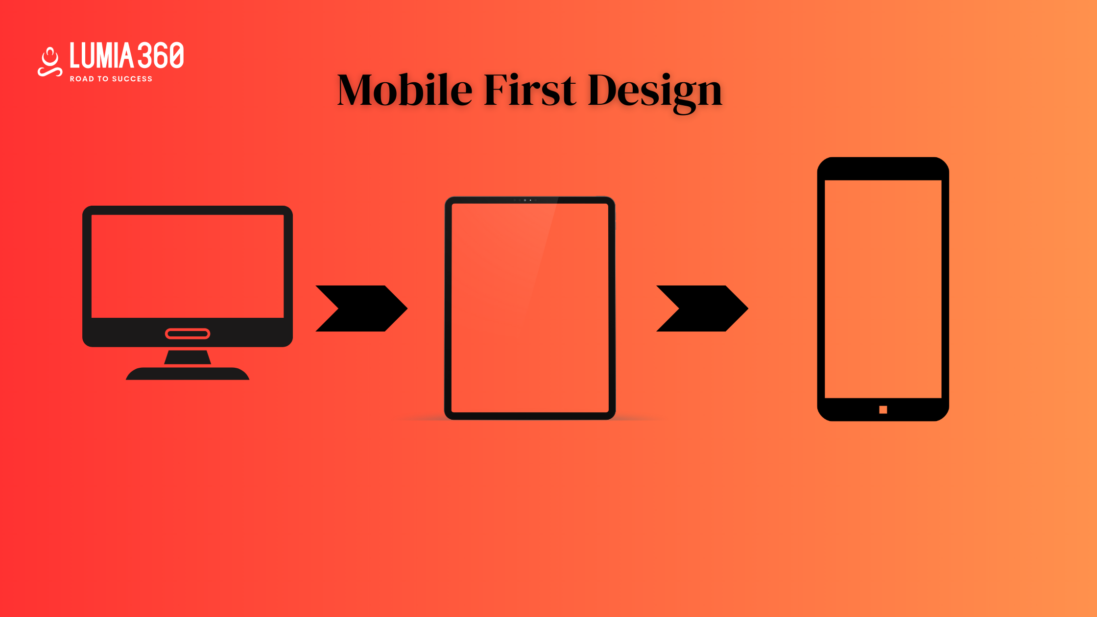
Responsive and mobile-friendly emails are different concepts that are often used interchangeably. Mobile-friendly design is one where emails are simple with a static layout and larger font with accessible buttons to ensure readability on smaller screens. They may not adapt to smaller screens, but are easy to read on mobile devices. Whereas responsive design uses CSS media queries to automatically adjust layout, images, font size, etc, based on the device’s screen size. It offers a seamless experience across all devices without any user action required. There is also a separate version of email optimised for mobile, which is accessed through a link and is called the mobile version. It is not as seamless as responsive design, but it is useful for users with devices that don’t support responsive format, such as older BlackBerry models.
Mobile email marketing enhances reach and expands your customer base. The majority of email users check their emails on mobile. It also builds a strong online reputation because unreadable text, awkward layout, unclickable links, etc, lead to a high bounce rate and affect your online reputation. Mobile-friendly emails are less likely to be flagged as spam and lead to a high deliverability rate. These emails are also optimized for performance, easy, and intuitive navigation. They have fast load times and enhance the overall user experience. These emails have high conversion and engagement rates as users are more likely to engage with emails that are easy to read, understand, and engage with.
5 Pillars of Mobile-Friendly Email Design

Mobile-friendly emails should be visually attractive and functional on all mobile devices. These 4 pillars will help you in designing your emails
- Content: On mobile, attention spans are shorter and screen space is limited. Effective email copy should be clear and concise. It should include a compelling CTA that makes it easily tappable. Make sure your CTA is well placed so that it helps in better navigation. Most users skim, hence it is advisable to break up your content with headings and bullet points.
- Layout: Mobile users scroll vertically. However, mobile screens can also flip from portrait to landscape and vice versa. Mobile-friendly email needs to look good and respond well in both formats. Use a single-column layout format rather than a multi-column format. Ensure touch-friendly spacing for links and buttons. Use logical hierarchy for placing important CTA and content near the top.
- Technical Foundation: A strong code ensures the email is rendered correctly across clients and devices. Responsive coding uses media queries for fluid layout. Fallback for fonts and images, such as alternative text for images, to ensure readability. Test across multiple clients such as Gmail, Apple Mail, Yahoo, etc, to check for any pending issues.
- Fast Load Time: Limit external scripts and use inline CSS. Make sure your website loads fast in order to keep the total file size under 100 KB for a snappy experience.
- Visual Design: Strike a right balance between aesthetics and speed. Include optimised images that load quickly and display well on high-DPI screens. Maintain a minimalist design. Utilise consistent branding elements to establish a strong brand identity while maintaining mobile usability. Use a minimum font size of 14x to ensure sufficient contrast between background colour and text.
Best Practices of Mobile Email Marketing
Crafting emails for mobile users demands more than just responsive design. Here are some of the best practices of Mobile Email Marketing
- Optimise Subject Line: Make your subject line short, relevant and benefit-focused. Use preheader text as a secondary hook to expand on the subject line.
- Single-Column Layout: Single-column layout ensures seamless vertical scrolling and optimal readability on a small screen. Prevent awkward horizontal movement or broken formatting of that multi-column design from suffering on mobile. Keep the content block clean, focused
- Use a Readable Font: Mobile screen demands clarity. Use at least 14px for body text and 22-28px for headers to maintain legibility to avoid eye strain. Stick to web-safe fonts like Arial, Georgia, Helvetica, etc. Ensure a comfortable line height to make the reading experience smooth.
- Call-to-Action: Your CTA should be thumb-friendly. It should be bold, sized 44x44px and surrounded by generous padding. Avoid text-only CTA or links. Use high contrast buttons to grab the user’s attention.
- Optimise Image: Optimise images for better load time. Compress images to reduce file size without sacrificing quality. Use responsive formats such as PNGs. Total email weight should ideally be under 100 KB. Add alt text to describe visuals.
- Tap-Friendliness: Avoid placing tappable elements too close together. Leave enough space between them to prevent accidental clicks. Make sure links, menus, buttons, etc, are easy to interact with using a single thumb.
- Design: Design your email for both light and dark modes. With dark mode now standard on mobile devices, make sure your email looks good in both themes. Avoid hardcoded white background or black text overlays. Use transparent PNG, avoid colour combinations that disappear in dark mode, hence test for colour contrast.
- Content Above-the-Fold: Mobile users decide in seconds whether they want to read or scroll. Place your most important message within the first 250-300px. Don’t rely on scroll behaviour for engagement. Also, make sure you follow a visual hierarchy in your email.
- Personalise Content: Mobile users engage with content that feels personal to them. Go beyond using first and last name, use behavioural segmentation to deliver dynamic content based on actions like purchase history, cart abandonment and browsing behaviour. Segment users by intent, interest, recency, and adjust it to your message. Personalised emails drive engagement.
Responsive design is just a starting point for making successful mobile email marketing. Create relevant content that is hyper-personalised and provide solutions to users’ problems. Lumia 360 provides online solutions that can boost your online presence and increase your online growth. Our strategies will grow your social media presence, craft hyper-personalised content and responsive web design. To know more about our solutions, email info@lumia360.com or call 514-668-5599.
Read Also: Managing Social Media Crisis
Read Also: The Importance of Responsive Web Design


