


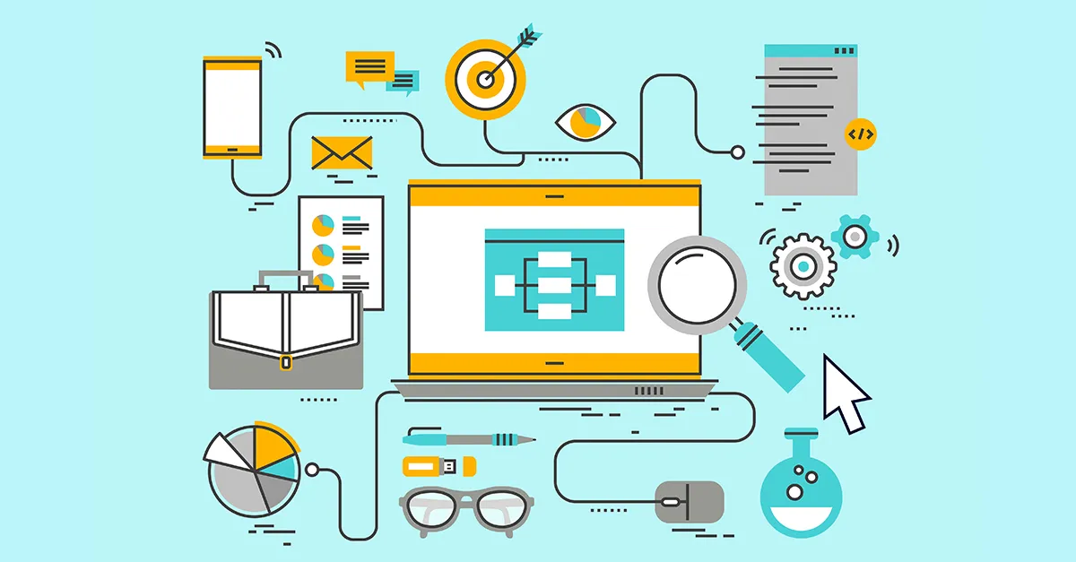
Have you ever run into a website that looked terrible on your mobile and the fonts and images didn’t load properly? What makes things worse is that you can’t find the menu or tap buttons. All this hampers user experience and forms a negative reputation for your brand. According to a report, 83% of mobile users feel that websites should provide a smooth and seamless experience across all devices.
Responsive web design refers to adapting to the varying screen sizes that users employ for viewing your website. Responsive web design is nearly universal in 2025, with roughly 90% of websites implementing it. Responsive design makes your website mobile-friendly and enhances its overall quality. 61% of internet users have a higher opinion of companies that have mobile-friendly websites.
In this article, we’ll learn what responsive web design is and its benefits. Also, we’ll learn what the difference is between responsive web design and mobile-friendly web design.
What is Responsible Web Design?
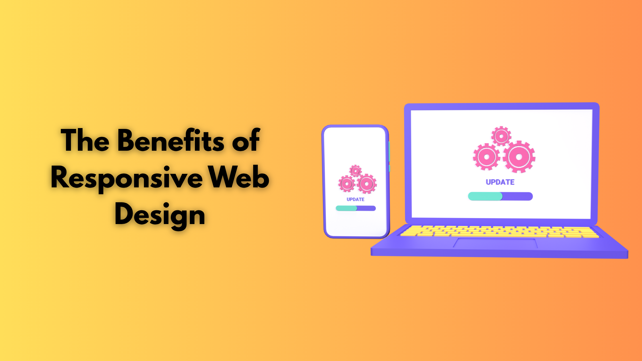
Responsive web design ensures that your website displays or adapts to all screen sizes without hampering the quality of the content. Imagine you are scrolling through a website with attractive visuals and excellent fonts, but when you open that website on your mobile device, it suddenly looks disorganized and images don’t load effectively, then it hampers your smooth experience.
If a user accesses your website through a mobile, tablet, laptop, etc, then their user experience will be smooth and pleasant. To achieve this, your HTML and CSS should be proper. It ensures that your website automatically enlarges, shrinks, resizes, and hides certain elements to meet every device screen size. Responsive web design ensures that your website adapts to the user’s device screen
Benefits of Responsive Design
According to PWC’s Global Consumer Insights Survey, 41% of customers do their shopping daily or weekly via smartphone. It is important to optimize your website for mobile; otherwise, you will miss a lot of potential customers. Responsive design is very important because 45% of people work across multiple devices. To target different sections of the audience, you must optimize your website for different channels. Here are some of the other benefits of responsive design
- Traffic: Poor design and experience frustrate the users. According to Adobe’s report, 30% of people will stop viewing your website if it doesn’t display well on their current screen, and 41% will abandon your website. All this leads to a loss of customers and traffic.
- Enhance UX: A website that has a good UX ensures that users will come back to the website. Make sure all the images load clearly, buttons and menus are accessible, text is readable, etc, then users will keep getting back to the website. Consistency ensures that the overall experience remains good. If you get high-quality traffic, it will lead to a high conversion rate.
- Google Ranking: If your website ranks on the first page of Google, then your website has better chances of getting a good reach. Responsive web design makes your website design mobile-friendly, which Google prioritizes. This, along with other factors, helps your website get a good rank. Other factors like time on site, bounce rate, page load time, etc, can influence Google ranking. According to research, 53% of visitors abandon a mobile site if it takes longer than 3 seconds to load.
- Conversion Rate: Many people research products and services on the phone and make the final purchase on a desktop or a laptop. If you provide a stable digital experience, then they can continue from where they have left off, not feeling the difference. It helps in building trust and increasing conversion rate.
- Time: Responsive websites update quickly and are easy to manage. All this helps in saving time and resources. You can utilize this time on more important issues.
- Cost-Effective: If you have one version of a website, then it is easy to maintain its content. You don’t need a dedicated web development team; your in-house digital marketing team can update the website. It reduces the maintenance
Difference between Responsive Web Design and Mobile-friendly Web Design

Mobile-friendly websites are usually scaled-down versions of their desktop counterparts. Mobile users can use this website, but it doesn’t provide a good experience.
Responsive web design is designed in such a way that all the elements of the website adapt to the screen size you are using without compromising on quality or user experience.
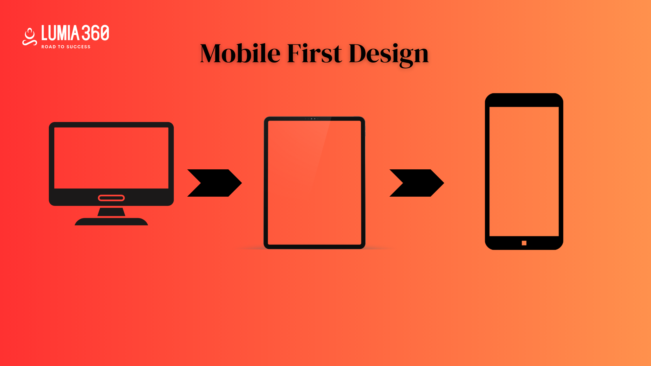
Responsive web design ensures that your website is adaptable to all device sizes; it doesn’t mean it is designed with a mobile-first approach. Mobile-first approach offers a better digital experience, which involves creating designs for smaller device screens simultaneously with desktop screens. It helps in considering all design elements such as content placement, font size, accessibility of buttons, etc.
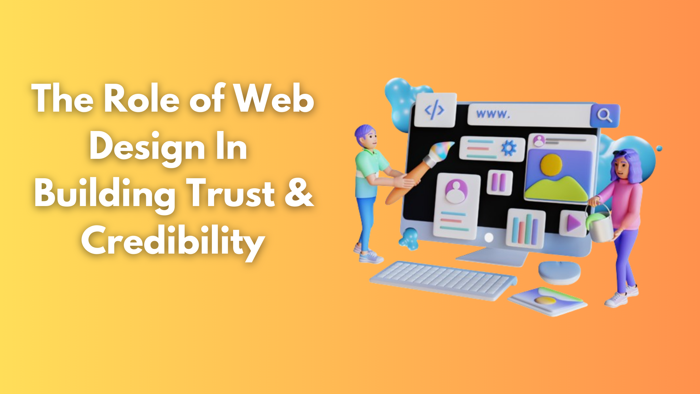
In today’s digital environment, it is important to have a responsive website as half of your traffic is coming from mobile. At Lumia 360, we are a trusted choice for responsive web design services. We have worked with many startups, small and medium enterprises (SMEs), and grown their business. To know more about our services, Contact Us! We are looking forward to building up your empire!
Read Also: How to Define your Target Audience on Social Media


