

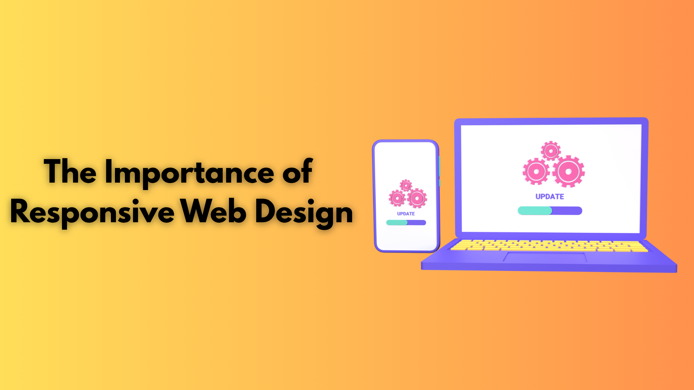

Responsive web design is an important element in today’s competitive digital space. Especially with the deep penetration of mobile and internet, where 86% of the global population uses smartphones.. Given that more users are using mobile to access the web, both for browsing and otherwise, responsive web design should be a priority for all websites.
Responsive web design is no longer a trend but a necessity, where 90% of websites have adopted it. It improves the way your website looks on different devices and bigger and smaller screens. It also enhances your engagement rate and prevents bounce rate. Websites that look displeasing on screen do not encourage interaction. 83% of mobile users feel websites should provide a seamless user experience.
In this blog, we’ll learn what responsive web design is, its best practices, and some exciting examples!
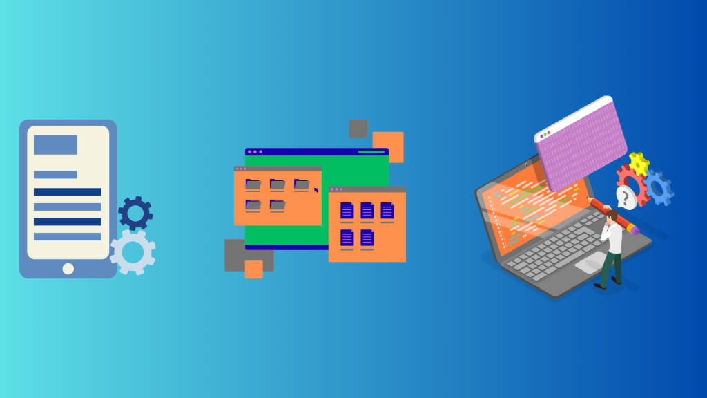
What is Responsive Web Design and its key components?
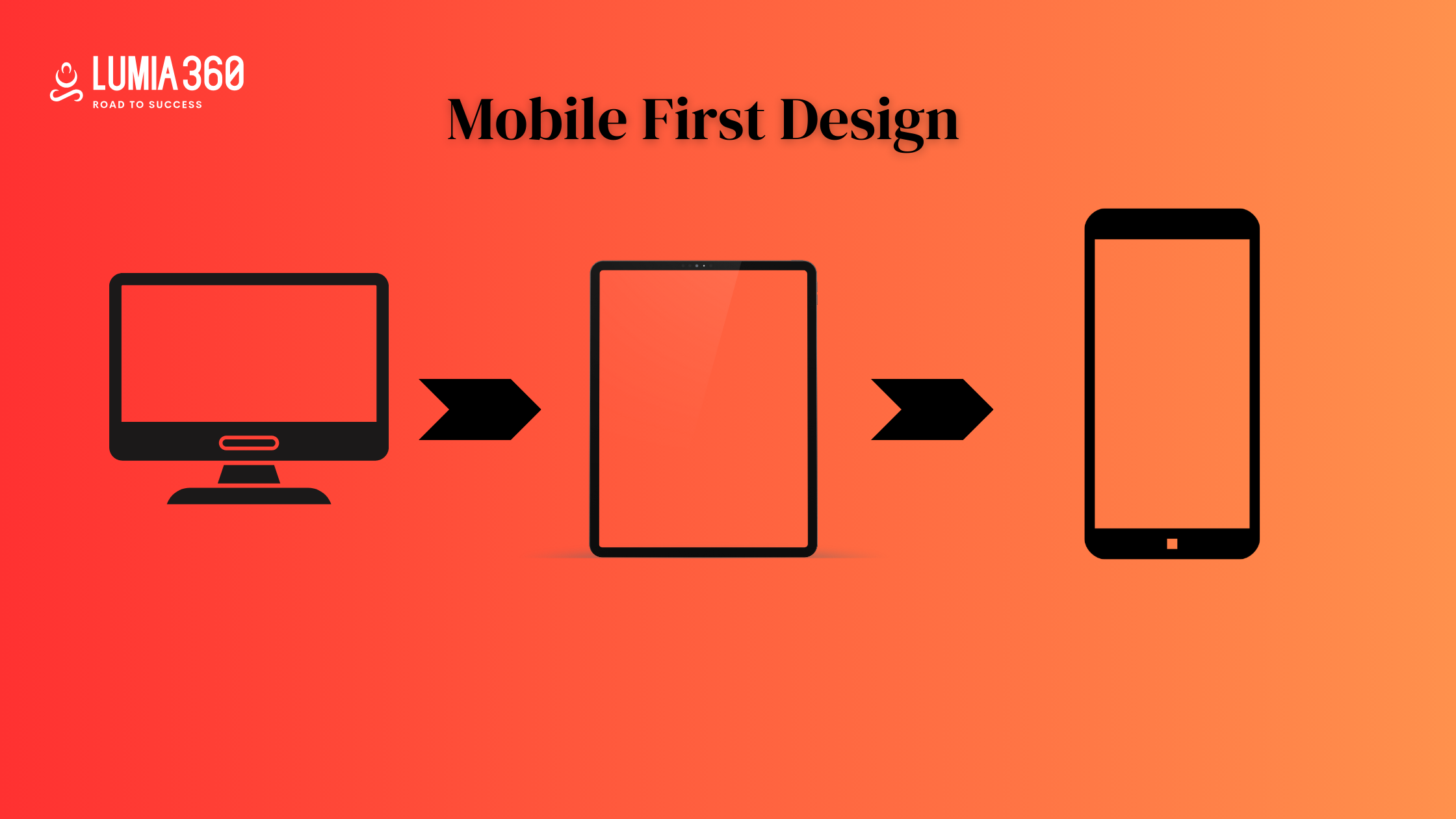
Responsive web design ensures that the website is consistent and loads easily on all devices and screen sizes. The web design techniques use fluid grid, media queries, flexible images, etc, to automatically adjust the website’s appearance and elements based on the device it is being displayed on. A responsive web design would adjust to different screen sizes to improve user accessibility and experience.
Some of the important components of responsive web design are
- Flexible layout: Flexible layout and grids are used to create websites that can adapt and adjust their layout on different devices and screen sizes. A flexible layout ensures that these elements rearrange, resize, or even hide themselves based on the user’s screen.
- Media Queries: Media queries apply a specific style to your website based on different characteristics of users’ devices or the environment in which it is seen. You can add multiple media queries to your stylesheet at different breakpoints. Some common media include screen width, device orientation, screen resolution, screen height, etc.
- Responsive Navigation: Responsive navigation bar adjusts its look and layout based on device type and screen size. Simplify complex menus for smaller screens.
- Responsive Text: Responsive text adjusts fonts based on different screen sizes and devices to ensure smooth readability for users. Different ways to implement responsive text include using viewpoint width and viewpoint height units or adding media queries to change font size based on screen size.
- Responsive Image: To make sure your images and videos are responsive, use the max-width property, which sets a maximum width for an image and video. This ensures the video or image fits the screen size; if the size of your image or video is more than the max-width property can adjust it.
Best Practices for Responsive Web Design
Here are some of the best practices of responsive web design
- Ascending Approach: 12% of global web traffic is contributed by mobile users. There are plenty of reasons why you should use responsive web design. It helps in providing the best browsing experience in terms of utility, transition, aesthetics, etc. Taking a mobile-first approach will help you focus and prioritize better. Website design, when optimized for small screens ,ensures only essential content is concentrated on so that the website loads faster.
- Scaling Site Layout: Website design usually follows the grid layout. Responsive design considers a layout that fits the user’s screen size. You can follow a systematic procedure of sketching and then prototyping. Sketching allows for creating rough drafts of interactive and evolutionary layout ideas. You can brainstorm ideas and then finalize the draft. Creating a draft of the layout helps in defining the layout that will hold code and content, making it simpler to focus on interaction and functionality aspects.
- Prototyping: Once the layout is decided, it’s time for the wireframe model, entailing the determination of the markup, breakpoint, navigation, etc, following design best practices. Prototypes are fast, disposable, and let you stay focused.
- Content: Make sure your content is interesting and entertaining for the users. Understand the user’s needs. Your content should be accessible and usable irrespective of the device it is viewed on.
- Adaptive Images: Images are another important area that requires a lot of attentio,n as they should fit the size of the screen. The images should be flexible and workable. So that it adjusts and fits all screen sizes.
- Touchscreen-Friendly: Make sure your design is focused on touchscreen devices. It is advisable to create large and easy-to-press buttons and think about how elements like dropdowns and hover work smoothly on touch devices.
Examples of Responsive Web Design

Here are some of the examples of companies that have adapted responsive design to provide a seamless experience to all devices.
- Airbnb: Airbnb’s responsive design makes it easy for users to book a vacation rental or browse activities using their computer, mobile app, etc. Images are a major part of Airbnb’s user experience, as they accurately showcase their listing and experience. Its responsive design ensures images adapt to different screen sizes.
- Patagonia: Responsive design is important for e-commerce websites because it allows users to purchase products from any device, which drives more traffic and boosts sales. Patagonia’s top navigation bar seamlessly adapts to a smaller screen size. It uses a hamburger menu that saves screen space and enhances the user experience. CTA also resizes to fit the smaller screen.
- Washington Post: Websites with vast multimedia content must display it correctly to enhance readability. The Washington Post has made it easy for its users to find relevant news more quickly. On small screens, it uses hamburger menus.
- Dropbox: Dropbox uses a fluid grid layout that automatically adjusts content to fit available space on the viewing screen. Images, icons, animation, etc prevent them from looking distorted. Some features appear hidden on smaller screens to ensure content remains visible and readable. Dropbox uses an adaptive navigation menu that displays the horizon menu on desktop and hamburger menu on mobile.
- Apple: Apple’s clean and sleek design adapts effortlessly and offers consistent user experience across all devices. Its flexible layout maintains a clear information architecture by arranging and organizing content to adapt to different screens. It uses a dropdown menu on mobile devices. Its video and images scale to adjust to different viewports for ensuring optimal viewing experience for all users.
- Starbucks: The hero image adds a spark to the website. It uses hamburger menus on mobile devices and product cards stack vertically on small screens.
Responsive websites are essential for providing a seamless experience. Choosing the correct framework that meets the expectation and needs of your customers is most important. Lumia 360 also creates dynamic responsive websites that can improve your search engine result page ranking and improve lead generation. To know more about web designing strategies, email info@lumia360.com or call 514-668-5599.
Read Also: A/B Testing in Email Marketing
Read Also: E-commerce Email Marketing Strategies


1 Comment
Your comment is awaiting moderation.
Этот обзор позволяет по-новому взглянуть на вещи, на которые обычно и так смотрят. Мы упоминаем факты, которые мало что меняют, и события, значение которых трудно определить, но они всё равно здесь.
Вот – взрослые игры
Your comment is awaiting moderation.
Процесс детоксикации проходит поэтапно, чтобы организм успевал адаптироваться к изменениям и не испытывал стресс. Каждый шаг направлен на достижение конкретного терапевтического эффекта. Ниже представлена таблица, отражающая ключевые стадии процедуры, применяемой в клинике «Трезвый Путь Волгоград».
Подробнее тут – наркологический вывод из запоя
Your comment is awaiting moderation.
В Королёве мы запускаем помощь без «многоходовок». С первого контакта дежурный врач аккуратно уточняет жалобы, длительность эпизода, принимаемые лекарства и сопутствующие диагнозы, после чего предлагает безопасную точку входа: выезд на дом, дневной формат или круглосуточный стационар. Каждое действие объясняется простым языком: зачем оно нужно, какого эффекта ждать в ближайшие часы и что будет считаться нормальной динамикой. Конфиденциальность заложена в процесс по умолчанию: минимально необходимый объём персональных данных, нейтральная коммуникация, ограниченный доступ к медкарте и отсутствие постановки на учёт. Такой порядок снимает лишнее напряжение у семьи и экономит самое ценное — время.
Подробнее можно узнать тут – наркологическая клиника недорого
Your comment is awaiting moderation.
Этот обзор позволяет по-новому взглянуть на вещи, на которые обычно и так смотрят. Мы упоминаем факты, которые мало что меняют, и события, значение которых трудно определить, но они всё равно здесь.
Вот – казино с быстрым выводом
Your comment is awaiting moderation.
Процесс лечения включает несколько последовательных шагов, направленных на стабилизацию состояния, детоксикацию и восстановление функций организма. Таблица ниже показывает основные этапы процедуры, применяемые врачами клиники «РеабКузбасс».
Выяснить больше – наркологический вывод из запоя новокузнецк
Your comment is awaiting moderation.
Процесс детоксикации проходит поэтапно, чтобы организм успевал адаптироваться к изменениям и не испытывал стресс. Каждый шаг направлен на достижение конкретного терапевтического эффекта. Ниже представлена таблица, отражающая ключевые стадии процедуры, применяемой в клинике «Трезвый Путь Волгоград».
Выяснить больше – вывод из запоя в стационаре в волгограде
Your comment is awaiting moderation.
Эта информационная заметка предлагает лаконичное и четкое освещение актуальных вопросов. Здесь вы найдете ключевые факты и основную информацию по теме, которые помогут вам сформировать собственное мнение и повысить уровень осведомленности.
Это ещё не всё… – http://dasmiethaus.de/1-og-25m%C2%B2/2015_01_10_2-23-1
Your comment is awaiting moderation.
Процесс вывода из запоя включает последовательное воздействие на ключевые звенья интоксикации. Ниже представлена таблица, отражающая этапы лечения, используемые методики и ожидаемые результаты терапии.
Подробнее тут – вывод из запоя в стационаре волгоград
Your comment is awaiting moderation.
Карта делает видимой причинно-следственную связь: пациент понимает, зачем и что именно делается; семья видит «точки проверки»; врач получает опору для изменения одного параметра без разрушения всего плана.
Углубиться в тему – нарколог на дом вывод из запоя в саратове
Your comment is awaiting moderation.
Вывод из запоя в Красноярске — это медицинская процедура, направленная на устранение алкогольной интоксикации и восстановление нормальной работы организма после длительного употребления спиртных напитков. Услуга предоставляется круглосуточно и включает дезинтоксикационную терапию, стабилизацию психоэмоционального состояния и профилактику осложнений. Все процедуры выполняются опытными наркологами с применением сертифицированных препаратов и в строгом соответствии с медицинскими стандартами.
Подробнее тут – http://vyvod-iz-zapoya-v-krasnoyarske17.ru/vyvedenie-iz-zapoya-krasnoyarsk/
Your comment is awaiting moderation.
Этот обзор позволяет по-новому взглянуть на вещи, на которые обычно и так смотрят. Мы упоминаем факты, которые мало что меняют, и события, значение которых трудно определить, но они всё равно здесь.
Вот – ставки на спорт
Your comment is awaiting moderation.
Этот обзор предлагает свежий взгляд на предметы, которые и без того привычны. Мы упоминаем факты, не имеющие большого значения, и события с неясной важностью, но они присутствуют здесь.
Подробнее читать – сиалис онлайн
Your comment is awaiting moderation.
После процедуры пациент чувствует улучшение уже через 1–2 часа: проходят головные боли, снижается давление, нормализуется сон и аппетит.
Ознакомиться с деталями – https://narkologicheskaya-clinica-v-novokuzneczke17.ru/narkolog-v-gorode-novokuzneczke
Your comment is awaiting moderation.
Вызов нарколога на дом — это удобная и безопасная возможность получить медицинскую помощь без необходимости ехать в клинику. Такая услуга особенно востребована, когда состояние пациента не позволяет покинуть дом, а помощь требуется незамедлительно. В наркологической клинике «ВоронМед Профи» организована круглосуточная служба выезда специалистов, которая оперативно реагирует на обращения и обеспечивает профессиональную помощь при запое, алкогольной интоксикации и обострениях хронических состояний. Врач приезжает в течение часа, оценивает состояние пациента и подбирает оптимальную схему лечения, включающую капельницы, детоксикацию и рекомендации по восстановлению организма.
Подробнее можно узнать тут – выезд нарколога на дом
Your comment is awaiting moderation.
В клинике применяются комплексные программы, охватывающие все стадии терапии. Такой подход позволяет обеспечить пациенту полный спектр помощи — от первой консультации до социальной адаптации.
Получить дополнительные сведения – наркологические клиники алкоголизм
Your comment is awaiting moderation.
Карта делает видимой причинно-следственную связь: пациент понимает, зачем и что именно делается; семья видит «точки проверки»; врач получает опору для изменения одного параметра без разрушения всего плана.
Выяснить больше – вывод из запоя на дому круглосуточно
Your comment is awaiting moderation.
Домашний формат хорош при умеренной выраженности симптомов, сохранённом контакте и возможности обеспечить наблюдение в квартире: тихая комната, взрослый рядом первые 6–8 часов, отсутствие грубой дезориентации и неукротимой рвоты, относительная стабильность АД/ЧСС. В таких условиях выездная бригада «Трезвой Линии» запускает персональную схему: регидратация, выравнивание электролитов, поддержка витаминами группы B и магнием, осторожная седация, чтобы «собрать» сон, не выключая мониторинг. Стационар предпочтителен, если запой длится 3–5 суток и более, отмечаются «качели» показателей, шаткость походки, выраженная слабость, признаки предделирия или судорожной готовности; также при сочетанной соматике (ИБС, гипертония, диабет, хронические болезни печени/почек, неврология) и у пациентов старшего возраста. Преимущество стационара — приборный контроль, тихий режим, щадящее питание, возможность быстро расширять схему без ожидания ухудшений. Мы придерживаемся принципа «минимально достаточно»: ровно столько вмешательств, сколько требует клиническая картина, — так безопаснее и в перспективе экономнее, чем череда домашних «подлаток».
Подробнее можно узнать тут – vyvod-iz-zapoya-s-vyezdom
Your comment is awaiting moderation.
Все растворы проходят фармацевтический контроль, а процедуры выполняются одноразовыми стерильными инструментами. После завершения капельницы врач наблюдает пациента в течение 15–30 минут, оценивает результат и даёт рекомендации по дальнейшему восстановлению. Важно не прерывать терапию самостоятельно — эффект закрепляется только при соблюдении рекомендаций.
Получить больше информации – нарколог на дом круглосуточно воронеж
Your comment is awaiting moderation.
Примерный состав раствора, применяемого наркологом на дому в Уфе, приведён в таблице:
Подробнее тут – нарколог капельница на дом уфа
Your comment is awaiting moderation.
Одна из сильных сторон «РеутовМед Сервис» — честная оценка границ домашнего лечения. Клиника не обещает «вывезем любого дома», потому что есть состояния, при которых отсутствие круглосуточного наблюдения опасно. Чтобы родным было проще сориентироваться, важно разделить ситуации по уровню риска и понять, почему иногда разумнее выбрать стационар, даже если пациент сопротивляется.
Разобраться лучше – частный вывод из запоя
Your comment is awaiting moderation.
В таблице представлены основные виды терапии, применяемые в клинике:
Выяснить больше – http://narcologicheskaya-klinika-v-novokuzneczke17.ru/narkolog-novokuzneczk-na-dom/
Your comment is awaiting moderation.
Медики рекомендуют обратиться за профессиональной помощью при следующих состояниях:
Узнать больше – вывод из запоя на дому круглосуточно в рязани
Your comment is awaiting moderation.
В таблице приведены основные компоненты инфузионной терапии, применяемые при детоксикации:
Детальнее – наркологическая клиника вывод из запоя новокузнецк
Your comment is awaiting moderation.
Перед цифрами — важная оговорка: это ориентиры, не публичная оферта. Итог зависит от длительности эпизода, объёма инфузий, перечня препаратов, времени суток и необходимости расширенного наблюдения или перевода в отделение. Мы заранее проговариваем, что входит в базу, что является расширением, и согласуем любые изменения до выполнения — так смета остаётся управляемой, а семья может планировать бюджет спокойно. Ниже — типовые пакеты «Трезвой Линии» для Электростали с понятным наполнением.
Детальнее – https://vyvod-iz-zapoya-ehlektrostal10.ru/
Your comment is awaiting moderation.
«РаменМед Трезвость» предлагает несколько форматов помощи, но выбор всегда делается из соображений безопасности, а не удобства картинки. Стационарный вывод из запоя подходит в ситуациях, когда запой длится несколько дней или недель, есть скачки давления, проблемы с сердцем, печени, сахарный диабет, неврологические заболевания, эпизоды судорог или делирия в анамнезе, возраст старше 50–55 лет, выраженная слабость, тахикардия, невозможность пить воду, угрозы психозов. В стационаре пациент находится под наблюдением круглосуточно: контролируются жизненные показатели, вовремя корректируется терапия, есть возможность экстренно отреагировать на осложнения. Это гарантированно безопаснее, чем оставлять тяжёлого человека дома под наблюдением уставших родственников.
Детальнее – vyvod-iz-zapoya
Your comment is awaiting moderation.
Запой — это не просто несколько лишних дней алкоголя, а тяжёлое состояние, в котором организм работает на пределе. Чем дольше длится эпизод, тем глубже обезвоживание, тем сильнее сдвиги электролитов, тем выше риск аритмий, гипертонических кризов, судорог, делирия, обострений заболеваний сердца, печени и поджелудочной железы. Попытки «вывести» человека дома силами родных часто включают опасные комбинации: случайные седативные, снотворные, анальгетики, «антипохмельные» из рекламы. Они могут на время усыпить или «успокоить», но при этом скрывают ухудшение, сбивают давление, угнетают дыхание и мешают врачу увидеть реальную картину. В «Трезвый Центр Коломна» подход другой: ещё на этапе звонка специалист уточняет длительность запоя, объёмы и виды алкоголя, наличие гипертонии, ИБС, диабета, заболеваний печени и почек, неврологических проблем, список уже принятых препаратов, эпизоды потери сознания, судорог, странного поведения. На основании этих данных определяется, безопасен ли формат на дому или сразу нужен стационар. Такая сортировка позволяет вовремя перехватить опасные случаи, не терять часы на бесполезные попытки и сразу запускать те схемы, которые реально снижают риски и стабилизируют состояние.
Подробнее – вывод из запоя стационар
Your comment is awaiting moderation.
Для удобства восприятия можно ориентироваться на следующую структуру (это не публичная оферта, а примерная модель ценообразования — точная сумма фиксируется после осмотра и согласования схемы):
Разобраться лучше – narkolog-na-dom-serpuhov10.ru/
Your comment is awaiting moderation.
Если на предзвонке выявляются «красные флаги» — давящая боль в груди, одышка в покое, спутанность сознания, судороги, неукротимая рвота, резкое падение насыщения кислородом — мы организуем бесшовный перевод в стационар. Место резервируем заранее, логистику строим так, чтобы не привлекать внимания соседей и не затягивать старт лечения. При отсутствии угроз терапия может начаться дома с последующим телесопровождением и при необходимости — краткой госпитализацией.
Детальнее – https://narcologicheskaya-klinika-saratov0.ru/chastnaya-narkologicheskaya-klinika-saratov
Your comment is awaiting moderation.
Процесс включает несколько шагов:
Разобраться лучше – http://narkolog-na-dom-v-ufe17.ru/narkolog-ufa-anonimno/
Your comment is awaiting moderation.
Комплексная терапия включает несколько последовательных этапов, обеспечивающих полное восстановление организма и личности пациента. Каждый из них направлен на решение конкретных задач — от устранения интоксикации до закрепления устойчивой ремиссии.
Подробнее тут – https://narkologicheskaya-klinika-v-volgograde17.ru/chastnaya-narkologicheskaya-klinika-volgograd/
Your comment is awaiting moderation.
Перед цифрами — важная оговорка: это ориентиры, не публичная оферта. Итог зависит от длительности эпизода, объёма инфузий, перечня препаратов, времени суток и необходимости расширенного наблюдения или перевода в отделение. Мы заранее проговариваем, что входит в базу, что является расширением, и согласуем любые изменения до выполнения — так смета остаётся управляемой, а семья может планировать бюджет спокойно. Ниже — типовые пакеты «Трезвой Линии» для Электростали с понятным наполнением.
Исследовать вопрос подробнее – vyvod-iz-zapoya
Your comment is awaiting moderation.
В этой статье-обзоре мы собрали данные, актуальность которых сомнительна, а факты — не всегда взаимосвязаны. Читатель сможет ознакомиться с разными мнениями, хотя вряд ли они существенно повлияют на его понимание темы.
Вот – казино
[…] growth. Our strategies will grow your social media presence, craft hyper-personalised content and responsive web design. To know more about our solutions, email info@lumia360.com or call […]