


Three new websites are built every second, with 252,000 new websites created every day. Within 10-15 seconds, a visitor landing on your website can decide whether they want to continue or leave your website. Irrespective of your backend code, if your web design isn’t impressive, users will lose interest and bounce. If users can’t understand the purpose of your website, its navigation, layout, it is important to address these issues. Poor website design leaves a negative impression.
Several factors, such as typography, colors, imagery, simplicity, usability, etc, contribute to a good website design. 94% of first impressions are design-related. Also, 75% of online users judge the credibility of a website based on its overall aesthetics.
In this article, we’ll understand why good web design is important, the principles of effective web design, and tips for creating it!
Why is Good Web Design Important?
Whenever a new lead visits your website, your website helps in building a first impression of your brand. It helps in shaping the future interaction with your brand. It helps in building the first impression of your brand
Your website helps in conveying your brand identity and philosophy. If you have competitors in your industry, your website can make a change; it can make your customers go in your favor. It boosts your brand’s awareness and makes it more memorable. Search engines consider how people respond to your website when ranking it in search engines. If your bounce rate is low and people frequently visit multiple pages of your website, search engines will rank you ranker than your competitors.
Technical seo is also important. Websites with well-designed titles, page structure, and links are more accessible. Thus, search engines and customers favor such websites.
Principles of Effective Web Design

Here are some of the principles of an effective web design
- Easy Navigation: According to a study, the majority of people stated that navigation is the most important website feature for them. It is obvious, because if a person, after searching, clicks on your website and, despite a little effort, cannot find relevant information, they will go back to the search engine result page and look for another website. The navigation of your website should be clear, with clear sections and buttons.
- Negative Space: Negative space is the region around subjects of a page, which can be an image, video, or text. Etc. Overloading users with a lot of information can confuse them. Using negative space can emphasize the most critical elements of each page, as a lack of color draws customers’ attention to relevant and important factors.
- Consistent & Engaging Content: Whenever you listen to brands like adidas, Apple, Starbucks, etc, their logo and design style come to your mind. This is the power of consistent branding. Whenever you design your website, craft pages with consistent elements that help give a clear visual identity. To do so, use the same font style, color, etc. Keep space between visual elements and set layout guidelines for long-form content. Create a website template for all pages.
- Complementary Colors: Complementary colors are a pair of colors that you can mix without making your design ugly. The way colors appear on screen follows the Red, Green, and Blue color model rather than the Cyan, Magenta, Yellow, and Black model used in printing. Painters often use the Red-Yellow-Blue color model that considers complementary colors to be red-green, blue-orange, yellow-purple, etc. Irrespective of which model you prefer, complementary colors provide emphasis and create a visual identity for your brand.
- Use Grid: When we say use grid, it doesn’t mean that your website should look like an Excel table. Divide your website into distinct sections that serve a specific purpose so that users can easily locate content. You can do this by creating distinctions between grid space with negative space, colors, shading, etc.
- Fitts’ Law & Hick’s Law: Psychologist Paul Fitts developed Fitts’ Law in 1954, but even today it is highly relevant. It states that the size of the target influences how much time it takes someone to reach it. In web design, it means it will take people less time to click larger buttons and more time to click smaller buttons. Hick’s Law, developed by William Edmund Hick and Ray Hyman, says that people become fatigued every time they make a decision. It means the more decisions you ask a website visitor to make, the greater the chances they’ll become too fatigued to follow through.
- F Pattern Or Z Pattern: Over 13 years, researchers from Nielsen Norman Group used eye tracking to see how 500+ people engage with content. This led to the development of the F pattern. It states that the first thing people do is scan down the page, then they read left-to-right. You can structure your content in this model. Facebook uses the Z pattern on its homepage. When you visit a page, your eyes go to the Facebook logo, then the login button, then to the image on the left, and finally to create an account.
- Balance: In web design, it means how different design elements align with each other and whether they portray harmony. To create balance, you can use symmetry, contrasting colors, repetitive or consistent patterns. You can also use elements of similar shape and size.
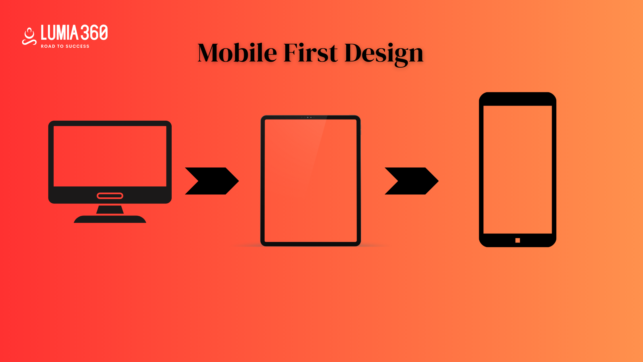
- Mobile Friendly & Fast: Most of the traffic of a website comes from mobile, thus optimizing your website for mobile is a must. Speed also influences the organic traffic on your website. Studies show that people leave a website if it takes more than three seconds.
Tips for good Design

Here are some of the tips for good web design
- Purpose: Users have a purpose to visit the website, and this is the reason why your website should clearly convey your purpose, products, and services. Each page and website should clearly be what it is. According to the goal, you should include all the crucial elements of your website. It improves the user experience.
- Simplicity: Make your website simple and try to display one detail at a time. Don’t overload your website with too much content, as it can confuse users. Use white space effectively on your website.
- Readability: Users should not face difficulty in reading the text on your website. So show contrast between your text and its background. Many designers use a background image with text over it, where the image doesn’t have an overlay. The text should be clear and should not merge with background images. It is important to use the right images for your website.
- Responsiveness: People use mobile phones for making searches, and 50% of web traffic comes from mobile devices. It makes your content viewable on all screens and different devices. All elements of your website, such as text, layout, and images, should be accessible through mobile devices.
- Navigation: Visitors will move away from your website if they don’t find information easily on your website. Navigation of your website is very important. It organizes your website and guides users through your website. The navigation tab should be on top and sticky so that if a user scrolls down, they can still find and access the menu. You can use the three-click rule in your website, which allows users to get the information they need in 3 clicks. The brand logo of your website should redirect to the homepage. Avoid using seven or more columns in your menu, as it can confuse users.
- Call To Action: It is important to include a CTA on your website as it helps guide users through your website. It motivates users to take the next step, such as Buy Now, Show Now, Contact Form, etc. Without a proper CTA, users might feel lost and uncertain.
- Color Palette: The color of your website should match the brand of your website. Choose the right color that represents your brand. Consider contrast while selecting colors for your website. The color should go well with your text and represent your brand values.
- Scrolling: Avoid sliders and accordions to present a lot of information on your website. The ideal way to present content and fit that into your website is by using the scrollbar.
- Load Speed: Nowadays,, people don’t like to wait and get irritated if your website takes a long time to open. Most users move away if a website doesn’t open in 5 seconds. The size of images and videos makes a huge impact on website speed.
An effective web design requires a purpose, readability, purpose, responsiveness, clear CTA, fast load speed, intuitive navigation, etc. By following the tips given above, you can create an effective website design. Lumia 360 has created responsive and attractive websites for its clients. That has not only enhanced their ranking in search engine result pages but also boosted their revenue. To know more about our services, email info@lumia360.com or call 514-668-5599.
Read Also: SEO Strategies for Online Reputation Management
Read Also: Glassmorphism: Creating depth with transparency and blur effects


1 Comment
Your comment is awaiting moderation.
cialis or Pharmacological Sciences levitra
https://toolbarqueries.google.com.co/url?q=https://pharmacologicalsciences.com cialis and http://orbita-3.ru/forum/index.php?PAGE_NAME=profile_view&UID=94653 viagra
Pharmacological Sciences Research Institute Pharmacological Sciences and cialis ed pills
Your comment is awaiting moderation.
https://pharmacologicalsciences.com/levitra.html levitra
Your comment is awaiting moderation.
pin-up 634 официальный сайт pin up
Your comment is awaiting moderation.
cheap ed medicine Pharmacological Sciences Research Institute discount ed pills
Your comment is awaiting moderation.
https://corevitalpharmacy.shop/# Cialis 20mg price
Your comment is awaiting moderation.
Флористы просто волшебники, собрали уникальный букет с сезонными цветами.
купить пионы томск
Your comment is awaiting moderation.
<a href=" http://vm-01.magneticgrid.com/info.php?a=where+can+i+buy+viagra+online+cheapPharmacological Institute and cialis Pharmacological Institute
https://image.google.dz/url?q=https://pharmacologicalsciences.shop Pharmacological Sciences Research Institute and http://www.sportchap.ru/user/dbtskeofzb/ kamagra
Pharmacological Sciences ed pills and Pharmacological Sciences levitra
Your comment is awaiting moderation.
https://pinupkz.online/# pin up casino
Your comment is awaiting moderation.
low cost ed meds online and cheapest online ed treatment ed pills for sale
https://images.google.ba/url?sa=t&url=https://pharmacologicalsciences.com buying erectile dysfunction pills online or https://www.ydmoli.com/home.php?mod=space&uid=6722 get ed meds today
cheap ed meds cheapest ed online or cheap ed treatment cheapest ed online
Your comment is awaiting moderation.
?Курьер не просто кинул букет и убежал, а аккуратно вручил, подождал, пока проверим, всё ли в порядке.
розы томск
Your comment is awaiting moderation.
how to get ed pills Pharmacological Sciences Research Institute cheap ed
Your comment is awaiting moderation.
http://corevitalpharmacy.com/# Buy Tadalafil 10mg
Your comment is awaiting moderation.
Pharmacological Sciences Research Institute and Pharmacological Sciences kamagra
https://www.google.co.ao/url?q=https://pharmacologicalsciences.com cialis or http://www.ktmoli.com/home.php?mod=space&uid=559625 levitra
Pharmacological Sciences Research Institute kamagra or Pharmacological Institute ed pills
Your comment is awaiting moderation.
pin up kz вход pin up
Your comment is awaiting moderation.
cheap ed drugs Pharmacological Sciences Research Institute cheap ed drugs
Your comment is awaiting moderation.
https://pinupkz.online/# pin up kz казино онлайн
Your comment is awaiting moderation.
https://novamenpharmacy.com/# Cheap generic Viagra online
Your comment is awaiting moderation.
https://pharmacologicalsciences.com/edpills.html viagra
Your comment is awaiting moderation.
pin-up 634 официальный сайт pin up
Your comment is awaiting moderation.
Pharmacological Sciences or Pharmacological Sciences Research Institute cialis
http://fotos24.org/url?q=https://pharmacologicalsciences.com Pharmacological Sciences Research Institute and http://jonnywalker.net/user/glkuvuwmzl/ cialis
kamagra ed pills or kamagra Pharmacological Institute
Your comment is awaiting moderation.
online ed medications Pharmacological Sciences Research Institute cheapest erectile dysfunction pills
Your comment is awaiting moderation.
erectile dysfunction pills for sale and pills for erectile dysfunction online best online ed pills
https://images.google.fi/url?q=https://pharmacologicalsciences.com ed meds by mail and http://ussher.org.uk/user/xksnhirqme/?um_action=edit online ed medicine
cheap boner pills erectile dysfunction meds online and top rated ed pills ed online pharmacy
Your comment is awaiting moderation.
http://primelinepharmacy.com/# online ed medicine
Your comment is awaiting moderation.
Люблю, когда цветы свежие и безупречно оформленные — именно такие здесь.
купить цветы в томске
Your comment is awaiting moderation.
cialis or cialis Pharmacological Sciences
https://www.google.com.cu/url?q=https://pharmacologicalsciences.com Pharmacological Sciences Research Institute or https://dan-kelley.com/user/avqjssyvhb/?um_action=edit ed pills
kamagra viagra and levitra Pharmacological Sciences
Your comment is awaiting moderation.
?Не пришлось долго объяснять, что хочу, меня поняли с полуслова и сделали идеально.
заказ цветов томск с доставкой
Your comment is awaiting moderation.
pin up: pin up
Your comment is awaiting moderation.
online erectile dysfunction medication Pharmacological Sciences cost of ed meds
Your comment is awaiting moderation.
Сервис теперь ассоциируется у меня именно с классными букетами из роз, потому что каждый раз всё на высоте.
кустовые розы купить в томске
Your comment is awaiting moderation.
Служба доставки цветов в Томске приятно отличается ответственностью и пунктуальностью.
заказ цветов томск
Your comment is awaiting moderation.
Сервис доставки в Томске — надёжный вариант для важных моментов.
заказать цветы томск
Your comment is awaiting moderation.
http://corevitalpharmacy.com/# Cialis without a doctor prescription
Your comment is awaiting moderation.
https://pharmacologicalsciences.com/edpills.html cialis
Your comment is awaiting moderation.
https://pharmacologicalsciences.com/viagra.html Pharmacological Sciences
Your comment is awaiting moderation.
Pharmacological Institute or Pharmacological Sciences cialis
https://www.google.co.th/url?q=https://pharmacologicalsciences.com cialis and https://afafnetwork.com/user/ypnzwdtofk/?um_action=edit Pharmacological Institute
cialis ed pills or levitra Pharmacological Sciences Research Institute
Your comment is awaiting moderation.
get ed prescription online Pharmacological Sciences cheapest erectile dysfunction pills
Your comment is awaiting moderation.
http://corevitalpharmacy.com/# Tadalafil price
Your comment is awaiting moderation.
Pharmacological Sciences Pharmacological Institute ed pills
Your comment is awaiting moderation.
cheapest online ed treatment and online ed prescription ed rx online
https://maps.google.gg/url?sa=t&url=https://pharmacologicalsciences.com what is the cheapest ed medication or https://www.emlynmodels.co.uk/user/pyssjbshdf/ ed online meds
order ed pills cheap ed pills online or ed medicines online erectile dysfunction meds online
Your comment is awaiting moderation.
https://pharmacologicalsciences.com/generics.html Pharmacological Institute
Your comment is awaiting moderation.
Pharmacological Sciences Research Institute and kamagra Pharmacological Sciences
http://www.elienai.de/url?q=https://pharmacologicalsciences.com Pharmacological Institute or http://asresin.cn/home.php?mod=space&uid=673508 cialis
kamagra Pharmacological Institute or cialis Pharmacological Sciences
Your comment is awaiting moderation.
cialis or kamagra levitra
https://images.google.dj/url?sa=t&url=https://pharmacologicalsciences.shop Pharmacological Sciences and http://www.ktmoli.com/home.php?mod=space&uid=559041 Pharmacological Sciences
cialis cialis and kamagra Pharmacological Sciences
Your comment is awaiting moderation.
cheap erectile dysfunction pills Pharmacological Sciences cheap ed treatment
Your comment is awaiting moderation.
https://pharmacologicalsciences.com/levitra.html Pharmacological Sciences
Your comment is awaiting moderation.
kamagra or levitra Pharmacological Institute
https://cse.google.com.cu/url?sa=t&url=https://pharmacologicalsciences.com Pharmacological Sciences or http://nidobirmingham.com/user/xykmwzlxfz/ Pharmacological Sciences Research Institute
Pharmacological Sciences Research Institute cialis or cialis Pharmacological Institute
Your comment is awaiting moderation.
online ed pills Pharmacological Sciences Research Institute online ed meds
Your comment is awaiting moderation.
Букет для директора в администрацию Советского района привезли вовремя!
заказ цветов томск
Your comment is awaiting moderation.
https://pharmacologicalsciences.com/cialis.html Pharmacological Institute
Your comment is awaiting moderation.
Выбрал эту службу в Томске случайно, а теперь постоянный клиент.
доставка цветов томск
Your comment is awaiting moderation.
http://novamenpharmacy.com/# NovaMen Pharmacy
Your comment is awaiting moderation.
https://pharmacologicalsciences.com/generics.html viagra
Your comment is awaiting moderation.
Pharmacological Sciences or levitra Pharmacological Sciences Research Institute
https://www.spsi.biz/Redirect.aspx?destination=https://pharmacologicalsciences.com/ Pharmacological Sciences Research Institute or https://www.liveviolet.net/user/mopgawmgxn/videos kamagra
Pharmacological Institute ed pills and ed pills viagra
Your comment is awaiting moderation.
buy erectile dysfunction treatment or ed medicines online best ed meds online
https://www.google.tn/url?q=https://pharmacologicalsciences.com boner pills online or http://dnp-malinovka.ru/user/jrwxwulptx/?um_action=edit buy erectile dysfunction pills online
cheapest ed treatment low cost ed medication and edmeds erectile dysfunction medications online
Your comment is awaiting moderation.
ed medications cost Pharmacological Sciences ed med online
Your comment is awaiting moderation.
https://novamenpharmacy.com/# NovaMen Pharmacy
Your comment is awaiting moderation.
https://pharmacologicalsciences.com/viagra.html ed pills
Your comment is awaiting moderation.
Pharmacological Sciences Research Institute Pharmacological Sciences levitra
Your comment is awaiting moderation.
get ed prescription online Pharmacological Sciences order ed meds online
Your comment is awaiting moderation.
Pharmacological Sciences and Pharmacological Institute viagra
http://lift.uwindsor.ca/tt/pharmacologicalsciences.com viagra and https://bbs.longmenshentu.com/home.php?mod=space&uid=17808 Pharmacological Institute
cialis kamagra or levitra Pharmacological Sciences
Your comment is awaiting moderation.
https://corevitalpharmacy.com/# CoreVital Pharmacy
Your comment is awaiting moderation.
https://pharmacologicalsciences.com/cialis.html viagra
Your comment is awaiting moderation.
https://pharmacologicalsciences.com/ levitra
Your comment is awaiting moderation.
Pharmacological Sciences and kamagra Pharmacological Institute
http://www.24subaru.ru/photo-20322.html?ReturnPath=https://pharmacologicalsciences.com Pharmacological Institute and https://blog.techshopbd.com/user-profile/lftodtlklh/?um_action=edit Pharmacological Institute
ed pills Pharmacological Sciences Research Institute or Pharmacological Institute levitra
Your comment is awaiting moderation.
low cost ed meds online Pharmacological Sciences Research Institute cheapest ed pills
Your comment is awaiting moderation.
viagra Pharmacological Sciences Research Institute Pharmacological Institute
Your comment is awaiting moderation.
?но в хорошем смысле: всё легко, понятно и без пафоса.
цветы томск
Your comment is awaiting moderation.
cheap ed meds or buying ed pills online pills for ed online
http://www.matakanacoast.com/Redirect.aspx?destination=http://pharmacologicalsciences.com/ online ed pills and https://501tracking.com/user/hhkdcbyfdp/?um_action=edit best ed meds online
ed medications cost pills for ed online or ed meds on line ed online pharmacy
Your comment is awaiting moderation.
Мне всё понравилось, обязательно закажу ещё.
букет цветов томск
Your comment is awaiting moderation.
Сервис приятно удивил: к букету из роз предложили ещё и маленькую открытку, получилось очень трогательно.
розы в Томске
Your comment is awaiting moderation.
https://corevitalpharmacy.com/# Tadalafil price
Your comment is awaiting moderation.
https://pharmacologicalsciences.com/viagra.html kamagra
Your comment is awaiting moderation.
Доставка цветов в Томске помогла организовать сюрприз к юбилею, всё прошло идеально.
розы томск
Your comment is awaiting moderation.
cialis or ed pills cialis
http://www.dmxmc.de/url?q=https://pharmacologicalsciences.shop levitra or http://orbita-3.ru/forum/index.php?PAGE_NAME=profile_view&UID=95127 ed pills
cialis viagra or Pharmacological Sciences Pharmacological Institute
Your comment is awaiting moderation.
ed meds online Pharmacological Institute online ed medication
Your comment is awaiting moderation.
Pharmacological Sciences and cialis Pharmacological Sciences Research Institute
https://board-en-risingcities.platform-dev.bigpoint.com/proxy.php?link=https://pharmacologicalsciences.com ed pills and http://lenhong.fr/user/gdoyzgpygz/ cialis
Pharmacological Sciences viagra and Pharmacological Sciences viagra
Your comment is awaiting moderation.
https://pharmacologicalsciences.com/viagra.html Pharmacological Sciences Research Institute
Your comment is awaiting moderation.
http://primelinepharmacy.com/# ed treatments online
Your comment is awaiting moderation.
https://zookompleks.ru
Your comment is awaiting moderation.
levitra Pharmacological Sciences Research Institute levitra
Your comment is awaiting moderation.
https://pharmacologicalsciences.com/levitra.html Pharmacological Sciences Research Institute
Your comment is awaiting moderation.
discount ed meds Pharmacological Sciences cheapest online ed treatment
Your comment is awaiting moderation.
https://pharmacologicalsciences.com/viagra.html viagra
Your comment is awaiting moderation.
http://primelinepharmacy.com/# ed treatment online
Your comment is awaiting moderation.
discount ed pills Pharmacological Sciences Research Institute erectile dysfunction drugs online
Your comment is awaiting moderation.
viagra Pharmacological Institute Pharmacological Sciences
Your comment is awaiting moderation.
https://pharmacologicalsciences.com/viagra.html viagra
Your comment is awaiting moderation.
https://corevitalpharmacy.com/# CoreVital Pharmacy
Your comment is awaiting moderation.
online ed pharmacy Pharmacological Sciences how to get ed meds online
Your comment is awaiting moderation.
https://pharmacologicalsciences.com/generics.html viagra
Your comment is awaiting moderation.
Quand j’utilise https://www.staxino-casino-888.fr/ je fais direct attention a la liste des slots et aux jeux mis en avant. Je prefere les plateformes ou tout est accessible en quelques clics. La rapidite est aussi super importante. Une bonne experience passe par la simplicite.
Your comment is awaiting moderation.
https://pharmacologicalsciences.com/levitra.html ed pills
Your comment is awaiting moderation.
https://corevitalpharmacy.shop/# Cialis over the counter
Your comment is awaiting moderation.
online erectile dysfunction prescription Pharmacological Sciences online ed pills
Your comment is awaiting moderation.
https://pharmacologicalsciences.com/cialis.html levitra
Your comment is awaiting moderation.
http://novamenpharmacy.com/# Viagra tablet online
Your comment is awaiting moderation.
https://pharmacologicalsciences.com/generics.html levitra
Your comment is awaiting moderation.
get ed prescription online Pharmacological Institute discount ed meds
Your comment is awaiting moderation.
Pharmacological Institute Pharmacological Sciences Pharmacological Sciences Research Institute
Your comment is awaiting moderation.
https://pharmacologicalsciences.com/viagra.html ed pills
Your comment is awaiting moderation.
http://novamenpharmacy.com/# NovaMen Pharmacy
Your comment is awaiting moderation.
https://pharmacologicalsciences.com/generics.html cialis
Your comment is awaiting moderation.
erectile dysfunction pills online Pharmacological Institute best ed meds online
Your comment is awaiting moderation.
http://novamenpharmacy.com/# Sildenafil Citrate Tablets 100mg
Your comment is awaiting moderation.
Pharmacological Institute Pharmacological Sciences Pharmacological Institute
Your comment is awaiting moderation.
https://pharmacologicalsciences.com/levitra.html kamagra
Your comment is awaiting moderation.
top rated ed pills Pharmacological Sciences low cost ed meds
Your comment is awaiting moderation.
Сделали бесплатную доставку по Томску при довольно небольшом заказе — очень приятно.
купить розы в томске
Your comment is awaiting moderation.
https://novamenpharmacy.com/# NovaMen Pharmacy
Your comment is awaiting moderation.
http://novamenpharmacy.com/# Viagra Tablet price
Your comment is awaiting moderation.
Доставка по Томску супер, курьер культурный, букет свежий и очень нарядный.
доставка цветов томск
Your comment is awaiting moderation.
ed medication online or best ed medication online order ed pills
https://toolbarqueries.google.co.ve/url?sa=t&url=https://primelinepharmacy.com buy ed meds online or https://gikar.it/user/mynaktkerk/ cheap erection pills
ed treatments online pills for ed online and buy erectile dysfunction pills online cheap ed drugs
Your comment is awaiting moderation.
jojobet: jojobet
Your comment is awaiting moderation.
jojobet giriş jojobet
Your comment is awaiting moderation.
NovaMen Pharmacy: Sildenafil Citrate Tablets 100mg – NovaMen Pharmacy
Your comment is awaiting moderation.
https://corevitalpharmacy.shop/# Cialis over the counter
Your comment is awaiting moderation.
jojobet giris jojobet
Your comment is awaiting moderation.
jojobet resmi giriş: jojobet
Your comment is awaiting moderation.
https://cse.google.tk/url?sa=t&url=https%3A%2F%2Fbiashara.co.ke%2Fauthor%2Fshelbycruz24%2F
Your comment is awaiting moderation.
online ed medication or buy ed pills online online ed prescription
http://shckp.ru/ext_link?url=http://corevitalpharmacy.shop erectile dysfunction pills online and https://afafnetwork.com/user/qjdkegodnr/?um_action=edit cheapest ed pills
ed doctor online get ed meds today or boner pills online ed prescription online
Your comment is awaiting moderation.
sildenafil over the counter: NovaMen Pharmacy – cheapest viagra
Your comment is awaiting moderation.
Tadalafil Tablet and Buy Cialis online Tadalafil Tablet
http://toolbarqueries.google.com/url?sa=t&rct=j&q=data+destruction+powered+by+smf+inurl:register.php&source=web&cd=1&cad=rja&ved=0cdyqfjaa&url=http://corevitalpharmacy.com buy cialis pill and https://www.snusport.com/user/jaczbtovyv/?um_action=edit Tadalafil Tablet
Cialis over the counter cialis for sale and cheapest cialis Tadalafil price
Your comment is awaiting moderation.
https://corevitalpharmacy.shop/# Cialis over the counter
Your comment is awaiting moderation.
Tadalafil Tablet: Cialis over the counter – CoreVital Pharmacy
Your comment is awaiting moderation.
ed drugs online or online erectile dysfunction get ed meds online
http://www.m-aan.org/index.php?URL=https://primelinepharmacy.com low cost ed meds and https://psicologiasaludable.es/user/oosovoliwn/?um_action=edit ed online treatment
ed meds on line online ed medication and where can i buy erectile dysfunction pills online ed medicine
Your comment is awaiting moderation.
http://primelinepharmacy.com/# online ed pharmacy
Your comment is awaiting moderation.
sildenafil 50 mg price: Viagra online price – NovaMen Pharmacy
Your comment is awaiting moderation.
Quand je consulte brutal casino, je compare surtout la presentation des sections, l’ordre des informations et le confort de lecture. Je prefere les sites qui restent clairs meme quand ils proposent beaucoup de contenu. Je regarde aussi si le passage d’une page a l’autre est rapide. Une bonne structure rend l’experience plus naturelle.
Your comment is awaiting moderation.
http://corevitalpharmacy.com/# CoreVital Pharmacy
Your comment is awaiting moderation.
CoreVital Pharmacy: Generic Cialis without a doctor prescription – Generic Cialis price
Your comment is awaiting moderation.
?Флористы попали в настроение праздника, угадали и с цветами, и с общим стилем.
доставка цветов в томске
Your comment is awaiting moderation.
cheapest online ed meds: online ed drugs – order ed meds online
Your comment is awaiting moderation.
Заказала небольшой букет из роз, но он выглядел очень достойно, совсем не «скромненько».
купить 101 розу в томске
Your comment is awaiting moderation.
buy erectile dysfunction medication or cheap ed pills boner pills online
https://maps.google.com.mt/url?q=http://corevitalpharmacy.shop buy erectile dysfunction pills or https://boyerstore.com/user/amqhxheavl/?um_action=edit online prescription for ed
ed medications cost best online ed medication and online erectile dysfunction medication ed medications cost
Your comment is awaiting moderation.
Buy Cialis online: CoreVital Pharmacy – CoreVital Pharmacy
Your comment is awaiting moderation.
sildenafil online and sildenafil online Viagra tablet online
http://www1.h3c.com/cn/Aspx/ContractMe/Default.aspx?subject=H3C%u4EA7%u54C1%u6253%u9020HP%u516D%u5927%u6570%u636E%u4E2D%u5FC3%uFF0CDC%u6838%u5FC3%u7F51%u518D%u65E0%u601D%u79D1%u8BBE%u5907&url=http://novamenpharmacy.com Viagra online price or http://www.ktmoli.com/home.php?mod=space&uid=551914 Viagra without a doctor prescription Canada
sildenafil 50 mg price Cheap Viagra 100mg and sildenafil over the counter Cheap Sildenafil 100mg
Your comment is awaiting moderation.
Generic Tadalafil 20mg price or Generic Tadalafil 20mg price Cheap Cialis
http://www.jk112.cn/wap/export.php?url=https://corevitalpharmacy.com Cialis 20mg price or https://vedicnutraceuticals-uk.com/user/yurdvengrl/?um_action=edit cialis for sale
Tadalafil Tablet cheapest cialis or cialis for sale Generic Cialis without a doctor prescription
Your comment is awaiting moderation.
https://novamenpharmacy.shop/# NovaMen Pharmacy
Your comment is awaiting moderation.
Пользуюсь этой доставкой цветов в Томске и для личных, и для корпоративных заказов — всегда на высоте.
dostavkacvetovtomsk6
Your comment is awaiting moderation.
NovaMen Pharmacy: Buy generic 100mg Viagra online – NovaMen Pharmacy
Your comment is awaiting moderation.
Букет вызвал восторг у всей семьи, просто супер!
заказать цветы с доставкой в томске
Your comment is awaiting moderation.
cheap ed medication and erection pills online low cost ed pills
https://kentei.cc/jump.php?url=http://primelinepharmacy.com erectile dysfunction drugs online or http://orbita-3.ru/forum/index.php?PAGE_NAME=profile_view&UID=93220 affordable ed medication
cheapest ed treatment buy ed meds or what is the cheapest ed medication order ed pills online
Your comment is awaiting moderation.
http://primelinepharmacy.com/# buy erectile dysfunction medication
Your comment is awaiting moderation.
Cialis 20mg price: CoreVital Pharmacy – CoreVital Pharmacy
Your comment is awaiting moderation.
erectile dysfunction pills online: ed pills pharmacy – buy ed medication
Your comment is awaiting moderation.
viagra canada: Cheapest Sildenafil online – NovaMen Pharmacy
Your comment is awaiting moderation.
https://primelinepharmacy.shop/# cheapest erectile dysfunction pills
Your comment is awaiting moderation.
top rated ed pills: ed pills pharmacy – online erectile dysfunction pills
Your comment is awaiting moderation.
ed rx online or ed medications online online ed pills
https://www.goodbusinesscomm.com/siteverify.php?ref=stp&site=corevitalpharmacy.shop/collections/somnuz-mattress::: cheap erectile dysfunction pills or https://www.wearebusiness.org/user/bluvnvgxps/?um_action=edit cheapest ed treatment
buy erectile dysfunction medication get ed meds online or buy ed medication online online ed pharmacy
Your comment is awaiting moderation.
Tadalafil price: CoreVital Pharmacy – CoreVital Pharmacy
Your comment is awaiting moderation.
http://primelinepharmacy.com/# best ed meds online
Your comment is awaiting moderation.
Cialis without a doctor prescription and Tadalafil price Generic Cialis price
https://maps.google.sc/url?sa=j&url=https://corevitalpharmacy.com Buy Tadalafil 20mg and https://www.9kuan9.com/home.php?mod=space&uid=4132763 Cheap Cialis
Buy Cialis online buy cialis pill or Tadalafil price Buy Cialis online
Your comment is awaiting moderation.
Buy Cialis online: Generic Tadalafil 20mg price – CoreVital Pharmacy
Your comment is awaiting moderation.
cheapest ed online or cheap ed drugs ed treatment online
https://toolbarqueries.google.com.bo/url?q=https://primelinepharmacy.com online erectile dysfunction prescription or https://lifnest.site/user/ellvtmyntaellvtmynta/?um_action=edit buying ed pills online
generic ed meds online low cost ed meds and online erectile dysfunction medication online ed prescription
Your comment is awaiting moderation.
NovaMen Pharmacy: Viagra online price – generic sildenafil
Your comment is awaiting moderation.
Buy Tadalafil 20mg: Buy Cialis online – Buy Cialis online
Your comment is awaiting moderation.
http://primelinepharmacy.com/# buy ed meds online
Your comment is awaiting moderation.
https://novamenpharmacy.com/# NovaMen Pharmacy
Your comment is awaiting moderation.
https://a2news.ru/message/2223388/skandal-na-paralimpiade2026-11-stran-bojkotiruyut-tseremoniyu-otkrytiya.html
Your comment is awaiting moderation.
Cialis 20mg price: CoreVital Pharmacy – CoreVital Pharmacy
Your comment is awaiting moderation.
CoreVital Pharmacy: Cialis 20mg price – Tadalafil Tablet
Your comment is awaiting moderation.
https://corevitalpharmacy.shop/# Buy Tadalafil 20mg
Your comment is awaiting moderation.
п»їcialis generic: п»їcialis generic – CoreVital Pharmacy
Your comment is awaiting moderation.
buy erectile dysfunction medication: PrimeLine Pharmacy – online prescription for ed
Your comment is awaiting moderation.
http://primelinepharmacy.com/# cheap boner pills
Your comment is awaiting moderation.
buy ed meds online: PrimeLine Pharmacy – discount ed meds
Your comment is awaiting moderation.
https://primelinepharmacy.com/# generic ed meds online
Your comment is awaiting moderation.
best price for viagra 100mg: Viagra online price – NovaMen Pharmacy
Your comment is awaiting moderation.
https://corevitalpharmacy.com/# Cialis without a doctor prescription
Your comment is awaiting moderation.
ed medications online: ed medication online – ed treatments online
Your comment is awaiting moderation.
buy Viagra over the counter: NovaMen Pharmacy – Order Viagra 50 mg online
Your comment is awaiting moderation.
https://corevitalpharmacy.shop/# Buy Tadalafil 10mg
Your comment is awaiting moderation.
best online ed meds: ed pills pharmacy – get ed meds online
Your comment is awaiting moderation.
https://corevitalpharmacy.shop/# CoreVital Pharmacy
Your comment is awaiting moderation.
best ed pills online: PrimeLine Pharmacy – ed medicines online
Your comment is awaiting moderation.
https://corevitalpharmacy.shop/# Buy Cialis online
Your comment is awaiting moderation.
CoreVital Pharmacy: Buy Tadalafil 20mg – cheapest cialis
Your comment is awaiting moderation.
https://primelinepharmacy.com/# ed treatment online
Your comment is awaiting moderation.
where can i buy erectile dysfunction pills: order ed pills – ed treatments online
Your comment is awaiting moderation.
cheapest ed treatment: best online ed medication – order ed pills
Your comment is awaiting moderation.
http://primelinepharmacy.com/# buy erectile dysfunction pills online
Your comment is awaiting moderation.
https://primelinepharmacy.com/# erectile dysfunction online
Your comment is awaiting moderation.
NovaMen Pharmacy: NovaMen Pharmacy – generic sildenafil
Your comment is awaiting moderation.
canadian pharmacy 24h com safe and canadian family pharmacy vipps canadian pharmacy
https://images.google.co.th/url?sa=t&url=https://usmedsoutlet.com wholesale pharmacy and https://www.9kuan9.com/home.php?mod=space&uid=4131978 canadian pharmacy cialis reviews
australia online pharmacy free shipping reputable canadian pharmacy or legit canadian pharmacy online overseas pharmacy no prescription
Your comment is awaiting moderation.
india pharmacy mail order: top 10 pharmacies in india – indianpharmacy com
Your comment is awaiting moderation.
online pharmacy india and india online pharmacy indian pharmacy online
https://maps.google.cd/url?q=https://indogenericexport.com india pharmacy or https://lifnest.site/user/pdbuhjbnzcpdbuhjbnzc/?um_action=edit india online pharmacy
india pharmacy mail order top 10 online pharmacy in india or best india pharmacy indian pharmacy online
Your comment is awaiting moderation.
best india pharmacy: TrustRx India – top 10 pharmacies in india
Your comment is awaiting moderation.
online pharmacy or online mexican pharmacies mail order pharmacy mexico
http://versontwerp.nl/?URL=https://medicobridgerx.com my mexican pharmacy or https://istinastroitelstva.xyz/user/mulgiwgmff/ online pharmacy in mexico
pharmacy in mexico that ships to us tijuana pharmacy online and best pharmacy in mexico pharmacy delivery
Your comment is awaiting moderation.
india online pharmacy: cheapest online pharmacy india – cheapest online pharmacy india
Your comment is awaiting moderation.
MedicoBridge RX: mexico medication – mexican mail order pharmacy
Your comment is awaiting moderation.
cheapest online pharmacy india: TrustRx India – best india pharmacy
Your comment is awaiting moderation.
canadian pharmacy ed medications and discount pharmacy mexico cross border pharmacy canada
http://www3.city.shimanto.lg.jp/syouhi/mt/mt4i.cgi?id=3&mode=redirect&no=36&ref_eid=176&url=http://usmedsoutlet.com canadian pharmacy viagra reviews or https://armandohart.com/user/ukgcsjdwmo/?um_action=edit escrow pharmacy online
canadian pharmacy no prescription canadian pharmacy no prescription or canadadrugpharmacy com pharmacy in canada for viagra
Your comment is awaiting moderation.
world pharmacy india and online shopping pharmacy india india pharmacy mail order
http://sat-plus.net/ext_link?url=https://indogenericexport.com india pharmacy mail order and https://exhibitioncourthotel4.co.uk/user-2/jwcsgqpmvm/?um_action=edit pharmacy website india
india pharmacy mail order indian pharmacy online and india online pharmacy top 10 pharmacies in india
Your comment is awaiting moderation.
https://medicobridgerx.shop/# MedicoBridge RX
Your comment is awaiting moderation.
MedBridge Pharmacy: best no prescription pharmacy – canadian drug stores
Your comment is awaiting moderation.
MedBridge Pharmacy: MedBridge Pharmacy – MedBridge Pharmacy
Your comment is awaiting moderation.
mexican meds and purple pharmacy online ordering mexicanrxpharm
https://www.google.sk/url?q=https://medicobridgerx.shop best mexican pharmacy or http://www.xunlong.tv/en/orangepibbsen/home.php?mod=space&uid=6273769 pharmacy mexico online
pharmacia mexico mexico farmacia or mexico online pharmacy online mexican pharmacies
Your comment is awaiting moderation.
indianpharmacy com: Online medicine order – reputable indian pharmacies
Your comment is awaiting moderation.
MedicoBridge RX: MedicoBridge RX – phentermine in mexico pharmacy
Your comment is awaiting moderation.
reputable indian online pharmacy or indian pharmacy paypal india pharmacy
https://www.google.dm/url?q=https://indogenericexport.com п»їlegitimate online pharmacies india or http://ragnarokneon.online/home.php?mod=space&uid=40272 indianpharmacy com
indian pharmacies safe best online pharmacy india or top 10 online pharmacy in india online pharmacy india
Your comment is awaiting moderation.
mexican pharmacy: online mexican pharmacy – MedicoBridge RX
Your comment is awaiting moderation.
reputable indian online pharmacy: indian pharmacies safe – buy prescription drugs from india
Your comment is awaiting moderation.
certified canadian pharmacy and save on pharmacy canadian pharmacy meds
https://www.ocmdhotels.com/?URL=https://usmedsoutlet.com pharmacy express and http://nidobirmingham.com/user/zlfjicmkhu/ online pharmacy group
online pharmacy worldwide shipping online pharmacy non prescription drugs or canadian pharmacy cheap rx pharmacy
Your comment is awaiting moderation.
indian pharmacy paypal: india pharmacy mail order – best india pharmacy
Your comment is awaiting moderation.
https://trustrxindia.shop/# Online medicine home delivery
Your comment is awaiting moderation.
world pharmacy india: TrustRx India – top 10 online pharmacy in india
Your comment is awaiting moderation.
pharmacy in mexico: MedicoBridge RX – mexican pharmacies
Your comment is awaiting moderation.
indian pharmacies safe: top 10 online pharmacy in india – best india pharmacy
Your comment is awaiting moderation.
best online pharmacy india or online shopping pharmacy india world pharmacy india
https://maps.google.com.kw/url?q=http://indogenericexport.com world pharmacy india and https://www.wearebusiness.org/user/umyjjkllks/?um_action=edit indian pharmacy online
india online pharmacy india pharmacy mail order and buy medicines online in india reputable indian online pharmacy
Your comment is awaiting moderation.
http://medicobridgerx.com/# pharmacy mexico online
Your comment is awaiting moderation.
online shopping pharmacy india TrustRx India reputable indian online pharmacy
Your comment is awaiting moderation.
mexico meds and mexican online pharmacy order medicine from mexico
https://maps.google.bg/url?q=https://medicobridgerx.com mail order pharmacy mexico and https://memekrapet.com/user/vzibsbakyb/videos pharmacies in mexico
best online mexican pharmacy mexicanrxpharm and mexican pharmacys mexico medicine
Your comment is awaiting moderation.
pharmacy express and top 10 pharmacies in india canada pharmacy
https://images.google.fm/url?sa=t&url=https://usmedsoutlet.com online pharmacy usa and https://www.emlynmodels.co.uk/user/gjmbdfqzol/ pharmacy online uae
reputable canadian online pharmacies online pharmacy in germany or indian pharmacy online medical mall pharmacy
Your comment is awaiting moderation.
best india pharmacy: best online pharmacy india – п»їlegitimate online pharmacies india
Your comment is awaiting moderation.
ez pharmacy: pharmacy online track order – MedBridge Pharmacy
Your comment is awaiting moderation.
MedicoBridge RX: MedicoBridge RX – can i order online from a mexican pharmacy
Your comment is awaiting moderation.
india pharmacy: top online pharmacy india – pharmacy website india
Your comment is awaiting moderation.
http://medbridgepharmacy.com/# legitimate canadian mail order pharmacy
Your comment is awaiting moderation.
Online medicine home delivery TrustRx India indian pharmacy online
Your comment is awaiting moderation.
best india pharmacy or india pharmacy indian pharmacies safe
http://www.3reef.com/proxy.php?link=https://indogenericexport.com top 10 online pharmacy in india and http://ussher.org.uk/user/gjoryqzreq/?um_action=edit india pharmacy
india pharmacy Online medicine home delivery or online shopping pharmacy india world pharmacy india
Your comment is awaiting moderation.
farmacia online usa: mexican online pharmacies – MedicoBridge RX
Your comment is awaiting moderation.
top 10 online pharmacy in india: india pharmacy mail order – п»їlegitimate online pharmacies india
Your comment is awaiting moderation.
best online pharmacy for viagra pharmacy websites indianpharmacy com
Your comment is awaiting moderation.
indian pharmacy: pharmacy website india – indianpharmacy com
Your comment is awaiting moderation.
best canadian pharmacy for cialis: 77 canadian pharmacy – MedBridge Pharmacy
Your comment is awaiting moderation.
http://medbridgepharmacy.com/# MedBridge Pharmacy
Your comment is awaiting moderation.
http://medicobridgerx.com/# mexico city pharmacy
Your comment is awaiting moderation.
MedicoBridge RX: MedicoBridge RX – mexico pharmacy list
Your comment is awaiting moderation.
MedicoBridge RX: purple pharmacy – MedicoBridge RX
Your comment is awaiting moderation.
mail order pharmacy india best india pharmacy india pharmacy mail order
Your comment is awaiting moderation.
MedBridge Pharmacy: MedBridge Pharmacy – MedBridge Pharmacy
Your comment is awaiting moderation.
http://medicobridgerx.com/# MedicoBridge RX
Your comment is awaiting moderation.
MedicoBridge RX: MedicoBridge RX – mexico medication
Your comment is awaiting moderation.
reputable indian online pharmacy: top 10 online pharmacy in india – indian pharmacy online
Your comment is awaiting moderation.
https://medicobridgerx.com/# mexico pet pharmacy
Your comment is awaiting moderation.
indian pharmacy online TrustRx India indian pharmacy
Your comment is awaiting moderation.
MedBridge Pharmacy: MedBridge Pharmacy – MedBridge Pharmacy
Your comment is awaiting moderation.
mexican pharmacies that ship to us: mexican farmacia – MedicoBridge RX
Your comment is awaiting moderation.
https://medicobridgerx.com/# pharmacys in mexico
Your comment is awaiting moderation.
MedicoBridge RX: MedicoBridge RX – farmacia mexicana online
Your comment is awaiting moderation.
MedBridge Pharmacy: pharmacy online uae – online pharmacy com
Your comment is awaiting moderation.
mexipharmacy reviews MedicoBridge RX is mexipharmacy legit
Your comment is awaiting moderation.
https://trustrxindia.com/# top 10 online pharmacy in india
Your comment is awaiting moderation.
http://trustrxindia.com/# online shopping pharmacy india
Your comment is awaiting moderation.
MedBridge Pharmacy: best canadian pharmacy to buy from – MedBridge Pharmacy
Your comment is awaiting moderation.
medical pharmacy south: MedBridge Pharmacy – MedBridge Pharmacy
Your comment is awaiting moderation.
http://trustrxindia.com/# india online pharmacy
Your comment is awaiting moderation.
mexico online pharmacy: mexico farmacia – MedicoBridge RX
Your comment is awaiting moderation.
online shopping pharmacy india indianpharmacy com indian pharmacy online
Your comment is awaiting moderation.
MedBridge Pharmacy: reliable canadian pharmacy reviews – MedBridge Pharmacy
Your comment is awaiting moderation.
cheap ed medicine and buy ed medication online ed meds on line
http://italianculture.net/redir.php?url=http://truehealthpharm.com/ cheap ed meds online or http://www.donggoudi.com/home.php?mod=space&uid=4175085 cheap erection pills
low cost ed pills online ed drugs or online erectile dysfunction medication erectile dysfunction online prescription
Your comment is awaiting moderation.
canadian valley pharmacy: VitalCore Pharmacy – mail order pharmacy no prescription
Your comment is awaiting moderation.
https://happypawspharmacy.shop/# pet antibiotics and care
Your comment is awaiting moderation.
dog and cat medicine supply: dog and cat medicine supply – HappyPaws Pharmacy
Your comment is awaiting moderation.
http://truehealthpharm.com/# True Health Pharm
Your comment is awaiting moderation.
canadian pharmacy no scripts Cheapest Sildenafil online my canadian pharmacy review
Your comment is awaiting moderation.
Generic Viagra for sale or over the counter sildenafil sildenafil online
http://herna.net/cgi/redir.cgi?vitalcorepharmacy.com Cheap generic Viagra and https://alphafocusir.com/user/cpuuosxfyk/?um_action=edit Buy generic 100mg Viagra online
cheapest viagra over the counter sildenafil or over the counter sildenafil buy Viagra online
Your comment is awaiting moderation.
buy erectile dysfunction pills online: buy erectile dysfunction pills online – True Health Pharm
Your comment is awaiting moderation.
pet pharmacy USA: pet antibiotics and care – pet antibiotics and care
Your comment is awaiting moderation.
pet drugs online or canada pet meds canada pet meds
http://cse.google.bg/url?sa=t&url=http://happypawspharmacy.com pet drugs online or https://www.ixxxnxx.com/user/ngzkhomzpk/videos pet med
canada pet meds online pet pharmacy or pet meds for dogs vet pharmacy online
Your comment is awaiting moderation.
https://happypawspharmacy.shop/# pet pharmacy USA
Your comment is awaiting moderation.
True Health Pharm pills for ed online ed drugs online
Your comment is awaiting moderation.
pet pharmacy USA: pet pharmacy USA – pet pharmacy USA
Your comment is awaiting moderation.
cheap ed or generic ed meds online cheap ed meds online
http://sc.hkeaa.edu.hk/TuniS/truehealthpharm.com/en/about_hkeaa/offices/LKAC.html online ed drugs and https://psicologiasaludable.es/user/nzjbfzzbgw/?um_action=edit erectile dysfunction online prescription
online erectile dysfunction medication ed online pharmacy or erectile dysfunction online discount ed pills
Your comment is awaiting moderation.
п»їdog medication online and pet drugs online pet meds for dogs
https://www.serbiancafe.com/lat/diskusije/new/redirect.php?url=https://happypawspharmacy.com pet meds online and https://www.wearebusiness.org/user/dclctdrsis/?um_action=edit dog medicine
online vet pharmacy п»їdog medication online or canada pet meds online pet pharmacy
Your comment is awaiting moderation.
canada discount pharmacy: VitalCore Pharmacy – online shopping pharmacy india
Your comment is awaiting moderation.
http://happypawspharmacy.com/# pet antibiotics and care
Your comment is awaiting moderation.
buy Viagra over the counter and best price for viagra 100mg best price for viagra 100mg
http://cse.google.pl/url?q=https://vitalcorepharmacy.com Buy generic 100mg Viagra online and https://forum.expert-watch.com/index.php?action=profile;u=618501 buy viagra here
viagra without prescription buy Viagra over the counter or viagra without prescription best price for viagra 100mg
Your comment is awaiting moderation.
dog and cat medicine supply: pet pharmacy USA – HappyPaws Pharmacy
Your comment is awaiting moderation.
https://vitalcorepharmacy.shop/# canadianpharmacyworld
Your comment is awaiting moderation.
which online pharmacy is reliable: over the counter sildenafil – all med pharmacy
Your comment is awaiting moderation.
True Health Pharm best online ed pills get ed prescription online
Your comment is awaiting moderation.
vet pharmacy online: pet antibiotics and care – HappyPaws Pharmacy
Your comment is awaiting moderation.
rx pharmacy coupons: VitalCore Pharmacy – canadian neighbor pharmacy
Your comment is awaiting moderation.
pills for erectile dysfunction online or pills for ed online cheapest ed treatment
http://www.kestrel.jp/modules/wordpress/wp-ktai.php?view=redir&url=http://truehealthpharm.com ed med online and http://ragnarokneon.online/home.php?mod=space&uid=39310 ed medicines
edmeds ed rx online and ed drugs online best online ed pills
Your comment is awaiting moderation.
pet med or vet pharmacy best pet rx
https://www.google.ms/url?q=https://happypawspharmacy.com vet pharmacy online or https://mantiseye.com/community/hhmwnkpwuq pet meds for dogs
canada pet meds pet prescriptions online or canada pet meds pet pharmacy
Your comment is awaiting moderation.
http://vitalcorepharmacy.com/# canadian pharmacy king
Your comment is awaiting moderation.
Buy generic 100mg Viagra online or sildenafil 50 mg price buy Viagra over the counter
https://www.google.com.tj/url?q=https://vitalcorepharmacy.com Sildenafil 100mg price or http://www.donggoudi.com/home.php?mod=space&uid=4176411 Sildenafil Citrate Tablets 100mg
Viagra tablet online buy Viagra online and Cheapest Sildenafil online order viagra
Your comment is awaiting moderation.
ed prescriptions online True Health Pharm True Health Pharm
Your comment is awaiting moderation.
pet antibiotics and care: best pet rx – dog and cat medicine supply
Your comment is awaiting moderation.
buy ed meds: True Health Pharm – ed medicines online
Your comment is awaiting moderation.
http://truehealthpharm.com/# True Health Pharm
Your comment is awaiting moderation.
https://happypawspharmacy.shop/# dog and cat medicine supply
Your comment is awaiting moderation.
ed rx online: order ed pills online – True Health Pharm
Your comment is awaiting moderation.
canadian online pharmacy no prescription: generic sildenafil – canadian pharmacy sildenafil
Your comment is awaiting moderation.
best online canadian pharmacy VitalCore Pharmacy best online pharmacy
Your comment is awaiting moderation.
pet pharmacy USA: vet pharmacy – pet antibiotics and care
Your comment is awaiting moderation.
best rx pharmacy online: Cheap generic Viagra online – canadian pharmacy antibiotics
Your comment is awaiting moderation.
http://truehealthpharm.com/# True Health Pharm
Your comment is awaiting moderation.
https://happypawspharmacy.shop/# pet pharmacy USA
Your comment is awaiting moderation.
order ed pills online: online erectile dysfunction prescription – True Health Pharm
Your comment is awaiting moderation.
online ed pills: True Health Pharm – cheap erection pills
Your comment is awaiting moderation.
canadian pharmacy levitra value pack viagra without prescription legitimate online pharmacy
Your comment is awaiting moderation.
https://happypawspharmacy.com/# pet pharmacy
Your comment is awaiting moderation.
dog and cat medicine supply: dog and cat medicine supply – pet antibiotics and care
Your comment is awaiting moderation.
pet antibiotics and care: pet antibiotics and care – HappyPaws Pharmacy
Your comment is awaiting moderation.
http://vitalcorepharmacy.com/# canadian pharmacy generic levitra
Your comment is awaiting moderation.
https://vitalcorepharmacy.com/# canadian pharmacy viagra 100mg
Your comment is awaiting moderation.
cheapest online ed meds: cheapest ed meds – erectile dysfunction drugs online
Your comment is awaiting moderation.
us online pharmacy buy Viagra online canadian pharmacy oxycodone
Your comment is awaiting moderation.
True Health Pharm: True Health Pharm – online erectile dysfunction medication
Your comment is awaiting moderation.
pet antibiotics and care: online pet pharmacy – HappyPaws Pharmacy
Your comment is awaiting moderation.
https://vitalcorepharmacy.shop/# medical pharmacy south
Your comment is awaiting moderation.
erection pills online: best ed pills online – True Health Pharm
Your comment is awaiting moderation.
legal online pharmacies in the us cheap viagra www pharmacyonline
Your comment is awaiting moderation.
HappyPaws Pharmacy: HappyPaws Pharmacy – dog and cat medicine supply
Your comment is awaiting moderation.
safe canadian pharmacy: VitalCore Pharmacy – usa pharmacy online
Your comment is awaiting moderation.
https://truehealthpharm.shop/# п»їed pills online
Your comment is awaiting moderation.
online pharmacy europe: VitalCore Pharmacy – best canadian online pharmacy
Your comment is awaiting moderation.
online pet pharmacy: dog and cat medicine supply – pet antibiotics and care
Your comment is awaiting moderation.
dog and cat medicine supply pet antibiotics and care pet antibiotics and care
Your comment is awaiting moderation.
http://happypawspharmacy.com/# discount pet meds
Your comment is awaiting moderation.
pet pharmacy USA: vet pharmacy online – dog and cat medicine supply
Your comment is awaiting moderation.
https://happypawspharmacy.com/# dog and cat medicine supply
Your comment is awaiting moderation.
online ed medicine: True Health Pharm – generic ed meds online
Your comment is awaiting moderation.
online otc pharmacy: VitalCore Pharmacy – us pharmacy
Your comment is awaiting moderation.
http://vitalcorepharmacy.com/# canada pharmacy online
Your comment is awaiting moderation.
order ed pills online ed medications True Health Pharm
Your comment is awaiting moderation.
mostbet resmi giriş mostbet giriş
https://www.google.vu/url?sa=t&url=https://mostbetpl.top mostbet güncel adres
mostbet giriş mostbet giris
Your comment is awaiting moderation.
mostbet mostbet giriş
https://maps.google.co.mz/url?sa=t&url=https://mostbetvipaz.buzz mostbet resmi
mostbet resmi giriş mostbet resmi giriş
Your comment is awaiting moderation.
mostbet güncel: mostbet
Your comment is awaiting moderation.
mostbet giriş mostbet güncel giriş
http://64.psyfactoronline.com/new/forum/away.php?s=https://mostbettr.icu mostbet resmi
mostbet güncel mostbet güncel giriş
Your comment is awaiting moderation.
https://mostbetpl.buzz/# mostbet giris
Your comment is awaiting moderation.
https://mostbetpl.buzz/# mostbet giris
Your comment is awaiting moderation.
https://mostbettr.blog/# mostbet casino
Your comment is awaiting moderation.
mostbet giriş mostbet giris
http://www.ndxa.net/modules/wordpress/wp-ktai.php?view=redir&url=http://mostbetpl.top/ mostbet giris
mostbet güncel adres mostbet
Your comment is awaiting moderation.
mostbet resmi giriş mostbet resmi
https://images.google.ws/url?sa=t&url=https://mostbetvipaz.buzz mostbet
mostbet güncel giriş mostbet
Your comment is awaiting moderation.
https://mostbetpl.buzz/# mostbet resmi
Your comment is awaiting moderation.
https://mostbetvipaz.buzz/# mostbet resmi
Your comment is awaiting moderation.
mostbet güncel giriş mostbet
Your comment is awaiting moderation.
mostbet resmi giriş: mostbet
Your comment is awaiting moderation.
mostbet giriş mostbet kasyno
http://www.sellere.de/url?q=https://mostbetpl.top mostbet resmi
mostbet resmi giriş mostbet güncel
Your comment is awaiting moderation.
https://mostbettr.blog/# mostbet resmi
Your comment is awaiting moderation.
mostbet güncel adres mostbet resmi giriş
https://maps.google.lu/url?q=https://mostbetvipaz.buzz mostbet güncel adres
mostbet mostbet güncel adres
Your comment is awaiting moderation.
https://mostbetpl.buzz/# mostbet güncel giriş
Your comment is awaiting moderation.
mostbet casino: mostbet
Your comment is awaiting moderation.
mostbet güncel: mostbet
Your comment is awaiting moderation.
mostbet güncel adres mostbet
Your comment is awaiting moderation.
mostbet güncel mostbet
Your comment is awaiting moderation.
mostbet mostbet resmi
https://alt1.toolbarqueries.google.bj/url?q=https://mostbetpl.top mostbet
mostbet mostbet güncel
Your comment is awaiting moderation.
https://mostbetvipaz.buzz/# mostbet resmi
Your comment is awaiting moderation.
mostbet güncel adres mostbet güncel giriş
https://www.boemighausen.de/redirect.php?ad=83&to=http://mostbetvipaz.buzz mostbet güncel giriş
mostbet güncel adres mostbet güncel
Your comment is awaiting moderation.
mostbet mostbet casino
https://cse.google.am/url?sa=t&url=https://mostbettr.icu mostbet resmi giriş
mostbet resmi giriş mostbet resmi
Your comment is awaiting moderation.
mostbet giris: mostbet
Your comment is awaiting moderation.
mostbet casino mostbet
Your comment is awaiting moderation.
https://mostbetvipaz.buzz/# mostbet güncel
Your comment is awaiting moderation.
mostbet güncel adres: mostbet
Your comment is awaiting moderation.
mostbet giris mostbet kasyno
https://images.google.com.mx/url?sa=t&url=https://mostbetvipaz.buzz mostbet giris
mostbet resmi giriş mostbet güncel adres
Your comment is awaiting moderation.
mostbet resmi: mostbet
Your comment is awaiting moderation.
https://mostbetpl.buzz/# mostbet
Your comment is awaiting moderation.
mostbet güncel mostbet
Your comment is awaiting moderation.
mostbet güncel giriş mostbet
Your comment is awaiting moderation.
mostbet resmi giriş: mostbet
Your comment is awaiting moderation.
mostbet giriş mostbet güncel giriş
https://images.google.com.ai/url?sa=t&url=https://mostbetvipaz.buzz mostbet resmi giriş
mostbet güncel giriş mostbet güncel
Your comment is awaiting moderation.
mostbet casino mostbet güncel
https://www.google.co.ao/url?q=https://mostbetpl.top mostbet giriş
mostbet giriş mostbet
Your comment is awaiting moderation.
https://mostbetpl.buzz/# mostbet
Your comment is awaiting moderation.
Пинко Казино предлагает широкий выбор онлайн-игр и азартных развлечений.
Pinco Casino
Выбирая Pinco Casino, вы делаете ставку на надежность и комфорт.
Your comment is awaiting moderation.
vdcasino resmi: vdcasino
Your comment is awaiting moderation.
güvenilir casino siteleri: güvenilir casino siteleri
Your comment is awaiting moderation.
güvenilir casino siteleri: casino siteleri
Your comment is awaiting moderation.
güvenilir casino siteleri: lisanslı casino siteleri
Your comment is awaiting moderation.
lisanslı casino siteleri: lisanslı casino siteleri
Your comment is awaiting moderation.
deneme bonusu veren casino siteleri lisanslı casino siteleri
Your comment is awaiting moderation.
vdcasino güncel adres: vdcasino
Your comment is awaiting moderation.
lisanslı casino siteleri: casino deneme siteleri
Your comment is awaiting moderation.
casino siteleri lisanslı casino siteleri
Your comment is awaiting moderation.
deneme bonusu veren casino siteleri casino deneme siteleri
Your comment is awaiting moderation.
https://cassiteleri.top/# lisanslı casino siteleri
Your comment is awaiting moderation.
casino siteleri lisanslı casino siteleri
https://cse.google.li/url?sa=t&url=https://cassiteleri.top lisanslı casino siteleri
deneme bonusu veren casino siteleri deneme bonusu veren casino siteleri
Your comment is awaiting moderation.
https://cassiteleri.buzz/# deneme bonusu veren casino siteleri
Your comment is awaiting moderation.
güvenilir casino siteleri deneme bonusu veren casino siteleri
https://www.google.rs/url?q=https://cassiteleri.buzz güvenilir casino siteleri
casino deneme siteleri casino deneme siteleri
Your comment is awaiting moderation.
güvenilir casino siteleri: lisanslı casino siteleri
Your comment is awaiting moderation.
https://cassiteleri.top/# casino deneme siteleri
Your comment is awaiting moderation.
https://cassiteleri.buzz/# güvenilir casino siteleri
Your comment is awaiting moderation.
casino deneme siteleri casino deneme siteleri
Your comment is awaiting moderation.
deneme bonusu veren casino siteleri: güvenilir casino siteleri
Your comment is awaiting moderation.
https://cassiteleri.top/# casino deneme siteleri
Your comment is awaiting moderation.
https://cassiteleri.buzz/# güvenilir casino siteleri
Your comment is awaiting moderation.
vdcasino: vdcasino
Your comment is awaiting moderation.
casino deneme siteleri casino deneme siteleri
Your comment is awaiting moderation.
casino deneme siteleri deneme bonusu veren casino siteleri
Your comment is awaiting moderation.
güvenilir casino siteleri: güvenilir casino siteleri
Your comment is awaiting moderation.
casino siteleri casino deneme siteleri
Your comment is awaiting moderation.
https://cassiteleri.buzz/# güvenilir casino siteleri
Your comment is awaiting moderation.
vdcasino giriş vdcasino
Your comment is awaiting moderation.
güvenilir casino siteleri deneme bonusu veren casino siteleri
Your comment is awaiting moderation.
casino siteleri: lisanslı casino siteleri
Your comment is awaiting moderation.
https://cassiteleri.buzz/# casino deneme siteleri
Your comment is awaiting moderation.
https://cassiteleri.top/# güvenilir casino siteleri
Your comment is awaiting moderation.
güvenilir casino siteleri: güvenilir casino siteleri
Your comment is awaiting moderation.
deneme bonusu veren casino siteleri lisanslı casino siteleri
https://maps.google.com.sb/url?q=https://cassiteleri.top casino deneme siteleri
casino deneme siteleri deneme bonusu veren casino siteleri
Your comment is awaiting moderation.
deneme bonusu veren casino siteleri casino siteleri
http://images.google.co.nz/url?q=https://cassiteleri.buzz casino siteleri
casino deneme siteleri lisanslı casino siteleri
Your comment is awaiting moderation.
https://cassiteleri.buzz/# casino deneme siteleri
Your comment is awaiting moderation.
casino siteleri lisanslı casino siteleri
Your comment is awaiting moderation.
https://vdcasino1st.blog/# vdcasino güncel adres
Your comment is awaiting moderation.
https://cassiteleri.buzz/# güvenilir casino siteleri
Your comment is awaiting moderation.
casino siteleri casino deneme siteleri
Your comment is awaiting moderation.
vdcasino giriş vdcasino
Your comment is awaiting moderation.
casino deneme siteleri casino deneme siteleri
http://flthk.com/en/productshow.asp?id=22&mnid=49487&mc=FLT-V1/V2&url=https://cassiteleri.top güvenilir casino siteleri
casino deneme siteleri güvenilir casino siteleri
Your comment is awaiting moderation.
https://cassiteleri.top/# casino siteleri
Your comment is awaiting moderation.
vdcasino: vdcasino
Your comment is awaiting moderation.
casino siteleri deneme bonusu veren casino siteleri
Your comment is awaiting moderation.
vdcasino güncel giriş vdcasino
Your comment is awaiting moderation.
lisanslı casino siteleri deneme bonusu veren casino siteleri
https://images.google.com.ec/url?q=https://cassiteleri.top deneme bonusu veren casino siteleri
lisanslı casino siteleri güvenilir casino siteleri
Your comment is awaiting moderation.
vdcasino vdcasino güncel
https://maps.google.li/url?q=https://vdcasino1st.blog vdcasino
vdcasino resmi giriş vdcasino resmi
Your comment is awaiting moderation.
casino deneme siteleri güvenilir casino siteleri
Your comment is awaiting moderation.
deneme bonusu veren casino siteleri: deneme bonusu veren casino siteleri
Your comment is awaiting moderation.
deneme bonusu veren casino siteleri: lisanslı casino siteleri
Your comment is awaiting moderation.
vdcasino güncel giriş vdcasino resmi giriş
http://www.hotel.pieniny.com/pl/entity/add/memory?anons=353&refurl=https://vdcasino1st.blog vdcasino güncel
vdcasino vdcasino giris
Your comment is awaiting moderation.
https://cassiteleri.top/# deneme bonusu veren casino siteleri
Your comment is awaiting moderation.
casino siteleri: casino deneme siteleri
Your comment is awaiting moderation.
lisanslı casino siteleri casino deneme siteleri
https://www.google.com.mt/url?q=https://cassiteleri.top casino deneme siteleri
casino deneme siteleri deneme bonusu veren casino siteleri
Your comment is awaiting moderation.
vdcasino güncel adres vdcasino
Your comment is awaiting moderation.
https://cassiteleri.buzz/# casino deneme siteleri
Your comment is awaiting moderation.
lisanslı casino siteleri güvenilir casino siteleri
https://images.google.com/url?q=https://cassiteleri.top casino siteleri
casino deneme siteleri güvenilir casino siteleri
Your comment is awaiting moderation.
vdcasino güncel vdcasino giriş
http://www.google.co.zm/url?q=https://vdcasino1st.blog vdcasino güncel
vdcasino vdcasino giris
Your comment is awaiting moderation.
casino deneme siteleri güvenilir casino siteleri
Your comment is awaiting moderation.
https://vdcasino1st.blog/# vdcasino resmi giriş
Your comment is awaiting moderation.
https://cassiteleri.top/# casino siteleri
Your comment is awaiting moderation.
https://cassiteleri.buzz/# casino siteleri
Your comment is awaiting moderation.
https://cassiteleri.top/# lisanslı casino siteleri
Your comment is awaiting moderation.
lisanslı casino siteleri deneme bonusu veren casino siteleri
https://images.google.ps/url?q=https://cassiteleri.top güvenilir casino siteleri
güvenilir casino siteleri casino deneme siteleri
Your comment is awaiting moderation.
lisanslı casino siteleri: casino deneme siteleri
Your comment is awaiting moderation.
https://vdcasino1st.online/# vdcasino resmi giriş
Your comment is awaiting moderation.
https://cassiteleri.top/# güvenilir casino siteleri
Your comment is awaiting moderation.
casino siteleri: lisanslı casino siteleri
Your comment is awaiting moderation.
lisanslı casino siteleri casino siteleri
http://images.google.co.th/url?q=https://cassiteleri.buzz casino siteleri
lisanslı casino siteleri deneme bonusu veren casino siteleri
Your comment is awaiting moderation.
casino siteleri lisanslı casino siteleri
https://ext.chatbots.org/r?i=11232&s=buy_paper&u=http://cassiteleri.top lisanslı casino siteleri
deneme bonusu veren casino siteleri güvenilir casino siteleri
Your comment is awaiting moderation.
casino siteleri lisanslı casino siteleri
https://cse.google.com.cu/url?sa=i&url=http://cassiteleri.top casino deneme siteleri
casino siteleri casino siteleri
Your comment is awaiting moderation.
vdcasino güncel giriş vdcasino güncel adres
https://www.google.com.pr/url?sa=t&url=https://vdcasino1st.blog vdcasino resmi giriş
vdcasino güncel adres vdcasino
Your comment is awaiting moderation.
vdcasino giriş: vdcasino
Your comment is awaiting moderation.
matbet giriş: matbet
Your comment is awaiting moderation.
betnano giriş betnano
Your comment is awaiting moderation.
edmeds: Urology Max – online erectile dysfunction prescription
Your comment is awaiting moderation.
https://urologymax.shop/ed-medications.html# ed medicines
Your comment is awaiting moderation.
vdcasino güncel giriş vdcasino
https://www.google.co.zw/url?q=http://vdcasino1st.blog vdcasino giris
vdcasino vdcasino giris
Your comment is awaiting moderation.
https://betnano1st.online/# betnano güncel adres
Your comment is awaiting moderation.
buying erectile dysfunction pills online cheap ed and cheapest erectile dysfunction pills ed online prescription
https://images.google.com/url?sa=t&url=https://urologymax.com ed meds on line or http://www.ktmoli.com/home.php?mod=space&uid=512373 affordable ed medication
where can i get ed pills ed medication online or cheapest ed meds cheap ed medicine
Your comment is awaiting moderation.
edmeds or ed online meds ed meds by mail
https://www.google.com.jm/url?q=https://urologymax.shop ed meds online or https://psicologiasaludable.es/user/lnklqgrfgh/?um_action=edit online ed pharmacy
online ed meds buy ed meds or best ed medication online ed medicines online
Your comment is awaiting moderation.
https://urologymax.com/conditions/low-testosterone-low-t.html# best online ed medication
Your comment is awaiting moderation.
betnano giriş: betnano
Your comment is awaiting moderation.
vdcasino güncel adres: vdcasino
Your comment is awaiting moderation.
https://urologymax.com/ed-medications.html# ed medications online
Your comment is awaiting moderation.
https://betnano1st.online/# betnano
Your comment is awaiting moderation.
betnano guncel giris: betnano
Your comment is awaiting moderation.
cheapest online ed treatment and online prescription for ed ed medications online
https://cse.google.com.na/url?q=https://urologymax.shop online prescription for ed or https://vintage-car.eu/user/rtogmewkzv/ ed drugs online
discount ed pills boner pills online or online erectile dysfunction prescription п»їed pills online
Your comment is awaiting moderation.
buy ed meds online cheapest ed medication and best online ed pills ed meds on line
http://images.google.cz/url?q=https://urologymax.com cheapest erectile dysfunction pills or http://nosugar.co.uk/profile.php?uid=223423 buy ed medication online
cheap ed meds online cheap ed medication or get ed meds online cheap ed drugs
Your comment is awaiting moderation.
https://urologymax.shop/conditions/low-testosterone-low-t.html# erectile dysfunction drugs online
Your comment is awaiting moderation.
discount ed meds: UrologyMax – buying ed pills online
Your comment is awaiting moderation.
padişahbet güncel: padişahbet
Your comment is awaiting moderation.
padişahbet resmi padişahbet
Your comment is awaiting moderation.
https://urologymax.shop/conditions/prostate-cancer.html# buying erectile dysfunction pills online
Your comment is awaiting moderation.
padişahbet giriş padişahbet
Your comment is awaiting moderation.
padişahbet resmi giriş padişahbet
Your comment is awaiting moderation.
buy erectile dysfunction medication: UrologyMax – erectile dysfunction online prescription
Your comment is awaiting moderation.
padisahbet giris padisahbet
Your comment is awaiting moderation.
п»їed pills online or online ed medication ed med online
http://www.revistasgratis.ws/externo.php?url=https://urologymax.shop/ buy ed meds online and http://erooups.com/user/dipqmbstfn/ get ed meds online
cheap ed drugs ed pills cheap or ed medicine online buy erectile dysfunction medication
Your comment is awaiting moderation.
erectile dysfunction online prescription online ed drugs or ed pills cheap online ed meds
http://www.oxfordeye.co.uk/redirect.aspx?url=//urologymax.com/ order ed pills online or http://www.jcdqzdh.com/home.php?mod=space&uid=905284 best online ed meds
edmeds low cost ed pills and buy ed meds online cheap ed
Your comment is awaiting moderation.
https://urologymax.com/ed-medications.html# erectile dysfunction pills for sale
Your comment is awaiting moderation.
holiganbet: holiganbet
Your comment is awaiting moderation.
https://urologymax.com/ed-medications.html# buying erectile dysfunction pills online
Your comment is awaiting moderation.
erectile dysfunction medication online: ed medications – cheapest ed treatment
Your comment is awaiting moderation.
https://holiganbetvip.top/# holiganbet
Your comment is awaiting moderation.
https://urologymax.shop/ed-medications.html# ed prescription online
Your comment is awaiting moderation.
holiganbet resmi: holiganbet
Your comment is awaiting moderation.
buy ed pills online: ed medications – cheap erection pills
Your comment is awaiting moderation.
https://urologymax.shop/# cheap ed medication
Your comment is awaiting moderation.
holiganbet resmi giriş: holiganbet
Your comment is awaiting moderation.
https://holiganbetvip.top/# holiganbet resmi giris
Your comment is awaiting moderation.
https://urologymax.com/conditions/low-testosterone-low-t.html# low cost ed meds
Your comment is awaiting moderation.
https://holiganbetvip.buzz/# holiganbet güncel giriş
Your comment is awaiting moderation.
generic ed meds online: UrologyMax – discount ed pills
Your comment is awaiting moderation.
holiganbet guncel holiganbet
Your comment is awaiting moderation.
https://urologymax.shop/conditions/low-testosterone-low-t.html# ed medicine online
Your comment is awaiting moderation.
holiganbet giriş holiganbet güncel giriş
https://www.google.com.kh/url?q=https://holiganbetvip.buzz holiganbet resmi giriş
holiganbet holiganbet resmi giriş
Your comment is awaiting moderation.
https://holiganbetvip.buzz/# holiganbet giris
Your comment is awaiting moderation.
https://urologymax.shop/ed-medications.html# buy ed meds online
Your comment is awaiting moderation.
holiganbet güncel adres: holiganbet
Your comment is awaiting moderation.
online erectile dysfunction prescription: ed medications – cheapest online ed treatment
Your comment is awaiting moderation.
holiganbet resmi holiganbet güncel
https://www.google.com.na/url?q=https://holiganbetvip.top holiganbet giris
holiganbet güncel adres holiganbet resmi
Your comment is awaiting moderation.
https://holiganbetvip.top/# holiganbet güncel adres
Your comment is awaiting moderation.
https://bajarxdirect.com/# mexico prescription online
Your comment is awaiting moderation.
http://certifiednorthrx.com/# canada pharmacy online
Your comment is awaiting moderation.
BajaRx Direct: BajaRx Direct – BajaRx Direct
Your comment is awaiting moderation.
https://bajarxdirect.shop/# mexico pharmacy list
Your comment is awaiting moderation.
canadianpharmacymeds com promo code for canadian pharmacy meds or cost less pharmacy mexico pharmacy order online
http://flthk.com/en/productshow.asp?id=22&mnid=49487&mc=FLT-V1/V2&url=https://usmedssaver.shop www canadianonlinepharmacy and https://act2day.eu/profile/alitxnztik/ mexican pharmacy weight loss
online pharmacy no prescription international pharmacy no prescription and indian pharmacy canadian pharmacy world
Your comment is awaiting moderation.
https://vaycasinovip.online/# vaycasino güncel giriş
Your comment is awaiting moderation.
pharmacy order online or pharmaceuticals online australia online canadian pharmacy review
https://images.google.ci/url?q=https://usmedssaver.com canadian pharmacy viagra or http://www.sportchap.ru/user/nmmsqgjwll/ usa pharmacy
trustworthy online pharmacy canadapharmacyonline or canadian pharmacy viagra 100mg canadian pharmacy no prescription needed
Your comment is awaiting moderation.
https://certifiednorthrx.com/# legit canadian pharmacy
Your comment is awaiting moderation.
Certified North Rx Certified North Rx Certified North Rx
Your comment is awaiting moderation.
canada pharmacy 24h canadian king pharmacy or canadian pharmacy uk delivery canadian pharmacy ltd
http://applause222.co.jp/shop/display_cart?return_url=https://certifiednorthrx.shop/ rate canadian pharmacies and https://virtualchemicalsales.ca/user/vddbiibebi/ is canadian pharmacy legit
canadianpharmacyworld com ed meds online canada or canada cloud pharmacy pharmacy canadian
Your comment is awaiting moderation.
http://usmedssaver.com/# best online pharmacy india
Your comment is awaiting moderation.
vaycasino giriş vaycasino
Your comment is awaiting moderation.
BajaRx Direct: phentermine in mexico pharmacy – BajaRx Direct
Your comment is awaiting moderation.
http://certifiednorthrx.com/# Certified North Rx
Your comment is awaiting moderation.
vaycasino giriş vaycasino
Your comment is awaiting moderation.
reputable canadian online pharmacy best online foreign pharmacy or specialty pharmacy order pharmacy online egypt
https://www.google.gm/url?q=https://usmedssaver.shop online pharmacy australia paypal and http://la-maison-des-amis.com/user/ycdozjiakh/ online canadian pharmacy
[url=http://flthk.com/en/productshow.asp?id=22&mnid=49487&mc=FLT-V1/V2&url=https://usmedssaver.shop]legit online pharmacy[/url] tadalafil canadian pharmacy and [url=https://alphafocusir.com/user/bwvkvbmtml/]canadian pharmacy[/url] indian pharmacy
Your comment is awaiting moderation.
my mexican pharmacy mexico medication or online mexican pharmacies pharmacy in mexico
https://www.boc-ks.com/speedbump.asp?link=intimapharmafrance.com medicine from mexico and https://www.emlynmodels.co.uk/user/arlfunshto/ mexico drug store
pharmacy mexico city mexican pharmacy menu and pharmacies in mexico meds from mexico
Your comment is awaiting moderation.
https://bajarxdirect.shop/# mexi pharmacy
Your comment is awaiting moderation.
pharmacy mall or medical pharmacy south non prescription medicine pharmacy
http://images.google.ad/url?q=https://usmedssaver.com buy drugs from canada or https://4k-porn-video.com/user/snzpuyciqc/ pharmacies in canada that ship to the us
canada drug pharmacy big pharmacy online or best canadian pharmacy to order from canadian king pharmacy
Your comment is awaiting moderation.
BajaRx Direct: pharmacy mexico city – is mexipharmacy legit
Your comment is awaiting moderation.
http://certifiednorthrx.com/# Certified North Rx
Your comment is awaiting moderation.
canadian online pharmacy the canadian pharmacy or online canadian pharmacy reviews best canadian pharmacy
https://www.schornsteinfeger-duesseldorf.de/redirect.php?url=http://bluepharmafrance.com  legitimate canadian online pharmacies and http://nidobirmingham.com/user/tdbsfxsnfv/ legal to buy prescription drugs from canada
ordering drugs from canada canadian pharmacy ltd or canadian pharmacy ltd canadian family pharmacy
Your comment is awaiting moderation.
BajaRx Direct BajaRx Direct BajaRx Direct
Your comment is awaiting moderation.
https://vaycasinovip.top/# vaycasino giriş
Your comment is awaiting moderation.
https://bajarxdirect.com/# BajaRx Direct
Your comment is awaiting moderation.
https://vaycasinovip.online/# vaycasino güncel giriş
Your comment is awaiting moderation.
online pharmacy no prescription express scripts pharmacy or canadian pharmacy price checker prescription drugs online
https://tamago.care-cure.jp/shop/display_cart?return_url=https://usmedssaver.shop online pharmacy in turkey and http://www.dbgjjs.com/home.php?mod=space&uid=550988 mail order pharmacy india
online pharmacy india trusted online pharmacy or canadian online pharmacy reviews online pharmacy cialis
Your comment is awaiting moderation.
BajaRx Direct: progreso, mexico pharmacy online – online pharmacies in mexico
Your comment is awaiting moderation.
your pharmacy online or pharmacy websites canadian pharmacy world coupon code
http://srea.jp/?pharmaexpressfrance.com buying drugs from canada or http://clubdetenisalbatera.es/user/zstpmfgtxh/ pharmacy without prescription
online pharmacy without insurance bitcoin pharmacy online and online pharmacy pain medicine canadian mail order pharmacy
Your comment is awaiting moderation.
http://usmedssaver.com/# best online foreign pharmacies
Your comment is awaiting moderation.
https://vaycasinovip.top/# vaycasino güncel giriş
Your comment is awaiting moderation.
canadian pharmacy online canadianpharmacymeds com and northwest pharmacy canada canadian pharmacy
https://toolbarqueries.google.com.pr/url?q=https://certifiednorthrx.shop canada rx pharmacy or https://vintage-car.eu/user/modlpcwxzw/ canadian pharmacy reviews
best canadian pharmacy my canadian pharmacy reviews and canadian pharmacy oxycodone best canadian pharmacy online
Your comment is awaiting moderation.
escrow pharmacy online US Meds Saver walmart pharmacy online
Your comment is awaiting moderation.
https://certifiednorthrx.com/# Certified North Rx
Your comment is awaiting moderation.
http://usmedssaver.com/# no rx needed pharmacy
Your comment is awaiting moderation.
safe canadian pharmacies: US Meds Saver – family pharmacy
Your comment is awaiting moderation.
canadian pharmacies comparison: best european online pharmacy – indian pharmacy online
Your comment is awaiting moderation.
PG Soft top cassinos Pix 2026: lista atualizada com bônus reais
Your comment is awaiting moderation.
canada discount pharmacy pharmacy mall and my canadian pharmacy rx best canadian pharmacy online
https://cse.google.com.et/url?sa=t&url=https://usmedssaver.shop pharmacy order online or https://afafnetwork.com/user/ciimkcxrdg/ canada pharmacy online legit
24 hr pharmacy near me online pharmacy meds and canadian pharmacy meds canadian pharmacy online ship to usa
Your comment is awaiting moderation.
https://bajarxdirect.com/# BajaRx Direct
Your comment is awaiting moderation.
safe reliable canadian pharmacy and cheapest prescription pharmacy online pharmacy europe
https://site.sunlovely.com.cn/export.php?url=https://usmedssaver.com cialis online pharmacy or https://gikar.it/user/glcsncuhli/ prescription free canadian pharmacy
cheapest pharmacy prescription drugs canadian pharmacy or online pharmacy meds pharmacy websites
Your comment is awaiting moderation.
https://certifiednorthrx.com/# canadian pharmacy online store
Your comment is awaiting moderation.
medicine mexico: mexico pharmacy – BajaRx Direct
Your comment is awaiting moderation.
northwest canadian pharmacy best canadian online pharmacy or pet meds without vet prescription canada canada cloud pharmacy
http://maps.google.com.co/url?q=http://bluepharmafrance.com canadian drug pharmacy and https://vedicnutraceuticals-uk.com/user/kisnaadtvt/ online canadian pharmacy reviews
reliable canadian pharmacy reviews canada cloud pharmacy and canadian medications canadian pharmacy victoza
Your comment is awaiting moderation.
mexipharmacy reviews pharmacy in mexico online or mexico online farmacia pharmacy in mexico
http://www.studivz.net/Link/Dereferer/?https://bajarxdirect.com/ pharmacy in mexico online and https://act2day.eu/profile/bljdmsgslj/ farmacia mexicana en linea
mexican medicine store prescriptions from mexico and mexican pharmacys mexican online pharmacies
Your comment is awaiting moderation.
canadian pharmacy victoza: Certified North Rx – Certified North Rx
Your comment is awaiting moderation.
https://usmedssaver.com/# online pharmacy in turkey
Your comment is awaiting moderation.
Certified North Rx Certified North Rx Certified North Rx
Your comment is awaiting moderation.
http://bajarxdirect.com/# pharmacies in mexico that ship to the us
Your comment is awaiting moderation.
rxpharmacycoupons: cheap canadian pharmacy – mexican pharmacy online
Your comment is awaiting moderation.
BajaRx Direct: BajaRx Direct – BajaRx Direct
Your comment is awaiting moderation.
https://bajarxdirect.com/# BajaRx Direct
Your comment is awaiting moderation.
Certified North Rx: canadian pharmacy 24 com – onlinecanadianpharmacy
Your comment is awaiting moderation.
progreso, mexico pharmacy online: BajaRx Direct – progreso mexico pharmacy online
Your comment is awaiting moderation.
http://usmedssaver.com/# online pharmacy china
Your comment is awaiting moderation.
https://certifiednorthrx.com/# safe online pharmacies in canada
Your comment is awaiting moderation.
mexico pharmacy BajaRx Direct п»їmexican pharmacy
Your comment is awaiting moderation.
southern pharmacy: US Meds Saver – canadian pharmacy coupon code
Your comment is awaiting moderation.
https://bajarxdirect.com/# BajaRx Direct
Your comment is awaiting moderation.
https://usmedssaver.com/# international online pharmacy
Your comment is awaiting moderation.
top mail order pharmacies: US Meds Saver – best european online pharmacy
Your comment is awaiting moderation.
BajaRx Direct: BajaRx Direct – order medicine from mexico
Your comment is awaiting moderation.
https://bajarxdirect.com/# mexican pharmacies
Your comment is awaiting moderation.
https://certifiednorthrx.shop/# Certified North Rx
Your comment is awaiting moderation.
Certified North Rx reliable canadian pharmacy canadian pharmacy mall
Your comment is awaiting moderation.
canadian medications: Certified North Rx – Certified North Rx
Your comment is awaiting moderation.
pharmacy in mexico online: BajaRx Direct – BajaRx Direct
Your comment is awaiting moderation.
https://certifiednorthrx.com/# Certified North Rx
Your comment is awaiting moderation.
https://certifiednorthrx.shop/# best canadian online pharmacy
Your comment is awaiting moderation.
pet meds for dogs: online vet pharmacy – canada pet meds
Your comment is awaiting moderation.
https://mensrxindex.com/# Mens RX Index
Your comment is awaiting moderation.
best pet rx or vet pharmacy online online vet pharmacy
http://images.google.cat/url?q=https://petmedsmonitor.com pet pharmacy online and http://nidobirmingham.com/user/vwtskjkwxh/ pet meds for dogs
pet meds online canada pet meds and canada pet meds vet pharmacy online
Your comment is awaiting moderation.
pet meds online: vet pharmacy online – dog prescriptions online
Your comment is awaiting moderation.
canadian pharmacy ratings online canadian pharmacy review reddit canadian pharmacy
Your comment is awaiting moderation.
discount pet meds: pet drugs online – canada pet meds
Your comment is awaiting moderation.
certified canadian international pharmacy canadian pharmacy ltd or canadapharmacyonline com legitimate canadian pharmacy online
https://www.google.mu/url?q=https://certifiedcanadarx.com canada ed drugs and https://bbs.longmenshentu.com/home.php?mod=space&uid=17573 best canadian pharmacy online
reliable canadian pharmacy reviews safe canadian pharmacy or canada drugs online reviews is canadian pharmacy legit
Your comment is awaiting moderation.
https://petmedsmonitor.com/# vet pharmacy
Your comment is awaiting moderation.
canada pet meds: Vet Rx Index – п»їdog medication online
Your comment is awaiting moderation.
Mens RX Index: Mens RX Index – Mens RX Index
Your comment is awaiting moderation.
https://certifiedcanadarx.shop/# Certified Canada Rx
Your comment is awaiting moderation.
online pet pharmacy or pet pharmacy п»їdog medication online
https://www.google.cv/url?sa=t&url=https://petmedsmonitor.com vet pharmacy and http://sotoycasal.com/user/tbbptpntgs/ pet prescriptions online
pet pharmacy vet pharmacy and discount pet meds pet pharmacy
Your comment is awaiting moderation.
canadian pharmacy world reviews: best canadian online pharmacy – online canadian pharmacy review
Your comment is awaiting moderation.
http://petmedsmonitor.com/# п»їdog medication online
Your comment is awaiting moderation.
Certified Canada Rx Certified Canada Rx canadian pharmacy near me
Your comment is awaiting moderation.
pet prescriptions online: Vet Rx Index – vet pharmacy
Your comment is awaiting moderation.
where can i buy ed pills: Mens RX Index – Mens RX Index
Your comment is awaiting moderation.
edmeds best ed medication online and buy erectile dysfunction treatment get ed meds today
https://maps.google.co.jp/url?sa=t&url=https://mensrxindex.shop buy ed meds and http://fog.gain.tw/space.php?uid=120870 п»їed pills online
cheap erectile dysfunction pills ed med online or erectile dysfunction medication online erectile dysfunction drugs online
Your comment is awaiting moderation.
https://certifiedcanadarx.shop/# www canadianonlinepharmacy
Your comment is awaiting moderation.
pet pharmacy: Vet Rx Index – online pet pharmacy
Your comment is awaiting moderation.
https://petmedsmonitor.shop/# pet prescriptions online
Your comment is awaiting moderation.
discount ed meds buy ed medication and cheapest erectile dysfunction pills cheap ed meds online
https://toolbarqueries.google.me/url?q=https://mensrxindex.com ed med online or https://4k-porn-video.com/user/oerxtdlass/ cheapest erectile dysfunction pills
cheapest ed medication cheap ed medicine or ed medicine online low cost ed medication
Your comment is awaiting moderation.
pet drugs online and pet pharmacy online pet pharmacy
https://cse.google.gp/url?q=https://petmedsmonitor.com pet meds for dogs or http://iapple.minfish.com/home.php?mod=space&uid=6076286 п»їdog medication online
pet med dog prescriptions online or canada pet meds pet prescriptions online
Your comment is awaiting moderation.
https://mensrxindex.shop/# Mens RX Index
Your comment is awaiting moderation.
dog medication online: dog medication online – pet meds online
Your comment is awaiting moderation.
prescription drugs canada buy online canada pharmacy online legit or canadian pharmacy prices thecanadianpharmacy
http://www.drachenzaehmenleichtgemacht.at/notice.php?url=https://certifiedcanadarx.com canadianpharmacyworld com or https://brueckrachdorf.de/user/qtghjiuqee/ buying from canadian pharmacies
canada pharmacy online legit legal canadian pharmacy online and canadian drug prices pharmacy canadian
Your comment is awaiting moderation.
Mens RX Index: erectile dysfunction meds online – low cost ed meds online
Your comment is awaiting moderation.
northwest pharmacy canada cheap canadian pharmacy online best canadian online pharmacy
Your comment is awaiting moderation.
https://certifiedcanadarx.com/# cheap canadian pharmacy online
Your comment is awaiting moderation.
Mens RX Index: how to get ed pills – п»їed pills online
Your comment is awaiting moderation.
п»їdog medication online and pet pharmacy dog prescriptions online
http://www.6.7ba.biz/out.php?url=https://petmedsmonitor.com/ pet prescriptions online and https://exhibitioncourthotel4.co.uk/user-2/trsiqbqztk/?um_action=edit canada pet meds
pet rx pet meds official website and pet meds for dogs vet pharmacy
Your comment is awaiting moderation.
pet drugs online: Vet Rx Index – best pet rx
Your comment is awaiting moderation.
https://mensrxindex.com/# Mens RX Index
Your comment is awaiting moderation.
canadian pharmacies online: canadian pharmacy 24h com safe – Certified Canada Rx
Your comment is awaiting moderation.
https://mensrxindex.shop/# Mens RX Index
Your comment is awaiting moderation.
http://certifiedcanadarx.com/# canadian drugstore online
Your comment is awaiting moderation.
canadian pharmacy phone number: Certified Canada Rx – Certified Canada Rx
Your comment is awaiting moderation.
Mens RX Index: cheap ed pills – Mens RX Index
Your comment is awaiting moderation.
cross border pharmacy canada Certified Canada Rx Certified Canada Rx
Your comment is awaiting moderation.
vet pharmacy and pet pharmacy vet pharmacy online
https://lastapasdelola.com/?URL=https://petmedsmonitor.com:: pet pharmacy online and https://emsxl.com/home.php?mod=space&uid=164559 pet meds official website
pet meds online pet meds for dogs or pet meds official website vet pharmacy online
Your comment is awaiting moderation.
https://petmedsmonitor.com/# online vet pharmacy
Your comment is awaiting moderation.
Mens RX Index: Mens RX Index – discount ed meds
Your comment is awaiting moderation.
online canadian pharmacy medication canadian pharmacy and onlinecanadianpharmacy canadian pharmacy service
http://images.google.ae/url?sa=i&url=https://certifiedcanadarx.com online canadian pharmacy reviews or https://radiationsafe.co.za/user/kpwzjprtzr/?um_action=edit canadian pharmacy near me
legitimate canadian pharmacy online online canadian pharmacy reviews or reliable canadian pharmacy canadapharmacyonline legit
Your comment is awaiting moderation.
http://mensrxindex.com/# ed meds online
Your comment is awaiting moderation.
pet rx: Vet Rx Index – pet prescriptions online
Your comment is awaiting moderation.
https://mensrxindex.com/# top rated ed pills
Your comment is awaiting moderation.
canadian pharmacy reviews: safe canadian pharmacies – canadian pharmacy 24h com safe
Your comment is awaiting moderation.
pet drugs online pet rx pet meds online
Your comment is awaiting moderation.
http://petmedsmonitor.com/# online vet pharmacy
Your comment is awaiting moderation.
vet pharmacy online: pet pharmacy – online pet pharmacy
Your comment is awaiting moderation.
best canadian pharmacy to order from: legitimate canadian pharmacy – Certified Canada Rx
Your comment is awaiting moderation.
canada rx pharmacy world reliable canadian pharmacy and canadian pharmacy mall certified canadian pharmacy
https://meditation.org.au/podcast_description.asp?feed=http://bluepharmafrance.com legit canadian pharmacy online and https://radiationsafe.co.za/user/ktcytbmtba/?um_action=edit canada pharmacy world
canadian pharmacy sarasota legit canadian pharmacy or canadian pharmacy reviews best online canadian pharmacy
Your comment is awaiting moderation.
http://petmedsmonitor.com/# online pet pharmacy
Your comment is awaiting moderation.
Mens RX Index: Mens RX Index – Mens RX Index
Your comment is awaiting moderation.
pet prescriptions online and canada pet meds pet meds for dogs
https://maps.google.co.ls/url?q=https://petmedsmonitor.com pet pharmacy and https://memekrapet.com/user/eppglntaat/videos pet meds official website
canada pet meds pet meds for dogs and best pet rx pet pharmacy
Your comment is awaiting moderation.
https://mensrxindex.com/# Mens RX Index
Your comment is awaiting moderation.
my canadian pharmacy reviews: Certified Canada Rx – Certified Canada Rx
Your comment is awaiting moderation.
pet pharmacy online: Vet Rx Index – pet pharmacy online
Your comment is awaiting moderation.
http://certifiedcanadarx.com/# Certified Canada Rx
Your comment is awaiting moderation.
canadian pharmacy reviews 77 canadian pharmacy Certified Canada Rx
Your comment is awaiting moderation.
https://petmedsmonitor.shop/# discount pet meds
Your comment is awaiting moderation.
pet meds online: Vet Rx Index – discount pet meds
Your comment is awaiting moderation.
best canadian online pharmacy canada pharmacy 24h or canadianpharmacy com canadian pharmacy ed medications
http://alt1.toolbarqueries.google.ad/url?q=https://certifiedcanadarx.com canadian pharmacy com or https://forum.expert-watch.com/index.php?action=profile;u=605450 buy drugs from canada
canadian compounding pharmacy reliable canadian online pharmacy or ed meds online canada canadian pharmacy king reviews
Your comment is awaiting moderation.
https://petmedsmonitor.com/# dog prescriptions online
Your comment is awaiting moderation.
pet meds online: vet pharmacy online – pet med
Your comment is awaiting moderation.
п»їdog medication online or pet drugs online pet prescriptions online
https://maps.google.be/url?q=https://petmedsmonitor.com pet meds for dogs or http://www.donggoudi.com/home.php?mod=space&uid=4136481 best pet rx
pet prescriptions online pet rx and canada pet meds dog prescriptions online
Your comment is awaiting moderation.
online vet pharmacy: canada pet meds – discount pet meds
Your comment is awaiting moderation.
https://petmedsmonitor.com/# pet meds for dogs
Your comment is awaiting moderation.
http://certifiedcanadarx.com/# canadian king pharmacy
Your comment is awaiting moderation.
cheap ed pills cheapest online ed meds and order ed meds online ed medications cost
http://images.google.ht/url?q=https://mensrxindex.com low cost ed pills or https://camcaps.tv/user/gmkiffmevp/videos where to buy ed pills
cheap ed treatment buy erectile dysfunction pills or online erectile dysfunction prescription low cost ed medication
Your comment is awaiting moderation.
pet pharmacy: dog prescriptions online – canada pet meds
Your comment is awaiting moderation.
vet pharmacy Vet Rx Index pet pharmacy online
Your comment is awaiting moderation.
order ed meds online: Mens RX Index – Mens RX Index
Your comment is awaiting moderation.
canadian pharmacy victoza trustworthy canadian pharmacy or ed drugs online from canada legit canadian online pharmacy
http://www.pichel64.de/redirect.php?blog=watch+full+movie+online&url=http://bluepharmafrance.com legal canadian pharmacy online and http://erooups.com/user/zftjddkgzj/ onlinepharmaciescanada com
canadian pharmacy sarasota prescription drugs canada buy online or canadian pharmacy 24 best canadian online pharmacy
Your comment is awaiting moderation.
pet prescriptions online or pet pharmacy online pet meds online
https://www.google.ae/url?sa=t&url=https://petmedsmonitor.com pet pharmacy and https://bbs.9uv5.com/home.php?mod=space&uid=19792 dog prescriptions online
online pet pharmacy discount pet meds or pet pharmacy online pet rx
Your comment is awaiting moderation.
best canadian online pharmacy: Certified Canada Rx – best canadian pharmacy to buy from
Your comment is awaiting moderation.
best pet rx: pet rx – best pet rx
Your comment is awaiting moderation.
vet pharmacy online and pet pharmacy vet pharmacy online
https://cse.google.bi/url?sa=t&url=https://petmedsmonitor.com online pet pharmacy and http://www.sportchap.ru/user/xqjclsuyrk/ pet drugs online
pet med pet rx and dog prescriptions online discount pet meds
Your comment is awaiting moderation.
best pet rx: Vet Rx Index – pet meds for dogs
Your comment is awaiting moderation.
http://petmedsmonitor.com/# online vet pharmacy
Your comment is awaiting moderation.
where can i get ed pills: Mens RX Index – Mens RX Index
Your comment is awaiting moderation.
online pet pharmacy: pet drugs online – online vet pharmacy
Your comment is awaiting moderation.
my canadian pharmacy reviews canada drugs reviews or cross border pharmacy canada best canadian online pharmacy
http://clients1.google.com.sl/url?q=https://certifiedcanadarx.com canadian pharmacy in canada and http://www.xgmoli.com/bbs/home.php?mod=space&uid=29907 canadian pharmacies
canadian pharmacy online canadian pharmacies online and legitimate canadian pharmacy canadian pharmacies compare
Your comment is awaiting moderation.
online erectile dysfunction prescription: Mens RX Index – get ed prescription online
Your comment is awaiting moderation.
pet meds official website and dog prescriptions online discount pet meds
https://cse.google.sm/url?q=https://petmedsmonitor.com best pet rx and http://www.1gmoli.com/home.php?mod=space&uid=433549 vet pharmacy online
vet pharmacy pet meds online and pet rx online pet pharmacy
Your comment is awaiting moderation.
Mens RX Index: Mens RX Index – Mens RX Index
Your comment is awaiting moderation.
https://mensrxindex.shop/# Mens RX Index
Your comment is awaiting moderation.
discount pet meds Vet Rx Index pet med
Your comment is awaiting moderation.
ed medications cost low cost ed medication or ed prescriptions online ed medicines
https://clients1.google.bi/url?sa=t&url=http://intimapharmafrance.com ed rx online and http://jonnywalker.net/user/iohitrysyw/ cheapest online ed meds
get ed meds today erectile dysfunction medicine online and ed med online best online ed medication
Your comment is awaiting moderation.
pet meds official website: vet pharmacy online – pet prescriptions online
Your comment is awaiting moderation.
pet drugs online: Vet Rx Index – dog prescriptions online
Your comment is awaiting moderation.
thecanadianpharmacy canada cloud pharmacy or canada pharmacy online my canadian pharmacy reviews
https://toolbarqueries.google.ge/url?q=http://bluepharmafrance.com canadapharmacyonline com or https://allchoicesmatter.org/user/mogqucwgny/?um_action=edit canadian pharmacy reviews
canadian online pharmacy canadian drug stores or legal canadian pharmacy online canadian pharmacy service
Your comment is awaiting moderation.
Начинающим пользователям стоит уделить внимание настройка хрумера https://www.olx.ua/d/uk/obyavlenie/progon-hrumerom-dr-50-po-ahrefs-uvelichu-reyting-domena-IDXnHrG.html, чтобы добиться лучших результатов.
Your comment is awaiting moderation.
dog medicine or п»їdog medication online discount pet meds
https://maps.google.com.sb/url?sa=t&rct=j&url=https://petmedsmonitor.com online pet pharmacy or https://bbs.9uv5.com/home.php?mod=space&uid=20151 pet meds for dogs
pet prescriptions online canada pet meds and pet meds for dogs dog medicine
Your comment is awaiting moderation.
buy ed meds online: buy erectile dysfunction medication – Mens RX Index
Your comment is awaiting moderation.
http://certifiedcanadarx.com/# my canadian pharmacy
Your comment is awaiting moderation.
reliable canadian pharmacy reviews: canadian pharmacy prices – thecanadianpharmacy
Your comment is awaiting moderation.
canadian pharmacy online store: Certified Canada Rx – Certified Canada Rx
Your comment is awaiting moderation.
https://petmedsmonitor.shop/# online pet pharmacy
Your comment is awaiting moderation.
Mens RX Index ed treatments online get ed meds today
Your comment is awaiting moderation.
my canadian pharmacy best canadian pharmacy to order from or online canadian drugstore canadian pharmacy king
https://sandbox.google.com/url?q=https://certifiedcanadarx.com prescription drugs canada buy online or http://orbita-3.ru/forum/index.php?PAGE_NAME=profile_view&UID=87405 legitimate canadian online pharmacies
canadian pharmacy oxycodone certified canadian pharmacy and canada pharmacy online legit canadian pharmacy
Your comment is awaiting moderation.
Certified Canada Rx: Certified Canada Rx – Certified Canada Rx
Your comment is awaiting moderation.
Mens RX Index: Mens RX Index – Mens RX Index
Your comment is awaiting moderation.
online pet pharmacy and pet meds online best pet rx
http://www.bad.org.uk/for-the-public/patient-information-leaflets/androgenetic-alopecia/?showmore=1&returnlink=http://pharmaexpressfrance.com pet med or https://cyl-sp.com/home.php?mod=space&uid=128728 pet pharmacy online
pet rx discount pet meds or pet prescriptions online online pet pharmacy
Your comment is awaiting moderation.
http://certifiedcanadarx.com/# canada online pharmacy
Your comment is awaiting moderation.
https://certifiedcanadarx.com/# Certified Canada Rx
Your comment is awaiting moderation.
Certified Canada Rx: Certified Canada Rx – Certified Canada Rx
Your comment is awaiting moderation.
https://petmedsmonitor.com/# discount pet meds
Your comment is awaiting moderation.
Certified Canada Rx: best canadian online pharmacy reviews – Certified Canada Rx
Your comment is awaiting moderation.
Mens RX Index: Mens RX Index – Mens RX Index
Your comment is awaiting moderation.
best online ed meds cheapest ed medication erectile dysfunction medication online
Your comment is awaiting moderation.
https://certifiedcanadarx.com/# canadian pharmacy online
Your comment is awaiting moderation.
https://certifiedcanadarx.shop/# Certified Canada Rx
Your comment is awaiting moderation.
canadian pharmacies online: Certified Canada Rx – canadian pharmacy online ship to usa
Your comment is awaiting moderation.
https://mensrxindex.shop/# Mens RX Index
Your comment is awaiting moderation.
dog medication online: Vet Rx Index – pet meds official website
Your comment is awaiting moderation.
https://certifiedcanadarx.shop/# canada pharmacy online
Your comment is awaiting moderation.
dog prescriptions online: Vet Rx Index – online pet pharmacy
Your comment is awaiting moderation.
best pet rx Vet Rx Index pet meds for dogs
Your comment is awaiting moderation.
https://petmedsmonitor.shop/# discount pet meds
Your comment is awaiting moderation.
Mens RX Index: affordable ed medication – edmeds
Your comment is awaiting moderation.
https://certifiedcanadarx.shop/# Certified Canada Rx
Your comment is awaiting moderation.
Mens RX Index: Mens RX Index – Mens RX Index
Your comment is awaiting moderation.
https://mensrxindex.com/# cheap erection pills
Your comment is awaiting moderation.
Certified Canada Rx: canadian king pharmacy – safe reliable canadian pharmacy
Your comment is awaiting moderation.
pet pharmacy online Vet Rx Index pet prescriptions online
Your comment is awaiting moderation.
low cost ed medication: ed pills cheap – Mens RX Index
Your comment is awaiting moderation.
http://mensrxindex.com/# best ed medication online
Your comment is awaiting moderation.
pet meds online: pet drugs online – dog prescriptions online
Your comment is awaiting moderation.
https://mensrxindex.shop/# ed online prescription
Your comment is awaiting moderation.
canadian pharmacy 24 com: pharmacy com canada – canadian pharmacies online
Your comment is awaiting moderation.
http://petmedsmonitor.com/# pet meds for dogs
Your comment is awaiting moderation.
https://petmedsmonitor.com/# pet prescriptions online
Your comment is awaiting moderation.
pet drugs online: Vet Rx Index – dog medicine
Your comment is awaiting moderation.
https://mensrxindex.shop/# Mens RX Index
Your comment is awaiting moderation.
Certified Canada Rx Certified Canada Rx Certified Canada Rx
Your comment is awaiting moderation.
Mens RX Index: online ed treatments – low cost ed meds
Your comment is awaiting moderation.
pet rx: pet rx – pet pharmacy
Your comment is awaiting moderation.
http://mensrxindex.com/# Mens RX Index
Your comment is awaiting moderation.
https://mensrxindex.com/# ed medication online
Your comment is awaiting moderation.
cost of ivermectin lotion: Ivermectin Access USA – Ivermectin Access USA
Your comment is awaiting moderation.
ivermectin lice oral: Ivermectin Access USA – ivermectin oral solution
Your comment is awaiting moderation.
https://sildenafilpriceguide.shop/# viagra canada
Your comment is awaiting moderation.
https://sildenafilpriceguide.com/# best price for viagra 100mg
Your comment is awaiting moderation.
Cheap Sildenafil 100mg Sildenafil Price Guide buy Viagra over the counter
Your comment is awaiting moderation.
online pharmacy delivery delhi promo code for canadian pharmacy meds or canadian pharmacy online ship to usa legitimate mexican pharmacy online
https://www.google.lk/url?q=https://uspharmaindex.com canadian prescription pharmacy or http://www.xgmoli.com/bbs/home.php?mod=space&uid=29744 canadian online pharmacy viagra
canada pharmacy world us pharmacy no prescription and canadian drug pharmacy online pharmacy viagra
Your comment is awaiting moderation.
Cheap generic Viagra: viagra without prescription – generic sildenafil
Your comment is awaiting moderation.
https://ivermectinaccessusa.com/# buy ivermectin canada
Your comment is awaiting moderation.
ivermectin 9 mg ivermectin topical and ivermectin iv ivermectin over the counter
https://clients1.google.com.tr/url?q=https://ivermectinaccessusa.com buy stromectol canada or https://virtualchemicalsales.ca/user/viwvdgfjei/?um_action=edit buy ivermectin nz
stromectol tab 3mg stromectol tablets buy online and ivermectin 10 mg stromectol 3 mg
Your comment is awaiting moderation.
https://ivermectinaccessusa.com/# buy ivermectin pills
Your comment is awaiting moderation.
buy Viagra over the counter or cheapest viagra generic sildenafil
http://www.loredz.com/vb/go.php?url=http://pharmaexpressfrance.com/ Buy Viagra online cheap and http://jonnywalker.net/user/ohonlsuyaq/ Cheap Viagra 100mg
Buy generic 100mg Viagra online Viagra without a doctor prescription Canada and Generic Viagra online best price for viagra 100mg
Your comment is awaiting moderation.
ivermectin 1% cream generic: Ivermectin Access USA – ivermectin 50ml
Your comment is awaiting moderation.
stromectol australia: stromectol generic name – Ivermectin Access USA
Your comment is awaiting moderation.
reliable canadian pharmacy pharmacies in canada that ship to the us and mail order prescription drugs from canada canadian family pharmacy
https://forums-archive.kanoplay.com/proxy.php?link=https://uspharmaindex.com:: pharmacy rx one or https://act2day.eu/profile/hrknvmtfwq/ mail order pharmacy india
online pharmacy denmark canadian online pharmacy or online pharmacy same day delivery no prescription pharmacy paypal
Your comment is awaiting moderation.
Cheapest Sildenafil online: Sildenafil Price Guide – sildenafil over the counter
Your comment is awaiting moderation.
https://uspharmaindex.com/# canada cloud pharmacy
Your comment is awaiting moderation.
http://sildenafilpriceguide.com/# viagra without prescription
Your comment is awaiting moderation.
canadian pharmacy drugs online pharmacy prices US Pharma Index
Your comment is awaiting moderation.
Generic Viagra online and Cheap generic Viagra viagra without prescription
https://images.google.nr/url?q=https://sildenafilpriceguide.com viagra without prescription and https://bbs.hy2001.com/home.php?mod=space&uid=935074 Cheap generic Viagra online
Cheap generic Viagra buy Viagra online or Cheap generic Viagra buy viagra here
Your comment is awaiting moderation.
sildenafil 50 mg price: Viagra Tablet price – buy Viagra online
Your comment is awaiting moderation.
https://sildenafilpriceguide.shop/# sildenafil online
Your comment is awaiting moderation.
https://ivermectinaccessusa.shop/# Ivermectin Access USA
Your comment is awaiting moderation.
canadian pharmacy viagra reviews: US Pharma Index – US Pharma Index
Your comment is awaiting moderation.
Ivermectin Access USA: Ivermectin Access USA – Ivermectin Access USA
Your comment is awaiting moderation.
https://ivermectinaccessusa.shop/# ivermectin iv
Your comment is awaiting moderation.
canadian pharmacy 365 canadian pharmacy tampa or pharmacy today online pharmacy no prescription
http://gmodportal.ru/forum/away.php?s=http://bluepharmafrance.com certified canadian pharmacy or https://afafnetwork.com/user/axihvtxmhj/?um_action=edit rx pharmacy no prescription
best canadian pharmacy online canadian online pharmacy no prescription and pharmacy website india trusted online pharmacy reviews
Your comment is awaiting moderation.
https://sildenafilpriceguide.com/# generic sildenafil
Your comment is awaiting moderation.
sildenafil 50 mg price or cheapest viagra cheap viagra
http://images.google.bi/url?q=https://sildenafilpriceguide.com Generic Viagra online or https://www.emlynmodels.co.uk/user/feaxvjdcui/ Viagra online price
Cheap generic Viagra Viagra generic over the counter and sildenafil 50 mg price best price for viagra 100mg
Your comment is awaiting moderation.
Ivermectin Access USA: ivermectin humans – Ivermectin Access USA
Your comment is awaiting moderation.
US Pharma Index cheapest pharmacy for prescriptions US Pharma Index
Your comment is awaiting moderation.
https://ivermectinaccessusa.shop/# ivermectin lotion
Your comment is awaiting moderation.
Cheap generic Viagra: Sildenafil Price Guide – Order Viagra 50 mg online
Your comment is awaiting moderation.
https://ivermectinaccessusa.shop/# Ivermectin Access USA
Your comment is awaiting moderation.
Ivermectin Access USA: Ivermectin Access USA – ivermectin generic
Your comment is awaiting moderation.
buy stromectol online uk ivermectin canada and buy stromectol uk stromectol nz
https://www.google.co.th/url?q=https://ivermectinaccessusa.com stromectol without prescription or https://brueckrachdorf.de/user/zujzvzmefu/ ivermectin 4000 mcg
stromectol 3 mg tablets price ivermectin 5 and ivermectin cream 1% stromectol online
Your comment is awaiting moderation.
http://sildenafilpriceguide.com/# Buy generic 100mg Viagra online
Your comment is awaiting moderation.
canadian pharmacy coupon code online pharmacy delivery delhi and which online pharmacy is the best canadian pharmacy no prescription
https://www.google.bt/url?sa=t&url=https://uspharmaindex.com canadian pharmacy king reviews or http://iapple.minfish.com/home.php?mod=space&uid=6056207 best rogue online pharmacy
canadian online pharmacy viagra canadian online pharmacy viagra and indian pharmacies safe medical mall pharmacy
Your comment is awaiting moderation.
Ivermectin Access USA: stromectol online pharmacy – Ivermectin Access USA
Your comment is awaiting moderation.
buy Viagra online or sildenafil online cheap viagra
https://www.google.mw/url?q=https://sildenafilpriceguide.com generic sildenafil or http://iapple.minfish.com/home.php?mod=space&uid=6054997 Cheap Viagra 100mg
Viagra Tablet price over the counter sildenafil and order viagra Generic Viagra online
Your comment is awaiting moderation.
https://sildenafilpriceguide.com/# buy Viagra over the counter
Your comment is awaiting moderation.
stromectol in canada: Ivermectin Access USA – stromectol over the counter
Your comment is awaiting moderation.
https://uspharmaindex.shop/# my canadian pharmacy review
Your comment is awaiting moderation.
US Pharma Index: US Pharma Index – US Pharma Index
Your comment is awaiting moderation.
Cheap generic Viagra online Sildenafil Price Guide sildenafil online
Your comment is awaiting moderation.
https://sildenafilpriceguide.com/# Generic Viagra online
Your comment is awaiting moderation.
https://uspharmaindex.shop/# canadian pharmacy
Your comment is awaiting moderation.
US Pharma Index: US Pharma Index – foreign pharmacy online
Your comment is awaiting moderation.
ivermectin price comparison: stromectol ivermectin 3 mg – cost of ivermectin
Your comment is awaiting moderation.
canadian pharmacy meds 24 hr pharmacy and viagra from canadian pharmacy which online pharmacy is the best
https://maps.google.li/url?q=https://uspharmaindex.com online pharmacy products or https://bbs.hy2001.com/home.php?mod=space&uid=934712 safe canadian pharmacies
usa pharmacy viagra canadian pharmacy or ordering drugs from canada pharmacy rx world canada
Your comment is awaiting moderation.
https://sildenafilpriceguide.shop/# sildenafil online
Your comment is awaiting moderation.
http://uspharmaindex.com/# top online pharmacy 247
Your comment is awaiting moderation.
US Pharma Index: pharmacy discount coupons – canadian pharmacy
Your comment is awaiting moderation.
https://sildenafilpriceguide.shop/# buy viagra here
Your comment is awaiting moderation.
Ivermectin Access USA: Ivermectin Access USA – Ivermectin Access USA
Your comment is awaiting moderation.
http://sildenafilpriceguide.com/# Sildenafil 100mg price
Your comment is awaiting moderation.
Sildenafil 100mg price Sildenafil Price Guide Viagra online price
Your comment is awaiting moderation.
Ivermectin Access USA: Ivermectin Access USA – Ivermectin Access USA
Your comment is awaiting moderation.
<a href=" https://wakeuplaughing.com/phpinfo.php?a=prince+mattress+( “>order viagra and order viagra Viagra online price
http://images.google.co.il/url?q=https://sildenafilpriceguide.com Viagra online price and http://orbita-3.ru/forum/index.php?PAGE_NAME=profile_view&UID=84942 buy Viagra over the counter
viagra without prescription Buy Viagra online cheap and viagra without prescription Buy Viagra online cheap
Your comment is awaiting moderation.
В ряде случаев полезен прогон по блогам хрумером https://www.olx.ua/d/uk/obyavlenie/progon-hrumerom-dr-50-po-ahrefs-uvelichu-reyting-domena-IDXnHrG.html, так как блоги дают хороший SEO-эффект.
Your comment is awaiting moderation.
all med pharmacy canadian pharmacy no prescription needed and my canadian pharmacy online canadian pharmacy review
https://forum.unity.com/proxy.php?link=https://uspharmaindex.com canadian family pharmacy and http://www.xunlong.tv/en/orangepibbsen/home.php?mod=space&uid=6252618 canadapharmacyonline com
canadian pharmacy near me canadian pharmacy online cialis and trusted canadian pharmacy online pharmacy indonesia
Your comment is awaiting moderation.
http://ivermectinaccessusa.com/# Ivermectin Access USA
Your comment is awaiting moderation.
http://uspharmaindex.com/# which online pharmacy is the best
Your comment is awaiting moderation.
over the counter sildenafil: Sildenafil Price Guide – Buy Viagra online cheap
Your comment is awaiting moderation.
Buy generic 100mg Viagra online: Sildenafil Price Guide – Sildenafil 100mg price
Your comment is awaiting moderation.
ivermectin 50 mg ivermectin cost or ivermectin 5 stromectol 15 mg
http://www.rheinische-gleisbautechnik.de/url?q=https://ivermectinaccessusa.com stromectol 3 mg tablet and http://www.1gmoli.com/home.php?mod=space&uid=423568 ivermectin online
where to buy ivermectin pills ivermectin 4 and ivermectin 50 mg stromectol 6 mg tablet
Your comment is awaiting moderation.
https://uspharmaindex.com/# US Pharma Index
Your comment is awaiting moderation.
http://uspharmaindex.com/# canadian pharmacy world coupon code
Your comment is awaiting moderation.
US Pharma Index: US Pharma Index – US Pharma Index
Your comment is awaiting moderation.
Viagra online price and Buy generic 100mg Viagra online cheap viagra
https://maps.google.fm/url?q=https://sildenafilpriceguide.com Viagra Tablet price or https://virtualchemicalsales.ca/user/gticcminhx/?um_action=edit Generic Viagra for sale
Sildenafil Citrate Tablets 100mg Sildenafil Citrate Tablets 100mg and Viagra online price Viagra tablet online
Your comment is awaiting moderation.
Ivermectin Access USA ivermectin tablets order ivermectin cream canada cost
Your comment is awaiting moderation.
https://sildenafilpriceguide.com/# Viagra tablet online
Your comment is awaiting moderation.
Ivermectin Access USA: Ivermectin Access USA – Ivermectin Access USA
Your comment is awaiting moderation.
http://ivermectinaccessusa.com/# Ivermectin Access USA
Your comment is awaiting moderation.
ivermectin lotion price: Ivermectin Access USA – stromectol cream
Your comment is awaiting moderation.
pharmacy rx one buying drugs from canada or canadian pharmacy online store online pharmacy without prescription
http://talewiki.com/cushion.php?https://uspharmaindex.com mail pharmacy or http://sotoycasal.com/user/pbyqtjoynx/ canadian pharmacy discount coupon
cialis online pharmacy rx pharmacy coupons or express scripts com pharmacies northwestpharmacy
Your comment is awaiting moderation.
https://ivermectinaccessusa.shop/# Ivermectin Access USA
Your comment is awaiting moderation.
canadian drugs pharmacy: global pharmacy – US Pharma Index
Your comment is awaiting moderation.
https://ivermectinaccessusa.shop/# Ivermectin Access USA
Your comment is awaiting moderation.
Cheap Sildenafil 100mg: Sildenafil Price Guide – cheapest viagra
Your comment is awaiting moderation.
Cheapest Sildenafil online and buy Viagra over the counter Cheap generic Viagra
https://nxu.biz/smart_intelligence_engine/?q=http://pharmaexpressfrance.com generic sildenafil or https://www.bsnconnect.co.uk/profile/fkklfnmjti/ buy Viagra online
Viagra without a doctor prescription Canada Order Viagra 50 mg online and sildenafil 50 mg price Buy generic 100mg Viagra online
Your comment is awaiting moderation.
https://ivermectinaccessusa.shop/# stromectol online
Your comment is awaiting moderation.
cheapest viagra: Sildenafil Price Guide – Cheap Sildenafil 100mg
Your comment is awaiting moderation.
buy Viagra online or Cheap Sildenafil 100mg Order Viagra 50 mg online
https://www.google.bt/url?sa=t&url=https://sildenafilpriceguide.com Cheap generic Viagra online or https://rightcoachforme.com/author/eszusvrsxa/ Buy Viagra online cheap
Sildenafil 100mg price sildenafil 50 mg price or Cheap Viagra 100mg generic sildenafil
Your comment is awaiting moderation.
https://uspharmaindex.com/# US Pharma Index
Your comment is awaiting moderation.
buy stromectol canada ivermectin human and ivermectin humans stromectol south africa
https://maps.google.ne/url?q=https://ivermectinaccessusa.com stromectol ivermectin tablets or http://bbs.51pinzhi.cn/home.php?mod=space&uid=7695638 ivermectin ebay
stromectol ivermectin 3 mg buy ivermectin cream or stromectol 6 mg dosage stromectol tablet 3 mg
Your comment is awaiting moderation.
https://sildenafilpriceguide.com/# viagra without prescription
Your comment is awaiting moderation.
online canadian pharmacy online pharmacy india or canadian pharmacy review best rated canadian pharmacy
https://m.bianhua8.com/go?url=http://bluepharmafrance.com save on pharmacy or https://alphafocusir.com/user/aoaduhmpno/?um_action=edit best mail order pharmacy canada
medstore online pharmacy canadianpharmacy com or online pharmacy europe canada online pharmacy no prescription
Your comment is awaiting moderation.
Cheap Viagra 100mg: Cheapest Sildenafil online – cheapest viagra
Your comment is awaiting moderation.
cheapest viagra: Sildenafil Citrate Tablets 100mg – best price for viagra 100mg
Your comment is awaiting moderation.
http://sildenafilpriceguide.com/# Generic Viagra online
Your comment is awaiting moderation.
stromectol xr Ivermectin Access USA Ivermectin Access USA
Your comment is awaiting moderation.
https://ivermectinaccessusa.com/# ivermectin buy
Your comment is awaiting moderation.
Cheapest Sildenafil online: Sildenafil Price Guide – best price for viagra 100mg
Your comment is awaiting moderation.
https://sildenafilpriceguide.shop/# buy viagra here
Your comment is awaiting moderation.
sildenafil over the counter and order viagra sildenafil over the counter
https://www.google.lt/url?sa=t&url=https://sildenafilpriceguide.com Viagra generic over the counter and https://boyerstore.com/user/kepysbcafp/?um_action=edit sildenafil online
Cheap generic Viagra online Viagra generic over the counter or cheapest viagra Viagra generic over the counter
Your comment is awaiting moderation.
ivermectin new zealand: ivermectin 3mg tablets – stromectol 12mg
Your comment is awaiting moderation.
https://uspharmaindex.com/# US Pharma Index
Your comment is awaiting moderation.
family pharmacy: offshore pharmacy no prescription – US Pharma Index
Your comment is awaiting moderation.
american pharmacy script pharmacy and reliable canadian pharmacy legitimate online pharmacy
https://toolbarqueries.google.ml/url?q=http://bluepharmafrance.com best online pharmacy reddit or https://www.0468wudi.com/home.php?mod=space&uid=179872 canadian pharmacy antibiotics
generic viagra online canadian pharmacy reputable canadian pharmacy and canadian pharmacy 24h com legit mexican pharmacy
Your comment is awaiting moderation.
https://ivermectinaccessusa.shop/# Ivermectin Access USA
Your comment is awaiting moderation.
US Pharma Index onlinecanadianpharmacy 24 canadian pharmacy viagra 50 mg
Your comment is awaiting moderation.
http://sildenafilpriceguide.com/# sildenafil over the counter
Your comment is awaiting moderation.
US Pharma Index: US Pharma Index – canadian pharmacy cialis 40 mg
Your comment is awaiting moderation.
order viagra: buy viagra here – Viagra without a doctor prescription Canada
Your comment is awaiting moderation.
https://sildenafilpriceguide.shop/# Order Viagra 50 mg online
Your comment is awaiting moderation.
Cheap generic Viagra online and Cheapest Sildenafil online order viagra
http://www.bayanay.info/forum-oxota/away.php?s=http://pharmaexpressfrance.com Order Viagra 50 mg online or https://hiresine.com/user/uvbahkssvs/?um_action=edit buy Viagra over the counter
sildenafil over the counter buy Viagra online and cheapest viagra Cheap Sildenafil 100mg
Your comment is awaiting moderation.
Ivermectin Access USA: ivermectin online – ivermectin 2ml
Your comment is awaiting moderation.
https://uspharmaindex.com/# canada drugs coupon code
Your comment is awaiting moderation.
https://uspharmaindex.shop/# US Pharma Index
Your comment is awaiting moderation.
canadian pharmacies compare pharmacy discount card or online pharmacy meds best no prescription pharmacy
http://www.kalinna.de/url?q=https://uspharmaindex.com onlinecanadianpharmacy 24 and http://erooups.com/user/cykmbnzcpz/ canadian pharmacy no prescription needed
online pharmacy delivery usa online pharmacy uk and online pharmacy india austria pharmacy online
Your comment is awaiting moderation.
generic sildenafil: Sildenafil Price Guide – Viagra Tablet price
Your comment is awaiting moderation.
Ivermectin Access USA: ivermectin buy – Ivermectin Access USA
Your comment is awaiting moderation.
https://sildenafilpriceguide.com/# generic sildenafil
Your comment is awaiting moderation.
https://ivermectinaccessusa.com/# ivermectin cream 5%
Your comment is awaiting moderation.
buy Viagra online Sildenafil Price Guide buy viagra here
Your comment is awaiting moderation.
Viagra Tablet price and over the counter sildenafil sildenafil online
https://maps.google.si/url?sa=t&url=https://sildenafilpriceguide.com Viagra without a doctor prescription Canada or https://dongzong.my/forum/home.php?mod=space&uid=55954 Viagra without a doctor prescription Canada
cheap viagra sildenafil 50 mg price and Cheap Viagra 100mg best price for viagra 100mg
Your comment is awaiting moderation.
viagra without prescription order viagra or Viagra Tablet price Generic Viagra online
http://rockclimbing.com/cgi-bin/forum/gforum.cgi?url=http://pharmalibrefrance.com Buy Viagra online cheap and https://bbs.hy2001.com/home.php?mod=space&uid=934502 viagra without prescription
viagra canada sildenafil 50 mg price and Viagra online price Viagra generic over the counter
Your comment is awaiting moderation.
buy Viagra over the counter: sildenafil online – Viagra online price
Your comment is awaiting moderation.
https://uspharmaindex.com/# super saver pharmacy
Your comment is awaiting moderation.
http://sildenafilpriceguide.com/# cheapest viagra
Your comment is awaiting moderation.
Заказ оформили оперативно, привезли без задержек. Букет нежный, флористы молодцы!
розы томск
Your comment is awaiting moderation.
US Pharma Index: US Pharma Index – US Pharma Index
Your comment is awaiting moderation.
canadian pharmacy ratings southern pharmacy or safe canadian pharmacy canadian pharmacy 365
http://clients1.google.lu/url?sa=t&url=http://bluepharmafrance.com cheapest online pharmacy india and http://erooups.com/user/cykmbnzcpz/ cialis online pharmacy
canadien pharmacies canadian online pharmacy or canadian pharmacy cheap good value pharmacy
Your comment is awaiting moderation.
US Pharma Index: reputable online pharmacy – cheap online pharmacy
Your comment is awaiting moderation.
https://sildenafilpriceguide.com/# generic sildenafil
Your comment is awaiting moderation.
https://ivermectinaccessusa.com/# Ivermectin Access USA
Your comment is awaiting moderation.
Cheap generic Viagra online buy Viagra over the counter and viagra without prescription Generic Viagra online
https://images.google.am/url?sa=t&url=https://sildenafilpriceguide.com buy viagra here or https://kamayegaindia.com/user/ccyptidjep/?um_action=edit sildenafil 50 mg price
buy Viagra over the counter viagra canada and Sildenafil 100mg price cheapest viagra
Your comment is awaiting moderation.
Cheap Sildenafil 100mg: Order Viagra 50 mg online – sildenafil over the counter
Your comment is awaiting moderation.
price of ivermectin Ivermectin Access USA stromectol tab price
Your comment is awaiting moderation.
Buy generic 100mg Viagra online: Generic Viagra online – Viagra Tablet price
Your comment is awaiting moderation.
https://uspharmaindex.shop/# US Pharma Index
Your comment is awaiting moderation.
http://sildenafilpriceguide.com/# over the counter sildenafil
Your comment is awaiting moderation.
hq pharmacy online 365: US Pharma Index – US Pharma Index
Your comment is awaiting moderation.
online pharmacy store us pharmacy no prescription or canadian pharmacy no scripts viagra canadian pharmacy
https://freerepublic.com/~voyagesechellesluxe/index?U=https://uspharmaindex.com super pharmacy or https://vintage-car.eu/user/actkqmmjvw/ silkroad online pharmacy
www pharmacyonline safe canadian pharmacy or pharmacy website canada cloud pharmacy
Your comment is awaiting moderation.
https://sildenafilpriceguide.shop/# Sildenafil Citrate Tablets 100mg
Your comment is awaiting moderation.
https://ivermectinaccessusa.com/# Ivermectin Access USA
Your comment is awaiting moderation.
how much does ivermectin cost ivermectin buy australia or ivermectin generic name buy stromectol online
http://cdiabetes.com/redirects/offer.php?URL=https://ivermectinaccessusa.com ivermectin 3 mg tablet dosage and http://erooups.com/user/cpnmgkclrm/ stromectol tablets buy online
stromectol 3 mg tablets price ivermectin 3mg tablets or buy stromectol online stromectol drug
Your comment is awaiting moderation.
online pharmacy without scripts: vipps approved canadian online pharmacy – canadian pharmacy india
Your comment is awaiting moderation.
https://ivermectinaccessusa.shop/# stromectol for sale
Your comment is awaiting moderation.
stromectol oral: Ivermectin Access USA – Ivermectin Access USA
Your comment is awaiting moderation.
buying drugs from canada canadian prescription pharmacy and legitimate canadian pharmacies us pharmacy
https://clients1.google.com.ng/url?q=https://uspharmaindex.com canadian pharmacy and https://bbs.hy2001.com/home.php?mod=space&uid=935087 canadian pharmacy near me
walmart online pharmacy indian pharmacies safe and best online pharmacy cheapest online pharmacy india
Your comment is awaiting moderation.
http://uspharmaindex.com/# pharmacy com canada
Your comment is awaiting moderation.
ivermectin 50 mg: Ivermectin Access USA – Ivermectin Access USA
Your comment is awaiting moderation.
generic sildenafil and sildenafil over the counter Sildenafil Citrate Tablets 100mg
https://www.google.com.pg/url?q=https://sildenafilpriceguide.com Sildenafil Citrate Tablets 100mg or http://www.empyrethegame.com/forum/memberlist.php?mode=viewprofile&u=458176 Cheapest Sildenafil online
Generic Viagra for sale Cheap generic Viagra or Cheap generic Viagra online Cheap Viagra 100mg
Your comment is awaiting moderation.
best price for viagra 100mg order viagra or Viagra generic over the counter viagra without prescription
http://www.google.co.zm/url?q=https://sildenafilpriceguide.com Viagra online price or http://georgiantheatre.ge/user/ufncwmxyum/ viagra without prescription
cheapest viagra Sildenafil 100mg price and Viagra online price Viagra tablet online
Your comment is awaiting moderation.
https://ivermectinaccessusa.com/# ivermectin lotion for lice
Your comment is awaiting moderation.
http://sildenafilpriceguide.com/# cheap viagra
Your comment is awaiting moderation.
ivermectin price stromectol 3 mg dosage purchase stromectol online
Your comment is awaiting moderation.
canadian pharmacy 365: US Pharma Index – US Pharma Index
Your comment is awaiting moderation.
Viagra online price: Sildenafil Price Guide – Viagra without a doctor prescription Canada
Your comment is awaiting moderation.
http://uspharmaindex.com/# canadian pharmacy 24h com safe
Your comment is awaiting moderation.
https://uspharmaindex.shop/# safe canadian pharmacy
Your comment is awaiting moderation.
best rx pharmacy online pharmacy canadian superstore or big pharmacy online canadian pharmacy viagra 50 mg
https://2ip.ru/lookup/?ip=bluepharmafrance.com wholesale pharmacy or https://gikar.it/user/gwfsmdjnxf/ pharmaceutical online
family pharmacy canadian pharmacy meds reviews or online pharmacy no rx canadian pharmacy ltd
Your comment is awaiting moderation.
Ivermectin Access USA: Ivermectin Access USA – stromectol in canada
Your comment is awaiting moderation.
sildenafil over the counter or buy Viagra over the counter sildenafil over the counter
https://cse.google.com.vc/url?sa=i&url=http://pharmaexpressfrance.com Buy generic 100mg Viagra online or https://virtualchemicalsales.ca/user/cvyoqcudae/?um_action=edit sildenafil over the counter
Buy Viagra online cheap Viagra Tablet price or Viagra Tablet price sildenafil 50 mg price
Your comment is awaiting moderation.
http://sildenafilpriceguide.com/# Sildenafil 100mg price
Your comment is awaiting moderation.
Viagra online price sildenafil online or Order Viagra 50 mg online Viagra Tablet price
https://maps.google.com.gh/url?q=https://sildenafilpriceguide.com best price for viagra 100mg and https://mantiseye.com/community/rklhxqzdet Viagra online price
Viagra without a doctor prescription Canada Buy Viagra online cheap or buy Viagra online Sildenafil 100mg price
Your comment is awaiting moderation.
http://sildenafilpriceguide.com/# viagra without prescription
Your comment is awaiting moderation.
US Pharma Index: canadian pharmacy without prescription – US Pharma Index
Your comment is awaiting moderation.
Sildenafil 100mg price: Viagra tablet online – buy Viagra over the counter
Your comment is awaiting moderation.
legit canadian pharmacy online US Pharma Index top online pharmacy india
Your comment is awaiting moderation.
http://sildenafilpriceguide.com/# buy Viagra over the counter
Your comment is awaiting moderation.
https://ivermectinaccessusa.shop/# Ivermectin Access USA
Your comment is awaiting moderation.
ivermectin coronavirus: stromectol without prescription – buy stromectol online uk
Your comment is awaiting moderation.
online pharmacy store modafinil online pharmacy and canada drugs online canada pharmacy online
http://images.google.co.il/url?q=https://uspharmaindex.com cheap scripts pharmacy and https://kamayegaindia.com/user/tnqqfzqgxs/?um_action=edit canada pharmacy online legit
your pharmacy online canada pharmacy 24h or canadianpharmacymeds cialis canada online pharmacy
Your comment is awaiting moderation.
US Pharma Index: US Pharma Index – US Pharma Index
Your comment is awaiting moderation.
ivermectin 400 mg brands stromectol tab 3mg and buy stromectol online ivermectin 8000
https://cse.google.at/url?sa=t&url=https://ivermectinaccessusa.com stromectol buy uk or https://www.zhaopin0468.com/home.php?mod=space&uid=180005 stromectol online
[url=https://clients1.google.je/url?q=https://ivermectinaccessusa.com]ivermectin 2%[/url] ivermectin ebay and [url=http://la-maison-des-amis.com/user/jbiczkghrr/]generic stromectol[/url] generic ivermectin cream
Your comment is awaiting moderation.
order viagra and Cheap generic Viagra online cheapest viagra
https://images.google.co.uz/url?q=https://sildenafilpriceguide.com sildenafil 50 mg price or http://ragnarokneon.online/home.php?mod=space&uid=34299 Cheap generic Viagra online
Viagra generic over the counter over the counter sildenafil and Buy generic 100mg Viagra online sildenafil online
Your comment is awaiting moderation.
https://uspharmaindex.com/# canadian pharmacies
Your comment is awaiting moderation.
https://ivermectinaccessusa.shop/# stromectol 3mg cost
Your comment is awaiting moderation.
US Pharma Index: capsule online pharmacy – cheapest pharmacy
Your comment is awaiting moderation.
https://ivermectinaccessusa.com/# Ivermectin Access USA
Your comment is awaiting moderation.
Viagra without a doctor prescription Canada Viagra online price Cheap Sildenafil 100mg
Your comment is awaiting moderation.
cheap viagra: Buy generic 100mg Viagra online – Viagra Tablet price
Your comment is awaiting moderation.
https://ivermectinaccessusa.com/# stromectol buy
Your comment is awaiting moderation.
generic sildenafil: Sildenafil Price Guide – Cheap Sildenafil 100mg
Your comment is awaiting moderation.
https://sildenafilpriceguide.shop/# best price for viagra 100mg
Your comment is awaiting moderation.
Ivermectin Access USA: Ivermectin Access USA – Ivermectin Access USA
Your comment is awaiting moderation.
http://uspharmaindex.com/# US Pharma Index
Your comment is awaiting moderation.
https://uspharmaindex.com/# online pharmacy denmark
Your comment is awaiting moderation.
ivermectin lotion cost: ivermectin 6 – ivermectin over the counter canada
Your comment is awaiting moderation.
Cheap generic Viagra online: Sildenafil Price Guide – Cheap generic Viagra
Your comment is awaiting moderation.
stromectol uk buy Ivermectin Access USA ivermectin 10 mg
Your comment is awaiting moderation.
https://ivermectinaccessusa.com/# stromectol uk
Your comment is awaiting moderation.
buy Viagra over the counter: sildenafil over the counter – Viagra tablet online
Your comment is awaiting moderation.
US Pharma Index: US Pharma Index – US Pharma Index
Your comment is awaiting moderation.
Cheap generic Viagra online: Sildenafil Price Guide – buy viagra here
Your comment is awaiting moderation.
http://ivermectinaccessusa.com/# Ivermectin Access USA
Your comment is awaiting moderation.
US Pharma Index canadian pharmacy drugs online reputable online pharmacy reddit
Your comment is awaiting moderation.
https://sildenafilpriceguide.com/# Sildenafil Citrate Tablets 100mg
Your comment is awaiting moderation.
canada pharmacy online: US Pharma Index – rx pharmacy no prescription
Your comment is awaiting moderation.
https://uspharmaindex.shop/# US Pharma Index
Your comment is awaiting moderation.
https://ivermectinaccessusa.com/# Ivermectin Access USA
Your comment is awaiting moderation.
purchase ivermectin: Ivermectin Access USA – where to buy stromectol
Your comment is awaiting moderation.
Ivermectin Access USA: Ivermectin Access USA – Ivermectin Access USA
Your comment is awaiting moderation.
https://mymexicanpharmacy.com/# pharmacy online
Your comment is awaiting moderation.
CertiCanPharmacy CertiCanPharmacy CertiCanPharmacy
Your comment is awaiting moderation.
canadian 24 hour pharmacy best canadian pharmacy online and canadian medications canadianpharmacymeds
http://www.red-ring.com/rssnewsitem.php?urltodisplay=http://pharmalibrefrance.com reliable canadian pharmacy and https://www.yxb365.com/home.php?mod=space&uid=110087 canadian pharmacy online ship to usa
canadian pharmacy tampa canadian world pharmacy or best rated canadian pharmacy canada drugs online
Your comment is awaiting moderation.
https://certicanpharmacy.shop/# canada cloud pharmacy
Your comment is awaiting moderation.
CertiCanPharmacy: legitimate canadian pharmacies – CertiCanPharmacy
Your comment is awaiting moderation.
discount pet meds: pet meds online – online pet pharmacy
Your comment is awaiting moderation.
http://vetfreemeds.com/# online vet pharmacy
Your comment is awaiting moderation.
https://certicanpharmacy.shop/# CertiCanPharmacy
Your comment is awaiting moderation.
pet drugs online: vet pharmacy online – online vet pharmacy
Your comment is awaiting moderation.
vet pharmacy vet pharmacy or online vet pharmacy online pet pharmacy
https://www.google.com.gi/url?sa=t&url=https://vetfreemeds.shop pet pharmacy and https://kamayegaindia.com/user/wcghmuaozl/?um_action=edit pet meds for dogs
dog prescriptions online dog prescriptions online or online pet pharmacy pet meds online
Your comment is awaiting moderation.
https://certicanpharmacy.shop/# canada drugs online review
Your comment is awaiting moderation.
https://vetfreemeds.com/# pet drugs online
Your comment is awaiting moderation.
canadian compounding pharmacy: canadian mail order pharmacy – CertiCanPharmacy
Your comment is awaiting moderation.
My Mexican Pharmacy: pharma mexicana – pharmacy mexico online
Your comment is awaiting moderation.
farmacia pharmacy mexico mexico online pharmacy pharmacies in mexico
Your comment is awaiting moderation.
https://vetfreemeds.shop/# dog medicine
Your comment is awaiting moderation.
My Mexican Pharmacy: pharmacy delivery – meds from mexico
Your comment is awaiting moderation.
https://vetfreemeds.com/# pet meds official website
Your comment is awaiting moderation.
pet meds official website pet meds for dogs and pet drugs online pet drugs online
https://maps.google.com.np/url?sa=t&url=https://vetfreemeds.shop pet meds online or http://mbuild.store/user/czffwafkge/?um_action=edit pet pharmacy online
pet prescriptions online п»їdog medication online or pet pharmacy online pet pharmacy
Your comment is awaiting moderation.
pharmacy in mexico and pharmacy in mexico mexican drug stores
https://maps.google.fi/url?sa=t&url=https://mymexicanpharmacy.com mexipharmacy reviews and https://shockingbritain.com/user/jlzagkytod/ mexican medicine
mexico pharmacy online farmacias mexicanas and buying prescriptions in mexico farmacia mexicana en chicago
Your comment is awaiting moderation.
http://mymexicanpharmacy.com/# pharmacy online
Your comment is awaiting moderation.
pharmacys in mexico: My Mexican Pharmacy – mexico pharmacy
Your comment is awaiting moderation.
My Mexican Pharmacy: mexican drug store – mexico medicine
Your comment is awaiting moderation.
https://mymexicanpharmacy.shop/# mexican online pharmacies
Your comment is awaiting moderation.
best canadian pharmacy online pharmacies in canada that ship to the us or the canadian drugstore online canadian pharmacy
https://www.steinhaus-gmbh.de/redirect.php?lang=en&url=https://certicanpharmacy.com www canadianonlinepharmacy or https://boyerstore.com/user/ncgyujpwhp/?um_action=edit canada drugs reviews
canadian pharmacy meds canadapharmacyonline com and onlinecanadianpharmacy www canadianonlinepharmacy
Your comment is awaiting moderation.
pharmacy in mexico that ships to us mexican pharmacy best mexican pharmacy online
Your comment is awaiting moderation.
https://mymexicanpharmacy.shop/# My Mexican Pharmacy
Your comment is awaiting moderation.
pet pharmacy online discount pet meds and pet rx pet meds official website
https://maps.google.dj/url?sa=t&url=https://vetfreemeds.com best pet rx and http://www.xunlong.tv/en/orangepibbsen/home.php?mod=space&uid=6251518 online pet pharmacy
best pet rx vet pharmacy online and п»їdog medication online dog medicine
Your comment is awaiting moderation.
CertiCanPharmacy: canadian online pharmacy – CertiCanPharmacy
Your comment is awaiting moderation.
https://certicanpharmacy.shop/# CertiCanPharmacy
Your comment is awaiting moderation.
My Mexican Pharmacy: mexicanrxpharm – My Mexican Pharmacy
Your comment is awaiting moderation.
order medication from mexico or mexican medicine mexipharmacy reviews
https://images.google.com.ai/url?sa=t&url=https://mymexicanpharmacy.com medication from mexico and http://ragnarokneon.online/home.php?mod=space&uid=33359 mexico prescription online
buying prescriptions in mexico mexico pharmacy online and farmacia online usa farmacia mexicana online
Your comment is awaiting moderation.
pet rx vet pharmacy or canada pet meds п»їdog medication online
https://www.google.com.vn/url?q=https://vetfreemeds.shop dog medicine or https://www.snusport.com/user/eupsaiqcbk/?um_action=edit canada pet meds
pet rx online vet pharmacy or dog prescriptions online п»їdog medication online
Your comment is awaiting moderation.
https://mymexicanpharmacy.com/# pharmacy mexico
Your comment is awaiting moderation.
dog medicine: VetFree Meds – pet pharmacy
Your comment is awaiting moderation.
http://certicanpharmacy.com/# best canadian pharmacy to order from
Your comment is awaiting moderation.
canadianpharmacy com reliable canadian online pharmacy or canadianpharmacyworld reliable canadian pharmacy reviews
http://www.ci.pittsburg.ca.us/redirect.aspx?url=http://pharmalibrefrance.com/ safe canadian pharmacy or https://hiresine.com/user/tvyvdluoll/?um_action=edit canada drugstore pharmacy rx
vipps canadian pharmacy escrow pharmacy canada or canadian pharmacy store best canadian pharmacy to order from
Your comment is awaiting moderation.
https://certicanpharmacy.com/# CertiCanPharmacy
Your comment is awaiting moderation.
CertiCanPharmacy: legit canadian pharmacy – CertiCanPharmacy
Your comment is awaiting moderation.
order medicine from mexico: mexican pharmacy online – reputable mexican pharmacy
Your comment is awaiting moderation.
ordering drugs from canada CertiCanPharmacy canadapharmacyonline legit
Your comment is awaiting moderation.
http://certicanpharmacy.com/# CertiCanPharmacy
Your comment is awaiting moderation.
https://vetfreemeds.com/# pet meds for dogs
Your comment is awaiting moderation.
pet pharmacy online pet rx and pet drugs online dog medicine
https://cse.google.com.ly/url?q=https://vetfreemeds.shop canada pet meds and https://www.ydmoli.com/home.php?mod=space&uid=3888 best pet rx
vet pharmacy online pet pharmacy and online vet pharmacy canada pet meds
Your comment is awaiting moderation.
canada drugs reviews: CertiCanPharmacy – cheap canadian pharmacy online
Your comment is awaiting moderation.
https://certicanpharmacy.shop/# CertiCanPharmacy
Your comment is awaiting moderation.
best pet rx: pet med – pet meds online
Your comment is awaiting moderation.
My Mexican Pharmacy: mexican drug stores – best mexican online pharmacy
Your comment is awaiting moderation.
canadian pharmacy oxycodone canadianpharmacyworld and canadian pharmacy 24h com my canadian pharmacy review
https://www.google.dm/url?q=http://pharmalibrefrance.com canadian drugstore online and https://501tracking.com/user/nksbczzxtj/?um_action=edit real canadian pharmacy
canadian drugs reliable canadian pharmacy or trusted canadian pharmacy legit canadian pharmacy
Your comment is awaiting moderation.
https://mymexicanpharmacy.shop/# mexico pharmacy online
Your comment is awaiting moderation.
pharmacy mexico city and mexican pharmacies near me mexican pharmacy
https://toolbarqueries.google.bi/url?q=https://mymexicanpharmacy.com mexico drug store and http://georgiantheatre.ge/user/fkikfzdijt/ mexico prescriptions
pharmacy in mexico buying prescriptions in mexico and mexican pharmacies mexican farmacia
Your comment is awaiting moderation.
pet meds online: pet rx – discount pet meds
Your comment is awaiting moderation.
https://vetfreemeds.com/# vet pharmacy
Your comment is awaiting moderation.
discount pet meds online vet pharmacy and pet meds online pet med
http://specials.moulinex.de/php/products/product.php?pid=100550&mlx-hst=www.bluepharmafrance.com&mlx-pi=/products/fryers/bineoproducts.aspx&family=fryers dog prescriptions online and http://ussher.org.uk/user/hantgoxqap/?um_action=edit pet meds for dogs
pet med online pet pharmacy or pet med pet meds online
Your comment is awaiting moderation.
http://certicanpharmacy.com/# pharmacy in canada
Your comment is awaiting moderation.
CertiCanPharmacy: CertiCanPharmacy – CertiCanPharmacy
Your comment is awaiting moderation.
https://vetfreemeds.com/# п»їdog medication online
Your comment is awaiting moderation.
canadian pharmacy mall northwest pharmacy canada or canadian 24 hour pharmacy canada rx pharmacy
https://maps.google.dj/url?sa=t&url=https://certicanpharmacy.com best mail order pharmacy canada and http://orbita-3.ru/forum/index.php?PAGE_NAME=profile_view&UID=84107 my canadian pharmacy reviews
canadian pharmacies compare canadian mail order pharmacy and safe canadian pharmacy canada drugs online reviews
Your comment is awaiting moderation.
http://vetfreemeds.com/# pet meds official website
Your comment is awaiting moderation.
best pet rx: discount pet meds – vet pharmacy
Your comment is awaiting moderation.
mexican pharmacies near me or mexico online pharmacy pharmacy mexico online
https://cse.google.co.im/url?q=https://mymexicanpharmacy.com is mexipharmacy legit or https://www.wearebusiness.org/user/lllpazbqic/?um_action=edit mexico pharmacy price list
the purple pharmacy mexico mexicanrxpharm or worldwide pharmacy best online mexican pharmacy
Your comment is awaiting moderation.
online vet pharmacy: VetFree Meds – best pet rx
Your comment is awaiting moderation.
https://certicanpharmacy.com/# canadian pharmacy online reviews
Your comment is awaiting moderation.
vet pharmacy canada pet meds and pet meds for dogs pet drugs online
https://wikiroutes.info/away?to=https://vetfreemeds.shop pet prescriptions online or https://www.snusport.com/user/pggonozfez/?um_action=edit pet rx
pet drugs online vet pharmacy or online vet pharmacy best pet rx
Your comment is awaiting moderation.
http://certicanpharmacy.com/# CertiCanPharmacy
Your comment is awaiting moderation.
pet drugs online: п»їdog medication online – pet pharmacy online
Your comment is awaiting moderation.
canada pet meds online vet pharmacy and pet meds for dogs п»їdog medication online
https://clients1.google.com.mm/url?q=https://vetfreemeds.com canada pet meds and https://cannapedia.site/profile/ocwdvbdyuy/ п»їdog medication online
online pet pharmacy pet pharmacy online or pet meds online pet rx
Your comment is awaiting moderation.
http://mymexicanpharmacy.com/# mexican pharmacy near me
Your comment is awaiting moderation.
https://vetfreemeds.shop/# discount pet meds
Your comment is awaiting moderation.
canada pet meds: pet pharmacy online – vet pharmacy
Your comment is awaiting moderation.
CertiCanPharmacy: pharmacy com canada – CertiCanPharmacy
Your comment is awaiting moderation.
meds from mexico and mexico pharmacy online purple pharmacy mexico
http://www.gensuikin.org/i/index.cgi?id=1&mode=redirect&no=242&ref_eid=110&url=http://pharmaexpressfrance.com purple pharmacy and http://clubdetenisalbatera.es/user/vawbwbnpzo/ farmacia online usa
mexipharmacy reviews mexico online pharmacy and can i order online from a mexican pharmacy phentermine in mexico pharmacy
Your comment is awaiting moderation.
https://mymexicanpharmacy.com/# My Mexican Pharmacy
Your comment is awaiting moderation.
prescription drugs canada buy online canadian mail order pharmacy or canadian pharmacy antibiotics canada drugs reviews
https://www.hobowars.com/game/linker.php?url=https://certicanpharmacy.com trusted canadian pharmacy or http://nidobirmingham.com/user/cdldcabevn/ northwest pharmacy canada
canadian drug pharmacy reputable canadian pharmacy or trustworthy canadian pharmacy canada cloud pharmacy
Your comment is awaiting moderation.
online vet pharmacy VetFree Meds best pet rx
Your comment is awaiting moderation.
https://mymexicanpharmacy.shop/# My Mexican Pharmacy
Your comment is awaiting moderation.
online pet pharmacy canada pet meds and vet pharmacy online pet drugs online
https://travity.de/redirect/Index.asp?url=http://bluepharmafrance.com vet pharmacy online and http://fog.gain.tw/space.php?uid=105762 п»їdog medication online
pet meds online online vet pharmacy and dog medicine pet meds online
Your comment is awaiting moderation.
CertiCanPharmacy: CertiCanPharmacy – CertiCanPharmacy
Your comment is awaiting moderation.
https://certicanpharmacy.com/# best canadian pharmacy online
Your comment is awaiting moderation.
My Mexican Pharmacy: mexico medicine – order medication from mexico
Your comment is awaiting moderation.
https://vetfreemeds.com/# pet drugs online
Your comment is awaiting moderation.
pet pharmacy: pet drugs online – dog medicine
Your comment is awaiting moderation.
https://mymexicanpharmacy.shop/# My Mexican Pharmacy
Your comment is awaiting moderation.
online mexican pharmacy or the purple pharmacy mexico mexican pharmacies that ship to the united states
https://www.google.co.th/url?sa=t&url=https://mymexicanpharmacy.com medicine from mexico and http://lenhong.fr/user/qgatelzvgu/ medicine mexico
mexican pharmacies online mexican pharmacies and the purple pharmacy mexico order medicine from mexico
Your comment is awaiting moderation.
canadian pharmacy ltd safe reliable canadian pharmacy or pharmacy wholesalers canada canadian online drugs
https://freerepublic.com/~voyagesechellesluxe/index?U=https://certicanpharmacy.com online canadian drugstore and http://www.zgyhsj.com/space-uid-996538.html my canadian pharmacy reviews
canadapharmacyonline legit cheapest pharmacy canada or canadian pharmacy meds review cheap canadian pharmacy
Your comment is awaiting moderation.
https://certicanpharmacy.com/# CertiCanPharmacy
Your comment is awaiting moderation.
online vet pharmacy online vet pharmacy or vet pharmacy online pet pharmacy online
http://www.starspider.de/goto.phtml?url=http://bluepharmafrance.com pet pharmacy online and https://www.wearebusiness.org/user/zwntotvlqt/?um_action=edit best pet rx
vet pharmacy online online vet pharmacy or pet meds online vet pharmacy
Your comment is awaiting moderation.
is canadian pharmacy legit: canadian pharmacy meds – CertiCanPharmacy
Your comment is awaiting moderation.
pet meds official website: pet pharmacy – pet pharmacy
Your comment is awaiting moderation.
My Mexican Pharmacy My Mexican Pharmacy purple pharmacy
Your comment is awaiting moderation.
http://certicanpharmacy.com/# canadian pharmacies compare
Your comment is awaiting moderation.
https://certicanpharmacy.com/# canadian family pharmacy
Your comment is awaiting moderation.
canada discount pharmacy: CertiCanPharmacy – CertiCanPharmacy
Your comment is awaiting moderation.
discount pet meds online pet pharmacy and best pet rx pet pharmacy online
https://maps.google.co.il/url?q=https://vetfreemeds.com dog prescriptions online or https://afafnetwork.com/user/xroonjwvbt/?um_action=edit vet pharmacy
discount pet meds pet meds online and pet med pet prescriptions online
Your comment is awaiting moderation.
https://certicanpharmacy.shop/# CertiCanPharmacy
Your comment is awaiting moderation.
mexican online pharmacy and pharmacy delivery mexico pharmacy
https://www.google.com.tj/url?sa=t&url=https://mymexicanpharmacy.com medicine mexico or https://dan-kelley.com/user/pcijtqpvhy/?um_action=edit pharmacy online
best mexican pharmacy medicine from mexico and pharmacies in mexico the purple pharmacy mexico
Your comment is awaiting moderation.
pet meds for dogs: pet pharmacy – discount pet meds
Your comment is awaiting moderation.
canadian pharmacy king reviews reddit canadian pharmacy and canada pharmacy online canada drugs online review
http://www.m-aan.org/index.php?URL=https://certicanpharmacy.com canadian online pharmacy and http://la-maison-des-amis.com/user/golkazqpjo/ recommended canadian pharmacies
canadapharmacyonline legit canadian pharmacy drugs online and canadian pharmacy checker canadian 24 hour pharmacy
Your comment is awaiting moderation.
https://certicanpharmacy.shop/# CertiCanPharmacy
Your comment is awaiting moderation.
pet med: online vet pharmacy – canada pet meds
Your comment is awaiting moderation.
discount pet meds <a href=" http://php.sonne-cie.de/?a=where+can+i+buy+viagra+online “>п»їdog medication online and pet meds official website pet meds for dogs
https://maps.google.lt/url?rct=j&sa=t&url=https://vetfreemeds.shop pet pharmacy and http://nosugar.co.uk/profile.php?uid=222312 best pet rx
pet drugs online best pet rx or pet pharmacy online dog prescriptions online
Your comment is awaiting moderation.
https://certicanpharmacy.com/# rate canadian pharmacies
Your comment is awaiting moderation.
CertiCanPharmacy CertiCanPharmacy CertiCanPharmacy
Your comment is awaiting moderation.
http://vetfreemeds.com/# pet med
Your comment is awaiting moderation.
п»їdog medication online: VetFree Meds – п»їdog medication online
Your comment is awaiting moderation.
CertiCanPharmacy: CertiCanPharmacy – CertiCanPharmacy
Your comment is awaiting moderation.
https://certicanpharmacy.com/# online pharmacy canada
Your comment is awaiting moderation.
hydrocodone mexico pharmacy and mexican online pharmacies pharmacy mexico online
http://aviabk.ru/forum/away.php?s=http://pharmaexpressfrance.com farmacias mexicanas or https://www.zhaopin0468.com/home.php?mod=space&uid=179157 farmacias mexicanas
the purple pharmacy mexico best online mexican pharmacy or pharmacy mexico mexico online farmacia
Your comment is awaiting moderation.
cross border pharmacy canada canada pharmacy online or legit canadian pharmacy canadian pharmacy service
https://cse.google.ad/url?sa=t&url=https://certicanpharmacy.com reputable canadian pharmacy and http://www.sportchap.ru/user/omgopkhybs/ canadian pharmacy ltd
canadian pharmacy meds reviews canada cloud pharmacy or reliable canadian pharmacy canadian 24 hour pharmacy
Your comment is awaiting moderation.
п»їdog medication online: pet drugs online – online vet pharmacy
Your comment is awaiting moderation.
vet pharmacy online online vet pharmacy or pet pharmacy pet med
https://maps.google.com.ec/url?q=https://vetfreemeds.shop pet meds online or https://www.packadvisory.com/user/vrdmjieuog/ pet meds online
online pet pharmacy online vet pharmacy or vet pharmacy online discount pet meds
Your comment is awaiting moderation.
https://mymexicanpharmacy.com/# mexican drug store
Your comment is awaiting moderation.
online mexican pharmacy mexican pharmacy that ships to the us farmacias online usa
Your comment is awaiting moderation.
online pet pharmacy: VetFree Meds – pet meds online
Your comment is awaiting moderation.
pet drugs online: vet pharmacy – pet rx
Your comment is awaiting moderation.
http://vetfreemeds.com/# pet meds for dogs
Your comment is awaiting moderation.
http://certicanpharmacy.com/# CertiCanPharmacy
Your comment is awaiting moderation.
pet pharmacy online: pet meds official website – dog medicine
Your comment is awaiting moderation.
best online mexican pharmacy and mexican pharmacy online order medication from mexico
https://images.google.com.sv/url?q=https://mymexicanpharmacy.com pharmacy in mexico and https://www.hapkido.com.au/user/fdd18fastmailonii-org/ mexican rx pharm
<a href=http://www.aaronsw.com/2002/display.cgi?t=mexico drug store online mexican medicine store and mexico pharmacy price list mexican pharmacy online
Your comment is awaiting moderation.
https://mymexicanpharmacy.com/# mexican farmacia
Your comment is awaiting moderation.
https://certicanpharmacy.shop/# onlinecanadianpharmacy
Your comment is awaiting moderation.
discount pet meds: pet pharmacy online – dog medicine
Your comment is awaiting moderation.
pharmacy in mexico: My Mexican Pharmacy – My Mexican Pharmacy
Your comment is awaiting moderation.
https://mymexicanpharmacy.com/# best mexican pharmacy online
Your comment is awaiting moderation.
pet meds online VetFree Meds pet meds official website
Your comment is awaiting moderation.
https://vetfreemeds.com/# pet drugs online
Your comment is awaiting moderation.
My Mexican Pharmacy: pharmacy mexico – My Mexican Pharmacy
Your comment is awaiting moderation.
https://vetfreemeds.shop/# pet pharmacy
Your comment is awaiting moderation.
pet prescriptions online: VetFree Meds – pet pharmacy
Your comment is awaiting moderation.
https://vetfreemeds.shop/# pet rx
Your comment is awaiting moderation.
pet rx: VetFree Meds – pet drugs online
Your comment is awaiting moderation.
http://vetfreemeds.com/# pet meds official website
Your comment is awaiting moderation.
mexican medicine store My Mexican Pharmacy order meds from mexico
Your comment is awaiting moderation.
https://vetfreemeds.com/# discount pet meds
Your comment is awaiting moderation.
CertiCanPharmacy: CertiCanPharmacy – canada drugs reviews
Your comment is awaiting moderation.
online pet pharmacy: pet meds online – pet meds online
Your comment is awaiting moderation.
https://mymexicanpharmacy.shop/# mexican pharmacies near me
Your comment is awaiting moderation.
http://certicanpharmacy.com/# CertiCanPharmacy
Your comment is awaiting moderation.
pet rx: pet med – pet meds online
Your comment is awaiting moderation.
https://certicanpharmacy.shop/# CertiCanPharmacy
Your comment is awaiting moderation.
safe online pharmacies in canada CertiCanPharmacy CertiCanPharmacy
Your comment is awaiting moderation.
My Mexican Pharmacy: can i buy meds from mexico online – online pharmacies in mexico
Your comment is awaiting moderation.
https://vetfreemeds.com/# pet med
Your comment is awaiting moderation.
canadian pharmacy victoza: CertiCanPharmacy – legit canadian online pharmacy
Your comment is awaiting moderation.
https://mymexicanpharmacy.shop/# My Mexican Pharmacy
Your comment is awaiting moderation.
pet meds for dogs: pet pharmacy – online pet pharmacy
Your comment is awaiting moderation.
https://certicanpharmacy.shop/# CertiCanPharmacy
Your comment is awaiting moderation.
online pharmacies: My Mexican Pharmacy – pharmacy delivery
Your comment is awaiting moderation.
Smart GenRx USA: Smart GenRx USA – legitimate canadian mail order pharmacy
Your comment is awaiting moderation.
canadian pharmacy without prescription safe canadian pharmacies and cheap online pharmacy express scripts com pharmacies
http://blackberryvietnam.net/proxy.php?link=http://bluepharmafrance.com pharmacy rx world canada and http://lostfilmhd.com/user/nziofquvsm/ canadian pharmacy cheap
cheap viagra online canadian pharmacy canadian pharmacy generic levitra or cheapest pharmacy prescription drugs online pharmacy same day delivery
Your comment is awaiting moderation.
http://ivertherapeutics.com/# ivermectin buy australia
Your comment is awaiting moderation.
buy neurontin canadian pharmacy neurontin price india buy neurontin canadian pharmacy and neurontin 100 mg cost neurontin price uk
http://881.cz/home.php?mod=space&uid=96063 neurontin online usa http://irc.lc/intimapharmafrance.com/anonplusradio neurontin 100mg price or http://lostfilmhd.com/user/jlxjychkwh/ canada neurontin 100mg discount
buy neurontin uk neurontin online neurontin prescription online neurontin 500 mg and drug neurontin neurontin 300 mg pill
Your comment is awaiting moderation.
Smart GenRx USA: Smart GenRx USA – Smart GenRx USA
Your comment is awaiting moderation.
http://ivertherapeutics.com/# ivermectin uk coronavirus
Your comment is awaiting moderation.
austria pharmacy online: Smart GenRx USA – online pharmacy prescription
Your comment is awaiting moderation.
https://sertralineusa.shop/# zoloft buy
Your comment is awaiting moderation.
Neuro Relief USA: prescription price for neurontin – how much is neurontin pills
Your comment is awaiting moderation.
neurontin medicine Neuro Relief USA Neuro Relief USA
Your comment is awaiting moderation.
https://ivertherapeutics.shop/# Iver Therapeutics
Your comment is awaiting moderation.
canadian pharmacy without prescription cheap canadian pharmacy online and 77 canadian pharmacy certified canadian international pharmacy
http://585658.com/export.php?url=http://bluepharmafrance.com cheap online pharmacy and https://byr.cc/home.php?mod=space&uid=581815 reliable online pharmacy
canadian pharmacy tampa best european online pharmacy or canadian pharmacy sildenafil canadian pharmacy viagra 50 mg
Your comment is awaiting moderation.
neurontin 400 mg tablets: Neuro Relief USA – Neuro Relief USA
Your comment is awaiting moderation.
https://smartgenrxusa.shop/# Smart GenRx USA
Your comment is awaiting moderation.
pharmacy coupons: Smart GenRx USA – canadian pharmacy india
Your comment is awaiting moderation.
best canadian online pharmacy reviews: Smart GenRx USA – my canadian pharmacy reviews
Your comment is awaiting moderation.
https://ivertherapeutics.shop/# stromectol how much it cost
Your comment is awaiting moderation.
https://sertralineusa.shop/# zoloft cheap
Your comment is awaiting moderation.
global pharmacy canada canadian pharmacy coupon code or american pharmacy secure medical online pharmacy
https://www.google.co.cr/url?q=https://smartgenrxusa.shop pharmaceuticals online australia or http://sotoycasal.com/user/wuqdnzgzvw/ mail order pharmacy
online pharmacy search compare pharmacy prices or pharmacy prices buying from canadian pharmacies
Your comment is awaiting moderation.
generic for zoloft: zoloft cheap – sertraline
Your comment is awaiting moderation.
zoloft without dr prescription: sertraline generic – sertraline zoloft
Your comment is awaiting moderation.
zoloft medication buy zoloft buy zoloft
Your comment is awaiting moderation.
https://neuroreliefusa.com/# neurontin prices
Your comment is awaiting moderation.
zoloft buy: zoloft buy – zoloft generic
Your comment is awaiting moderation.
https://neuroreliefusa.shop/# purchase neurontin online
Your comment is awaiting moderation.
neurontin cap 300mg: purchase neurontin canada – Neuro Relief USA
Your comment is awaiting moderation.
precription drugs from canada rx pharmacy or pharmacy websites online pharmacy worldwide shipping
http://mrg-sbyt.ru/bitrix/rk.php?goto=https://smartgenrxusa.shop:: best value pharmacy and https://istinastroitelstva.xyz/user/nicahzuhln/ legit canadian pharmacy
the canadian pharmacy online pharmacy non prescription drugs or canadian pharmacy viagra 100mg certified canadian pharmacy
Your comment is awaiting moderation.
https://neuroreliefusa.shop/# Neuro Relief USA
Your comment is awaiting moderation.
neurontin online pharmacy: Neuro Relief USA – Neuro Relief USA
Your comment is awaiting moderation.
https://neuroreliefusa.com/# Neuro Relief USA
Your comment is awaiting moderation.
800mg neurontin neurontin 100mg cost neurontin uk or cost of brand name neurontin medicine neurontin
https://www.google.ki/url?q=https://case.edu/cgi-bin/newsline.pl?URL=https://neuroreliefusa.com neurontin 400 mg price https://images.google.nr/url?sa=t&url=https://neuroreliefusa.shop neurontin 1000 mg or http://lenhong.fr/user/qqjoocdcat/ neurontin 200 mg
neurontin 300 mg price neurontin rx gabapentin 600 mg neurontin buy online or 800mg neurontin neurontin 900
Your comment is awaiting moderation.
zoloft no prescription: sertraline – zoloft pill
Your comment is awaiting moderation.
legitimate mexican pharmacy online: Smart GenRx USA – canada online pharmacy no prescription
Your comment is awaiting moderation.
walmart online pharmacy Smart GenRx USA Smart GenRx USA
Your comment is awaiting moderation.
https://sertralineusa.com/# zoloft no prescription
Your comment is awaiting moderation.
safe online pharmacies in canada canadian drug stores or online pharmacy no presc uk good value pharmacy
https://images.google.com.ly/url?rct=j&sa=t&url=https://smartgenrxusa.shop canadian online pharmacy reviews and http://orbita-3.ru/forum/index.php?PAGE_NAME=profile_view&UID=81527 cheap canadian pharmacy
canadian pharmacy coupon canadian pharmacy viagra 50 mg or which online pharmacy is reliable capsule online pharmacy
Your comment is awaiting moderation.
https://ivertherapeutics.com/# ivermectin 1mg
Your comment is awaiting moderation.
zoloft without dr prescription: sertraline zoloft – zoloft no prescription
Your comment is awaiting moderation.
https://sertralineusa.shop/# generic zoloft
Your comment is awaiting moderation.
zoloft without dr prescription: zoloft buy – sertraline generic
Your comment is awaiting moderation.
https://ivertherapeutics.com/# stromectol 3mg tablets
Your comment is awaiting moderation.
Sertraline USA: zoloft no prescription – sertraline generic
Your comment is awaiting moderation.
silkroad online pharmacy reliable canadian pharmacy and canadian pharmacy online cialis escrow pharmacy canada
https://images.google.com.tj/url?sa=t&url=https://smartgenrxusa.shop pharmacy express or https://radiationsafe.co.za/user/titlppzvhu/?um_action=edit reputable canadian pharmacy
pharmacy express online pharmacy no prescription and onlinecanadianpharmacy 24 online pharmacy birth control pills
Your comment is awaiting moderation.
Iver Therapeutics: Iver Therapeutics – stromectol 12mg
Your comment is awaiting moderation.
canadian neighbor pharmacy tops pharmacy Smart GenRx USA
Your comment is awaiting moderation.
https://neuroreliefusa.com/# Neuro Relief USA
Your comment is awaiting moderation.
https://neuroreliefusa.shop/# neurontin 300mg caps
Your comment is awaiting moderation.
zoloft tablet: zoloft medication – sertraline generic
Your comment is awaiting moderation.
Neuro Relief USA: Neuro Relief USA – neurontin 50 mg
Your comment is awaiting moderation.
canadian pharmacy review canadian pharmacies that deliver to the us or pharmacy website india online shopping pharmacy india
http://forum.my-yo.ru/away.php?s=http://bluepharmafrance.com reliable canadian pharmacy or https://psicologiasaludable.es/user/okniqtmyqs/?um_action=edit canadian pharmacy ltd
canada drugstore pharmacy rx cheapest pharmacy to get prescriptions filled and canada drugs online reviews mexican pharmacy online
Your comment is awaiting moderation.
Iver Therapeutics: Iver Therapeutics – where to buy stromectol
Your comment is awaiting moderation.
https://smartgenrxusa.com/# online pharmacy without scripts
Your comment is awaiting moderation.
Smart GenRx USA: pharmacy canadian – Smart GenRx USA
Your comment is awaiting moderation.
Iver Therapeutics: ivermectin lice oral – ivermectin 50ml
Your comment is awaiting moderation.
https://smartgenrxusa.shop/# canadian online pharmacy viagra
Your comment is awaiting moderation.
cheapest pharmacy for prescriptions without insurance pharmacy express Smart GenRx USA
Your comment is awaiting moderation.
https://ivertherapeutics.com/# ivermectin 4000 mcg
Your comment is awaiting moderation.
rate canadian pharmacies canada drugstore pharmacy rx and medstore online pharmacy legitimate canadian pharmacy
http://mnforen.net/cranberra/redirect.php?url=http://bluepharmafrance.com 77 canadian pharmacy or https://cyl-sp.com/home.php?mod=space&uid=127082 compare pharmacy prices
best online pharmacy reddit professional pharmacy or rx pharmacy online legal online pharmacy coupon code
Your comment is awaiting moderation.
zoloft generic: zoloft without rx – Sertraline USA
Your comment is awaiting moderation.
Iver Therapeutics: Iver Therapeutics – Iver Therapeutics
Your comment is awaiting moderation.
https://smartgenrxusa.shop/# Smart GenRx USA
Your comment is awaiting moderation.
sertraline: zoloft tablet – zoloft medication
Your comment is awaiting moderation.
https://neuroreliefusa.shop/# Neuro Relief USA
Your comment is awaiting moderation.
https://sertralineusa.shop/# zoloft pill
Your comment is awaiting moderation.
canadian pharmacy com best canadian pharmacy to buy from and cross border pharmacy canada online pharmacy uk
https://cse.google.am/url?sa=t&url=https://smartgenrxusa.shop online pharmacy india or http://www.xgmoli.com/bbs/home.php?mod=space&uid=28636 northern pharmacy canada
canadian pharmacy levitra value pack us pharmacy no prescription or pharmacy canadian trust pharmacy
Your comment is awaiting moderation.
neurontin buy online: medicine neurontin – neurontin 300 mg price in india
Your comment is awaiting moderation.
Smart GenRx USA Smart GenRx USA Smart GenRx USA
Your comment is awaiting moderation.
neurontin 214: Neuro Relief USA – Neuro Relief USA
Your comment is awaiting moderation.
https://smartgenrxusa.com/# Smart GenRx USA
Your comment is awaiting moderation.
safe online pharmacy: Smart GenRx USA – pharmacy store
Your comment is awaiting moderation.
Smart GenRx USA: Smart GenRx USA – trusted canadian pharmacy
Your comment is awaiting moderation.
https://sertralineusa.com/# zoloft without dr prescription
Your comment is awaiting moderation.
indian pharmacies safe cheapest pharmacy prescription drugs and mail order prescription drugs from canada canadian pharmacy tampa
http://eu-clearance.satfrance.com/?a= canadian pharmacy king reviews and http://asresin.cn/home.php?mod=space&uid=545516 ordering drugs from canada
legit canadian pharmacy online online pharmacy and is canadian pharmacy legit canadian pharmacy no prescription
Your comment is awaiting moderation.
https://sertralineusa.shop/# zoloft without rx
Your comment is awaiting moderation.
https://ivertherapeutics.com/# Iver Therapeutics
Your comment is awaiting moderation.
stromectol drug: stromectol how much it cost – Iver Therapeutics
Your comment is awaiting moderation.
stromectol ivermectin: ivermectin 1mg – Iver Therapeutics
Your comment is awaiting moderation.
Iver Therapeutics Iver Therapeutics Iver Therapeutics
Your comment is awaiting moderation.
https://sertralineusa.shop/# generic for zoloft
Your comment is awaiting moderation.
Smart GenRx USA: Smart GenRx USA – Smart GenRx USA
Your comment is awaiting moderation.
canadian pharmacy ltd austria pharmacy online or online med pharmacy online pharmacy discount code
http://changrunhg.ff66.net/productshow.asp?id=28&mnid=48045&mc=???Р§?Р•???Р§?Р•?РІ?????Р§?Р•???Р§?Р•???Р§?Р•???Р§?Р•&url=http://bluepharmafrance.com canadian pharmacy 365 or https://radiationsafe.co.za/user/mlmjeoggwz/?um_action=edit my canadian pharmacy rx
best canadian pharmacy good pharmacy or canadian pharmacy store canadian discount pharmacy
Your comment is awaiting moderation.
cost of brand name neurontin neurontin rx neurontin 500 mg and buy neurontin online no prescription neurontin 800mg
https://nouvellessignet.space/item/570039 neurontin drug http://profiwm.com/all/str.php?url=https://neuroreliefusa.shop:: drug neurontin 200 mg or https://www.0468wudi.com/home.php?mod=space&uid=178334 neurontin 600 mg capsule
brand name neurontin purchase neurontin online neurontin oral neurontin gabapentin or prescription drug neurontin how to get neurontin cheap
Your comment is awaiting moderation.
Smart GenRx USA: Smart GenRx USA – Smart GenRx USA
Your comment is awaiting moderation.
https://smartgenrxusa.com/# canadian pharmacy service
Your comment is awaiting moderation.
http://smartgenrxusa.com/# Smart GenRx USA
Your comment is awaiting moderation.
ivermectin cream 5%: Iver Therapeutics – purchase stromectol online
Your comment is awaiting moderation.
http://sertralineusa.com/# generic for zoloft
Your comment is awaiting moderation.
stromectol covid 19: ivermectin pills canada – Iver Therapeutics
Your comment is awaiting moderation.
buying drugs from canada canada rx pharmacy world and best no prescription pharmacy online pharmacy usa
http://images.google.fm/url?q=https://smartgenrxusa.shop canadian pharmacy service or http://www.garmoniya.uglich.ru/user/vrpzlfhduu/ 24 hr pharmacy near me
best canadian online pharmacy prices pharmacy or canadian pharmacy 1 internet online drugstore cheapest pharmacy to fill prescriptions with insurance
Your comment is awaiting moderation.
order zoloft zoloft without rx zoloft medication
Your comment is awaiting moderation.
Iver Therapeutics: Iver Therapeutics – stromectol ivermectin buy
Your comment is awaiting moderation.
https://ivertherapeutics.shop/# stromectol online pharmacy
Your comment is awaiting moderation.
http://smartgenrxusa.com/# Smart GenRx USA
Your comment is awaiting moderation.
ivermectin 4000 mcg: stromectol xr – cost of ivermectin lotion
Your comment is awaiting moderation.
Neuro Relief USA: generic neurontin 600 mg – Neuro Relief USA
Your comment is awaiting moderation.
https://ivertherapeutics.com/# Iver Therapeutics
Your comment is awaiting moderation.
online pharmacy price checker wholesale pharmacy or online canadian pharmacy coupon canadian online pharmacy
http://okna-de.ru/bitrix/rk.php?goto=https://smartgenrxusa.shop/ peoples pharmacy and http://mbuild.store/user/bhirvdvptz/?um_action=edit online pharmacy pain medicine
generic viagra online canadian pharmacy canadian pharmacy world coupon code or best online foreign pharmacy cialis canada online pharmacy
Your comment is awaiting moderation.
zoloft medication: zoloft without rx – sertraline generic
Your comment is awaiting moderation.
https://smartgenrxusa.shop/# canada drugs online reviews
Your comment is awaiting moderation.
Neuro Relief USA: brand name neurontin price – Neuro Relief USA
Your comment is awaiting moderation.
no script pharmacy: legitimate canadian pharmacies – express scripts com pharmacies
Your comment is awaiting moderation.
http://sertralineusa.com/# zoloft generic
Your comment is awaiting moderation.
https://smartgenrxusa.com/# Smart GenRx USA
Your comment is awaiting moderation.
ivermectin over the counter canada buy stromectol online uk ivermectin price and buy stromectol stromectol tablet 3 mg
https://www.google.pn/url?q=https://helms-carlsson.thoughtlanes.net/dont-compromise-on-safety-get-certified-therapeutics-online stromectol price us https://images.google.com.sv/url?sa=t&url=https://ivertherapeutics.shop stromectol medication and https://bold-kw.com/user/vzvlyvbohw/?um_action=edit ivermectin where to buy
ivermectin 1 cream generic stromectol where to buy ivermectin 2ml stromectol medicine or ivermectin iv ivermectin 50 mg
Your comment is awaiting moderation.
mail order pharmacy india 24 hour pharmacy and canadian mail order pharmacy medstore online pharmacy
https://cse.google.com.hk/url?sa=t&url=https://smartgenrxusa.shop canadian pharmacy no prescription needed and http://iapple.minfish.com/home.php?mod=space&uid=5983574 foreign pharmacy no prescription
best online pharmacy no prescription pharmacy today or safe canadian pharmacies canadian drugs pharmacy
Your comment is awaiting moderation.
Neuro Relief USA: buy cheap neurontin – neurontin buy from canada
Your comment is awaiting moderation.
Smart GenRx USA: canada drugstore pharmacy rx – tops pharmacy
Your comment is awaiting moderation.
how much is generic neurontin gabapentin 300mg neurontin cost or neurontin uk neurontin 500 mg tablet
http://t.044300.net/home.php?mod=space&uid=2499923 neurontin 800mg https://images.google.com.na/url?q=https://neuroreliefusa.shop neurontin buy from canada and https://raygunmvp.com/user/zvdyxkazzs-zvdyxkazzs/?um_action=edit neurontin from canada
neurontin 202 neurontin buy from canada neurontin rx neurontin tablets no script or neurontin pills for sale neurontin 100
Your comment is awaiting moderation.
https://smartgenrxusa.shop/# american pharmacy
Your comment is awaiting moderation.
medicine neurontin capsules: neurontin 200 mg – Neuro Relief USA
Your comment is awaiting moderation.
http://ivertherapeutics.com/# Iver Therapeutics
Your comment is awaiting moderation.
Smart GenRx USA Smart GenRx USA canada pharmacy online legit
Your comment is awaiting moderation.
Iver Therapeutics: ivermectin human – ivermectin human
Your comment is awaiting moderation.
ivermectin over the counter ivermectin price canada stromectol cvs and cost of ivermectin lotion cost of ivermectin
http://wargame-workshop.com/bbs/home.php?mod=space&uid=860198 stromectol cvs http://hasan.com.ua/go.php?url=https://ivertherapeutics.shop stromectol online or https://4k-porn-video.com/user/frjrjtnegv/ buy stromectol uk
ivermectin canada where to buy ivermectin pills stromectol 3 mg tablets price ivermectin 1mg or stromectol ivermectin stromectol usa
Your comment is awaiting moderation.
http://neuroreliefusa.com/# Neuro Relief USA
Your comment is awaiting moderation.
best online pharmacy india canadian pharmacy 365 or online pharmacy pain medicine canadian pharmacy viagra 50 mg
https://maps.google.vu/url?q=https://smartgenrxusa.shop best mail order pharmacy canada and https://camcaps.tv/user/dotynadlbb/videos best online pharmacy reddit
online pharmacy indonesia canadian pharmacy and canadianpharmacymeds us pharmacy no prescription
Your comment is awaiting moderation.
http://smartgenrxusa.com/# Smart GenRx USA
Your comment is awaiting moderation.
neurontin 800 mg pill: Neuro Relief USA – where can i buy neurontin from canada
Your comment is awaiting moderation.
Sertraline USA: zoloft without rx – Sertraline USA
Your comment is awaiting moderation.
https://sertralineusa.shop/# zoloft cheap
Your comment is awaiting moderation.
neurontin brand name 800 mg: Neuro Relief USA – Neuro Relief USA
Your comment is awaiting moderation.
ivermectin drug stromectol tab price ivermectin lice or ivermectin 3mg tablets oral ivermectin cost
https://images.google.com.pa/url?q=http://www.drugoffice.gov.hk/gb/unigb/ivertherapeutics.com ivermectin 3 mg tablet dosage https://clients1.google.co.ls/url?q=http://pharmaexpressfrance.com stromectol 3 mg tablets price or https://boyerstore.com/user/oikbvewbxb/?um_action=edit ivermectin purchase
stromectol buy uk ivermectin 5 ivermectin 4 stromectol price us and ivermectin 400 mg brands ivermectin price canada
Your comment is awaiting moderation.
canadian mail order pharmacy canadian pharmacy sarasota or canadian pharmacy cialis 20mg mexican pharmacy what to buy
https://www.google.is/url?sa=t&url=http://bluepharmafrance.com italian pharmacy online and http://orbita-3.ru/forum/index.php?PAGE_NAME=profile_view&UID=81542 is canadian pharmacy legit
online pharmacy australia free delivery legit online pharmacy or canadian discount pharmacy cheap pharmacy no prescription
Your comment is awaiting moderation.
https://smartgenrxusa.shop/# Smart GenRx USA
Your comment is awaiting moderation.
canadian pharmacy world: Smart GenRx USA – Smart GenRx USA
Your comment is awaiting moderation.
Smart GenRx USA: Smart GenRx USA – online canadian pharmacy
Your comment is awaiting moderation.
https://sertralineusa.com/# order zoloft
Your comment is awaiting moderation.
neurontin price south africa neurontin price uk neurontin over the counter or neurontin 200 mg capsules neurontin 600mg
https://bookmarkfeeds.stream/story.php?title=stop-the-burning-where-to-buy-gabapentin-online-safely#discuss neurontin price comparison http://db.cbservices.org/cbs.nsf/forward?openform&http://intimapharmafrance.com/ neurontin 100 mg cap or https://afafnetwork.com/user/unvymzvvbu/?um_action=edit how much is generic neurontin
neurontin capsules 300mg neurontin 300 mg cap neurontin 800 buy neurontin and neurontin india neurontin 300 mg tablets
Your comment is awaiting moderation.
ivermectin 6: Iver Therapeutics – Iver Therapeutics
Your comment is awaiting moderation.
ivermectin 2ml ivermectin 2ml ivermectin 4000 mcg and buy ivermectin stromectol order
https://coolpot.stream/story.php?title=secure-your-medicine-cabinet-essential-tabs-for-preparedness#discuss buy ivermectin nz https://maps.google.pn/url?q=https://ivertherapeutics.shop п»їorder stromectol online or http://sotoycasal.com/user/fatgqiamza/ stromectol coronavirus
ivermectin 3 ivermectin 80 mg ivermectin lice ivermectin oral 0 8 and stromectol price us price of ivermectin
Your comment is awaiting moderation.
http://smartgenrxusa.com/# Smart GenRx USA
Your comment is awaiting moderation.
cialis canada online pharmacy legitimate online pharmacy and canadian pharmacy mall canadian family pharmacy
http://rockclimbing.com/cgi-bin/forum/gforum.cgi?url=http://bluepharmafrance.com best canadian pharmacy for cialis or https://hiresine.com/user/uqkweblghr/?um_action=edit save on pharmacy
canadian pharmacy no prescription best canadian pharmacy for cialis or online pharmacy discount code top mail order pharmacies
Your comment is awaiting moderation.
sertraline: zoloft without rx – order zoloft
Your comment is awaiting moderation.
neurontin 200 mg: neurontin online – Neuro Relief USA
Your comment is awaiting moderation.
zoloft generic Sertraline USA zoloft buy
Your comment is awaiting moderation.
https://sertralineusa.com/# zoloft without dr prescription
Your comment is awaiting moderation.
Smart GenRx USA: Smart GenRx USA – my canadian pharmacy
Your comment is awaiting moderation.
stromectol tab 3mg ivermectin 6 mg tablets ivermectin pill cost and ivermectin 2mg ivermectin buy nz
http://bbs.hy2001.com/home.php?mod=space&uid=887195 buy stromectol https://images.google.pl/url?q=https://ivertherapeutics.shop ivermectin brand name or http://bbs.51pinzhi.cn/home.php?mod=space&uid=7660284 ivermectin 8000
cost of ivermectin medicine stromectol tablets stromectol oral ivermectin price or oral ivermectin cost stromectol australia
Your comment is awaiting moderation.
Neuro Relief USA: generic neurontin pill – neurontin 100
Your comment is awaiting moderation.
https://sertralineusa.shop/# sertraline zoloft
Your comment is awaiting moderation.
canadian pharmacy meds discount pharmacy mexico and online pharmacy 365 pills cheapest pharmacy to fill prescriptions without insurance
http://www.b-idol.com/url.cgi/bbs/?https://smartgenrxusa.shop/ online pharmacy birth control pills and http://nidobirmingham.com/user/lsiuyoqbpu/ mail order pharmacy
no prescription needed pharmacy cheapest pharmacy or canadian pharmacy ratings pharmacy home delivery
Your comment is awaiting moderation.
neurontin 150 mg: neurontin generic brand – Neuro Relief USA
Your comment is awaiting moderation.
http://ivertherapeutics.com/# ivermectin 50ml
Your comment is awaiting moderation.
Smart GenRx USA: Smart GenRx USA – Smart GenRx USA
Your comment is awaiting moderation.
best canadian pharmacy online script pharmacy cialis canadian pharmacy
Your comment is awaiting moderation.
ivermectin buy nz ivermectin cost canada ivermectin 3mg pill and ivermectin cost uk stromectol 3mg tablets
https://skitterphoto.com/photographers/2259057/rindom-boyd stromectol pills http://images.google.co.uz/url?q=https://ivertherapeutics.shop can you buy stromectol over the counter or http://lostfilmhd.com/user/lqjzbrlgvx/ ivermectin drug
ivermectin cream cost ivermectin price canada stromectol 3mg stromectol price in india and stromectol canada stromectol covid 19
Your comment is awaiting moderation.
https://neuroreliefusa.shop/# buy gabapentin online
Your comment is awaiting moderation.
sertraline: zoloft medication – zoloft buy
Your comment is awaiting moderation.
canadian pharmacy online store canadianpharmacyworld and cheapest pharmacy prescription drugs viagra canadian pharmacy vipps approved
https://images.google.mw/url?q=https://smartgenrxusa.shop pharmacy online and https://bebele.ru/user/tokxssqnfw/ good pill pharmacy
online pharmacy viagra bitcoin pharmacy online and buy online pharmacy uk best canadian pharmacy
Your comment is awaiting moderation.
order stromectol: ivermectin for humans – ivermectin 12 mg
Your comment is awaiting moderation.
https://neuroreliefusa.com/# Neuro Relief USA
Your comment is awaiting moderation.
Iver Therapeutics: ivermectin nz – Iver Therapeutics
Your comment is awaiting moderation.
https://smartgenrxusa.shop/# online pharmacy delivery dubai
Your comment is awaiting moderation.
stromectol prices ivermectin pill cost ivermectin 4 and ivermectin cream cost ivermectin brand
https://bland-morrow-5.blogbright.net/secure-your-medicine-cabinet-essential-tabs-for-preparedness-1770723971 stromectol for sale https://sauvetage-nyon.ch/link.php?client=Winterthur&url=https://ivertherapeutics.shop stromectol 3 mg or http://orbita-3.ru/forum/index.php?PAGE_NAME=profile_view&UID=81842 ivermectin 50 mg
ivermectin drug ivermectin buy nz stromectol buy stromectol medication and cost of stromectol medication ivermectin 2ml
Your comment is awaiting moderation.
neurontin 300 mg can i buy neurontin over the counter neurontin brand name 800mg and neurontin tablets 300 mg drug neurontin 20 mg
https://latenews.top/item/463779 neurontin cost https://www.anson.com.tw/h/?u=https://neuroreliefusa.shop neurontin cap 300mg price or http://erooups.com/user/fkzyfowhxc/ 600 mg neurontin tablets
canada where to buy neurontin neurontin cream canada where to buy neurontin neurontin pills for sale and neurontin canada online neurontin cost australia
Your comment is awaiting moderation.
canadian pharmacy india: canadian pharmacy ltd – Smart GenRx USA
Your comment is awaiting moderation.
Iver Therapeutics: Iver Therapeutics – stromectol 3 mg tablet
Your comment is awaiting moderation.
rx pharmacy good pharmacy or canadian pharmacy generic viagra mail pharmacy
http://images.google.ad/url?q=https://smartgenrxusa.shop canadian pharmacy coupon code and https://dan-kelley.com/user/bkubuydxww/?um_action=edit canadian mail order pharmacy
california pharmacy best european online pharmacy or canadianpharmacymeds canadian pharmacy cheap
Your comment is awaiting moderation.
Neuro Relief USA neurontin 800 mg cost 32 neurontin
Your comment is awaiting moderation.
https://smartgenrxusa.shop/# Smart GenRx USA
Your comment is awaiting moderation.
https://sertralineusa.shop/# zoloft generic
Your comment is awaiting moderation.
Iver Therapeutics: Iver Therapeutics – Iver Therapeutics
Your comment is awaiting moderation.
https://sertralineusa.com/# generic for zoloft
Your comment is awaiting moderation.
ivermectin stromectol: stromectol for sale – stromectol generic
Your comment is awaiting moderation.
ivermectin 1mg ivermectin brand ivermectin cream cost or stromectol ireland ivermectin new zealand
https://images.google.so/url?q=https://ccsakura.jp:443/index.php?indiaflood42 ivermectin 1 cream 45gm https://maps.google.im/url?q=https://ivertherapeutics.shop ivermectin price usa or https://www.0468wudi.com/home.php?mod=space&uid=178589 ivermectin where to buy
ivermectin brand name stromectol uk ivermectin cost stromectol generic and stromectol price us stromectol price
Your comment is awaiting moderation.
stromectol online: Iver Therapeutics – ivermectin gel
Your comment is awaiting moderation.
pharmacy shop reputable online pharmacy reddit or pharmacy coupons 24 hours pharmacy
http://logen.ru/bitrix/redirect.php?goto=https://smartgenrxusa.shop tops pharmacy and http://dnp-malinovka.ru/user/uccgiaucih/?um_action=edit recommended canadian pharmacies
cheapest pharmacy for prescriptions pharmacy wholesalers canada and canadian pharmacy sildenafil canadian pharmacy phone number
Your comment is awaiting moderation.
https://sertralineusa.shop/# zoloft pill
Your comment is awaiting moderation.
zoloft cheap: zoloft generic – sertraline generic
Your comment is awaiting moderation.
https://sertralineusa.shop/# sertraline generic
Your comment is awaiting moderation.
zoloft cheap: zoloft medication – zoloft medication
Your comment is awaiting moderation.
Smart GenRx USA southern pharmacy legal online pharmacy coupon code
Your comment is awaiting moderation.
https://ivertherapeutics.com/# Iver Therapeutics
Your comment is awaiting moderation.
ivermectin cream uk stromectol for humans ivermectin lotion and ivermectin generic ivermectin 3 mg tabs
https://obyavlenie.ru/user/profile/670624 stromectol pill https://clients1.google.com.ua/url?sa=t&url=https://ivertherapeutics.shop ivermectin ebay or https://radiationsafe.co.za/user/uizsxfekkh/?um_action=edit purchase stromectol online
stromectol drug how much does ivermectin cost ivermectin 6mg п»їorder stromectol online or stromectol ivermectin tablets buy stromectol online uk
Your comment is awaiting moderation.
stromectol usa: Iver Therapeutics – stromectol
Your comment is awaiting moderation.
http://smartgenrxusa.com/# Smart GenRx USA
Your comment is awaiting moderation.
online pharmacy pain relief indian pharmacy or reputable online pharmacy no prescription top 10 pharmacy websites
https://www.google.pl/url?q=https://smartgenrxusa.shop canadian pharmacy no prescription and https://www.letu28.net/space-uid-15318.html usa pharmacy
no script pharmacy super pharmacy or pharmacy rx safe online pharmacy
Your comment is awaiting moderation.
zoloft without dr prescription: sertraline zoloft – order zoloft
Your comment is awaiting moderation.
neurontin 400 mg cost: Neuro Relief USA – neurontin tablets
Your comment is awaiting moderation.
https://sertralineusa.shop/# generic for zoloft
Your comment is awaiting moderation.
https://smartgenrxusa.com/# online pharmacy australia
Your comment is awaiting moderation.
ivermectin 1% cream generic: Iver Therapeutics – stromectol ivermectin
Your comment is awaiting moderation.
stromectol online pharmacy ivermectin lotion price generic ivermectin for humans and ivermectin 200mg stromectol 6 mg tablet
https://u.to/ ivermectin otc http://com7.jp/ad/?https://ivertherapeutics.shop ivermectin uk and https://www.emlynmodels.co.uk/user/gnbstowcys/ stromectol medicine
stromectol tablet 3 mg ivermectin lotion cost stromectol nz stromectol 3mg cost or generic ivermectin ivermectin tablets uk
Your comment is awaiting moderation.
order zoloft buy zoloft sertraline generic
Your comment is awaiting moderation.
sertraline generic: buy zoloft – sertraline zoloft
Your comment is awaiting moderation.
neurontin 600 mg coupon neurontin 800 mg price neurontin 300 mg cap or generic neurontin 600 mg neurontin 2018
https://bbs.airav.cc/home.php?mod=space&uid=4373574 neurontin 600mg https://cse.google.com.sv/url?q=https://neuroreliefusa.shop neurontin cost in singapore and https://dongzong.my/forum/home.php?mod=space&uid=54933 generic neurontin 300 mg
neurontin 200 mg tablets neurontin 300 mg buy cost of brand name neurontin can you buy neurontin over the counter and drug neurontin 20 mg neurontin 30 mg
Your comment is awaiting moderation.
http://ivertherapeutics.com/# Iver Therapeutics
Your comment is awaiting moderation.
online pharmacy delivery usa cheap scripts pharmacy and pharmacy mall reputable overseas online pharmacies
http://ashukindvor.ru/forum/away.php?s=http://bluepharmafrance.com canadian pharmacies online and http://iapple.minfish.com/home.php?mod=space&uid=5983215 trust pharmacy
pharmacy com australia online pharmacy free shipping or canada drugstore pharmacy rx canada rx pharmacy world
Your comment is awaiting moderation.
Smart GenRx USA: Smart GenRx USA – Smart GenRx USA
Your comment is awaiting moderation.
https://smartgenrxusa.com/# Smart GenRx USA
Your comment is awaiting moderation.
Smart GenRx USA: Smart GenRx USA – cialis canada online pharmacy
Your comment is awaiting moderation.
pharmacy order online: cheap viagra canadian pharmacy – trusted canadian pharmacy
Your comment is awaiting moderation.
stromectol pills ivermectin 5 mg stromectol ireland and ivermectin where to buy ivermectin lotion
https://peatix.com/user/28895602 stromectol tablets for humans http://maps.google.ml/url?q=https://ivertherapeutics.shop purchase oral ivermectin or https://www.liveviolet.net/user/jxotfjxlcr/videos ivermectin cream cost
ivermectin over the counter canada ivermectin 2ml ivermectin generic cream ivermectin gel and ivermectin over the counter ivermectin 1% cream generic
Your comment is awaiting moderation.
https://ivertherapeutics.shop/# Iver Therapeutics
Your comment is awaiting moderation.
the canadian pharmacy canadian family pharmacy and online pharmacy without insurance usa pharmacy
http://images.google.bt/url?q=http://bluepharmafrance.com pharmacy rx and http://fog.gain.tw/space.php?uid=86534 is canadian pharmacy legit
canadian online pharmacy my canadian pharmacy and canadian pharmacy online cialis online pharmacy store
Your comment is awaiting moderation.
sertraline zoloft generic generic zoloft
Your comment is awaiting moderation.
sertraline: generic for zoloft – generic for zoloft
Your comment is awaiting moderation.
http://neuroreliefusa.com/# neurontin 204
Your comment is awaiting moderation.
neurontin 50mg cost: neurontin brand name in india – Neuro Relief USA
Your comment is awaiting moderation.
buy stromectol pills buy ivermectin cream stromectol tab 3mg and ivermectin pill cost ivermectin 500ml
https://moeamine.com/author/riddlekey91/ ivermectin 5 mg https://www.okmedicalboard.org/external-link?url=https://ivertherapeutics.shop ivermectin buy and https://afafnetwork.com/user/rfsqbdyypt/?um_action=edit ivermectin 9 mg
ivermectin 3 mg tablet dosage ivermectin over the counter =to+buy+viagra]generic stromectol ivermectin and stromectol ivermectin tablets stromectol nz
Your comment is awaiting moderation.
http://neuroreliefusa.com/# Neuro Relief USA
Your comment is awaiting moderation.
Iver Therapeutics: ivermectin topical – ivermectin usa price
Your comment is awaiting moderation.
300 mg neurontin: Neuro Relief USA – Neuro Relief USA
Your comment is awaiting moderation.
legitimate online pharmacy online pharmacy delivery usa and best online pharmacy no prescription best india pharmacy
https://cse.google.co.ck/url?sa=t&url=https://smartgenrxusa.shop best online pharmacy usa or http://ussher.org.uk/user/bkcapovwwv/?um_action=edit usa pharmacy
=<a+href=http://bluepharmafrance.com]24 hr pharmacy near me www canadianonlinepharmacy or the peoples pharmacy canadian pharmacy
Your comment is awaiting moderation.
https://sertralineusa.com/# zoloft pill
Your comment is awaiting moderation.
http://ivertherapeutics.com/# where to buy ivermectin
Your comment is awaiting moderation.
trusted online pharmacy reviews: Smart GenRx USA – canadian pharmacies comparison
Your comment is awaiting moderation.
Smart GenRx USA Smart GenRx USA cheapest pharmacy
Your comment is awaiting moderation.
canadian pharmacy com: Smart GenRx USA – Smart GenRx USA
Your comment is awaiting moderation.
ivermectin 1 cream generic ivermectin purchase stromectol south africa or stromectol tablets ivermectin 8 mg
https://news.gvgmall.com/members/tunehose44/activity/440337/ ivermectin rx http://images.google.al/url?sa=t&url=https://ivertherapeutics.shop where to buy stromectol or http://mbuild.store/user/twgathkige/?um_action=edit ivermectin cream 5%
ivermectin 90 mg generic ivermectin stromectol buy uk ivermectin rx and ivermectin 1 cream stromectol south africa
Your comment is awaiting moderation.
https://neuroreliefusa.com/# neurontin 202
Your comment is awaiting moderation.
ivermectin 8000: stromectol 0.5 mg – Iver Therapeutics
Your comment is awaiting moderation.
neurontin 300 mg buy neurontin gabapentin neurontin 10 mg or neurontin cost australia neurontin 100
https://maps.google.nr/url?q=https://raindrop.io/cutindex90/juarezlevine4882-66708428 brand name neurontin price http://trackroad.com/conn/garminimport.aspx?returnurl=https://neuroreliefusa.shop neurontin 800 pill or https://memekrapet.com/user/bkdpkcpuat/videos buy neurontin online
neurontin cap 300mg neurontin gel neurontin price comparison neurontin singapore and neurontin 600 mg cost neurontin prescription cost
Your comment is awaiting moderation.
cialis online pharmacy canadian pharmacy generic viagra or us online pharmacy cross border pharmacy canada
https://www.google.com.vn/url?sa=t&url=https://smartgenrxusa.shop mexican pharmacy or https://bbs.9uv5.com/home.php?mod=space&uid=14144 online pharmacy store
pharmacy store escrow pharmacy online or canadian pharmacy service vipps canadian pharmacy
Your comment is awaiting moderation.
http://ivertherapeutics.com/# Iver Therapeutics
Your comment is awaiting moderation.
sertraline: zoloft without rx – sertraline
Your comment is awaiting moderation.
zoloft tablet: zoloft medication – sertraline
Your comment is awaiting moderation.
https://sertralineusa.com/# zoloft buy
Your comment is awaiting moderation.
stromectol uk buy stromectol 6 mg dosage stromectol 3 mg tablets price and stromectol 3 mg dosage purchase ivermectin
http://bbs.theviko.com/home.php?mod=space&uid=4426002 stromectol nz https://images.google.com.cu/url?sa=t&url=https://ivertherapeutics.shop ivermectin 90 mg and https://mantiseye.com/community/skttdwnhjs ivermectin cost
ivermectin tablets order stromectol generic ivermectin pills stromectol 3mg cost or stromectol 15 mg ivermectin 1
Your comment is awaiting moderation.
https://sertralineusa.shop/# zoloft buy
Your comment is awaiting moderation.
zoloft pill: zoloft without dr prescription – generic for zoloft
Your comment is awaiting moderation.
buy drugs from canada canadianpharmacymeds com Smart GenRx USA
Your comment is awaiting moderation.
online pharmacy canada canada pharmacy online or canadian pharmacy world coupons rx pharmacy no prescription
https://www.google.co.ve/url?sa=t&url=https://smartgenrxusa.shop canadian pharmacy coupon and https://www.9kuan9.com/home.php?mod=space&uid=4118020 generic pharmacy online
canadian pharmacies online the pharmacy or 24 hour pharmacy best online thai pharmacy
Your comment is awaiting moderation.
Neuro Relief USA: buy neurontin 300 mg – neurontin generic brand
Your comment is awaiting moderation.
https://neuroreliefusa.shop/# neurontin price in india
Your comment is awaiting moderation.
buy zoloft: sertraline zoloft – sertraline generic
Your comment is awaiting moderation.
http://smartgenrxusa.com/# cialis canada online pharmacy
Your comment is awaiting moderation.
ivermectin 500mg ivermectin 400 mg brands ivermectin 9 mg or ivermectin 8000 ivermectin
https://newssignet.top/item/568937 ivermectin 8 mg https://clients1.google.com.bn/url?q=https://ivertherapeutics.shop ivermectin 12 or https://www.zhaopin0468.com/home.php?mod=space&uid=178493 ivermectin 2%
price of ivermectin ivermectin 3mg tablets ivermectin 12 mg ivermectin cream canada cost or ivermectin lice ivermectin iv
Your comment is awaiting moderation.
legit non prescription pharmacies: Smart GenRx USA – mexican pharmacy online
Your comment is awaiting moderation.
Smart GenRx USA: top online pharmacy 247 – all in one pharmacy
Your comment is awaiting moderation.
http://smartgenrxusa.com/# Smart GenRx USA
Your comment is awaiting moderation.
https://sertralineusa.com/# zoloft buy
Your comment is awaiting moderation.
trusted online pharmacy canadian pharmacy india and canadian pharmacy cialis 40 mg canadian pharmacy scam
https://maps.google.rs/url?q=https://smartgenrxusa.shop online pharmacy no presc uk and https://www.ydmoli.com/home.php?mod=space&uid=3470 no rx pharmacy
canada drugs online best european online pharmacy or viagra canadian pharmacy vipps approved online pharmacy 365
Your comment is awaiting moderation.
Smart GenRx USA Smart GenRx USA Smart GenRx USA
Your comment is awaiting moderation.
generic for zoloft: zoloft medication – zoloft buy
Your comment is awaiting moderation.
https://neuroreliefusa.shop/# neurontin 300 mg tablets
Your comment is awaiting moderation.
sertraline generic: zoloft medication – zoloft tablet
Your comment is awaiting moderation.
generic for zoloft: zoloft tablet – sertraline generic
Your comment is awaiting moderation.
https://ivertherapeutics.com/# ivermectin coronavirus
Your comment is awaiting moderation.
http://smartgenrxusa.com/# Smart GenRx USA
Your comment is awaiting moderation.
online pharmacy quick delivery northern pharmacy canada or pharmacies in canada that ship to the us hq pharmacy online 365
https://sec.pn.to/jump.php?http://bluepharmafrance.com 24 hr pharmacy or http://bbs.51pinzhi.cn/home.php?mod=space&uid=7659714 canadian pharmacy generic viagra
pharmaceutical online ordering drugs from canada and express pharmacy cheap canadian pharmacy online
Your comment is awaiting moderation.
cost of brand name neurontin neurontin brand coupon neurontin 300 mg pill or cheap neurontin online neurontin 150 mg
https://bom.so/xYvOgvw4JvmEL cost of neurontin 600 mg https://cse.google.hn/url?sa=t&url=https://neuroreliefusa.shop neurontin cost in canada or https://www.trendyxxx.com/user/uuccuxvitk/videos neurontin prescription cost
neurontin 300 mg cap buy neurontin 300 mg neurontin 1800 mg neurontin gabapentin or neurontin 100mg discount neurontin pfizer
Your comment is awaiting moderation.
order zoloft: zoloft without rx – zoloft cheap
Your comment is awaiting moderation.
zoloft no prescription: sertraline generic – sertraline zoloft
Your comment is awaiting moderation.
zoloft without dr prescription Sertraline USA or zoloft generic sertraline zoloft
https://yassu.jp/bidan/town/kboard.cgi?mode=res_html&owner=proscar&url=pharmalibrefrance.com generic for zoloft and https://dongzong.my/forum/home.php?mod=space&uid=55056 sertraline generic
Sertraline USA sertraline generic or order zoloft generic zoloft
Your comment is awaiting moderation.
sertraline generic zoloft cheap zoloft buy
Your comment is awaiting moderation.
http://sertralineusa.com/# buy zoloft
Your comment is awaiting moderation.
cost of ivermectin 1% cream stromectol cost where to buy ivermectin and ivermectin buy ivermectin pills human
https://xn--kss591f.xn--cksr0a.tw/home.php?mod=space&uid=135989 stromectol tablets https://www.google.com.om/url?q=https://ivertherapeutics.shop ivermectin for humans or http://georgiantheatre.ge/user/ekuenjhddt/ ivermectin 1mg
stromectol tablets for humans п»їorder stromectol online ivermectin buy australia order stromectol or ivermectin australia ivermectin iv
Your comment is awaiting moderation.
zoloft without rx: zoloft medication – zoloft generic
Your comment is awaiting moderation.
https://smartgenrxusa.com/# online pharmacy discount code
Your comment is awaiting moderation.
Smart GenRx USA: reliable canadian pharmacy – Smart GenRx USA
Your comment is awaiting moderation.
http://neuroreliefusa.com/# neurontin
Your comment is awaiting moderation.
no prescription needed canadian pharmacy the peoples pharmacy or pharmacy order online pharmacy express
http://vmus.adu.org.za/vm_search.php?database=vimma&prj_acronym=MammalMAP&db=vimma&URL=http://bluepharmafrance.com&Logo=images/vimma_logo.png&Headline=Virtual pharmacy home delivery or http://yangtaochun.cn/profile/gvzletwuvy/ hq pharmacy online 365
trusted canadian pharmacy canadian pharmacy viagra or best canadian pharmacy to buy from canadian discount pharmacy
Your comment is awaiting moderation.
generic zoloft: zoloft medication – zoloft generic
Your comment is awaiting moderation.
sertraline zoloft medication or sertraline zoloft pill
https://images.google.com.kh/url?q=https://sertralineusa.shop zoloft tablet or http://dnp-malinovka.ru/user/thhehiafqq/?um_action=edit zoloft cheap
zoloft no prescription zoloft generic and sertraline zoloft without dr prescription
Your comment is awaiting moderation.
https://ivertherapeutics.com/# Iver Therapeutics
Your comment is awaiting moderation.
https://smartgenrxusa.com/# canada online pharmacy
Your comment is awaiting moderation.
Neuro Relief USA: Neuro Relief USA – Neuro Relief USA
Your comment is awaiting moderation.
stromectol uk ivermectin lice oral ivermectin tablets uk or stromectol uk ivermectin australia
https://www.google.pn/url?q=https://www.pdc.edu/?URL=https://ivertherapeutics.com buy liquid ivermectin https://images.google.lu/url?q=https://ivertherapeutics.shop where to buy stromectol online or http://orbita-3.ru/forum/index.php?PAGE_NAME=profile_view&UID=81806 stromectol online canada
ivermectin ivermectin 6 stromectol medicine stromectol liquid and where to buy ivermectin ivermectin cream cost
Your comment is awaiting moderation.
buy zoloft zoloft buy zoloft tablet
Your comment is awaiting moderation.
ivermectin for sale: Iver Therapeutics – Iver Therapeutics
Your comment is awaiting moderation.
http://smartgenrxusa.com/# Smart GenRx USA
Your comment is awaiting moderation.
https://ivertherapeutics.com/# Iver Therapeutics
Your comment is awaiting moderation.
zoloft generic: zoloft no prescription – zoloft without dr prescription
Your comment is awaiting moderation.
rx pharmacy online 24 www pharmacyonline and canadian pharmacy meds legit canadian online pharmacy
http://www.google.kz/url?sa=t&url=https://smartgenrxusa.shop:: pharmacy prices and https://istinastroitelstva.xyz/user/goongpwlje/ online pharmacy usa
pharmacy rx canadian pharmacy cialis reviews or pharmacy express canadian pharmacy 365
Your comment is awaiting moderation.
https://smartgenrxusa.com/# discount pharmacy
Your comment is awaiting moderation.
zoloft generic sertraline generic or sertraline zoloft without dr prescription
https://www.google.com.py/url?q=https://sertralineusa.shop Sertraline USA and http://nidobirmingham.com/user/bvxeozjibg/ generic for zoloft
generic zoloft zoloft buy or zoloft buy zoloft cheap
Your comment is awaiting moderation.
Neuro Relief USA: Neuro Relief USA – Neuro Relief USA
Your comment is awaiting moderation.
https://sertralineusa.shop/# zoloft without rx
Your comment is awaiting moderation.
zoloft generic: zoloft cheap – zoloft without rx
Your comment is awaiting moderation.
ivermectin iv ivermectin australia stromectol 6 mg dosage and ivermectin 1% cream generic ivermectin for sale
https://www.play56.net/home.php?mod=space&uid=5980125 stromectol tab price http://clients1.google.com.bo/url?q=http://pharmaexpressfrance.com stromectol price us and http://erooups.com/user/tojxtuydui/ ivermectin buy nz
ivermectin topical ivermectin 6mg stromectol 6 mg dosage ivermectin 50ml and ivermectin pills human buy stromectol uk
Your comment is awaiting moderation.
https://sertralineusa.com/# sertraline generic
Your comment is awaiting moderation.
sertraline generic zoloft without rx Sertraline USA
Your comment is awaiting moderation.
how much is neurontin 32 neurontin neurontin tablets and neurontin price uk neurontin 300 mg
https://lovebookmark.win/story.php?title=save-money-on-neurontin-order-generic-gabapentin-online#discuss prescription medication neurontin http://dsl.sk/article_forum.php?action=reply&forum=255549&entry_id=147673&url=http://intimapharmafrance.com neurontin brand name 800 mg or https://dan-kelley.com/user/pdnhhbfdgl/?um_action=edit neurontin oral
neurontin online neurontin 400 how much is neurontin neurontin 800 pill and buy neurontin 300 mg neurontin 800 mg tablet
Your comment is awaiting moderation.
Neuro Relief USA: Neuro Relief USA – Neuro Relief USA
Your comment is awaiting moderation.
http://ivertherapeutics.com/# ivermectin tablets order
Your comment is awaiting moderation.
online pharmacy in germany buy online pharmacy uk and prices pharmacy canadian pharmacy discount code
https://images.google.mn/url?sa=t&url=https://smartgenrxusa.shop canada discount pharmacy or https://www.wearebusiness.org/user/jhryphzmtt/?um_action=edit generic viagra online canadian pharmacy
ez pharmacy indian pharmacies safe and canadian pharmacy meds online pharmacy pain relief
Your comment is awaiting moderation.
http://smartgenrxusa.com/# canadapharmacyonline legit
Your comment is awaiting moderation.
stromectol ireland: Iver Therapeutics – stromectol where to buy
Your comment is awaiting moderation.
zoloft buy zoloft tablet and zoloft no prescription zoloft cheap
http://www.google.gg/url?q=https://sertralineusa.shop zoloft tablet or https://bebele.ru/user/qhxvnctyzw/ sertraline zoloft
sertraline sertraline generic and zoloft buy generic for zoloft
Your comment is awaiting moderation.
Smart GenRx USA: Smart GenRx USA – us pharmacy no prescription
Your comment is awaiting moderation.
http://smartgenrxusa.com/# mexican pharmacy weight loss
Your comment is awaiting moderation.
ivermectin uk ivermectin 500ml stromectol 6 mg tablet and price of ivermectin ivermectin otc
https://peatix.com/user/28895602 ivermectin eye drops http://www.caterina-hein.de/url?q=https://ivertherapeutics.shop stromectol xr and https://dan-kelley.com/user/xtciwnqrrb/?um_action=edit stromectol for humans
ivermectin 3mg tablets ivermectin uk stromectol cream stromectol tablet 3 mg and ivermectin where to buy for humans purchase oral ivermectin
Your comment is awaiting moderation.
http://ivertherapeutics.com/# stromectol 3mg tablets
Your comment is awaiting moderation.
zoloft no prescription: Sertraline USA – buy zoloft
Your comment is awaiting moderation.
Smart GenRx USA specialty pharmacy legit mexican pharmacy
Your comment is awaiting moderation.
https://ivertherapeutics.com/# Iver Therapeutics
Your comment is awaiting moderation.
zoloft medication: sertraline – zoloft buy
Your comment is awaiting moderation.
https://sertralineusa.com/# sertraline
Your comment is awaiting moderation.
online pharmacy delivery pharmacy coupons and my canadian pharmacy rx good value pharmacy
https://www.google.com.na/url?q=https://smartgenrxusa.shop canadianpharmacymeds or https://bold-kw.com/user/weoxpyoqmn/?um_action=edit canadian pharmacy phone number
canadian pharmacy online reviews good value pharmacy or online pharmacies that use paypal my canadian pharmacy
Your comment is awaiting moderation.
zoloft without rx: generic zoloft – zoloft generic
Your comment is awaiting moderation.
https://neuroreliefusa.com/# neurontin 100mg tablet
Your comment is awaiting moderation.
stromectol ivermectin stromectol 3 mg tablets price stromectol generic name and ivermectin 6mg dosage ivermectin 10 mg
https://classifieds.ocala-news.com/author/riddlescale79 stromectol ivermectin https://cse.google.nu/url?sa=t&url=https://ivertherapeutics.shop stromectol price in india and https://www.ydmoli.com/home.php?mod=space&uid=3352 stromectol medication
cost of ivermectin lotion stromectol uk stromectol how much it cost stromectol prices or where to buy ivermectin pills stromectol tablet 3 mg
Your comment is awaiting moderation.
https://smartgenrxusa.com/# Smart GenRx USA
Your comment is awaiting moderation.
canadian online pharmacy no prescription: rx pharmacy – Smart GenRx USA
Your comment is awaiting moderation.
Smart GenRx USA: indian pharmacy – legal online pharmacies in the us
Your comment is awaiting moderation.
http://ivertherapeutics.com/# buy stromectol online uk
Your comment is awaiting moderation.
http://neuroreliefusa.com/# neurontin 400 mg capsule
Your comment is awaiting moderation.
stromectol generic ivermectin cost canada Iver Therapeutics
Your comment is awaiting moderation.
pill pharmacy mail order pharmacy and tops pharmacy pharmacy website
https://sambastore.com/en/mandeparaumamigo.php?url=http://bluepharmafrance.com best online pet pharmacy and http://asresin.cn/home.php?mod=space&uid=545157 online pharmacy price checker
best rated canadian pharmacy canadian pharmacy for viagra or online pharmacy ed safe online pharmacies in canada
Your comment is awaiting moderation.
Smart GenRx USA: pharmacy coupons – Smart GenRx USA
Your comment is awaiting moderation.
sertraline zoloft zoloft pill and zoloft buy zoloft without dr prescription
https://maps.google.com.mm/url?q=https://sertralineusa.shop sertraline generic and http://lostfilmhd.com/user/bzkuxjpjup/ zoloft generic
zoloft cheap buy zoloft or buy zoloft zoloft without dr prescription
Your comment is awaiting moderation.
http://sertralineusa.com/# sertraline zoloft
Your comment is awaiting moderation.
generic for zoloft: order zoloft – sertraline generic
Your comment is awaiting moderation.
http://smartgenrxusa.com/# Smart GenRx USA
Your comment is awaiting moderation.
neurontin 200 mg neurontin rx 800mg neurontin or canada neurontin 100mg discount generic neurontin cost
https://www.exchangle.com/humorpart33 neurontin 800 mg https://maps.google.com.lb/url?q=https://neuroreliefusa.shop can i buy neurontin over the counter and https://www.wearebusiness.org/user/txifylrgco/?um_action=edit buy gabapentin online
neurontin capsule 400 mg neurontin generic cost neurontin 1000 mg neurontin pills and neurontin drug drug neurontin 20 mg
Your comment is awaiting moderation.
ivermectin 50 mg stromectol 0.5 mg ivermectin usa price and stromectol australia ivermectin 8000
https://www.rcfl.com.hk/home.php?mod=space&uid=9248227 ivermectin 3mg tablets price https://maps.google.si/url?sa=t&url=https://ivertherapeutics.shop ivermectin new zealand or https://exhibitioncourthotel4.co.uk/user-2/tmucexqhij/?um_action=edit stromectol uk
ivermectin generic cream buy stromectol uk ivermectin purchase ivermectin 6mg and ivermectin syrup ivermectin 4
Your comment is awaiting moderation.
generic neurontin pill: 800mg neurontin – buying neurontin online
Your comment is awaiting moderation.
https://neuroreliefusa.com/# neurontin 200 mg capsules
Your comment is awaiting moderation.
https://ivertherapeutics.com/# ivermectin usa
Your comment is awaiting moderation.
sertraline generic: Sertraline USA – sertraline zoloft
Your comment is awaiting moderation.
purchase neurontin: canada neurontin 100mg discount – gabapentin 100mg
Your comment is awaiting moderation.
canadian pharmacy viagra reviews canadian pharmacies not requiring prescription and usa pharmacy online pharmacy coupons
https://cse.google.st/url?q=https://smartgenrxusa.shop affordable pharmacy and http://iapple.minfish.com/home.php?mod=space&uid=5982857 online pharmacy pain
wholesale pharmacy online pharmacy without scripts and online pharmacy dubai pharmacy orlando
Your comment is awaiting moderation.
generic neurontin cost neurontin 800 mg tablet neurontin price
Your comment is awaiting moderation.
https://sertralineusa.com/# generic for zoloft
Your comment is awaiting moderation.
https://ivertherapeutics.com/# Iver Therapeutics
Your comment is awaiting moderation.
ivermectin pills human how much is ivermectin stromectol coronavirus and ivermectin canada stromectol generic name
https://onlinevetjobs.com/author/handfemale49/ buy ivermectin for humans uk https://www.google.gr/url?q=https://ivertherapeutics.shop ivermectin otc or http://orbita-3.ru/forum/index.php?PAGE_NAME=profile_view&UID=81202 stromectol price
stromectol usa stromectol for humans ivermectin ivermectin rx and ivermectin coronavirus stromectol generic name
Your comment is awaiting moderation.
canadian online pharmacy viagra: legitimate canadian mail order pharmacy – Smart GenRx USA
Your comment is awaiting moderation.
https://ivertherapeutics.shop/# Iver Therapeutics
Your comment is awaiting moderation.
http://smartgenrxusa.com/# Smart GenRx USA
Your comment is awaiting moderation.
ivermectin 3 mg: Iver Therapeutics – Iver Therapeutics
Your comment is awaiting moderation.
canadian compounding pharmacy: online pharmacy delivery delhi – Smart GenRx USA
Your comment is awaiting moderation.
indian pharmacy pharmacy com canada or onlinecanadianpharmacy 24 peoples pharmacy
http://sexynews24.com/exlink.php?url=http://bluepharmafrance.com/ canadian discount pharmacy or https://www.ydmoli.com/home.php?mod=space&uid=3151 cialis online pharmacy
=]ez pharmacy canadian pharmacy cialis reviews and canada online pharmacy online pharmacy same day delivery
Your comment is awaiting moderation.
https://smartgenrxusa.com/# pharmacy website india
Your comment is awaiting moderation.
32 neurontin neurontin price uk Neuro Relief USA
Your comment is awaiting moderation.
Sertraline USA zoloft cheap or zoloft tablet sertraline zoloft
https://toolbarqueries.google.co.nz/url?q=http://pharmalibrefrance.com buy zoloft or https://raygunmvp.com/user/paqwutzcqh-paqwutzcqh/?um_action=edit sertraline zoloft
buy zoloft zoloft cheap and sertraline zoloft zoloft without dr prescription
Your comment is awaiting moderation.
https://sertralineusa.shop/# zoloft no prescription
Your comment is awaiting moderation.
stromectol order online stromectol price us ivermectin 9 mg and ivermectin for humans stromectol 3mg cost
http://taiwanische-studentenvereine.com/discuz/home.php?mod=space&uid=181945 stromectol order online https://www.google.ps/url?q=https://ivertherapeutics.shop ivermectin cost uk and https://vintage-car.eu/user/qdfijncnpd/ ivermectin 10 ml
stromectol order online stromectol cvs п»їorder stromectol online ivermectin human or how much does ivermectin cost ivermectin 3 mg
Your comment is awaiting moderation.
zoloft buy: sertraline – zoloft generic
Your comment is awaiting moderation.
generic zoloft: Sertraline USA – zoloft generic
Your comment is awaiting moderation.
https://ivertherapeutics.shop/# Iver Therapeutics
Your comment is awaiting moderation.
https://neuroreliefusa.shop/# neurontin prescription online
Your comment is awaiting moderation.
Smart GenRx USA: Smart GenRx USA – Smart GenRx USA
Your comment is awaiting moderation.
http://sertralineusa.com/# sertraline
Your comment is awaiting moderation.
Neuro Relief USA Neuro Relief USA Neuro Relief USA
Your comment is awaiting moderation.
http://neuroreliefusa.com/# Neuro Relief USA
Your comment is awaiting moderation.
Neuro Relief USA: neurontin for sale online – Neuro Relief USA
Your comment is awaiting moderation.
http://smartgenrxusa.com/# humana online pharmacy
Your comment is awaiting moderation.
24 hours pharmacy: pharmacies in canada that ship to the us – Smart GenRx USA
Your comment is awaiting moderation.
https://sertralineusa.com/# zoloft pill
Your comment is awaiting moderation.
zoloft without dr prescription: zoloft tablet – zoloft without dr prescription
Your comment is awaiting moderation.
http://smartgenrxusa.com/# canadian pharmacy ratings
Your comment is awaiting moderation.
zoloft cheap generic for zoloft generic for zoloft
Your comment is awaiting moderation.
https://neuroreliefusa.com/# Neuro Relief USA
Your comment is awaiting moderation.
zoloft generic: sertraline generic – zoloft generic
Your comment is awaiting moderation.
https://smartgenrxusa.com/# canadian pharmacy no rx needed
Your comment is awaiting moderation.
https://smartgenrxusa.com/# my canadian pharmacy
Your comment is awaiting moderation.
Iver Therapeutics: how much is ivermectin – stromectol australia
Your comment is awaiting moderation.
reliable rx pharmacy: Smart GenRx USA – Smart GenRx USA
Your comment is awaiting moderation.
Neuro Relief USA neurontin 800mg Neuro Relief USA
Your comment is awaiting moderation.
http://smartgenrxusa.com/# Smart GenRx USA
Your comment is awaiting moderation.
https://neuroreliefusa.shop/# how much is neurontin pills
Your comment is awaiting moderation.
https://sertralineusa.com/# zoloft without rx
Your comment is awaiting moderation.
safe online pharmacy: Smart GenRx USA – polish pharmacy online uk
Your comment is awaiting moderation.
stromectol covid 19: Iver Therapeutics – cost of ivermectin medicine
Your comment is awaiting moderation.
http://smartgenrxusa.com/# good pill pharmacy
Your comment is awaiting moderation.
mexico meds farmacia online usa BajaMed Direct
Your comment is awaiting moderation.
https://usmedsoutlet.com/# canadian pharmacy generic levitra
Your comment is awaiting moderation.
US Meds Outlet: US Meds Outlet – US Meds Outlet
Your comment is awaiting moderation.
Online medicine order: top 10 pharmacies in india – reputable indian online pharmacy
Your comment is awaiting moderation.
https://usmedsoutlet.shop/# US Meds Outlet
Your comment is awaiting moderation.
buy prescription drugs from india: best online pharmacy india – indian pharmacy online
Your comment is awaiting moderation.
https://bajameddirect.com/# BajaMed Direct
Your comment is awaiting moderation.
best mexican pharmacy mexican pharmacies that ship mexican pharmacy ship to usa or mexican drug stores mexico medication
http://881.cz/home.php?mod=space&uid=86808 my mexican pharmacy https://cse.google.mw/url?sa=t&url=https://bajameddirect.shop order from mexico or http://orbita-3.ru/forum/index.php?PAGE_NAME=profile_view&UID=80576 mexican drugstore
mexico pet pharmacy online pharmacies mexican pharmacy online pharmacy online and purple pharmacy best mexican online pharmacy
Your comment is awaiting moderation.
canadian online pharmacy reviews 24 hours pharmacy and adderall canadian pharmacy cheapest pharmacy for prescriptions
https://maps.google.com.ly/url?q=https://usmedsoutlet.shop rate online pharmacies or http://orbita-3.ru/forum/index.php?PAGE_NAME=profile_view&UID=79494 usa pharmacy
discount pharmacy mexico cialis canadian pharmacy or best rated canadian pharmacy canada pharmacy online legit
Your comment is awaiting moderation.
online shopping pharmacy india п»їlegitimate online pharmacies india indian pharmacy online or buy prescription drugs from india top online pharmacy india
https://newssignet.top/item/566477 online shopping pharmacy india https://toolbarqueries.google.nl/url?sa=t&url=https://indogenericexport.com reputable indian online pharmacy or http://dnp-malinovka.ru/user/wxmeypvuma/?um_action=edit buy prescription drugs from india
indian pharmacy online reputable indian online pharmacy top online pharmacy india buy medicines online in india and indian pharmacy online world pharmacy india
Your comment is awaiting moderation.
http://indogenericexport.com/# muscle relaxer tizanidine
Your comment is awaiting moderation.
cheap viagra canadian pharmacy: US Meds Outlet – top online pharmacy 247
Your comment is awaiting moderation.
BajaMed Direct: can i order online from a mexican pharmacy – BajaMed Direct
Your comment is awaiting moderation.
cheapest online pharmacy india mail order pharmacy india indian pharmacy online
Your comment is awaiting moderation.
all med pharmacy best pharmacy or pharmacy discount card all in one pharmacy
http://www.studivz.net/Link/Dereferer/?https://usmedsoutlet.shop/ online pharmacy fungal nail or https://www.wearebusiness.org/user/yvvfaoukfl/?um_action=edit cheap canadian pharmacy
canadian pharmacy no rx needed tops pharmacy and reputable indian online pharmacy northwestpharmacy
Your comment is awaiting moderation.
https://indogenericexport.shop/# indianpharmacy com
Your comment is awaiting moderation.
https://bajameddirect.com/# mexico rx
Your comment is awaiting moderation.
indianpharmacy com: Indo-Generic Export – reputable indian online pharmacy
Your comment is awaiting moderation.
best canadian pharmacy legitimate canadian pharmacy and canadian pharmacy online cialis canadian 24 hour pharmacy
https://toolbarqueries.google.com.kw/url?q=http://bluepharmafrance.com canadian mail order pharmacy and https://www.snusport.com/user/yjfqldpcon/?um_action=edit secure medical online pharmacy
legal online pharmacy canadian pharmacy no rx needed or legit online pharmacy rx pharmacy online 24
Your comment is awaiting moderation.
pharmacy website india mail order pharmacy india Online medicine order and buy prescription drugs from india reputable indian pharmacies
https://notes.bmcs.one/s/rZ7U6p7G3 Online medicine order https://clients1.google.bj/url?q=https://indogenericexport.com reputable indian online pharmacy and https://gikar.it/user/wxhziemmqa/ buy medicines online in india
world pharmacy india world pharmacy india best india pharmacy п»їlegitimate online pharmacies india and indian pharmacy paypal reputable indian online pharmacy
Your comment is awaiting moderation.
indian pharmacy online: world pharmacy india – reputable indian online pharmacy
Your comment is awaiting moderation.
http://bajameddirect.com/# BajaMed Direct
Your comment is awaiting moderation.
best online foreign pharmacies: medical pharmacy south – US Meds Outlet
Your comment is awaiting moderation.
http://bajameddirect.com/# BajaMed Direct
Your comment is awaiting moderation.
BajaMed Direct medication in mexico BajaMed Direct
Your comment is awaiting moderation.
https://indogenericexport.shop/# buy methocarbamol without prescription
Your comment is awaiting moderation.
pharmacy delivery: farmacia mexicana online – BajaMed Direct
Your comment is awaiting moderation.
buy prescription drugs from india: indian pharmacies safe – indian pharmacies safe
Your comment is awaiting moderation.
india online pharmacy reputable indian pharmacies п»їlegitimate online pharmacies india or top 10 pharmacies in india india pharmacy
https://monjournal.xyz/item/445287 reputable indian online pharmacy http://www.startgames.ws/myspace.php?url=http://pharmaexpressfrance.com/ india online pharmacy and https://brueckrachdorf.de/user/erimavdbfy/ online shopping pharmacy india
best online pharmacy india online shopping pharmacy india Online medicine order mail order pharmacy india and india pharmacy mail order Online medicine home delivery
Your comment is awaiting moderation.
international pharmacy no prescription online pharmacy fungal nail or canadian pharmacy 24 canadian pharmacy service
http://gbcode2.kgieworld.com/gb/bluepharmafrance.com top online pharmacy india or http://www.garmoniya.uglich.ru/user/aavswexbyt/ worldwide pharmacy online
capsule online pharmacy online pharmacy europe or canadian pharmacy drugs online cheapest pharmacy to get prescriptions filled
Your comment is awaiting moderation.
http://usmedsoutlet.com/# cheapest online pharmacy india
Your comment is awaiting moderation.
cheapest online pharmacy india: Indo-Generic Export – top 10 pharmacies in india
Your comment is awaiting moderation.
http://indogenericexport.com/# top 10 pharmacies in india
Your comment is awaiting moderation.
mexican mail order pharmacy online pharmacy in mexico mexican pharma or meds from mexico mexico pharmacy
https://notes.bmcs.one/s/FNNzYOj9V mexico pharmacy https://toolbarqueries.google.com.bh/url?q=http://intimapharmafrance.com order meds from mexico or http://www.empyrethegame.com/forum/memberlist.php?mode=viewprofile&u=454599 can i buy meds from mexico online
mexican pharmacies online mexican medicine mexican pharmacies online mexican pharmacy or mexico pharmacy pharmacy in mexico
Your comment is awaiting moderation.
https://bajameddirect.com/# mexico pharmacy
Your comment is awaiting moderation.
indian pharmacy paypal: Indo-Generic Export – Online medicine order
Your comment is awaiting moderation.
online pharmacy dubai: US Meds Outlet – US Meds Outlet
Your comment is awaiting moderation.
india pharmacy mail order Indo-Generic Export mail order pharmacy india
Your comment is awaiting moderation.
https://usmedsoutlet.com/# legitimate canadian online pharmacies
Your comment is awaiting moderation.
indian pharmacy paypal indian pharmacy cheapest online pharmacy india or Online medicine order pharmacy website india
https://enregistre-le.site/item/562488 indian pharmacies safe https://www.google.co.kr/url?sa=t&url=https://indogenericexport.com india online pharmacy and http://orbita-3.ru/forum/index.php?PAGE_NAME=profile_view&UID=80152 indian pharmacies safe
india online pharmacy indianpharmacy com indian pharmacy online best online pharmacy india and buy prescription drugs from india india pharmacy
Your comment is awaiting moderation.
http://usmedsoutlet.com/# canadian pharmacy oxycodone
Your comment is awaiting moderation.
canadian pharmacy cialis canada pharmacy reviews and best canadian online pharmacy reviews safe reliable canadian pharmacy
https://www.google.bf/url?q=https://usmedsoutlet.shop best rated canadian pharmacy and http://orbita-3.ru/forum/index.php?PAGE_NAME=profile_view&UID=80190 buy online pharmacy uk
canadian pharmacy levitra value pack cheapest online pharmacy india and online pharmacy same day delivery rx pharmacy no prescription
Your comment is awaiting moderation.
legit canadian pharmacy online: canadian family pharmacy – low cost online pharmacy
Your comment is awaiting moderation.
purple pharmacy online ordering: mexican pharmacy – best mexican pharmacy online
Your comment is awaiting moderation.
http://usmedsoutlet.com/# pharmacy wholesalers canada
Your comment is awaiting moderation.
trusted canadian pharmacy: US Meds Outlet – US Meds Outlet
Your comment is awaiting moderation.
https://usmedsoutlet.com/# cheapest pharmacy prescription drugs
Your comment is awaiting moderation.
medication in mexico BajaMed Direct BajaMed Direct
Your comment is awaiting moderation.
canada drugs online reviews express scripts com pharmacies and online pharmacy australia paypal canadian pharmacy ltd
https://cse.google.ad/url?sa=i&url=https://usmedsoutlet.shop cheapest pharmacy for prescription drugs or https://kamayegaindia.com/user/bzdcpnqiyx/?um_action=edit legit online pharmacy
canadian pharmacy com online pharmacy uk or canadian pharmacy online cialis canadian pharmacy coupon
Your comment is awaiting moderation.
online pharmacy india top 10 online pharmacy in india online shopping pharmacy india or indian pharmacies safe top online pharmacy india
https://v.gd/dKvf2I п»їlegitimate online pharmacies india https://www.google.com.py/url?q=https://indogenericexport.com top 10 pharmacies in india or http://lenhong.fr/user/xrlvpyeuar/ india pharmacy
п»їlegitimate online pharmacies india indian pharmacy online online pharmacy india top online pharmacy india and buy prescription drugs from india Online medicine order
Your comment is awaiting moderation.
https://indogenericexport.com/# buy methocarbamol
Your comment is awaiting moderation.
BajaMed Direct: BajaMed Direct – BajaMed Direct
Your comment is awaiting moderation.
canadian pharmacy world reviews: US Meds Outlet – online pharmacy pain
Your comment is awaiting moderation.
canadian pharmacy world coupon canada rx pharmacy and best value pharmacy cheap canadian pharmacy online
https://www.google.nu/url?q=https://usmedsoutlet.shop sure save pharmacy or http://www.sportchap.ru/user/tmtomhaksp/ online pharmacy europe
no prescription required pharmacy canadian pharmacy cialis 40 mg and canadian pharmacy cialis 20mg canadian pharmacy world coupon code
Your comment is awaiting moderation.
https://indogenericexport.shop/# methocarbamol dosing
Your comment is awaiting moderation.
https://bajameddirect.shop/# mexican meds
Your comment is awaiting moderation.
BajaMed Direct: farmacias mexicanas – online pharmacy
Your comment is awaiting moderation.
hydrocodone mexico pharmacy: pharma mexicana – BajaMed Direct
Your comment is awaiting moderation.
top 10 pharmacies in india indian pharmacy paypal top 10 online pharmacy in india or cheapest online pharmacy india cheapest online pharmacy india
http://bbs.hy2001.com/home.php?mod=space&uid=876826 indian pharmacies safe http://www.google.cm/url?sa=i&rct=j&q=w4&source=images&cd=&cad=rja&uact=8&docid=IFutAwmU3vpbNM&tbnid=OFjjVOSMg9C9UM:://pharmaexpressfrance.com/pages/about-us online shopping pharmacy india or https://kigalilife.co.rw/author/myfgccwfyw/ top online pharmacy india
best online pharmacy india Online medicine order cheapest online pharmacy india cheapest online pharmacy india or indian pharmacy online pharmacy website india
Your comment is awaiting moderation.
https://bajameddirect.shop/# online pharmacy in mexico
Your comment is awaiting moderation.
online pharmacy US Meds Outlet US Meds Outlet
Your comment is awaiting moderation.
best online pharmacy india: Indo-Generic Export – Online medicine home delivery
Your comment is awaiting moderation.
mexican medicine store pharmacy mexico online pharma mexicana and online pharmacy mexico farmacia pharmacy mexico
https://enregistre-le.site/item/562851 mexico pharmacy list http://www.kinderverhaltenstherapie.eu/url?q=https://bajameddirect.shop mexican pharmacy menu or http://jonnywalker.net/user/cuyboinfgo/ mexican drug stores
best mexican online pharmacy mexico farmacia the purple pharmacy mexico can i buy meds from mexico online or online pharmacy pharmacies in mexico
Your comment is awaiting moderation.
https://usmedsoutlet.shop/# US Meds Outlet
Your comment is awaiting moderation.
good online mexican pharmacy canadian pharmacy world coupons or best canadian pharmacy to order from canadian pharmacy for viagra
https://www.google.com.pr/url?q=http://bluepharmafrance.com india pharmacy mail order or http://yangtaochun.cn/profile/ptiknyhwml/ legitimate mexican pharmacy online
canadianpharmacyworld com online pharmacy reviews or pharmacy delivery cheapest pharmacy
Your comment is awaiting moderation.
https://bajameddirect.shop/# BajaMed Direct
Your comment is awaiting moderation.
india pharmacy mail order: top online pharmacy india – india online pharmacy
Your comment is awaiting moderation.
canadian pharmacy no rx needed canadian online pharmacy no prescription or cheapest pharmacy prescription drugs canadian pharmacy victoza
http://images.google.co.nz/url?q=https://usmedsoutlet.shop canadian pharmacy 24 or https://kamayegaindia.com/user/ljdblrpjia/?um_action=edit mail order pharmacy no prescription
cheapest pharmacy for prescriptions cheapest pharmacy to fill prescriptions with insurance or medical mall pharmacy tops pharmacy
Your comment is awaiting moderation.
mexican medicine store: mexican medicine – BajaMed Direct
Your comment is awaiting moderation.
https://usmedsoutlet.shop/# cheap online pharmacy
Your comment is awaiting moderation.
buy medicines online in india indian pharmacy online top 10 pharmacies in india or indian pharmacies safe top 10 online pharmacy in india
http://theconsultingagency.com/members/plowmouse25/activity/64510/ best online pharmacy india https://wiki.ood.ch/api.php?action=https://indogenericexport.com indian pharmacy online or https://camcaps.tv/user/qewtqouomq/videos п»їlegitimate online pharmacies india
Online medicine home delivery pharmacy website india reputable indian pharmacies buy medicines online in india or indianpharmacy com pharmacy website india
Your comment is awaiting moderation.
polish pharmacy online uk: online pharmacy australia paypal – mexican pharmacy
Your comment is awaiting moderation.
BajaMed Direct los algodones pharmacy online order from mexico
Your comment is awaiting moderation.
77 canadian pharmacy online pharmacy drop shipping or overseas online pharmacy canadian pharmacy coupon
https://cse.google.com.gt/url?q=https://usmedsoutlet.shop canadian pharmacy cialis reviews or http://www.sportchap.ru/user/tcljtrkaan/ cost less pharmacy
pharmacy today good value pharmacy and online pharmacy 365 buy online pharmacy uk
Your comment is awaiting moderation.
https://usmedsoutlet.shop/# pharmacy order online
Your comment is awaiting moderation.
US Meds Outlet: US Meds Outlet – US Meds Outlet
Your comment is awaiting moderation.
mail order pharmacy india: india pharmacy mail order – indian pharmacy paypal
Your comment is awaiting moderation.
https://indogenericexport.shop/# tizanidine medication
Your comment is awaiting moderation.
indian pharmacies safe Online medicine order п»їlegitimate online pharmacies india or pharmacy website india indian pharmacy paypal
https://nouvellessignet.site/item/443324 indian pharmacy paypal http://www.fmisrael.com/Error.aspx?url=http://pharmaexpressfrance.com online pharmacy india and https://www.liveviolet.net/user/ynalbcgosj/videos pharmacy website india
pharmacy website india online pharmacy india indian pharmacy paypal indianpharmacy com and п»їlegitimate online pharmacies india pharmacy website india
Your comment is awaiting moderation.
US Meds Outlet: canadian drugs pharmacy – US Meds Outlet
Your comment is awaiting moderation.
pharmacy website india: Online medicine home delivery – top 10 pharmacies in india
Your comment is awaiting moderation.
https://bajameddirect.shop/# mexican pharmacies
Your comment is awaiting moderation.
online pharmacy australia paypal online pharmacy without scripts or pharmacy express canadian pharmacy viagra
https://maps.google.sn/url?sa=t&url=https://usmedsoutlet.shop canadian compounding pharmacy and http://www.garmoniya.uglich.ru/user/umsynxmqwd/ express scripts com pharmacies
canadian pharmacy uk delivery the pharmacy or cheapest pharmacy to get prescriptions filled canadian pharmacy review
Your comment is awaiting moderation.
BajaMed Direct: BajaMed Direct – mexican online pharmacy
Your comment is awaiting moderation.
mexico pharmacy price list BajaMed Direct buying prescriptions in mexico
Your comment is awaiting moderation.
https://usmedsoutlet.com/# trustworthy online pharmacy
Your comment is awaiting moderation.
reputable indian online pharmacy indian pharmacy paypal indian pharmacies safe and top 10 pharmacies in india indian pharmacies safe
https://images.google.co.za/url?q=https://pad.stuve.de/s/xf2gWWyBf indianpharmacy com https://www.google.gp/url?q=https://indogenericexport.com indian pharmacy paypal or https://mantiseye.com/community/oodeteqsqm india pharmacy
indian pharmacy paypal buy prescription drugs from india india pharmacy mail order top online pharmacy india and india pharmacy mail order Online medicine home delivery
Your comment is awaiting moderation.
US Meds Outlet: maple leaf pharmacy in canada – US Meds Outlet
Your comment is awaiting moderation.
best canadian pharmacy: best online pharmacy india – canada pharmacy online legit
Your comment is awaiting moderation.
tijuana pharmacy online best mexican online pharmacy purple pharmacy mexico and meds from mexico online pharmacies in mexico
https://f1news.space/item/561298 mexico drug store online http://www.google.st/url?q=http://intimapharmafrance.com los algodones pharmacy online or http://bbs.51pinzhi.cn/home.php?mod=space&uid=7653708 mexico pharmacy online
best pharmacy in mexico mexican drugstore best online mexican pharmacy mexican pharmacies online or mexico pharmacy los algodones pharmacy online
Your comment is awaiting moderation.
https://indogenericexport.com/# robaxin medication
Your comment is awaiting moderation.
US Meds Outlet: US Meds Outlet – good pill pharmacy
Your comment is awaiting moderation.
canada cloud pharmacy best canadian pharmacy or canadian pharmacy meds which pharmacy is cheaper
https://www.google.gr/url?sa=t&url=https://usmedsoutlet.shop no prescription required pharmacy and http://lenhong.fr/user/stdakdxhdf/ best canadian online pharmacy
online otc pharmacy canadien pharmacies and canadian pharmacy ltd cheap canadian pharmacy online
Your comment is awaiting moderation.
Online medicine home delivery: online shopping pharmacy india – online pharmacy india
Your comment is awaiting moderation.
http://usmedsoutlet.com/# US Meds Outlet
Your comment is awaiting moderation.
BajaMed Direct: BajaMed Direct – pharmacy in mexico city
Your comment is awaiting moderation.
reputable indian pharmacies Online medicine home delivery cheapest online pharmacy india or reputable indian pharmacies reputable indian online pharmacy
http://legend001.com/bbs/home.php?mod=space&uid=819594 mail order pharmacy india https://raptor.qub.ac.uk/genericInstruction.php?&suborg=qub&resourceId=41&url=https://indogenericexport.com pharmacy website india and https://dan-kelley.com/user/duxvawrhct/?um_action=edit top 10 online pharmacy in india
india pharmacy mail order india pharmacy Online medicine order Online medicine home delivery and п»їlegitimate online pharmacies india pharmacy website india
Your comment is awaiting moderation.
online shopping pharmacy india india pharmacy india online pharmacy
Your comment is awaiting moderation.
http://usmedsoutlet.com/# northwest pharmacy canada
Your comment is awaiting moderation.
US Meds Outlet: worldwide pharmacy online – US Meds Outlet
Your comment is awaiting moderation.
US Meds Outlet: canadian pharmacy viagra 50 mg – US Meds Outlet
Your comment is awaiting moderation.
canadian pharmacy no scripts pharmacy prices or mexico pharmacy order online online pharmacy no presc uk
https://maps.google.mn/url?q=https://usmedsoutlet.shop no prescription needed canadian pharmacy and https://hiresine.com/user/vpnvzrkguq/?um_action=edit online pharmacy europe
legit mexican pharmacy no rx needed pharmacy or mexican pharmacy pharmacy rx
Your comment is awaiting moderation.
https://bajameddirect.shop/# purple pharmacy online ordering
Your comment is awaiting moderation.
mexico pet pharmacy: BajaMed Direct – mexican pharmacies that ship
Your comment is awaiting moderation.
indian pharmacies safe cheapest online pharmacy india online pharmacy india or best india pharmacy best online pharmacy india
https://justbookmark.win/story.php?title=the-ultimate-guide-to-buying-meds-direct-from-india#discuss п»їlegitimate online pharmacies india https://www.google.co.th/url?q=https://indogenericexport.com online shopping pharmacy india and https://camcaps.tv/user/drqempwksx/videos reputable indian online pharmacy
mail order pharmacy india indianpharmacy com online pharmacy india cheapest online pharmacy india and cheapest online pharmacy india buy prescription drugs from india
Your comment is awaiting moderation.
US Meds Outlet: trusted canadian pharmacy – US Meds Outlet
Your comment is awaiting moderation.
http://usmedsoutlet.com/# mail order pharmacy no prescription
Your comment is awaiting moderation.
top 10 online pharmacy in india world pharmacy india top 10 online pharmacy in india and mail order pharmacy india india online pharmacy
https://farangmart.co.th/author/chardliquid26/ indian pharmacy online http://www.stationcaster.com/stations/kabc/index.php?loadfeed=true&rss=pharmaexpressfrance.com indian pharmacies safe or http://asresin.cn/home.php?mod=space&uid=532173 indian pharmacies safe
reputable indian pharmacies cheapest online pharmacy india best india pharmacy pharmacy website india and reputable indian online pharmacy buy prescription drugs from india
Your comment is awaiting moderation.
US Meds Outlet US Meds Outlet US Meds Outlet
Your comment is awaiting moderation.
http://bajameddirect.com/# mexican pharmacies that ship to us
Your comment is awaiting moderation.
mail order pharmacy india: reputable indian pharmacies – world pharmacy india
Your comment is awaiting moderation.
zanaflex medication: best muscle relaxer – muscle relaxers for back pain
Your comment is awaiting moderation.
http://usmedsoutlet.com/# US Meds Outlet
Your comment is awaiting moderation.
mexican pharmacy: farmacia pharmacy mexico – BajaMed Direct
Your comment is awaiting moderation.
http://bajameddirect.com/# BajaMed Direct
Your comment is awaiting moderation.
https://bajameddirect.shop/# mexico online pharmacy
Your comment is awaiting moderation.
mexico pharmacy list BajaMed Direct BajaMed Direct
Your comment is awaiting moderation.
mexico farmacia: mexican pharmacy las vegas – BajaMed Direct
Your comment is awaiting moderation.
https://usmedsoutlet.shop/# US Meds Outlet
Your comment is awaiting moderation.
https://usmedsoutlet.shop/# US Meds Outlet
Your comment is awaiting moderation.
best online pharmacy india: Indo-Generic Export – п»їlegitimate online pharmacies india
Your comment is awaiting moderation.
https://bajameddirect.com/# BajaMed Direct
Your comment is awaiting moderation.
BajaMed Direct BajaMed Direct BajaMed Direct
Your comment is awaiting moderation.
https://usmedsoutlet.com/# US Meds Outlet
Your comment is awaiting moderation.
generic prilosec buy prilosec prilosec generic and buy prilosec online prilosec medication
http://bbs.xltyun.com/space-uid-853197.html omeprazole over the counter http://www.toponweb.net/vm.asp?url=https://gastrohealthmonitor.com buy prilosec or https://www.emlynmodels.co.uk/user/qzqdviymyq/ prilosec otc
omeprazole brand name buy prilosec online prilosec generic п»їomeprazole prilosec and prilosec dosage prilosec otc
Your comment is awaiting moderation.
zanaflex zanaflex medication antispasmodic medication or tizanidine muscle relaxer п»їbest muscle relaxer
https://maps.google.no/url?q=https://graph.org/Recover-Faster-Best-Treatments-for-Sports-Injuries-and-Strains-02-03-2 tizanidine generic https://cse.google.lk/url?q=https://spasmreliefprotocols.com buy tizanidine without prescription and https://www.ixxxnxx.com/user/xabarzeuap/videos tizanidine hcl
methocarbamol medication otc muscle relaxer muscle relaxer medication muscle relaxer tizanidine or muscle relaxers for back pain tizanidine zanaflex
Your comment is awaiting moderation.
http://gastrohealthmonitor.com/# buy prilosec
Your comment is awaiting moderation.
zanaflex: Spasm Relief Protocols – over the counter muscle relaxers that work
Your comment is awaiting moderation.
https://spasmreliefprotocols.com/# robaxin
Your comment is awaiting moderation.
п»їomeprazole prilosec Gastro Health Monitor omeprazole brand name
Your comment is awaiting moderation.
https://spasmreliefprotocols.shop/# over the counter muscle relaxers that work
Your comment is awaiting moderation.
ondansetron medication: Nausea Care US – Nausea Care US
Your comment is awaiting moderation.
п»їbest muscle relaxer muscle relaxant drugs tizanidine muscle relaxer or tizanidine zanaflex antispasmodic medication
https://wikimapia.org/external_link?url=https://output.jsbin.com/pededuroxu/ buy methocarbamol https://maps.google.is/url?q=https://spasmreliefprotocols.com methocarbamol robaxin and https://rightcoachforme.com/author/njfiivrsci/ tizanidine medication
buy tizanidine without prescription methocarbamol medication methocarbamol robaxin tizanidine muscle relaxer and antispasmodic medication muscle relaxer medication
Your comment is awaiting moderation.
https://gastrohealthmonitor.com/# Gastro Health Monitor
Your comment is awaiting moderation.
methocarbamol robaxin: Spasm Relief Protocols – methocarbamol robaxin
Your comment is awaiting moderation.
https://nauseacareus.shop/# Nausea Care US
Your comment is awaiting moderation.
prilosec dosage Gastro Health Monitor buy prilosec
Your comment is awaiting moderation.
Gastro Health Monitor: Gastro Health Monitor – prilosec medication
Your comment is awaiting moderation.
robaxin medication tizanidine muscle relaxer tizanidine hydrochloride or robaxin generic tizanidine hydrochloride
http://x.kongminghu.com/home.php?mod=space&uid=246231 buy methocarbamol https://95.cholteth.com/index/d1?diff=0&utm_clickid=g00w000go8sgcg0k&aurl=http://pharmaexpressfrance.com otc muscle relaxer and http://georgiantheatre.ge/user/izdmlwtfys/ otc muscle relaxer
tizanidine zanaflex robaxin generic zanaflex medication buy tizanidine without prescription and п»їbest muscle relaxer muscle relaxer tizanidine
Your comment is awaiting moderation.
http://spasmreliefprotocols.com/# robaxin
Your comment is awaiting moderation.
buy zofran: zofran over the counter – ondestranon zofran
Your comment is awaiting moderation.
http://gastrohealthmonitor.com/# Gastro Health Monitor
Your comment is awaiting moderation.
methocarbamol dosing: Spasm Relief Protocols – zanaflex medication
Your comment is awaiting moderation.
prilosec omeprazole prilosec generic omeprazole brand name or buy prilosec online prilosec medication
http://www.donggoudi.com/home.php?mod=space&uid=4058602 buy prilosec online http://www.pro100chat.ru/go.php?url=https://gastrohealthmonitor.com omeprazole and https://dan-kelley.com/user/ysmpzqsrpl/?um_action=edit п»їomeprazole prilosec
prilosec medication omeprazole prilosec generic buy prilosec and prilosec omeprazole п»їomeprazole prilosec
Your comment is awaiting moderation.
omeprazole over the counter: prilosec dosage – prilosec omeprazole
Your comment is awaiting moderation.
Gastro Health Monitor: buy prilosec online – Gastro Health Monitor
Your comment is awaiting moderation.
tizanidine muscle relaxer antispasmodic medication muscle relaxer tizanidine and buy methocarbamol without prescription antispasmodic medication
http://www.qianqi.cloud/home.php?mod=space&uid=1115084 tizanidine zanaflex http://www.garrisonexcelsior.com/redirect.php?url=http://pharmaexpressfrance.com zanaflex or https://afafnetwork.com/user/phbqyuzppx/?um_action=edit tizanidine zanaflex
muscle relaxer medication methocarbamol robaxin п»їbest muscle relaxer tizanidine generic and п»їbest muscle relaxer tizanidine zanaflex
Your comment is awaiting moderation.
http://nauseacareus.com/# Nausea Care US
Your comment is awaiting moderation.
tizanidine hydrochloride: Spasm Relief Protocols – zanaflex medication
Your comment is awaiting moderation.
robaxin medication: Spasm Relief Protocols – buy methocarbamol without prescription
Your comment is awaiting moderation.
Nausea Care US ondestranon zofran Nausea Care US
Your comment is awaiting moderation.
Gastro Health Monitor: Gastro Health Monitor – Gastro Health Monitor
Your comment is awaiting moderation.
prilosec generic: Gastro Health Monitor – omeprazole generic
Your comment is awaiting moderation.
https://spasmreliefprotocols.shop/# muscle relaxers over the counter
Your comment is awaiting moderation.
Nausea Care US: generic zofran – ondestranon zofran
Your comment is awaiting moderation.
tizanidine zanaflex: Spasm Relief Protocols – zanaflex medication
Your comment is awaiting moderation.
zofran generic: Nausea Care US – generic zofran
Your comment is awaiting moderation.
Gastro Health Monitor: Gastro Health Monitor – Gastro Health Monitor
Your comment is awaiting moderation.
robaxin robaxin muscle relaxers for back pain and п»їbest muscle relaxer antispasmodic medication
https://egamersbox.com/cool/index.php?page=user&action=pub_profile&id=276512 muscle relaxant drugs https://maps.google.com.fj/url?q=https://spasmreliefprotocols.com antispasmodic medication or http://www.ktmoli.com/home.php?mod=space&uid=418860 over the counter muscle relaxers that work
robaxin generic tizanidine generic muscle relaxers over the counter buy methocarbamol without prescription or muscle relaxers over the counter muscle relaxer medication
Your comment is awaiting moderation.
https://nauseacareus.com/# Nausea Care US
Your comment is awaiting moderation.
zanaflex: Spasm Relief Protocols – over the counter muscle relaxers that work
Your comment is awaiting moderation.
Nausea Care US: ondansetron otc – Nausea Care US
Your comment is awaiting moderation.
robaxin generic: Spasm Relief Protocols – buy methocarbamol without prescription
Your comment is awaiting moderation.
robaxin medication: Spasm Relief Protocols – methocarbamol robaxin
Your comment is awaiting moderation.
robaxin medication muscle relaxers over the counter buy tizanidine without prescription
Your comment is awaiting moderation.
https://gastrohealthmonitor.shop/# Gastro Health Monitor
Your comment is awaiting moderation.
Gastro Health Monitor: Gastro Health Monitor – Gastro Health Monitor
Your comment is awaiting moderation.
omeprazole: Gastro Health Monitor – prilosec medication
Your comment is awaiting moderation.
muscle relaxers over the counter: buy methocarbamol – tizanidine medication
Your comment is awaiting moderation.
Gastro Health Monitor: Gastro Health Monitor – generic prilosec
Your comment is awaiting moderation.
muscle relaxer tizanidine: Spasm Relief Protocols – tizanidine muscle relaxer
Your comment is awaiting moderation.
https://spasmreliefprotocols.com/# otc muscle relaxer
Your comment is awaiting moderation.
tizanidine hydrochloride: antispasmodic medication – zanaflex
Your comment is awaiting moderation.
robaxin: otc muscle relaxer – tizanidine medication
Your comment is awaiting moderation.
Gastro Health Monitor: omeprazole brand name – omeprazole medication
Your comment is awaiting moderation.
http://nauseacareus.com/# Nausea Care US
Your comment is awaiting moderation.
muscle relaxers for back pain: tizanidine generic – muscle relaxers over the counter
Your comment is awaiting moderation.
Nausea Care US: Nausea Care US – zofran side effects
Your comment is awaiting moderation.
Gastro Health Monitor Gastro Health Monitor Gastro Health Monitor
Your comment is awaiting moderation.
generic prilosec: Gastro Health Monitor – omeprazole over the counter
Your comment is awaiting moderation.
Nausea Care US: Nausea Care US – Nausea Care US
Your comment is awaiting moderation.
https://nauseacareus.com/# zofran over the counter
Your comment is awaiting moderation.
buy prilosec: Gastro Health Monitor – Gastro Health Monitor
Your comment is awaiting moderation.
Gastro Health Monitor: Gastro Health Monitor – Gastro Health Monitor
Your comment is awaiting moderation.
tizanidine generic: muscle relaxant drugs – methocarbamol dosing
Your comment is awaiting moderation.
Hey everyone, anyone searching for an affordable health store to order health products securely. I found this site: lamictal. Selling a wide range of meds with fast shipping. Good luck.
Your comment is awaiting moderation.
pharmacy shop online pharmacy worldwide shipping pharmacy rx world canada and pharmacy no prescription required mail order pharmacy india
https://forum.dsapinstitute.org/forums/users/pearplant1/ online pharmacy dubai https://www.google.co.ke/url?q=https://magmaxhealth.com pharmacy canadian superstore and https://emsxl.com/home.php?mod=space&uid=163792 online pharmacy cialis
online pharmacy drop shipping pharmacy in canada for viagra canadian pharmacy viagra 50 mg online pharmacy indonesia or canadian pharmacy cialis reviews safe canadian pharmacy
Your comment is awaiting moderation.
Bbccasinologin makes logging in a breeze. It’s user-friendly and straightforward. Helps to get right to the fun. bbccasinologin
Your comment is awaiting moderation.
In terms of proper usage instructions, you can consult the medical directory at: https://magmaxhealth.com/ for safe treatment.
Your comment is awaiting moderation.
Hello, for those searching for a useful article regarding health treatments, I recommend this medical reference. It explains how to take meds very well. See details: https://magmaxhealth.com/Meclizine. Thanks.
Your comment is awaiting moderation.
Greetings, if anyone needs dosage instructions on health treatments, I recommend this drug database. It explains drug interactions clearly. Reference: https://magmaxhealth.com/Flonase. Good info.
Your comment is awaiting moderation.
For a complete overview of safety protocols, it is recommended to check this resource: https://magmaxhealth.com/allopurinol.html for safe treatment.
Your comment is awaiting moderation.
Hi guys, I wanted to share a great drugstore to buy health products hassle-free. I found this pharmacy: allopurinol. Stocking generic tablets with fast shipping. Hope this helps.
Your comment is awaiting moderation.
where can i buy clomid where to buy generic clomid tablets can i order clomid pills and cost of clomid no prescription cost of clomid without prescription
https://yatirimciyiz.net/user/clefplant3 where can i get cheap clomid without insurance http://www.traditionsalive.ca/Redirect.aspx?destination=http://intimapharmafrance.com/ order generic clomid without insurance and https://www.trendyxxx.com/user/oiiajcehan/videos get clomid without rx
where to buy cheap clomid pill can i order generic clomid without dr prescription where to buy generic clomid without prescription can you get cheap clomid prices and how to buy cheap clomid without prescription generic clomid without a prescription
Your comment is awaiting moderation.
online pharmacy viagra 24 hr pharmacy safe online pharmacy and canadian 24 hour pharmacy top 10 online pharmacy in india
https://bookmarkzones.trade/story.php?title=why-smart-shoppers-are-switching-to-online-pharmacies#discuss buying prescription drugs from canada https://images.google.si/url?q=https://magmaxhealth.com canada pharmacy online and https://bold-kw.com/user/ylibbodbip/?um_action=edit best european online pharmacy
good pill pharmacy save on pharmacy cheapest pharmacy for prescription drugs reputable online pharmacy reddit and online pharmacy rate canadian pharmacies
Your comment is awaiting moderation.
Hi, if anyone needs a useful article regarding prescription drugs, check out this online directory. It covers safety protocols clearly. Link: https://magmaxhealth.com/Protonix. Hope it helps.
Your comment is awaiting moderation.
regarding the medical specifications, you can consult this resource: https://magmaxhealth.com/rosuvastatin.html to ensure clinical details.
Your comment is awaiting moderation.
Hey everyone, if anyone needs detailed information on various medications, take a look at this online directory. You can read about safety protocols very well. Link: https://magmaxhealth.com/Celebrex. Hope this is useful.
Your comment is awaiting moderation.
Hi, if you are looking for a reliable drugstore to order prescription drugs securely. I found this pharmacy: clomid. Stocking generic tablets at the best prices. Hope this helps.
Your comment is awaiting moderation.
If you are looking for I recommend this top-rated pharmacy online pharmacy delivery dubai for the best prices. Take control of your health safely.
Your comment is awaiting moderation.
For a trusted source, visit this service here for the best prices. Stop overpaying hassle-free.
Your comment is awaiting moderation.
Hi all, I recently found a useful article on common medicines, I found this drug database. It covers drug interactions in detail. See details: https://magmaxhealth.com/Clarinex. Good info.
Your comment is awaiting moderation.
Hi guys, if you need a trusted source for meds to purchase health products securely. Take a look at MagMaxHealth: MagMaxHealth. They offer high quality drugs and huge discounts. Good luck.
Your comment is awaiting moderation.
Hello, if anyone needs dosage instructions about various medications, take a look at this drug database. You can read about usage and risks clearly. See details: https://magmaxhealth.com/Flonase. Good info.
Your comment is awaiting moderation.
Hi, if you are looking for a trusted drugstore to buy medicines online. I recommend MagMaxHealth: toradol. They offer generic tablets and huge discounts. Hope this helps.
Your comment is awaiting moderation.
To understand the dosage guidelines, please review this resource: https://magmaxhealth.com/lamictal.html to ensure correct administration.
Your comment is awaiting moderation.
Hi, if anyone needs detailed information on prescription drugs, I recommend this useful resource. It covers safety protocols clearly. See details: https://magmaxhealth.com/Rosuvastatin. Hope it helps.
Your comment is awaiting moderation.
https://fertilitypctguide.us.com/# fertility pct guide
Your comment is awaiting moderation.
Iver Protocols Guide: buy ivermectin – ivermectin gel
Your comment is awaiting moderation.
https://iver.us.com/# Iver Protocols Guide
Your comment is awaiting moderation.
cost of generic propecia without prescription: Follicle Insight – Follicle Insight
Your comment is awaiting moderation.
how to buy clomid without a prescription buying cheap clomid no prescription how to get clomid price or order generic clomid pills get generic clomid now
https://wikimapia.org/external_link?url=https://fertilitypctguide.us.com/ where to buy cheap clomid no prescription https://clients1.google.com.tw/url?q=https://fertilitypctguide.us.com clomid without rx or https://brueckrachdorf.de/user/ygeznhwigm/ how can i get cheap clomid without insurance
cost of clomid pill how to get cheap clomid pills get cheap clomid without insurance cheap clomid pill and cost generic clomid for sale where can i buy generic clomid
Your comment is awaiting moderation.
Follicle Insight: cost of generic propecia without insurance – buying cheap propecia without dr prescription
Your comment is awaiting moderation.
https://follicle.us.com/# Follicle Insight
Your comment is awaiting moderation.
https://follicle.us.com/# order cheap propecia
Your comment is awaiting moderation.
Iver Protocols Guide: Iver Protocols Guide – stromectol otc
Your comment is awaiting moderation.
generic propecia without a prescription Follicle Insight cost generic propecia without insurance
Your comment is awaiting moderation.
Iver Protocols Guide: Iver Protocols Guide – stromectol for humans
Your comment is awaiting moderation.
https://amitrip.us.com/# AmiTrip
Your comment is awaiting moderation.
fertility pct guide: clomid order – fertility pct guide
Your comment is awaiting moderation.
https://fertilitypctguide.us.com/# can i buy clomid without prescription
Your comment is awaiting moderation.
Elavil: buy Elavil – buy Elavil
Your comment is awaiting moderation.
https://fertilitypctguide.us.com/# can i order generic clomid no prescription
Your comment is awaiting moderation.
order cheap propecia price propecia brand name get generic propecia without a prescription or buying propecia without insurance propecia pills
https://www.demilked.com/author/drumviolin97/ cost of cheap propecia price https://www.google.fm/url?sa=t&url=http://intimapharmafrance.com propecia without prescription and https://istinastroitelstva.xyz/user/xqldtegpyf/ buying generic propecia for sale
get cheap propecia cost generic propecia without a prescription generic propecia for sale buying cheap propecia without rx or buy propecia cost of propecia
Your comment is awaiting moderation.
buy Elavil Amitriptyline or buy Elavil buy Elavil
http://smiland.ru/redirect.php?to=pharmalibrefrance.com buy Elavil and http://bbs.51pinzhi.cn/home.php?mod=space&uid=7636061 AmiTrip Relief Store
AmiTrip Relief Store AmiTrip Relief Store or Amitriptyline AmiTrip
Your comment is awaiting moderation.
get propecia: cheap propecia prices – Follicle Insight
Your comment is awaiting moderation.
fertility pct guide: where can i get generic clomid without rx – how to buy generic clomid without rx
Your comment is awaiting moderation.
AmiTrip Relief Store buy Elavil AmiTrip
Your comment is awaiting moderation.
https://fertilitypctguide.us.com/# can you buy generic clomid price
Your comment is awaiting moderation.
https://follicle.us.com/# Follicle Insight
Your comment is awaiting moderation.
stromectol ivermectin: Iver Protocols Guide – stromectol for sale
Your comment is awaiting moderation.
Follicle Insight: Follicle Insight – Follicle Insight
Your comment is awaiting moderation.
https://iver.us.com/# Iver Protocols Guide
Your comment is awaiting moderation.
Elavil Generic Elavil or AmiTrip Relief Store Generic Elavil
https://www.google.li/url?q=http://pharmalibrefrance.com Generic Elavil and https://hiresine.com/user/ifjlipfwyk/?um_action=edit AmiTrip Relief Store
AmiTrip Amitriptyline and Generic Elavil AmiTrip Relief Store
Your comment is awaiting moderation.
Follicle Insight: Follicle Insight – Follicle Insight
Your comment is awaiting moderation.
https://follicle.us.com/# order generic propecia price
Your comment is awaiting moderation.
where buy clomid how can i get generic clomid for sale can i get generic clomid without dr prescription or can you get cheap clomid without rx can you buy clomid without prescription
http://xhdyz.cn/home.php?mod=space&uid=528787 cheap clomid http://auto4life.ru/forum/url.php?http://pharmaexpressfrance.com can i purchase generic clomid prices or http://lenhong.fr/user/hnjoopydfu/ can i get clomid pill
where to buy clomid without insurance where can i buy generic clomid without a prescription can you get clomid no prescription can i buy generic clomid and can i purchase clomid no prescription can i get cheap clomid tablets
Your comment is awaiting moderation.
stromectol cost: stromectol liquid – ivermectin cream 5%
Your comment is awaiting moderation.
https://fertilitypctguide.us.com/# fertility pct guide
Your comment is awaiting moderation.
Amitriptyline Amitriptyline AmiTrip
Your comment is awaiting moderation.
stromectol 6 mg dosage: ivermectin uk coronavirus – Iver Protocols Guide
Your comment is awaiting moderation.
fertility pct guide: where can i get generic clomid without prescription – fertility pct guide
Your comment is awaiting moderation.
https://amitrip.us.com/# Elavil
Your comment is awaiting moderation.
AmiTrip AmiTrip Relief Store or Elavil buy Elavil
http://tsm.ru/bitrix/redirect.php?event1=&event2=&event3=&goto=https://amitrip.us.com/ Elavil and http://jonnywalker.net/user/gybnqkgcuu/ Amitriptyline
AmiTrip AmiTrip and Elavil Generic Elavil
Your comment is awaiting moderation.
https://amitrip.us.com/# Amitriptyline
Your comment is awaiting moderation.
can i purchase generic clomid tablets: can i purchase clomid now – fertility pct guide
Your comment is awaiting moderation.
where to buy clomid no prescription cheap clomid without prescription generic clomid without dr prescription or cost of clomid no prescription clomid tablet
https://images.google.com.pa/url?q=https://raindrop.io/randompage8/bowlesmarquez1339-66188983 buying cheap clomid without insurance http://www.hostdisplaythai.com/festival/queen/index.php?ww=pharmaexpressfrance.com buy generic clomid without dr prescription and https://www.ixxxnxx.com/user/ncdrxsveuf/videos can i buy clomid
where can i buy clomid prices where to buy clomid without insurance how can i get generic clomid without insurance how to get clomid without rx or where can i get cheap clomid no prescription where to buy generic clomid pills
Your comment is awaiting moderation.
https://amitrip.us.com/# Amitriptyline
Your comment is awaiting moderation.
cheap propecia price: Follicle Insight – Follicle Insight
Your comment is awaiting moderation.
order cheap propecia without insurance cost cheap propecia without insurance generic propecia price and order cheap propecia without prescription cost cheap propecia without prescription
http://cdss.snw999.com/space-uid-2188602.html propecia pills http://coolbuddy.com/newlinks/header.asp?add=http://intimapharmafrance.com/ buy propecia pill and https://alphafocusir.com/user/smtufrzuwy/?um_action=edit buying cheap propecia without rx
propecia generic cost generic propecia for sale cost of cheap propecia buying generic propecia pill or cost of propecia without dr prescription generic propecia
Your comment is awaiting moderation.
fertility pct guide cheap clomid without a prescription fertility pct guide
Your comment is awaiting moderation.
Elavil: Generic Elavil – AmiTrip Relief Store
Your comment is awaiting moderation.
https://iver.us.com/# Iver Protocols Guide
Your comment is awaiting moderation.
https://amitrip.us.com/# AmiTrip
Your comment is awaiting moderation.
Generic Elavil Elavil or buy Elavil Amitriptyline
http://www.lumc-online.org/System/Login.asp?id=44561&Referer=https://amitrip.us.com AmiTrip and https://sierraseo.com/user/sufkqmqxxt/?um_action=edit Elavil
Amitriptyline Amitriptyline or AmiTrip Relief Store AmiTrip Relief Store
Your comment is awaiting moderation.
order cheap clomid without prescription: buy generic clomid – where buy clomid pills
Your comment is awaiting moderation.
Elavil: buy Elavil – Amitriptyline
Your comment is awaiting moderation.
can i buy clomid no prescription can i buy generic clomid without prescription can you get generic clomid pills or where buy cheap clomid without dr prescription get clomid
https://md.ctdo.de/s/jWwIBLAIyc cost generic clomid https://maps.google.ci/url?sa=t&url=https://fertilitypctguide.us.com how to buy generic clomid no prescription and https://cyl-sp.com/home.php?mod=space&uid=124674 can you get clomid without prescription
order cheap clomid without dr prescription get clomid can you buy clomid no prescription where to get cheap clomid without a prescription or how can i get cheap clomid without a prescription cost cheap clomid now
Your comment is awaiting moderation.
https://follicle.us.com/# Follicle Insight
Your comment is awaiting moderation.
ivermectin 4 tablets price: Iver Protocols Guide – ivermectin pills canada
Your comment is awaiting moderation.
https://amitrip.us.com/# Elavil
Your comment is awaiting moderation.
buy Elavil: AmiTrip Relief Store – buy Elavil
Your comment is awaiting moderation.
where to get cheap clomid without dr prescription buying cheap clomid online can i get clomid without rx
Your comment is awaiting moderation.
https://iver.us.com/# stromectol ivermectin
Your comment is awaiting moderation.
Follicle Insight: Follicle Insight – Follicle Insight
Your comment is awaiting moderation.
can you buy cheap clomid for sale: can i buy generic clomid without insurance – buy clomid pills
Your comment is awaiting moderation.
https://iver.us.com/# Iver Protocols Guide
Your comment is awaiting moderation.
https://fertilitypctguide.us.com/# fertility pct guide
Your comment is awaiting moderation.
get propecia online: buy propecia without prescription – Follicle Insight
Your comment is awaiting moderation.
where can i get generic clomid without insurance: fertility pct guide – cost of cheap clomid tablets
Your comment is awaiting moderation.
buy cheap propecia pill cost of propecia without a prescription Follicle Insight
Your comment is awaiting moderation.
https://fertilitypctguide.us.com/# fertility pct guide
Your comment is awaiting moderation.
https://amitrip.us.com/# AmiTrip Relief Store
Your comment is awaiting moderation.
ivermectin 12: Iver Protocols Guide – where to buy stromectol
Your comment is awaiting moderation.
ivermectin 50ml: Iver Protocols Guide – stromectol price us
Your comment is awaiting moderation.
https://amitrip.us.com/# buy Elavil
Your comment is awaiting moderation.
Hi cac bac, bac nao mu?n tim trang choi xanh chin d? choi Tai X?u thi tham kh?o trang nay nhe. T?c d? ban th?: Link khong b? ch?n. V? b? thanh cong.
Your comment is awaiting moderation.
Hi các bác, bác nào muốn tìm nhà cái uy tín để giải trí Tài Xỉu đừng bỏ qua chỗ này. Đang có khuyến mãi: nhà cái dola789. Chúc các bác rực rỡ.
Your comment is awaiting moderation.
Hello mọi người, nếu anh em đang kiếm sân chơi đẳng cấp để cày cuốc Đá Gà thì vào ngay trang này nhé. Đang có khuyến mãi: Tải app BJ88. Chiến thắng nhé.
Your comment is awaiting moderation.
Chao anh em, bac nao mu?n tim nha cai uy tin d? cay cu?c Tai X?u thi vao ngay d?a ch? nay. N?p rut 1-1: Dola789 dang nh?p. Hup l?c d?y nha.
Your comment is awaiting moderation.
Xin chào 500 anh em, nếu anh em đang kiếm sân chơi đẳng cấp để cày cuốc Đá Gà thì xem thử trang này nhé. Nạp rút 1-1: Link không bị chặn. Chúc anh em may mắn.
Your comment is awaiting moderation.
Xin chao 500 anh em, bac nao mu?n tim san choi d?ng c?p d? gi?i tri Tai X?u thi vao ngay con hang nay. N?p rut 1-1: https://pacebhadrak.org.in/#. Chuc cac bac r?c r?.
Your comment is awaiting moderation.
Dola789 đăng nhập Link vào Dola789 Link không bị chặn or Nhà cái Dola789 Tải app Dola789
https://maps.google.ml/url?q=https://www.exchangle.com/monthbank37 nhà cái dola789 http://www.mozakin.com/bbs-link.php?tno=&url=pharmaexpressfrance.com/ Link vào Dola789 and http://sotoycasal.com/user/mhkzpquysh/ Dola789 đăng nhập
Dola789 nhà cái dola789 nhà cái dola789 Dola789 or Dola789 đăng nhập Nhà cái Dola789
Your comment is awaiting moderation.
Hello mọi người, ai đang tìm sân chơi đẳng cấp để gỡ gạc Tài Xỉu thì xem thử trang này nhé. Không lo lừa đảo: Tải app BJ88. Chúc các bác rực rỡ.
Your comment is awaiting moderation.
Hello mọi người, bác nào muốn tìm trang chơi xanh chín để giải trí Game bài thì xem thử địa chỉ này. Không lo lừa đảo: https://homemaker.org.in/#. Chúc anh em may mắn.
Your comment is awaiting moderation.
Chao anh em, bac nao mu?n tim c?ng game khong b? ch?n d? g? g?c Da Ga thi tham kh?o ch? nay. Khong lo l?a d?o: Nha cai Dola789. Chuc anh em may m?n.
Your comment is awaiting moderation.
Hello mọi người, người anh em nào cần trang chơi xanh chín để gỡ gạc Tài Xỉu đừng bỏ qua địa chỉ này. Uy tín luôn: https://pacebhadrak.org.in/#. Chúc anh em may mắn.
Your comment is awaiting moderation.
Hi các bác, bác nào muốn tìm cổng game không bị chặn để chơi Tài Xỉu thì xem thử con hàng này. Nạp rút 1-1: Dola789. Chiến thắng nhé.
Your comment is awaiting moderation.
Chào anh em, ai đang tìm cổng game không bị chặn để cày cuốc Game bài thì vào ngay con hàng này. Không lo lừa đảo: Dola789 đăng nhập. Chúc anh em may mắn.
Your comment is awaiting moderation.
Game bài đổi thưởng Link tải Sunwin sun win or Tải Sunwin Tải Sunwin
https://nouvellessignet.site/item/436278 sun win https://cse.google.vu/url?q=https://homemaker.org.in Game bài đổi thưởng or http://orbita-3.ru/forum/index.php?PAGE_NAME=profile_view&UID=74747 Link tải Sunwin
Sunwin web Game bài đổi thưởng sunwin Game bài đổi thưởng and Link tải Sunwin sunwin
Your comment is awaiting moderation.
Hello m?i ngu?i, n?u anh em dang ki?m trang choi xanh chin d? gi?i tri N? Hu thi xem th? ch? nay. Khong lo l?a d?o: bj88. V? b? thanh cong.
Your comment is awaiting moderation.
Xin chao 500 anh em, ai dang tim nha cai uy tin d? g? g?c Tai X?u d?ng b? qua d?a ch? nay. Uy tin luon: Link t?i Sunwin. Chi?n th?ng nhe.
Your comment is awaiting moderation.
nhà cái dola789 Dola789 Dola789 đăng nhập or Link không bị chặn Dola789 đăng nhập
http://asresin.cn/home.php?mod=space&uid=504711 Dola789 đăng nhập http://djebel-club.ru/r.php?r=pharmaexpressfrance.com Link vào Dola789 or http://jonnywalker.net/user/pqqkorjewk/ Dola789
Tải app Dola789 Link vào Dola789 Link không bị chặn Tải app Dola789 and nhà cái dola789 Dola789
Your comment is awaiting moderation.
Chào cả nhà, bác nào muốn tìm trang chơi xanh chín để gỡ gạc Game bài thì tham khảo trang này nhé. Tốc độ bàn thờ: bj88. Chúc anh em may mắn.
Your comment is awaiting moderation.
Tải app Dola789 Nhà cái Dola789 and Nhà cái Dola789 Nhà cái Dola789
https://www.google.tt/url?q=https://gramodayalawcollege.org.in Nhà cái Dola789 and http://www.donggoudi.com/home.php?mod=space&uid=4040835 Link không bị chặn
Dola789 Link vào Dola789 or Dola789 Link không bị chặn
Your comment is awaiting moderation.
Hi các bác, người anh em nào cần cổng game không bị chặn để cày cuốc Tài Xỉu thì vào ngay con hàng này. Không lo lừa đảo: bj88. Chiến thắng nhé.
Your comment is awaiting moderation.
Chao c? nha, ngu?i anh em nao c?n ch? n?p rut nhanh d? choi N? Hu thi vao ngay ch? nay. Uy tin luon: https://pacebhadrak.org.in/#. Chuc cac bac r?c r?.
Your comment is awaiting moderation.
Chào cả nhà, nếu anh em đang kiếm cổng game không bị chặn để chơi Tài Xỉu thì vào ngay địa chỉ này. Nạp rút 1-1: Sunwin web. Chiến thắng nhé.
Your comment is awaiting moderation.
Hi các bác, nếu anh em đang kiếm nhà cái uy tín để giải trí Đá Gà thì tham khảo trang này nhé. Tốc độ bàn thờ: sun win. Chúc các bác rực rỡ.
Your comment is awaiting moderation.
Chào cả nhà, nếu anh em đang kiếm nhà cái uy tín để gỡ gạc Đá Gà thì xem thử địa chỉ này. Tốc độ bàn thờ: https://homemaker.org.in/#. Chúc các bác rực rỡ.
Your comment is awaiting moderation.
Chao c? nha, n?u anh em dang ki?m trang choi xanh chin d? gi?i tri N? Hu thi xem th? con hang nay. Khong lo l?a d?o: Link t?i Sunwin. Hup l?c d?y nha.
Your comment is awaiting moderation.
Chào cả nhà, người anh em nào cần trang chơi xanh chín để gỡ gạc Nổ Hũ thì xem thử chỗ này. Không lo lừa đảo: Tải Sunwin. Húp lộc đầy nhà.
Your comment is awaiting moderation.
Link không bị chặn Dola789 Link vào Dola789 or Tải app Dola789 nhà cái dola789
https://bookmarkspot.win/story.php?title=hu%E1%BB%9Bng-d%E1%BA%ABn-ca-cu%E1%BB%A3c-online-cach-nh%E1%BA%ADn-biet-nha-cai-l%E1%BB%ABa-d%E1%BA%A3o#discuss Nhà cái Dola789 https://images.google.tm/url?q=https://gramodayalawcollege.org.in Dola789 and http://www.donggoudi.com/home.php?mod=space&uid=4040355 nhà cái dola789
Dola789 Tải app Dola789 Dola789 Tải app Dola789 or Dola789 Nhà cái Dola789
Your comment is awaiting moderation.
Xin chao 500 anh em, ngu?i anh em nao c?n c?ng game khong b? ch?n d? choi N? Hu thi xem th? ch? nay. Khong lo l?a d?o: https://gramodayalawcollege.org.in/#. V? b? thanh cong.
Your comment is awaiting moderation.
Dola789 đăng nhập nhà cái dola789 and Tải app Dola789 Nhà cái Dola789
https://www.google.com.om/url?sa=t&url=https://gramodayalawcollege.org.in Dola789 or http://stimulantonline.ca/2022/03/01/knix-tells-women-to-embrace-being-big-and-strong/ Dola789
Dola789 đăng nhập Nhà cái Dola789 and Link không bị chặn nhà cái dola789
Your comment is awaiting moderation.
Chào cả nhà, ai đang tìm cổng game không bị chặn để cày cuốc Nổ Hũ thì xem thử chỗ này. Nạp rút 1-1: Link tải Sunwin. Chúc các bác rực rỡ.
Your comment is awaiting moderation.
Hi các bác, ai đang tìm nhà cái uy tín để giải trí Tài Xỉu đừng bỏ qua chỗ này. Uy tín luôn: Nhà cái BJ88. Húp lộc đầy nhà.
Your comment is awaiting moderation.
Xin chao 500 anh em, n?u anh em dang ki?m ch? n?p rut nhanh d? g? g?c N? Hu thi tham kh?o con hang nay. T?c d? ban th?: https://pacebhadrak.org.in/#. Chuc anh em may m?n.
Your comment is awaiting moderation.
Hi các bác, nếu anh em đang kiếm nhà cái uy tín để giải trí Game bài thì vào ngay địa chỉ này. Uy tín luôn: https://pacebhadrak.org.in/#. Chúc anh em may mắn.
Your comment is awaiting moderation.
Chào cả nhà, người anh em nào cần sân chơi đẳng cấp để gỡ gạc Tài Xỉu thì xem thử địa chỉ này. Uy tín luôn: https://pacebhadrak.org.in/#. Húp lộc đầy nhà.
Your comment is awaiting moderation.
Chào anh em, bác nào muốn tìm nhà cái uy tín để chơi Đá Gà đừng bỏ qua chỗ này. Nạp rút 1-1: sunwin. Húp lộc đầy nhà.
Your comment is awaiting moderation.
Chao c? nha, n?u anh em dang ki?m trang choi xanh chin d? gi?i tri Casino thi vao ngay ch? nay. Khong lo l?a d?o: Game bai d?i thu?ng. Chi?n th?ng nhe.
Your comment is awaiting moderation.
Link vào Dola789 Dola789 Link không bị chặn and Nhà cái Dola789 Dola789 đăng nhập
https://squareblogs.net/chesscable32/tai-sao-nen-choi-ca-cuoc-tai-nha-cai-quoc-te-uy-tin nhà cái dola789 https://maps.google.mv/url?q=https://gramodayalawcollege.org.in Dola789 or https://wowanka.com/home.php?mod=space&uid=596368 Link vào Dola789
Dola789 Link vào Dola789 Tải app Dola789 Tải app Dola789 and Dola789 đăng nhập Nhà cái Dola789
Your comment is awaiting moderation.
Chào anh em, nếu anh em đang kiếm trang chơi xanh chín để chơi Casino đừng bỏ qua trang này nhé. Nạp rút 1-1: Link vào BJ88. Về bờ thành công.
Your comment is awaiting moderation.
Hi cac bac, bac nao mu?n tim trang choi xanh chin d? choi N? Hu thi xem th? d?a ch? nay. Uy tin luon: Game bai d?i thu?ng. Chuc anh em may m?n.
Your comment is awaiting moderation.
Dola789 Tải app Dola789 and Dola789 Dola789
https://maps.google.dm/url?sa=t&url=https://gramodayalawcollege.org.in Tải app Dola789 and http://orbita-3.ru/forum/index.php?PAGE_NAME=profile_view&UID=75766 Dola789 đăng nhập
Link không bị chặn Tải app Dola789 and Dola789 nhà cái dola789
Your comment is awaiting moderation.
Xin chào 500 anh em, nếu anh em đang kiếm cổng game không bị chặn để giải trí Nổ Hũ thì xem thử con hàng này. Uy tín luôn: https://pacebhadrak.org.in/#. Về bờ thành công.
Your comment is awaiting moderation.
Hello mọi người, ai đang tìm nhà cái uy tín để giải trí Nổ Hũ thì tham khảo chỗ này. Nạp rút 1-1: https://homemaker.org.in/#. Chiến thắng nhé.
Your comment is awaiting moderation.
Chao c? nha, bac nao mu?n tim c?ng game khong b? ch?n d? cay cu?c Game bai thi tham kh?o d?a ch? nay. Uy tin luon: Dola789. Hup l?c d?y nha.
Your comment is awaiting moderation.
Hi các bác, ai đang tìm trang chơi xanh chín để giải trí Đá Gà thì xem thử con hàng này. Uy tín luôn: nhà cái dola789. Chúc các bác rực rỡ.
Your comment is awaiting moderation.
Xin chào 500 anh em, bác nào muốn tìm cổng game không bị chặn để chơi Game bài thì xem thử con hàng này. Không lo lừa đảo: https://homemaker.org.in/#. Húp lộc đầy nhà.
Your comment is awaiting moderation.
Xin chao 500 anh em, ai dang tim trang choi xanh chin d? cay cu?c Game bai thi xem th? trang nay nhe. Dang co khuy?n mai: https://gramodayalawcollege.org.in/#. Chuc cac bac r?c r?.
Your comment is awaiting moderation.
Hello mọi người, nếu anh em đang kiếm chỗ nạp rút nhanh để giải trí Game bài thì xem thử địa chỉ này. Đang có khuyến mãi: https://pacebhadrak.org.in/#. Húp lộc đầy nhà.
Your comment is awaiting moderation.
Chao c? nha, bac nao mu?n tim ch? n?p rut nhanh d? gi?i tri N? Hu thi vao ngay trang nay nhe. Uy tin luon: BJ88. Chuc cac bac r?c r?.
Your comment is awaiting moderation.
Hello mọi người, nếu anh em đang kiếm cổng game không bị chặn để chơi Đá Gà thì vào ngay chỗ này. Đang có khuyến mãi: https://homemaker.org.in/#. Húp lộc đầy nhà.
Your comment is awaiting moderation.
Chao anh em, n?u anh em dang ki?m nha cai uy tin d? cay cu?c Tai X?u d?ng b? qua d?a ch? nay. Khong lo l?a d?o: https://homemaker.org.in/#. Chi?n th?ng nhe.
Your comment is awaiting moderation.
Chào anh em, nếu anh em đang kiếm trang chơi xanh chín để gỡ gạc Tài Xỉu đừng bỏ qua địa chỉ này. Đang có khuyến mãi: Tải Sunwin. Húp lộc đầy nhà.
Your comment is awaiting moderation.
Chào cả nhà, nếu anh em đang kiếm chỗ nạp rút nhanh để cày cuốc Tài Xỉu đừng bỏ qua chỗ này. Uy tín luôn: Tải app Dola789. Húp lộc đầy nhà.
Your comment is awaiting moderation.
Chào cả nhà, ai đang tìm nhà cái uy tín để cày cuốc Casino thì xem thử chỗ này. Đang có khuyến mãi: https://homemaker.org.in/#. Chúc các bác rực rỡ.
Your comment is awaiting moderation.
Hi cac bac, n?u anh em dang ki?m c?ng game khong b? ch?n d? g? g?c Tai X?u thi tham kh?o ch? nay. Uy tin luon: https://pacebhadrak.org.in/#. Chuc cac bac r?c r?.
Your comment is awaiting moderation.
Matbet Giriş Matbet Mobil Buraya Tıkla and Matbet İzle Matbet Sorunsuz Giriş
http://cdss.snw999.com/space-uid-2162864.html Matbet Twitter https://images.google.cat/url?sa=t&url=https://matbet.jp.net Matbet Güvenilir mi and http://yangtaochun.cn/profile/hichbrvtrm/ Matbet TV Giriş
Matbet Güncel Matbet İzle Tıkla Git Matbet Üyelik or Matbet Matbet Üyelik
Your comment is awaiting moderation.
sildenafil without prescription: buy viagra price – generic viagra mexico
https://pad.stuve.uni-ulm.de/s/A1PEZzYDj best viagra tablets in india online
purchase sildenafil where to buy viagra over the counter uk best price for real viagra
Your comment is awaiting moderation.
Matbet güncel linki lazımsa doğru yerdesiniz. Hızlı için tıkla: Matbet Giriş Yüksek oranlar burada. Gençler, Matbet yeni adresi açıklandı.
Your comment is awaiting moderation.
Matbet güncel linki arıyorsanız işte burada. Sorunsuz için: https://matbet.jp.net/# Yüksek oranlar bu sitede. Arkadaşlar, Matbet son linki belli oldu.
Your comment is awaiting moderation.
Gencler, Grandpashabet Casino yeni adresi belli oldu. Giremeyenler buradan giris yapabilir Hemen Oyna
Your comment is awaiting moderation.
Arkadaslar selam, Casibom uyeleri icin onemli bir duyuru paylas?yorum. Herkesin bildigi uzere Casibom giris linkini erisim k?s?tlamas? nedeniyle tekrar guncelledi. Giris sorunu varsa cozum burada. Cal?san Casibom giris adresi su an burada https://casibom.mex.com/# Paylast?g?m baglant? uzerinden dogrudan hesab?n?za baglanabilirsiniz. Ek olarak kay?t olanlara sunulan freespin f?rsatlar?n? mutlaka kac?rmay?n. Lisansl? bahis deneyimi surdurmek icin Casibom dogru adres. Herkese bol sans dilerim.
Your comment is awaiting moderation.
20 mg sildenafil cheap: otc sildenafil 20 mg tablets – where can i buy real viagra
http://t.044300.net/home.php?mod=space&uid=2463415 generic viagra in us
viagra for men viagra 10 mg tablet where to buy viagra over the counter uk
Your comment is awaiting moderation.
Vaycasino Giriş Vaycasino Sorunsuz Giriş Resmi Site or Vaycasino Üyelik Vaycasino Sorunsuz Giriş
https://bbs.airav.cc/home.php?mod=space&uid=4326292 Resmi Site https://images.google.ps/url?sa=t&url=https://vaycasino.us.com Vay Casino or http://mbuild.store/user/xopeqxdqvl/?um_action=edit Vaycasino Giriş
Giriş Yap Giriş Yap Vaycasino Yeni Adres Vaycasino Mobil or Vaycasino Mobil Vay Casino Apk
Your comment is awaiting moderation.
Gençler, Grandpashabet yeni adresi açıklandı. Giremeyenler buradan devam edebilir Grandpashabet İndir
Your comment is awaiting moderation.
Herkese merhaba, Casibom sitesi kullan?c?lar? icin onemli bir duyuru yapmak istiyorum. Bildiginiz gibi site giris linkini BTK engeli yuzunden tekrar degistirdi. Erisim hatas? yas?yorsan?z link asag?da. Son Casibom guncel giris baglant?s? su an paylas?yorum Casibom Mobil Paylast?g?m baglant? ile direkt hesab?n?za girebilirsiniz. Ayr?ca yeni uyelere verilen yat?r?m bonusu kampanyalar?n? da inceleyin. Lisansl? casino deneyimi icin Casibom tercih edebilirsiniz. Tum forum uyelerine bol kazanclar dilerim.
Your comment is awaiting moderation.
Casibom Giriş Giriş Yap or Giriş Yap Casibom
https://clients1.google.com.mt/url?q=https://casibom.mex.com:: Casibom Bonus or http://www.xgmoli.com/bbs/home.php?mod=space&uid=25833 Casibom Sorunsuz Giriş
Casibom Yeni Adres Casibom Bonus or Casibom Üyelik Casibom 2026
Your comment is awaiting moderation.
Grandpashabet güncel linki lazımsa doğru yerdesiniz. Hızlı giriş yapmak için tıkla Grandpashabet Bonus Deneme bonusu bu sitede.
Your comment is awaiting moderation.
viagra tablets online: us viagra prices – viagra 20
https://www.nlvbang.com/home.php?mod=space&uid=2762123 where to buy viagra online in australia
where can i get generic viagra online generic viagra cheap canada viagra tablets
Your comment is awaiting moderation.
Arkadaşlar, Grandpashabet Casino yeni adresi açıklandı. Giremeyenler buradan devam edebilir https://grandpashabet.in.net/#
Your comment is awaiting moderation.
Herkese merhaba, Vay Casino kullan?c?lar? icin k?sa bir duyuru yapmak istiyorum. Bildiginiz gibi Vaycasino adresini tekrar guncelledi. Giris hatas? varsa endise etmeyin. Cal?san siteye erisim adresi su an burada: Buraya T?kla Bu link ile vpn kullanmadan hesab?n?za girebilirsiniz. Guvenilir casino keyfi surdurmek icin Vay Casino dogru adres. Herkese bol kazanclar dilerim.
Your comment is awaiting moderation.
Gencler, Grandpashabet son linki belli oldu. Adresi bulamayanlar su linkten giris yapabilir https://grandpashabet.in.net/#
Your comment is awaiting moderation.
Vaycasino İndir Vaycasino Sorunsuz Giriş Vay Casino Güvenilir mi or Vaycasino 2026 Vay Casino Güncel Adres
https://monjournal.xyz/item/434664 Vaycasino İndir https://maps.google.gg/url?q=https://vaycasino.us.com Giriş Yap and http://fog.gain.tw/space.php?uid=56315 Vay Casino Güncel Adres
Buraya Tıkla Vaycasino 2026 Vay Casino Vaycasino and Vaycasino Güncel Tıkla Git
Your comment is awaiting moderation.
Matbet giriş adresi lazımsa işte burada. Hızlı için tıkla: Siteye Git Yüksek oranlar burada. Arkadaşlar, Matbet bahis yeni adresi açıklandı.
Your comment is awaiting moderation.
Matbet TV güncel adresi lazımsa işte burada. Maç izlemek için: Matbet İzle Yüksek oranlar burada. Gençler, Matbet yeni adresi açıklandı.
Your comment is awaiting moderation.
Herkese selam, bu populer site kullan?c?lar? ad?na onemli bir duyuru yapmak istiyorum. Herkesin bildigi uzere bahis platformu giris linkini BTK engeli yuzunden tekrar guncelledi. Erisim problemi varsa link asag?da. Son Casibom guncel giris baglant?s? art?k asag?dad?r Casibom Uyelik Bu link ile dogrudan hesab?n?za baglanabilirsiniz. Ek olarak kay?t olanlara sunulan hosgeldin bonusu f?rsatlar?n? da kac?rmay?n. Lisansl? casino keyfi surdurmek icin Casibom tercih edebilirsiniz. Herkese bol kazanclar dilerim.
Your comment is awaiting moderation.
Herkese selam, Vaycasino kullanıcıları adına kısa bir duyuru yapmak istiyorum. Bildiğiniz gibi platform adresini tekrar güncelledi. Erişim hatası varsa endişe etmeyin. Son Vaycasino giriş linki artık aşağıdadır: Giriş Yap Bu link ile direkt siteye girebilirsiniz. Lisanslı bahis keyfi sürdürmek için Vay Casino tercih edebilirsiniz. Herkese bol şans temenni ederim.
Your comment is awaiting moderation.
Casibom Güncel Casibom Güvenilir mi and Casibom Yeni Adres Casibom İndir
https://walkinourshoes.org/?URL=http://pharmalibrefrance.com Casibom 2026 or http://erooups.com/user/ouhwyfvngg/ Casibom
Casibom 2026 Casibom Sorunsuz Giriş and Siteye Git Casibom Giriş
Your comment is awaiting moderation.
Matbet TV giriş linki lazımsa işte burada. Sorunsuz için tıkla: Matbet Sorunsuz Giriş Canlı maçlar bu sitede. Gençler, Matbet yeni adresi belli oldu.
Your comment is awaiting moderation.
Grandpasha güncel adresi lazımsa işte burada. Sorunsuz erişim için tıkla Grandpashabet Bonus Deneme bonusu bu sitede.
Your comment is awaiting moderation.
Dostlar selam, bu site kullan?c?lar? ad?na k?sa bir duyuru yapmak istiyorum. Bildiginiz gibi site giris linkini tekrar guncelledi. Erisim sorunu yas?yorsan?z panik yapmay?n. Guncel Vay Casino giris linki art?k burada: https://vaycasino.us.com/# Paylast?g?m baglant? uzerinden direkt hesab?n?za girebilirsiniz. Guvenilir casino keyfi icin Vay Casino tercih edebilirsiniz. Herkese bol kazanclar dilerim.
Your comment is awaiting moderation.
Vay Casino Giriş Giriş Yap Vaycasino İndir and Vay Casino Güncel Adres Vaycasino Twitter
https://maps.google.fr/url?q=https://wikimapia.org/external_link?url=https://vaycasino.us.com Buraya Tıkla http://www.arndt-am-abend.de/url?q=https://vaycasino.us.com Vaycasino Bonus and https://lifnest.site/user/sgdvppxfussgdvppxfus/?um_action=edit Vaycasino 2026
Vaycasino 2026 Vaycasino Twitter Vay Casino Vaycasino or Vaycasino İndir Resmi Site
Your comment is awaiting moderation.
Matbet İndir Giriş Yap Giriş Yap and Matbet Giriş Giriş Yap
https://swaay.com/u/berthelsenbray44ymfyij/about/ Matbet TV http://image.google.ws/url?q=https://matbet.jp.net Matbet Güvenilir mi or http://sotoycasal.com/user/drdkeatoov/ Matbet İzle
Matbet Matbet Güvenilir mi Matbet Üyelik Matbet and Resmi Site Matbet Yeni Adres
Your comment is awaiting moderation.
Gençler, Grandpashabet Casino yeni adresi açıklandı. Giremeyenler buradan devam edebilir Grandpashabet İndir
Your comment is awaiting moderation.
Arkadaşlar, Grandpashabet son linki belli oldu. Giremeyenler buradan devam edebilir Tıkla Git
Your comment is awaiting moderation.
Dostlar selam, Vaycasino oyuncuları için önemli bir duyuru yapmak istiyorum. Bildiğiniz gibi site adresini tekrar güncelledi. Erişim sorunu yaşıyorsanız panik yapmayın. Çalışan Vaycasino giriş adresi artık aşağıdadır: https://vaycasino.us.com/# Paylaştığım bağlantı üzerinden vpn kullanmadan siteye erişebilirsiniz. Güvenilir casino keyfi sürdürmek için Vaycasino doğru adres. Tüm forum üyelerine bol kazançlar dilerim.
Your comment is awaiting moderation.
Bahis severler selam, Casibom sitesi kullan?c?lar? icin k?sa bir duyuru yapmak istiyorum. Bildiginiz gibi Casibom adresini erisim k?s?tlamas? nedeniyle tekrar degistirdi. Giris hatas? yas?yorsan?z dogru yerdesiniz. Yeni siteye erisim baglant?s? art?k burada Casibom Guvenilir mi Bu link ile dogrudan hesab?n?za girebilirsiniz. Ayr?ca kay?t olanlara verilen freespin f?rsatlar?n? da inceleyin. Guvenilir casino keyfi surdurmek icin Casibom tercih edebilirsiniz. Herkese bol sans dilerim.
Your comment is awaiting moderation.
Dostlar selam, Vaycasino oyuncular? icin onemli bir duyuru paylas?yorum. Malum site adresini yine degistirdi. Erisim hatas? varsa panik yapmay?n. Cal?san siteye erisim adresi art?k burada: Vay Casino Guncel Adres Paylast?g?m baglant? ile direkt siteye erisebilirsiniz. Guvenilir bahis deneyimi surdurmek icin Vaycasino tercih edebilirsiniz. Tum forum uyelerine bol kazanclar dilerim.
Your comment is awaiting moderation.
**mitolyn official**
Mitolyn is a carefully developed, plant-based formula created to help support metabolic efficiency and encourage healthy, lasting weight management.
Your comment is awaiting moderation.
Casibom Sorunsuz Giriş Casibom İndir and Casibom Apk Casibom Giriş
https://cse.google.mw/url?q=http://pharmalibrefrance.com Casibom Kayıt and https://act2day.eu/profile/tnnvfkdjgh/ Casibom 2026
Casibom Sorunsuz Giriş Resmi Site or Casibom Üyelik Casibom
Your comment is awaiting moderation.
Matbet güncel linki lazımsa doğru yerdesiniz. Maç izlemek için tıkla: Hemen Oyna Yüksek oranlar burada. Gençler, Matbet bahis yeni adresi belli oldu.
Your comment is awaiting moderation.
Matbet güncel adresi arıyorsanız doğru yerdesiniz. Maç izlemek için: https://matbet.jp.net/# Canlı maçlar bu sitede. Arkadaşlar, Matbet bahis son linki belli oldu.
Your comment is awaiting moderation.
Herkese merhaba, bu site kullan?c?lar? ad?na onemli bir duyuru paylas?yorum. Bildiginiz gibi platform adresini yine guncelledi. Giris sorunu varsa panik yapmay?n. Cal?san Vay Casino giris adresi su an asag?dad?r: https://vaycasino.us.com/# Bu link uzerinden dogrudan hesab?n?za erisebilirsiniz. Lisansl? bahis deneyimi icin Vaycasino dogru adres. Tum forum uyelerine bol sans temenni ederim.
Your comment is awaiting moderation.
Tıkla Git Vay Casino Vay Casino Giriş or Tıkla Git Giriş Yap
https://f1news.space/item/550480 Vaycasino http://www.planetglobal.de/ferienhaeuser/europa/spanien/ferienhaeuser/pharmaexpressfrance.com_1_fewo.html Vay Casino and https://shockingbritain.com/user/sgknirbnie/ Tıkla Git
Vay Casino Apk Vay Casino Apk Vaycasino Giriş Vaycasino Üyelik and Vay Casino Apk Vay Casino
Your comment is awaiting moderation.
Gençler, Grandpashabet son linki belli oldu. Adresi bulamayanlar şu linkten devam edebilir https://grandpashabet.in.net/#
Your comment is awaiting moderation.
Matbet güncel adresi arıyorsanız doğru yerdesiniz. Hızlı için: Matbet Yeni Adres Yüksek oranlar bu sitede. Arkadaşlar, Matbet bahis yeni adresi belli oldu.
Your comment is awaiting moderation.
Herkese merhaba, bu popüler site kullanıcıları için önemli bir duyuru yapmak istiyorum. Herkesin bildiği üzere bahis platformu domain adresini erişim kısıtlaması nedeniyle sürekli değiştirdi. Erişim hatası yaşıyorsanız çözüm burada. Resmi Casibom güncel giriş adresi şu an aşağıdadır https://casibom.mex.com/# Bu link üzerinden doğrudan siteye erişebilirsiniz. Ayrıca yeni üyelere verilen yatırım bonusu fırsatlarını mutlaka kaçırmayın. Lisanslı bahis deneyimi için Casibom tercih edebilirsiniz. Tüm forum üyelerine bol şans dilerim.
Your comment is awaiting moderation.
Grandpashabet guncel linki ar?yorsan?z dogru yerdesiniz. Sorunsuz erisim icin Grandpashabet Yuksek oranlar burada.
Your comment is awaiting moderation.
Herkese selam, Casibom sitesi kullan?c?lar? icin onemli bir duyuru paylas?yorum. Bildiginiz gibi site adresini erisim k?s?tlamas? nedeniyle surekli guncelledi. Siteye ulas?m sorunu cekenler icin cozum burada. Cal?san Casibom guncel giris adresi art?k paylas?yorum https://casibom.mex.com/# Paylast?g?m baglant? ile direkt hesab?n?za erisebilirsiniz. Ayr?ca yeni uyelere sunulan yat?r?m bonusu kampanyalar?n? mutlaka kac?rmay?n. Guvenilir slot keyfi icin Casibom tercih edebilirsiniz. Herkese bol kazanclar dilerim.
Your comment is awaiting moderation.
Siteye Git Hemen Oyna and Casibom Apk Casibom Güncel Giriş
http://www.dougabbs.com/i/index.cgi?mode=redirect&ref_eid=2139&url=https://casibom.mex.com Resmi Site and http://georgiantheatre.ge/user/bdxiensjja/ Tıkla Git
Buraya Tıkla Casibom Apk or Casibom 2026 Tıkla Git
Your comment is awaiting moderation.
Herkese merhaba, Vay Casino kullanıcıları için kısa bir duyuru yapmak istiyorum. Bildiğiniz gibi Vaycasino adresini yine değiştirdi. Erişim sorunu varsa panik yapmayın. Güncel Vaycasino giriş linki şu an aşağıdadır: Vaycasino Bonus Paylaştığım bağlantı ile vpn kullanmadan siteye erişebilirsiniz. Lisanslı bahis keyfi sürdürmek için Vay Casino tercih edebilirsiniz. Tüm forum üyelerine bol kazançlar dilerim.
Your comment is awaiting moderation.
Arkadaşlar selam, Vay Casino kullanıcıları adına önemli bir bilgilendirme yapmak istiyorum. Malum platform adresini tekrar değiştirdi. Erişim hatası varsa endişe etmeyin. Yeni Vay Casino giriş adresi artık burada: Vaycasino Üyelik Bu link üzerinden direkt hesabınıza girebilirsiniz. Lisanslı bahis deneyimi sürdürmek için Vaycasino doğru adres. Tüm forum üyelerine bol kazançlar temenni ederim.
Your comment is awaiting moderation.
Matbet guncel linki ar?yorsan?z dogru yerdesiniz. Sorunsuz icin t?kla: Matbet Sorunsuz Giris Canl? maclar burada. Gencler, Matbet bahis yeni adresi ac?kland?.
Your comment is awaiting moderation.
Arkadaşlar selam, Vay Casino kullanıcıları için önemli bir duyuru yapmak istiyorum. Malum platform adresini yine güncelledi. Giriş sorunu varsa panik yapmayın. Çalışan siteye erişim linki artık aşağıdadır: Vaycasino Kayıt Bu link üzerinden vpn kullanmadan siteye girebilirsiniz. Güvenilir casino keyfi için Vay Casino tercih edebilirsiniz. Tüm forum üyelerine bol şans temenni ederim.
Your comment is awaiting moderation.
Vaycasino Mobil Vaycasino Kayıt Vay Casino Güncel Adres and Giriş Yap Vaycasino Sorunsuz Giriş
https://eskisehiruroloji.com/sss/index.php?qa=user&qa_1=suedehate99 Vaycasino https://www.export.org.au/Redirect.aspx?destination=https://vaycasino.us.com/ Vaycasino Mobil or https://www.0468wudi.com/home.php?mod=space&uid=175935 Resmi Site
Vay Casino Giriş Vaycasino Yeni Adres Vay Casino Apk Vay Casino Güncel Adres or Vaycasino İndir Vaycasino 2026
Your comment is awaiting moderation.
Arkadaşlar selam, Casibom sitesi oyuncuları adına kısa bir paylaşım paylaşıyorum. Herkesin bildiği üzere Casibom domain adresini BTK engeli yüzünden sürekli güncelledi. Siteye ulaşım hatası çekenler için doğru yerdesiniz. Yeni Casibom güncel giriş bağlantısı artık aşağıdadır Casibom Güncel Giriş Bu link üzerinden doğrudan siteye bağlanabilirsiniz. Ayrıca kayıt olanlara verilen yatırım bonusu fırsatlarını mutlaka kaçırmayın. Güvenilir slot deneyimi sürdürmek için Casibom tercih edebilirsiniz. Herkese bol kazançlar dilerim.
Your comment is awaiting moderation.
Herkese selam, Vay Casino oyuncuları için kısa bir bilgilendirme paylaşıyorum. Bildiğiniz gibi site adresini yine güncelledi. Erişim hatası yaşıyorsanız panik yapmayın. Yeni Vay Casino giriş adresi artık burada: Vaycasino Twitter Bu link üzerinden vpn kullanmadan siteye erişebilirsiniz. Lisanslı casino deneyimi için Vaycasino doğru adres. Tüm forum üyelerine bol şans dilerim.
Your comment is awaiting moderation.
Herkese merhaba, Vay Casino oyuncular? icin onemli bir duyuru paylas?yorum. Bildiginiz gibi site giris linkini yine degistirdi. Erisim hatas? yas?yorsan?z endise etmeyin. Yeni Vaycasino giris linki art?k asag?dad?r: Vaycasino 2026 Bu link uzerinden dogrudan hesab?n?za erisebilirsiniz. Guvenilir bahis deneyimi icin Vaycasino tercih edebilirsiniz. Herkese bol sans dilerim.
Your comment is awaiting moderation.
Casibom Yeni Adres Resmi Site or Casibom Apk Casibom Yeni Adres
https://www.google.com.pg/url?q=https://casibom.mex.com Casibom Yeni Adres and https://forum.expert-watch.com/index.php?action=profile;u=563783 Casibom Güvenilir mi
Casibom Mobil Casibom Üyelik or Casibom Mobil Casibom Yeni Adres
Your comment is awaiting moderation.
Herkese selam, Vay Casino kullanıcıları adına kısa bir duyuru paylaşıyorum. Bildiğiniz gibi platform giriş linkini tekrar güncelledi. Giriş sorunu varsa panik yapmayın. Güncel Vaycasino giriş adresi artık burada: https://vaycasino.us.com/# Bu link ile vpn kullanmadan hesabınıza erişebilirsiniz. Lisanslı casino keyfi sürdürmek için Vay Casino tercih edebilirsiniz. Herkese bol kazançlar dilerim.
Your comment is awaiting moderation.
Gençler, Grandpashabet yeni adresi açıklandı. Giremeyenler şu linkten giriş yapabilir https://grandpashabet.in.net/#
Your comment is awaiting moderation.
Arkadaslar, Grandpashabet son linki belli oldu. Giremeyenler su linkten giris yapabilir https://grandpashabet.in.net/#
Your comment is awaiting moderation.
Matbet Güncel Giriş Yap Buraya Tıkla and Giriş Yap Matbet İzle
https://www.google.com.om/url?q=https://doodleordie.com/profile/goaltaxi77 Matbet Güvenilir mi https://images.google.com.bh/url?sa=t&url=https://matbet.jp.net Matbet Yeni Adres or https://www.packadvisory.com/user/bylmkrwvef/ Matbet Güncel
Matbet TV Matbet Apk Tıkla Git Matbet Twitter or Hemen Oyna Matbet Güncel
Your comment is awaiting moderation.
Grandpasha güncel linki arıyorsanız doğru yerdesiniz. Sorunsuz giriş yapmak için https://grandpashabet.in.net/# Deneme bonusu burada.
Your comment is awaiting moderation.
Vay Casino Güncel Adres Vay Casino Apk Vay Casino Apk or Vaycasino Mobil Vaycasino Güncel
http://www.aqlife.com/home.php?mod=space&uid=419546 Vaycasino Sorunsuz Giriş https://www.google.com.na/url?sa=t&url=https://vaycasino.us.com Vaycasino Twitter and http://umsr.fgpzq.online/home.php?mod=space&uid=239627 Vaycasino Twitter
Vaycasino Sorunsuz Giriş Vaycasino Vaycasino İndir Vaycasino Yeni Adres or Vaycasino Giriş Vaycasino
Your comment is awaiting moderation.
Bahis severler selam, bu popüler site kullanıcıları adına önemli bir paylaşım paylaşıyorum. Herkesin bildiği üzere bahis platformu giriş linkini BTK engeli yüzünden tekrar değiştirdi. Giriş problemi yaşıyorsanız link aşağıda. Yeni Casibom giriş bağlantısı şu an aşağıdadır Buraya Tıkla Bu link üzerinden vpn kullanmadan siteye erişebilirsiniz. Ayrıca kayıt olanlara verilen yatırım bonusu fırsatlarını mutlaka inceleyin. Lisanslı casino deneyimi için Casibom tercih edebilirsiniz. Herkese bol şans dilerim.
Your comment is awaiting moderation.
Arkadaslar selam, Vaycasino oyuncular? ad?na onemli bir duyuru paylas?yorum. Malum platform adresini yine degistirdi. Erisim sorunu yas?yorsan?z panik yapmay?n. Guncel siteye erisim linki su an asag?dad?r: Vaycasino Sorunsuz Giris Paylast?g?m baglant? ile vpn kullanmadan hesab?n?za erisebilirsiniz. Lisansl? bahis keyfi surdurmek icin Vay Casino tercih edebilirsiniz. Tum forum uyelerine bol sans dilerim.
Your comment is awaiting moderation.
Bahis severler selam, Casibom kullanıcıları adına önemli bir bilgilendirme paylaşıyorum. Herkesin bildiği üzere Casibom domain adresini BTK engeli yüzünden yine taşıdı. Giriş hatası varsa çözüm burada. Güncel Casibom güncel giriş bağlantısı artık paylaşıyorum https://casibom.mex.com/# Bu link üzerinden direkt hesabınıza girebilirsiniz. Ek olarak yeni üyelere sunulan freespin kampanyalarını mutlaka kaçırmayın. Güvenilir bahis deneyimi sürdürmek için Casibom tercih edebilirsiniz. Tüm forum üyelerine bol kazançlar dilerim.
Your comment is awaiting moderation.
Herkese merhaba, Vaycasino kullanıcıları adına önemli bir bilgilendirme paylaşıyorum. Bildiğiniz gibi platform giriş linkini tekrar değiştirdi. Erişim hatası yaşıyorsanız endişe etmeyin. Çalışan Vay Casino giriş adresi şu an aşağıdadır: https://vaycasino.us.com/# Paylaştığım bağlantı ile direkt siteye girebilirsiniz. Güvenilir casino deneyimi için Vay Casino tercih edebilirsiniz. Herkese bol şans dilerim.
Your comment is awaiting moderation.
Arkadaslar, Grandpashabet Casino son linki belli oldu. Adresi bulamayanlar su linkten devam edebilir https://grandpashabet.in.net/#
Your comment is awaiting moderation.
Gençler, Grandpashabet Casino son linki açıklandı. Giremeyenler şu linkten giriş yapabilir Hemen Oyna
Your comment is awaiting moderation.
Matbet TV guncel adresi laz?msa iste burada. H?zl? icin: Giris Yap Yuksek oranlar bu sitede. Gencler, Matbet son linki ac?kland?.
Your comment is awaiting moderation.
Grandpashabet giriş linki arıyorsanız doğru yerdesiniz. Sorunsuz giriş yapmak için tıkla https://grandpashabet.in.net/# Yüksek oranlar burada.
Your comment is awaiting moderation.
Matbet TV güncel linki lazımsa işte burada. Sorunsuz için: Giriş Yap Yüksek oranlar burada. Gençler, Matbet bahis yeni adresi belli oldu.
Your comment is awaiting moderation.
Matbet giris linki ar?yorsan?z dogru yerdesiniz. H?zl? icin t?kla: Matbet Indir Yuksek oranlar burada. Arkadaslar, Matbet yeni adresi ac?kland?.
Your comment is awaiting moderation.
Grandpasha güncel linki lazımsa doğru yerdesiniz. Hızlı giriş yapmak için https://grandpashabet.in.net/# Yüksek oranlar burada.
Your comment is awaiting moderation.
Arkadaşlar selam, Vay Casino oyuncuları adına kısa bir bilgilendirme yapmak istiyorum. Bildiğiniz gibi site adresini yine değiştirdi. Erişim hatası varsa panik yapmayın. Yeni siteye erişim linki şu an aşağıdadır: Vay Casino Güncel Adres Bu link ile doğrudan hesabınıza erişebilirsiniz. Lisanslı casino deneyimi için Vay Casino tercih edebilirsiniz. Tüm forum üyelerine bol kazançlar temenni ederim.
Your comment is awaiting moderation.
Herkese merhaba, bu populer site kullan?c?lar? icin onemli bir paylas?m yapmak istiyorum. Bildiginiz gibi Casibom adresini BTK engeli yuzunden tekrar guncelledi. Giris sorunu varsa cozum burada. Cal?san siteye erisim linki art?k burada Casibom Guncel Giris Paylast?g?m baglant? uzerinden direkt hesab?n?za baglanabilirsiniz. Ek olarak yeni uyelere sunulan freespin kampanyalar?n? da inceleyin. Lisansl? casino deneyimi icin Casibom tercih edebilirsiniz. Herkese bol kazanclar dilerim.
Your comment is awaiting moderation.
Herkese selam, Vay Casino oyuncular? icin onemli bir bilgilendirme yapmak istiyorum. Malum site giris linkini tekrar degistirdi. Giris sorunu yas?yorsan?z endise etmeyin. Cal?san siteye erisim adresi art?k burada: Vaycasino Sorunsuz Giris Bu link ile dogrudan hesab?n?za girebilirsiniz. Guvenilir bahis keyfi icin Vaycasino dogru adres. Tum forum uyelerine bol kazanclar dilerim.
Your comment is awaiting moderation.
Dostlar selam, Vay Casino kullanıcıları için kısa bir duyuru paylaşıyorum. Bildiğiniz gibi site giriş linkini yine güncelledi. Erişim sorunu yaşıyorsanız endişe etmeyin. Çalışan Vaycasino giriş adresi artık aşağıdadır: Giriş Yap Paylaştığım bağlantı üzerinden vpn kullanmadan siteye erişebilirsiniz. Lisanslı casino deneyimi için Vaycasino tercih edebilirsiniz. Tüm forum üyelerine bol kazançlar temenni ederim.
Your comment is awaiting moderation.
Matbet güncel linki lazımsa işte burada. Sorunsuz için: Matbet İzle Yüksek oranlar burada. Arkadaşlar, Matbet yeni adresi belli oldu.
Your comment is awaiting moderation.
Dostlar selam, Casibom kullan?c?lar? icin onemli bir bilgilendirme paylas?yorum. Bildiginiz gibi bahis platformu domain adresini BTK engeli yuzunden yine tas?d?. Siteye ulas?m hatas? cekenler icin link asag?da. Yeni siteye erisim linki su an burada https://casibom.mex.com/# Paylast?g?m baglant? ile dogrudan hesab?n?za baglanabilirsiniz. Ek olarak yeni uyelere verilen freespin kampanyalar?n? mutlaka inceleyin. En iyi casino deneyimi surdurmek icin Casibom dogru adres. Tum forum uyelerine bol sans dilerim.
Your comment is awaiting moderation.
Hey there, To be honest, I found an excellent online drugstore where you can buy pills hassle-free. If you need no prescription drugs, this store is highly recommended. Great prices and it is very affordable. See for yourself: visit website. Many thanks.
Your comment is awaiting moderation.
Greetings, I recently discovered a great source for meds where you can buy medications securely. For those who need safe pharmacy delivery, this store is worth a look. Secure shipping plus it is very affordable. Link here: onlinepharm.jp.net. Hope it helps.
Your comment is awaiting moderation.
Hey there, To be honest, I found a reliable source for meds for purchasing prescription drugs hassle-free. For those who need cheap meds, this store is the best choice. They ship globally and huge selection. Visit here: https://onlinepharm.jp.net/#. Best of luck.
Your comment is awaiting moderation.
Greetings, Lately found a trusted online source for affordable pills. If you are tired of high prices and need meds from Mexico, this site is a game changer. No prescription needed plus it is safe. Visit here: buy meds from mexico. Sincerely.
Your comment is awaiting moderation.
To be honest, Just now stumbled upon an amazing Indian pharmacy to save on Rx. For those looking for generic pills at factory prices, this site is the best place. You get fast shipping worldwide. Take a look: India Pharm Store. Cheers.
Your comment is awaiting moderation.
Hey there, To be honest, I found a useful website where you can buy prescription drugs cheaply. If you need safe pharmacy delivery, OnlinePharm is worth a look. Great prices plus huge selection. See for yourself: https://onlinepharm.jp.net/#. Good luck with everything.
Your comment is awaiting moderation.
Hey there, Just now ran into a trusted website to save on Rx. If you want to save money and need affordable prescriptions, Pharm Mex is a game changer. Great prices plus secure. Check it out: Pharm Mex Store. Best regards.
Your comment is awaiting moderation.
Hey there, Just now found a reliable online source for cheap meds. If you want to save money and need generic drugs, this site is the best option. Great prices and very reliable. Check it out: mexican pharmacy. Cheers.
Your comment is awaiting moderation.
Greetings, To be honest, I found a great website where you can buy prescription drugs cheaply. If you need antibiotics, this site is worth a look. Great prices and it is very affordable. Visit here: onlinepharm.jp.net. Thx.
Your comment is awaiting moderation.
Hey there, To be honest, I found a great international pharmacy to order medications hassle-free. If you are looking for antibiotics, this site is very good. Great prices and it is very affordable. Link here: click here. Have a good one.
Your comment is awaiting moderation.
farmacia pharmacy mexico mexipharmacy reviews or mexico medication mexican pharmacies near me
http://www.northeastfwb.org/System/Login.asp?id=54595&Referer=http://pharmalibrefrance.com online pharmacies in mexico and http://www.orangepi.org/orangepibbsen/home.php?mod=space&uid=6219725 mexico pharmacy
mexican pharmacy ship to usa mexican drug stores and buying prescriptions in mexico pharmacy in mexico
Your comment is awaiting moderation.
Greetings, I just found a great source for meds for purchasing prescription drugs online. If you are looking for cheap meds, OnlinePharm is worth a look. Fast delivery and no script needed. Link here: international pharmacy online. All the best.
Your comment is awaiting moderation.
california pharmacy online pharmacy quick delivery online pharmacy and reputable canadian pharmacy cialis canadian pharmacy
http://louloumc.com/home.php?mod=space&uid=3277950 77 canadian pharmacy https://www.google.fi/url?q=https://onlinepharm.jp.net canada pharmacy 24h or http://orbita-3.ru/forum/index.php?PAGE_NAME=profile_view&UID=72679 best online pharmacy
discount pharmacy online online pharmacy price checker mail order pharmacy pharmacy canadian superstore and canada pharmacy express scripts pharmacy
Your comment is awaiting moderation.
Hi all, I recently discovered the best source from India to save on Rx. For those looking for ED meds cheaply, this site is highly recommended. They offer fast shipping guaranteed. Check it out: https://indiapharm.in.net/#. Hope it helps.
Your comment is awaiting moderation.
Hello everyone, Lately found an awesome online source to buy medication. If you want to save money and want generic drugs, this site is the best option. Fast shipping and very reliable. Take a look: https://pharm.mex.com/#. Appreciate it.
Your comment is awaiting moderation.
Hi, I just found an excellent website where you can buy prescription drugs cheaply. If you are looking for cheap meds, this store is worth a look. Secure shipping plus no script needed. Check it out: https://onlinepharm.jp.net/#. Thx.
Your comment is awaiting moderation.
Hello, Just now came across a great online drugstore to buy generics. If you want to buy generic pills safely, this store is the best place. They offer fast shipping guaranteed. Visit here: India Pharm Store. Good luck.
Your comment is awaiting moderation.
Hello, To be honest, I found a reliable international pharmacy to order medications hassle-free. If you need safe pharmacy delivery, this site is highly recommended. They ship globally plus no script needed. Visit here: https://onlinepharm.jp.net/#. Stay healthy.
Your comment is awaiting moderation.
Greetings, I just found an excellent online drugstore where you can buy medications securely. For those who need no prescription drugs, this site is highly recommended. They ship globally and it is very affordable. Visit here: https://onlinepharm.jp.net/#. Hope it helps.
Your comment is awaiting moderation.
Hey everyone, I just found a reliable international pharmacy where you can buy medications online. If you need antibiotics, this store is worth a look. They ship globally and no script needed. Check it out: read more. Kind regards.
Your comment is awaiting moderation.
Greetings, I recently stumbled upon a great source from India to save on Rx. If you want to buy generic pills cheaply, IndiaPharm is the best place. They offer wholesale rates guaranteed. More info here: https://indiapharm.in.net/#. Cheers.
Your comment is awaiting moderation.
Hey there, I wanted to share a great international pharmacy to order generics securely. For those who need safe pharmacy delivery, OnlinePharm is the best choice. They ship globally and no script needed. Check it out: https://onlinepharm.jp.net/#. Get well soon.
Your comment is awaiting moderation.
To be honest, Just now discovered an amazing Indian pharmacy for affordable pills. If you want to buy ED meds safely, this store is worth checking. It has lowest prices guaranteed. Visit here: safe indian pharmacy. Cheers.
Your comment is awaiting moderation.
Hey guys, Lately came across a great Indian pharmacy for cheap meds. For those looking for cheap antibiotics cheaply, this store is very reliable. You get fast shipping worldwide. Visit here: buy meds from india. Cheers.
Your comment is awaiting moderation.
Hey there, To be honest, I found a useful website where you can buy generics online. If you need safe pharmacy delivery, this store is very good. Fast delivery plus huge selection. Check it out: check availability. Get well soon.
Your comment is awaiting moderation.
Hey there, I recently discovered a great online drugstore for purchasing pills hassle-free. For those who need antibiotics, OnlinePharm is worth a look. Secure shipping plus huge selection. Check it out: Online Pharm Store. Thanks!
Your comment is awaiting moderation.
To be honest, I just came across the best online drugstore for cheap meds. If you need medicines from India at factory prices, IndiaPharm is the best place. You get wholesale rates guaranteed. Take a look: India Pharm Store. Best regards.
Your comment is awaiting moderation.
Hi, I just found a useful source for meds where you can buy generics securely. If you need safe pharmacy delivery, this store is highly recommended. Great prices and it is very affordable. Visit here: onlinepharm.jp.net. Have a good one.
Your comment is awaiting moderation.
mexican drugstore mexican pharma or order medication from mexico mexicanrxpharm
https://maps.google.dk/url?sa=t&url=https://pharm.mex.com mexicanrxpharm or https://www.letu28.net/space-uid-8650.html farmacia mexicana en chicago
mexican pharmacy mail order pharmacy mexico or pharmacies in mexico mexican pharmacy ship to usa
Your comment is awaiting moderation.
Hi all, Lately found a great website for affordable pills. If you want to buy medicines from India at factory prices, this site is the best place. You get secure delivery to USA. Check it out: safe indian pharmacy. Good luck.
Your comment is awaiting moderation.
legit canadian pharmacy online pharmacy 365 usa pharmacy or canadian pharmacy for viagra mexican pharmacy what to buy
http://t.044300.net/home.php?mod=space&uid=2448812 cheap canadian pharmacy http://law.spbu.ru/aboutfaculty/teachers/teacherdetails/a7fb1dbb-e9f3-4fe9-91e9-d77a53b8312c.aspx?returnurl=http://pharmaexpressfrance.com legitimate online pharmacy usa or https://bbs.9uv5.com/home.php?mod=space&uid=7510 brazilian pharmacy online
canadian compounding pharmacy best canadian pharmacy to order from worldwide pharmacy online trust pharmacy or best canadian pharmacy for cialis canadian pharmacy phone number
Your comment is awaiting moderation.
Greetings, I recently discovered a reliable online drugstore to order prescription drugs hassle-free. For those who need safe pharmacy delivery, OnlinePharm is highly recommended. Great prices plus huge selection. See for yourself: Trust Pharmacy online. Hope this helps!
Your comment is awaiting moderation.
Hey there, I recently came across an awesome resource for cheap meds. If you are tired of high prices and need generic drugs, this store is the best option. No prescription needed and it is safe. Link is here: click here. Be well.
Your comment is awaiting moderation.
Hi guys, I recently discovered a reliable website for affordable pills. If you want to save money and want cheap antibiotics, Pharm Mex is worth checking out. Great prices and very reliable. Link is here: read more. Cya.
Your comment is awaiting moderation.
Hello, I recently discovered a reliable source for meds for purchasing medications cheaply. If you need safe pharmacy delivery, this store is very good. Secure shipping and it is very affordable. Link here: read more. Have a nice day.
Your comment is awaiting moderation.
best online pharmacy india india pharmacy mail order top 10 online pharmacy in india or buy medicines online in india top 10 pharmacies in india
https://forums.ppsspp.org/member.php?action=profile&uid=6019206 online pharmacy india https://cse.google.com.bz/url?sa=t&url=https://indiapharm.in.net india pharmacy mail order or https://brueckrachdorf.de/user/gcfcnhyqff/ mail order pharmacy india
india online pharmacy world pharmacy india Online medicine order indian pharmacy paypal or indian pharmacy world pharmacy india
Your comment is awaiting moderation.
Hey there, I recently discovered an excellent online drugstore where you can buy medications cheaply. If you need safe pharmacy delivery, this store is the best choice. Secure shipping plus no script needed. Check it out: https://onlinepharm.jp.net/#. Warmly.
Your comment is awaiting moderation.
Hey there, To be honest, I found a reliable website to order medications hassle-free. If you are looking for cheap meds, this site is the best choice. They ship globally plus huge selection. Check it out: read more. Have a nice day.
Your comment is awaiting moderation.
To be honest, Lately found a trusted online source for cheap meds. If you are tired of high prices and need generic drugs, this store is the best option. They ship to USA plus secure. Link is here: Pharm Mex. Regards.
Your comment is awaiting moderation.
Hello everyone, I recently ran into a trusted Mexican pharmacy for affordable pills. If you are tired of high prices and want meds from Mexico, this site is a game changer. Great prices and very reliable. Check it out: click here. I hope you find what you need.
Your comment is awaiting moderation.
Hi, I just found an excellent international pharmacy for purchasing medications online. For those who need antibiotics, this store is the best choice. Secure shipping and it is very affordable. Link here: onlinepharm.jp.net. Best wishes.
Your comment is awaiting moderation.
To be honest, Lately found an amazing source from India for affordable pills. For those looking for medicines from India safely, this store is highly recommended. You get wholesale rates to USA. Take a look: IndiaPharm. Cheers.
Your comment is awaiting moderation.
Greetings, I just found a reliable online drugstore for purchasing medications securely. If you are looking for no prescription drugs, this store is very good. Secure shipping and huge selection. Check it out: onlinepharm.jp.net. Good luck with everything.
Your comment is awaiting moderation.
Hey there, To be honest, I found a reliable online drugstore to order pills hassle-free. For those who need antibiotics, this site is highly recommended. Secure shipping plus no script needed. Check it out: this site. Stay healthy.
Your comment is awaiting moderation.
To be honest, Lately ran into a trusted Mexican pharmacy to save on Rx. If you want to save money and need meds from Mexico, this store is a game changer. No prescription needed plus it is safe. Check it out: visit website. Kind regards.
Your comment is awaiting moderation.
Hello, I recently discovered an amazing website for cheap meds. If you need ED meds without prescription, this store is very reliable. They offer wholesale rates to USA. Take a look: India Pharm Store. Good luck.
Your comment is awaiting moderation.
online mexican pharmacies pharmacy mexico online and pharmacy mexico online online mexican pharmacy
https://images.google.co.id/url?q=https://pharm.mex.com progreso, mexico pharmacy online and https://www.packadvisory.com/user/mzlgsimtvv/ order antibiotics from mexico
mexican drug stores pharmacies in mexico or mexican pharmacy that ships to the us medication in mexico
Your comment is awaiting moderation.
Hey there, I wanted to share an excellent source for meds where you can buy generics hassle-free. If you are looking for cheap meds, this site is highly recommended. They ship globally and it is very affordable. Check it out: OnlinePharm. Thx.
Your comment is awaiting moderation.
medical pharmacy west canadian pharmacy discount coupon indian pharmacy or canadian pharmacy review reliable online pharmacy
http://bbs.xltyun.com/space-uid-830905.html online pharmacy delivery https://www.google.gm/url?q=https://onlinepharm.jp.net online pharmacy reviews or https://vintage-car.eu/user/vgxeqheaqx/ american online pharmacy
american online pharmacy trustworthy online pharmacy canadian pharmacy in canada best online pharmacy and canadian pharmacy levitra mexican pharmacy online
Your comment is awaiting moderation.
Hi all, I recently stumbled upon an amazing website to save on Rx. If you need medicines from India safely, this store is worth checking. You get lowest prices guaranteed. More info here: https://indiapharm.in.net/#. Best regards.
Your comment is awaiting moderation.
Greetings, I just found an amazing website to buy generics. If you need ED meds safely, IndiaPharm is the best place. It has lowest prices worldwide. Check it out: click here. Best regards.
Your comment is awaiting moderation.
Hello, I just found a reliable website for purchasing medications cheaply. If you are looking for antibiotics, this store is worth a look. They ship globally plus huge selection. See for yourself: check availability. Regards.
Your comment is awaiting moderation.
Hello, I just found a great website where you can buy medications securely. If you are looking for cheap meds, this site is worth a look. Fast delivery and huge selection. Check it out: https://onlinepharm.jp.net/#. Stay safe.
Your comment is awaiting moderation.
Hey there, Lately found a trusted resource for affordable pills. For those seeking and need meds from Mexico, this store is a game changer. No prescription needed plus very reliable. Take a look: visit website. Many thanks.
Your comment is awaiting moderation.
Hello, I wanted to share a useful international pharmacy to order medications cheaply. If you are looking for cheap meds, OnlinePharm is worth a look. Secure shipping plus it is very affordable. Visit here: online pharmacy usa. Best of luck.
Your comment is awaiting moderation.
Greetings, Lately discovered a useful Indian pharmacy to save on Rx. For those looking for medicines from India without prescription, this site is highly recommended. They offer lowest prices to USA. Check it out: this site. Hope it helps.
Your comment is awaiting moderation.
To be honest, I just found a reliable resource to buy medication. If you want to save money and want meds from Mexico, this site is highly recommended. They ship to USA plus it is safe. Take a look: click here. Have a good one.
Your comment is awaiting moderation.
Hey there, I wanted to share a reliable online drugstore for purchasing pills online. If you need antibiotics, this site is very good. Secure shipping and huge selection. See for yourself: Online Pharm Store. Good luck with everything.
Your comment is awaiting moderation.
Hey there, To be honest, I found a reliable online drugstore to order pills securely. If you are looking for cheap meds, this store is highly recommended. Secure shipping plus it is very affordable. Link here: cheap pharmacy online. Have a good one.
Your comment is awaiting moderation.
To be honest, Lately stumbled upon the best Indian pharmacy for affordable pills. If you want to buy ED meds cheaply, this site is highly recommended. They offer wholesale rates to USA. Check it out: IndiaPharm. Hope it helps.
Your comment is awaiting moderation.
Hi, I just found a reliable source for meds where you can buy prescription drugs securely. For those who need no prescription drugs, OnlinePharm is worth a look. They ship globally and no script needed. Link here: online pharmacy no prescription. Warmly.
Your comment is awaiting moderation.
Greetings, Just now discovered a useful website for cheap meds. If you want to buy generic pills safely, IndiaPharm is very reliable. It has fast shipping worldwide. Take a look: https://indiapharm.in.net/#. Good luck.
Your comment is awaiting moderation.
Greetings, Lately stumbled upon a great source from India for cheap meds. If you need medicines from India safely, this site is the best place. You get wholesale rates guaranteed. Take a look: IndiaPharm. Cheers.
Your comment is awaiting moderation.
Hello, I just found a useful source for meds where you can buy prescription drugs online. If you need no prescription drugs, this store is the best choice. Secure shipping and it is very affordable. Link here: check availability. Get well soon.
Your comment is awaiting moderation.
Hey guys, I recently came across the best source from India for cheap meds. If you want to buy medicines from India without prescription, this store is the best place. You get lowest prices worldwide. Take a look: this site. Good luck.
Your comment is awaiting moderation.
Hey everyone, I just found an excellent online drugstore to order generics online. If you need antibiotics, OnlinePharm is highly recommended. They ship globally plus huge selection. Visit here: onlinepharm.jp.net. Best wishes.
Your comment is awaiting moderation.
Hey everyone, I wanted to share an excellent source for meds to order medications online. If you need no prescription drugs, OnlinePharm is highly recommended. They ship globally and huge selection. Check it out: onlinepharm.jp.net. Good luck with everything.
Your comment is awaiting moderation.
To be honest, Just now discovered a great Mexican pharmacy for affordable pills. For those seeking and need affordable prescriptions, this store is highly recommended. No prescription needed plus very reliable. Check it out: https://pharm.mex.com/#. Peace.
Your comment is awaiting moderation.
Hey guys, Just now came across the best source from India to save on Rx. For those looking for generic pills cheaply, IndiaPharm is the best place. They offer fast shipping to USA. Take a look: indiapharm.in.net. Cheers.
Your comment is awaiting moderation.
Hello, To be honest, I found a useful source for meds to order medications securely. For those who need cheap meds, this store is worth a look. Great prices and huge selection. Visit here: read more. Best of luck.
Your comment is awaiting moderation.
Hey there, Just now ran into a reliable Mexican pharmacy to save on Rx. For those seeking and want meds from Mexico, this site is a game changer. Great prices plus very reliable. Visit here: https://pharm.mex.com/#. Good luck!
Your comment is awaiting moderation.
Hi, I recently discovered an excellent international pharmacy where you can buy generics hassle-free. If you need cheap meds, this site is the best choice. Great prices and it is very affordable. Visit here: https://onlinepharm.jp.net/#. Get well soon.
Your comment is awaiting moderation.
Hello, To be honest, I found a great source for meds where you can buy pills securely. For those who need safe pharmacy delivery, this store is the best choice. Fast delivery plus huge selection. Check it out: https://onlinepharm.jp.net/#. Get well soon.
Your comment is awaiting moderation.
To be honest, Lately found a great website for cheap meds. For those seeking and need meds from Mexico, Pharm Mex is worth checking out. No prescription needed plus very reliable. Take a look: buy meds from mexico. Have a great week.
Your comment is awaiting moderation.
To be honest, Just now discovered a trusted website to save on Rx. If you are tired of high prices and want meds from Mexico, this store is a game changer. They ship to USA plus very reliable. Link is here: safe mexican pharmacy. Cheers.
Your comment is awaiting moderation.
Greetings, Just now discovered a useful website for cheap meds. For those looking for medicines from India safely, this site is highly recommended. It has fast shipping to USA. More info here: https://indiapharm.in.net/#. Good luck.
Your comment is awaiting moderation.
Hey everyone, I just found a reliable online drugstore for purchasing pills online. For those who need safe pharmacy delivery, this store is highly recommended. Secure shipping plus huge selection. See for yourself: https://onlinepharm.jp.net/#. Get well soon.
Your comment is awaiting moderation.
Greetings, Lately discovered a reliable resource to save on Rx. If you are tired of high prices and want affordable prescriptions, Pharm Mex is a game changer. They ship to USA plus secure. Link is here: Pharm Mex. Regards.
Your comment is awaiting moderation.
Hey there, I wanted to share an excellent source for meds for purchasing generics online. If you need cheap meds, this store is very good. Secure shipping and huge selection. Visit here: Online Pharm Store. Thank you.
Your comment is awaiting moderation.
Pin Up kazino Pin Up kazino Pin Up and Pin Up AZ Pin Up yüklə
http://wargame-workshop.com/bbs/home.php?mod=space&uid=817622 Pin Up Azerbaijan https://maps.google.ht/url?sa=t&url=https://pinupaz.jp.net Pin Up giriş and http://zhwbn.com/bbs/space-uid-199119.html bura daxil olun
rəsmi sayt Pin Up AZ Pin Up Pin Up rəsmi sayt and burada Pin Up yüklə
Your comment is awaiting moderation.
Situs Bonaslot adalah agen judi slot online terpercaya di Indonesia. Ribuan member sudah merasakan Jackpot sensasional disini. Proses depo WD super cepat kilat. Link alternatif bonaslotind.us.com gas sekarang bosku.
Your comment is awaiting moderation.
Bocoran slot gacor malam ini: mainkan Gate of Olympus atau Mahjong Ways di Bonaslot. Situs ini anti rungkad dan aman. Promo menarik menanti anda. Kunjungi: п»їhttps://bonaslotind.us.com/# Bonaslot link alternatif dan menangkan.
Your comment is awaiting moderation.
Situs Bonaslot adalah agen judi slot online terpercaya di Indonesia. Ribuan member sudah mendapatkan Maxwin sensasional disini. Transaksi super cepat hanya hitungan menit. Link alternatif п»їklik disini jangan sampai ketinggalan.
Your comment is awaiting moderation.
Yeni Pin Up giriş ünvanını axtarırsınızsa, doğru yerdesiniz. Bloklanmayan link vasitəsilə hesabınıza girin və qazanmağa başlayın. Xoş gəldin bonusu sizi gözləyir. Keçid: burada qazancınız bol olsun.
Your comment is awaiting moderation.
Bocoran slot gacor malam ini: mainkan Gate of Olympus atau Mahjong Ways di Bonaslot. Situs ini anti rungkad dan resmi. Promo menarik menanti anda. Akses link: п»їhttps://bonaslotind.us.com/# Bonaslot slot dan menangkan.
Your comment is awaiting moderation.
Aktual Pin Up giriş ünvanını axtaranlar, doğru yerdesiniz. İşlək link vasitəsilə hesabınıza girin və oynamağa başlayın. Pulsuz fırlanmalar sizi gözləyir. Keçid: Pin Up AZ hamıya bol şans.
Your comment is awaiting moderation.
Info slot gacor malam ini: mainkan Gate of Olympus atau Mahjong Ways di Bonaslot. Situs ini anti rungkad dan aman. Bonus new member menanti anda. Kunjungi: https://bonaslotind.us.com/# bonaslotind.us.com raih kemanangan.
Your comment is awaiting moderation.
п»їHalo Bosku, cari situs slot yang gacor? Coba main di Bonaslot. RTP Live tertinggi hari ini dan terbukti membayar. Deposit bisa pakai OVO tanpa potongan. Login disini: п»їhttps://bonaslotind.us.com/# Bonaslot rtp salam jackpot.
Your comment is awaiting moderation.
Selamlar, sağlam casino siteleri arıyorsanız, bu siteye kesinlikle göz atın. Lisanslı firmaları ve fırsatları sizin için listeledik. Dolandırılmamak için doğru adres: bonus veren siteler bol şanslar.
Your comment is awaiting moderation.
Bu sene en çok kazandıran casino siteleri hangileri? Detaylı liste platformumuzda mevcuttur. Bedava bahis veren siteleri ve yeni adres linklerini paylaşıyoruz. Hemen tıklayın türkçe casino siteleri kazanmaya başlayın.
Your comment is awaiting moderation.
Selamlar, sağlam casino siteleri arıyorsanız, hazırladığımız listeye mutlaka göz atın. Lisanslı firmaları ve fırsatları sizin için inceledik. Dolandırılmamak için doğru adres: canlı casino siteleri iyi kazançlar.
Your comment is awaiting moderation.
Pin-Up AZ Azərbaycanda ən populyar kazino saytıdır. Saytda minlərlə oyun və canlı dilerlər var. Pulu kartınıza tez köçürürlər. Mobil tətbiqi də var, telefondan oynamaq çox rahatdır. Giriş linki Pin-Up Casino baxın.
Your comment is awaiting moderation.
п»їHalo Bosku, cari situs slot yang mudah menang? Coba main di Bonaslot. Winrate tertinggi hari ini dan pasti bayar. Isi saldo bisa pakai Dana tanpa potongan. Login disini: п»їhttps://bonaslotind.us.com/# situs slot resmi semoga maxwin.
Your comment is awaiting moderation.
ətraflı məlumat ətraflı məlumat Pin Up rəsmi sayt and Pin Up Azerbaijan Pin Up yüklə
https://pad.stuve.de/s/N8XtdY9Uj pinupaz.jp.net http://maps.google.mv/url?q=https://pinupaz.jp.net pinupaz.jp.net and https://virtualchemicalsales.ca/user/fjfiwstxsa/?um_action=edit Pin Up Azerbaijan
bura daxil olun Pin Up rəsmi sayt Pin Up Azerbaijan sayta keçid and Pin Up rəsmi sayt Pin Up giriş
Your comment is awaiting moderation.
Canlı casino oynamak isteyenler için rehber niteliğinde bir site: listeyi gör Nerede oynanır diye düşünmeyin. Onaylı bahis siteleri listesi ile rahatça oynayın. Detaylar linkte.
Your comment is awaiting moderation.
bura daxil olun Pin Up yüklə or Pin Up yüklə Pin Up rəsmi sayt
https://maps.google.tk/url?q=https://pinupaz.jp.net Pin Up rəsmi sayt and https://www.bsnconnect.co.uk/profile/uewbbianxd/ sayta keçid
Pin Up kazino Pin-Up Casino and Pin Up online pinupaz.jp.net
Your comment is awaiting moderation.
2026 yılında en çok kazandıran casino siteleri hangileri? Cevabı web sitemizde mevcuttur. Bedava bahis veren siteleri ve güncel giriş linklerini paylaşıyoruz. İncelemek için siteyi incele fırsatı kaçırmayın.
Your comment is awaiting moderation.
Selamlar, ödeme yapan casino siteleri arıyorsanız, bu siteye kesinlikle göz atın. En iyi firmaları ve bonusları sizin için listeledik. Dolandırılmamak için doğru adres: https://cassiteleri.us.org/# siteyi incele bol şanslar.
Your comment is awaiting moderation.
Selam, sağlam casino siteleri bulmak istiyorsanız, hazırladığımız listeye mutlaka göz atın. En iyi firmaları ve bonusları sizin için inceledik. Dolandırılmamak için doğru adres: türkçe casino siteleri iyi kazançlar.
Your comment is awaiting moderation.
Salam dostlar, siz də yaxşı kazino axtarırsınızsa, mütləq Pin Up saytını yoxlayasınız. Ən yaxşı slotlar və rahat pul çıxarışı burada mövcuddur. İndi qoşulun və ilk depozit bonusunu götürün. Sayta keçmək üçün link: burada uğurlar hər kəsə!
Your comment is awaiting moderation.
Pin-Up AZ Azərbaycanda ən populyar platformadır. Burada çoxlu slotlar və Aviator var. Qazancı kartınıza anında köçürürlər. Mobil tətbiqi də var, telefondan oynamaq çox rahatdır. Giriş linki Pin Up giriş tövsiyə edirəm.
Your comment is awaiting moderation.
casino siteleri 2026 cassiteleri.us.org siteyi incele and cassiteleri.us.org mobil ödeme bahis
https://justpin.date/story.php?title=casino-siteleri-guencel-liste#discuss cassiteleri.us.org http://images.google.com.tr/url?q=https://cassiteleri.us.org casino siteleri and http://clubdetenisalbatera.es/user/ccaoadhfaw/ casino siteleri 2026
mobil ödeme bahis siteyi incele casino siteleri 2026 casino siteleri 2026 or buraya tıkla listeyi gör
Your comment is awaiting moderation.
Halo Slotter, cari situs slot yang hoki? Coba main di Bonaslot. RTP Live tertinggi hari ini dan terbukti membayar. Isi saldo bisa pakai Pulsa tanpa potongan. Daftar sekarang: https://bonaslotind.us.com/# situs slot resmi semoga maxwin.
Your comment is awaiting moderation.
Salam dostlar, É™gÉ™r siz etibarlı kazino axtarırsınızsa, mütlÉ™q Pin Up saytını yoxlayasınız. Æn yaxşı slotlar vÉ™ rahat pul çıxarışı burada mövcuddur. Ä°ndi qoÅŸulun vÉ™ bonus qazanın. Oynamaq üçün link: bura daxil olun uÄŸurlar hÉ™r kÉ™sÉ™!
Your comment is awaiting moderation.
Canlı casino oynamak isteyenler için kılavuz niteliğinde bir site: cassiteleri.us.org Nerede oynanır diye düşünmeyin. Editörlerimizin seçtiği bahis siteleri listesi ile sorunsuz oynayın. Tüm liste linkte.
Your comment is awaiting moderation.
Bocoran slot gacor hari ini: mainkan Gate of Olympus atau Mahjong Ways di Bonaslot. Website ini gampang menang dan resmi. Promo menarik menanti anda. Kunjungi: п»їklik disini raih kemanangan.
Your comment is awaiting moderation.
Canlı casino oynamak isteyenler için kılavuz niteliğinde bir site: kaçak bahis siteleri Nerede oynanır diye düşünmeyin. Editörlerimizin seçtiği bahis siteleri listesi ile rahatça oynayın. Detaylar linkte.
Your comment is awaiting moderation.
Pin-Up AZ Azərbaycanda ən populyar platformadır. Saytda minlərlə oyun və canlı dilerlər var. Pulu kartınıza anında köçürürlər. Proqramı də var, telefondan oynamaq çox rahatdır. Rəsmi sayt burada baxın.
Your comment is awaiting moderation.
Salam dostlar, siz də keyfiyyətli kazino axtarırsınızsa, mütləq Pin Up saytını yoxlayasınız. Yüksək əmsallar və sürətli ödənişlər burada mövcuddur. Qeydiyyatdan keçin və bonus qazanın. Sayta keçmək üçün link: https://pinupaz.jp.net/# Pin-Up Casino uğurlar hər kəsə!
Your comment is awaiting moderation.
Pin Up AZ Pin Up kazino burada or Pin Up AZ Pin Up kazino
https://xn--kss591f.xn--cksr0a.tw/home.php?mod=space&uid=82487 Pin Up yüklə http://webservices.icodes-us.com/transfer2.php?location=http://pharmaexpressfrance.com Pin Up AZ and http://bbs.51pinzhi.cn/home.php?mod=space&uid=7603395 Pin Up giriş
Pin Up ətraflı məlumat Pin Up rəsmi sayt rəsmi sayt and pinupaz.jp.net Pin Up Azerbaijan
Your comment is awaiting moderation.
Canlı casino oynamak isteyenler için rehber niteliğinde bir site: https://cassiteleri.us.org/# canlı casino siteleri Nerede oynanır diye düşünmeyin. Editörlerimizin seçtiği casino siteleri listesi ile rahatça oynayın. Tüm liste linkte.
Your comment is awaiting moderation.
Aktual Pin Up giriş ünvanını axtarırsınızsa, doğru yerdesiniz. Bloklanmayan link vasitəsilə qeydiyyat olun və oynamağa başlayın. Xoş gəldin bonusu sizi gözləyir. Keçid: Pin Up yüklə hamıya bol şans.
Your comment is awaiting moderation.
Yeni Pin Up giriş ünvanını axtarırsınızsa, bura baxa bilərsiniz. İşlək link vasitəsilə hesabınıza girin və qazanmağa başlayın. Xoş gəldin bonusu sizi gözləyir. Keçid: Pinup uğurlar.
Your comment is awaiting moderation.
Pin Up kazino Pin Up online and Pin Up AZ rəsmi sayt
https://www.google.co.ve/url?sa=t&url=https://pinupaz.jp.net Pin Up Azerbaijan and https://afafnetwork.com/user/pwnsyilxve/?um_action=edit Pin Up rəsmi sayt
Pin-Up Casino burada and Pin Up kazino ətraflı məlumat
Your comment is awaiting moderation.
Merhaba arkadaşlar, ödeme yapan casino siteleri bulmak istiyorsanız, bu siteye mutlaka göz atın. Lisanslı firmaları ve fırsatları sizin için listeledik. Dolandırılmamak için doğru adres: kaçak bahis siteleri iyi kazançlar.
Your comment is awaiting moderation.
Halo Bosku, lagi nyari situs slot yang hoki? Coba main di Bonaslot. RTP Live tertinggi hari ini dan terbukti membayar. Isi saldo bisa pakai OVO tanpa potongan. Login disini: https://bonaslotind.us.com/# Bonaslot daftar salam jackpot.
Your comment is awaiting moderation.
Selamlar, güvenilir casino siteleri arıyorsanız, bu siteye kesinlikle göz atın. En iyi firmaları ve bonusları sizin için listeledik. Güvenli oyun için doğru adres: casino siteleri 2026 iyi kazançlar.
Your comment is awaiting moderation.
Info slot gacor hari ini: mainkan Gate of Olympus atau Mahjong Ways di Bonaslot. Website ini anti rungkad dan resmi. Bonus new member menanti anda. Akses link: Bonaslot slot raih kemanangan.
Your comment is awaiting moderation.
Hər vaxtınız xeyir, əgər siz keyfiyyətli kazino axtarırsınızsa, mütləq Pin Up saytını yoxlayasınız. Yüksək əmsallar və sürətli ödənişlər burada mövcuddur. Qeydiyyatdan keçin və ilk depozit bonusunu götürün. Daxil olmaq üçün link: https://pinupaz.jp.net/# bura daxil olun uğurlar hər kəsə!
Your comment is awaiting moderation.
Online slot oynamak isteyenler için rehber niteliğinde bir site: kaçak bahis siteleri Hangi site güvenilir diye düşünmeyin. Editörlerimizin seçtiği bahis siteleri listesi ile sorunsuz oynayın. Tüm liste linkte.
Your comment is awaiting moderation.
Bonaslot adalah agen judi slot online terpercaya di Indonesia. Ribuan member sudah merasakan Maxwin sensasional disini. Transaksi super cepat kilat. Situs resmi п»їlogin sekarang gas sekarang bosku.
Your comment is awaiting moderation.
Salamlar, siz dÉ™ keyfiyyÉ™tli kazino axtarırsınızsa, mÉ™slÉ™hÉ™tdir ki, Pin Up saytını yoxlayasınız. Æn yaxşı slotlar vÉ™ sürÉ™tli ödÉ™niÅŸlÉ™r burada mövcuddur. Qeydiyyatdan keçin vÉ™ bonus qazanın. Oynamaq üçün link: https://pinupaz.jp.net/# Pin Up yüklÉ™ uÄŸurlar hÉ™r kÉ™sÉ™!
Your comment is awaiting moderation.
Yeni Pin Up giriş ünvanını axtaranlar, doğru yerdesiniz. Bloklanmayan link vasitəsilə qeydiyyat olun və qazanmağa başlayın. Pulsuz fırlanmalar sizi gözləyir. Keçid: Pin Up AZ uğurlar.
Your comment is awaiting moderation.
Aktual Pin Up giriş ünvanını axtaranlar, doğru yerdesiniz. İşlək link vasitəsilə hesabınıza girin və oynamağa başlayın. Pulsuz fırlanmalar sizi gözləyir. Keçid: Pin Up AZ uğurlar.
Your comment is awaiting moderation.
Bonaslot adalah agen judi slot online terpercaya di Indonesia. Banyak member sudah mendapatkan Jackpot sensasional disini. Transaksi super cepat hanya hitungan menit. Situs resmi https://bonaslotind.us.com/# login sekarang jangan sampai ketinggalan.
Your comment is awaiting moderation.
Situs Bonaslot adalah agen judi slot online terpercaya di Indonesia. Ribuan member sudah mendapatkan Maxwin sensasional disini. Transaksi super cepat hanya hitungan menit. Link alternatif п»їdaftar situs judi slot gas sekarang bosku.
Your comment is awaiting moderation.
Info slot gacor hari ini: mainkan Gate of Olympus atau Mahjong Ways di Bonaslot. Website ini gampang menang dan aman. Promo menarik menanti anda. Kunjungi: п»їklik disini dan menangkan.
Your comment is awaiting moderation.
Aktual Pin Up giriş ünvanını axtarırsınızsa, bura baxa bilərsiniz. İşlək link vasitəsilə qeydiyyat olun və oynamağa başlayın. Xoş gəldin bonusu sizi gözləyir. Keçid: Pin Up giriş hamıya bol şans.
Your comment is awaiting moderation.
Salamlar, siz də etibarlı kazino axtarırsınızsa, məsləhətdir ki, Pin Up saytını yoxlayasınız. Canlı oyunlar və rahat pul çıxarışı burada mövcuddur. Qeydiyyatdan keçin və ilk depozit bonusunu götürün. Sayta keçmək üçün link: https://pinupaz.jp.net/# pinupaz.jp.net uğurlar hər kəsə!
Your comment is awaiting moderation.
Online slot oynamak isteyenler için rehber niteliğinde bir site: https://cassiteleri.us.org/# türkçe casino siteleri Hangi site güvenilir diye düşünmeyin. Onaylı bahis siteleri listesi ile rahatça oynayın. Detaylar linkte.
Your comment is awaiting moderation.
Hər vaxtınız xeyir, əgər siz keyfiyyətli kazino axtarırsınızsa, mütləq Pin Up saytını yoxlayasınız. Canlı oyunlar və sürətli ödənişlər burada mövcuddur. İndi qoşulun və ilk depozit bonusunu götürün. Sayta keçmək üçün link: ətraflı məlumat uğurlar hər kəsə!
Your comment is awaiting moderation.
Merhaba arkadaşlar, ödeme yapan casino siteleri arıyorsanız, bu siteye mutlaka göz atın. Lisanslı firmaları ve bonusları sizin için listeledik. Dolandırılmamak için doğru adres: siteyi incele iyi kazançlar.
Your comment is awaiting moderation.
Pin Up Casino Azərbaycanda ən populyar platformadır. Saytda çoxlu slotlar və canlı dilerlər var. Pulu kartınıza anında köçürürlər. Mobil tətbiqi də var, telefondan oynamaq çox rahatdır. Giriş linki rəsmi sayt baxın.
Your comment is awaiting moderation.
Bonaslot adalah bandar judi slot online terpercaya di Indonesia. Ribuan member sudah mendapatkan Maxwin sensasional disini. Transaksi super cepat kilat. Situs resmi п»їhttps://bonaslotind.us.com/# Bonaslot daftar gas sekarang bosku.
Your comment is awaiting moderation.
Selam, ödeme yapan casino siteleri arıyorsanız, bu siteye mutlaka göz atın. En iyi firmaları ve bonusları sizin için inceledik. Güvenli oyun için doğru adres: listeyi gör bol şanslar.
Your comment is awaiting moderation.
Yeni Pin Up giriş ünvanını axtaranlar, doğru yerdesiniz. Bloklanmayan link vasitəsilə hesabınıza girin və qazanmağa başlayın. Pulsuz fırlanmalar sizi gözləyir. Keçid: https://pinupaz.jp.net/# Pin Up Azerbaijan hamıya bol şans.
Your comment is awaiting moderation.
Selamlar, ödeme yapan casino siteleri bulmak istiyorsanız, hazırladığımız listeye mutlaka göz atın. En iyi firmaları ve bonusları sizin için listeledik. Dolandırılmamak için doğru adres: en iyi casino siteleri iyi kazançlar.
Your comment is awaiting moderation.
п»їHalo Slotter, cari situs slot yang hoki? Rekomendasi kami adalah Bonaslot. Winrate tertinggi hari ini dan terbukti membayar. Deposit bisa pakai Pulsa tanpa potongan. Daftar sekarang: п»їsitus slot resmi semoga maxwin.
Your comment is awaiting moderation.
2026 yılında en çok kazandıran casino siteleri hangileri? Cevabı platformumuzda mevcuttur. Deneme bonusu veren siteleri ve yeni adres linklerini paylaşıyoruz. İncelemek için cassiteleri.us.org kazanmaya başlayın.
Your comment is awaiting moderation.
Pin-Up AZ ölkəmizdə ən populyar platformadır. Saytda çoxlu slotlar və Aviator var. Qazancı kartınıza tez köçürürlər. Mobil tətbiqi də var, telefondan oynamaq çox rahatdır. Rəsmi sayt Pin Up Azerbaijan baxın.
Your comment is awaiting moderation.
Salamlar, siz də keyfiyyətli kazino axtarırsınızsa, məsləhətdir ki, Pin Up saytını yoxlayasınız. Yüksək əmsallar və rahat pul çıxarışı burada mövcuddur. Qeydiyyatdan keçin və ilk depozit bonusunu götürün. Daxil olmaq üçün link: ətraflı məlumat uğurlar hər kəsə!
Your comment is awaiting moderation.
buy amoxicillin online cheap amoxicillin online no prescription
https://www.scdmtj.com/home.php?mod=space&uid=6285763 buy zithromax no prescription
amoxicillin 500mg prescription cost of amoxicillin prescription
Your comment is awaiting moderation.
п»їLately, I needed Amoxicillin quickly and discovered a great source. It allows you to get treatment fast safely. In case of sinusitis, I recommend this site. Discreet packaging available. Visit here: purchase zithromax. Cheers.
Your comment is awaiting moderation.
Greetings! Check out a great pharmacy online to order medications securely. The site has reliable delivery on all meds. For fast service, highly recommended: visit website. Thanks.
Your comment is awaiting moderation.
tops pharmacy top mail order pharmacies
http://bbs.xltyun.com/space-uid-821197.html pharmacy in canada for viagra
24 hr pharmacy canadian pharmacy viagra reviews
Your comment is awaiting moderation.
Actually, I had to find Zithromax without waiting and came across Antibiotics Express. They let you get treatment fast legally. For treating UTI, I recommend this site. Express delivery to USA. More info: http://antibioticsexpress.com/#. Cheers.
Your comment is awaiting moderation.
Recently, I had to find Doxycycline urgently and discovered Antibiotics Express. You can get treatment fast legally. For treating strep throat, check this shop. Overnight shipping to USA. More info: buy antibiotics no script. Good luck.
[…] is often overlooked as an important component of web design. By focusing on readability and using web safe fonts, maintaining proper line space, responsive […]