Typography is not limited to selecting an attractive and readable font. The way text is presented affects how easily users consume content, follow instructions, and engage with your website. 70% of companies use sans-serif fonts in their logos. However, graphic designers use 5 to 20 different fonts in a project. Readability helps in building trust, enhances visual harmony, and improves readability. Typography hierarchy ensures readers process important information quickly and improves understanding. According to a study, using professional fonts can improve user experience by up to 40%.
Typography hierarchy helps in making the text easily scannable, visually appealing, and comprehensive. It guides users through the text.
In this article, we’ll learn what typography hierarchy is and its benefits. Also, elements of effective typography hierarchy and tips for creating better hierarchy.
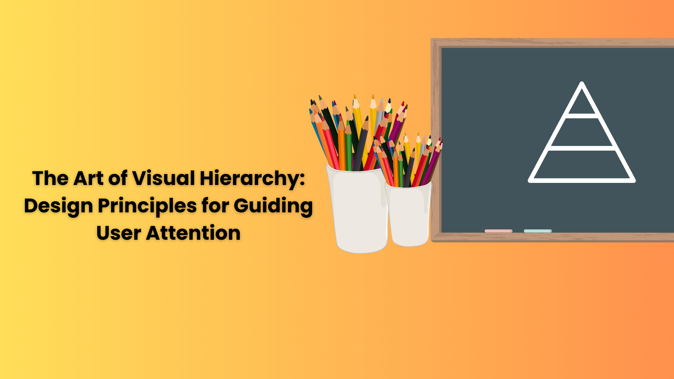
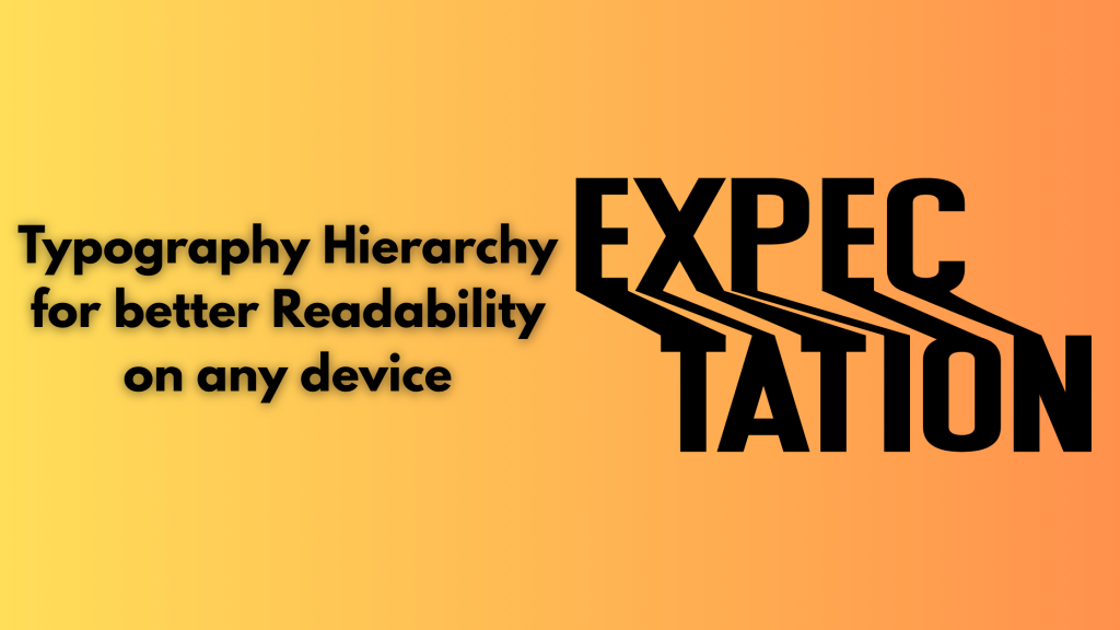
What is Typographical Hierarchy and its benefits?
Typographical hierarchy is a system for organizing your design layout to help readers find the information they are finding more easily. Users mostly scan the content and do not particularly read the entire page from top to bottom. Typographical hierarchy prioritizes more important information over nonessential details and tries to gather the user’s attention on the page.
A well-executed typographical hierarchy makes it easier for readers to use and understand your site, print layout, and digital product. It has more benefits, such as improving accessibility for users, even those who use supportive technology. It also enhances engagement as users can now easily navigate your website and interact more naturally with its content. Professional appearances portray that you care about your customers and your offerings.
Better typography also helps bots used by Google, Bing, and other search engines find and index your content properly. These bots may not be able to scan messy layouts with no meaningful hierarchy, leaving the website out of important search results. It also helps in creating brand recognition, supporting content goals, and attracting more customers.
Elements of good Typography Hierarchy
Typographical hierarchy uses several design traits to help users prioritize information. Some of these considerations are
- Size: larger text grabs attention first, making it suitable for headlines. Smaller text naturally seems less important.
- Weight: Bold and light font weights help in distinguishing key information and add visual structure
- Color: Using color helps in separating content and enhancing clarity, especially using good contrast against backgrounds
- Case: Uppercase letters in headers can create emphasis, though full caps in body text should be avoided for readability
- Placement: Where text appears, it is important. Centered or offset text draws more attention and signals higher importance in the layout
- Contrast: Large and big differences in weight, size, and style are important; however, small differences can go unnoticed. Make sure the contrast is clear and intentional.
- Alignment: To achieve balance and help readers move more easily down a page, align design elements such as your logo, images, body text, etc. Space each design element equally and employ padding and margins consistently. Left, right, and center justify your text based on your project needs.
- Leading: It refers to line length, the distance between one text line’s baseline and the baseline of the text line above it. Generally, the line height is 1.125 to 1.200 times the font size results in better readability.
- Kerning: Adjust the amount of space between individual letters so that the distance appears consistent. Proper kerning can boost text’s visual appeal while improving legibility.
Tips for Creating a Better Hierarchy
- Web-Safe Fonts: Choose fonts that are balanced, clean, and readable on all screens. Always prioritize legibility. Sans-serif fonts like Roboto, Open Sans, and Lato are popular for body text. Avoid overly decorative fonts for large blocks of text because they strain eyes and hamper readability.
- Built a Clear Font Hierarchy: Hierarchy helps users in scanning and understanding the content easily. Define font size and weight for heading, subheading, captions, and body text. Use H1 for the main headline, H2 for sections, and so on. Visual hierarchy helps in guiding users’ attention.
- Limit 2-3 Font: Using too many typefaces can make your website look chaotic. Limit your design to one font for the heading, one for the body, and a third for the accent. It keeps your design cohesive and consistent and makes your website look professional. Select fonts that are compatible with each other.
- Proper Line Space: Line height affects how easy it is to read text. Too little space and words feel cramped, and your text feels disconnected. Aim for 1.4 to 1.6 times the font size for body text. Adequate spacing enhances readability.
- Color Contrast: Make sure your text is readable on all devices and in various lighting conditions. Select text with background color combinations with string contrast. Black text on a white background is standard for clarity. You can also use dark gray.
- Avoid Justified Text Alignment: Justified alignment looks neat in print; however, it often causes awkward spacing in web design. Stick to left-aligned text for body content to improve readability. Left alignment creates natural word spacing and enhances scanability.
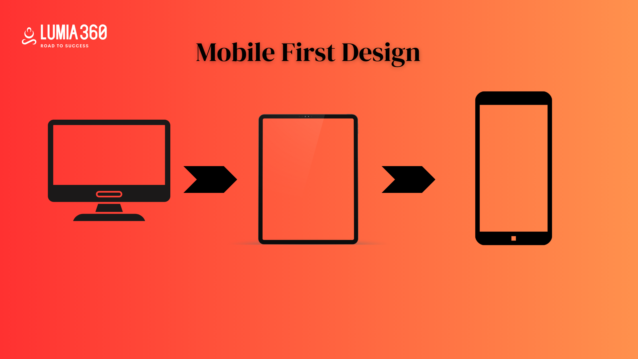
- Responsive Font Size: Your typography should adapt to different screen sizes. Use relative units like em, rem, percentage-based size instead of fx values. Responsive typography ensures that text remains legible on all devices and screen sizes. It helps improve user experience.
- Test: At times, a font can look good on a laptop but might appear broken on small screens. Test typography across multiple browsers and devices. Use fallback fonts in your CSS and load web fonts properly using services such as Google Fonts or Adobe Fonts to maintain consistency.
- Font Weight: Varying font weights adds emphasis and enhances visual flow. Use bold text for headings, and highlight keywords. Avoid using bold and italic together, and use heavy font weights for emphasis without overusing it.
Typography is often overlooked as an important component of web design. By focusing on readability and using web safe fonts, maintaining proper line space, responsive font size, testing on different browsers and devices, etc can improve your typography hierarchy. You can make your layouts efficient by using hierarchy, typeface, and spacing smartly. Lumia 360 provides smart web design solutions to improve your website and enhance SERP ranking. Our strategies and team of experts help in creating a responsive and accessible website that offers a smooth user experience to readers. From typography to considering color psychology to managing design elements, our solutions cover it all. To know more about our web design strategies, email info@lumia360.com or call 514-668-5599.
Read Also: Turning Negative Reviews Into a Positive Customer Experience
Read Also: Voice Search Optimisation: Preparing for the next wave of queries