
The use of color theory in design can affect the emotion and mood of the people. Using colors efficiently can enhance UX and trigger desired customer behaviour. Sometimes by changing the color of the buttons can double the desired behaviour by double. According to a study, color increases brand recognition by 80%.
Color is a silent communicator that is capable of eliciting mood and emotional responses and even helps in forming a decision. Each color impacts a user in a particular way. Understanding color theory is very important for better results. According to research conducted by the Institute for Color Research, people make a judgement about a product within 90 seconds of seeing it, and around 62% to 90% of that assessment is based on the color. Brands like McDonald’s and Burger King use a combination of colors, red and yellow, which is not a coincidence. Surprisingly, looking at this mixture of two colors can make you hungry. In this blog, we’ll learn the effect of colors on emotions and performance and important color theory terms that you should know. Also, how popular brands choose their color scheme!
Effect of Color on Emotions and Performance
Multiple elements can be influenced by the way a person perceives or sees a certain color. It is influenced by the personal association with that color. For example, if a person’s favourite toy as a child was in red, then they might prefer red in the future as well. Similarly, if a child was hit by a grey car in their childhood, then they might dislike or feel negative about that particular color.
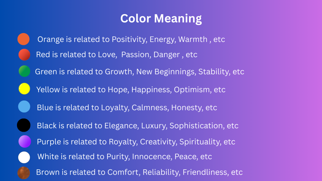
Given the universal human experience, it is practically impossible to predict how a particular color will trigger people. In such scenarios, we consider the average, generally accepted perception of the society. For example, green is associated with growth and nature because people have witnessed how plants grow. Blue is considered universally calming because it is associated with the sky and water.
Some meanings of the color are influenced by culture. For example, Purple is often associated with luxury because purple dye was very pricey and rare in many ancient cultures. For this reason, it was used by royalty. Other than mood, emotions, colors can also influence your performance. For example, a study found that the color red negatively affects the performance on a test. When contestants were given a red participant number (instead of black or green), they performed 20% worse on the test as compared to their competitors. However, it doesn’t mean that the color red always hampers performance. According to a study, athletes who wore red uniforms appeared to have an advantage. During the 2004 Olympics, athletes were competing in four different sports and were randomly given either blue or red protective gear. The red-clad athletes won in 19 out of 29 weight classes. A similar scenario was witnessed in soccer, where those wearing red uniforms performed better. It can be related to the famous connotations of the red color with anger and aggression. Either red uniform makes a person more intimidating to opponents, which negatively affects their performance.
Important Color Theory Terms You Should Know

With over millions of colors to choose from, while creating a website, you must select relevant colors that align with your brand identity and convey the correct emotions. But to identify and select the right colors, you must know these important color theory terms
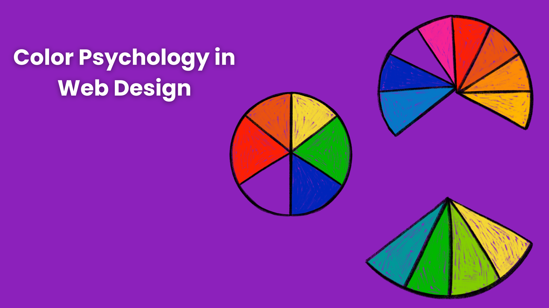
- Color Wheel: A Color wheel is a very important tool in color theory that helps you in visualising the relationships between colors in standard and schematic ways. The basic wheel consists of 12 colors. Primary color forms the basis of all other colors. Mixing primary colors gives you Orange, green, and purple. These colors are known as secondary colors. You can combine primary and secondary colors to create tertiary colors such as yellow-green.
- Color Relationships: While creating a design, designers rely on fundamental color relationships known as color schemes. The four main color schemes are monochrome, complementary, analogous, and triadic. Many designers feel that complementary and analogous color schemes are the easiest to work with.
- Color Warmth: Colors can either be cool or warm. Hues that contain higher amounts of yellow and red are considered warm colors. It evokes passion and happiness, but it can also feel aggressive. Which is why they are used in alert messages. On the other hand, colors that contain higher amounts of blue and purple are known as cool colors. They are more relaxing and calming than warm colors. Adding neutral colors such as white and black can create a harmonious palette. It helps in balancing the color scheme and adds contrast to your design.
- Color Systems: The three standard color systems are RGB (Red, Green, Blue), CMYK (Cyan, Magenta, Yellow, Black), and HEX. The RGB color system is based on light. All colors in this system are combinations of red, green, and blue. Each value is represented by a number from 0 (Black) to 255 (White). CMYK is used in print design. HEX uses a six-digit, three-byte, hexadecimal description of each color, such as %000000 for black and #ffffff for white.
- Hue, Saturation, and Light: Hue defines the degree of similarity between colors. While saturation refers to color intensity. While lightness reflects how bright a color is compared to pure white.
- Tints and Shades: You can create tints by adding white color. Higher levels of white produce lighter tints. Likewise, if you add black, you will produce a different shade. You can combine tints and shades of a base color to achieve a monochrome color scheme.
Case Studies Of Popular Brands’ Color Schemes
Here are some examples of established brands on how they use color schemes for their branding.
- Coca-Cola: The brand’s iconic red color is recognised worldwide. It symbolises energy and passion. The choice of this color has helped coca cola in standing out in the beverage market, making it synonymous with happiness.
- Apple: Apple uses a clean, minimalist color palette that is dominated by white and gray. It reflects sophistication and innovation. This has helped Apple establish itself as a modern brand that provides technologically advanced products.
- Netflix: The bold red used by Netflix evokes excitement and urgency. Which encourages the customers to engage more with the brand. This choice has become synonymous with binge-watching and entertainment, which makes it a leading streaming service globally.
- Starbucks: The green color of Starbucks evokes freshness and growth. It reflects the company’s commitment to quality and ethical sourcing. It helps in creating a perfect vibe for coffee lovers worldwide.
- Facebook: The blue color of Facebook reflects connectivity and reliability. It helps in building a sense of communication and community. Which makes users comfortable with the website. The blue hue has become inseparable from Facebook.
We have learned how colors affect emotions and performance. By understanding and applying color psychology, designers can create highly engaging, accessible websites that are visually attractive. It also resonates with target audiences. The case studies highlight the importance of selecting a particular color. Colors work as a tool of communication. We at Lumia 360 have created visually attractive and engaging websites for our clients using the principles of color psychology. We specialize in creating websites that are highly engaging and rank well on search engines.
Read Also: How to improve your website’s user experience for better conversion
Read Also: How to Measure the Success of Your Email Marketing Campaigns